
Search results for "Extra potential" in Home Design Ideas

 BJOID Inc.
With its artsy design & contemporary finishes, this kitchen defines ‘non-traditional’. Working with this family of 4 was a delight as free reign was given; as long as it was functional modern and ‘cool’. The custom walnut door with horizontal grain offers a refined detail, and the ‘Burnt Ember’ island colour by Benjamin Moore ties in the Caesarstone Piatra Gray countertops. The large mitered island is the core of the kitchen, and Caesarstone’s gorgeous Calacatta Nuvo design wisps effortlessly across and down each waterfall end. With few uppers, efficiency is important. From Super Susans and spice pullouts, to peg board drawer liners and utensil dividers, everything has its place so that each family member can help out easily. The 60” Miele fridge, steam oven and matching dishwashers with applied panels, are all built-in for a fully integrated look. A slight extension on the sink wall offers extra working space, and creates a perfect homework zone for the kids. Lighting is difficult without upper cabinets, so the 2” floating shelf which emerges from the stacked lift-up cabinets has a recessed LED puck to light up the sink area. This kitchen’s fresh materials & bold design choices perfectly complement the client’s lifestyle.

 Five Star Tree Care
It’s important to make sure that all trees on your property are healthy and in good condition. This means hiring professional tree trimming services to maintain your trees yearly in order to keep them looking beautiful and healthy. In late winter or early spring is the best time to trim your trees. Doing so will help to improve the new growth that happens later in the spring. But fruit bearing trees and damaged trees can benefit from careful pruning in the summer. It takes an expert to skillfully trim trees during the summer without damaging them or causing harm and our team at Five Star Tree Services is just a call away to help you with your tree trimming needs!
Why Trim Your Trees?
By trimming your trees annually, this will not only open up your landscaping, which allows more sunlight to get to your property, but there are many other benefits.
These can include:
-Keep Trees Healthy and Promote Growth
When you trim your trees in the spring, before they start producing buds, this helps to stimulate more new growth, which helps to keep trees in excellent condition. This can be especially important for saplings as it encourages them to fill out nicely and in a controlled and structurally sound way. If you are not maintaining your trees properly, they can become too dense, which causes a bunch of problems. One being that it restricts the amount of sunlight getting to all the leaves and it reduces the amount of nutrient circulation needed to support the tree.
Professional tree pruning properly aids in tree growth and its overall aesthetic. Cutting off unneeded or unwanted branches allows other parts of the tree to grow easier. Ridding the tree of these extra branches also stimulates more leaf and fruit production.
-Increased Safety
Your landscape is affected when you neglect to take care of your trees, along with everything else on your property. If you have any dead trees remaining on your property, not only are you putting yourself at risk of injury, but you are putting your family, neighbours, pedestrians, and guests at risk as well. Dead or damaged branches can also be a hazard as they could fall at any time and impact with anyone standing too close to it, or it can fall on your house, which is another issue altogether, if it causes damage. Luckily, you are able to avoid all of this by simply having regular trimmings that will keep your trees healthy. You also need to make sure that all branches close to power lines are cut. This especially, should only be done by a trained professional in order to avoid potential electrocution.
-Increase Production of Fruit
If you are lucky enough to have a fruit bearing tree, it is especially important to have it professionally trimmed before and after it fruits. Doing so helps to improve its overall health and ability to bear fruit by getting rid of unhealthy branches. New fruit also develops and spurs for bearing fruit for the following year.
-Manage Spreading Diseases
Tree branches that are damaged tend to be prone to diseases which are able to spread to other plants and trees in your yard. Branches that are dead also have the potential to easily fall with any wind and especially during a storm. Severely damaged branches can even fall without reason. When you get your trees trimmed and pruned regularly, this prevents these things from happening. It also prevents spreading disease to other trees. Any disease branches should especially be trimmed if they are close to where kids play, people walk, or by doors.
-Increase the Value of Your Property and Overall Appearance
Continuous maintenance and trilling will improve the aesthetic of your property. It controls clutter and opens up the space of the landscaping. Meaning that the curbside appeal to your property increases. This is especially important if you are planning to sell your house, which will actually raise the value of your property. The first step in enhancing the appearance of your property is properly taking care of your trees. The first thing people see when they pull up to or go past your house is the trees. By simply pruning your trees you can make a good impression on potential buyers and your neighbours as well.
-Safeguarding Your Property
Owning a house is the biggest investment you will probably ever make. Making the effort to maintain and increase its value by keeping it in good condition should be your first priority. By trimming your trees regularly, you will be protecting your investment. Not to mention this also allows you to enjoy a nicely manicured property.
Why Professionals Are Essential
Professionals help to improve the health and overall condition of your trees. Trying to trim or prune your trees when you don’t know how can be detrimental. This is why hiring a professional, who has the right knowledge and tools, is better than trying to do it yourself.
-Cost-Effective
Think of it as a short-term expense for a long-term return on your investment. Allowing professional arborists to do your tree maintenance can potentially help to negate the costs of injuries attained from DIY home improvements related to trees, replacements and repairs.
-Skilled and Experienced
Real tools required for trimming a tree need to be handled properly and by the appropriate people. If a regular person were to try and use these tools, the end result could be injury and property damage. This is especially true for any trimming required around power lines. All professionals will have the right experience and skills required to wield these tools in a safe way. This minimizes the likelihood of hazards, injuries, and life-threatening incidents.
-Proper Tools
Heavy-duty chainsaws, ladders, and protective gear are all needed to safely and properly trim a tree. When you hire a professional, they have all the required tools and more. Meaning that you won’t have to go out and buy these tools yourself. As a professional, they also make sure that their tools are reliable and well-maintained in order to efficiently get the job done well.
-Insured
Professionals are also always insured with liability insurance when doing jobs to cover any damages or injuries attained while working. They are able to also provide a guarantee for the safety of your property and belongings while they are doing a job for you.
How Five Star Tree Services Can Help
Although trimming your tree might seem like an easy job, it’s always best to trust the professionals. Proper execution of the task requires the right skills, experience, and knowledge. Our team at Five Star Tree Services have all of this and more! Give us a call at (416) 990-3355 to enlist us for all your Toronto Tree Trimming needs!
 TKS Design Group
Download our free ebook, Creating the Ideal Kitchen. DOWNLOAD NOW
Lakefront property in the northwest suburbs of Chicago is hard to come by, so when we were hired by this young family with exactly that, we were immediately inspired by not just the unusually large footprint of this 1950’s colonial revival but also the lovely views of the manmade lake it was sited on. The large 5-bedroom home was solidly stuck in the 1980’s, but we saw tons of potential. We started out by updating the existing staircase with a fresh coat of paint and adding new herringbone slate to the entry hall.
The powder room off the entryway also got a refresh - new flooring, new cabinets and fixtures. We ran the new slate right through into this space for some consistency. A fun wallpaper and shiplap trim add a welcoming feel and set the tone for the home.
Next, we tackled the kitchen. Located away from the rest of the first floor, the kitchen felt a little isolated, so we immediately began planning for how to better connect it to the rest of the first floor. We landed on removing the wall between the kitchen and dining room and designed a modified galley style space with separate cooking and clean up zones. The cooking zone consists of the refrigerator, prep sink and cooktop, along with a nice long run of prep space at the island. The cleanup side of the kitchen consists of the main sink and dishwasher. Both areas are situated so that the user can view the lake during prep work and cleanup!
One of the home’s main puzzles was how to incorporate the mudroom and area in front of the patio doors at the back of the house. We already had a breakfast table area, so the space by the patio doors was a bit of a no man’s land. We decided to separate the kitchen proper from what became the new mudroom with a large set of barn doors. That way you can quickly hide any mudroom messes but have easy access to the light coming in through the patio doors as well as the outdoor grilling station. We also love the impact the barn doors add to the overall space.
The homeowners’ first words to us were “it’s time to ditch the brown,” so we did! We chose a lovely blue pallet that reflects the home’s location on the lake which is also vibrant yet easy on the eye. Countertops are white quartz, and the natural oak floor works well with the other honey accents. The breakfast table was given a refresh with new chairs, chandelier and window treatments that frame the gorgeous views of the lake out the back.
We coordinated the slate mudroom flooring with that used in the home’s main entrance for a consistent feel. The storage area consists of open and closed storage to allow for some clutter control as needed.
Next on our “to do” list was revamping the dated brown bar area in the neighboring dining room. We eliminated the clutter by adding some closed cabinets and did some easy updates to help the space feel more current. One snag we ran into here was the discovery of a beam above the existing open shelving that had to be modified with a smaller structural beam to allow for our new design to work. This was an unexpected surprise, but in the end we think it was well worth it!
We kept the colors here a bit more muted to blend with the homeowner’s existing furnishings. Open shelving and polished nickel hardware add some simple detail to the new entertainment zone which also looks out onto the lake!
Next we tackled the upstairs starting with the homeowner’s son’s bath. The bath originally had both a tub shower and a separate shower, so we decided to swap out the shower for a new laundry area. This freed up some space downstairs in what used to be the mudroom/laundry room and is much more convenient for daily laundry needs.
We continued the blue palette here with navy cabinetry and the navy tile in the shower. Porcelain floor tile and chrome fixtures keep maintenance to a minimum while matte black mirrors and lighting add some depth the design. A low maintenance runner adds some warmth underfoot and ties the whole space together.
We added a pocket door to the bathroom to minimize interference with the door swings. The left door of the laundry closet is on a 180 degree hinge to allow for easy full access to the machines. Next we tackled the master bath which is an en suite arrangement. The original was typical of the 1980’s with the vanity outside of the bathroom, situated near the master closet. And the brown theme continued here with multiple shades of brown.
Our first move was to segment off the bath and the closet from the master bedroom. We created a short hall from the bedroom to the bathroom with his and hers walk-in closets on the left and right as well as a separate toilet closet outside of the main bathroom for privacy and flexibility.
The original bathroom had a giant soaking tub with steps (dangerous!) as well as a small shower that did not work well for our homeowner who is 6’3”. With other bathtubs in the home, they decided to eliminate the tub and create an oversized shower which takes up the space where the old tub was located. The double vanity is on the opposite wall and a bench is located under the window for morning conversations and a place to set a couple of towels.
The pallet in here is light and airy with a mix of blond wood, creamy porcelain and marble tile, and brass accents. A simple roman shade adds some texture and it’s top-down mechanism allows for light and privacy.
This large whole house remodel gave our homeowners not only the ability to maximize the potential of their home but also created a lovely new frame from which to view their fabulous lake views.
Designed by: Susan Klimala, CKD, CBD
Photography by: Michael Kaskel
For more information on kitchen and bath design ideas go to: www.kitchenstudio-ge.com
Find the right local pro for your project
 Tile Doctor Ltd
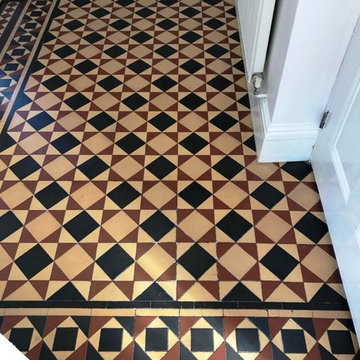
I was recently contacted by the owner of this Minton Victorian tiled floor in Kidderminster. The tiles had been covered over with carpet which I suspect was due to some the tiles being missing. Now uncovered it was stained with glue and carpet underlay was still stuck to the tiles in places. The owner was keen to have the floor fully restored including replacing damaged and missing tiles. We can replace missing or damaged tiles however the problem with old Victorian floors is finding matching replacements due to the unique patterns that many have. Fortunately, due to the popularity of Victorian tiles there are several suppliers who sell reproductions and occasionally you can find originals on ebay.
I went over to survey the floor an could see the tiles were certainly in need of some love and care. As part of the visit I carried out a test clean on a patch of the floor and the results were very satisfactory, so the owner asked me to go ahead.
On the day of arrival my first job was to spray the floor with neat Tile Doctor Remove and Go, this is a powerful cleaner/stripper which set to work on removing the glue and carpet underlay, this product will also remove any old sealer. I then left the solution to dwell and worked the chemical in with my buffer and a black pad removing the slurry with a wet and dry vacuum.
The tiles were then treated to an acid wash using Tile Doctor Acid Gel to further clean them and counter any potential efflorescence problem which is a problem with floors of this age that were installed without a damp-proof membrane. The product was scrubbed into the tile and grout, rinsed off with water and then extracted with the wet vacuum.
Once the floor was clean, I checked the colour of the tiles so I could cut and replace the missing section. I had managed to source some tiles that were a close match and set about cutting all the tiles to size and then fitted them using a flexible rapid set adhesive. The newly laid tiles needed to set, and the floor needed to dry out before we could apply the sealer.
The floor was left to dry overnight, on my return in the morning I tested the floor with a damp meter to check the moisture levels and ensure it was dry enough for sealing. I was satisfied it was dry so was able to proceed and seal the floor. Five coats of Tile Doctor Seal and Go Extra were applied which takes a lot of time as you need to wait for the previous coat to dry before applying the next. This product is a semi-gloss breathable sealer which gives a nice sheen to the tiles and fully protects them. It really allowed the colours and detail of the pattern to shine through and being breathable it will cope with any moisture rising though the floor.
The client was very happy with the overall finish and was really pleased that the Victorian tiles were now restored to their original appearance. It a fact that original features like these are in demand and add a lot of value to a property.
Mark Conway
Worcestershire Tile Doctor

 Star Renovations NY
Open kitchen, White shaker cabinets again the marble backsplash and a waterfall island!
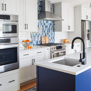
Example of a mid-sized minimalist galley light wood floor and brown floor eat-in kitchen design in New York with an undermount sink, shaker cabinets, white cabinets, quartz countertops, gray backsplash, porcelain backsplash, stainless steel appliances, an island and white countertops
Example of a mid-sized minimalist galley light wood floor and brown floor eat-in kitchen design in New York with an undermount sink, shaker cabinets, white cabinets, quartz countertops, gray backsplash, porcelain backsplash, stainless steel appliances, an island and white countertops

 RAJ Kitchen and Bath, LLC
**Check out the video of this transformation on our website**
This small kitchen was way too small for this 2 bedrooms, 2 bathrooms apartment. Not only was it a very small kitchen, but the physical location of it made it very difficult to make it any bigger. There wasn't much that could have been done without incurring astronomical cost, which would get little or no return on the investment. The client wanted a kitchen that can be optimized in its current location to add a ton of value for resale.
This was difficult to do, because there was no moving of any mechanical around in the kitchen and even if we wanted to, the management of the building would not allow. For those of you who live in condos, co-ops or apartment building, you know how difficult it is to rework these foot prints. When we showed up, we saw the problems, but we also saw a huge opportunity where we can achieve those goals in the small space. This was accomplished by making some key changes and to incorporate some new things that was not possible when this kitchen was built years ago.
The crucial part of the design that would drive the entire new layout, was selecting the only appliance; that was the Refrigerator. Once we nailed down that refrigerator, we then proceeded to design the kitchen around it. We moved it to the other side of the wall where the sink was so that we can tap into the water line from the sink plumbing. It was crucial that it stays exactly 24" deep, not an inch more because we had to keep the entry as open as possible. Also, it was going to be directly in front of another big storage unit - The pantry. It is not ideal in most cases, but we needed the rest of the space to ramp up the design and open feel towards the side where all of the activities would take place, which happend to be the dining room and the view.
Once all that was figured out, we re-positioned the sink, dishwasher and the range and proceeded to wrap the cabinets around the columns to integrate them into the space. Thirty- six inches cabinets height was used so that they can be installed higher towards the ceiling height to give more room rather than the standard 18" required height between the counter tops. This was done to make the room feel a lot bigger than it really was. Not to mention, we also didn't want the faucet to be buried under the cabinets so that was also a necessary design detail for the space.
We then lowered both knee walls so that the counter top can sit on top of them, by removing that stop point that would have otherwise defined the kitchen area. This allowed us to pick up that extra footprint into the room for added prep space and enabled us to create the illusion of a kitchen that is looking longer than it really is. Every inch mattered when designing this kitchen and we made a conscious decision to use every one of that inch.
White cabinets were selected to do just what white cabinets are design to do; make a small or dark room appear bigger, brighter and more open. In this kitchen, this was amplified the more because of the kitchen location. It was perfect! We knew we did justice to the space because while we were there taking some photos, a few potential buyers walked in and went straight for the kitchen! They said its design just to fit the apartment.
Pantry roll out shelving, Double recycle bin, fancy handles, LED lighting, Quartz counter top, beautiful backslash tiles and grey linen floors finished off the kitchen which looked over a beautiful view of the George Washington Bridge from the top of this lovely 4th floor apartment.
Credit to Masterpiece Tile and Marble (Annmarie on the selection of Tiles and countertop and Val on the Construction to complete this project).
Davor Kokic Photography

 Metro Tile Inc
Alcove shower - small contemporary 3/4 gray tile, white tile and matchstick tile porcelain tile and beige floor alcove shower idea in New York with a one-piece toilet
Sponsored
Delaware, OH

Buckeye Basements, Inc.
Central Ohio's Basement Finishing ExpertsBest Of Houzz '13-'21

 My House Design|Build|Team
After living in their home for over 18 years, the homeowners loved the architectural potential of their home, and needed a refresh to meet their current family needs.
They now had two kids in college and wanted to focus on entertaining.
The key projects in the home included a new dramatic living room, the white kitchen renovation, a new personalized man-cave for the husband, and a large walk-in closet with custom height drawer storage for the wife.
Throughout the rooms in this renovation, we added pops of gold and glamour, yet kept the home cozy and livable.
We utilized cohesive design elements throughout the home including ship-lap texture and detailing throughout the kitchen, new mudroom, wok kitchen, living room, and master bedroom.
Project Highlights: White Kitchen Renovation
In this white kitchen renovation, we removed the old wooden shaker-style kitchen cabinetry and replaced them with all new white and grey cabinets, and white marble counter tops. Expertly hidden behind some of these cabinets is the family’s new walk-in pantry.
The original space had a small, awkward-shaped kitchen island that was so small it was barely functional or convenient for more than one person to sit at. We gave the homeowners a much larger kitchen island, with a beveled edge, that now has more than enough space for eating, socializing, or doing work. With a large overhang counter top on one side, there is now room for several backless bar stools tucked under the island. You’ll also notice glitters of gold inside the two over-sized lighting fixtures suspended over the island.
We created the homeowners a small wok kitchen just off of their new white kitchen renovation. In the main kitchen, we added a ceramic flat cook top and subtle white exhaust hood with an elegant rose-gold trim. Behind it, a white/grey mosaic back splash acts as a wall accent to provide some dimension to the otherwise solid white space. Surrounding the range hood are two large wall cabinets with clear doors to provide extra storage without adding bulk to the newly opened room.
The adjacent dining room was also updated to include a long, contemporary dining table with comfortable seating for eight (ten if you want to get cozy). We replaced the low-hanging run-of-the-mill chandelier with a higher, more modern style made of gold and glass. Behind it all is a new dark grey accent wall with a paneled design to add dimension and depth to the new brighter room.
Brightening the Living Room
In addition to the white kitchen renovations, the living room got a much needed update too.
The original high ceilings were so high they were unusable for decor or artwork, and a fireplace was mostly unused.
We installed a large dark grey paneled accent wall (to match the new accent wall in the new formal dining room nearby), to make better use of the space in a stylish, artful way.
In the middle of the room, a stunning minimalist hanging chandelier adds a pop of gold and elegance to the new space.
If you’re looking to change up the colour scheme in your home, or make a transformation from dated to like the white kitchen renovation we did in this Surrey home, let us take a look. Schedule a complimentary consultation with the My House Design/Build Team today.
 My House Design|Build|Team
After living in their home for over 18 years, the homeowners loved the architectural potential of their home, and needed a refresh to meet their current family needs.
They now had two kids in college and wanted to focus on entertaining.
The key projects in the home included a new dramatic living room, the white kitchen renovation, a new personalized man-cave for the husband, and a large walk-in closet with custom height drawer storage for the wife.
Throughout the rooms in this renovation, we added pops of gold and glamour, yet kept the home cozy and livable.
We utilized cohesive design elements throughout the home including ship-lap texture and detailing throughout the kitchen, new mudroom, wok kitchen, living room, and master bedroom.
Project Highlights: White Kitchen Renovation
In this white kitchen renovation, we removed the old wooden shaker-style kitchen cabinetry and replaced them with all new white and grey cabinets, and white marble counter tops. Expertly hidden behind some of these cabinets is the family’s new walk-in pantry.
The original space had a small, awkward-shaped kitchen island that was so small it was barely functional or convenient for more than one person to sit at. We gave the homeowners a much larger kitchen island, with a beveled edge, that now has more than enough space for eating, socializing, or doing work. With a large overhang counter top on one side, there is now room for several backless bar stools tucked under the island. You’ll also notice glitters of gold inside the two over-sized lighting fixtures suspended over the island.
We created the homeowners a small wok kitchen just off of their new white kitchen renovation. In the main kitchen, we added a ceramic flat cook top and subtle white exhaust hood with an elegant rose-gold trim. Behind it, a white/grey mosaic back splash acts as a wall accent to provide some dimension to the otherwise solid white space. Surrounding the range hood are two large wall cabinets with clear doors to provide extra storage without adding bulk to the newly opened room.
The adjacent dining room was also updated to include a long, contemporary dining table with comfortable seating for eight (ten if you want to get cozy). We replaced the low-hanging run-of-the-mill chandelier with a higher, more modern style made of gold and glass. Behind it all is a new dark grey accent wall with a paneled design to add dimension and depth to the new brighter room.
Brightening the Living Room
In addition to the white kitchen renovations, the living room got a much needed update too.
The original high ceilings were so high they were unusable for decor or artwork, and a fireplace was mostly unused.
We installed a large dark grey paneled accent wall (to match the new accent wall in the new formal dining room nearby), to make better use of the space in a stylish, artful way.
In the middle of the room, a stunning minimalist hanging chandelier adds a pop of gold and elegance to the new space.
If you’re looking to change up the colour scheme in your home, or make a transformation from dated to like the white kitchen renovation we did in this Surrey home, let us take a look. Schedule a complimentary consultation with the My House Design/Build Team today.
 Powell Construction
This 1960’s home underwent a striking transformation--remodeling the kitchen, hall bathroom and laundry room. These homeowners dreamed of an open floor plan that would unite the kitchen and adjacent living areas. To accomplish this, we removed an imposing chimney that separated the kitchen from the living room. Additionally, we eliminated a weight-bearing wall that was between the kitchen and dining room. What a change! The spaces that formerly felt dark and confined are now bright and connected, comfortably accommodating larger gatherings.
When considering the specifics of design, we wanted to stay true to the home’s mid-century roots, while updating it with today’s style elements. Embracing the mid-century aspects, we played off some of the existing features of the home by mirroring them in the spaces we redesigned. To introduce today’s style, we thoughtfully incorporated the finishes and touches that would aptly reflect that component. The resulting design is beautifully juxtaposed by the homeowners’ treasured antique furniture pieces.
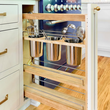
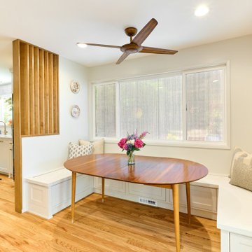
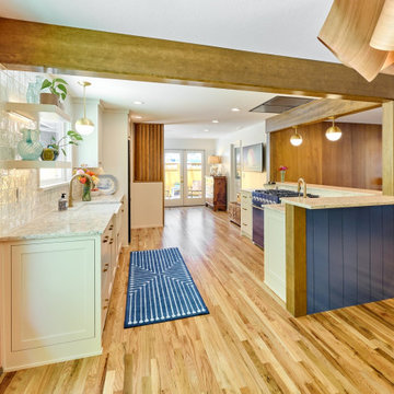
In the kitchen, we enhanced the open and airy feel by choosing a light greige color for the inset cabinetry paired with a tonal light-colored, blue-veined quartz for the countertops. These tones are perfectly complemented by the gold finishes of the cabinet hardware, faucets, and mid-century modern pendants. To maximize the storage potential of this kitchen, we customized the cabinetry with a convenient utensil organizer and a blind corner “cloud” pullout. A full height zellige-style tile backsplash with custom floating shelves makes for an impressive statement wall. With family get togethers in mind, we added an additional bar/prep sink and a spacious breakfast nook with a good deal of bench storage. A vertically-slatted wood half-wall separates the kitchen and breakfast nook, replicating the original mid-century wall detail at the entry.
Between the living room and kitchen, we designed a semi-open bar-height peninsula, accenting the bar front with a vertical shiplap kickplate in a bold blue. Carrying this color statement through the kitchen, the homeowner selected a “Navy Steel” Samsung Bespoke refrigerator and an AGA Mercury range, in “Blueberry.” These colors are also echoed in the multi-tonal quartz.
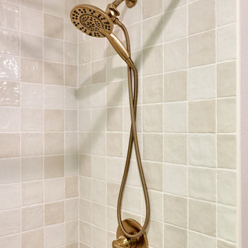
In the hall bathroom, we were aiming for the bright ambiance we’d achieved in the living areas. The penny round tile flooring and full height zellige-look tile combine for a classy, elevated look. In keeping with the kitchen, we installed similar gold fixtures and inset cabinetry and the same beautiful quartz countertop. The vanity towers provide these happy homeowners with additional room to store all their necessities.
Through the design process, we were able to gain square footage in the laundry room which allowed for the extra cabinet space the homeowners were looking for. Of course, a remodel is never complete without conveniences for the pets. The kitty’s litter box is neatly tucked in the cabinet behind a custom cat-cutout--a cute and tidy idea!
Kitchen Selections: Cabinet color-Farrow & Ball Ammonite No. 274; Countertops-Silestone Pietra; Cabinet hardware-Top Knobs Barrington collection in Honey Bronze; Pendants-Rejuvenation Palo Alto; Faucets- Delta Trinsic in Champagne Bronze; Tile-Tilebar Portmore 4x4 in White; Island bar shiplap color-Farrow and Ball Wine Dark No. 308
Bathroom Selections: Floor tile-Cepac Classic Rounds in Cloud; Tile-Tilebar Portmore 4x4 in White; Cabinet color-Farrow & Ball Purbeck Stone No. 275; Countertop-Silestone Pietra; Faucet-Delta Trinsic in Champagne Bronze

 User
Reference: BB513-3-US
Model: FIGARO
Color: Trendy Gray
Shape: rectangular - trough
Finish: honed inside and outside
US Dimensions: 39.37 x 19.68" x 2.36"
US Drain size: standard hole size (1.5")
Faucet Holes: With or without
Faucet holes size: 35mm - 1.38" X2
Material: granite grade A
Natural stone vessel sink or wall mounted FIGARO 39"x20"x2" - genuine interior decoration trendy gray granite. The "Exceptional" cut in the block without any comparison with plastic and other chemical resin market often unaffordable. You will definitely not let anyone feel indifferent with this 100% natural stone unique in the US and exclusively available on Living'ROC.net.
Discover the well–being provided by this beautiful piece, FIGARO'S sleek lines and Zen-style give an elegant and chic look to your bathroom. Cut from a trendy gray (little flower) granite block you will love its generous size.
This basin is from the AQUADEOS range created only from natural stone. Inspired by the model FOLE'GE (better adapter to larger spaces) FIGARO will beautify a smaller space. FIGARO can provide a modern, serene, and trendy atmosphere in your bathroom. Honed finishes and its very convenient slope will add practicality to beauty.
If you wish to standardize your project, you can choose among a wide range of our Trendy gray granite shower bases carved from the same material (very similar color and same honed finish) as it came from the same quarry and most often from the same block of stone. Spacium, Palaos, Quasar or Dalaos.
This vessel sink is Highly resistant to chipping and scratching, withstands hot temperatures, tolerant to very high temperature changes.
Our creation is delivered without an overflow drain and faucet (not included) - every US drains and faucets models you can find on the market will fit perfectly on Living'ROC vessel sink. This model is ready to use over the countertop.
The photos you see online have been taken with extreme care by our Founder CEO - Florent LEPVREAU, because without them we would not be one of the natural stone business key player of the online European continent. Once you have encountered the product in your home you will always have pure happiness for the love of the materials. It will be beyond your expectations because what you see online at livingroc.net is what you will receive. This is why we always guarantee a degree of quality (Grade A) and impeccable finish as can attest with the reviews filed by our customers. We also draw your attention to the fact that veining, flames, small variations of colors and various stone particularities make all the charm of the stone and distinguish it from non-natural materials! Simply our living'ROC style.
 RAJ Kitchen and Bath, LLC
**Check out the video of this transformation on our website**
This small kitchen was way too small for this 2 bedrooms, 2 bathrooms apartment. Not only was it a very small kitchen, but the physical location of it made it very difficult to make it any bigger. There wasn't much that could have been done without incurring astronomical cost, which would get little or no return on the investment. The client wanted a kitchen that can be optimized in its current location to add a ton of value for resale.
This was difficult to do, because there was no moving of any mechanical around in the kitchen and even if we wanted to, the management of the building would not allow. For those of you who live in condos, co-ops or apartment building, you know how difficult it is to rework these foot prints. When we showed up, we saw the problems, but we also saw a huge opportunity where we can achieve those goals in the small space. This was accomplished by making some key changes and to incorporate some new things that was not possible when this kitchen was built years ago.
The crucial part of the design that would drive the entire new layout, was selecting the only appliance; that was the Refrigerator. Once we nailed down that refrigerator, we then proceeded to design the kitchen around it. We moved it to the other side of the wall where the sink was so that we can tap into the water line from the sink plumbing. It was crucial that it stays exactly 24" deep, not an inch more because we had to keep the entry as open as possible. Also, it was going to be directly in front of another big storage unit - The pantry. It is not ideal in most cases, but we needed the rest of the space to ramp up the design and open feel towards the side where all of the activities would take place, which happend to be the dining room and the view.
Once all that was figured out, we re-positioned the sink, dishwasher and the range and proceeded to wrap the cabinets around the columns to integrate them into the space. Thirty- six inches cabinets height was used so that they can be installed higher towards the ceiling height to give more room rather than the standard 18" required height between the counter tops. This was done to make the room feel a lot bigger than it really was. Not to mention, we also didn't want the faucet to be buried under the cabinets so that was also a necessary design detail for the space.
We then lowered both knee walls so that the counter top can sit on top of them, by removing that stop point that would have otherwise defined the kitchen area. This allowed us to pick up that extra footprint into the room for added prep space and enabled us to create the illusion of a kitchen that is looking longer than it really is. Every inch mattered when designing this kitchen and we made a conscious decision to use every one of that inch.
White cabinets were selected to do just what white cabinets are design to do; make a small or dark room appear bigger, brighter and more open. In this kitchen, this was amplified the more because of the kitchen location. It was perfect! We knew we did justice to the space because while we were there taking some photos, a few potential buyers walked in and went straight for the kitchen! They said its design just to fit the apartment.
Pantry roll out shelving, Double recycle bin, fancy handles, LED lighting, Quartz counter top, beautiful backslash tiles and grey linen floors finished off the kitchen which looked over a beautiful view of the George Washington Bridge from the top of this lovely 4th floor apartment.
Credit to Masterpiece Tile and Marble (Annmarie on the selection of Tiles and countertop and Val on the Construction to complete this project).
Davor Kokic Photography
 Powell Construction
This 1960’s home underwent a striking transformation--remodeling the kitchen, hall bathroom and laundry room. These homeowners dreamed of an open floor plan that would unite the kitchen and adjacent living areas. To accomplish this, we removed an imposing chimney that separated the kitchen from the living room. Additionally, we eliminated a weight-bearing wall that was between the kitchen and dining room. What a change! The spaces that formerly felt dark and confined are now bright and connected, comfortably accommodating larger gatherings.
When considering the specifics of design, we wanted to stay true to the home’s mid-century roots, while updating it with today’s style elements. Embracing the mid-century aspects, we played off some of the existing features of the home by mirroring them in the spaces we redesigned. To introduce today’s style, we thoughtfully incorporated the finishes and touches that would aptly reflect that component. The resulting design is beautifully juxtaposed by the homeowners’ treasured antique furniture pieces.
In the kitchen, we enhanced the open and airy feel by choosing a light greige color for the inset cabinetry paired with a tonal light-colored, blue-veined quartz for the countertops. These tones are perfectly complemented by the gold finishes of the cabinet hardware, faucets, and mid-century modern pendants. To maximize the storage potential of this kitchen, we customized the cabinetry with a convenient utensil organizer and a blind corner “cloud” pullout. A full height zellige-style tile backsplash with custom floating shelves makes for an impressive statement wall. With family get togethers in mind, we added an additional bar/prep sink and a spacious breakfast nook with a good deal of bench storage. A vertically-slatted wood half-wall separates the kitchen and breakfast nook, replicating the original mid-century wall detail at the entry.
Between the living room and kitchen, we designed a semi-open bar-height peninsula, accenting the bar front with a vertical shiplap kickplate in a bold blue. Carrying this color statement through the kitchen, the homeowner selected a “Navy Steel” Samsung Bespoke refrigerator and an AGA Mercury range, in “Blueberry.” These colors are also echoed in the multi-tonal quartz.
In the hall bathroom, we were aiming for the bright ambiance we’d achieved in the living areas. The penny round tile flooring and full height zellige-look tile combine for a classy, elevated look. In keeping with the kitchen, we installed similar gold fixtures and inset cabinetry and the same beautiful quartz countertop. The vanity towers provide these happy homeowners with additional room to store all their necessities.
Through the design process, we were able to gain square footage in the laundry room which allowed for the extra cabinet space the homeowners were looking for. Of course, a remodel is never complete without conveniences for the pets. The kitty’s litter box is neatly tucked in the cabinet behind a custom cat-cutout--a cute and tidy idea!
Kitchen Selections: Cabinet color-Farrow & Ball Ammonite No. 274; Countertops-Silestone Pietra; Cabinet hardware-Top Knobs Barrington collection in Honey Bronze; Pendants-Rejuvenation Palo Alto; Faucets- Delta Trinsic in Champagne Bronze; Tile-Tilebar Portmore 4x4 in White; Island bar shiplap color-Farrow and Ball Wine Dark No. 308
Bathroom Selections: Floor tile-Cepac Classic Rounds in Cloud; Tile-Tilebar Portmore 4x4 in White; Cabinet color-Farrow & Ball Purbeck Stone No. 275; Countertop-Silestone Pietra; Faucet-Delta Trinsic in Champagne Bronze
Sponsored
Westerville, OH

Custom Home Works
Franklin County's Award-Winning Design, Build and Remodeling Expert
 Powell Construction
This 1960’s home underwent a striking transformation--remodeling the kitchen, hall bathroom and laundry room. These homeowners dreamed of an open floor plan that would unite the kitchen and adjacent living areas. To accomplish this, we removed an imposing chimney that separated the kitchen from the living room. Additionally, we eliminated a weight-bearing wall that was between the kitchen and dining room. What a change! The spaces that formerly felt dark and confined are now bright and connected, comfortably accommodating larger gatherings.
When considering the specifics of design, we wanted to stay true to the home’s mid-century roots, while updating it with today’s style elements. Embracing the mid-century aspects, we played off some of the existing features of the home by mirroring them in the spaces we redesigned. To introduce today’s style, we thoughtfully incorporated the finishes and touches that would aptly reflect that component. The resulting design is beautifully juxtaposed by the homeowners’ treasured antique furniture pieces.
In the kitchen, we enhanced the open and airy feel by choosing a light greige color for the inset cabinetry paired with a tonal light-colored, blue-veined quartz for the countertops. These tones are perfectly complemented by the gold finishes of the cabinet hardware, faucets, and mid-century modern pendants. To maximize the storage potential of this kitchen, we customized the cabinetry with a convenient utensil organizer and a blind corner “cloud” pullout. A full height zellige-style tile backsplash with custom floating shelves makes for an impressive statement wall. With family get togethers in mind, we added an additional bar/prep sink and a spacious breakfast nook with a good deal of bench storage. A vertically-slatted wood half-wall separates the kitchen and breakfast nook, replicating the original mid-century wall detail at the entry.
Between the living room and kitchen, we designed a semi-open bar-height peninsula, accenting the bar front with a vertical shiplap kickplate in a bold blue. Carrying this color statement through the kitchen, the homeowner selected a “Navy Steel” Samsung Bespoke refrigerator and an AGA Mercury range, in “Blueberry.” These colors are also echoed in the multi-tonal quartz.
In the hall bathroom, we were aiming for the bright ambiance we’d achieved in the living areas. The penny round tile flooring and full height zellige-look tile combine for a classy, elevated look. In keeping with the kitchen, we installed similar gold fixtures and inset cabinetry and the same beautiful quartz countertop. The vanity towers provide these happy homeowners with additional room to store all their necessities.
Through the design process, we were able to gain square footage in the laundry room which allowed for the extra cabinet space the homeowners were looking for. Of course, a remodel is never complete without conveniences for the pets. The kitty’s litter box is neatly tucked in the cabinet behind a custom cat-cutout--a cute and tidy idea!
Kitchen Selections: Cabinet color-Farrow & Ball Ammonite No. 274; Countertops-Silestone Pietra; Cabinet hardware-Top Knobs Barrington collection in Honey Bronze; Pendants-Rejuvenation Palo Alto; Faucets- Delta Trinsic in Champagne Bronze; Tile-Tilebar Portmore 4x4 in White; Island bar shiplap color-Farrow and Ball Wine Dark No. 308
Bathroom Selections: Floor tile-Cepac Classic Rounds in Cloud; Tile-Tilebar Portmore 4x4 in White; Cabinet color-Farrow & Ball Purbeck Stone No. 275; Countertop-Silestone Pietra; Faucet-Delta Trinsic in Champagne Bronze
 RAJ Kitchen and Bath, LLC
**Check out the video of this transformation on our website**
This small kitchen was way too small for this 2 bedrooms, 2 bathrooms apartment. Not only was it a very small kitchen, but the physical location of it made it very difficult to make it any bigger. There wasn't much that could have been done without incurring astronomical cost, which would get little or no return on the investment. The client wanted a kitchen that can be optimized in its current location to add a ton of value for resale.
This was difficult to do, because there was no moving of any mechanical around in the kitchen and even if we wanted to, the management of the building would not allow. For those of you who live in condos, co-ops or apartment building, you know how difficult it is to rework these foot prints. When we showed up, we saw the problems, but we also saw a huge opportunity where we can achieve those goals in the small space. This was accomplished by making some key changes and to incorporate some new things that was not possible when this kitchen was built years ago.
The crucial part of the design that would drive the entire new layout, was selecting the only appliance; that was the Refrigerator. Once we nailed down that refrigerator, we then proceeded to design the kitchen around it. We moved it to the other side of the wall where the sink was so that we can tap into the water line from the sink plumbing. It was crucial that it stays exactly 24" deep, not an inch more because we had to keep the entry as open as possible. Also, it was going to be directly in front of another big storage unit - The pantry. It is not ideal in most cases, but we needed the rest of the space to ramp up the design and open feel towards the side where all of the activities would take place, which happend to be the dining room and the view.
Once all that was figured out, we re-positioned the sink, dishwasher and the range and proceeded to wrap the cabinets around the columns to integrate them into the space. Thirty- six inches cabinets height was used so that they can be installed higher towards the ceiling height to give more room rather than the standard 18" required height between the counter tops. This was done to make the room feel a lot bigger than it really was. Not to mention, we also didn't want the faucet to be buried under the cabinets so that was also a necessary design detail for the space.
We then lowered both knee walls so that the counter top can sit on top of them, by removing that stop point that would have otherwise defined the kitchen area. This allowed us to pick up that extra footprint into the room for added prep space and enabled us to create the illusion of a kitchen that is looking longer than it really is. Every inch mattered when designing this kitchen and we made a conscious decision to use every one of that inch.
White cabinets were selected to do just what white cabinets are design to do; make a small or dark room appear bigger, brighter and more open. In this kitchen, this was amplified the more because of the kitchen location. It was perfect! We knew we did justice to the space because while we were there taking some photos, a few potential buyers walked in and went straight for the kitchen! They said its design just to fit the apartment.
Pantry roll out shelving, Double recycle bin, fancy handles, LED lighting, Quartz counter top, beautiful backslash tiles and grey linen floors finished off the kitchen which looked over a beautiful view of the George Washington Bridge from the top of this lovely 4th floor apartment.
Credit to Masterpiece Tile and Marble (Annmarie on the selection of Tiles and countertop and Val on the Construction to complete this project).
Davor Kokic Photography
 Powell Construction
This 1960’s home underwent a striking transformation--remodeling the kitchen, hall bathroom and laundry room. These homeowners dreamed of an open floor plan that would unite the kitchen and adjacent living areas. To accomplish this, we removed an imposing chimney that separated the kitchen from the living room. Additionally, we eliminated a weight-bearing wall that was between the kitchen and dining room. What a change! The spaces that formerly felt dark and confined are now bright and connected, comfortably accommodating larger gatherings.
When considering the specifics of design, we wanted to stay true to the home’s mid-century roots, while updating it with today’s style elements. Embracing the mid-century aspects, we played off some of the existing features of the home by mirroring them in the spaces we redesigned. To introduce today’s style, we thoughtfully incorporated the finishes and touches that would aptly reflect that component. The resulting design is beautifully juxtaposed by the homeowners’ treasured antique furniture pieces.
In the kitchen, we enhanced the open and airy feel by choosing a light greige color for the inset cabinetry paired with a tonal light-colored, blue-veined quartz for the countertops. These tones are perfectly complemented by the gold finishes of the cabinet hardware, faucets, and mid-century modern pendants. To maximize the storage potential of this kitchen, we customized the cabinetry with a convenient utensil organizer and a blind corner “cloud” pullout. A full height zellige-style tile backsplash with custom floating shelves makes for an impressive statement wall. With family get togethers in mind, we added an additional bar/prep sink and a spacious breakfast nook with a good deal of bench storage. A vertically-slatted wood half-wall separates the kitchen and breakfast nook, replicating the original mid-century wall detail at the entry.
Between the living room and kitchen, we designed a semi-open bar-height peninsula, accenting the bar front with a vertical shiplap kickplate in a bold blue. Carrying this color statement through the kitchen, the homeowner selected a “Navy Steel” Samsung Bespoke refrigerator and an AGA Mercury range, in “Blueberry.” These colors are also echoed in the multi-tonal quartz.
In the hall bathroom, we were aiming for the bright ambiance we’d achieved in the living areas. The penny round tile flooring and full height zellige-look tile combine for a classy, elevated look. In keeping with the kitchen, we installed similar gold fixtures and inset cabinetry and the same beautiful quartz countertop. The vanity towers provide these happy homeowners with additional room to store all their necessities.
Through the design process, we were able to gain square footage in the laundry room which allowed for the extra cabinet space the homeowners were looking for. Of course, a remodel is never complete without conveniences for the pets. The kitty’s litter box is neatly tucked in the cabinet behind a custom cat-cutout--a cute and tidy idea!
Kitchen Selections: Cabinet color-Farrow & Ball Ammonite No. 274; Countertops-Silestone Pietra; Cabinet hardware-Top Knobs Barrington collection in Honey Bronze; Pendants-Rejuvenation Palo Alto; Faucets- Delta Trinsic in Champagne Bronze; Tile-Tilebar Portmore 4x4 in White; Island bar shiplap color-Farrow and Ball Wine Dark No. 308
Bathroom Selections: Floor tile-Cepac Classic Rounds in Cloud; Tile-Tilebar Portmore 4x4 in White; Cabinet color-Farrow & Ball Purbeck Stone No. 275; Countertop-Silestone Pietra; Faucet-Delta Trinsic in Champagne Bronze
 Powell Construction
This 1960’s home underwent a striking transformation--remodeling the kitchen, hall bathroom and laundry room. These homeowners dreamed of an open floor plan that would unite the kitchen and adjacent living areas. To accomplish this, we removed an imposing chimney that separated the kitchen from the living room. Additionally, we eliminated a weight-bearing wall that was between the kitchen and dining room. What a change! The spaces that formerly felt dark and confined are now bright and connected, comfortably accommodating larger gatherings.
When considering the specifics of design, we wanted to stay true to the home’s mid-century roots, while updating it with today’s style elements. Embracing the mid-century aspects, we played off some of the existing features of the home by mirroring them in the spaces we redesigned. To introduce today’s style, we thoughtfully incorporated the finishes and touches that would aptly reflect that component. The resulting design is beautifully juxtaposed by the homeowners’ treasured antique furniture pieces.
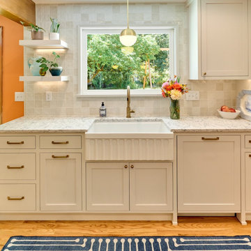
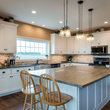
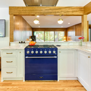
In the kitchen, we enhanced the open and airy feel by choosing a light greige color for the inset cabinetry paired with a tonal light-colored, blue-veined quartz for the countertops. These tones are perfectly complemented by the gold finishes of the cabinet hardware, faucets, and mid-century modern pendants. To maximize the storage potential of this kitchen, we customized the cabinetry with a convenient utensil organizer and a blind corner “cloud” pullout. A full height zellige-style tile backsplash with custom floating shelves makes for an impressive statement wall. With family get togethers in mind, we added an additional bar/prep sink and a spacious breakfast nook with a good deal of bench storage. A vertically-slatted wood half-wall separates the kitchen and breakfast nook, replicating the original mid-century wall detail at the entry.
Between the living room and kitchen, we designed a semi-open bar-height peninsula, accenting the bar front with a vertical shiplap kickplate in a bold blue. Carrying this color statement through the kitchen, the homeowner selected a “Navy Steel” Samsung Bespoke refrigerator and an AGA Mercury range, in “Blueberry.” These colors are also echoed in the multi-tonal quartz.
In the hall bathroom, we were aiming for the bright ambiance we’d achieved in the living areas. The penny round tile flooring and full height zellige-look tile combine for a classy, elevated look. In keeping with the kitchen, we installed similar gold fixtures and inset cabinetry and the same beautiful quartz countertop. The vanity towers provide these happy homeowners with additional room to store all their necessities.
Through the design process, we were able to gain square footage in the laundry room which allowed for the extra cabinet space the homeowners were looking for. Of course, a remodel is never complete without conveniences for the pets. The kitty’s litter box is neatly tucked in the cabinet behind a custom cat-cutout--a cute and tidy idea!
Kitchen Selections: Cabinet color-Farrow & Ball Ammonite No. 274; Countertops-Silestone Pietra; Cabinet hardware-Top Knobs Barrington collection in Honey Bronze; Pendants-Rejuvenation Palo Alto; Faucets- Delta Trinsic in Champagne Bronze; Tile-Tilebar Portmore 4x4 in White; Island bar shiplap color-Farrow and Ball Wine Dark No. 308
Bathroom Selections: Floor tile-Cepac Classic Rounds in Cloud; Tile-Tilebar Portmore 4x4 in White; Cabinet color-Farrow & Ball Purbeck Stone No. 275; Countertop-Silestone Pietra; Faucet-Delta Trinsic in Champagne Bronze

 Powell Construction
This 1960’s home underwent a striking transformation--remodeling the kitchen, hall bathroom and laundry room. These homeowners dreamed of an open floor plan that would unite the kitchen and adjacent living areas. To accomplish this, we removed an imposing chimney that separated the kitchen from the living room. Additionally, we eliminated a weight-bearing wall that was between the kitchen and dining room. What a change! The spaces that formerly felt dark and confined are now bright and connected, comfortably accommodating larger gatherings.
When considering the specifics of design, we wanted to stay true to the home’s mid-century roots, while updating it with today’s style elements. Embracing the mid-century aspects, we played off some of the existing features of the home by mirroring them in the spaces we redesigned. To introduce today’s style, we thoughtfully incorporated the finishes and touches that would aptly reflect that component. The resulting design is beautifully juxtaposed by the homeowners’ treasured antique furniture pieces.
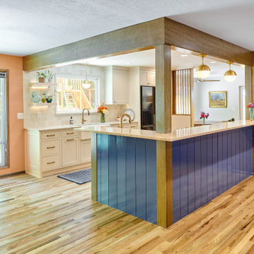
In the kitchen, we enhanced the open and airy feel by choosing a light greige color for the inset cabinetry paired with a tonal light-colored, blue-veined quartz for the countertops. These tones are perfectly complemented by the gold finishes of the cabinet hardware, faucets, and mid-century modern pendants. To maximize the storage potential of this kitchen, we customized the cabinetry with a convenient utensil organizer and a blind corner “cloud” pullout. A full height zellige-style tile backsplash with custom floating shelves makes for an impressive statement wall. With family get togethers in mind, we added an additional bar/prep sink and a spacious breakfast nook with a good deal of bench storage. A vertically-slatted wood half-wall separates the kitchen and breakfast nook, replicating the original mid-century wall detail at the entry.
Between the living room and kitchen, we designed a semi-open bar-height peninsula, accenting the bar front with a vertical shiplap kickplate in a bold blue. Carrying this color statement through the kitchen, the homeowner selected a “Navy Steel” Samsung Bespoke refrigerator and an AGA Mercury range, in “Blueberry.” These colors are also echoed in the multi-tonal quartz.
In the hall bathroom, we were aiming for the bright ambiance we’d achieved in the living areas. The penny round tile flooring and full height zellige-look tile combine for a classy, elevated look. In keeping with the kitchen, we installed similar gold fixtures and inset cabinetry and the same beautiful quartz countertop. The vanity towers provide these happy homeowners with additional room to store all their necessities.
Through the design process, we were able to gain square footage in the laundry room which allowed for the extra cabinet space the homeowners were looking for. Of course, a remodel is never complete without conveniences for the pets. The kitty’s litter box is neatly tucked in the cabinet behind a custom cat-cutout--a cute and tidy idea!
Kitchen Selections: Cabinet color-Farrow & Ball Ammonite No. 274; Countertops-Silestone Pietra; Cabinet hardware-Top Knobs Barrington collection in Honey Bronze; Pendants-Rejuvenation Palo Alto; Faucets- Delta Trinsic in Champagne Bronze; Tile-Tilebar Portmore 4x4 in White; Island bar shiplap color-Farrow and Ball Wine Dark No. 308
Bathroom Selections: Floor tile-Cepac Classic Rounds in Cloud; Tile-Tilebar Portmore 4x4 in White; Cabinet color-Farrow & Ball Purbeck Stone No. 275; Countertop-Silestone Pietra; Faucet-Delta Trinsic in Champagne Bronze
 Powell Construction
This 1960’s home underwent a striking transformation--remodeling the kitchen, hall bathroom and laundry room. These homeowners dreamed of an open floor plan that would unite the kitchen and adjacent living areas. To accomplish this, we removed an imposing chimney that separated the kitchen from the living room. Additionally, we eliminated a weight-bearing wall that was between the kitchen and dining room. What a change! The spaces that formerly felt dark and confined are now bright and connected, comfortably accommodating larger gatherings.
When considering the specifics of design, we wanted to stay true to the home’s mid-century roots, while updating it with today’s style elements. Embracing the mid-century aspects, we played off some of the existing features of the home by mirroring them in the spaces we redesigned. To introduce today’s style, we thoughtfully incorporated the finishes and touches that would aptly reflect that component. The resulting design is beautifully juxtaposed by the homeowners’ treasured antique furniture pieces.
In the kitchen, we enhanced the open and airy feel by choosing a light greige color for the inset cabinetry paired with a tonal light-colored, blue-veined quartz for the countertops. These tones are perfectly complemented by the gold finishes of the cabinet hardware, faucets, and mid-century modern pendants. To maximize the storage potential of this kitchen, we customized the cabinetry with a convenient utensil organizer and a blind corner “cloud” pullout. A full height zellige-style tile backsplash with custom floating shelves makes for an impressive statement wall. With family get togethers in mind, we added an additional bar/prep sink and a spacious breakfast nook with a good deal of bench storage. A vertically-slatted wood half-wall separates the kitchen and breakfast nook, replicating the original mid-century wall detail at the entry.
Between the living room and kitchen, we designed a semi-open bar-height peninsula, accenting the bar front with a vertical shiplap kickplate in a bold blue. Carrying this color statement through the kitchen, the homeowner selected a “Navy Steel” Samsung Bespoke refrigerator and an AGA Mercury range, in “Blueberry.” These colors are also echoed in the multi-tonal quartz.
In the hall bathroom, we were aiming for the bright ambiance we’d achieved in the living areas. The penny round tile flooring and full height zellige-look tile combine for a classy, elevated look. In keeping with the kitchen, we installed similar gold fixtures and inset cabinetry and the same beautiful quartz countertop. The vanity towers provide these happy homeowners with additional room to store all their necessities.
Through the design process, we were able to gain square footage in the laundry room which allowed for the extra cabinet space the homeowners were looking for. Of course, a remodel is never complete without conveniences for the pets. The kitty’s litter box is neatly tucked in the cabinet behind a custom cat-cutout--a cute and tidy idea!
Kitchen Selections: Cabinet color-Farrow & Ball Ammonite No. 274; Countertops-Silestone Pietra; Cabinet hardware-Top Knobs Barrington collection in Honey Bronze; Pendants-Rejuvenation Palo Alto; Faucets- Delta Trinsic in Champagne Bronze; Tile-Tilebar Portmore 4x4 in White; Island bar shiplap color-Farrow and Ball Wine Dark No. 308
Bathroom Selections: Floor tile-Cepac Classic Rounds in Cloud; Tile-Tilebar Portmore 4x4 in White; Cabinet color-Farrow & Ball Purbeck Stone No. 275; Countertop-Silestone Pietra; Faucet-Delta Trinsic in Champagne Bronze
 Dimensions in Wood Inc
This client’s vision for their kitchen/hearth room remodel was to create a harmonious space for gathering and socializing with family and friends. Without the before and after photos, you would scarcely believe this was the same home.
This huge home renovation perfectly illustrates that Dimensions In Wood’s expert team can handle every aspect of your remodeling project. Plumbing, flooring, electrical wiring, custom cabinets, structural engineering, appliances, windows, interior and exterior doors, entertainment and more. Contact us today to discuss Translating Your Visions into Reality
The client was interested in new appliance technology, cabinetry to the ceiling, and an Island large enough to seat 3. They also wanted a built-in breakfast nook, improved pantry space, more functional storage on either side of their fireplace, and a built-in appearance for the TV above the mantel. The original built-in desk was not used, and they preferred for that space to serve as a small bar area with refrigeration and a place to store their printer. We designed several plans for the space before selecting the final layout.
The new design required the removal of the soffit over the old sink, as well as a small wall beside the old refrigerator. The wall beside the stairwell had to be shortened 13 inches and a new beam installed to carry the load of the home’s 2nd story to gain enough space for the large central island. The existing closet pantry walls were also reconfigured as per the new plan.
This serves as a great reminder that Dimensions In Wood is much more than just custom cabinets.
Central to the entire custom kitchen is an 8-foot Walnut island. The huge island, which comfortably seats three, is topped with Essenza Blue quartzite. The stone’s natural striations are beautiful. Quartzite is harder than granite, and less likely to stain than other stones because of its density. The couple had to look through multiple slabs to find a piece they LOVED. The island’s custom Walnut cabinetry, built to resemble a piece of custom furniture, was stained Bronzed Walnut by Sherwin Williams.
The 4-foot Galley Workstation in the island, handles all the kitchen’s prep, serving, and cleanup needs. The Galley’s culinary tools include an upper tier cutting board, upper tier drying rack, 2 lower tier platforms, 11″ colander with non-slip handles, and 11” mixing bowl with lid and non-slip bottom. Learn more about the amazing Galley Workstation here. A Waterstone gantry faucet in a pewter finish combines a pull-down sprayer for maximum mobility and a articulated swivel spout. A water tap with reverse osmosis filter provides the highest quality drinking water. To keep a clean and sleek counter we installed a raised air switch for the garbage disposal and integrated soap dispenser. The island also houses the Thermador Sapphire 7-Program Dishwasher with a hidden touch control panel and a custom Walnut wood front. The cabinetry under the Galley Workstation features a trash roll out, as well as storage for the culinary tools.
Shortening the stairwell wall, and reframing around the stairs, which included shortening the handrail, also made room for a bi-fold door walk-in pantry with extra roll out storage and space for a small microwave. Above the panty doors is a remote controlled, electric motor powered, lift up cabinet door which hides a flat screen TV, used while the family is cooking.
To the right of the walk-in pantry is cold food storage. The Thermador, 30-inch Freedom Collection refrigerator and 24-inch built-in freezer column with internal ice maker are covered with matching cabinetry fronts. An open display space was designed above the units, creating an aesthetically beautiful wall. To the right of the refrigerator & freezer columns is a tall cabinet designed for the built-in Thermador steam and convection oven. The convention steam oven is a relatively new technology for homes, but its versatility and food quality is amazing. To the right of this is a pull-out appliance pantry which provides easy access and storage for a stand mixer, blender, and any other appliance you do not want to clutter the counter.
The most visible wall of the kitchen features the 36-inch Thermador Professional Series Harmony Gas Range with Griddle. Between the range and custom designed wood hood, a framed mosaic tile accent in the backsplash, creates a focal point. To clear the air, the Professional Series Thermador 42-inch ventilation insert provides excellent exhaust capabilities, as well as providing multi-level, vivid LED lights for beautiful illumination.
The wall cabinetry symmetrically flanks the custom hood, utilizing deeper wall cabinetry on each end, allowing for storage of oversized dishware. The base cabinetry on this wall is made up of drawers, except for the corner, which is a Kesseböhmer LeMans II. This specially designed shelf system allows ease of access in underutilized blind corners. The dual action articulation system with soft close mechanism ensures a smooth open and close.
Rounding the corner to the outside wall, the base cabinetry was built to a narrower depth, providing additional space for the island, as well as easier access to the new larger pass-thru window which serves the screen porch. The client selected Black Vermont granite countertops with an ogee edge to contrast the Linen White painted cabinetry.
The door to the screen porch was replaced with a Marvin Exterior Door with a raised panel at the bottom of the 3⁄4 glass door.
Marvin Windows replaced the other windows in the space increasing the energy efficiency and value of the home. To establish the breakfast nook, a bench with drawers and an upholstered seat was built into the bay area of the room.
Custom bookshelves were built with open shelves, cabinet doors, and drawers on either side of the fireplace. A new stone hearth and fireplace surround were installed. Above the existing mantel we built a recessed space for the flat screen television hiding all wiring inside the walls for a completely clean look.
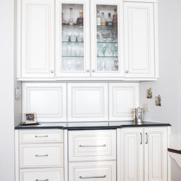
The space that was once a desk was transformed into a bar area. The glass shelves and glass cabinet front liquor cabinet stand out. But this bar area has hidden secrets. Tucked beneath the black granite is a Thermador under-counter double drawer refrigerator with matching wood front panels. They blend in perfectly with the cabinets. A wireless printer is easily accessed on a slide out drawer. Plus, what looks like merely wooden panels on the wall are concealing recessed storage for more bottles and glasses!
Overhead recessed lighting and speaker system provide illumination and entertainment through the entire space.
This luxury home had original, solid oak flooring through most of the first floor which the homeowner obviously wanted to keep but were in desperate need of repair and refinishing. Our master craftsmen wove in new wood flooring to match the old where needed, particularly where walls had been changed and where the floor was damaged. We sanded the floors, smoothing away years of wear and tear. The entire wood floor was then uniformly stained, making it impossible to differentiate where any repairs were made.
If this renovation has inspired you, then contact us today! There is no limit to our Dimensions.
72