
Search results for "Extraneous up to dateness" in Home Design Ideas
 Joy Street Design
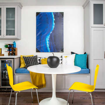
A gorgeous kitchen showcasing a brand new color palette of gray and bold blue! As this was the client’s childhood home, we wanted to preserve her memories while still refreshing the interior and bringing it up-to-date. We started with a new spatial layout and increased the size of wall openings to create the sense of an open plan without removing all the walls. By adding a more functional layout and pops of color throughout the space, we were able to achieve a youthful update to a cherished space without losing all the character and memories that the homeowner loved.
Designed by Joy Street Design serving Oakland, Berkeley, San Francisco, and the whole of the East Bay.
For more about Joy Street Design, click here: https://www.joystreetdesign.com/
To learn more about this project, click here: https://www.joystreetdesign.com/portfolio/randolph-street
 ReVision Design + Build
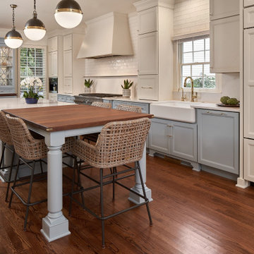
Benjamin Moore White Dove and Sherwin-Williams Stardew paired with walnut, brass and acrylic accents give this transitional kitchen a classic feel while still remaining current and up to date for today's modern lifestyles. © Lassiter Photography | **Any product tags listed as “related,” “similar,” or “sponsored” are done so by Houzz and are not the actual products specified. They have not been approved by, nor are they endorsed by ReVision Design/Remodeling.**
 Skill Construction & Design, LLC
Last week we featured an incredible new kitchen with an open floor plan and unique architectural interest. I alluded to a change in the staircase and here it is. Part of designing a new kitchen or bath is looking at surrounding spaces and how the remodel will affect them. Will the current master bedroom seem dated as an entrance to the new bath? Is the dining room that adjoins the kitchen badly in need of flooring and lighting? Some projects might have to wait. But if the immediate area has an adverse affect on the newly remodeled kitchen it might be just as important to address these areas within your remodel.
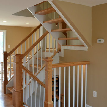
Although the staircase was in harmony with the homes existing era and colors, it simply didn’t work with the new kitchen. Despite its open risers, the existing balusters and railings with their colonial turnings and dark stain, were the opposite of the finished kitchen. With the carpeting gone from the floors, it looked dated and out-of-place on the stairs.
We carried our kitchen theme to the staircase. We used the natural oak of our flooring for the treads, handrails and posts, but kept the balusters and trim crisp white. The effect perfectly reflects the feel of the kitchen, light and airy.
Before, the dark wood details drew the eye up, ultimately to the textured ceiling in the dining room. The darker tone created a dramatic ending as it traveled up to die into the wall.
Now, as the eye travels up, the staircase seems to soar. The textured ceiling was replaced with a smooth white one and the wall color is a soft warm contrast. The handrail still ends at the wall, but with white balusters and the light oak handrail, the ending is softer.
It isn’t a lighting change, the staircase simply lets the light shine through. The treads are slim and sleek, while the white walls, trim and balusters reflect the light for an overall brighter feel.
The newel posts were a great choice. The larger size and square craftsman like features add substance and architecture without seeming heavy or bulky.
The final touch completes the look. From front door to back, up and down, this remodel is finished. This home now bursts with sunshine the minute you enter and stays bright and sunny no matter where you turn. From the architectural details that are the center of attention, to the modern stainless steel appliance, this space is perfect for entertaining, or any day.
http://www.designsbyskill.com/
http://www.rjkconstructioninc.com/
Find the right local pro for your project
 TVL Creative Ltd.
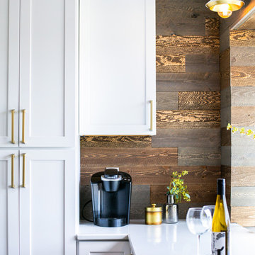
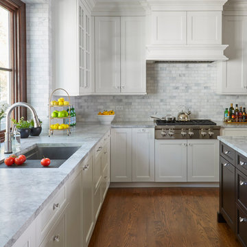
This kitchen took a tired, 80’s builder kitchen and revamped it into a personalized gathering space for our wonderful client. The existing space was split up by the dated configuration of eat-in kitchen table area to one side and cramped workspace on the other. It didn’t just under-serve our client’s needs; it flat out discouraged them from using the space. Our client desired an open kitchen with a central gathering space where family and friends could connect. To open things up, we removed the half wall separating the kitchen from the dining room and the wall that blocked sight lines to the family room and created a narrow hallway to the kitchen. The old oak cabinets weren't maximizing storage and were dated and dark. We used Waypoint Living Spaces cabinets in linen white to brighten up the room. On the east wall, we created a hutch-like stack that features an appliance garage that keeps often used countertop appliance on hand but out of sight. The hutch also acts as a transition from the cooking zone to the coffee and wine area. We eliminated the north window that looked onto the entry walkway and activated this wall as storage with refrigerator enclosure and pantry. We opted to leave the east window as-is and incorporated it into the new kitchen layout by creating a window well for growing plants and herbs. The countertops are Pental Quartz in Carrara. The sleek cabinet hardware is from our friends at Amerock in a gorgeous satin champagne bronze. One of the most striking features in the space is the pattern encaustic tile from Tile Shop. The pop of blue in the backsplash adds personality and contrast to the champagne accents. The reclaimed wood cladding surrounding the large east-facing window introduces a quintessential Colorado vibe, and the natural texture balances the crisp white cabinetry and geometric patterned tile. Minimalist modern lighting fixtures from Mitzi by Hudson Valley Lighting provide task lighting over the sink and at the wine/ coffee station. The visual lightness of the sink pendants maintains the openness and visual connection between the kitchen and dining room. Together the elements make for a sophisticated yet casual vibe-- a comfortable chic kitchen. We love the way this space turned out and are so happy that our clients now have such a bright and welcoming gathering space as the heart of their home!
 TKS Design Group
Free ebook, Creating the Ideal Kitchen. DOWNLOAD NOW
This project started out as a kitchen remodel but ended up as so much more. As the original plan started to take shape, some water damage provided the impetus to remodel a small upstairs hall bath. Once this bath was complete, the homeowners enjoyed the result so much that they decided to set aside the kitchen and complete a large master bath remodel. Once that was completed, we started planning for the kitchen!
The original kitchen was just large enough to accommodate an island and a separate pantry but felt a little cramped, especially during the weekends when the couple likes to entertain. The primary goal was to maintain the functionality of the current space, but to add some breathing room as well as to provide a view to the homeowner’s side yard and substantial Hosta garden.
The solution was to bump out the space about 10 feet which provided ample room for large pro appliances, a large island for gathering and an upgraded pantry space. It was important to the homeowners to create a space that felt like it belonged in their historic 1866 home. Details such as matching new trim to the existing large custom profiles in the original home and re-purposing an existing door to be used for the new pantry, provided these touches. A large window at the main sink provides that view into the yard and a beautiful focal point for the room.
A mix of painted wood and stained cabinetry gives the new kitchen a sense of belonging in the older home, as do the Super White quartzite that has the look of marble, subway tile backsplash, polished nickel lanterns and glass and mirrored doors. The large pantry, filled with custom shelving built to the homeowner’s specifications, stainless steel appliances and the two Galley Workstations – sinks that do double duty as prep space – ensure that not only does the kitchen look great, but also functions in a personalized manner that works perfectly for the occupants.
Doing the bump out also allowed the opportunity for a small mudroom and powder room right off the kitchen as well as re-arranging some openings to allow for better traffic flow throughout the entire first floor. The result is a comfortable up-to-date home that feels both steeped in history yet allows for today’s style of living.
Designed by: Susan Klimala, CKD, CBD
Photography by: Michael Alan Kaskel
For more information on kitchen and bath design ideas go to: www.kitchenstudio-ge.com
 User
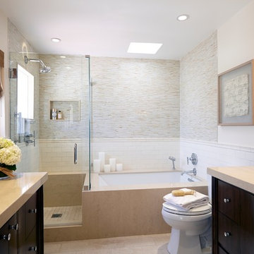
UserSCD brightened up the dark and dated master bath using a light, neutral palette. Glass mosaic tile adds sparkle to the walls in the tub and shower and contrasts nicely with the matte-finish subway tile. Vanities with curved fronts and chrome legs up the glam factor, while the artwork and Roman shade add texture.
Doug Hill Photography
 Skill Construction & Design, LLC
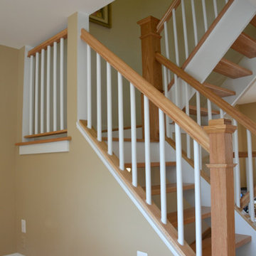
Last week we featured an incredible new kitchen with an open floor plan and unique architectural interest. I alluded to a change in the staircase and here it is. Part of designing a new kitchen or bath is looking at surrounding spaces and how the remodel will affect them. Will the current master bedroom seem dated as an entrance to the new bath? Is the dining room that adjoins the kitchen badly in need of flooring and lighting? Some projects might have to wait. But if the immediate area has an adverse affect on the newly remodeled kitchen it might be just as important to address these areas within your remodel.
Although the staircase was in harmony with the homes existing era and colors, it simply didn’t work with the new kitchen. Despite its open risers, the existing balusters and railings with their colonial turnings and dark stain, were the opposite of the finished kitchen. With the carpeting gone from the floors, it looked dated and out-of-place on the stairs.
We carried our kitchen theme to the staircase. We used the natural oak of our flooring for the treads, handrails and posts, but kept the balusters and trim crisp white. The effect perfectly reflects the feel of the kitchen, light and airy.
Before, the dark wood details drew the eye up, ultimately to the textured ceiling in the dining room. The darker tone created a dramatic ending as it traveled up to die into the wall.
Now, as the eye travels up, the staircase seems to soar. The textured ceiling was replaced with a smooth white one and the wall color is a soft warm contrast. The handrail still ends at the wall, but with white balusters and the light oak handrail, the ending is softer.
It isn’t a lighting change, the staircase simply lets the light shine through. The treads are slim and sleek, while the white walls, trim and balusters reflect the light for an overall brighter feel.
The newel posts were a great choice. The larger size and square craftsman like features add substance and architecture without seeming heavy or bulky.
The final touch completes the look. From front door to back, up and down, this remodel is finished. This home now bursts with sunshine the minute you enter and stays bright and sunny no matter where you turn. From the architectural details that are the center of attention, to the modern stainless steel appliance, this space is perfect for entertaining, or any day.
http://www.designsbyskill.com/
http://www.rjkconstructioninc.com/

Sponsored
Columbus, OH
Free consultation for landscape design!

Peabody Landscape Group
Franklin County's Reliable Landscape Design & Contracting
 Skill Construction & Design, LLC
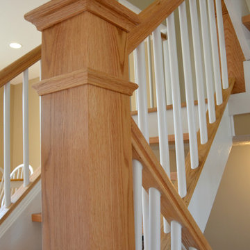
Last week we featured an incredible new kitchen with an open floor plan and unique architectural interest. I alluded to a change in the staircase and here it is. Part of designing a new kitchen or bath is looking at surrounding spaces and how the remodel will affect them. Will the current master bedroom seem dated as an entrance to the new bath? Is the dining room that adjoins the kitchen badly in need of flooring and lighting? Some projects might have to wait. But if the immediate area has an adverse affect on the newly remodeled kitchen it might be just as important to address these areas within your remodel.
Although the staircase was in harmony with the homes existing era and colors, it simply didn’t work with the new kitchen. Despite its open risers, the existing balusters and railings with their colonial turnings and dark stain, were the opposite of the finished kitchen. With the carpeting gone from the floors, it looked dated and out-of-place on the stairs.
We carried our kitchen theme to the staircase. We used the natural oak of our flooring for the treads, handrails and posts, but kept the balusters and trim crisp white. The effect perfectly reflects the feel of the kitchen, light and airy.
Before, the dark wood details drew the eye up, ultimately to the textured ceiling in the dining room. The darker tone created a dramatic ending as it traveled up to die into the wall.
Now, as the eye travels up, the staircase seems to soar. The textured ceiling was replaced with a smooth white one and the wall color is a soft warm contrast. The handrail still ends at the wall, but with white balusters and the light oak handrail, the ending is softer.
It isn’t a lighting change, the staircase simply lets the light shine through. The treads are slim and sleek, while the white walls, trim and balusters reflect the light for an overall brighter feel.
The newel posts were a great choice. The larger size and square craftsman like features add substance and architecture without seeming heavy or bulky.
The final touch completes the look. From front door to back, up and down, this remodel is finished. This home now bursts with sunshine the minute you enter and stays bright and sunny no matter where you turn. From the architectural details that are the center of attention, to the modern stainless steel appliance, this space is perfect for entertaining, or any day.
http://www.designsbyskill.com/
http://www.rjkconstructioninc.com/
 TVL Creative Ltd.
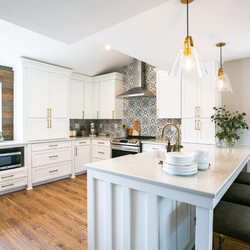
This kitchen took a tired, 80’s builder kitchen and revamped it into a personalized gathering space for our wonderful client. The existing space was split up by the dated configuration of eat-in kitchen table area to one side and cramped workspace on the other. It didn’t just under-serve our client’s needs; it flat out discouraged them from using the space. Our client desired an open kitchen with a central gathering space where family and friends could connect. To open things up, we removed the half wall separating the kitchen from the dining room and the wall that blocked sight lines to the family room and created a narrow hallway to the kitchen. The old oak cabinets weren't maximizing storage and were dated and dark. We used Waypoint Living Spaces cabinets in linen white to brighten up the room. On the east wall, we created a hutch-like stack that features an appliance garage that keeps often used countertop appliance on hand but out of sight. The hutch also acts as a transition from the cooking zone to the coffee and wine area. We eliminated the north window that looked onto the entry walkway and activated this wall as storage with refrigerator enclosure and pantry. We opted to leave the east window as-is and incorporated it into the new kitchen layout by creating a window well for growing plants and herbs. The countertops are Pental Quartz in Carrara. The sleek cabinet hardware is from our friends at Amerock in a gorgeous satin champagne bronze. One of the most striking features in the space is the pattern encaustic tile from Tile Shop. The pop of blue in the backsplash adds personality and contrast to the champagne accents. The reclaimed wood cladding surrounding the large east-facing window introduces a quintessential Colorado vibe, and the natural texture balances the crisp white cabinetry and geometric patterned tile. Minimalist modern lighting fixtures from Mitzi by Hudson Valley Lighting provide task lighting over the sink and at the wine/ coffee station. The visual lightness of the sink pendants maintains the openness and visual connection between the kitchen and dining room. Together the elements make for a sophisticated yet casual vibe-- a comfortable chic kitchen. We love the way this space turned out and are so happy that our clients now have such a bright and welcoming gathering space as the heart of their home!
 TVL Creative Ltd.
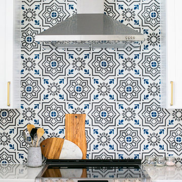
This kitchen took a tired, 80’s builder kitchen and revamped it into a personalized gathering space for our wonderful client. The existing space was split up by the dated configuration of eat-in kitchen table area to one side and cramped workspace on the other. It didn’t just under-serve our client’s needs; it flat out discouraged them from using the space. Our client desired an open kitchen with a central gathering space where family and friends could connect. To open things up, we removed the half wall separating the kitchen from the dining room and the wall that blocked sight lines to the family room and created a narrow hallway to the kitchen. The old oak cabinets weren't maximizing storage and were dated and dark. We used Waypoint Living Spaces cabinets in linen white to brighten up the room. On the east wall, we created a hutch-like stack that features an appliance garage that keeps often used countertop appliance on hand but out of sight. The hutch also acts as a transition from the cooking zone to the coffee and wine area. We eliminated the north window that looked onto the entry walkway and activated this wall as storage with refrigerator enclosure and pantry. We opted to leave the east window as-is and incorporated it into the new kitchen layout by creating a window well for growing plants and herbs. The countertops are Pental Quartz in Carrara. The sleek cabinet hardware is from our friends at Amerock in a gorgeous satin champagne bronze. One of the most striking features in the space is the pattern encaustic tile from Tile Shop. The pop of blue in the backsplash adds personality and contrast to the champagne accents. The reclaimed wood cladding surrounding the large east-facing window introduces a quintessential Colorado vibe, and the natural texture balances the crisp white cabinetry and geometric patterned tile. Minimalist modern lighting fixtures from Mitzi by Hudson Valley Lighting provide task lighting over the sink and at the wine/ coffee station. The visual lightness of the sink pendants maintains the openness and visual connection between the kitchen and dining room. Together the elements make for a sophisticated yet casual vibe-- a comfortable chic kitchen. We love the way this space turned out and are so happy that our clients now have such a bright and welcoming gathering space as the heart of their home!
 Leslie Williams Interior Design
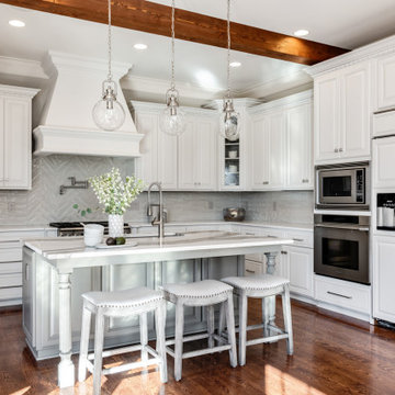
This Old World Style house received a total transformation to bring it up to date! The client is loving the new fresh, brighter look! We also added wooden ceiling beams to give it a homey feel. Loving the sparkle in the shiny subway tile and the herringbone pattern.
 TVL Creative Ltd.
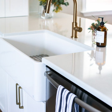
This kitchen took a tired, 80’s builder kitchen and revamped it into a personalized gathering space for our wonderful client. The existing space was split up by the dated configuration of eat-in kitchen table area to one side and cramped workspace on the other. It didn’t just under-serve our client’s needs; it flat out discouraged them from using the space. Our client desired an open kitchen with a central gathering space where family and friends could connect. To open things up, we removed the half wall separating the kitchen from the dining room and the wall that blocked sight lines to the family room and created a narrow hallway to the kitchen. The old oak cabinets weren't maximizing storage and were dated and dark. We used Waypoint Living Spaces cabinets in linen white to brighten up the room. On the east wall, we created a hutch-like stack that features an appliance garage that keeps often used countertop appliance on hand but out of sight. The hutch also acts as a transition from the cooking zone to the coffee and wine area. We eliminated the north window that looked onto the entry walkway and activated this wall as storage with refrigerator enclosure and pantry. We opted to leave the east window as-is and incorporated it into the new kitchen layout by creating a window well for growing plants and herbs. The countertops are Pental Quartz in Carrara. The sleek cabinet hardware is from our friends at Amerock in a gorgeous satin champagne bronze. One of the most striking features in the space is the pattern encaustic tile from Tile Shop. The pop of blue in the backsplash adds personality and contrast to the champagne accents. The reclaimed wood cladding surrounding the large east-facing window introduces a quintessential Colorado vibe, and the natural texture balances the crisp white cabinetry and geometric patterned tile. Minimalist modern lighting fixtures from Mitzi by Hudson Valley Lighting provide task lighting over the sink and at the wine/ coffee station. The visual lightness of the sink pendants maintains the openness and visual connection between the kitchen and dining room. Together the elements make for a sophisticated yet casual vibe-- a comfortable chic kitchen. We love the way this space turned out and are so happy that our clients now have such a bright and welcoming gathering space as the heart of their home!
 Thyme & Place Design LLC
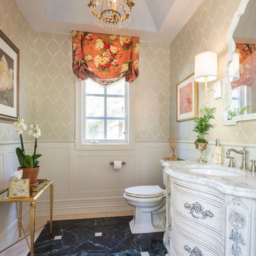
Our beautiful formal front powder room only needed a little bit of paint to bring it up to date. The vanity had a green and pink decorative motif with antique bronze hardware. Some silver leaf brings it back to life. We added wainscoting to the lower walls and added a shimmery trellis faux paint to the upper walls. The tray ceiling was painted a soft sky blue. Our London shade in a lovely floral completes the garden them of the space. Marco Ricca
Sponsored
Sunbury, OH

J.Holderby - Renovations
Franklin County's Leading General Contractors - 2X Best of Houzz!
 Skill Construction & Design, LLC
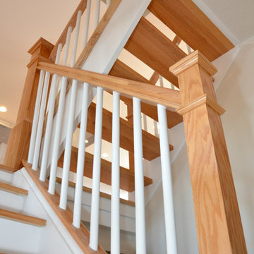
Last week we featured an incredible new kitchen with an open floor plan and unique architectural interest. I alluded to a change in the staircase and here it is. Part of designing a new kitchen or bath is looking at surrounding spaces and how the remodel will affect them. Will the current master bedroom seem dated as an entrance to the new bath? Is the dining room that adjoins the kitchen badly in need of flooring and lighting? Some projects might have to wait. But if the immediate area has an adverse affect on the newly remodeled kitchen it might be just as important to address these areas within your remodel.
Although the staircase was in harmony with the homes existing era and colors, it simply didn’t work with the new kitchen. Despite its open risers, the existing balusters and railings with their colonial turnings and dark stain, were the opposite of the finished kitchen. With the carpeting gone from the floors, it looked dated and out-of-place on the stairs.
We carried our kitchen theme to the staircase. We used the natural oak of our flooring for the treads, handrails and posts, but kept the balusters and trim crisp white. The effect perfectly reflects the feel of the kitchen, light and airy.
Before, the dark wood details drew the eye up, ultimately to the textured ceiling in the dining room. The darker tone created a dramatic ending as it traveled up to die into the wall.
Now, as the eye travels up, the staircase seems to soar. The textured ceiling was replaced with a smooth white one and the wall color is a soft warm contrast. The handrail still ends at the wall, but with white balusters and the light oak handrail, the ending is softer.
It isn’t a lighting change, the staircase simply lets the light shine through. The treads are slim and sleek, while the white walls, trim and balusters reflect the light for an overall brighter feel.
The newel posts were a great choice. The larger size and square craftsman like features add substance and architecture without seeming heavy or bulky.
The final touch completes the look. From front door to back, up and down, this remodel is finished. This home now bursts with sunshine the minute you enter and stays bright and sunny no matter where you turn. From the architectural details that are the center of attention, to the modern stainless steel appliance, this space is perfect for entertaining, or any day.
http://www.designsbyskill.com/
http://www.rjkconstructioninc.com/
 WPL Interior Design
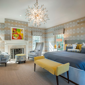
A grand home on Philadelphia's Main Line receives a freshening up when clients buy an old home and bring in their previous traditional furnishings but add lots of new contemporary and colorful furnishings to bring the house up to date. A gold and silver wallpaper left by the previous owner becomes the backdrop for a gray and yellow color scheme in a massive master bedroom suite. Jay Greene Photography
 WPL Interior Design
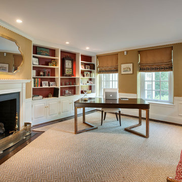
A grand home on Philadelphia's Main Line receives a freshening up when clients buy an old home and bring in their previous traditional furnishings but add lots of new contemporary and colorful furnishings to bring the house up to date. A small study by the front entrance offers a quiet space to meet. Jay Greene Photography
 Alair Homes Plano
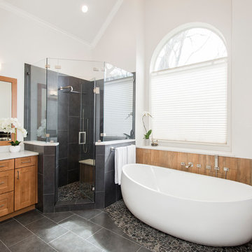
Our clients drastically needed to update this master suite from the original forest green floral wallpaper to something more clean and simple. They wanted to open up the dated cultured marble enclosed tub and shower and remove all soffits and plant ledges above the vanities. They wanted to explore the possibilities of opening up the shower with glass and look at installing a freestanding bathtub and they definitely wanted to keep the double sided fireplace but update the look of it.
First off, we did some minor changes to the bedroom. We replaced the carpet with a beautiful soft multi-color gray low pile carpet and painted the walls a soft white. The fireplace surround was replaced with Carrara 12×12 polished porcelain tile for a more elegant look. Finally, we tore out a corner built in desk and squared off and textured the wall, making it look as though it were never there.
We needed to strip this bathroom down and start from scratch. We demoed the cabinets, counter tops, all plumbing fixtures, ceiling fan, track lighting, tub and tub surround, fireplace surround, shower door, shower walls and ceiling above the shower, all flooring, soffits above vanity areas, saloon doors on the water closet and of course the wallpaper!
We changed the walls around the shower to pony walls with glass on the upper half, opening up the shower. The tile was lined with Premium Antasit 12×24 tile installed vertically in a 50/50 brick pattern. The shower floor and the floor below the tub is Solo River Grey Pebble mosaic tile. A contemporary Jaclo Collection shower system was installed including a contemporary handshower and square shower head. The large freestanding tub is a white Hydro Sytsems “Picasso” with “Steelnox” wall mounted tub filler and hardware from Graff.
All of the cabinets were replaced with Waypoint maple mocha glazed flat front doors and drawers. Quartzmasters Calacatta Grey countertops were installed with 2 Icera “Muse” undermount sinks for a clean modern look. The cabinet hardware the clients chose is ultra modern ”Sutton” from Hardware Resources and the faucet and other hardware is all from the Phylrich “Mix” collection.
Pulling it all together, Premium Antasit 12×14 installed floor tile was installed in a 50/50 brick pattern. The pebble tile that was installed in the shower floor was also installed in an oval shape under the bathtub for a great modern look and to break up the solid gray flooring.
Addison Oak Wood planks were installed vertically behind the bathtub, below the fireplace surround and behind the potty for a modern finished look. The fireplace was surrounded with Carrara 12×12 polished porcelain, as well as the wood planks. Finally, to add the finishing touches, Z-Lite brushed nickel vanity lights were installed above each vanity sink. The clients are so pleased to be able to enjoy and relax in their new contemporary bathroom!


 Skill Construction & Design, LLC
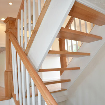
Last week we featured an incredible new kitchen with an open floor plan and unique architectural interest. I alluded to a change in the staircase and here it is. Part of designing a new kitchen or bath is looking at surrounding spaces and how the remodel will affect them. Will the current master bedroom seem dated as an entrance to the new bath? Is the dining room that adjoins the kitchen badly in need of flooring and lighting? Some projects might have to wait. But if the immediate area has an adverse affect on the newly remodeled kitchen it might be just as important to address these areas within your remodel.
Although the staircase was in harmony with the homes existing era and colors, it simply didn’t work with the new kitchen. Despite its open risers, the existing balusters and railings with their colonial turnings and dark stain, were the opposite of the finished kitchen. With the carpeting gone from the floors, it looked dated and out-of-place on the stairs.
We carried our kitchen theme to the staircase. We used the natural oak of our flooring for the treads, handrails and posts, but kept the balusters and trim crisp white. The effect perfectly reflects the feel of the kitchen, light and airy.
Before, the dark wood details drew the eye up, ultimately to the textured ceiling in the dining room. The darker tone created a dramatic ending as it traveled up to die into the wall.
Now, as the eye travels up, the staircase seems to soar. The textured ceiling was replaced with a smooth white one and the wall color is a soft warm contrast. The handrail still ends at the wall, but with white balusters and the light oak handrail, the ending is softer.
It isn’t a lighting change, the staircase simply lets the light shine through. The treads are slim and sleek, while the white walls, trim and balusters reflect the light for an overall brighter feel.
The newel posts were a great choice. The larger size and square craftsman like features add substance and architecture without seeming heavy or bulky.
The final touch completes the look. From front door to back, up and down, this remodel is finished. This home now bursts with sunshine the minute you enter and stays bright and sunny no matter where you turn. From the architectural details that are the center of attention, to the modern stainless steel appliance, this space is perfect for entertaining, or any day.
http://www.designsbyskill.com/
http://www.rjkconstructioninc.com/
 CONTENT Architecture
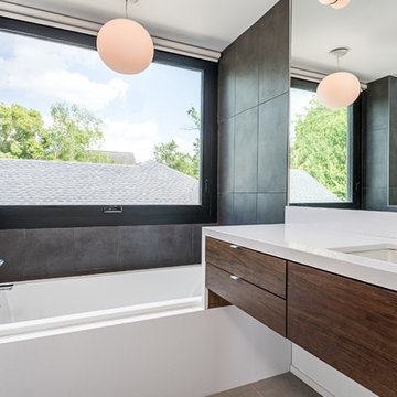
Photo by Peter Molick. The Robinhood Residence is a small house renovation for a family that loves the scale and quaint setting of their home, but was quickly outgrowing its dated appearance and storage allowance. The main tasks for Content were creating a clear organization and simple flow to the home while bringing cohesion to the previous renovations. Custom cabinet pieces were designed for new storage and room focal points. A balance was struck, opening up visibility between rooms while maintaining the client's beloved elements from a quirky mid century renovation.
 Schroeder Design/Build, Inc.
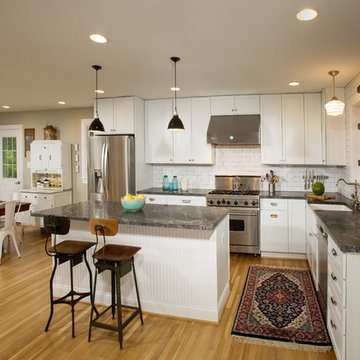
Remodel or Sell? When our client inherited the home he grew up in he knew he didn't want to sell it. Instead, he decided to remodel and create a place to raise his own family. Schroeder Design/Build completed a whole house remodel that included opening up the main areas of the home, a master bathroom, and bringing the electrical and plumbing up-to-date throughout.
8