
Search results for "Extremely low" in Home Design Ideas


 Theodore Payne Foundation
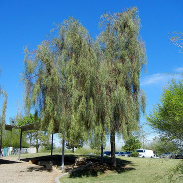
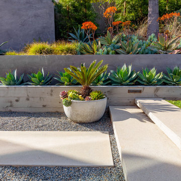
Garden 2 in Santa Monica
http://www.nativeplantgardentour.org/gardens/garden-2-in-santa-monica/
Photo Credit: Philip Oakley Otto
 Misiaszek Turpin pllc
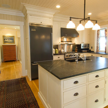
This 4,800 square-foot guesthouse is a three-story residence consisting of a main-level master suite, upper-level guest suite, and a large bunkroom. The exterior finishes were selected for their durability and low-maintenance characteristics, as well as to provide a unique, complementary element to the site. Locally quarried granite and a sleek slate roof have been united with cement fiberboard shingles, board-and-batten siding, and rustic brackets along the eaves.
The public spaces are located on the north side of the site in order to communicate with the public spaces of a future main house. With interior details picking up on the picturesque cottage style of architecture, this space becomes ideal for both large and small gatherings. Through a similar material dialogue, an exceptional boathouse is formed along the water’s edge, extending the outdoor recreational space to encompass the lake.
Photographer: Bob Manely
Find the right local pro for your project

 ZeroEnergy Design
This LEED Platinum certified house reflects the homeowner's desire for an exceptionally healthy and comfortable living environment, within a traditional neighborhood.
INFILL SITE. The family, who moved from another area of Wellesley, sought out this property to be within walking distance of the high school and downtown area. An existing structure on the tight lot was removed to make way for the new home. 84% of the construction waste, from both the previous structure and the new home, was diverted from a landfill. ZED designed to preserve the existing mature trees on the perimeter of the property to minimize site impacts, and to maintain the character of the neighborhood as well as privacy on the site.
EXTERIOR EXPRESSION. The street facade of the home relates to the local New England vernacular. The rear uses contemporary language, a nod to the family’s Californian roots, to incorporate a roof deck, solar panels, outdoor living space, and the backyard swimming pool. ZED’s careful planning avoided to the need to face the garage doors towards the street, a common syndrome of a narrow lot.
THOUGHTFUL SPACE. Homes with dual entries can often result in duplicate and unused spaces. In this home, the everyday and formal entry areas are one and the same; the front and garage doors share the entry program of coat closets, mudroom storage with bench for removing your shoes, and a laundry room with generous closets for the children's sporting equipment. The entry area leads directly to the living space, encompassing the kitchen, dining and sitting area areas in an L-shaped open plan arrangement. The kitchen is placed at the south-west corner of the space to allow for a strong connection to the dining, sitting and outdoor living spaces. A fire pit on the deck satisfies the family’s desire for an open flame while a sealed gas fireplace is used indoors - ZED’s preference after omitting gas burning appliances completely from an airtight home. A small study, with a window seat, is conveniently located just off of the living space. A first floor guest bedroom includes an accessible bathroom for aging visitors and can be used as a master suite to accommodate aging in place.
HEALTHY LIVING. The client requested a home that was easy to clean and would provide a respite from seasonal allergies and common contaminants that are found in many indoor spaces. ZED selected easy to clean solid surface flooring throughout, provided ample space for cleaning supplies on each floor, and designed a mechanical system with ventilation that provides a constant supply of fresh outdoor air. ZED selected durable materials, finishes, cabinetry, and casework with low or no volatile organic compounds (VOCs) and no added urea formaldehyde.
YEAR-ROUND COMFORT. The home is super insulated and air-tight, paired with high performance triple-paned windows, to ensure it is draft-free throughout the winter (even when in front of the large windows and doors). ZED designed a right-sized heating and cooling system to pair with the thermally improved building enclosure to ensure year-round comfort. The glazing on the home maximizes passive solar gains, and facilitates cross ventilation and daylighting.
ENERGY EFFICIENT. As one of the most energy efficient houses built to date in Wellesley, the home highlights a practical solution for Massachusetts. First, the building enclosure reduces the largest energy requirement for typical houses (heating). Super-insulation, exceptional air sealing, a thermally broken wall assembly, triple pane windows, and passive solar gain combine for a sizable heating load reduction. Second, within the house only efficient systems consume energy. These include an air source heat pump for heating & cooling, a heat pump hot water heater, LED lighting, energy recovery ventilation, and high efficiency appliances. Lastly, photovoltaics provide renewable energy help offset energy consumption. The result is an 89% reduction in energy use compared to a similar brand new home built to code requirements.
RESILIENT. The home will fare well in extreme weather events. During a winter power outage, heat loss will be very slow due to the super-insulated and airtight envelope– taking multiple days to drop to 60 degrees even with no heat source. An engineered drainage system, paired with careful the detailing of the foundation, will help to keep the finished basement dry. A generator will provide full operation of the all-electric house during a power outage.
OVERALL. The home is a reflection of the family goals and an expression of their values, beautifully enabling health, comfort, safety, resilience, and utility, all while respecting the planet.
ZED - Architect & Mechanical Designer
Bevilacqua Builders Inc - Contractor
Creative Land & Water Engineering - Civil Engineering
Barbara Peterson Landscape - Landscape Design
Nest & Company - Interior Furnishings
Eric Roth Photography - Photography
 Corsini Stark Architects
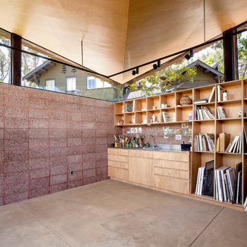
A free-standing painting and drawing studio, distinctly contemporary but complementary to the existing historic shingle-style residence. Together the sequence from house to deck to courtyard to breezeway to studio interior is a choreography of movement and space, seamlessly integrating site, topography, and horizon.
Images by Steve King Architectural Photography.
 VintageView
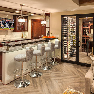
This 600-bottle plus cellar is the perfect accent to a crazy cool basement remodel. Just off the wet bar and entertaining area, it's perfect for those who love to drink wine with friends. Featuring VintageView Wall Series racks (with Floor to Ceiling Frames) in brushed nickel finish.
 Zola European Windows
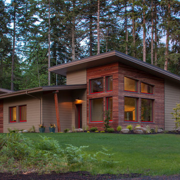
Essential, contemporary, and inviting defines this extremely energy efficient, Energy Star certified, Passive House design-inspired home in the Pacific Northwest. Designed for an active family of four, the one-story 3 bedroom, 2 bath floor plan offers tasteful aging in place features, a strong sense of privacy, and a low profile that doesn’t impinge on the natural landscape. This house will heat itself in the dead of winter with less energy than it takes to run a hair dryer, and be sensual to live in while it does it. The forms throughout the home are simple and neutral, allowing for ample natural light, rich warm materials, and of course, room for the Guinea pigs makes this a great example of artful architecture applied to a genuine family lifestyle.
This ultra energy efficient home relies on extremely high levels of insulation, air-tight detailing and construction, and the implementation of high performance, custom made European windows and doors by Zola Windows. Zola’s ThermoPlus Clad line, which boasts R-11 triple glazing and is thermally broken with a layer of patented German Purenit®, was selected for the project. Natural daylight enters both from the tilt & turn and fixed windows in the living and dining areas, and through the terrace door that leads seamlessly outside to the natural landscape.
Project Designed & Built by: artisansgroup
Certifications: Energy Star & Built Green Lvl 4
Photography: Art Gray of Art Gray Photography

Sponsored
Delaware, OH

Buckeye Basements, Inc.
Central Ohio's Basement Finishing ExpertsBest Of Houzz '13-'21
 ZeroEnergy Design
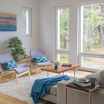
This modern green home offers both a vacation destination on Cape Cod near local family members and an opportunity for rental income.
FAMILY ROOTS. A West Coast couple living in the San Francisco Bay Area sought a permanent East Coast vacation home near family members living on Cape Cod. As academic professionals focused on sustainability, they sought a green, energy efficient home that was well-aligned with their values. With no green homes available for sale on Cape Cod, they decided to purchase land near their family and build their own.
SLOPED SITE. Comprised of a 3/4 acre lot nestled in the pines, the steeply sloping terrain called for a plan that embraced and took advantage of the slope. Of equal priority was optimizing solar exposure, preserving privacy from abutters, and creating outdoor living space. The design accomplished these goals with a simple, rectilinear form, offering living space on the both entry and lower/basement levels. The stepped foundation allows for a walk-out basement level with light-filled living space on the down-hill side of the home. The traditional basement on the eastern, up-hill side houses mechanical equipment and a home gym. The house welcomes natural light throughout, captures views of the forest, and delivers entertainment space that connects indoor living space to outdoor deck and dining patio.
MODERN VISION. The clean building form and uncomplicated finishes pay homage to the modern architectural legacy on the outer Cape. Durable and economical fiber cement panels, fixed with aluminum channels, clad the primary form. Cedar clapboards provide a visual accent at the south-facing living room, which extends a single roof plane to cover the entry porch.
SMART USE OF SPACE. On the entry level, the “L”-shaped living, dining, and kitchen space connects to the exterior living, dining, and grilling spaces to effectively double the home’s summertime entertainment area. Placed at the western end of the entry level (where it can retain privacy but still claim expansive downhill views) is the master suite with a built-in study. The lower level has two guest bedrooms, a second full bathroom, and laundry. The flexibility of the space—crucial in a house with a modest footprint—emerges in one of the guest bedrooms, which doubles as home office by opening the barn-style double doors to connect it to the bright, airy open stair leading up to the entry level. Thoughtful design, generous ceiling heights and large windows transform the modest 1,100 sf* footprint into a well-lit, spacious home. *(total finished space is 1800 sf)
RENTAL INCOME. The property works for its owners by netting rental income when the owners are home in San Francisco. The house especially caters to vacationers bound for nearby Mayo Beach and includes an outdoor shower adjacent to the lower level entry door. In contrast to the bare bones cottages that are typically available on the Cape, this home offers prospective tenants a modern aesthetic, paired with luxurious and green features. Durable finishes inside and out will ensure longevity with the heavier use that comes with a rental property.
COMFORT YEAR-ROUND. The home is super-insulated and air-tight, with mechanical ventilation to provide continuous fresh air from the outside. High performance triple-paned windows complement the building enclosure and maximize passive solar gain while ensuring a warm, draft-free winter, even when sitting close to the glass. A properly sized air source heat pump offers efficient heating & cooling, and includes a carefully designed the duct distribution system to provide even comfort throughout the house. The super-insulated envelope allows us to significantly reduce the equipment capacity, duct size, and airflow quantities, while maintaining unparalleled thermal comfort.
ENERGY EFFICIENT. The building’s shell and mechanical systems play instrumental roles in the home’s exceptional performance. The building enclosure reduces the most significant energy glutton: heating. Continuous super-insulation, thorough air sealing, triple-pane windows, and passive solar gain work together to yield a miniscule heating load. All active energy consumers are extremely efficient: an air source heat pump for heating and cooling, a heat pump hot water heater, LED lighting, energy recovery ventilation (ERV), and high efficiency appliances. The result is a home that uses 70% less energy than a similar new home built to code requirements.
OVERALL. The home embodies the owners’ goals and values while comprehensively enabling thermal comfort, energy efficiency, a vacation respite, and supplementary income.
PROJECT TEAM
ZeroEnergy Design - Architect & Mechanical Designer
A.F. Hultin & Co. - Contractor
Pamet Valley Landscape Design - Landscape & Masonry
Lisa Finch - Original Artwork
European Architectural Supply - Windows
Eric Roth Photography - Photography
 Andover Landscape Design & Construction
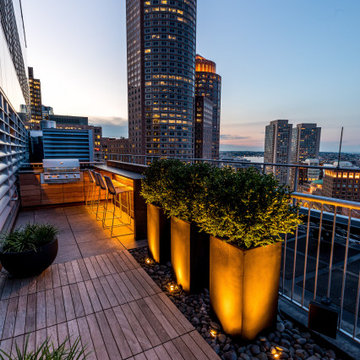
Our long-time clients wanted a bit of outdoor entertainment space at their Boston penthouse, and while there were some challenges due to location and footprint, we agreed to help. The views are amazing as this space overlooks the harbor and Boston’s bustling Seaport below. With Logan Airport just on the other side of the Boston Harbor, the arriving jets are a mesmerizing site as their lights line up in preparation to land.
The entire space we had to work with is less than 10 feet wide and 45 feet long (think bowling-alley-lane dimensions), so we worked extremely hard to get as much programmable space as possible without forcing any of the areas. The gathering spots are delineated by granite and IPE wood floor tiles supported on a custom pedestal system designed to protect the rubber roof below.
The gas grill and wine fridge are installed within a custom-built IPE cabinet topped by jet-mist granite countertops. This countertop extends to a slightly-raised bar area for the ultimate view beyond and terminates as a waterfall of granite meets the same jet-mist floor tiles… custom-cut and honed to match, of course.
Moving along the length of the space, the floor transitions from granite to wood, and is framed by sculptural containers and plants. Low-voltage lighting warms the space and creates a striking display that harmonizes with the city lights below. Once again, the floor transitions, this time back to granite in the seating area consisting of two counter-height chairs.
"This purposeful back-and-forth of the floor really helps define the space and our furniture choices create these niches that are both aesthetically pleasing and functional.” - Russell
The terrace concludes with a large trough planter filled with ornamental grasses in the summer months and a seasonal holiday arrangements throughout the winter. An ‘L’-shaped couch offers a spot for multiple guests to relax and take in the sounds of a custom sound system — all hidden and out of sight — which adds to the magical feel of this ultimate night spot.

 Mackenzie Collier Interiors
James Stewart
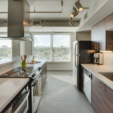
Example of a small minimalist single-wall porcelain tile open concept kitchen design in Phoenix with flat-panel cabinets, quartz countertops, white backsplash, stainless steel appliances, an island, glass sheet backsplash, dark wood cabinets and an undermount sink
Example of a small minimalist single-wall porcelain tile open concept kitchen design in Phoenix with flat-panel cabinets, quartz countertops, white backsplash, stainless steel appliances, an island, glass sheet backsplash, dark wood cabinets and an undermount sink
 Interlocking Concrete Pavement Institute
HNA Hardscape Project Award Winner
Permeable Paradise
Grand Island, Nebraska
Grindstone Hardscapes
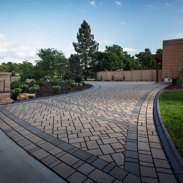
The goal was to create a maintenance-free system with extreme curb appeal for these homeowners when installing their new driveway, patio, and front entrance. The entire project is permeable and heated, including the front steps. The three piece paver used Gascony Tan for the field to match the home and Brookestone slate for accents. The field was laid at a 45 degree angle to the house, a solution to the road not being square to any entrance on the driveway or walk. The pavers never see the snow or ice on them. Both are drained through the joints as soon as touching the surface. The heat cord had to be fastened to wire mesh on top of the rock base to hold it in place, and then the bedding layer was screeded over it. Traditional paver edging/grid was used on the driveway as an edge restraint, with a decorative concrete curb being laid over top of it, to increase strength and tie it in with the landscapes on the property. Each entrance to the circle drive and to the front door is announced by custom columns built on each side. There are 9 columns total. Each includes four LED low voltage lights for nighttime accent, and one holds a built in mailbox and package delivery shelf. All mail and packages can be picked up right from the car window.
 Advance Design Studio, Ltd.
After six years of living in their Huntley IL home, Chris and Meghan were tired of their dark, dingy, outdated kitchen and it was finally time for a long-anticipated change. “The kitchen is the place where we live, it’s where we do everything,” Meghan said. “It was important that it be a space where we wanted to be.” Meghan loves cooking and enjoys including their girls in healthy meal prepping, this led them to want a brighter, more enjoyable kitchen with increased functionality and improved storage.
For Chris especially, the laundry room was an entirely dysfunctional eyesore. “We had a washer and a dryer, but it was all kind-of cobbled together!” Chris said. “There were always laundry piles everywhere, we weren’t really sure what we wanted to do in there, but it was time for us to make a change.” The mess of the space was stressful every time they walked in the door from the garage each day. Kids’ backpacks and shoes piled up haphazardly in the makeshift boot-bench closet left the family feeling disorganized and stressed. They needed space for folding clothes and locker cubbies to help keep the family organized.
Having known Christine and Todd in the Huntley community for years, Chris and Meghan were familiar with their work. “We already trusted them personally and having seen their projects for years we knew they did top notch work. After we reviewed the initial round of designs, we knew that hiring them was definitely the right choice,” Meghan and Chris said. Although Chris had done a lot of work in their home himself, the kitchen and laundry room renovation was such a large undertaking that he didn’t want to steal time away from his family to spend what would surely be many long weekends doing the job himself. “That would not have been a wise choice for us,” Chris laughed.
“Our designer, Michelle was very, very, easy to work with; anything we wanted to see or weren’t sure about, she went above and beyond to make this easy for us. She was easy to get hold of and always quick to respond,” the couple said. Michelle pulled ideas that mirrored the couple’s taste and style and was adept at directing the couple to limited choices that didn’t overwhelm them and kept the process moving. “I have a hard time making decisions. Michelle made the decision-making process so easy. I loved how she listened to what I liked and then presented three great options for me to choose from,” Meghan said.
The main objectives for the kitchen were better storage solutions, they wanted the space to reflect their lifestyle and taste, and they wanted it to last for years with low maintenance. One of the first steps in creating a more functional kitchen was relocating the refrigerator, creating an improved workflow for the busy family.
“We didn’t know that we could even move the refrigerator to a new location where it is now, that was something that we never would have thought of,” Chris said. “The new refrigerator location makes the kitchen feel so much bigger. We didn’t add any space, but our whole kitchen with the new design just seems like it’s so much larger than before!” Meghan said.
The perimeter mist colored cabinets helped warm and brighten the entire room, while the graphite colored cabinets on the island added contrast. Using this fresh, clean color palette satisfied the couple’s desire for a bright space that was the exact opposite of what they had before. Organization accessories were also added to the cabinets such as a spice drawer tray and roll outs to create hidden convenience.
“I absolutely love the hidden spices – it makes cooking so much more enjoyable!” Chris said. “And all the pull outs, and the double trash bin, who would think you could get so excited about organization!” the couple said in unison.
One thing they hated in their original kitchen was how dark the space felt. Added lighting on the ceiling with the new light fixtures combined with the lighter cabinetry colors throughout solved this problem. “Our new kitchen has this warm, almost cozy feeling that our old kitchen never had, it’s just a space that I love spending my time in now,” Meghan said. The light airy feeling was accentuated with the use of floating white shelves on either side of the decorative range hood. “We have so much cabinetry space, the new design is amazing we actually have more storage space than we will ever need,” Meghan said.
The island was extended to create more work surface and added space for stool seating. “The new island changes how we live. Now the kids can be in the kitchen with us, doing homework, eating breakfast, and the three of us have special dinners there when Chris is working late,” Meghan said.
The Carrara Marmi Quartz countertops were chosen because they are, not only beautiful, but are made from hard-working material that doesn’t require maintenance. The white subway tile backsplash that wraps to the ceiling behind the focal point cooktop range/hood compliments the crisp white countertops perfectly, while brushed brass hardware and light fixtures keep the design fresh and new.
The couple had a few fears at the beginning of the project, as most homeowners do. Their biggest fear was being out of their kitchen and laundry room for an extended time. The crew made it very easy for the family to work in a limited space keeping the washer and dryer hooked up the majority of the time, and also getting appliances working with minimal downtime.
“They above and beyond accommodated us to get us through the process,” Meghan said. “They did a great job making sure we were as comfortable as possible throughout the process,” Chris added.
“Our project manager DJ did a great job. He was very good at updating us on schedule changes, getting guys in as quickly as possible. Everyone that stepped in the house was nice and did great work,” said Chris. They thought Advance’s carpenter was phenomenal and were impressed when he took a conceptual idea from a photograph and worked with designer Michelle to create a one of a kind range/hood that has become the topic of conversation with friends and family who visit the new kitchen. “He was in our house literally every day for several weeks. He was easy to work with and good at what he did,” Meghan and Chris said.
The focal point of the kitchen; a hand-crafted, custom-built ventilation hood was clad with handpicked reclaimed barnwood. Advance Design’s carpenter built the framework and the cladding to create a one-of-a-kind design element that the couple loves.
“I think it was especially fun for him to create something unique from scratch, showcasing his talent in this area,” Meghan said. “I love that my kitchen is not like everyone else’s. I got to pick out the wood on my hood and watch it being built and was able to choose what pieces of wood went where on it. It’s totally unique.”
Red Oak flooring was toothed-in throughout the kitchen and the rest of the first floor anywhere changes were made. Then the whole floor was refinished to tone down the orange undertones in the existing floor stain, ultimately changing the color complexion of the entire first floor. The result is a completely new feeling to the entire home.
Renovating the laundry room was extremely important to Meghan and Chris, but they had trouble visualizing what the possibilities were for the seemingly small space. Michelle produced beautiful 3D illustrations that helped them envision the space in a whole new way.
“I must have told Michelle 100 times that I am a visual person, seeing the designs in 3D made it so easy to make decisions and see what we could really do with our space,” Meghan said.
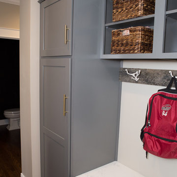
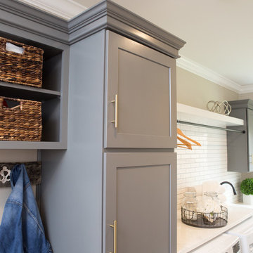
A dividing wall and doorway were removed between the existing laundry room and hallway formerly containing a coat closet, providing space to design specialized graphite colored cabinetry matching the kitchen island to house custom storage cubbies for each family member. Adding the tall utility cabinetry in the new laundry area helped solve the storage issue, tucking away cleaning supplies, household items, and even the cat got its own cubby.
“I love how everything is now hidden in its own space. I can’t tell you how much I hated coming home and seeing everything sitting around on counters,” Chris said.
Electrical outlets were planned for the inside of utility cabinets, so devices could charge in hidden locations. Stacking the washer and dryer allowed for wider countertop space to provide a folding area and a special space for clothes to hang. “The way I do laundry has been completely transformed! I can actually fold clothes and hang them now right out of the washer and dryer,” Meghan said.
“The end result in the kitchen and the laundry/mud room was an updated light and bright space, with a smarter work flow that better meets the needs of this family,” Michelle said.
“I would totally recommend Advance Design,” Meghan said. “Sometimes I sit and just look at my kitchen and laundry room and think ‘Wow, I can’t believe I get to live here!’ It’s an understatement to say we love our new space.”
Sponsored
Columbus, OH

Structural Remodeling
Franklin County's Heavy Timber Specialists | Best of Houzz 2020!
 Advance Design Studio, Ltd.
After six years of living in their Huntley IL home, Chris and Meghan were tired of their dark, dingy, outdated kitchen and it was finally time for a long-anticipated change. “The kitchen is the place where we live, it’s where we do everything,” Meghan said. “It was important that it be a space where we wanted to be.” Meghan loves cooking and enjoys including their girls in healthy meal prepping, this led them to want a brighter, more enjoyable kitchen with increased functionality and improved storage.
For Chris especially, the laundry room was an entirely dysfunctional eyesore. “We had a washer and a dryer, but it was all kind-of cobbled together!” Chris said. “There were always laundry piles everywhere, we weren’t really sure what we wanted to do in there, but it was time for us to make a change.” The mess of the space was stressful every time they walked in the door from the garage each day. Kids’ backpacks and shoes piled up haphazardly in the makeshift boot-bench closet left the family feeling disorganized and stressed. They needed space for folding clothes and locker cubbies to help keep the family organized.
Having known Christine and Todd in the Huntley community for years, Chris and Meghan were familiar with their work. “We already trusted them personally and having seen their projects for years we knew they did top notch work. After we reviewed the initial round of designs, we knew that hiring them was definitely the right choice,” Meghan and Chris said. Although Chris had done a lot of work in their home himself, the kitchen and laundry room renovation was such a large undertaking that he didn’t want to steal time away from his family to spend what would surely be many long weekends doing the job himself. “That would not have been a wise choice for us,” Chris laughed.
“Our designer, Michelle was very, very, easy to work with; anything we wanted to see or weren’t sure about, she went above and beyond to make this easy for us. She was easy to get hold of and always quick to respond,” the couple said. Michelle pulled ideas that mirrored the couple’s taste and style and was adept at directing the couple to limited choices that didn’t overwhelm them and kept the process moving. “I have a hard time making decisions. Michelle made the decision-making process so easy. I loved how she listened to what I liked and then presented three great options for me to choose from,” Meghan said.
The main objectives for the kitchen were better storage solutions, they wanted the space to reflect their lifestyle and taste, and they wanted it to last for years with low maintenance. One of the first steps in creating a more functional kitchen was relocating the refrigerator, creating an improved workflow for the busy family.
“We didn’t know that we could even move the refrigerator to a new location where it is now, that was something that we never would have thought of,” Chris said. “The new refrigerator location makes the kitchen feel so much bigger. We didn’t add any space, but our whole kitchen with the new design just seems like it’s so much larger than before!” Meghan said.
The perimeter mist colored cabinets helped warm and brighten the entire room, while the graphite colored cabinets on the island added contrast. Using this fresh, clean color palette satisfied the couple’s desire for a bright space that was the exact opposite of what they had before. Organization accessories were also added to the cabinets such as a spice drawer tray and roll outs to create hidden convenience.
“I absolutely love the hidden spices – it makes cooking so much more enjoyable!” Chris said. “And all the pull outs, and the double trash bin, who would think you could get so excited about organization!” the couple said in unison.
One thing they hated in their original kitchen was how dark the space felt. Added lighting on the ceiling with the new light fixtures combined with the lighter cabinetry colors throughout solved this problem. “Our new kitchen has this warm, almost cozy feeling that our old kitchen never had, it’s just a space that I love spending my time in now,” Meghan said. The light airy feeling was accentuated with the use of floating white shelves on either side of the decorative range hood. “We have so much cabinetry space, the new design is amazing we actually have more storage space than we will ever need,” Meghan said.
The island was extended to create more work surface and added space for stool seating. “The new island changes how we live. Now the kids can be in the kitchen with us, doing homework, eating breakfast, and the three of us have special dinners there when Chris is working late,” Meghan said.
The Carrara Marmi Quartz countertops were chosen because they are, not only beautiful, but are made from hard-working material that doesn’t require maintenance. The white subway tile backsplash that wraps to the ceiling behind the focal point cooktop range/hood compliments the crisp white countertops perfectly, while brushed brass hardware and light fixtures keep the design fresh and new.
The couple had a few fears at the beginning of the project, as most homeowners do. Their biggest fear was being out of their kitchen and laundry room for an extended time. The crew made it very easy for the family to work in a limited space keeping the washer and dryer hooked up the majority of the time, and also getting appliances working with minimal downtime.
“They above and beyond accommodated us to get us through the process,” Meghan said. “They did a great job making sure we were as comfortable as possible throughout the process,” Chris added.
“Our project manager DJ did a great job. He was very good at updating us on schedule changes, getting guys in as quickly as possible. Everyone that stepped in the house was nice and did great work,” said Chris. They thought Advance’s carpenter was phenomenal and were impressed when he took a conceptual idea from a photograph and worked with designer Michelle to create a one of a kind range/hood that has become the topic of conversation with friends and family who visit the new kitchen. “He was in our house literally every day for several weeks. He was easy to work with and good at what he did,” Meghan and Chris said.
The focal point of the kitchen; a hand-crafted, custom-built ventilation hood was clad with handpicked reclaimed barnwood. Advance Design’s carpenter built the framework and the cladding to create a one-of-a-kind design element that the couple loves.
“I think it was especially fun for him to create something unique from scratch, showcasing his talent in this area,” Meghan said. “I love that my kitchen is not like everyone else’s. I got to pick out the wood on my hood and watch it being built and was able to choose what pieces of wood went where on it. It’s totally unique.”
Red Oak flooring was toothed-in throughout the kitchen and the rest of the first floor anywhere changes were made. Then the whole floor was refinished to tone down the orange undertones in the existing floor stain, ultimately changing the color complexion of the entire first floor. The result is a completely new feeling to the entire home.
Renovating the laundry room was extremely important to Meghan and Chris, but they had trouble visualizing what the possibilities were for the seemingly small space. Michelle produced beautiful 3D illustrations that helped them envision the space in a whole new way.
“I must have told Michelle 100 times that I am a visual person, seeing the designs in 3D made it so easy to make decisions and see what we could really do with our space,” Meghan said.
A dividing wall and doorway were removed between the existing laundry room and hallway formerly containing a coat closet, providing space to design specialized graphite colored cabinetry matching the kitchen island to house custom storage cubbies for each family member. Adding the tall utility cabinetry in the new laundry area helped solve the storage issue, tucking away cleaning supplies, household items, and even the cat got its own cubby.
“I love how everything is now hidden in its own space. I can’t tell you how much I hated coming home and seeing everything sitting around on counters,” Chris said.
Electrical outlets were planned for the inside of utility cabinets, so devices could charge in hidden locations. Stacking the washer and dryer allowed for wider countertop space to provide a folding area and a special space for clothes to hang. “The way I do laundry has been completely transformed! I can actually fold clothes and hang them now right out of the washer and dryer,” Meghan said.
“The end result in the kitchen and the laundry/mud room was an updated light and bright space, with a smarter work flow that better meets the needs of this family,” Michelle said.
“I would totally recommend Advance Design,” Meghan said. “Sometimes I sit and just look at my kitchen and laundry room and think ‘Wow, I can’t believe I get to live here!’ It’s an understatement to say we love our new space.”
 Western Outdoor Designs
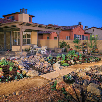
Xeriscaping is extremely popular, especially in Southern California. With rising water costs, many homeowners have turned to xeriscaping to lower their utility bills and reduce their carbon footprint. Xeriscaping entails the creative use of hardscape and native and succulant plants to create a beautiful, low-maintenance, drought-tolerant landscape design. Our experienced landscape architects and garden designers specialize in planning out practical, efficient garden designs that use little to no water.
 Zola European Windows
This Boulder, Colorado remodel by fuentesdesign demonstrates the possibility of renewal in American suburbs, and Passive House design principles. Once an inefficient single story 1,000 square-foot ranch house with a forced air furnace, has been transformed into a two-story, solar powered 2500 square-foot three bedroom home ready for the next generation.
The new design for the home is modern with a sustainable theme, incorporating a palette of natural materials including; reclaimed wood finishes, FSC-certified pine Zola windows and doors, and natural earth and lime plasters that soften the interior and crisp contemporary exterior with a flavor of the west. A Ninety-percent efficient energy recovery fresh air ventilation system provides constant filtered fresh air to every room. The existing interior brick was removed and replaced with insulation. The remaining heating and cooling loads are easily met with the highest degree of comfort via a mini-split heat pump, the peak heat load has been cut by a factor of 4, despite the house doubling in size. During the coldest part of the Colorado winter, a wood stove for ambiance and low carbon back up heat creates a special place in both the living and kitchen area, and upstairs loft.
This ultra energy efficient home relies on extremely high levels of insulation, air-tight detailing and construction, and the implementation of high performance, custom made European windows and doors by Zola Windows. Zola’s ThermoPlus Clad line, which boasts R-11 triple glazing and is thermally broken with a layer of patented German Purenit®, was selected for the project. These windows also provide a seamless indoor/outdoor connection, with 9′ wide folding doors from the dining area and a matching 9′ wide custom countertop folding window that opens the kitchen up to a grassy court where mature trees provide shade and extend the living space during the summer months.
With air-tight construction, this home meets the Passive House Retrofit (EnerPHit) air-tightness standard of
 David Morello Garden Enterprises, Inc.
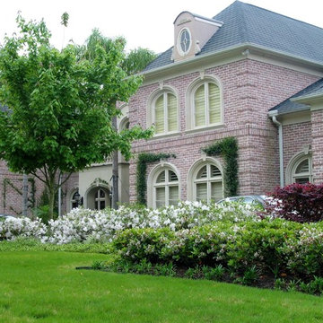
The G.G. Gerbing azaleas in full spectacular bloom.
David Morello
Design ideas for a traditional landscaping in Houston.
Design ideas for a traditional landscaping in Houston.


 Progressive Design Build
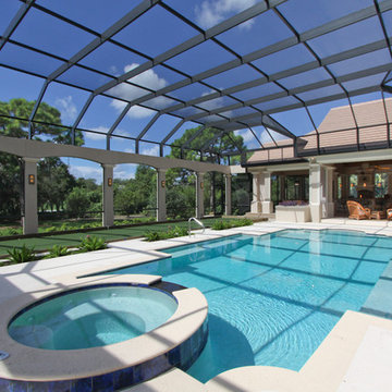
An extreme makeover turns an unassuming lanai deck into an outdoor oasis. These Bonita Bay homeowners loved the location of their home, but needed it to fit their current lifestyle. Because they love to entertain, they wanted to maximize their outdoor space—one that would accommodate a large family and lots of guests.
Working with Progressive Design Build, Mike Spreckelmeier helped the homeowners formulate a list of ideas about what they wanted to achieve in the renovation; then, guided them through the process of planning their remodel.
The renovation focused on reconfiguring the layout to extend the outdoor kitchen and living area—to include a new outdoor kitchen, dining area, sitting area and fireplace. Finishing details comprised a beautiful wood ceiling, cast stone accents, and porcelain tile. The lanai was also expanded to include a full size bocce ball court, which was fully encased in a beautiful custom colonnade and screen enclosure.
With the extension of the outdoor space came a need to connect the living area to the existing pool and deck. The pool and spa were refinished; and a well thought-out low voltage remote-control relay system was installed for easy control of all of the outdoor and landscape lighting, ceiling fans, and hurricane shutters.
This outdoor kitchen project turned out so well, the Bonita Bay homeowners hired Progressive Design Build to remodel the front of their home as well.
To create much needed space, Progressive Design Build tore down an existing two-car garage and designed and built a brand new 2.5-car garage with a family suite above. The family suite included three bedrooms, two bathrooms, additional air conditioned storage, a beautiful custom made stair system, and a sitting area. Also part of the project scope, we enlarged a separate one-car garage to a two-car garage (totaling 4.5 garages), and build a 4,000 sq. ft. driveway, complete with landscape design and installation.
 Richard Best Architect, Inc.
Hillside Modernism In Context.
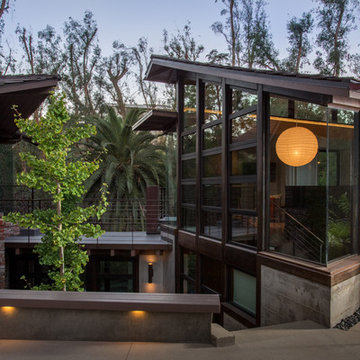
The owners of this modern hillside home sought to have a home in a nice Los Angeles neighborhood wherein they could raise their burgeoning family. The owners purchased a 1948 2000sf, single story, 2 bedroom English Cottage styled home (believed to have been originally owned by Yul Brynner) on a ½ acre hillside site in the exclusive Brentwood area of Los Angeles. The property slopes downward away from the street and overlooks a mini eucalyptus arroyo. The owners love their new location but are now faced-with having to raise their new and growing family on a hillside with extremely limited yard spaces for children to play and in a location where nature is very close – deer as well as coyotes wander the arroyo.
In 2000 the owners commissioned architect Richard Best to add 2500sf to the cottage and transform it into a home more fitting to their growing family’s needs. Subsequently, in 2014/15, the owners again commissioned Richard to create a 2-story master suite addition. Living in or visiting the completed project - the original 1948 home remodeled + the 2000 addition + the 2014/15 addition, one goes through an unexpected and delightful experience as the spaces of the home “unfold” to reveal intimacy and environmental immersion.
It was important to Richard and to the owners that their remodels and additions be appropriately designed to fit into the neighborhood and have the feel, scale, and soul of the original cottage. With this in-mind, Richard has interpreted the design intentions of the original cottage - “modernizing” the architectural vocabulary and creating open-plan, 2-story additions which promote site “engagement” at various floor levels and openness to the outdoors in a manner clearly inspired by the original cottage, yet modern.
At the front door of the original (still remains as it was) 1948 structure, one is presented with a quaint a low-slung entry which establishes a very comfortable sense of scale. Inside, the remodeled spaces of the original cottage exude comfort and a cozy sensibility evoked by the reuse of the original home’s exposed timber framing structure, open-plan circulation, and an inventive two-sided steel fireplace which acts as a room divider between the living room and a home office. Accordion wood doors connect these rooms to a newly formed outdoor rear patio. At this point one also gets ones first hint that something very interesting is happening just beyond – a glimpse of the 2000 & 2014/15 additions.
Moving from the original 1948 structure into the 2-story 2000 addition, one is greeted by a modern and open linear floor plan arrangement – a kitchen, casual dining and family room extend perpendicularly from the 1948 structure into the rear yard and down the hillside. The open framed cathedral ceiling and wood roof trusses establish a lofty feeling and a rhythm discretely separating the open rooms one from the other. Extensive use of windows and French doors connect the indoors to the outdoors and provide abundant natural lighting. This new appendage ends with a symmetrical family room which has no corners – it is a geometry composed of two overlapped squares - one rotated 45 degrees atop the other to create double opportunities for bay windows. The design not only connects the home to the desired exterior flat yards spaces, but it also takes full advantage of the sloping terrain by adding a floor below the original level so as to maintain a scale appropriate to the neighborhood. The exterior materials were chosen taking “hints” from the original 1948 structure – natural redwood siding, reused brick veneer and wood doors/windows all serving to aesthetically connect the addition back-to the spirit of the original structure.
By 2014/15 the owners’ family has fully blossomed - the children are now teenagers and there is a need for additional space. However, the owners are very content with their remodeled cottage and Richard’s 2000 addition – unsure how to add to a home which they feel is quite perfect as it is … wanting whatever changes are to be made to be sympathetic to it. They are also concerned about potential additions blocking-out their views of the eucalyptus arroyo. The owners approached Richard with trepidation – we love our perfect house but we need it to be a bit bigger and we don’t want to block-out the arroyo views or create a hemmed-in feeling – how can we add but still see the arroyo.
In response Richard created a private yet connected 2-story master suite, which by its positioning, dynamic geometries and extensive glazing create the fourth side of the former rear patio, making it into exterior courtyard with views around and through the new addition into the arroyo. A dynamic angularity in the new master addition (inspired by the 2000 addition) simultaneously reduces the apparent size/presence of the master suite addition on the edge of the eucalyptus arroyo while creating framed views into the arroyo from the newly formed courtyard. The new master suite - a master bathroom, master closet and a master sleeping loft each having exterior decks and/or patios, is connected back to the 2000 addition via a glazed hallway which provides a sense of connectedness and privacy. A modern rustic aesthetic of exposed board-formed concrete, natural finished Corten steel exterior cladding, frameless metal windows, and clear finished Douglas Fir planks serve to “extend” the soul of the original cottage into the master suite.
The project is a highly sustainable design as well. Energy use is reduced by employing a high efficiency heat pump heating and cooling system, dual paned/gasketed metal window/door systems, natural lighting through a Kalwall skylight and generous exterior glazing with extensive eaves for shading, rigid roof insulation, and earthen backing – the lower floor is up-against the hillside which tends to even-out the day/night temperature differential.
Credits:
Architecture & Interior Design: Richard Best Architect Inc.
Structural Engineering: Dan Echeto & David Choi Associates
Interior Decor: Noelle Schoop
Landscape: Connie Heitzman
Photos: Carmel McFayden and Adriano Sarmento / James Porschen
 ZeroEnergy Design
This LEED Platinum certified house reflects the homeowner's desire for an exceptionally healthy and comfortable living environment, within a traditional neighborhood.
INFILL SITE. The family, who moved from another area of Wellesley, sought out this property to be within walking distance of the high school and downtown area. An existing structure on the tight lot was removed to make way for the new home. 84% of the construction waste, from both the previous structure and the new home, was diverted from a landfill. ZED designed to preserve the existing mature trees on the perimeter of the property to minimize site impacts, and to maintain the character of the neighborhood as well as privacy on the site.
EXTERIOR EXPRESSION. The street facade of the home relates to the local New England vernacular. The rear uses contemporary language, a nod to the family’s Californian roots, to incorporate a roof deck, solar panels, outdoor living space, and the backyard swimming pool. ZED’s careful planning avoided to the need to face the garage doors towards the street, a common syndrome of a narrow lot.
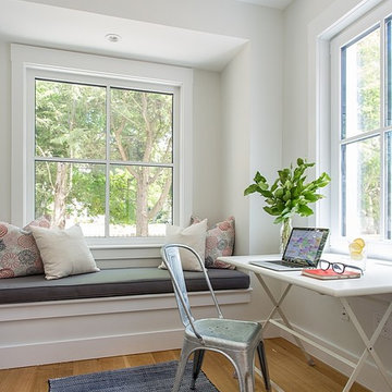
THOUGHTFUL SPACE. Homes with dual entries can often result in duplicate and unused spaces. In this home, the everyday and formal entry areas are one and the same; the front and garage doors share the entry program of coat closets, mudroom storage with bench for removing your shoes, and a laundry room with generous closets for the children's sporting equipment. The entry area leads directly to the living space, encompassing the kitchen, dining and sitting area areas in an L-shaped open plan arrangement. The kitchen is placed at the south-west corner of the space to allow for a strong connection to the dining, sitting and outdoor living spaces. A fire pit on the deck satisfies the family’s desire for an open flame while a sealed gas fireplace is used indoors - ZED’s preference after omitting gas burning appliances completely from an airtight home. A small study, with a window seat, is conveniently located just off of the living space. A first floor guest bedroom includes an accessible bathroom for aging visitors and can be used as a master suite to accommodate aging in place.
HEALTHY LIVING. The client requested a home that was easy to clean and would provide a respite from seasonal allergies and common contaminants that are found in many indoor spaces. ZED selected easy to clean solid surface flooring throughout, provided ample space for cleaning supplies on each floor, and designed a mechanical system with ventilation that provides a constant supply of fresh outdoor air. ZED selected durable materials, finishes, cabinetry, and casework with low or no volatile organic compounds (VOCs) and no added urea formaldehyde.
YEAR-ROUND COMFORT. The home is super insulated and air-tight, paired with high performance triple-paned windows, to ensure it is draft-free throughout the winter (even when in front of the large windows and doors). ZED designed a right-sized heating and cooling system to pair with the thermally improved building enclosure to ensure year-round comfort. The glazing on the home maximizes passive solar gains, and facilitates cross ventilation and daylighting.
ENERGY EFFICIENT. As one of the most energy efficient houses built to date in Wellesley, the home highlights a practical solution for Massachusetts. First, the building enclosure reduces the largest energy requirement for typical houses (heating). Super-insulation, exceptional air sealing, a thermally broken wall assembly, triple pane windows, and passive solar gain combine for a sizable heating load reduction. Second, within the house only efficient systems consume energy. These include an air source heat pump for heating & cooling, a heat pump hot water heater, LED lighting, energy recovery ventilation, and high efficiency appliances. Lastly, photovoltaics provide renewable energy help offset energy consumption. The result is an 89% reduction in energy use compared to a similar brand new home built to code requirements.
RESILIENT. The home will fare well in extreme weather events. During a winter power outage, heat loss will be very slow due to the super-insulated and airtight envelope– taking multiple days to drop to 60 degrees even with no heat source. An engineered drainage system, paired with careful the detailing of the foundation, will help to keep the finished basement dry. A generator will provide full operation of the all-electric house during a power outage.
OVERALL. The home is a reflection of the family goals and an expression of their values, beautifully enabling health, comfort, safety, resilience, and utility, all while respecting the planet.
ZED - Architect & Mechanical Designer
Bevilacqua Builders Inc - Contractor
Creative Land & Water Engineering - Civil Engineering
Barbara Peterson Landscape - Landscape Design
Nest & Company - Interior Furnishings
Eric Roth Photography - Photography
27