
Search results for "Eye level" in Home Design Ideas
 Level Studio
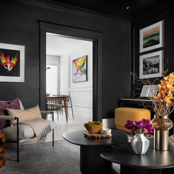
The living room goes fully black, ceiling included, with painted casings around the entryways that frame it like a portal from the foyer and dining room. Tone-on-tone black runs through the picture frames, coffee tables, piano, shelves, and drapery, warmed by texture rather than colour. A grey armchair, a yellow piano bench, and a caramel leather sofa draw the eye, beneath a limited-edition Bruce Boyd piece over the fireplace.
 TVL Creative Ltd.
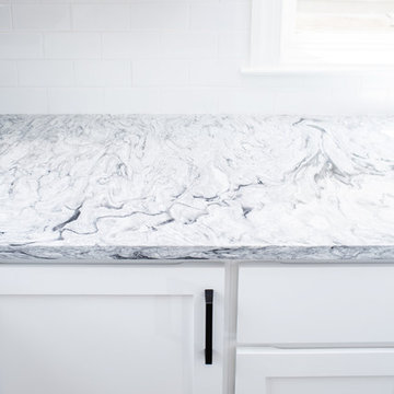
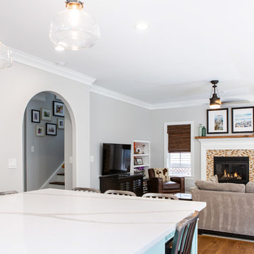
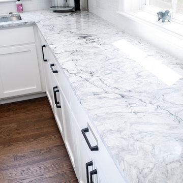
This project has been a labor of love for quite some time! The design ideas started flowing for this space back in 2016, and we are so excited to have recently completed the build-out process after our lengthy planning time frame. These wonderful clients completed a bathroom renovation with us last year, and we absolutely loved the charming, clean-lined farmhouse aesthetic we produced there. Wanting to carry that similar aesthetic into the kitchen, our clients hired us to transform their dated 90's builder-grade kitchen into a stunning showpiece for their home. While no major fixtures or appliances were relocated, nor were there major architectural changes, this space's transformation is a jaw-dropper. We began by removing the existing yellowed oak wood cabinets and replaced them with gorgeous custom cabinets from Tharp Cabinet Company. These cabinets are a very simple shaker style in a bright white paint color. We paired these fresh and bright cabinet with black hardware for a dramatic pop. We utilized the Blackrock pulls from Amerock and adore the playful contrast these pieces provide. On the backsplash, we used a very simple and understated white subway tile for a classic and timeless look that doesn't draw the eye away from the focal island or surrounding features. Over the range, we used a stunning mini-glass mosaic tile from TileBar that shimmers and showcases a variety of colors based on the time of day and light entry. The island is our favorite piece in this kitchen: a custom-built focal point from Tharp, painted in a gorgeous custom blue from Benjamin Moore. The island is topped with a dramatic slab of Arabescato from Pental Surfaces. On the perimeter cabinets, we've utilized the stunning White Fusion quartz, also from Pental. For final touches, we've utilized matte black wall sconces over the windows from Rejuvenation, and have a gorgeous sink faucet from Delta Faucet. Throughout the main level, we refinished the hardwood floors to bring them to a more soft, neutral brown color. New paint is carried throughout the house as well. We adore the bright simplicity of this space, and are so excited that our clients can enjoy this family friendly stunner for years to come!
 TVL Creative Ltd.
This project has been a labor of love for quite some time! The design ideas started flowing for this space back in 2016, and we are so excited to have recently completed the build-out process after our lengthy planning time frame. These wonderful clients completed a bathroom renovation with us last year, and we absolutely loved the charming, clean-lined farmhouse aesthetic we produced there. Wanting to carry that similar aesthetic into the kitchen, our clients hired us to transform their dated 90's builder-grade kitchen into a stunning showpiece for their home. While no major fixtures or appliances were relocated, nor were there major architectural changes, this space's transformation is a jaw-dropper. We began by removing the existing yellowed oak wood cabinets and replaced them with gorgeous custom cabinets from Tharp Cabinet Company. These cabinets are a very simple shaker style in a bright white paint color. We paired these fresh and bright cabinet with black hardware for a dramatic pop. We utilized the Blackrock pulls from Amerock and adore the playful contrast these pieces provide. On the backsplash, we used a very simple and understated white subway tile for a classic and timeless look that doesn't draw the eye away from the focal island or surrounding features. Over the range, we used a stunning mini-glass mosaic tile from TileBar that shimmers and showcases a variety of colors based on the time of day and light entry. The island is our favorite piece in this kitchen: a custom-built focal point from Tharp, painted in a gorgeous custom blue from Benjamin Moore. The island is topped with a dramatic slab of Arabescato from Pental Surfaces. On the perimeter cabinets, we've utilized the stunning White Fusion quartz, also from Pental. For final touches, we've utilized matte black wall sconces over the windows from Rejuvenation, and have a gorgeous sink faucet from Delta Faucet. Throughout the main level, we refinished the hardwood floors to bring them to a more soft, neutral brown color. New paint is carried throughout the house as well. We adore the bright simplicity of this space, and are so excited that our clients can enjoy this family friendly stunner for years to come!
Find the right local pro for your project
 Level Studio
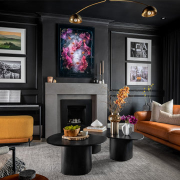
The living room goes fully black, ceiling included, with painted casings around the entryways that frame it like a portal from the foyer and dining room. Tone-on-tone black runs through the picture frames, coffee tables, piano, shelves, and drapery, warmed by texture rather than colour. A grey armchair, a yellow piano bench, and a caramel leather sofa draw the eye, beneath a limited-edition Bruce Boyd piece over the fireplace.
 Level One Construction
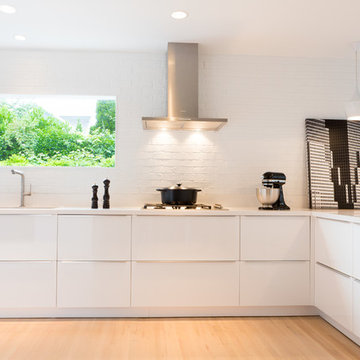
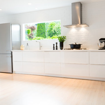
Seamless Elegance is a story bringing together both old and new. A cramped kitchen and a seldom-used den in a 100 year-old house were opened up to create a sprawling 300-sqft paradise. Obsessing over the little details was important to achieving our goal of seamless elegance.
The archway and molding detail between the dining and living room was perfectly mirrored between the dining room and kitchen, right down to the hidden closets. A faux brick wall painted white was added to the back wall of the kitchen to give the illusion that the previous expansion was always there.
The existing 1.5” wide beautiful oak hardwood floor was matched to the rest of the house and continued into the kitchen. The flooring throughout the house was re-done at the same time to solidify the marriage between old and new; the result was a seamless transition into functionality. The character brought into the space by the oak hardwood floor and brick wall off sets the contemporary high gloss white cabinets.
No upper cabinets were used in this design because we wanted to showcase the brick accent wall. The storage lost from zero upper kitchen cabinets was more than made up in floor-to-ceiling pantry. This corner pantry accommodates the bulk of storage for food and dishes in the kitchen. The subtraction of the upper cabinets allows the Tom Dixon pendant lights to be boldly featured over the eating peninsula.
Visual lines were a key aspect in this design helping the eye move throughout the space. The cabinet break lines are at the same height as the counter tops creating one continuous line. The paneled dishwasher blends perfectly with the rest of the kitchen cabinetry. The white quartz countertop flows down into a waterfall edge at the end of the eating peninsula, being the final grounding piece to visual lines.
Although the kitchen is all white, it is offset and given visual interest through texture and the use of different materials. The white allows the beautiful expensive appliances to be showcased along with the newly refinished flooring. The clean crisp kitchen will be the perfect backdrop to show case boldly colored art and accessories.
 Level One Construction
Seamless Elegance is a story bringing together both old and new. A cramped kitchen and a seldom-used den in a 100 year-old house were opened up to create a sprawling 300-sqft paradise. Obsessing over the little details was important to achieving our goal of seamless elegance.
The archway and molding detail between the dining and living room was perfectly mirrored between the dining room and kitchen, right down to the hidden closets. A faux brick wall painted white was added to the back wall of the kitchen to give the illusion that the previous expansion was always there.
The existing 1.5” wide beautiful oak hardwood floor was matched to the rest of the house and continued into the kitchen. The flooring throughout the house was re-done at the same time to solidify the marriage between old and new; the result was a seamless transition into functionality. The character brought into the space by the oak hardwood floor and brick wall off sets the contemporary high gloss white cabinets.
No upper cabinets were used in this design because we wanted to showcase the brick accent wall. The storage lost from zero upper kitchen cabinets was more than made up in floor-to-ceiling pantry. This corner pantry accommodates the bulk of storage for food and dishes in the kitchen. The subtraction of the upper cabinets allows the Tom Dixon pendant lights to be boldly featured over the eating peninsula.
Visual lines were a key aspect in this design helping the eye move throughout the space. The cabinet break lines are at the same height as the counter tops creating one continuous line. The paneled dishwasher blends perfectly with the rest of the kitchen cabinetry. The white quartz countertop flows down into a waterfall edge at the end of the eating peninsula, being the final grounding piece to visual lines.
Although the kitchen is all white, it is offset and given visual interest through texture and the use of different materials. The white allows the beautiful expensive appliances to be showcased along with the newly refinished flooring. The clean crisp kitchen will be the perfect backdrop to show case boldly colored art and accessories.
 RR Redesign
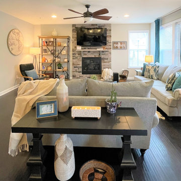
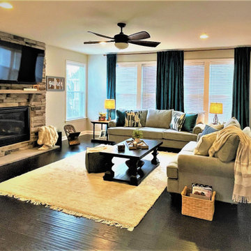
Light and airy with pops of color is the mood for this space. As you enter this newly designed family room your eye goes directly to the amazing long teal velvet curtain panels. Warm gray furniture invites you to a cozy seating arrangement. The deep espresso floor is beautifully anchored with the soft white pottery barn rug. I love the book shelf I found that accents all of the striking accessories found while traveling. Global textiles pull this main level refresh together.

 Level Studio
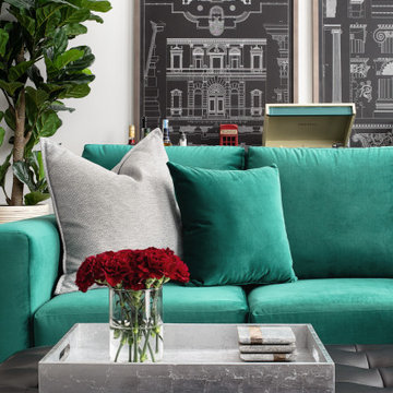
This modern townhome in Vaughan received some mid-century modern flair and some really fun wallpaper.
The large open concept living room was challenging in terms of creating a successful layout and we addressed it by bringing a large sectional closer to the center of the room rather than anchoring it against walls. Plenty of circulation space for a sideboard with a beautiful vinyl player, a collection of tall architectural prints and an eight foot tall floor lamp bring the eye up a double story living space.
Fun wallpaper creates a long feature wall in the living and dining area with a geometric pattern that brings some movement to the room and is also mirrored in the kitchen backsplash and sideboard veneer.
We designed a bedroom with the perfect shade of blue that will age nicely with our client’s young son along with a calming study perfect for getting some work done.
 TVL Creative Ltd.
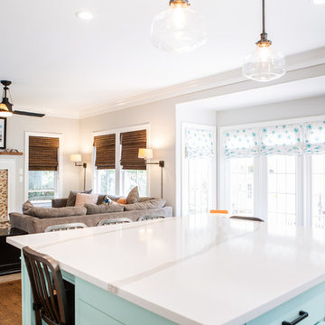
This project has been a labor of love for quite some time! The design ideas started flowing for this space back in 2016, and we are so excited to have recently completed the build-out process after our lengthy planning time frame. These wonderful clients completed a bathroom renovation with us last year, and we absolutely loved the charming, clean-lined farmhouse aesthetic we produced there. Wanting to carry that similar aesthetic into the kitchen, our clients hired us to transform their dated 90's builder-grade kitchen into a stunning showpiece for their home. While no major fixtures or appliances were relocated, nor were there major architectural changes, this space's transformation is a jaw-dropper. We began by removing the existing yellowed oak wood cabinets and replaced them with gorgeous custom cabinets from Tharp Cabinet Company. These cabinets are a very simple shaker style in a bright white paint color. We paired these fresh and bright cabinet with black hardware for a dramatic pop. We utilized the Blackrock pulls from Amerock and adore the playful contrast these pieces provide. On the backsplash, we used a very simple and understated white subway tile for a classic and timeless look that doesn't draw the eye away from the focal island or surrounding features. Over the range, we used a stunning mini-glass mosaic tile from TileBar that shimmers and showcases a variety of colors based on the time of day and light entry. The island is our favorite piece in this kitchen: a custom-built focal point from Tharp, painted in a gorgeous custom blue from Benjamin Moore. The island is topped with a dramatic slab of Arabescato from Pental Surfaces. On the perimeter cabinets, we've utilized the stunning White Fusion quartz, also from Pental. For final touches, we've utilized matte black wall sconces over the windows from Rejuvenation, and have a gorgeous sink faucet from Delta Faucet. Throughout the main level, we refinished the hardwood floors to bring them to a more soft, neutral brown color. New paint is carried throughout the house as well. We adore the bright simplicity of this space, and are so excited that our clients can enjoy this family friendly stunner for years to come!
 Level One Construction
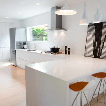
Seamless Elegance is a story bringing together both old and new. A cramped kitchen and a seldom-used den in a 100 year-old house were opened up to create a sprawling 300-sqft paradise. Obsessing over the little details was important to achieving our goal of seamless elegance.
The archway and molding detail between the dining and living room was perfectly mirrored between the dining room and kitchen, right down to the hidden closets. A faux brick wall painted white was added to the back wall of the kitchen to give the illusion that the previous expansion was always there.
The existing 1.5” wide beautiful oak hardwood floor was matched to the rest of the house and continued into the kitchen. The flooring throughout the house was re-done at the same time to solidify the marriage between old and new; the result was a seamless transition into functionality. The character brought into the space by the oak hardwood floor and brick wall off sets the contemporary high gloss white cabinets.
No upper cabinets were used in this design because we wanted to showcase the brick accent wall. The storage lost from zero upper kitchen cabinets was more than made up in floor-to-ceiling pantry. This corner pantry accommodates the bulk of storage for food and dishes in the kitchen. The subtraction of the upper cabinets allows the Tom Dixon pendant lights to be boldly featured over the eating peninsula.
Visual lines were a key aspect in this design helping the eye move throughout the space. The cabinet break lines are at the same height as the counter tops creating one continuous line. The paneled dishwasher blends perfectly with the rest of the kitchen cabinetry. The white quartz countertop flows down into a waterfall edge at the end of the eating peninsula, being the final grounding piece to visual lines.
Although the kitchen is all white, it is offset and given visual interest through texture and the use of different materials. The white allows the beautiful expensive appliances to be showcased along with the newly refinished flooring. The clean crisp kitchen will be the perfect backdrop to show case boldly colored art and accessories.
 Nate's Custom Renovations
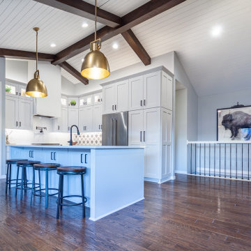
The modern industrial farmhouse style together in this remodel creates a pleasing and welcoming balance. This project was infused with materials, textures, and color to create a modern industrial feel.
The homeowners wanted an open floor plan. One of the most eye-catching elements is the custom-made rustic wood ceiling beams and the white shiplap, which elevates the entirety of opening this new space.
The homeowners added industrial elements to the space with mixed metals from the lighting, faucet, pot filler, and stainless-steel appliances to farmhouse elements with an apron front sink and rustic barstools. Another aspect of this gorgeous kitchen is the quartz backsplash behind the range with a modern plaster range hood to ceiling accented by a bold encaustic tile on the other backsplash wall. One of the defined focal points for the whole room is the large light fixtures in the kitchen and living area.
This main level remodel project has authentic beauty from floor to ceiling.
 TVL Creative Ltd.
This project has been a labor of love for quite some time! The design ideas started flowing for this space back in 2016, and we are so excited to have recently completed the build-out process after our lengthy planning time frame. These wonderful clients completed a bathroom renovation with us last year, and we absolutely loved the charming, clean-lined farmhouse aesthetic we produced there. Wanting to carry that similar aesthetic into the kitchen, our clients hired us to transform their dated 90's builder-grade kitchen into a stunning showpiece for their home. While no major fixtures or appliances were relocated, nor were there major architectural changes, this space's transformation is a jaw-dropper. We began by removing the existing yellowed oak wood cabinets and replaced them with gorgeous custom cabinets from Tharp Cabinet Company. These cabinets are a very simple shaker style in a bright white paint color. We paired these fresh and bright cabinet with black hardware for a dramatic pop. We utilized the Blackrock pulls from Amerock and adore the playful contrast these pieces provide. On the backsplash, we used a very simple and understated white subway tile for a classic and timeless look that doesn't draw the eye away from the focal island or surrounding features. Over the range, we used a stunning mini-glass mosaic tile from TileBar that shimmers and showcases a variety of colors based on the time of day and light entry. The island is our favorite piece in this kitchen: a custom-built focal point from Tharp, painted in a gorgeous custom blue from Benjamin Moore. The island is topped with a dramatic slab of Arabescato from Pental Surfaces. On the perimeter cabinets, we've utilized the stunning White Fusion quartz, also from Pental. For final touches, we've utilized matte black wall sconces over the windows from Rejuvenation, and have a gorgeous sink faucet from Delta Faucet. Throughout the main level, we refinished the hardwood floors to bring them to a more soft, neutral brown color. New paint is carried throughout the house as well. We adore the bright simplicity of this space, and are so excited that our clients can enjoy this family friendly stunner for years to come!
 Che Bella Interiors Design + Remodeling
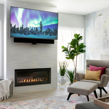
The clients lower level was in need of a bright and fresh perspective, with a twist of inspiration from a recent stay in Amsterdam. The previous space was dark, cold, somewhat rustic and featured a fireplace that too up way to much of the space. They wanted a new space where their teenagers could hang out with their friends and where family nights could be filled with colorful expression.
The pops of color are purposeful and not overwhelming, allowing your eye to travel around the room and take in all of the visual interest. A colorful rug and wallpaper mural were the jumping off point for colorful accessories. The fireplace tile adds a soft modern, yet artistic twist.
Check out the before photos for a true look at what was changed in the space.
Photography by Spacecrafting Photography
 RR Redesign
Light and airy with pops of color is the mood for this space. As you enter this newly designed family room your eye goes directly to the amazing long teal velvet curtain panels. Warm gray furniture invites you to a cozy seating arrangement. The deep espresso floor is beautifully anchored with the soft white pottery barn rug. I love the book shelf I found that accents all of the striking accessories found while traveling. Global textiles pull this main level refresh together.
 Level One Construction
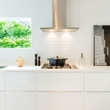
Seamless Elegance is a story bringing together both old and new. A cramped kitchen and a seldom-used den in a 100 year-old house were opened up to create a sprawling 300-sqft paradise. Obsessing over the little details was important to achieving our goal of seamless elegance.
The archway and molding detail between the dining and living room was perfectly mirrored between the dining room and kitchen, right down to the hidden closets. A faux brick wall painted white was added to the back wall of the kitchen to give the illusion that the previous expansion was always there.
The existing 1.5” wide beautiful oak hardwood floor was matched to the rest of the house and continued into the kitchen. The flooring throughout the house was re-done at the same time to solidify the marriage between old and new; the result was a seamless transition into functionality. The character brought into the space by the oak hardwood floor and brick wall off sets the contemporary high gloss white cabinets.
No upper cabinets were used in this design because we wanted to showcase the brick accent wall. The storage lost from zero upper kitchen cabinets was more than made up in floor-to-ceiling pantry. This corner pantry accommodates the bulk of storage for food and dishes in the kitchen. The subtraction of the upper cabinets allows the Tom Dixon pendant lights to be boldly featured over the eating peninsula.
Visual lines were a key aspect in this design helping the eye move throughout the space. The cabinet break lines are at the same height as the counter tops creating one continuous line. The paneled dishwasher blends perfectly with the rest of the kitchen cabinetry. The white quartz countertop flows down into a waterfall edge at the end of the eating peninsula, being the final grounding piece to visual lines.
Although the kitchen is all white, it is offset and given visual interest through texture and the use of different materials. The white allows the beautiful expensive appliances to be showcased along with the newly refinished flooring. The clean crisp kitchen will be the perfect backdrop to show case boldly colored art and accessories.
 TVL Creative Ltd.
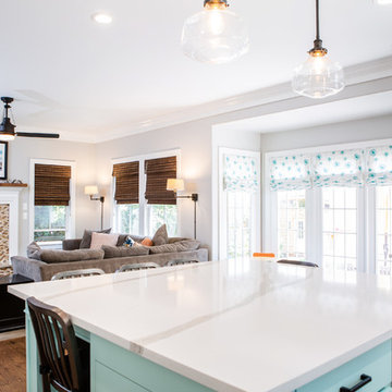
This project has been a labor of love for quite some time! The design ideas started flowing for this space back in 2016, and we are so excited to have recently completed the build-out process after our lengthy planning time frame. These wonderful clients completed a bathroom renovation with us last year, and we absolutely loved the charming, clean-lined farmhouse aesthetic we produced there. Wanting to carry that similar aesthetic into the kitchen, our clients hired us to transform their dated 90's builder-grade kitchen into a stunning showpiece for their home. While no major fixtures or appliances were relocated, nor were there major architectural changes, this space's transformation is a jaw-dropper. We began by removing the existing yellowed oak wood cabinets and replaced them with gorgeous custom cabinets from Tharp Cabinet Company. These cabinets are a very simple shaker style in a bright white paint color. We paired these fresh and bright cabinet with black hardware for a dramatic pop. We utilized the Blackrock pulls from Amerock and adore the playful contrast these pieces provide. On the backsplash, we used a very simple and understated white subway tile for a classic and timeless look that doesn't draw the eye away from the focal island or surrounding features. Over the range, we used a stunning mini-glass mosaic tile from TileBar that shimmers and showcases a variety of colors based on the time of day and light entry. The island is our favorite piece in this kitchen: a custom-built focal point from Tharp, painted in a gorgeous custom blue from Benjamin Moore. The island is topped with a dramatic slab of Arabescato from Pental Surfaces. On the perimeter cabinets, we've utilized the stunning White Fusion quartz, also from Pental. For final touches, we've utilized matte black wall sconces over the windows from Rejuvenation, and have a gorgeous sink faucet from Delta Faucet. Throughout the main level, we refinished the hardwood floors to bring them to a more soft, neutral brown color. New paint is carried throughout the house as well. We adore the bright simplicity of this space, and are so excited that our clients can enjoy this family friendly stunner for years to come!
 Colorworks Landscape Design
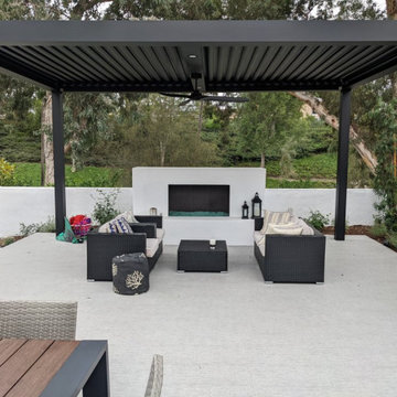
This masterpiece included a full demo, new concrete foundations, three levels of stunning porcelain tiling, and eye-catching intervening stairs. The cherry on top? An in-ground hot tub with a switch-operated retractable cover, a cozy fireplace feature, a custom outdoor kitchen, a chic pergola, and beautifully stuccoed walls. We didn't stop there— we added a touch of elegance with a repaint of the 2nd-floor deck and the perfect finishing touch with lush hedges and flowers, all seamlessly irrigated.
 Level One Construction
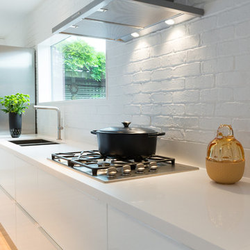
Seamless Elegance is a story bringing together both old and new. A cramped kitchen and a seldom-used den in a 100 year-old house were opened up to create a sprawling 300-sqft paradise. Obsessing over the little details was important to achieving our goal of seamless elegance.
The archway and molding detail between the dining and living room was perfectly mirrored between the dining room and kitchen, right down to the hidden closets. A faux brick wall painted white was added to the back wall of the kitchen to give the illusion that the previous expansion was always there.
The existing 1.5” wide beautiful oak hardwood floor was matched to the rest of the house and continued into the kitchen. The flooring throughout the house was re-done at the same time to solidify the marriage between old and new; the result was a seamless transition into functionality. The character brought into the space by the oak hardwood floor and brick wall off sets the contemporary high gloss white cabinets.
No upper cabinets were used in this design because we wanted to showcase the brick accent wall. The storage lost from zero upper kitchen cabinets was more than made up in floor-to-ceiling pantry. This corner pantry accommodates the bulk of storage for food and dishes in the kitchen. The subtraction of the upper cabinets allows the Tom Dixon pendant lights to be boldly featured over the eating peninsula.
Visual lines were a key aspect in this design helping the eye move throughout the space. The cabinet break lines are at the same height as the counter tops creating one continuous line. The paneled dishwasher blends perfectly with the rest of the kitchen cabinetry. The white quartz countertop flows down into a waterfall edge at the end of the eating peninsula, being the final grounding piece to visual lines.
Although the kitchen is all white, it is offset and given visual interest through texture and the use of different materials. The white allows the beautiful expensive appliances to be showcased along with the newly refinished flooring. The clean crisp kitchen will be the perfect backdrop to show case boldly colored art and accessories.
 menakaimai architects
Project Type : Residential
Location : Ethul Kotte
Land Area :3267 sqft ( 12 p )
Architects : Archt. Sameera Dharmasena (menakaimai design studio)
: Archt. Menaka Karunarathna (menakaimai design studio)
Structural Engineering : Eng Sajeewa Edirrisingha
Write-up : Archt. Navoda Rthnayaka
Photographs : Amila Rathnayaka (Amila Rathnayaka photography)
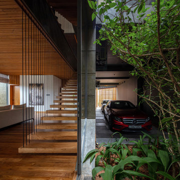
Just as the eyes are the windows to a person’s soul, a house is a window to its architect’s aspirations. The residence for Mr. Alex and family at Ethul Kotte is a perfect example for this, which is an open book with multiple layers. From the entrance to the rooftop, each space creates a specific impression and reveals a little more about the users, as it has been perfectly captured by the architect.
The house is located at the further end of a narrow drive-way, almost hidden from view with its dark façade and greenery, and sits in a compact lot that opens to a marsh at its rear end. With its cladded wall of cement blocks with a unique imprint and the line of bamboo covering the length of the front wall, the boundaries are defined effortlessly while drawing focus to the main entrance. Earthy feeling created at this point heavily dwells on the solidity of the materials and the muted color palette, which is juxtaposed by the lightness of the timber gate, perforated external façade and screen of vines flowing down from the rooftop. Upon entering, the ambiance of the house changes from its somber guarded exterior to a bright and spacious interior that completely opens to its surroundings.
The floating staircase that climbs along the dark titanium wall and the adjoining courtyard run through the full height of the building, merging the solids and the voids at all levels.
Spatial organization in the house is predominantly in three layers and each section of a floor has a clear demarcation between the public and private spaces. Spaciousness is achieved through the simplicity of the spaces, minimalistic furniture and muted tones that are complemented by the complete openness created by the glass facades covering the full height of the spaces. Another noticeable feature is the landscaping where thick low hedges are broken by thin trees to mimic a rampart that characterizes the intermediate space between the interior and boundary of the site, which is demarcated by the alternating solids and voids of the boundary fence.
The ground level creates a warm, welcoming ambiance that is ideal for entertaining guests. From the lines of textures and materials used, to heights and orientations of furniture, each element complements each other to add volume and composure to the space. A peculiar feature is a subtle inspiration from Japanese architecture that is visible in the sharp lines and several decorative features, which enhance the ambiance with splashes of vibrancy created by the simple, yet colorful elements. While the open living-dining space is a subtle fusion between a modern western living space and the Sri Lankan lifestyle that welcomes nature and social interactions, privacy of adjoining spaces such as the kitchen and bedroom is ensured by isolation made pleasant by their private courtyards.
Gradually gracing a visitor at the extended landing of the first floor is the calming sight of the full height cross formed by light filtering through crafted gaps on the wall which becomes a feature and an open shrine. This , seamless flows to the rest of the floor with its vibrant, spacious family living room and TV lobby a that connects all these well as the custom-designed bedrooms
The ambiance of each room voices the unique needs and tastes of its user, while the private balcony screened from the outside by a perforated aluminum façade and a screen of vines, creates an intimate niche. A significant feature is the glazed walls of the master bedroom, which are only screened by thick canvas shades that open to a mesmerizing sunset and a view of the marsh. This makes one question the concepts of privacy traditionally Sri Lankans, whereas the user appears to be embracing the vulnerability in openness and enjoying the soothing beauty in nature through the same.
The second floor is mostly the rooftop garden and bar, which is a multi-functional space ideal for a small gathering. The curtain of creepers covering the full height glass façade separating the bar and open terrace creates a significant change in ambiance by defining the cozy, timber interior of the bar, against the outdoor-, where the monotonous greenery is only broken by a splash of red from the punctured cover of a service staircase running to the upper rooftop level. The uniqueness is in how each space caters for contrast in transition between ambiances spanning from an intimate, mystic bar area ideal for isolation, to a lively social space creates a unique mood compared to the rest of the house. The rooftop thus completes the transition of spaces from open and interactive interior to a mind-palace and a garden that inspires the soul.
“I think that my job is to observe people and the world, and not to judge them; I always hope
To position myself away from so-called conclusions; I would like to leave everything wide open
To all the possibilities in the world.”
-Haruki Murakami-
Layering is a key feature in this design, which is evident in how the façade filters inwards from the curtain of greenery, permeable panel and the external wall, as well as the spatial structure of the interior. The linear form of the building, where the living spaces completely open-out through the glazed facades at the rear end of each floor merges these family-spaces with the neighborhood, which avoids complete isolation of the family. Thus, the design is inspired by the need for a sense of freedom in the residents, while allowing the house to become a place for escape when desired.
 Che Bella Interiors Design + Remodeling
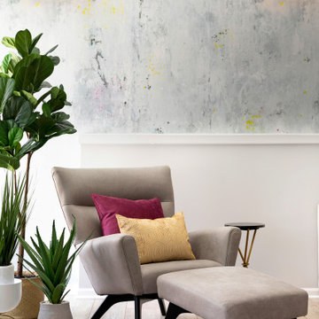
The clients lower level was in need of a bright and fresh perspective, with a twist of inspiration from a recent stay in Amsterdam. The previous space was dark, cold, somewhat rustic and featured a fireplace that too up way to much of the space. They wanted a new space where their teenagers could hang out with their friends and where family nights could be filled with colorful expression.
The pops of color are purposeful and not overwhelming, allowing your eye to travel around the room and take in all of the visual interest. A colorful rug and wallpaper mural were the jumping off point for colorful accessories. The fireplace tile adds a soft modern, yet artistic twist.
Check out the before photos for a true look at what was changed in the space.
Photography by Spacecrafting Photography
69