
Search results for "Facilitation" in Home Design Ideas
 MainStreet Design Build
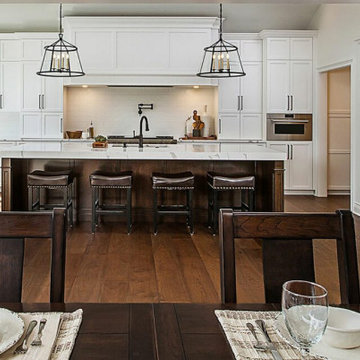
The new kitchen showcases exquisite custom cabinetry from Plain and Fancy, featuring a soft white painted perimeter and a cherry island that comfortably seats six. With dual sinks—one nestled beneath a window and the other discreetly placed in the island, just behind the 48” Wolf range—this kitchen facilitates multiple chefs and efficient cleanup, made even easier with the inclusion of two dishwashers, ideal for hosting large parties. A third steam oven quickly became a culinary essential for everyday family meals. A stone’s throw away, the Subzero refrigerator and freezer towers stand ready to accommodate the needs of a sizable crowd.
 Integrated Home Improvement
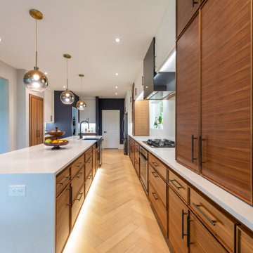
Both the design and construction teams put their heart into making sure we worked with the client to achieve this gorgeous vision. The client was sensitive to both aesthetic and functionality goals, so we set out to improve their old, dated cramped kitchen, with an open concept that facilitates cooking workflow, and dazzles the eye with its mid century modern design. One of their biggest items was their need for increased storage space. We certainly achieved that with ample cabinet space and doubling their pantry space.
The 13 foot waterfall island is the centerpiece, which is heavily utilized for cooking, eating, playing board games and hanging out. The pantry behind the walnut doors used to be the fridge space, and there's an extra pantry now to the left of the current fridge. We moved the sink from the counter to the island, which really helped workflow (we created triangle between cooktop, sink and fridge/pantry 2). To make the cabinets flow linearly at the top we moved and replaced the window. The beige paint is called alpaca from Sherwin Williams and the blue is charcoal blue from sw.
Everything was carefully selected, from the horizontal grain on the walnut cabinets, to the subtly veined white quartz from Arizona tile, to the black glass paneled luxury hood from Futuro Futuro. The pendants and chandelier are from West Elm. The flooring is from karastan; a gorgeous engineered, white oak in herringbone pattern. The recessed lights are decorative from Lumens. The pulls are antique brass from plank hardware (in London). We sourced the door handles and cooktop (Empava) from Houzz. The faucet is Rohl and the sink is Bianco.
 Rue Sherwood Landscape Design, LLC
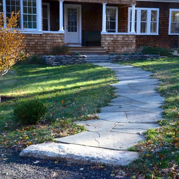
Landscape features are integrated with home improvements to ease the transition between inside and out. An informal bluestone walk guides visitors to the new front door from a generous circular driveway. The flow is facilitated with wide steps and a terrace. Local, reclaimed granite and slab stones add a sense of time and place.
Rue Sherwood Landscape Design
Find the right local pro for your project
 Gallery Kitchens and Baths
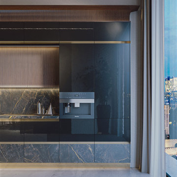
EuroGallery is the exciting new partnership between Gallery and A-Nathstudio, an acclaimed architectural and design studio based in Italy. The EuroGallery partnership serves to strengthen our commitment to delivering high quality kitchens and bathrooms at competitive prices.
While A-Nathstudio is essential in providing design and organizational support, they also facilitate our exclusive access to exceptional tailor-made cabinetry within the European Union. It’s here that high quality materials meet truly functional and customizable design for every space.
We collaborate with the premier European brands for kitchen and bathroom design: La Cornue, Martini, Pittori, Salvatori, L’Ottocento, Brummel amongst others. Our international Team is able to help with any customization requests, communicate project updates and provide post-sale assistance.
 Pinnacle Design & Remodeling
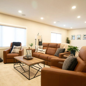
A blank slate and open minds are a perfect recipe for creative design ideas. The homeowner's brother is a custom cabinet maker who brought our ideas to life and then Landmark Remodeling installed them and facilitated the rest of our vision. We had a lot of wants and wishes, and were to successfully do them all, including a gym, fireplace, hidden kid's room, hobby closet, and designer touches.
 Drury Design
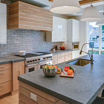
This beautiful combination of rooms was part of a whole house design that we put together to flow within the owner’s overall vision of modern style and functionality.
THE SETUP
The house was partially built when the owner purchased it, so we tweaked the layout to fit his needs.
Like so many homeowners today, our client is a casual diner and would rather not have space dedicated as a formal dining room. Island seating and a large table off the kitchen make more sense for his lifestyle.
Our client wanted a clean, contemporary look with a layout that works for one person preparing meals most of the time, but adaptable for entertaining at different scales at other times.
THE RENEWED SPACE
The first thing we did was design a bar in the space formerly designated for a formal dining room. It is open to the front entry foyer on one side and flows easily into the butler’s pantry on the other side. A TV for sports viewing is centered between a full-sized wine cooler and a glass cabinet for barware. The u-shaped bar top seats five people comfortably and hides the lower bar prep countertop from view from the entry.
The butler’s pantry is situated between the kitchen eating area and the front bar. The walls on the sides of this area were opened to help the areas flow together into one great room. An icemaker and under-counter refrigerator drawers were incorporated into the butler’s pantry to help it function as a place to set up drinks etc. to be used in the kitchen eating area. The floating shelves also helped open the space up.
Across from the butler’s area is a clean contemporary powder room with indirect lighting below floating cabinetry to complete the look.
The kitchen uses an array of man-made materials for ease of maintenance and durability. The layout includes a perfect work triangle for a one-cook kitchen with all the amenities. A range with double ovens, a built-in microwave and a warming drawer are all conveniently located. The countertop is a man-made quartz that looks like rugged concrete. The refrigerator and freezer are below a decorative niche, which gives them a furniture-type appearance.
Across from the kitchen is a family room with a fireplace surrounded by a quartz material and wooden wall panels that match the kitchen’s countertop and refrigerator cabinetry.
THE RENEWED SPACE
The overall effect is a beautiful area with separate spaces for living life comfortably and artistically. Everything flows together, facilitating life’s daily needs and a wide range of purposeful gatherings with family and friends.
 Pinnacle Design & Remodeling
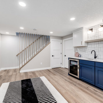
We love finishing basements and this one was no exception. Creating a new family friendly space from dark and dingy is always so rewarding.
Tschida Construction facilitated the construction end and we made sure even though it was a small space, we had some big style. The slat stairwell feature males the space feel more open and spacious and the artisan tile in a basketweave pattern elevates the space.
Installing luxury vinyl plank on the floor in a warm brown undertone and light wall color also makes the space feel less basement and more open and airy.
 Houseplay Renovations LLC
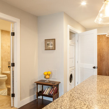
When this family wanted to renovate their 1-bedroom apartment, they called on Houseplay to help. Together, we created a cozy, modern layout that both facilitates relationships and increases the value of their home.
Specifically, the new layout features a larger bathroom, a new standing shower, an open plan kitchen with an island, and a laundry closet too. Our team installed new bamboo flooring, new doors and mouldings, and new recessed and feature lighting throughout the space; we also painted the entire apartment.
It’s amazing what a difference the layout of a space can make. If you’re struggling with a sub-par layout in your home or apartment, don’t wait; contact Houseplay for a consultation today!
Photo Credit: Anne Ruthmann Photography
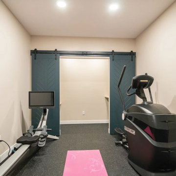 Pinnacle Design & Remodeling
A blank slate and open minds are a perfect recipe for creative design ideas. The homeowner's brother is a custom cabinet maker who brought our ideas to life and then Landmark Remodeling installed them and facilitated the rest of our vision. We had a lot of wants and wishes, and were to successfully do them all, including a gym, fireplace, hidden kid's room, hobby closet, and designer touches.
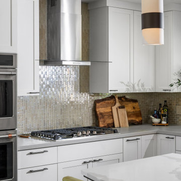
 Fiorito Interior Design
This gorgeous, nature-inspired Great Room—comprised of the kitchen, dining area, and sitting room—was reimagined for some wonderful repeat clients, beginning with a small, treasured piece of art.
Their large 1950s ranch house nestled into a gentle hill surrounded by orchards of fragrant orange, lemon, and cherry trees initially featured a too-small kitchen adjacent to a warren of small spaces with low ceilings serving as a dining and sitting area. They dreamed of a more spacious, light-filled layout.
A complete redesign of the home not only resolved spatial constraints but also embraced the beauty of the home’s natural surroundings. By removing walls and creating an open-plan layout, we enhanced the flow and connectivity between the kitchen, dining, and sitting areas, seamlessly integrating the outdoors with the indoors.
The relocated kitchen now faces the backyard, to facilitate outdoor entertaining and features a large island, serving as a welcoming focal point for both cooking and socializing. I designed a distinctive ceiling feature above the island, crafted from planks of the adjacent vaulted ceiling, mirroring the shape of the island below. This feature adds architectural interest and visually connects the flat kitchen plane with the vaulted plank ceiling of the sitting area, creating a harmonious sense of continuity and warmth.
A beautiful, prized painting of a bird on a branch created the direction for the color and texture palette. An intriguing yellow-green-tan background in the art guided my choices for the backsplash tile (an iridescent version mimics light glinting on water) and countertops. The kitchen's soothing color palette features various shades of natural green, while the dining area introduces feather-blue tones through chair upholstery and rug. Just steps away, the inviting sitting area features a rebuilt fireplace clad in cut, polished Haisa marble tiles in a vertical pattern. The soft, generous seating creates a comfortable spot for movie nights or cozying up by the fire on a cold winter evening. The elegant, simple silhouettes of the furniture enhance the serene and calming atmosphere of the space.
After photos: Bernardo Grijalva and Fiorito Interior Design
Cabinetry: custom by Schmitz Woodwork
Countertops: Primordia and Calcatta Maximus by Caesarstone
Backsplash: Elements in Miami Sand Pearl by Lunada Bay
Island pendants: Simple Sanders by Shades of Light
Stools: Essex by Lazar in Brisa fabric by Ultrafabrics
Dining table: Emerson Wave by Saloom
Dining chairs: Essex by Lazar
Dining lighting: Triad chandelier by Kichler
Dining rug: Soho Smoke by Jaunty Inc.
Sitting area sofa and ottoman: Corvo by Lazar
Sitting area swivel chair: Noah by Lazar
Sitting area rug: Soho Stone by Jaunty Inc.
Motorized shades: Hunter Douglas
Entry console: Reed by Uttermost
Entry light: Re by Visual Comfort
Fireplace: Haisa cut and polished marble by Icontile
Wall paint: Mascarpone by Benjamin Moore
 TKS Design Group
Download our free ebook, Creating the Ideal Kitchen. DOWNLOAD NOW
As with most projects, it all started with the kitchen layout. The home owners came to us wanting to upgrade their kitchen and overall aesthetic in their suburban home, with a combination of fresh paint, updated finishes, and improved flow for more ease when doing everyday activities.
A monochromatic, earth-toned palette left the kitchen feeling uninspired. It lacked the brightness they wanted from their space. An eat-in table underutilized the available square footage. The butler’s pantry was out of the way and hard to access, and the dining room felt detached from the kitchen.
Lead Designer, Stephanie Cole, saw an improved layout for the spaces that were no longer working for this family. By eliminating an existing wall between the kitchen and dining room, and relocating the bar area to the dining room, we opened up the kitchen, providing all the space we needed to create a dreamy and functional layout. A new perimeter configuration promoted circulation while also making space for a large and functional island loaded with seating – a must for any family. Because an island that isn’t big enough for everyone (and a few more) is a recipe for disaster. The light white cabinetry is fresh and contrasts with the deeper tones in the wood flooring, creating a modern aesthetic that is elevated, yet approachable for everyday living.
With better flow as the overarching goal, we made some structural changes too. To remove a bottleneck in the entryway, we angled one of the dining room walls to create more natural separation between rooms and facilitate ease of movement throughout the large space.
At The Kitchen Studio, we believe a well-designed kitchen uses every square inch to the fullest. By starting from scratch, it was possible to rethink the entire kitchen layout and design the space according to how it is used, because the kitchen shouldn’t make it harder to feed the family. A new location for the existing range, flanked by a new column refrigerator and freezer on each side, worked to anchor the space. The very large and very spacious island (a dream island if we do say so ourselves) now houses the primary sink and provides ample space for food prep and family gathering.
The new kitchen table and coordinating banquette seating provide a cozy nook for quick breakfasts before school or work, and evening homework sessions. Elegant gold details catch the natural light, elevating the aesthetic.
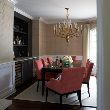
The dining room was transformed into one of this client’s favorite spaces and we couldn’t agree more. We saw an opportunity to give the dining room a more distinguished identity by closing off the entrance from the foyer. The relocated wet bar enhances the sophisticated vibe of this gathering space, complete with beautiful antique mirror tiles and open shelving encased by moody built-in cabinets.
Updated furnishings add warmth. A rich walnut table is paired with custom chairs in a muted coral fabric. The large, transitional chandelier grounds the room, pairing beautifully with the gold finishes prevalent in the faucet and cabinet hardware. Linen-inspired wallpaper and cream-toned window treatments add to the glamorous feel of this entertainment space.
There is no way around it. The laundry room was cramped. The large washer and dryer blocked access to the sink and left little room for the space to serve its other essential function – as a mudroom. Because we reworked the kitchen layout to create more space overall, we could rethink the mudroom too – an essential for any busy family. The first step was moving the washer and dryer to an existing area on the second floor, where most of the family’s laundry lives (no one wants to carry laundry up and down the stairs if they don’t have to anyway). This is a more functional solution and opened up the space for all the mudroom necessities – including the existing kitchen refrigerator, loads of built-in cubbies, and a bench.
It’s hard to not fall in love with every detail of a new space, especially when it serves your day-to-day life. But that doesn’t mean the clients didn’t have their favorite features they use on the daily. This remodel was focused largely on function with a new kitchen layout. And it’s the functional features that have the biggest impact. The large island provides much needed workspace in the kitchen and is a spot where everyone gathers together – it grounds the space and the family. And the custom counter stools are the icing on the cake. The nearby mudroom has everything their previous space was lacking – ample storage, space for everyone’s essentials, and the beloved cement floor tiles that are both durable and artistic.
 Acorn Deck House Company
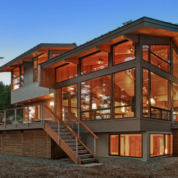
Headland is a NextHouse, situated to take advantage of the site’s panoramic ocean views while still providing privacy from the neighboring property. The home’s solar orientation provides passive solar heat gains in the winter while the home’s deep overhangs provide shade for the large glass windows in the summer. The mono-pitch roof was strategically designed to slope up towards the ocean to maximize daylight and the views.
The exposed post and beam construction allows for clear, open spaces throughout the home, but also embraces a connection with the land to invite the outside in. The aluminum clad windows, fiber cement siding and cedar trim facilitate lower maintenance without compromising the home’s quality or aesthetic.
The homeowners wanted to create a space that welcomed guests for frequent family gatherings. Acorn Deck House Company obliged by designing the home with a focus on indoor and outdoor entertaining spaces with a large, open great room and kitchen, expansive decks and a flexible layout to accommodate visitors. There is also a private master suite and roof deck, which showcases the views while maintaining privacy.
 AIBD - American Institute of Building Design
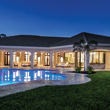
To facilitate the builder's desire to create a successful model home in this large site development with expansive natural preserves, this design creates a sense of presence far greater than its actual size. This was accomplished by a wide yet shallow layout that allows most rooms to look out to rear of home and preserve views beyond. Designed with a West Indies flavor, this thoroughly modern home's layout flows seamlessly from space to space. Each room is bright with lots of natural light, creating a home that takes fullest potential of this unique site.
An ARDA for Model Home Design goes to
The Stater Group, Inc.
Designer: The Sater Group, Inc.
From: Bonita Springs, Florida

 DesignTeam Plus LLC
The Jason Alba Playpark is designed as an extension of the client's mission statement: To unite the mind, body, and spirit. Students work in specially designed areas (zones) alongside therapists to support individual needs with sensory-seeking and avoiding tendencies.
• Acoustic –Embracing rhythm during vibration and sound therapy can lead to dance: a physical embodiment of emotions created by sound.
• Tactile - Sensory exposure is expressed through different textures, colors, and surface temperatures of materials. A tactile wall and pathway allow students to encounter varying surface conditions, strengthening their ability to react to changing conditions encountered every day.
• Active – Promoting healthy minds through activity: the active zone encourages the use of adaptive and accessible equipment, social engagement through physical activity, and inspires confidence through play.
• Color - Each color evokes different feelings that can calm, soothe, invigorate, and excite.
• Nature - A calming space with a greenhouse and sensory gardens establishes a welcoming environment for therapy sessions. Aromatherapy in the gardens stimulate one’s senses engaging in all aspects of therapy through the selection of safe plant materials.
• Water –Features such as harvesting, cleaning, and reusing rainwater teach sustainability and permeable surfaces facilitate save play.
 Rodwin Architecture & Skycastle Construction
Rodwin Architecture and Skycastle Homes
Location: Boulder, CO, United States
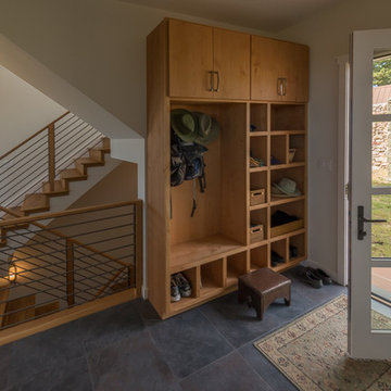
We recently completed the design and construction of this beautiful 3800 s.f. contemporary Colorado mountain home,above the foothills of Boulder. We designed the house to maximize the sweeping views of Indian Peaks mountain range, while simultaneously optimizing passive solar design. The open floor plan brings natural light and passive cooling into every part of the house; the vaulted ceilings create an airy, sunny feeling. Every room opens to generous patios and decks to facilitate easy indoor/outdoor living. White Oak floors, granite counters and local flagstone finishes lend a warm modern texture to the home. We carefully preserved one hand-built quartz wall that was part of the house that formerly occupied the site, and restored the original adjacent homestead, successfully receiving Historic Landmark designation. This very energy efficient home (HERS 40 – uses 60% less energy than allowed by code), uses solar–photovoltaics, foam insulation, Energy Star windows & appliances, LED lighting, and a high-efficiency mechanical system. It uses EPA Watersense plumbing fixtures and Xeric landscaping to dramatically reduce water
 Morpurgo Architects
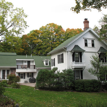
To provide a large gathering space for this modern family and to facilitate the flow of movement throughout their house, Morpurgo Architects designed additions that are contextually compatible with our clients’ landmark Dutch Colonial stone home.
Although we were constrained by the typography of a hill behind the house, we succeeded in integrating with the original structure a centrally located family room with connections to three levels of activity, including the kitchen, the second-floor bedrooms and the new garage. An exterior balcony on the second floor punctuates the facade overlooking the courtyard, ideally positioned to capture views of the setting sun.
High sloped ceilings follow the profile that distinguishes the Dutch Colonial roof lines. The creation of a two-story space allowed us to design large windows over pairs of doors that frame vistas of the tree line and highlight the impressive hill.
In granting approval to this notable home, the Borough’s Landmark Commission unanimously endorsed Morpurgo Architects’ sensitive placement and integration of the additions to this historic structure.
 Integrated Home Improvement
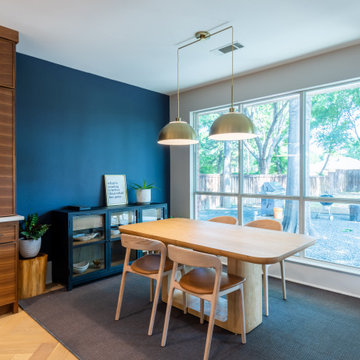
Both the design and construction teams put their heart into making sure we worked with the client to achieve this gorgeous vision. The client was sensitive to both aesthetic and functionality goals, so we set out to improve their old, dated cramped kitchen, with an open concept that facilitates cooking workflow, and dazzles the eye with its mid century modern design. One of their biggest items was their need for increased storage space. We certainly achieved that with ample cabinet space and doubling their pantry space.
The 13 foot waterfall island is the centerpiece, which is heavily utilized for cooking, eating, playing board games and hanging out. The pantry behind the walnut doors used to be the fridge space, and there's an extra pantry now to the left of the current fridge. We moved the sink from the counter to the island, which really helped workflow (we created triangle between cooktop, sink and fridge/pantry 2). To make the cabinets flow linearly at the top we moved and replaced the window. The beige paint is called alpaca from Sherwin Williams and the blue is charcoal blue from sw.
Everything was carefully selected, from the horizontal grain on the walnut cabinets, to the subtly veined white quartz from Arizona tile, to the black glass paneled luxury hood from Futuro Futuro. The pendants and chandelier are from West Elm. The flooring is from karastan; a gorgeous engineered, white oak in herringbone pattern. The recessed lights are decorative from Lumens. The pulls are antique brass from plank hardware (in London). We sourced the door handles and cooktop (Empava) from Houzz. The faucet is Rohl and the sink is Bianco.
 Ward+Blake Architects
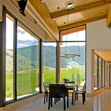
Located on a flat, open, grass-covered site amid wraparound views of the Teton and Gros Ventre ranges, the deliberately unobtrusive Tennican residence facilitates a clear dialogue between enclosed and natural space. Designed by Ward+Blake Architects in Jackson, Wyoming.
Photo Credit: Douglas Khan
 ECOterra Design Build
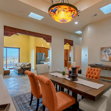
This open floor plan facilitates easy movement from the living area, to the kitchen, to the dining area, yet still feels cozy. Beautiful wood beams, stone floors, skylights, and great views make this a striking place to live and to entertain.
 IQ Glass UK
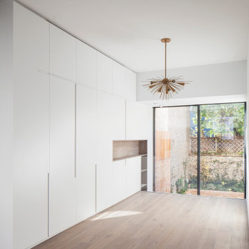
The upper floor mezzanine floor of this double height rear glass extension. You can see the top part of the 6m tall sliding doors than span across two storeys. The drop is protected by a glass balustrade.
52