
Search results for "Familiarize" in Home Design Ideas
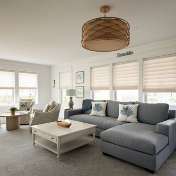
 GMT Home Designs Inc.
This beloved seaside home received a thoughtful, multi-phase expansion designed around one simple goal: more room for family. The project included a new attached 2-car garage with a finished suite above — featuring a kitchenette and in-unit laundry — plus a structural addition to the right side of the home that opened up the kitchen, dining, and living areas. Exterior decks were updated with modern materials, the landscaping was reimagined from the ground up, and the entire interior was remodeled and refreshed. The result is a home that feels both brand new and deeply familiar.

 Drury Design
THE SETUP
Our journey began with a familiar face — Alicia had previously transformed the client’s mother’s home, establishing a trusted relationship that naturally led to this personal project. The client desired a kitchen that truly reflected her own style while facilitating seamless entertaining.
Design Vision:
The original kitchen, segregated from the dining area by a wall, hindered the flow of interaction and space. Our client envisioned a unified area where she could engage with guests in both the kitchen and dining room simultaneously. Moreover, the space lacked a central island, relying instead on a floorplan anchored by cabinetry in a u-shaped layout.
Design Objectives:
Open up the space for an airy design conducive to entertaining large gatherings
Modernize the kitchen to be both stylish and functional
Integrate the design with the home’s new black-framed windows and doors
Relocate the cooktop to a central position to enhance usability and interaction
Design Challenges:
Removing the wall between the kitchen and dining room would necessitate the rerouting of existing HVAC ductwork that services the upper floor
Limited pantry space in the existing kitchen
The existing u-shaped layout of the kitchen restricted functionality and storage options
Insufficient space for wine storage
The client desired a raised-furniture look for the island, but without showing a new downdraft vent
THE RENEWED SPACE
Design Solutions:
We added a second HVAC unit to the upper floor and rerouted the existing ductwork in that wall
Created tall pantry pullouts on either side of the fridge to maximize dry goods storage
Designed a long island to facilitate cooking stations and dining moments
Created a stylish open display cabinet for wine
Engineered a dual-design island with a footed floating aesthetic on one side, and a full floor reach on the other to conceal the new downdraft ventilation.
Paired with the newly opened adjacent dining room featuring a wet bar, the kitchen has become a stylish and highly functional space for cooking and entertaining. Following a large baby shower hosted by the client (which seamlessly accommodated an 80-person gathering!), it is clear that the new design not only meets but exceeds the needs for hosting and everyday living. This project was a harmonious blend of the client’s vision and Alicia’s innovative design solutions, resulting in a kitchen that truly embodies personalized elegance and functionality.
 Solomon Rodgers Photography
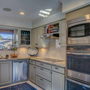
Mid-sized elegant u-shaped ceramic tile eat-in kitchen photo in Austin with an undermount sink, raised-panel cabinets, beige cabinets, granite countertops, white backsplash, subway tile backsplash, stainless steel appliances and no island
Find the right local pro for your project
 GMT Home Designs Inc.
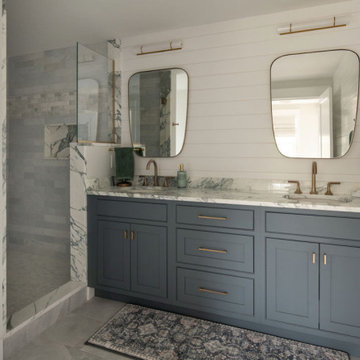
This beloved seaside home received a thoughtful, multi-phase expansion designed around one simple goal: more room for family. The project included a new attached 2-car garage with a finished suite above — featuring a kitchenette and in-unit laundry — plus a structural addition to the right side of the home that opened up the kitchen, dining, and living areas. Exterior decks were updated with modern materials, the landscaping was reimagined from the ground up, and the entire interior was remodeled and refreshed. The result is a home that feels both brand new and deeply familiar.
 Woodsmith Construction Inc
Transforming this long-standing home on Bradgate Rd required more than a simple update—it called for a careful balance between renewal, structure, and respect for what was already there.
The existing brick bungalow had strong bones, but the exterior was deteriorating, the carport was underutilized, and key interior spaces no longer supported the homeowners’ needs. Having lived in the home for decades, the goal wasn’t to start over—it was to rework the home into a more functional, comfortable space that could support the years ahead.
The scope included a full exterior masonry refresh, where the front layer of brick was removed and replaced while maintaining the integrity of the original structure. The carport was fully enclosed and integrated into the home as a garage, and a new roof tied everything together with consistent detailing and long-term performance in mind.
Inside, the layout was carefully reworked to introduce a new primary ensuite and completely renovate the main bathroom. Plumbing, mechanical, and electrical systems were updated throughout, with a focus on accessibility, ease of use, and everyday comfort.
The result is a home that feels both familiar and elevated—where thoughtful construction and refined design come together to support long-term living without compromising character.
 DesignARC
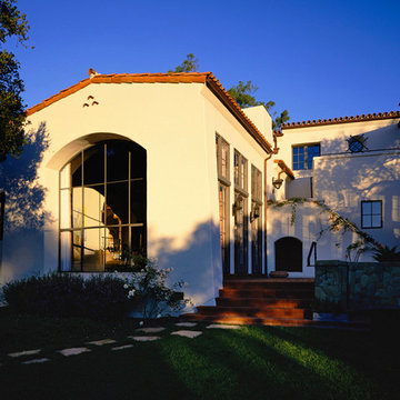
This Spanish Revival takes its place among the graceful and genteel tradition of Santa Barbara architecture. Located in a secreted area of Montecito, the house is tucked amidst a wooded glen along a riparian creek bed. Carefully sited at the top of a rolling green, the building provides a strong form in the natural landscape.
With its reference to historical precedent, the house is both undeniably familiar and tangibly rich. Site sensitivity and pure spatial relationships combine in new ways, showing that what’s old can be new again.
An entry courtyard concealed behind a pair of wooden doors of Moorish design begins the entry sequence. The courtyard, wrapped around an existing mature oak tree, creates an outdoor room, which establishes an interplay between interior and exterior spaces, a theme that recurs throughout the house.
An exercise in scale and proportion, the 5,000-square-foot residence is imbued with classic detail and richness found in the Spanish Colonial architecture characteristic of George Washington Smith and others. Interior spaces are created through pure and varied geometric volumes, and are elaborated by opened beamed ceilings, groin vaults and Moorish arches.
 Lewis & Associates Designs, llc
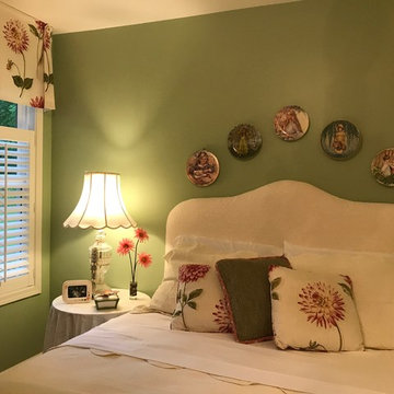
Using the things that were familiar to the homeowner was important to her, so we made the window valances from the valances that had once hung in her family room and paired them with lots of creamy white, pops of pink, and the plates that had once hung around her house. We kept the reamining palette light and bright and packed a lot of pizzaz in a small space.
 LiLu Interiors
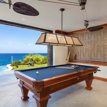
Chris and Marna believe in Ohana Mau Loa which means “family forever.” As return clients, they knew LiLu could help them build a vacation home in Hawaii that would provide a desirable and comfortable gathering place for four adult children and their spouses and 11 grandchildren. A central common space at the heart of the home with separate living quarters surrounding it helps to accommodate everyone with both shared and personal living spaces. Each has its own personality that showcases playful references to Big Island life. And yet the overall design concept weaves together a love of world travel with traditional tastes. Built with mahogany wood that is a staple of island construction, treasured heirlooms and other personal keepsakes are the perfect complement to make this dream home feel welcoming and familiar. Fabrics, finishes and furnishings were selected with the sea in mind and to accommodate wet swim suits, bare feet, and sandy shoes.
-----
Project designed by Minneapolis interior design studio LiLu Interiors. They serve the Minneapolis-St. Paul area including Wayzata, Edina, and Rochester, and they travel to the far-flung destinations that their upscale clientele own second homes in.
----
For more about LiLu Interiors, click here: https://www.liluinteriors.com/
-----
To learn more about this project, click here:
https://www.liluinteriors.com/blog/portfolio-items/ohana-mau-loa/
 Terrain Labs
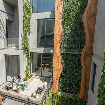
The design philosophy for this project rests on the belief that memory is an essential part of landscape experience. Instead of recreating the Rain tree in a literal form, the design interprets the sensations it once offered. The shifting light, the sound of leaves, the comfort of shade and the smell of earth.
These elements form a quiet yet powerful form of heritage that often goes unrecognised in redevelopment. By carrying these sensations into the new landscape, the project creates continuity within change. It shows how design can hold onto the emotional identity of a place and offer familiarity to residents returning to a transformed site.
This approach suggests a way of thinking about urban growth where memory and development do not stand in opposition but work together.
 Avenue Design
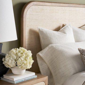
With its seamless layering of visually intriguing elements, the Reveal collection encourages the eye to linger just a bit longer and the hand to reach out and touch. Fresh yet familiar, these inspired designs are innately beautiful and grounded in a palette of raw materials curated with expert sophistication. Smooth wood planes finished in soft, dry finishes merge with exquisite woven textures for true dimensional appeal. Shapely silhouettes and relaxed modern forms are crafted from Ash solids and veneers while the expressive character of raffia elevates drawer faces and creates surface interest with tactile appeal. This whole-hearted embrace of natural elements weaves effortless elegance with modern organic design character.
 Ambient
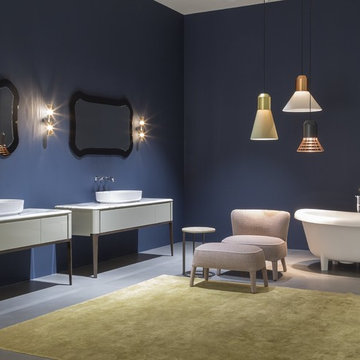
Design: Roberto Lazzeroni.
A highly emotional collection characterized by the material nature of the woods, by the skillful lacquering , retro style of the mirrors and the metal reflections: ILBagno describes an intimate and refined atmosphere with a return to origins, a project that looks to the past to explore the future.
A proposal less rigorous and minimal which allows you to recover the memory of familiar images, the style of a noble past, the suggestions that come from different styles.
Not nostalgic but rather current, a reworking of content obtained through the antoniolupi style almost maniacal attention to detail, the excellence of the workmanship and materials used.
 Ashley Littman Interiors
Sheli Lee-Fierstine
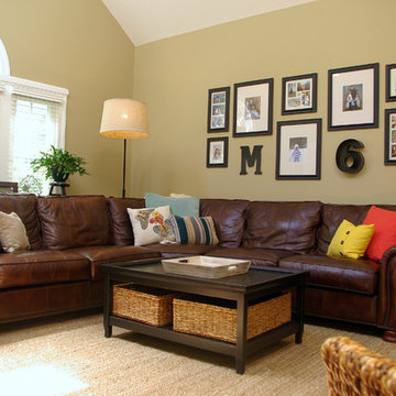
Example of a mid-sized minimalist open concept dark wood floor family room design in DC Metro with beige walls
Example of a mid-sized minimalist open concept dark wood floor family room design in DC Metro with beige walls

 Amy Troute Inspired Interior Design
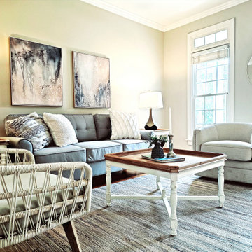
Second homes and vacation homes are such fun projects for us and when Portland residents Leslie and Phil found their dream house on the fairway in central Oregon, they asked us to help them make it feel like home. Updates to carpet and paint refreshed the palette for new furnishings, and the homeowners requested we use their treasured art and accessories to truly create that “homey” feeling. We “shopped” their Portland home for items that would work with the rooms we’d designed throughout the house, and the result was immediately familiar and welcoming. We also collaborated on custom stair railings and new island brackets with local master Downtown Ornamental Iron and redesigned a rustic slab fireplace mantel with a local craftsman. We’ve enjoyed additional projects with Leslie and Phil in their Portland home and returned to Bend to refresh the kitchen with quartz slab countertops, a bold black tile backsplash and new appliances. We aren’t surprised to hear this “vacation home” has become their primary residence much sooner than they’d planned!
 Katie Hutchison Studio
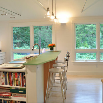
Constructed in two phases, this renovation, with a few small additions, touched nearly every room in this late ‘50’s ranch house. The owners raised their family within the original walls and love the house’s location, which is not far from town and also borders conservation land. But they didn’t love how chopped up the house was and the lack of exposure to natural daylight and views of the lush rear woods. Plus, they were ready to de-clutter for a more stream-lined look. As a result, KHS collaborated with them to create a quiet, clean design to support the lifestyle they aspire to in retirement.
To transform the original ranch house, KHS proposed several significant changes that would make way for a number of related improvements. Proposed changes included the removal of the attached enclosed breezeway (which had included a stair to the basement living space) and the two-car garage it partially wrapped, which had blocked vital eastern daylight from accessing the interior. Together the breezeway and garage had also contributed to a long, flush front façade. In its stead, KHS proposed a new two-car carport, attached storage shed, and exterior basement stair in a new location. The carport is bumped closer to the street to relieve the flush front facade and to allow access behind it to eastern daylight in a relocated rear kitchen. KHS also proposed a new, single, more prominent front entry, closer to the driveway to replace the former secondary entrance into the dark breezeway and a more formal main entrance that had been located much farther down the facade and curiously bordered the bedroom wing.
Inside, low ceilings and soffits in the primary family common areas were removed to create a cathedral ceiling (with rod ties) over a reconfigured semi-open living, dining, and kitchen space. A new gas fireplace serving the relocated dining area -- defined by a new built-in banquette in a new bay window -- was designed to back up on the existing wood-burning fireplace that continues to serve the living area. A shared full bath, serving two guest bedrooms on the main level, was reconfigured, and additional square footage was captured for a reconfigured master bathroom off the existing master bedroom. A new whole-house color palette, including new finishes and new cabinetry, complete the transformation. Today, the owners enjoy a fresh and airy re-imagining of their familiar ranch house.
Photos by Katie Hutchison
 DesignARC
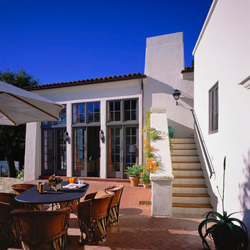
This Spanish Revival takes its place among the graceful and genteel tradition of Santa Barbara architecture. Located in a secreted area of Montecito, the house is tucked amidst a wooded glen along a riparian creek bed. Carefully sited at the top of a rolling green, the building provides a strong form in the natural landscape.
With its reference to historical precedent, the house is both undeniably familiar and tangibly rich. Site sensitivity and pure spatial relationships combine in new ways, showing that what’s old can be new again.
An entry courtyard concealed behind a pair of wooden doors of Moorish design begins the entry sequence. The courtyard, wrapped around an existing mature oak tree, creates an outdoor room, which establishes an interplay between interior and exterior spaces, a theme that recurs throughout the house.
An exercise in scale and proportion, the 5,000-square-foot residence is imbued with classic detail and richness found in the Spanish Colonial architecture characteristic of George Washington Smith and others. Interior spaces are created through pure and varied geometric volumes, and are elaborated by opened beamed ceilings, groin vaults and Moorish arches.
 User
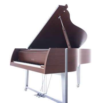
UserSauter Model Vivace Walnut
Vivace’s airy presence and unimposing architecture is ideal for urban piano lovers who value the luxury of less is more while enjoying the supreme quality of an established and reputable European piano builder.
With Vivace Sauter gives the world a new, post-modernist grand piano that embodies the simplicity and functionality of the genius-bar age. The steel legs are now adjoined with the panel up front that houses the pedal lyra while all we see is air, punctuated by the metal rods that administer pedal functions. Much like the open-heart mechanism of the most coveted luxury watches this modern piano revels in exposure of it’s core functions.
The traditional curves give way to truncated verticalities of the side keyboard panels lending the entire piano’s body a singular, enclosed appearance.
The combination of the industrial steel and warmth of the matte wood veneer create a contemporary ensemble perfectly suited for an ultra modern interior design where hi-tech functionality meet natural elements in a pure and elemental harmony.
The stainless-steel squares are imbedded in the wood outlining the familiar curvature of the piano shape while the lid nests inside of the piano’s body. This small revision of the traditional lip overlap lends this Sauter piano its clean simplicity of form.
 Ekocite Architecture
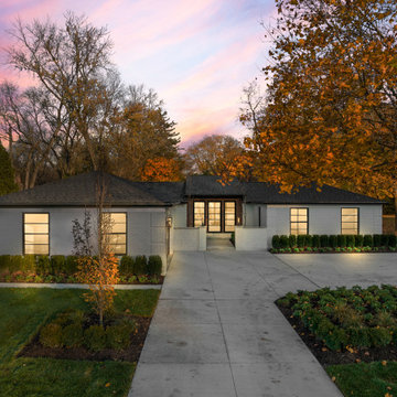
1960s white one-story brick house exterior idea in Detroit with a hip roof and a black roof
 Revive Kitchen and Bath
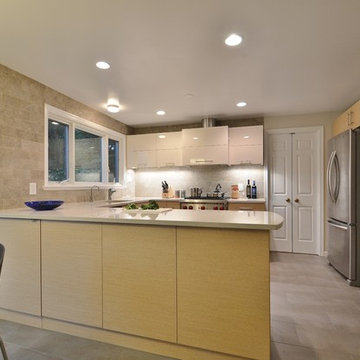
Engineered Veneer (EV) is composed of strips of wood veneer aligned on a board to create doors or drawer fronts. It has a unique textured appearance. By mixing differently stained strips EV can simulate exotic veneers or offer a new take on familiar ones. Here we are simulating white oak on the base/tall cabinets. We used foil wall cabinets. Photo/Design by Will Gowdy for Sunday Kitchen & Bath Rockville, MD 240 314-7011
 MacCracken Robinson Architects
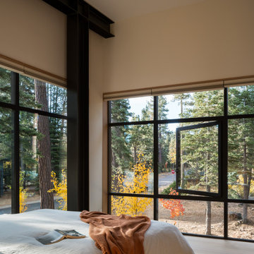
Our introduction to the Tahoe site was in late winter, on a clear sunny day with filtered light and long shadows through snow-laden fir and pine bows. It made a strong impression, stored for future consideration but the impetus for the design came soon after the spring snow melt. A powerful sense of horizontal layering of vegetation and various stages of decomposing downed timber on the two-acre site, juxtaposed with pine and fir trees and the dense canopy of the surrounding forest. The site is located near the historic 1960 Olympic Nordic track, situated on the edge of wetlands and seasonal streams.
The homeowners were previous clients and dreamt of having a retreat in the Sierras away from their home base in Berkeley, CA. Among skiers, bike riders, hikers, and boaters, they found the ideal central location for their home base near Lake Tahoe.
The home is organized as a series of linked spaces, each providing a unique sensory experience and connection to different parts of the site, both vertically and horizontally. The design includes extensive use of glass to create a true indoor/outdoor connection and maximize natural light. At the center of the site are two large fir trees, which the building respectfully wraps around in an L shape to create a focal point in the landscaped courtyard.
A refined, context-driven palette of natural materials including cedar, oak, fir, and steel is used to harmoniously blend in among the surroundings. The construction includes advanced details such as thermally broken steel beams supporting layered roof planes engineered to hold snow rather than shed it. Designed to resist significant load, we exposed the steel structure as a recurring element in the interior spaces. The resulting columns and support beams contribute to the familiar design aspects of each room and provide a better understanding of how the building was constructed. The second floor features cantilevered volumes that reach out into the nearby evergreen limbs, likening the experience to being in a tree house. The house incorporates features such as radiant heating, solar panels, and operable windows for passive cooling. Fire safety measures include the use of naturally fire-resistant materials, a Class A roof construction, sprinklers, and drought-tolerant landscaping beyond the defensible space.
59