
Search results for "Favored playing" in Home Design Ideas
 Amy Pearson Design
As a phase two for this home, APD was brought back to address the bathrooms and bedrooms of our Northwest Hills Mid Century project. While the hall bathroom was simple in scope - pull out what was old and replace with all new - the finished product is anything but simple. A walnut floating vanity takes center stage and grounds the space for all remaining selections. The enlarged penny tile in natural black basalt is a fresh and modern take on a very classic material while providing a functional foundation to the room. Modernity is continued in the updated scale in the herringbone marble shower tile, the warmth of which reflects back to the walnut vanity. With these elements, alongside the rich and warm brass finish on the plumbing, lighting, and cabinet hardware, the hall bathroom now shines as a welcoming room for guests!
The primary bedroom and bathroom are the showstoppers of this phase! Unused and awkwardly located closets in both the bedroom and bathroom were removed to make way for additional square-footage in the bath and replaced with a sizable and functional reach-in closet in the bedroom. A dated and cramped shower stall was removed in favor for an expansive step in shower spanning the width of the bathroom and a new transom window washes the room in natural light. While the previous bathroom was only able to accommodate a single vanity, the new layout allowed us to create double matching vanities mirrored across from each other - a much appreciated addition for a primary bath. Floating walnut vanities boast impressive storage and are capped with tower cabinets with hidden outlets for charging and storing electronic bathroom tools. While the color palette is restrained - black, white, gray, and brown - the result is a timelessly modern and masculine space that is at once striking and warm. Modern geometric patterns play with each other throughout the material selections.
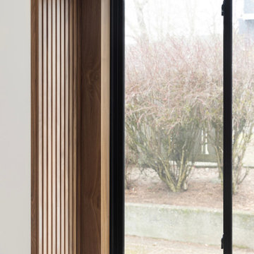
Since we believe firmly in cohesive design, we encourage you to find elements from Phase 1 that are reimagined in Phase 2 (hint, there are a lot!), including the walnut slat detail used to accentuate garden windows in the guest bedrooms!
 Amy Pearson Design
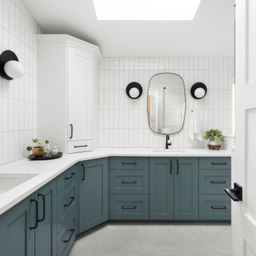
This project took APD to the Oregon Coast for the remodel of two beach house bathrooms! The primary suite was gutted - removing an unused jetted tub in favor of an expansive corner vanity. The shower was opened up by removing an awkwardly located tall cabinet and by swapping a full height wall in favor for a pony wall with glass above. The bathroom is bathed in natural light via the skylight and frosted casement window. A luxurious shower experience was created with ceiling mount rain shower head, wall mount fixed shower head, hand shower on slider bar, and a modern waterfall slab shower bench with integrated niche. A subtle coastal vibe was created with the blue, white, and sandy gray color palette while artistic light fixtures fixtures, clean lined matte black plumbing, and straight stacked tile infuse modernity. In the hall bathroom, a cohesive design was created with added playfulness from the patterned floor tile!
 Amy Pearson Design
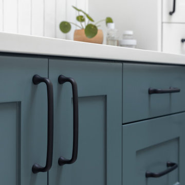
This project took APD to the Oregon Coast for the remodel of two beach house bathrooms! The primary suite was gutted - removing an unused jetted tub in favor of an expansive corner vanity. The shower was opened up by removing an awkwardly located tall cabinet and by swapping a full height wall in favor for a pony wall with glass above. The bathroom is bathed in natural light via the skylight and frosted casement window. A luxurious shower experience was created with ceiling mount rain shower head, wall mount fixed shower head, hand shower on slider bar, and a modern waterfall slab shower bench with integrated niche. A subtle coastal vibe was created with the blue, white, and sandy gray color palette while artistic light fixtures fixtures, clean lined matte black plumbing, and straight stacked tile infuse modernity. In the hall bathroom, a cohesive design was created with added playfulness from the patterned floor tile!
Find the right local pro for your project
 Amy Pearson Design
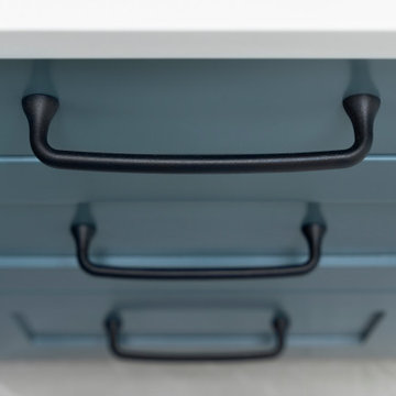
This project took APD to the Oregon Coast for the remodel of two beach house bathrooms! The primary suite was gutted - removing an unused jetted tub in favor of an expansive corner vanity. The shower was opened up by removing an awkwardly located tall cabinet and by swapping a full height wall in favor for a pony wall with glass above. The bathroom is bathed in natural light via the skylight and frosted casement window. A luxurious shower experience was created with ceiling mount rain shower head, wall mount fixed shower head, hand shower on slider bar, and a modern waterfall slab shower bench with integrated niche. A subtle coastal vibe was created with the blue, white, and sandy gray color palette while artistic light fixtures fixtures, clean lined matte black plumbing, and straight stacked tile infuse modernity. In the hall bathroom, a cohesive design was created with added playfulness from the patterned floor tile!
 Fiorito Interior Design
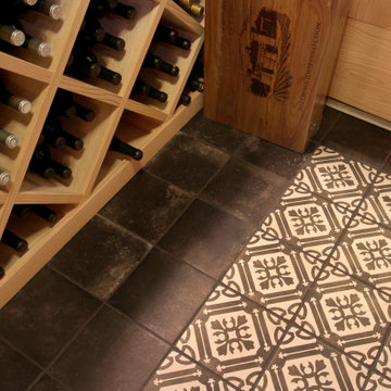
Like many projects, this one started with a simple wish from a client: turn an unused butler’s pantry between the dining room and kitchen into a fully functioning, climate-controlled wine room for his extensive collection of valuable vintages. But like many projects, the wine room is connected to the dining room which is connected to the sitting room which is connected to the entry. When you touch one room, it only makes sense to reinvigorate them all. We overhauled the entire ground floor of this lovely home.
For the wine room, I worked with Vintage Cellars in Southern California to create custom wine storage embedded with LED lighting to spotlight very special bottles. The walls are in a burgundy tone and the floors are porcelain tiles that look as if they came from an old wine cave in Tuscany. A bubble light chandelier alludes to sparkling varietals.
But as mentioned, the rest of the house came along for the ride. Since we were adding a climate-controlled wine room, the brief was to turn the rest of the house into a space that would rival any hot-spot winery in Napa.
After choosing new flooring and a new hue for the walls, the entry became a destination in itself with a huge concave metal mirror and custom bench. We knocked out a half wall that awkwardly separated the sitting room from the dining room so that after-dinner drinks could flow to the fireplace surrounded by stainless steel pebbles; and we outfitted the dining room with a new chandelier. We chose all new furniture for all spaces.
The kitchen received the least amount of work but ended up being completely transformed anyhow. At first our plan was to tear everything out, but we soon realized that the cabinetry was in good shape and only needed the dated honey pine color painted over with a cream white. We also played with the idea of changing the counter tops, but once the cabinetry changed color, the granite stood out beautifully. The final change was the removal of a pot rack over the island in favor of design-forward iron pendants.
Photo by: Genia Barnes
 Amy Pearson Design
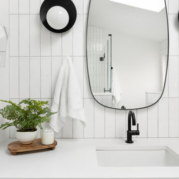
This project took APD to the Oregon Coast for the remodel of two beach house bathrooms! The primary suite was gutted - removing an unused jetted tub in favor of an expansive corner vanity. The shower was opened up by removing an awkwardly located tall cabinet and by swapping a full height wall in favor for a pony wall with glass above. The bathroom is bathed in natural light via the skylight and frosted casement window. A luxurious shower experience was created with ceiling mount rain shower head, wall mount fixed shower head, hand shower on slider bar, and a modern waterfall slab shower bench with integrated niche. A subtle coastal vibe was created with the blue, white, and sandy gray color palette while artistic light fixtures fixtures, clean lined matte black plumbing, and straight stacked tile infuse modernity. In the hall bathroom, a cohesive design was created with added playfulness from the patterned floor tile!
 Amy Pearson Design
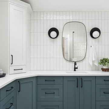
This project took APD to the Oregon Coast for the remodel of two beach house bathrooms! The primary suite was gutted - removing an unused jetted tub in favor of an expansive corner vanity. The shower was opened up by removing an awkwardly located tall cabinet and by swapping a full height wall in favor for a pony wall with glass above. The bathroom is bathed in natural light via the skylight and frosted casement window. A luxurious shower experience was created with ceiling mount rain shower head, wall mount fixed shower head, hand shower on slider bar, and a modern waterfall slab shower bench with integrated niche. A subtle coastal vibe was created with the blue, white, and sandy gray color palette while artistic light fixtures fixtures, clean lined matte black plumbing, and straight stacked tile infuse modernity. In the hall bathroom, a cohesive design was created with added playfulness from the patterned floor tile!

 Orange County Deck Co.
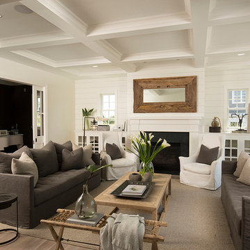
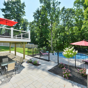
This project was full outdoor living environment, what some would call a “staycation” backyard. A hybrid pool had been installed the previous year but now the living and entertaining spaces needed to be constructed. Consisting of a deck, two patio spaces with walkways connecting all, a couple retaining walls, fencing, landscaping and a new sliding door. The retaining walls were needed to allow for the patio space around to pool. The patio space was divided into two sections, one the wet zone by the pool and the second being the handout zone. This also allowed for a smaller area of fence with a clean transition. The deck constructed using Azek building products provided the style they wanted without having to worry about maintenance. With the elevation being over 8 feet off the ground, the staircase was given careful consideration. It was put on the side that had the grade in its favor to cut down on the size and to not impede on the usable living areas. Traffic flow and usable space should always be considered when designing your space. Now to get a better view of their beautiful backyard we changed their existing single 3 ft. hinged door for a new 6 ft sliding unit. This type of change does involve some structural modification but well worth it. It gave them the sight line they wanted, allows more natural light and has less impact on the living space as the door now slides.
We had a great time constructing this space and love knowing they will be enjoying their home life with family and friends. What could we build in your backyard?

 Flavor Paper
Andy once said, “I never met an animal I didn’t like,” and he certainly favored dogs, owning several in his lifetime. While Warhol rendered his own pups, on canvas and film, it was his portrayal of Yves Saint Laurent’s French Bulldog Moujik we fell in love with and had to interpret in wallpaper. Warhol’s 1986 multi-color screenprint Moujik is engaging, endearing and demonstrates his signature layered off register and outlined technique to achieve a lively, three-dimensional look. For extra personality we included his shadow effect in the colorways Domino and Teddy, sprinkled in some sparkly iridescent ink for Goldie, and utilized a poppin’ silver Mylar background for Bluebelle. And, of course, we worked the pattern into a fun atypical repeat to make the design best in show!
 Crystal Kitchen + Bath
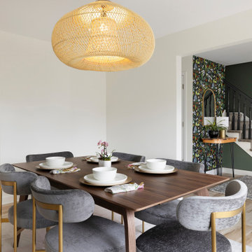
The Plymouth clients faced a dilemma with a non-functioning dishwasher, ovens, and cooktop, an awkward layout, and dated arches straight from the ’80s. Despite the challenges, their love for the school district, neighborhood, and home prevailed.
We undertook a transformative journey, turning their first floor into an entertainer’s haven with a stunning kitchen, a chic dining room, an enchanting powder bath, and a practical mudroom.
Breaking down barriers, we removed the wall between the kitchen and living room, widening entrances to the dining room. Faux beams and a window in the family room were eliminated, and the old Chicago fireplace brick received a sleek black makeover crowned with a live edge mantel. A pop of terracotta paint and floating shelves in the new record player niche set the stage for nostalgic LPs.
Considering the family’s love for baking and grilling, we prioritized ample storage. Pull-out spice racks, a charging drawer, built-in knife block, trash & recycle pull-out, built-in tray dividers, corner storage, large drawers, and roll-out shelves now keep everything organized and easily accessible.
Embracing a Scandifornian design style, favored by the clients, infused the space with color and natural materials. A woven grass light fixture in the dining room, light wood-look luxury vinyl floors, and a vibrant green herringbone tile backsplash all contributed to the refreshing aesthetic. Throughout the home, terracotta and green hues with accents of black added depth and interest, while the redesigned layout now bathes the entire space in natural light.
In addressing practical needs, we removed an exterior door from the mudroom to create a closet and a built-in bench with hooks. The main entry and powder bath now share playful floral wallpaper, complemented by a walnut vanity and gold fixtures in the powder room, offering a sophisticated touch amidst vibrant botanicals.
 Orange County Deck Co.
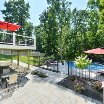
This project was full outdoor living environment, what some would call a “staycation” backyard. A hybrid pool had been installed the previous year but now the living and entertaining spaces needed to be constructed. Consisting of a deck, two patio spaces with walkways connecting all, a couple retaining walls, fencing, landscaping and a new sliding door. The retaining walls were needed to allow for the patio space around to pool. The patio space was divided into two sections, one the wet zone by the pool and the second being the handout zone. This also allowed for a smaller area of fence with a clean transition. The deck constructed using Azek building products provided the style they wanted without having to worry about maintenance. With the elevation being over 8 feet off the ground, the staircase was given careful consideration. It was put on the side that had the grade in its favor to cut down on the size and to not impede on the usable living areas. Traffic flow and usable space should always be considered when designing your space. Now to get a better view of their beautiful backyard we changed their existing single 3 ft. hinged door for a new 6 ft sliding unit. This type of change does involve some structural modification but well worth it. It gave them the sight line they wanted, allows more natural light and has less impact on the living space as the door now slides.
We had a great time constructing this space and love knowing they will be enjoying their home life with family and friends. What could we build in your backyard?
 Amy Pearson Design
This project took APD to the Oregon Coast for the remodel of two beach house bathrooms! The primary suite was gutted - removing an unused jetted tub in favor of an expansive corner vanity. The shower was opened up by removing an awkwardly located tall cabinet and by swapping a full height wall in favor for a pony wall with glass above. The bathroom is bathed in natural light via the skylight and frosted casement window. A luxurious shower experience was created with ceiling mount rain shower head, wall mount fixed shower head, hand shower on slider bar, and a modern waterfall slab shower bench with integrated niche. A subtle coastal vibe was created with the blue, white, and sandy gray color palette while artistic light fixtures fixtures, clean lined matte black plumbing, and straight stacked tile infuse modernity. In the hall bathroom, a cohesive design was created with added playfulness from the patterned floor tile!
 Martin Bros. Contracting, Inc.
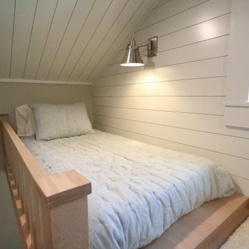
Bunkrooms are favored for their ability to maximize sleeping space, making them ideal for hosting large groups like families or friends. They’re cost-effective, kid-friendly, and foster a fun, communal vibe that complements the relaxed, social atmosphere of a lake house.
This cozy bunkroom comfortably sleeps seven, making it perfect for family gatherings or group getaways. It features two custom-built bunk beds: one stacked unit along the wall and another single bed nestled in a charming alcove. Each bed is equipped with a reading light and built-in storage, combining functionality with a sense of personal space. Warm wood tones, soft linens, and playful accents create an inviting ambiance. The adjoining media room, complete with plush cushions, offers a cozy spot to unwind, making this the ultimate retreat for rest and togetherness.
Design by Nanci Wirt of n.wirt design & gallery ; Architecture by Helman Sechrist Architecture ; Photography by Marie 'Martin' Kinney ; General Contracting by Martin Bros. Contracting, Inc. Images are a property of Martin Bros. Contracting, Inc. and may not be used without written consent.
 Amy Pearson Design
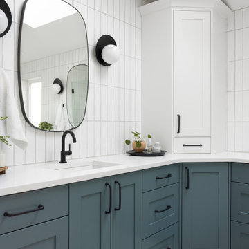
This project took APD to the Oregon Coast for the remodel of two beach house bathrooms! The primary suite was gutted - removing an unused jetted tub in favor of an expansive corner vanity. The shower was opened up by removing an awkwardly located tall cabinet and by swapping a full height wall in favor for a pony wall with glass above. The bathroom is bathed in natural light via the skylight and frosted casement window. A luxurious shower experience was created with ceiling mount rain shower head, wall mount fixed shower head, hand shower on slider bar, and a modern waterfall slab shower bench with integrated niche. A subtle coastal vibe was created with the blue, white, and sandy gray color palette while artistic light fixtures fixtures, clean lined matte black plumbing, and straight stacked tile infuse modernity. In the hall bathroom, a cohesive design was created with added playfulness from the patterned floor tile!
 Fiorito Interior Design
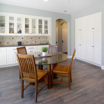
Like many projects, this one started with a simple wish from a client: turn an unused butler’s pantry between the dining room and kitchen into a fully functioning, climate-controlled wine room for his extensive collection of valuable vintages. But like many projects, the wine room is connected to the dining room which is connected to the sitting room which is connected to the entry. When you touch one room, it only makes sense to reinvigorate them all. We overhauled the entire ground floor of this lovely home.
For the wine room, I worked with Vintage Cellars in Southern California to create custom wine storage embedded with LED lighting to spotlight very special bottles. The walls are in a burgundy tone and the floors are porcelain tiles that look as if they came from an old wine cave in Tuscany. A bubble light chandelier alludes to sparkling varietals.
But as mentioned, the rest of the house came along for the ride. Since we were adding a climate-controlled wine room, the brief was to turn the rest of the house into a space that would rival any hot-spot winery in Napa.
After choosing new flooring and a new hue for the walls, the entry became a destination in itself with a huge concave metal mirror and custom bench. We knocked out a half wall that awkwardly separated the sitting room from the dining room so that after-dinner drinks could flow to the fireplace surrounded by stainless steel pebbles; and we outfitted the dining room with a new chandelier. We chose all new furniture for all spaces.
The kitchen received the least amount of work but ended up being completely transformed anyhow. At first our plan was to tear everything out, but we soon realized that the cabinetry was in good shape and only needed the dated honey pine color painted over with a cream white. We also played with the idea of changing the counter tops, but once the cabinetry changed color, the granite stood out beautifully. The final change was the removal of a pot rack over the island in favor of design-forward iron pendants.
Photo by: Genia Barnes
 Orange County Deck Co.
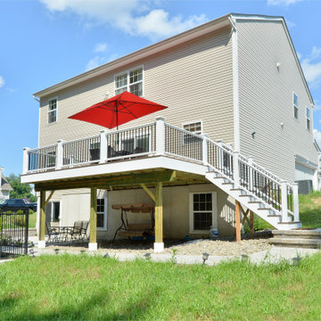
This project was full outdoor living environment, what some would call a “staycation” backyard. A hybrid pool had been installed the previous year but now the living and entertaining spaces needed to be constructed. Consisting of a deck, two patio spaces with walkways connecting all, a couple retaining walls, fencing, landscaping and a new sliding door. The retaining walls were needed to allow for the patio space around to pool. The patio space was divided into two sections, one the wet zone by the pool and the second being the handout zone. This also allowed for a smaller area of fence with a clean transition. The deck constructed using Azek building products provided the style they wanted without having to worry about maintenance. With the elevation being over 8 feet off the ground, the staircase was given careful consideration. It was put on the side that had the grade in its favor to cut down on the size and to not impede on the usable living areas. Traffic flow and usable space should always be considered when designing your space. Now to get a better view of their beautiful backyard we changed their existing single 3 ft. hinged door for a new 6 ft sliding unit. This type of change does involve some structural modification but well worth it. It gave them the sight line they wanted, allows more natural light and has less impact on the living space as the door now slides.
We had a great time constructing this space and love knowing they will be enjoying their home life with family and friends. What could we build in your backyard?

 safe ZOnea
Ask a kitchen designer in Chicago which countertop question comes up most and you will hear the same answer: white or off-white quartz, and which shade. Homeowners walk into showrooms with a photo saved on their phone, usually a bright, veined slab from a magazine spread, and leave an hour later realizing there are a dozen versions of that same look. The confusion is not about taste. It is about the fact that "white quartz" covers a huge range of patterns, undertones, and price points, and nobody explains the differences before the sale.
Older bungalows and newer builds alike are getting stripped of their dated laminate and butcher block in favor of quartz, and the reasons are practical rather than trendy. Quartz does not need sealing, resists the kind of staining that granite can suffer over decades, and holds up to the freeze-thaw humidity swings that Chicago basements and kitchens go through every year. Once a homeowner commits to quartz, though, the real decision starts: which white, and does the pattern justify the difference in cost.
This piece walks through three specific slabs that keep showing up in Chicago renovation projects, why designers reach for them in different rooms, and what actually separates a flat white surface from one with real depth. None of this requires a design background to follow. It is mostly about paying attention to how a slab behaves under kitchen lighting, how busy the vending gets, and how it photographs versus how it looks in person.
Why White Quartz Took Over Chicago Kitchens
Ten years ago, granite dominated Chicago kitchen remodels almost by default. It was durable, it looked expensive, and every fabricator in the metro area carried a wide range of colors. Quartz has since taken over that position, and the shift happened faster than most contractors expected. Engineered stone gave homeowners a more predictable surface, since natural granite varies slab to slab while quartz is manufactured to a consistent pattern batch after batch.
The other driver is light. Chicago winters are long and gray, and a lot of kitchens, especially in older two-flats and courtyard buildings, do not get much direct sun. A dark granite countertop in a dim kitchen can make the whole room feel smaller. White and light-toned quartz reflects what little natural light comes through the windows, and it makes a galley kitchen or a north-facing space feel noticeably brighter without touching the cabinetry or the layout.
There is also a resale argument that local real estate agents bring up constantly. White quartz photographs well for listings, reads as updated and low-maintenance to buyers touring in person, and does not compete visually with whatever cabinet color the next owner might prefer. It is a safer bet than a bold veined marble look or a colored quartz that might feel dated in five years.
Arctic White and the Cost Question
Among the flatter, more uniform whites, arctic white quartz price comes up constantly in budget conversations because the slab sits at a more approachable point than the heavily veined Italian-marble-inspired patterns. It reads as clean and bright without the busy movement that some homeowners find overwhelming in a small kitchen. Fabricators in the Chicago area tend to keep it in stock precisely because demand stays steady across both new construction and remodel projects.
Part of what keeps this slab affordable relative to its heavily patterned cousins comes down to manufacturing complexity. A quartz surface with minimal veining and a consistent white base is simpler to produce at scale than one that mimics the irregular, high-contrast movement of natural Calacatta marble. That production difference shows up directly in what a homeowner pays per square foot, and it is worth asking a fabricator to walk through that pricing before assuming every white quartz costs the same.
Homeowners planning a full kitchen, including an island, backsplash, and perimeter counters, often use a flatter white like this specifically because it lets other elements carry the visual interest. A patterned tile backsplash or a bold cabinet color reads more clearly against a calm countertop than against one already fighting for attention with heavy veining. Designers frequently pair simpler whites with statement lighting fixtures for exactly this reason.
What Makes Calacatta Patterns Different
Calacatta refers to a family of marble originally quarried in Italy, known for a bright white background broken up by bold, often gold-toned veining that moves in thick, dramatic streaks rather than thin gray lines. Natural Calacatta marble is soft, porous, and expensive to maintain, which is exactly why quartz manufacturers spent years developing engineered versions that replicate the look without the upkeep headaches.
The challenge with any Calacatta-style quartz is getting the veining to look organic instead of printed. Early generations of engineered stone struggled with repetitive patterns that gave away the fact the slab was manufactured rather than cut from actual marble. Modern digital printing and layering techniques have closed that gap considerably, and the better Calacatta-inspired quartz lines now vary the veining across each slab batch so two counters in the same kitchen do not look identical.
Chicago designers gravitate toward Calacatta patterns for kitchens that function as the visual centerpiece of an open floor plan, which describes a large share of the gut renovations happening in neighborhoods like Lincoln Park, Roscoe Village, and the North Shore suburbs. When the kitchen island is visible from the living room and dining area, a dramatic veined surface becomes part of the home's overall design language rather than a purely functional work surface.
Calacatta Arno Under Kitchen Lighting
One of the more popular options in this category, calacatta arno quartz, balances a warm white base with soft gray and gold veining that avoids looking too stark under the cooler LED lighting common in newer Chicago builds. Homeowners touring showrooms sometimes make the mistake of judging a slab entirely under warm incandescent lighting, then get surprised when the same surface looks slightly different once installed under their kitchen's actual fixtures.
What separates this particular pattern from flatter competitors is how the veining clusters rather than spreading evenly across the slab. That clustering mimics the way real quarried marble forms, with denser mineral deposits in some sections and cleaner stretches in others. Fabricators cutting a large island slab from a single piece will often orient the pattern intentionally so the busiest veining lands somewhere visually interesting rather than getting cut off at an edge.
Because the background reads warmer than a stark white, this pattern tends to pair well with brass or matte gold hardware, a combination that has been showing up repeatedly in Chicago kitchen remodels over the past few renovation seasons. Cabinet painters report a similar trend, with more clients requesting warm white or greige cabinet colors specifically because they complement this kind of veined quartz better than a cooler, blue-toned white would.
Silestone's Version of the Calacatta Look
Manufacturers compete directly in this Calacatta-inspired category, and silestone eternal calacatta gold represents one brand's specific take on the pattern, distinguished by richer gold veining set against a brighter white base than some competing slabs in the same family. Silestone has built a reputation around anti-bacterial surface treatments in addition to the standard quartz durability, a detail some homeowners specifically ask about for kitchens used heavily by families with young children.
The veining in this particular slab tends to run in longer, more continuous lines compared to the clustered pattern found in some other Calacatta-style options, which gives large island surfaces a sense of visual flow from one end to the other. Fabricators working with bigger islands, the kind increasingly common in open-concept Chicago remodels, often favor patterns like this because there is less need to worry about seams interrupting a busy, disconnected pattern.
Price positioning for this slab tends to sit toward the upper end of the engineered quartz category, reflecting both the brand's manufacturing process and the complexity of replicating that continuous gold veining consistently across production batches. Homeowners weighing this option against other Calacatta-style quartz should ask their fabricator directly about batch availability, since premium patterns sometimes have longer lead times than standard stock colors.
Living With Quartz Day to Day
Beyond how a slab looks in a showroom or a listing photo, the daily experience of owning quartz countertops matters more once the renovation dust settles. Quartz resists scratching far better than laminate and holds up to the acidic spills, hot pans, and general abuse of an active kitchen without the sealing maintenance that natural stone requires every year or two. That low-maintenance reputation is a large part of why quartz overtook granite in the first place.
Heat resistance is a detail that gets less attention than it should. While quartz handles moderate heat well, manufacturers generally recommend using a trivet or pad for very hot pots straight off the stove, since sudden temperature shock can occasionally cause stress marks in the resin binder that holds the engineered stone together. This is a minor precaution rather than a major limitation, but it is worth mentioning to anyone assuming quartz is entirely indestructible.
Cleaning routines stay simple across almost every pattern in this category. A damp cloth and mild soap handle daily messes, and the nonporous surface means wine, coffee, and tomato-based sauces do not soak in the way they can with unsealed granite or marble. Homeowners moving from an older stone counter often mention how much less they worry about everyday spills once quartz is installed, which is a quality-of-life change that rarely makes it into the initial design conversation.
Choosing Between the Three
There is no single correct answer among these three slabs, and that is exactly why they keep coming up together in the same design conversations across Chicago renovation projects. A flatter white with minimal veining suits kitchens where other elements need to carry the visual interest, while a bolder Calacatta-inspired pattern makes sense when the countertop itself is meant to be the centerpiece of an open floor plan.
Budget matters too, and it is worth having a direct conversation with a fabricator about where each option lands before falling in love with a specific slab in a showroom. Lighting, cabinet color, and how the kitchen connects to the rest of the home all play into which pattern will actually look right once installation is finished rather than just in a photo.
Whatever direction a homeowner leans, seeing a full slab in person under actual kitchen lighting remains the single most useful step before signing off. Photos only go so far once the countertop is sitting in the room it will live in for years.
 RENESA ARCHITECTURE DESIGN INTERIORS
The PentHaus, Gurgaon.
(High-End Luxury Interiors- Residential Category)
2013-14
Built Up Area-
12,000 sq feet approx
Design Team:
RENESA ARCHITECTURE DESIGN INTERIORS,New Delhi
• Sanjay Arora - Founder| Principal Architect
• Sanchit Arora - Studio Head Architect
• Vandana Arora - Interior Designer| Decor Head
• Virender Singh- Studio Technical Head| Architectural Assistant
Photographer-
• Vibhor Yadav - RENESA's Official Photographer.
Social Media Connect:-
RENESA ARCHITECTURE DESIGN INTERIORS STUDIO, New Delhi
www.renesa.in
Contact: +91-9953542461
Tel : 011 455 11 211
Tel : 011 457 00 411
Email: renesa91@gmail.com | sanchit.renesa@gmail.com
Facebook: https://www.facebook.com/renesa.architecture
Instagram: https://www.instagram.com/renesa.architects/
Consultants | Contractors:
• Site Contractor - Mr. Umesh Mehta (Star Construction)
• Mechanical Consultants - TN Engg & Consultants.
• Electrial Consultants - Electro Consultants
"The PentHaus,Gurgaon" - Design Profile.
The Conceptual Design Development-
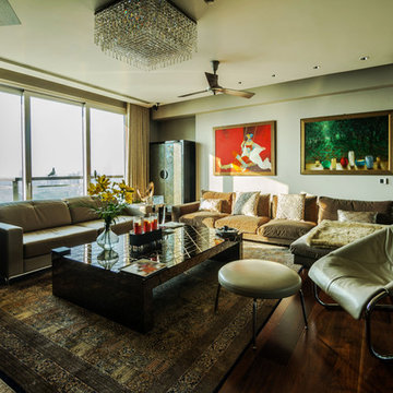
RENESA ARCHITECTURE DESIGN INTERIORS have recently completed an interiors project for a penthouse(The PentHaus) in Gurgaon.
The basic design requirement as per the client was to divide the floor plates in the penthouse on the basis of public and private relationship.(With the public interaction and services on the lower level with the private interface on the upper level).
The design philosophy as dictated and understood was on the lines of contrast in colors with the play of art and decorative pieces highlighting the depth in the detailing of the accessorization of the whole scale model.
The client's interest in art and design pieces worked in favor for RENESA DESIGN STUDIO as it was a value-addition to the whole interior decor design process.
Credits need to be given to the client for the right selection of art pieces in terms of the color pallet blending into the design philosophy set by RENESA STUDIO.
A mix of contemporary modern with classical essence here and there provides a smooth transition of amalgamation of different design philosophies in a given space model.
The play of solid volumes with double height spaces gives the apartment a very expansive and grand look at the entrance.
Thus a line of communication is created between the public and private zones via the massive chandelier mass structure in the middle of the entrance foyer.
RENESA ARCHITECTURE STUDIO carefully studied and analyzed the given area and the clients requirement for the look and feel for the space (internal decor) and planned the space accordingly. The positioning and placement of art pieces, furniture and furnishings once decided by RENESA was left to the client to decide and they did proper justification to the space with some amazing decor choice to value add to the existing space design by the architects. It is also great to have clients with good design taste as it is always a value addition to the architect's vision.
Each and every space has been demarcated with its own essence of design so that they stand out and give a new experience to the visitor while passing through.
Also, the toilets have been carefully crafted according to the ambience of the space. Different specialized Italian stones for each different toilets gives a new experience for the viewers.
Perhaps the contrasting color pallets of the activity zones change so massively that the eye catching experiential pathway is induced at the lower level of the apartment.
The kitchen area has been expansively designed to give a very airy feeling to the household activities. Huge windows with amazing views provide a perfect setup for a good-to-cook ambiance at any time of the day.
The deck area for the Penthouse has been carefully crafted in terms of keeping the pallet on the green side with a tinge of hardscaping with the lit backdrop of the penthouse adding character to this external space.
Hence, all in all the character of a bling-y yet subtle design space is created at this apartment with more importance given to the transparency of the space transitions with the careful play of the color shade card in the backdrop.
 Orange County Deck Co.
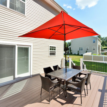
This project was full outdoor living environment, what some would call a “staycation” backyard. A hybrid pool had been installed the previous year but now the living and entertaining spaces needed to be constructed. Consisting of a deck, two patio spaces with walkways connecting all, a couple retaining walls, fencing, landscaping and a new sliding door. The retaining walls were needed to allow for the patio space around to pool. The patio space was divided into two sections, one the wet zone by the pool and the second being the handout zone. This also allowed for a smaller area of fence with a clean transition. The deck constructed using Azek building products provided the style they wanted without having to worry about maintenance. With the elevation being over 8 feet off the ground, the staircase was given careful consideration. It was put on the side that had the grade in its favor to cut down on the size and to not impede on the usable living areas. Traffic flow and usable space should always be considered when designing your space. Now to get a better view of their beautiful backyard we changed their existing single 3 ft. hinged door for a new 6 ft sliding unit. This type of change does involve some structural modification but well worth it. It gave them the sight line they wanted, allows more natural light and has less impact on the living space as the door now slides.
We had a great time constructing this space and love knowing they will be enjoying their home life with family and friends. What could we build in your backyard?
 Orange County Deck Co.
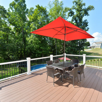
This project was full outdoor living environment, what some would call a “staycation” backyard. A hybrid pool had been installed the previous year but now the living and entertaining spaces needed to be constructed. Consisting of a deck, two patio spaces with walkways connecting all, a couple retaining walls, fencing, landscaping and a new sliding door. The retaining walls were needed to allow for the patio space around to pool. The patio space was divided into two sections, one the wet zone by the pool and the second being the handout zone. This also allowed for a smaller area of fence with a clean transition. The deck constructed using Azek building products provided the style they wanted without having to worry about maintenance. With the elevation being over 8 feet off the ground, the staircase was given careful consideration. It was put on the side that had the grade in its favor to cut down on the size and to not impede on the usable living areas. Traffic flow and usable space should always be considered when designing your space. Now to get a better view of their beautiful backyard we changed their existing single 3 ft. hinged door for a new 6 ft sliding unit. This type of change does involve some structural modification but well worth it. It gave them the sight line they wanted, allows more natural light and has less impact on the living space as the door now slides.
We had a great time constructing this space and love knowing they will be enjoying their home life with family and friends. What could we build in your backyard?
7