
Search results for "Favourable" in Home Design Ideas
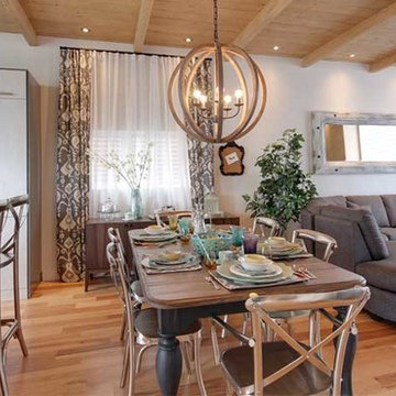
 Lauzon Wood Floors
Beautiful dining room featuring Lauzon's Natural Hickory hardwood flooring from the Émira Series. This flooring features the exclusive air-purifying technology called Pure Genius technology. Project realized for the TV show Ma Maison Rouge Canal Vie with Les Maisons Bonneville.
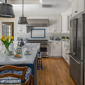
 Fiorito Interior Design
It is sometimes a surprise what beauty can lurk under the surface of a room. A client with a 1970s kitchen and eat-in area cut up by an unwieldy peninsula was desperate for it to reflect her love of all things English-and-French-Manor-Home.
Working closely with my client, we removed the peninsula in favor of a lovely free-standing island that we painted a shade of French Blue. This is topped with Old World sink hardware (note the ceramic HOT and COLD medallions on the faucets!) and a gorgeous marble counter with a very special edge profile that evokes an antique French Boulangerie counter from the 1910s. Pendants with patinaed metal shades over the island further the charming Old World feel. Handmade white and blue tiles laid in a quilted diamond pattern cover the backsplash, and the remainder of the cabinetry at the perimeter is in a warm cream tone.
The eat-in near the fireplace got a cozy treatment with custom seat cushions and window seat bench cushions in a classic blue-and-white Toile de Jouy matching the island stools.
The nearby living room got a similar treatment. We removed dark wood paneling and dark carpeting in favor of a light sky blue wall and lighter wood flooring. A new rug with the appearance of an heirloom, a new grand-scaled sofa, and some of my client’s precious antiques helped take the room from 70s rec room to English Sitting Room.
Photo: Bernardo Grijalva
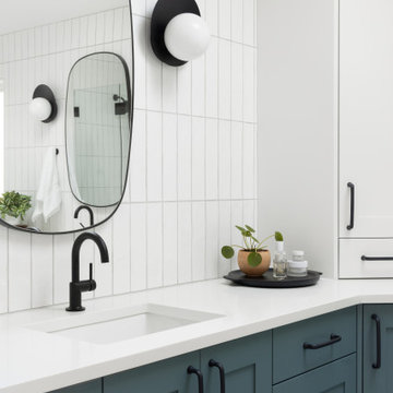
 Amy Pearson Design
This project took APD to the Oregon Coast for the remodel of two beach house bathrooms! The primary suite was gutted - removing an unused jetted tub in favor of an expansive corner vanity. The shower was opened up by removing an awkwardly located tall cabinet and by swapping a full height wall in favor for a pony wall with glass above. The bathroom is bathed in natural light via the skylight and frosted casement window. A luxurious shower experience was created with ceiling mount rain shower head, wall mount fixed shower head, hand shower on slider bar, and a modern waterfall slab shower bench with integrated niche. A subtle coastal vibe was created with the blue, white, and sandy gray color palette while artistic light fixtures fixtures, clean lined matte black plumbing, and straight stacked tile infuse modernity. In the hall bathroom, a cohesive design was created with added playfulness from the patterned floor tile!
Find the right local pro for your project
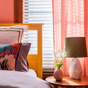

 Amy Pearson Design
This project took APD to the Oregon Coast for the remodel of two beach house bathrooms! The primary suite was gutted - removing an unused jetted tub in favor of an expansive corner vanity. The shower was opened up by removing an awkwardly located tall cabinet and by swapping a full height wall in favor for a pony wall with glass above. The bathroom is bathed in natural light via the skylight and frosted casement window. A luxurious shower experience was created with ceiling mount rain shower head, wall mount fixed shower head, hand shower on slider bar, and a modern waterfall slab shower bench with integrated niche. A subtle coastal vibe was created with the blue, white, and sandy gray color palette while artistic light fixtures fixtures, clean lined matte black plumbing, and straight stacked tile infuse modernity. In the hall bathroom, a cohesive design was created with added playfulness from the patterned floor tile!
 Fiorito Interior Design
It is sometimes a surprise what beauty can lurk under the surface of a room. A client with a 1970s kitchen and eat-in area cut up by an unwieldy peninsula was desperate for it to reflect her love of all things English-and-French-Manor-Home.
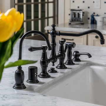
Working closely with my client, we removed the peninsula in favor of a lovely free-standing island that we painted a shade of French Blue. This is topped with Old World sink hardware (note the ceramic HOT and COLD medallions on the faucets!) and a gorgeous marble counter with a very special edge profile that evokes an antique French Boulangerie counter from the 1910s. Pendants with patinaed metal shades over the island further the charming Old World feel. Handmade white and blue tiles laid in a quilted diamond pattern cover the backsplash, and the remainder of the cabinetry at the perimeter is in a warm cream tone.
The eat-in near the fireplace got a cozy treatment with custom seat cushions and window seat bench cushions in a classic blue-and-white Toile de Jouy matching the island stools.
The nearby living room got a similar treatment. We removed dark wood paneling and dark carpeting in favor of a light sky blue wall and lighter wood flooring. A new rug with the appearance of an heirloom, a new grand-scaled sofa, and some of my client’s precious antiques helped take the room from 70s rec room to English Sitting Room.
Photo: Bernardo Grijalva
 safe ZOnea
Ask a kitchen designer in Chicago which countertop question comes up most and you will hear the same answer: white or off-white quartz, and which shade. Homeowners walk into showrooms with a photo saved on their phone, usually a bright, veined slab from a magazine spread, and leave an hour later realizing there are a dozen versions of that same look. The confusion is not about taste. It is about the fact that "white quartz" covers a huge range of patterns, undertones, and price points, and nobody explains the differences before the sale.
Older bungalows and newer builds alike are getting stripped of their dated laminate and butcher block in favor of quartz, and the reasons are practical rather than trendy. Quartz does not need sealing, resists the kind of staining that granite can suffer over decades, and holds up to the freeze-thaw humidity swings that Chicago basements and kitchens go through every year. Once a homeowner commits to quartz, though, the real decision starts: which white, and does the pattern justify the difference in cost.
This piece walks through three specific slabs that keep showing up in Chicago renovation projects, why designers reach for them in different rooms, and what actually separates a flat white surface from one with real depth. None of this requires a design background to follow. It is mostly about paying attention to how a slab behaves under kitchen lighting, how busy the vending gets, and how it photographs versus how it looks in person.
Why White Quartz Took Over Chicago Kitchens
Ten years ago, granite dominated Chicago kitchen remodels almost by default. It was durable, it looked expensive, and every fabricator in the metro area carried a wide range of colors. Quartz has since taken over that position, and the shift happened faster than most contractors expected. Engineered stone gave homeowners a more predictable surface, since natural granite varies slab to slab while quartz is manufactured to a consistent pattern batch after batch.
The other driver is light. Chicago winters are long and gray, and a lot of kitchens, especially in older two-flats and courtyard buildings, do not get much direct sun. A dark granite countertop in a dim kitchen can make the whole room feel smaller. White and light-toned quartz reflects what little natural light comes through the windows, and it makes a galley kitchen or a north-facing space feel noticeably brighter without touching the cabinetry or the layout.
There is also a resale argument that local real estate agents bring up constantly. White quartz photographs well for listings, reads as updated and low-maintenance to buyers touring in person, and does not compete visually with whatever cabinet color the next owner might prefer. It is a safer bet than a bold veined marble look or a colored quartz that might feel dated in five years.
Arctic White and the Cost Question
Among the flatter, more uniform whites, arctic white quartz price comes up constantly in budget conversations because the slab sits at a more approachable point than the heavily veined Italian-marble-inspired patterns. It reads as clean and bright without the busy movement that some homeowners find overwhelming in a small kitchen. Fabricators in the Chicago area tend to keep it in stock precisely because demand stays steady across both new construction and remodel projects.
Part of what keeps this slab affordable relative to its heavily patterned cousins comes down to manufacturing complexity. A quartz surface with minimal veining and a consistent white base is simpler to produce at scale than one that mimics the irregular, high-contrast movement of natural Calacatta marble. That production difference shows up directly in what a homeowner pays per square foot, and it is worth asking a fabricator to walk through that pricing before assuming every white quartz costs the same.
Homeowners planning a full kitchen, including an island, backsplash, and perimeter counters, often use a flatter white like this specifically because it lets other elements carry the visual interest. A patterned tile backsplash or a bold cabinet color reads more clearly against a calm countertop than against one already fighting for attention with heavy veining. Designers frequently pair simpler whites with statement lighting fixtures for exactly this reason.
What Makes Calacatta Patterns Different
Calacatta refers to a family of marble originally quarried in Italy, known for a bright white background broken up by bold, often gold-toned veining that moves in thick, dramatic streaks rather than thin gray lines. Natural Calacatta marble is soft, porous, and expensive to maintain, which is exactly why quartz manufacturers spent years developing engineered versions that replicate the look without the upkeep headaches.
The challenge with any Calacatta-style quartz is getting the veining to look organic instead of printed. Early generations of engineered stone struggled with repetitive patterns that gave away the fact the slab was manufactured rather than cut from actual marble. Modern digital printing and layering techniques have closed that gap considerably, and the better Calacatta-inspired quartz lines now vary the veining across each slab batch so two counters in the same kitchen do not look identical.
Chicago designers gravitate toward Calacatta patterns for kitchens that function as the visual centerpiece of an open floor plan, which describes a large share of the gut renovations happening in neighborhoods like Lincoln Park, Roscoe Village, and the North Shore suburbs. When the kitchen island is visible from the living room and dining area, a dramatic veined surface becomes part of the home's overall design language rather than a purely functional work surface.
Calacatta Arno Under Kitchen Lighting
One of the more popular options in this category, calacatta arno quartz, balances a warm white base with soft gray and gold veining that avoids looking too stark under the cooler LED lighting common in newer Chicago builds. Homeowners touring showrooms sometimes make the mistake of judging a slab entirely under warm incandescent lighting, then get surprised when the same surface looks slightly different once installed under their kitchen's actual fixtures.
What separates this particular pattern from flatter competitors is how the veining clusters rather than spreading evenly across the slab. That clustering mimics the way real quarried marble forms, with denser mineral deposits in some sections and cleaner stretches in others. Fabricators cutting a large island slab from a single piece will often orient the pattern intentionally so the busiest veining lands somewhere visually interesting rather than getting cut off at an edge.
Because the background reads warmer than a stark white, this pattern tends to pair well with brass or matte gold hardware, a combination that has been showing up repeatedly in Chicago kitchen remodels over the past few renovation seasons. Cabinet painters report a similar trend, with more clients requesting warm white or greige cabinet colors specifically because they complement this kind of veined quartz better than a cooler, blue-toned white would.
Silestone's Version of the Calacatta Look
Manufacturers compete directly in this Calacatta-inspired category, and silestone eternal calacatta gold represents one brand's specific take on the pattern, distinguished by richer gold veining set against a brighter white base than some competing slabs in the same family. Silestone has built a reputation around anti-bacterial surface treatments in addition to the standard quartz durability, a detail some homeowners specifically ask about for kitchens used heavily by families with young children.
The veining in this particular slab tends to run in longer, more continuous lines compared to the clustered pattern found in some other Calacatta-style options, which gives large island surfaces a sense of visual flow from one end to the other. Fabricators working with bigger islands, the kind increasingly common in open-concept Chicago remodels, often favor patterns like this because there is less need to worry about seams interrupting a busy, disconnected pattern.
Price positioning for this slab tends to sit toward the upper end of the engineered quartz category, reflecting both the brand's manufacturing process and the complexity of replicating that continuous gold veining consistently across production batches. Homeowners weighing this option against other Calacatta-style quartz should ask their fabricator directly about batch availability, since premium patterns sometimes have longer lead times than standard stock colors.
Living With Quartz Day to Day
Beyond how a slab looks in a showroom or a listing photo, the daily experience of owning quartz countertops matters more once the renovation dust settles. Quartz resists scratching far better than laminate and holds up to the acidic spills, hot pans, and general abuse of an active kitchen without the sealing maintenance that natural stone requires every year or two. That low-maintenance reputation is a large part of why quartz overtook granite in the first place.
Heat resistance is a detail that gets less attention than it should. While quartz handles moderate heat well, manufacturers generally recommend using a trivet or pad for very hot pots straight off the stove, since sudden temperature shock can occasionally cause stress marks in the resin binder that holds the engineered stone together. This is a minor precaution rather than a major limitation, but it is worth mentioning to anyone assuming quartz is entirely indestructible.
Cleaning routines stay simple across almost every pattern in this category. A damp cloth and mild soap handle daily messes, and the nonporous surface means wine, coffee, and tomato-based sauces do not soak in the way they can with unsealed granite or marble. Homeowners moving from an older stone counter often mention how much less they worry about everyday spills once quartz is installed, which is a quality-of-life change that rarely makes it into the initial design conversation.
Choosing Between the Three
There is no single correct answer among these three slabs, and that is exactly why they keep coming up together in the same design conversations across Chicago renovation projects. A flatter white with minimal veining suits kitchens where other elements need to carry the visual interest, while a bolder Calacatta-inspired pattern makes sense when the countertop itself is meant to be the centerpiece of an open floor plan.
Budget matters too, and it is worth having a direct conversation with a fabricator about where each option lands before falling in love with a specific slab in a showroom. Lighting, cabinet color, and how the kitchen connects to the rest of the home all play into which pattern will actually look right once installation is finished rather than just in a photo.
Whatever direction a homeowner leans, seeing a full slab in person under actual kitchen lighting remains the single most useful step before signing off. Photos only go so far once the countertop is sitting in the room it will live in for years.
 Amy Pearson Design
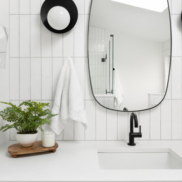
This project took APD to the Oregon Coast for the remodel of two beach house bathrooms! The primary suite was gutted - removing an unused jetted tub in favor of an expansive corner vanity. The shower was opened up by removing an awkwardly located tall cabinet and by swapping a full height wall in favor for a pony wall with glass above. The bathroom is bathed in natural light via the skylight and frosted casement window. A luxurious shower experience was created with ceiling mount rain shower head, wall mount fixed shower head, hand shower on slider bar, and a modern waterfall slab shower bench with integrated niche. A subtle coastal vibe was created with the blue, white, and sandy gray color palette while artistic light fixtures fixtures, clean lined matte black plumbing, and straight stacked tile infuse modernity. In the hall bathroom, a cohesive design was created with added playfulness from the patterned floor tile!
 Wine Cellar Specialists
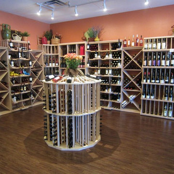
Wine racks improve wine cellars Texas considerably, displaying wine in an attractive fashion.
In a wine store, quality wine racks increase sales, and in residential wine cellars Dallas Texas they are sure to wow guests.
In a nutshell, they are great for any wine storage application, and provide a beautiful canvas upon which to display wines.
Wine Cellar Specialists
1134 Commerce Drive
Richardson
(972)454-0480
75081
winecellarspec.com
 Amy Pearson Design
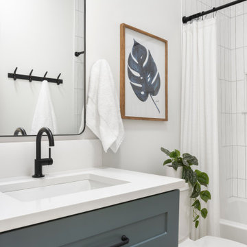
This project took APD to the Oregon Coast for the remodel of two beach house bathrooms! The primary suite was gutted - removing an unused jetted tub in favor of an expansive corner vanity. The shower was opened up by removing an awkwardly located tall cabinet and by swapping a full height wall in favor for a pony wall with glass above. The bathroom is bathed in natural light via the skylight and frosted casement window. A luxurious shower experience was created with ceiling mount rain shower head, wall mount fixed shower head, hand shower on slider bar, and a modern waterfall slab shower bench with integrated niche. A subtle coastal vibe was created with the blue, white, and sandy gray color palette while artistic light fixtures fixtures, clean lined matte black plumbing, and straight stacked tile infuse modernity. In the hall bathroom, a cohesive design was created with added playfulness from the patterned floor tile!
 Amy Pearson Design
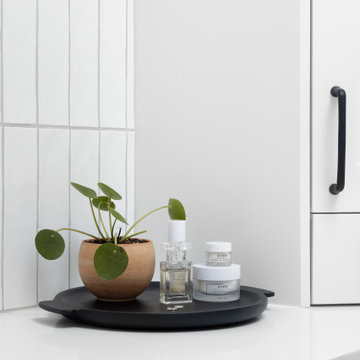
This project took APD to the Oregon Coast for the remodel of two beach house bathrooms! The primary suite was gutted - removing an unused jetted tub in favor of an expansive corner vanity. The shower was opened up by removing an awkwardly located tall cabinet and by swapping a full height wall in favor for a pony wall with glass above. The bathroom is bathed in natural light via the skylight and frosted casement window. A luxurious shower experience was created with ceiling mount rain shower head, wall mount fixed shower head, hand shower on slider bar, and a modern waterfall slab shower bench with integrated niche. A subtle coastal vibe was created with the blue, white, and sandy gray color palette while artistic light fixtures fixtures, clean lined matte black plumbing, and straight stacked tile infuse modernity. In the hall bathroom, a cohesive design was created with added playfulness from the patterned floor tile!
 TKS Design Group
Download our free ebook, Creating the Ideal Kitchen. DOWNLOAD NOW
The homeowners built their traditional Colonial style home 17 years’ ago. It was in great shape but needed some updating. Over the years, their taste had drifted into a more contemporary realm, and they wanted our help to bridge the gap between traditional and modern.
We decided the layout of the kitchen worked well in the space and the cabinets were in good shape, so we opted to do a refresh with the kitchen. The original kitchen had blond maple cabinets and granite countertops. This was also a great opportunity to make some updates to the functionality that they were hoping to accomplish.
After re-finishing all the first floor wood floors with a gray stain, which helped to remove some of the red tones from the red oak, we painted the cabinetry Benjamin Moore “Repose Gray” a very soft light gray. The new countertops are hardworking quartz, and the waterfall countertop to the left of the sink gives a bit of the contemporary flavor.
We reworked the refrigerator wall to create more pantry storage and eliminated the double oven in favor of a single oven and a steam oven. The existing cooktop was replaced with a new range paired with a Venetian plaster hood above. The glossy finish from the hood is echoed in the pendant lights. A touch of gold in the lighting and hardware adds some contrast to the gray and white. A theme we repeated down to the smallest detail illustrated by the Jason Wu faucet by Brizo with its similar touches of white and gold (the arrival of which we eagerly awaited for months due to ripples in the supply chain – but worth it!).
The original breakfast room was pleasant enough with its windows looking into the backyard. Now with its colorful window treatments, new blue chairs and sculptural light fixture, this space flows seamlessly into the kitchen and gives more of a punch to the space.
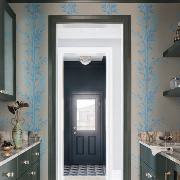
The original butler’s pantry was functional but was also starting to show its age. The new space was inspired by a wallpaper selection that our client had set aside as a possibility for a future project. It worked perfectly with our pallet and gave a fun eclectic vibe to this functional space. We eliminated some upper cabinets in favor of open shelving and painted the cabinetry in a high gloss finish, added a beautiful quartzite countertop and some statement lighting. The new room is anything but cookie cutter.
Next the mudroom. You can see a peek of the mudroom across the way from the butler’s pantry which got a facelift with new paint, tile floor, lighting and hardware. Simple updates but a dramatic change! The first floor powder room got the glam treatment with its own update of wainscoting, wallpaper, console sink, fixtures and artwork. A great little introduction to what’s to come in the rest of the home.
The whole first floor now flows together in a cohesive pallet of green and blue, reflects the homeowner’s desire for a more modern aesthetic, and feels like a thoughtful and intentional evolution. Our clients were wonderful to work with! Their style meshed perfectly with our brand aesthetic which created the opportunity for wonderful things to happen. We know they will enjoy their remodel for many years to come!
Photography by Margaret Rajic Photography

 Insideout Kitchens
Yeti Cooler Pull out Cabinet instead of ice maker
Home design - transitional home design idea in Charlotte
Home design - transitional home design idea in Charlotte

 MAZURKA SPIRITUAL TEMPLE
Dear friends,
You are at liberty to understand that the spiritual control the Physical.
Do you have problems at the place of work, or you have not gotten the promotions you need in your place of work. Do you
always have disappointments in your life, Have you been in shambles, a situation where you feel frustrated and inferior
before your contemporaries, are you into gambling and yet you never win, Are you into any curse, have your love
disappointed you, have you been scammed and you need back your money from your scammer, have you spoken to people and
afterwards, you had no favor from them despite your qualifications. Have you been turned down on your request for favor.
Do you need love at all expense without struggling about it. Are you a pastor who's churches are not growing despite your
fasting and prayers,have you had different business failures, do you need good luck spell and or love. Have you had a
sickness that the doctors could not help, such as all manner of CANCER and HIV, at MAZURKA SPIRITUAL TEMPLE you would
have a long lasting solutions without any side effects. We charge minimal and we will deliver
For people living with HIV/AIDS OR CANCER, you would required to buy a DOG OR any Animal of your choice and we will
immediately cast the sickness upon the animals and within few months the animal will die with the sickness and you will be
totally free.
We are no 1 in Asia, Africa, and Europe. We are genuine.
Worry less and contact us immediately on email at: mst.spiritualhealings@gmail.com OR through our website at:
http://www.spiritualsolutionsandhealing.com for your spiritual needs
 Fiorito Interior Design
It is sometimes a surprise what beauty can lurk under the surface of a room. A client with a 1970s kitchen and eat-in area cut up by an unwieldy peninsula was desperate for it to reflect her love of all things English-and-French-Manor-Home.
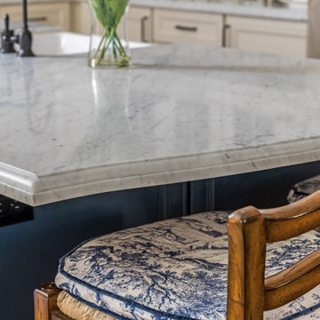
Working closely with my client, we removed the peninsula in favor of a lovely free-standing island that we painted a shade of French Blue. This is topped with Old World sink hardware (note the ceramic HOT and COLD medallions on the faucets!) and a gorgeous marble counter with a very special edge profile that evokes an antique French Boulangerie counter from the 1910s. Pendants with patinaed metal shades over the island further the charming Old World feel. Handmade white and blue tiles laid in a quilted diamond pattern cover the backsplash, and the remainder of the cabinetry at the perimeter is in a warm cream tone.
The eat-in near the fireplace got a cozy treatment with custom seat cushions and window seat bench cushions in a classic blue-and-white Toile de Jouy matching the island stools.
The nearby living room got a similar treatment. We removed dark wood paneling and dark carpeting in favor of a light sky blue wall and lighter wood flooring. A new rug with the appearance of an heirloom, a new grand-scaled sofa, and some of my client’s precious antiques helped take the room from 70s rec room to English Sitting Room.
Photo: Bernardo Grijalva

 Costa del Sol Interiors | Interior Designer
This interior design project involved a comprehensive renovation that completely transformed the appearance and features of an apartment located on the Costa del Sol, Spain. The goal was to modernize the space, enhance functionality, and create a more sophisticated and welcoming atmosphere, aligned with a Nordic style that emphasizes warmth and natural elements.
### Space Redistribution:
Originally, the apartment had only one bedroom and one bathroom. The first phase of the renovation involved redistributing the space to add a second bathroom, with one of them becoming an en-suite connected directly to the master bedroom. This addition significantly improved comfort and privacy, allowing each bedroom to have its own bathroom. Additionally, a new laundry area was created, providing a dedicated space for the washing machine, water heater, and cleaning supplies, optimizing the home's functionality without compromising aesthetics.
### Flooring and Visual Continuity:
The old dark, square-patterned flooring was replaced with porcelain tiles that mimic the texture and tone of wood. This new material was extended from the interior to the terrace, creating a sense of continuity and spaciousness. This change not only modernized the apartment's appearance but also reinforced the visual harmony between indoor and outdoor spaces, inviting residents to enjoy the natural light and views offered by the coastal location.
### Bathroom Renovation:
With the addition of a second bathroom, both spaces were completely renovated. The old tiles and bathtub were removed in favor of a more modern and functional design. Light-colored ceramics reflecting the Nordic style were installed, along with contemporary fixtures and clean lines. The en-suite bathroom was designed to offer an intimate and luxurious space, while the second bathroom, though equally modern, provides comfort and accessibility for the rest of the home.
### Style and Décor:
The predominant Nordic style was reflected in the choice of materials and colors. The walls were adorned with wooden slats, a detail that adds texture and warmth to the space, while the décor focused on natural elements like wood, linen, and plant fibers, creating a serene and relaxing atmosphere. Neutral tones and simple lines prevail, achieving a perfect balance between sophistication and comfort.
### Final Result:
The result is an apartment that not only looks more spacious and modern but also exudes a sense of tranquility and comfort. The renovation has transformed the space into a home that invites you to enjoy sunny days on the Costa del Sol, with a terrace seamlessly integrated with the interior and living spaces that reflect a sophisticated, functional, and inviting lifestyle.
Este proyecto de interiorismo consistió en una reforma integral que transformó por completo el aspecto y las características de un apartamento ubicado en la Costa del Sol, España. El objetivo era modernizar el espacio, mejorar la funcionalidad y crear un ambiente más sofisticado y acogedor, alineado con un estilo nórdico que resalta la calidez y la naturalidad.
### Redistribución del Espacio:
Inicialmente, el apartamento contaba con una sola habitación y un solo baño. La primera fase de la reforma implicó una redistribución del espacio, añadiendo un segundo baño, de los cuales uno se convirtió en suite, conectado directamente con la habitación principal. Esta ampliación mejoró significativamente la comodidad y privacidad, permitiendo que cada habitación tuviera su propio baño. Además, se creó una nueva zona de lavadero, un espacio dedicado para la lavadora, el termotanque y los elementos de limpieza, optimizando la funcionalidad del hogar sin sacrificar la estética.
### Suelos y Continuidad Visual:
Se reemplazaron los antiguos suelos de color oscuro, de apariencia cuadrada, por un porcelánico que imita la textura y el tono de la madera. Este nuevo material se extendió desde el interior hasta la terraza, creando una sensación de continuidad y amplitud. Este cambio no solo modernizó el aspecto del apartamento, sino que también reforzó la armonía visual entre los espacios interiores y exteriores, invitando a disfrutar de la luz natural y las vistas que ofrece la ubicación costera.
### Renovación de Baños:
Con la adición de un segundo baño, ambos espacios fueron completamente renovados. Se eliminaron los viejos azulejos y la bañera en favor de un diseño más moderno y funcional. Se instalaron cerámicas de tonos claros que reflejan el estilo nórdico, junto con elementos contemporáneos y líneas limpias. El baño en suite, en particular, fue diseñado para ofrecer un espacio íntimo y lujoso, mientras que el segundo baño, aunque igualmente moderno, ofrece comodidad y accesibilidad para el resto de la casa.
### Estilo y Decoración:
El estilo nórdico predominante se reflejó en la elección de materiales y colores. Las paredes fueron adornadas con palillería, un detalle que aporta textura y calidez al espacio, mientras que la decoración se basó en elementos naturales como madera, lino y fibras vegetales, creando una atmósfera serena y relajante. Los tonos neutros y las líneas simples predominan, logrando un equilibrio perfecto entre sofisticación y comodidad.
### Resultado Final:
El resultado es un apartamento que no solo se ve más amplio y moderno, sino que también transmite una sensación de tranquilidad y confort. La reforma ha transformado el espacio en un hogar que invita a disfrutar de los días soleados en la Costa del Sol, con una terraza que se integra perfectamente con el interior, y unos ambientes interiores que reflejan un estilo de vida sofisticado, funcional y acogedor.
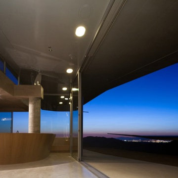
 David Hertz & Studio of Environmental Architecture
Photo: David Hertz
Inspiration for a modern patio remodel in Los Angeles
Inspiration for a modern patio remodel in Los Angeles
 FineLine Kitchens, Inc.
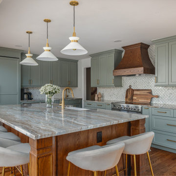
Hi everyone, I'm Sarah and Ogun we are here with fine line kitchens. So we are a couple working together. I do the interior design and remodeling of the space material selection meeting with the clients. And I handled operations outside, you know meaning all the construction work that is taking place the inside. The houses that we work in. I handle all the aspects of the construction, so today's project is very special. We're in Vienna and the client had a very big family. It's a family of seven that lives here. So we had a few aspects that we needed to keep in mind while designing this one. Having everybody be able to sit on the island. So we wanted plenty of seating all the way around. We didn't want anybody standing or anything like that. So what we did is we maximize the space. The center island is the biggest part of the kitchen. We use a natural stone to kind of give it a beautiful texture versus quartz. It's kind of standard white or kind of fabricated, so I wanted something very natural. We did this because I took my inspiration from the outside, so the inspiration if you look at the view right in front of me is there are so many greens there's a lot of brass accents and I wanted to bring this. Into this kitchen while designing it for my clients. She is very warm very. She wanted a very homey, comfy kind of look for the kitchen. So that's what we did today. As you can see, the cabinets are sage green, very light, so I still think it's a neutral, but it's a lighter color that again brings the outside in and we combine that with the oak right behind me so it's a slightly warm oak. It's not very dark. It's not very light. It's a medium brown and the same color went on the island. To kind of tie these two in and the backsplash, my favorite part is where you can see a little bit of design. It is, in my opinion still classic, but includes a pattern so the outside part is as we said in the beginning, is handled by my husband. I'd like him to speak a little bit about that. Thanks, Sarah, I want to talk to you guys a little bit about the construction part of this project. Originally this kitchen was located mostly in this area. They had their stove there sing. It was more of a peninsula layout in Sarah's and the customer vision they wanted. They wanted to get rid of the peninsula and they want to be able to have a huge island that can at least sit seven people because they're familiar with seven. So we wanted to make sure that we can achieve this design and bring it to life so that they can be happy with this layout. Some of the challenges we had, the house, the home being, you know, old home. There were a lot of you know the older electrical and plumbing that had to be replaced. We had to relocate the stove from here to this area. Over here we had put a nice foot fan that we had to relocate all the ductwork and the plumbing. Was being on the peninsula area. We had to relocate it to the center islands. So we achieved all this and kind of like bring it to bring in this kitchen up to date it looks beautiful. That's true, so yes, the old layout did not function for my clients because everything was kind of gathered on one side of the kitchen. So there was like a peninsula right there. So the end of this island kind of continued straight. And that was just the L shape. Kind of where everything was and there used to be another big table here, so they were using only kind of half of the space. So like I said at the beginning, our vision was to kind of feed everybody at the island, create some symmetry. 'cause I love that. So as you can see behind me, this is kind of the focal point symmetrical. Everything is kind of even we wanted to also panel the fridge here so it mimics the pantry and another size. So when you're looking at it, it is bringing again that symmetry back again. I hope you enjoyed this kitchen and this video and I'll see you soon. So how do you think this project turned out? It's nice. I like the color. I think it turned out nice. It's kind of like a little bit different color than what we always do. So I realize. Are you giving me a little bit of credit here that I did something different? Are you proud? I'm so proud of you. Other than that I like it. That they have kind of like a two sink. So if this was our kitchen, if we ever like you can have your own. I can have mine if we ever get into a fight then this can be like my own kitchen. Why are we gonna bring in a fight right now? So I'm cooking anyway. You're grilling most of the time, So what are you even talking about? My kitchen? That's my kitchen. You can just take the small sink. That's fine. It's always good to have your own space right there, so anyways. Thank you guys for watching. We hope to see you soon and if you have any questions please click the link below. It'll lead you to our website, house, YouTube and all of the social media is so nice to have you guys. We'll see you soon. Thanks bye bye-bye.
 TKS Design Group
Free ebook, Creating the Ideal Kitchen. DOWNLOAD NOW
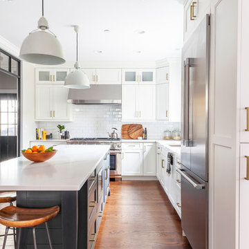
We went with a minimalist, clean, industrial look that feels light, bright and airy. The island is a dark charcoal with cool undertones that coordinates with the cabinetry and transom work in both the neighboring mudroom and breakfast area. White subway tile, quartz countertops, white enamel pendants and gold fixtures complete the update. The ends of the island are shiplap material that is also used on the fireplace in the next room.
In the new mudroom, we used a fun porcelain tile on the floor to get a pop of pattern, and walnut accents add some warmth. Each child has their own cubby, and there is a spot for shoes below a long bench. Open shelving with spots for baskets provides additional storage for the room.
Designed by: Susan Klimala, CKBD
Photography by: LOMA Studios
For more information on kitchen and bath design ideas go to: www.kitchenstudio-ge.com
 De Meza + Architecture
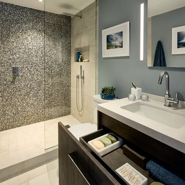
An Architect's bathroom added to the top floor of a beautiful home. Clean lines and cool colors are employed to create a perfect balance of soft and hard. Tile work and cabinetry provide great contrast and ground the space.
Photographer: Dean Birinyi
21