
Search results for "Favourable" in Home Design Ideas
 BEVOLO GAS & ELECTRIC LIGHTS
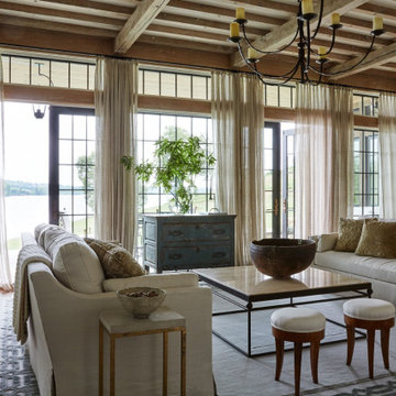
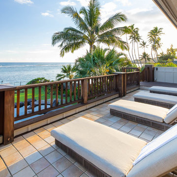
TENNESSEE RIVER HOUSE
A successful businessman sold his company, and as part of the deal, was required to move to Knoxville, Tennessee. Having long been used to lake living in his native Alabama, he and his wife wanted to find a spot that would allow them to continue their life long love of being close to the water. They located such a site on the Tennessee River in a place appropriately called “Lake Loudon”. The rolling pasture-like site had great water access and views, and few trees creating a wide open kind of scenery. They hoped to make a place for their grown children to return to them with their grandchildren. The design engages and embeds the house into the hillside to become part of the landscape rather than sit in the middle of the field. The house was rotated slightly away from a straight on view of the river to shield from western sun, in favor of the northern exposure which opened up longer views of the Tennessee River, also allowing for more liberal use of windows in the main living space.
 M.O.Daby Design
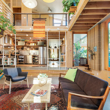
Conceived more similar to a loft type space rather than a traditional single family home, the homeowner was seeking to challenge a normal arrangement of rooms in favor of spaces that are dynamic in all 3 dimensions, interact with the yard, and capture the movement of light and air.
As an artist that explores the beauty of natural objects and scenes, she tasked us with creating a building that was not precious - one that explores the essence of its raw building materials and is not afraid of expressing them as finished.
We designed opportunities for kinetic fixtures, many built by the homeowner, to allow flexibility and movement.
The result is a building that compliments the casual artistic lifestyle of the occupant as part home, part work space, part gallery. The spaces are interactive, contemplative, and fun.
More details to come.
credits:
design: Matthew O. Daby - m.o.daby design /
construction: Cellar Ridge Construction /
structural engineer: Darla Wall - Willamette Building Solutions /
photography: Erin Riddle - KLIK Concepts
 TKS Design Group
Download our free ebook, Creating the Ideal Kitchen. DOWNLOAD NOW
The homeowners built their traditional Colonial style home 17 years’ ago. It was in great shape but needed some updating. Over the years, their taste had drifted into a more contemporary realm, and they wanted our help to bridge the gap between traditional and modern.
We decided the layout of the kitchen worked well in the space and the cabinets were in good shape, so we opted to do a refresh with the kitchen. The original kitchen had blond maple cabinets and granite countertops. This was also a great opportunity to make some updates to the functionality that they were hoping to accomplish.
After re-finishing all the first floor wood floors with a gray stain, which helped to remove some of the red tones from the red oak, we painted the cabinetry Benjamin Moore “Repose Gray” a very soft light gray. The new countertops are hardworking quartz, and the waterfall countertop to the left of the sink gives a bit of the contemporary flavor.
We reworked the refrigerator wall to create more pantry storage and eliminated the double oven in favor of a single oven and a steam oven. The existing cooktop was replaced with a new range paired with a Venetian plaster hood above. The glossy finish from the hood is echoed in the pendant lights. A touch of gold in the lighting and hardware adds some contrast to the gray and white. A theme we repeated down to the smallest detail illustrated by the Jason Wu faucet by Brizo with its similar touches of white and gold (the arrival of which we eagerly awaited for months due to ripples in the supply chain – but worth it!).
The original breakfast room was pleasant enough with its windows looking into the backyard. Now with its colorful window treatments, new blue chairs and sculptural light fixture, this space flows seamlessly into the kitchen and gives more of a punch to the space.
The original butler’s pantry was functional but was also starting to show its age. The new space was inspired by a wallpaper selection that our client had set aside as a possibility for a future project. It worked perfectly with our pallet and gave a fun eclectic vibe to this functional space. We eliminated some upper cabinets in favor of open shelving and painted the cabinetry in a high gloss finish, added a beautiful quartzite countertop and some statement lighting. The new room is anything but cookie cutter.
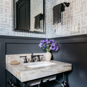
Next the mudroom. You can see a peek of the mudroom across the way from the butler’s pantry which got a facelift with new paint, tile floor, lighting and hardware. Simple updates but a dramatic change! The first floor powder room got the glam treatment with its own update of wainscoting, wallpaper, console sink, fixtures and artwork. A great little introduction to what’s to come in the rest of the home.
The whole first floor now flows together in a cohesive pallet of green and blue, reflects the homeowner’s desire for a more modern aesthetic, and feels like a thoughtful and intentional evolution. Our clients were wonderful to work with! Their style meshed perfectly with our brand aesthetic which created the opportunity for wonderful things to happen. We know they will enjoy their remodel for many years to come!
Photography by Margaret Rajic Photography
Find the right local pro for your project
 Bien Living Design
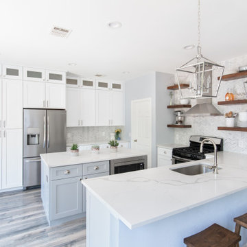
We took an outdated, builder basic kitchen to the next level - removed an old corner pantry in favor of floor-to-ceiling pantry cabinets, upper cabinets that go all the way to the 10' ceiling, counter-to-ceiling marble chevron backsplash, and installed custom floating shelving. For appliances, we installed a counter-depth refrigerator and built it in to the cabinetry. The previous over-the-range microwave was moved to the island.
 Wine Cellar Specialists
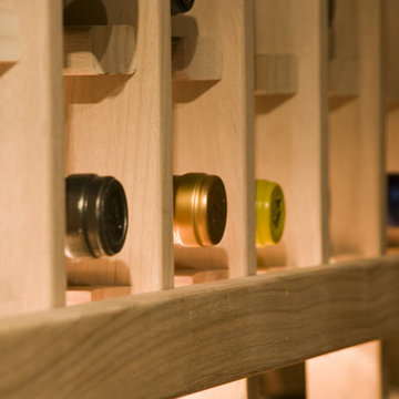
These are 'Niche Size' custom wine racks Dallas. They are of mahogany, left unfinished in favor of a raw, natural appearance.
Just like the wine, Mahogany is known to age beautifully over time. It is also durable and high resistant to decay and shrinkage.
Niche Size racks promote optimum airflow between wines. This allows the individual bottles to enjoy the ideal temperature and humidity levels equally.
Wine Cellar Specialists
Follow us on Twitter: https://twitter.com/winecellarspec
Chicago Design Office
858 W. Armitage Ave #385
Chicago, IL 60614
See what other people say about us: https://www.google.com/search?q=Wine+Cellar+Specialists&ludocid=8538802152238743744#lrd=0x0:0x767feb51238800c0,1
 Dura Supreme Cabinetry
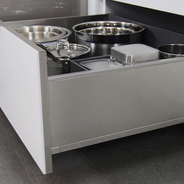
This contemporary kitchen features the NEW Stainless Steel Drawers and Roll-Out Shelves from Dura Supreme Cabinetry. The Bria (frameless) cabinets in Dura Supreme's "White" and Wired-Foil cabinets in Dura Supreme's "Wired-Mercury" are a great combination of cabinetry for creating the clean sleek look of this modern two-tone kitchen design.
Dura Supreme Cabinetry is excited to introduce NEW Stainless Steel Drawers and Roll-Out Shelves for their Bria Cabinetry (Frameless / Full-Access product line). For a limited time, this new metal drawer system is available exclusively from Dura Supreme as they partnered with Blum to be the first American manufacturer to bring it to market.
Dura Supreme’s Stainless Steel Drawers and Roll-Out Shelves are an attractive option for any kitchen design. Sleek, double-wall, stainless steel sides are only ½” thick and work with many of Dura Supreme’s wood drawer accessories, as well as the coordinating gray metal accessories designed specifically for Stainless Steel drawers. Concealed, undermount glides are integrated into the sides and are self-closing with a soft-close feature.
Our new Stainless Steel drawer option provides a contemporary alternative to our classic Maple dovetailed drawer. For homeowners that favor Transitional or Contemporary styling, this sleek, high-performance drawer system will be ideal!
Request a FREE Dura Supreme Brochure:
http://www.durasupreme.com/request-brochure
Find a Dura Supreme Showroom in your area:
http://www.durasupreme.com/dealer-locator
Want to become a Dura Supreme Dealer? Go to:
http://www.durasupreme.com/new-dealer-inquiry
To view a video and more info about this product go to: http://www.durasupreme.com/storage-solutions/stainless-steel-drawers-roll-outs
 Dura Supreme Cabinetry
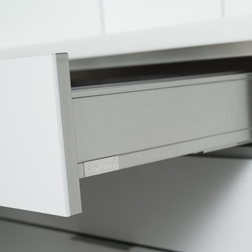
This contemporary kitchen features the NEW Stainless Steel Drawers and Roll-Out Shelves from Dura Supreme Cabinetry. The Bria (frameless) cabinets in Dura Supreme's "White" and Wired-Foil cabinets in Dura Supreme's "Wired-Mercury" are a great combination of cabinetry for creating the clean sleek look of this modern two-tone kitchen design.
Dura Supreme Cabinetry is excited to introduce NEW Stainless Steel Drawers and Roll-Out Shelves for their Bria Cabinetry (Frameless / Full-Access product line). For a limited time, this new metal drawer system is available exclusively from Dura Supreme as they partnered with Blum to be the first American manufacturer to bring it to market.
Dura Supreme’s Stainless Steel Drawers and Roll-Out Shelves are an attractive option for any kitchen design. Sleek, double-wall, stainless steel sides are only ½” thick and work with many of Dura Supreme’s wood drawer accessories, as well as the coordinating gray metal accessories designed specifically for Stainless Steel drawers. Concealed, undermount glides are integrated into the sides and are self-closing with a soft-close feature.
Our new Stainless Steel drawer option provides a contemporary alternative to our classic Maple dovetailed drawer. For homeowners that favor Transitional or Contemporary styling, this sleek, high-performance drawer system will be ideal!
Request a FREE Dura Supreme Brochure:
http://www.durasupreme.com/request-brochure
Find a Dura Supreme Showroom in your area:
http://www.durasupreme.com/dealer-locator
Want to become a Dura Supreme Dealer? Go to:
http://www.durasupreme.com/new-dealer-inquiry
To view a video and more info about this product go to: http://www.durasupreme.com/storage-solutions/stainless-steel-drawers-roll-outs





 The Phoenix Photography
Phoenix Photography © 2015 Houzz
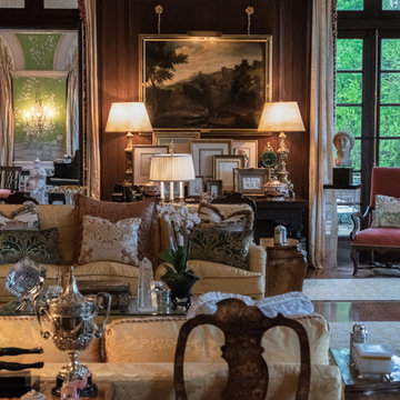
Living room - traditional living room idea in Louisville
Living room - traditional living room idea in Louisville
 Amy Pearson Design
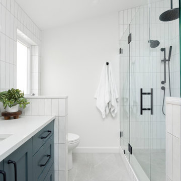
This project took APD to the Oregon Coast for the remodel of two beach house bathrooms! The primary suite was gutted - removing an unused jetted tub in favor of an expansive corner vanity. The shower was opened up by removing an awkwardly located tall cabinet and by swapping a full height wall in favor for a pony wall with glass above. The bathroom is bathed in natural light via the skylight and frosted casement window. A luxurious shower experience was created with ceiling mount rain shower head, wall mount fixed shower head, hand shower on slider bar, and a modern waterfall slab shower bench with integrated niche. A subtle coastal vibe was created with the blue, white, and sandy gray color palette while artistic light fixtures fixtures, clean lined matte black plumbing, and straight stacked tile infuse modernity. In the hall bathroom, a cohesive design was created with added playfulness from the patterned floor tile!
 TKS Design Group
Download our free ebook, Creating the Ideal Kitchen. DOWNLOAD NOW
The homeowners built their traditional Colonial style home 17 years’ ago. It was in great shape but needed some updating. Over the years, their taste had drifted into a more contemporary realm, and they wanted our help to bridge the gap between traditional and modern.
We decided the layout of the kitchen worked well in the space and the cabinets were in good shape, so we opted to do a refresh with the kitchen. The original kitchen had blond maple cabinets and granite countertops. This was also a great opportunity to make some updates to the functionality that they were hoping to accomplish.
After re-finishing all the first floor wood floors with a gray stain, which helped to remove some of the red tones from the red oak, we painted the cabinetry Benjamin Moore “Repose Gray” a very soft light gray. The new countertops are hardworking quartz, and the waterfall countertop to the left of the sink gives a bit of the contemporary flavor.
We reworked the refrigerator wall to create more pantry storage and eliminated the double oven in favor of a single oven and a steam oven. The existing cooktop was replaced with a new range paired with a Venetian plaster hood above. The glossy finish from the hood is echoed in the pendant lights. A touch of gold in the lighting and hardware adds some contrast to the gray and white. A theme we repeated down to the smallest detail illustrated by the Jason Wu faucet by Brizo with its similar touches of white and gold (the arrival of which we eagerly awaited for months due to ripples in the supply chain – but worth it!).
The original breakfast room was pleasant enough with its windows looking into the backyard. Now with its colorful window treatments, new blue chairs and sculptural light fixture, this space flows seamlessly into the kitchen and gives more of a punch to the space.
The original butler’s pantry was functional but was also starting to show its age. The new space was inspired by a wallpaper selection that our client had set aside as a possibility for a future project. It worked perfectly with our pallet and gave a fun eclectic vibe to this functional space. We eliminated some upper cabinets in favor of open shelving and painted the cabinetry in a high gloss finish, added a beautiful quartzite countertop and some statement lighting. The new room is anything but cookie cutter.
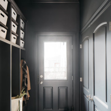
Next the mudroom. You can see a peek of the mudroom across the way from the butler’s pantry which got a facelift with new paint, tile floor, lighting and hardware. Simple updates but a dramatic change! The first floor powder room got the glam treatment with its own update of wainscoting, wallpaper, console sink, fixtures and artwork. A great little introduction to what’s to come in the rest of the home.
The whole first floor now flows together in a cohesive pallet of green and blue, reflects the homeowner’s desire for a more modern aesthetic, and feels like a thoughtful and intentional evolution. Our clients were wonderful to work with! Their style meshed perfectly with our brand aesthetic which created the opportunity for wonderful things to happen. We know they will enjoy their remodel for many years to come!
Photography by Margaret Rajic Photography
 Amy Pearson Design
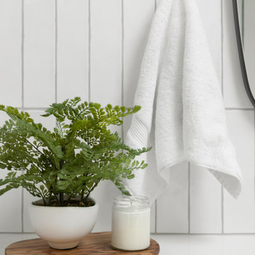
This project took APD to the Oregon Coast for the remodel of two beach house bathrooms! The primary suite was gutted - removing an unused jetted tub in favor of an expansive corner vanity. The shower was opened up by removing an awkwardly located tall cabinet and by swapping a full height wall in favor for a pony wall with glass above. The bathroom is bathed in natural light via the skylight and frosted casement window. A luxurious shower experience was created with ceiling mount rain shower head, wall mount fixed shower head, hand shower on slider bar, and a modern waterfall slab shower bench with integrated niche. A subtle coastal vibe was created with the blue, white, and sandy gray color palette while artistic light fixtures fixtures, clean lined matte black plumbing, and straight stacked tile infuse modernity. In the hall bathroom, a cohesive design was created with added playfulness from the patterned floor tile!

Photo: Joshua Mayer, via Flickr, licensed under Creative Commons Attribution-ShareAlike 2.0 Generic
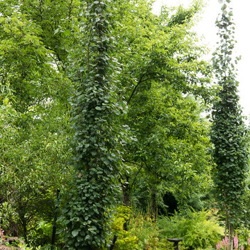
This is an example of a landscaping in Other.
This is an example of a landscaping in Other.
 Amy Pearson Design
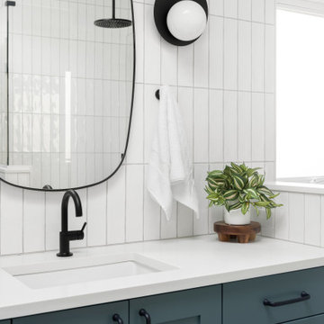
This project took APD to the Oregon Coast for the remodel of two beach house bathrooms! The primary suite was gutted - removing an unused jetted tub in favor of an expansive corner vanity. The shower was opened up by removing an awkwardly located tall cabinet and by swapping a full height wall in favor for a pony wall with glass above. The bathroom is bathed in natural light via the skylight and frosted casement window. A luxurious shower experience was created with ceiling mount rain shower head, wall mount fixed shower head, hand shower on slider bar, and a modern waterfall slab shower bench with integrated niche. A subtle coastal vibe was created with the blue, white, and sandy gray color palette while artistic light fixtures fixtures, clean lined matte black plumbing, and straight stacked tile infuse modernity. In the hall bathroom, a cohesive design was created with added playfulness from the patterned floor tile!
 Amy Pearson Design
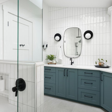
This project took APD to the Oregon Coast for the remodel of two beach house bathrooms! The primary suite was gutted - removing an unused jetted tub in favor of an expansive corner vanity. The shower was opened up by removing an awkwardly located tall cabinet and by swapping a full height wall in favor for a pony wall with glass above. The bathroom is bathed in natural light via the skylight and frosted casement window. A luxurious shower experience was created with ceiling mount rain shower head, wall mount fixed shower head, hand shower on slider bar, and a modern waterfall slab shower bench with integrated niche. A subtle coastal vibe was created with the blue, white, and sandy gray color palette while artistic light fixtures fixtures, clean lined matte black plumbing, and straight stacked tile infuse modernity. In the hall bathroom, a cohesive design was created with added playfulness from the patterned floor tile!
 TKS Design Group
Download our free ebook, Creating the Ideal Kitchen. DOWNLOAD NOW
The homeowners built their traditional Colonial style home 17 years’ ago. It was in great shape but needed some updating. Over the years, their taste had drifted into a more contemporary realm, and they wanted our help to bridge the gap between traditional and modern.
We decided the layout of the kitchen worked well in the space and the cabinets were in good shape, so we opted to do a refresh with the kitchen. The original kitchen had blond maple cabinets and granite countertops. This was also a great opportunity to make some updates to the functionality that they were hoping to accomplish.
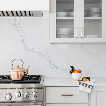
After re-finishing all the first floor wood floors with a gray stain, which helped to remove some of the red tones from the red oak, we painted the cabinetry Benjamin Moore “Repose Gray” a very soft light gray. The new countertops are hardworking quartz, and the waterfall countertop to the left of the sink gives a bit of the contemporary flavor.
We reworked the refrigerator wall to create more pantry storage and eliminated the double oven in favor of a single oven and a steam oven. The existing cooktop was replaced with a new range paired with a Venetian plaster hood above. The glossy finish from the hood is echoed in the pendant lights. A touch of gold in the lighting and hardware adds some contrast to the gray and white. A theme we repeated down to the smallest detail illustrated by the Jason Wu faucet by Brizo with its similar touches of white and gold (the arrival of which we eagerly awaited for months due to ripples in the supply chain – but worth it!).
The original breakfast room was pleasant enough with its windows looking into the backyard. Now with its colorful window treatments, new blue chairs and sculptural light fixture, this space flows seamlessly into the kitchen and gives more of a punch to the space.
The original butler’s pantry was functional but was also starting to show its age. The new space was inspired by a wallpaper selection that our client had set aside as a possibility for a future project. It worked perfectly with our pallet and gave a fun eclectic vibe to this functional space. We eliminated some upper cabinets in favor of open shelving and painted the cabinetry in a high gloss finish, added a beautiful quartzite countertop and some statement lighting. The new room is anything but cookie cutter.
Next the mudroom. You can see a peek of the mudroom across the way from the butler’s pantry which got a facelift with new paint, tile floor, lighting and hardware. Simple updates but a dramatic change! The first floor powder room got the glam treatment with its own update of wainscoting, wallpaper, console sink, fixtures and artwork. A great little introduction to what’s to come in the rest of the home.
The whole first floor now flows together in a cohesive pallet of green and blue, reflects the homeowner’s desire for a more modern aesthetic, and feels like a thoughtful and intentional evolution. Our clients were wonderful to work with! Their style meshed perfectly with our brand aesthetic which created the opportunity for wonderful things to happen. We know they will enjoy their remodel for many years to come!
Photography by Margaret Rajic Photography
 Costa del Sol Interiors | Interior Designer
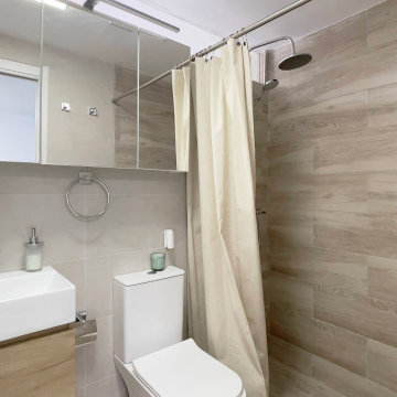
This interior design project involved a comprehensive renovation that completely transformed the appearance and features of an apartment located on the Costa del Sol, Spain. The goal was to modernize the space, enhance functionality, and create a more sophisticated and welcoming atmosphere, aligned with a Nordic style that emphasizes warmth and natural elements.
### Space Redistribution:
Originally, the apartment had only one bedroom and one bathroom. The first phase of the renovation involved redistributing the space to add a second bathroom, with one of them becoming an en-suite connected directly to the master bedroom. This addition significantly improved comfort and privacy, allowing each bedroom to have its own bathroom. Additionally, a new laundry area was created, providing a dedicated space for the washing machine, water heater, and cleaning supplies, optimizing the home's functionality without compromising aesthetics.
### Flooring and Visual Continuity:
The old dark, square-patterned flooring was replaced with porcelain tiles that mimic the texture and tone of wood. This new material was extended from the interior to the terrace, creating a sense of continuity and spaciousness. This change not only modernized the apartment's appearance but also reinforced the visual harmony between indoor and outdoor spaces, inviting residents to enjoy the natural light and views offered by the coastal location.
### Bathroom Renovation:
With the addition of a second bathroom, both spaces were completely renovated. The old tiles and bathtub were removed in favor of a more modern and functional design. Light-colored ceramics reflecting the Nordic style were installed, along with contemporary fixtures and clean lines. The en-suite bathroom was designed to offer an intimate and luxurious space, while the second bathroom, though equally modern, provides comfort and accessibility for the rest of the home.
### Style and Décor:
The predominant Nordic style was reflected in the choice of materials and colors. The walls were adorned with wooden slats, a detail that adds texture and warmth to the space, while the décor focused on natural elements like wood, linen, and plant fibers, creating a serene and relaxing atmosphere. Neutral tones and simple lines prevail, achieving a perfect balance between sophistication and comfort.
### Final Result:
The result is an apartment that not only looks more spacious and modern but also exudes a sense of tranquility and comfort. The renovation has transformed the space into a home that invites you to enjoy sunny days on the Costa del Sol, with a terrace seamlessly integrated with the interior and living spaces that reflect a sophisticated, functional, and inviting lifestyle.
Este proyecto de interiorismo consistió en una reforma integral que transformó por completo el aspecto y las características de un apartamento ubicado en la Costa del Sol, España. El objetivo era modernizar el espacio, mejorar la funcionalidad y crear un ambiente más sofisticado y acogedor, alineado con un estilo nórdico que resalta la calidez y la naturalidad.
### Redistribución del Espacio:
Inicialmente, el apartamento contaba con una sola habitación y un solo baño. La primera fase de la reforma implicó una redistribución del espacio, añadiendo un segundo baño, de los cuales uno se convirtió en suite, conectado directamente con la habitación principal. Esta ampliación mejoró significativamente la comodidad y privacidad, permitiendo que cada habitación tuviera su propio baño. Además, se creó una nueva zona de lavadero, un espacio dedicado para la lavadora, el termotanque y los elementos de limpieza, optimizando la funcionalidad del hogar sin sacrificar la estética.
### Suelos y Continuidad Visual:
Se reemplazaron los antiguos suelos de color oscuro, de apariencia cuadrada, por un porcelánico que imita la textura y el tono de la madera. Este nuevo material se extendió desde el interior hasta la terraza, creando una sensación de continuidad y amplitud. Este cambio no solo modernizó el aspecto del apartamento, sino que también reforzó la armonía visual entre los espacios interiores y exteriores, invitando a disfrutar de la luz natural y las vistas que ofrece la ubicación costera.
### Renovación de Baños:
Con la adición de un segundo baño, ambos espacios fueron completamente renovados. Se eliminaron los viejos azulejos y la bañera en favor de un diseño más moderno y funcional. Se instalaron cerámicas de tonos claros que reflejan el estilo nórdico, junto con elementos contemporáneos y líneas limpias. El baño en suite, en particular, fue diseñado para ofrecer un espacio íntimo y lujoso, mientras que el segundo baño, aunque igualmente moderno, ofrece comodidad y accesibilidad para el resto de la casa.
### Estilo y Decoración:
El estilo nórdico predominante se reflejó en la elección de materiales y colores. Las paredes fueron adornadas con palillería, un detalle que aporta textura y calidez al espacio, mientras que la decoración se basó en elementos naturales como madera, lino y fibras vegetales, creando una atmósfera serena y relajante. Los tonos neutros y las líneas simples predominan, logrando un equilibrio perfecto entre sofisticación y comodidad.
### Resultado Final:
El resultado es un apartamento que no solo se ve más amplio y moderno, sino que también transmite una sensación de tranquilidad y confort. La reforma ha transformado el espacio en un hogar que invita a disfrutar de los días soleados en la Costa del Sol, con una terraza que se integra perfectamente con el interior, y unos ambientes interiores que reflejan un estilo de vida sofisticado, funcional y acogedor.
18