
Search results for "Feel intentional" in Home Design Ideas
 lavish
Timeless, Tailored & Completely Livable — Primary Suite, Foyer & Whole-Home Interior Design | Raleigh, NC
This project is a study in how to make a home feel both elevated and deeply personal. Warm tones, natural wood, thoughtful layering of pattern and texture, and fixture choices that feel curated rather than catalog — every room earns its place.
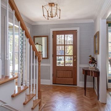
The foyer makes an immediate impression. Herringbone hardwood floors set a classic tone underfoot, while gray grasscloth wallpaper adds warmth and texture to the walls. A brass cage lantern flush mount and wainscoting complete the entry, making it feel finished without being fussy. It's the kind of space that makes guests pause.
The primary bedroom is the project's centerpiece. A brass spindle bed frame anchors the room with quiet drama, flanked by walnut nightstands with brass legs and topped with a pair of extraordinarily custom lighting moments — multi-rod pendant chandeliers in brass and glass that hang from ceiling canopies, functioning as both bedside task lighting and sculptural focal points. Soft blue-gray custom drapery in a tonal dash-dot pattern hangs floor to ceiling on brass rods, layered over woven shades for light control and warmth. A pair of oatmeal linen swivel chairs with a marble-topped brass side table creates a proper sitting area at the foot of the bed. Floral accent pillows in terracotta and rust, an orange bolster, and a geometric cream and blue area rug give the neutral palette its energy. A modern minimalist white ceiling fan balances the traditional bones of the room beautifully.
The primary bathroom is a full gut renovation executed at the highest level. Warm walnut cabinetry with raised panel detailing runs the full length of a double vanity, topped with white quartz and finished with polished nickel hardware and fixtures throughout. A heated towel warmer, large format Calacatta-look marble tile floors, individual rounded-rectangle nickel-framed mirrors, and nickel sconces round out the vanity wall. The shower is nothing short of a spa experience — floor-to-ceiling Calacatta marble tile in large format, a ceiling-mounted rain head, wall-mounted traditional shower head, hand shower on a slide bar, linear drain, floating bench seat, and grab bars integrated so seamlessly they feel designed rather than added. A second bathroom receives the same care: dark walnut cabinetry, white quartz, polished nickel fixtures, a custom patterned Roman shade, and a cylindrical glass sconce with brass accent.
The walk-in pantry was designed with the same intentionality as every other room — white cabinetry, open upper shelving, a dedicated wine rack with both vertical and horizontal bottle storage, a second refrigerator, and dramatic swirling granite countertops that make even the utility spaces feel considered.
 Walczak Design And Build
What once felt dark, segmented, and inefficient is now a bright, connected, and highly functional first floor designed for real family living.
Our clients, Terry and Lou, came to us with a home that simply wasn’t keeping up with their growing family. The kitchen was cramped, with tight working lanes and limited light. The laundry room doubled as a powder room—yet functioned poorly as both. Sightlines between spaces were cut off, making it difficult to stay connected to their young children throughout the day. Across the board, the home felt dated and disconnected.
Through thoughtful planning and strategic structural changes, we reimagined the entire first floor to better support how this family truly lives.
We began by redefining the entry experience—creating a true foyer complete with a dedicated drop zone and custom cubby storage. This space now acts as a natural landing point, bringing order and intention to everyday comings and goings.
Adjacent to the new entry, we relocated and redesigned the laundry room. Now positioned exactly where it needs to be, it functions as a hardworking utility space with countertops for folding, a utility sink for immediate stain treatment, and the ability to be closed off—keeping daily life contained when needed.
Separating the previous shared function allowed us to carve out a distinct, personality-filled powder room. Wrapped in a bold wave-patterned wallpaper and grounded by a custom reeded oak vanity with warm brass accents, this space delivers a moment of delight and individuality within the home.
The kitchen transformation is where the impact is felt most deeply.
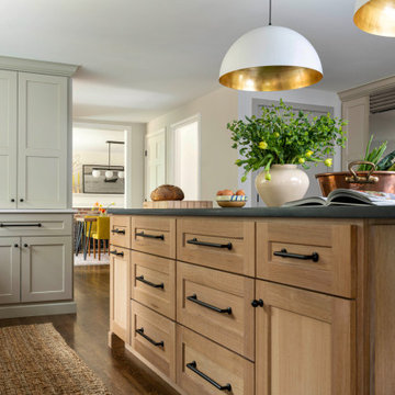
What was once a dark, restrictive layout has been opened into a spacious, highly efficient U-shaped kitchen with generous clearances and an oversized island for gathering. A thoughtful mix of painted cabinetry and rift white oak introduces warmth and balance, while the custom reeded hood becomes a sculptural focal point. Open shelving, integrated pantry storage, and layered lighting ensure the space is as functional as it is beautiful.
Beyond aesthetics, the redesign prioritizes flow—both in movement and in connection. Sightlines between the kitchen, dining, and living areas were intentionally opened, allowing for ease of interaction and visibility throughout the main living spaces.
To unify the home, existing hardwood floors were refinished and extended, creating continuity and a seamless visual experience from one space to the next.
The result is a home that feels lighter, more open, and deeply aligned with how this family lives day to day—designed not just to look beautiful, but to support everything from busy mornings to slow, shared evenings.
 Walczak Design And Build
What once felt dark, segmented, and inefficient is now a bright, connected, and highly functional first floor designed for real family living.
Our clients, Terry and Lou, came to us with a home that simply wasn’t keeping up with their growing family. The kitchen was cramped, with tight working lanes and limited light. The laundry room doubled as a powder room—yet functioned poorly as both. Sightlines between spaces were cut off, making it difficult to stay connected to their young children throughout the day. Across the board, the home felt dated and disconnected.
Through thoughtful planning and strategic structural changes, we reimagined the entire first floor to better support how this family truly lives.
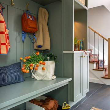
We began by redefining the entry experience—creating a true foyer complete with a dedicated drop zone and custom cubby storage. This space now acts as a natural landing point, bringing order and intention to everyday comings and goings.
Adjacent to the new entry, we relocated and redesigned the laundry room. Now positioned exactly where it needs to be, it functions as a hardworking utility space with countertops for folding, a utility sink for immediate stain treatment, and the ability to be closed off—keeping daily life contained when needed.
Separating the previous shared function allowed us to carve out a distinct, personality-filled powder room. Wrapped in a bold wave-patterned wallpaper and grounded by a custom reeded oak vanity with warm brass accents, this space delivers a moment of delight and individuality within the home.
The kitchen transformation is where the impact is felt most deeply.
What was once a dark, restrictive layout has been opened into a spacious, highly efficient U-shaped kitchen with generous clearances and an oversized island for gathering. A thoughtful mix of painted cabinetry and rift white oak introduces warmth and balance, while the custom reeded hood becomes a sculptural focal point. Open shelving, integrated pantry storage, and layered lighting ensure the space is as functional as it is beautiful.
Beyond aesthetics, the redesign prioritizes flow—both in movement and in connection. Sightlines between the kitchen, dining, and living areas were intentionally opened, allowing for ease of interaction and visibility throughout the main living spaces.
To unify the home, existing hardwood floors were refinished and extended, creating continuity and a seamless visual experience from one space to the next.
The result is a home that feels lighter, more open, and deeply aligned with how this family lives day to day—designed not just to look beautiful, but to support everything from busy mornings to slow, shared evenings.
Find the right local pro for your project
 Walczak Design And Build
What once felt dark, segmented, and inefficient is now a bright, connected, and highly functional first floor designed for real family living.
Our clients, Terry and Lou, came to us with a home that simply wasn’t keeping up with their growing family. The kitchen was cramped, with tight working lanes and limited light. The laundry room doubled as a powder room—yet functioned poorly as both. Sightlines between spaces were cut off, making it difficult to stay connected to their young children throughout the day. Across the board, the home felt dated and disconnected.
Through thoughtful planning and strategic structural changes, we reimagined the entire first floor to better support how this family truly lives.
We began by redefining the entry experience—creating a true foyer complete with a dedicated drop zone and custom cubby storage. This space now acts as a natural landing point, bringing order and intention to everyday comings and goings.
Adjacent to the new entry, we relocated and redesigned the laundry room. Now positioned exactly where it needs to be, it functions as a hardworking utility space with countertops for folding, a utility sink for immediate stain treatment, and the ability to be closed off—keeping daily life contained when needed.
Separating the previous shared function allowed us to carve out a distinct, personality-filled powder room. Wrapped in a bold wave-patterned wallpaper and grounded by a custom reeded oak vanity with warm brass accents, this space delivers a moment of delight and individuality within the home.
The kitchen transformation is where the impact is felt most deeply.
What was once a dark, restrictive layout has been opened into a spacious, highly efficient U-shaped kitchen with generous clearances and an oversized island for gathering. A thoughtful mix of painted cabinetry and rift white oak introduces warmth and balance, while the custom reeded hood becomes a sculptural focal point. Open shelving, integrated pantry storage, and layered lighting ensure the space is as functional as it is beautiful.
Beyond aesthetics, the redesign prioritizes flow—both in movement and in connection. Sightlines between the kitchen, dining, and living areas were intentionally opened, allowing for ease of interaction and visibility throughout the main living spaces.
To unify the home, existing hardwood floors were refinished and extended, creating continuity and a seamless visual experience from one space to the next.
The result is a home that feels lighter, more open, and deeply aligned with how this family lives day to day—designed not just to look beautiful, but to support everything from busy mornings to slow, shared evenings.
 KOPA DRAPES
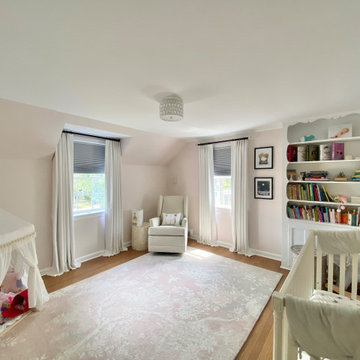
The vision for this project in our client’s home located in Westfield, NJ, was to bring a timeless and classic look to their daughter’s nursery.
The beauty in deciding to get custom drapes, is that one has the power to decide on every little detail that goes into manufacturing their draperies. Everything custom made, is made and selected with intention, and this project was exactly that. For this nursery room in our client’s home, they really wanted to achieve a very classic and timeless look. They wanted their nursery to be a room in which their daughter could grow and still be able to keep the same aesthetic as the years progress.
For this reason, our designer suggested going with a very light and simple fabric. The fabric utilized for the nursery was Evoque / Calm, made of a polyester and cotton blend. This white fabric with a very light sheen gave the room a very open and simple feel, yet elegant look. Along with being intentional with the fabric choice, the height of the drapes were also a small detail that went a long way with decorating this room.
THE BEAUTY OF PUDDLED DRAPES
These drapes are what we would call “puddled drapes.” This simply means the drapes have a break on the floor of about 2-3 inches. The decision to make the drapes puddle allowed for the look of the room to be exactly what our client desired, which was to have that timeless and classic look. In addition to the fabric choice itself, the hardware used for this project also added to that aesthetic.
The choice to go with the designer rod and rings in matte black, allowed for our customers to have flow within their entire house. Other spaces in their home have black accents, so choosing to go with this hardware, they were able to incorporate the same look as the rest of their home. All in all, all the decisions made as far as fabric selection and hardware allowed for our customer to transform their daughter’s nursery to exactly what they desired.
 Walczak Design And Build
What once felt dark, segmented, and inefficient is now a bright, connected, and highly functional first floor designed for real family living.
Our clients, Terry and Lou, came to us with a home that simply wasn’t keeping up with their growing family. The kitchen was cramped, with tight working lanes and limited light. The laundry room doubled as a powder room—yet functioned poorly as both. Sightlines between spaces were cut off, making it difficult to stay connected to their young children throughout the day. Across the board, the home felt dated and disconnected.
Through thoughtful planning and strategic structural changes, we reimagined the entire first floor to better support how this family truly lives.
We began by redefining the entry experience—creating a true foyer complete with a dedicated drop zone and custom cubby storage. This space now acts as a natural landing point, bringing order and intention to everyday comings and goings.
Adjacent to the new entry, we relocated and redesigned the laundry room. Now positioned exactly where it needs to be, it functions as a hardworking utility space with countertops for folding, a utility sink for immediate stain treatment, and the ability to be closed off—keeping daily life contained when needed.
Separating the previous shared function allowed us to carve out a distinct, personality-filled powder room. Wrapped in a bold wave-patterned wallpaper and grounded by a custom reeded oak vanity with warm brass accents, this space delivers a moment of delight and individuality within the home.
The kitchen transformation is where the impact is felt most deeply.
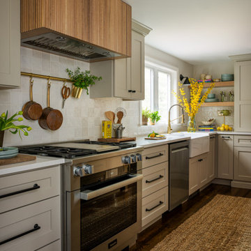
What was once a dark, restrictive layout has been opened into a spacious, highly efficient U-shaped kitchen with generous clearances and an oversized island for gathering. A thoughtful mix of painted cabinetry and rift white oak introduces warmth and balance, while the custom reeded hood becomes a sculptural focal point. Open shelving, integrated pantry storage, and layered lighting ensure the space is as functional as it is beautiful.
Beyond aesthetics, the redesign prioritizes flow—both in movement and in connection. Sightlines between the kitchen, dining, and living areas were intentionally opened, allowing for ease of interaction and visibility throughout the main living spaces.
To unify the home, existing hardwood floors were refinished and extended, creating continuity and a seamless visual experience from one space to the next.
The result is a home that feels lighter, more open, and deeply aligned with how this family lives day to day—designed not just to look beautiful, but to support everything from busy mornings to slow, shared evenings.
 Walczak Design And Build
What once felt dark, segmented, and inefficient is now a bright, connected, and highly functional first floor designed for real family living.
Our clients, Terry and Lou, came to us with a home that simply wasn’t keeping up with their growing family. The kitchen was cramped, with tight working lanes and limited light. The laundry room doubled as a powder room—yet functioned poorly as both. Sightlines between spaces were cut off, making it difficult to stay connected to their young children throughout the day. Across the board, the home felt dated and disconnected.
Through thoughtful planning and strategic structural changes, we reimagined the entire first floor to better support how this family truly lives.
We began by redefining the entry experience—creating a true foyer complete with a dedicated drop zone and custom cubby storage. This space now acts as a natural landing point, bringing order and intention to everyday comings and goings.
Adjacent to the new entry, we relocated and redesigned the laundry room. Now positioned exactly where it needs to be, it functions as a hardworking utility space with countertops for folding, a utility sink for immediate stain treatment, and the ability to be closed off—keeping daily life contained when needed.
Separating the previous shared function allowed us to carve out a distinct, personality-filled powder room. Wrapped in a bold wave-patterned wallpaper and grounded by a custom reeded oak vanity with warm brass accents, this space delivers a moment of delight and individuality within the home.
The kitchen transformation is where the impact is felt most deeply.
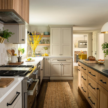
What was once a dark, restrictive layout has been opened into a spacious, highly efficient U-shaped kitchen with generous clearances and an oversized island for gathering. A thoughtful mix of painted cabinetry and rift white oak introduces warmth and balance, while the custom reeded hood becomes a sculptural focal point. Open shelving, integrated pantry storage, and layered lighting ensure the space is as functional as it is beautiful.
Beyond aesthetics, the redesign prioritizes flow—both in movement and in connection. Sightlines between the kitchen, dining, and living areas were intentionally opened, allowing for ease of interaction and visibility throughout the main living spaces.
To unify the home, existing hardwood floors were refinished and extended, creating continuity and a seamless visual experience from one space to the next.
The result is a home that feels lighter, more open, and deeply aligned with how this family lives day to day—designed not just to look beautiful, but to support everything from busy mornings to slow, shared evenings.
Sponsored
Columbus, OH
Free consultation for landscape design!

Peabody Landscape Group
Franklin County's Reliable Landscape Design & Contracting
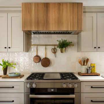 Walczak Design And Build
What once felt dark, segmented, and inefficient is now a bright, connected, and highly functional first floor designed for real family living.
Our clients, Terry and Lou, came to us with a home that simply wasn’t keeping up with their growing family. The kitchen was cramped, with tight working lanes and limited light. The laundry room doubled as a powder room—yet functioned poorly as both. Sightlines between spaces were cut off, making it difficult to stay connected to their young children throughout the day. Across the board, the home felt dated and disconnected.
Through thoughtful planning and strategic structural changes, we reimagined the entire first floor to better support how this family truly lives.
We began by redefining the entry experience—creating a true foyer complete with a dedicated drop zone and custom cubby storage. This space now acts as a natural landing point, bringing order and intention to everyday comings and goings.
Adjacent to the new entry, we relocated and redesigned the laundry room. Now positioned exactly where it needs to be, it functions as a hardworking utility space with countertops for folding, a utility sink for immediate stain treatment, and the ability to be closed off—keeping daily life contained when needed.
Separating the previous shared function allowed us to carve out a distinct, personality-filled powder room. Wrapped in a bold wave-patterned wallpaper and grounded by a custom reeded oak vanity with warm brass accents, this space delivers a moment of delight and individuality within the home.
The kitchen transformation is where the impact is felt most deeply.
What was once a dark, restrictive layout has been opened into a spacious, highly efficient U-shaped kitchen with generous clearances and an oversized island for gathering. A thoughtful mix of painted cabinetry and rift white oak introduces warmth and balance, while the custom reeded hood becomes a sculptural focal point. Open shelving, integrated pantry storage, and layered lighting ensure the space is as functional as it is beautiful.
Beyond aesthetics, the redesign prioritizes flow—both in movement and in connection. Sightlines between the kitchen, dining, and living areas were intentionally opened, allowing for ease of interaction and visibility throughout the main living spaces.
To unify the home, existing hardwood floors were refinished and extended, creating continuity and a seamless visual experience from one space to the next.
The result is a home that feels lighter, more open, and deeply aligned with how this family lives day to day—designed not just to look beautiful, but to support everything from busy mornings to slow, shared evenings.
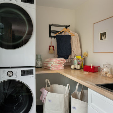 Walczak Design And Build
What once felt dark, segmented, and inefficient is now a bright, connected, and highly functional first floor designed for real family living.
Our clients, Terry and Lou, came to us with a home that simply wasn’t keeping up with their growing family. The kitchen was cramped, with tight working lanes and limited light. The laundry room doubled as a powder room—yet functioned poorly as both. Sightlines between spaces were cut off, making it difficult to stay connected to their young children throughout the day. Across the board, the home felt dated and disconnected.
Through thoughtful planning and strategic structural changes, we reimagined the entire first floor to better support how this family truly lives.
We began by redefining the entry experience—creating a true foyer complete with a dedicated drop zone and custom cubby storage. This space now acts as a natural landing point, bringing order and intention to everyday comings and goings.
Adjacent to the new entry, we relocated and redesigned the laundry room. Now positioned exactly where it needs to be, it functions as a hardworking utility space with countertops for folding, a utility sink for immediate stain treatment, and the ability to be closed off—keeping daily life contained when needed.
Separating the previous shared function allowed us to carve out a distinct, personality-filled powder room. Wrapped in a bold wave-patterned wallpaper and grounded by a custom reeded oak vanity with warm brass accents, this space delivers a moment of delight and individuality within the home.
The kitchen transformation is where the impact is felt most deeply.
What was once a dark, restrictive layout has been opened into a spacious, highly efficient U-shaped kitchen with generous clearances and an oversized island for gathering. A thoughtful mix of painted cabinetry and rift white oak introduces warmth and balance, while the custom reeded hood becomes a sculptural focal point. Open shelving, integrated pantry storage, and layered lighting ensure the space is as functional as it is beautiful.
Beyond aesthetics, the redesign prioritizes flow—both in movement and in connection. Sightlines between the kitchen, dining, and living areas were intentionally opened, allowing for ease of interaction and visibility throughout the main living spaces.
To unify the home, existing hardwood floors were refinished and extended, creating continuity and a seamless visual experience from one space to the next.
The result is a home that feels lighter, more open, and deeply aligned with how this family lives day to day—designed not just to look beautiful, but to support everything from busy mornings to slow, shared evenings.
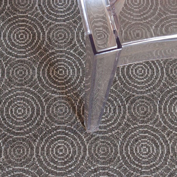
 Stark Carpet
Getting inspired with our Compass design from the Jamie Drake Collection. Tip: pair this carpet with retro pieces in a modern room.


 Draped
These custom drapes have beautiful banding fabric with a blue and cream oversized pattern. The cream main fabric contrasts beautifully against the warm gray walls of this dining room.
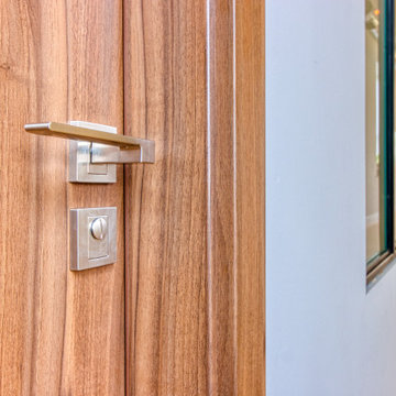
 Glenview Haus – Custom Doors & Wine Cellars
We were pleased to be brought in on this penthouse renovation in the heart of Bucktown, Chicago. The goal of this project was to revamp the space and add an additional touch of modern design through the use of warm Walnut Eco-Veneer doors. With warm tones, we were able to play on the traditional feel of the space, yet bring in modern touches with the magnetic latch hardware, concealed hinges, and flush designs. The seamlessly matching frames give an added touch of style, making these door units appear intentional and luxe. Noticed by every individual who walks through space, our Modern Interior doors are made to be an additional form of design that should complement and elevate your space.
Whenever we encounter a renovation project, we often anticipate certain obstacles. Existing design elements (flooring, wall thickness, building codes, etc.) and limited budgets can usually be tough to overcome. However, with our Modern Interior door package, we can provide flexible pricing and flexible styles and finishes that are guaranteed to complement any residence. Each door line has several different complementary designs to choose from, which can add variation throughout your home, while still providing a cohesive style that creates a meaningful flow.
Our Modern Interior door line comes equipped with everything you need for a no-fuss and effortless door buying process. One set price includes the door slab with desired solid wood veneer in finish of your choice, a matching adjustable frame, concealed hinges, and a magnetic lever set. Each door style provides a top of the line product and can exceed any and all expectations you might have. Our Modern Interior doors can provide an updated feel to your home, whether it is modern, contemporary or traditional. All elements of our Modern Interior Doors are geared towards updating your space and adding a luxury feel at an affordable price point. Glenview Haus has a mission to provide all design-savvy individuals with design elements that are highly coveted and unique to your home. Why blend in when you can stand out?
Sponsored
Delaware, OH

Buckeye Basements, Inc.
Central Ohio's Basement Finishing ExpertsBest Of Houzz '13-'21
 Marvin
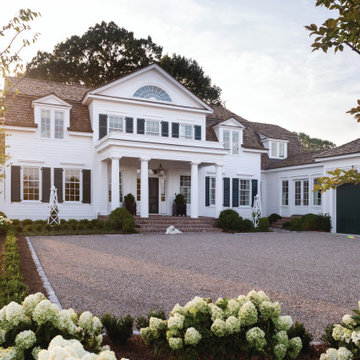
The 2021 Southern Living Idea House is inspiring on multiple levels—from the stunning location in Louisville, Kentucky overlooking the Ohio river, to the design-driven home that marries European countryside vibes with a timeless aesthetic. Dubbed the “forever home,” the concept was to design for all stages of life, with thoughtful spaces that meet the ever-evolving needs of families today.
The 5,545-square-foot, Colonial Greek Revival Cottage-style home is located in The Breakers at Prospect community and is the collective effort of many. While it may have formerly been a trend to embrace open layout living spaces, following the pandemic families are seeking spaces in the home that feel separated, to allow for privacy. Rooms with clear intentions allow more options for areas in which to spend time, depending on your mood, and this home perfectly balances livable and lively ideas.
Marvin products were chosen for this project to maximize the use of natural light, allow airflow from outdoors to indoors, and provide expansive views that overlook the Ohio River.
MARVIN PRODUCTS USED:
Marvin Awaken Skylight
Marvin Ultimate Casement Window
Marvin Ultimate Double Hung G2 Window
Marvin Ultimate Picture Window
Marvin Ultimate Direct Glaze Round Top Window
Marvin Ultimate Swinging French Door G2
BUILDER: Jason Black and Jimmy King of Artisan Signature Homes
ARCHITECT: Brandon Ingram of C. Brandon Ingram Design
INTERIOR DESIGNER: Sarah Bartholomew, Sarah Bartholomew Design
LANDSCAPE ARCHITECT: Josh Myers of Myers & Co. Landscape Architecture
PHOTOGRAPHY: Laurey W. Glenn, Marta Xochilt Perez, and Kriech-Higdon Photography for Southern Living
 J.P. Hoffman Design Build
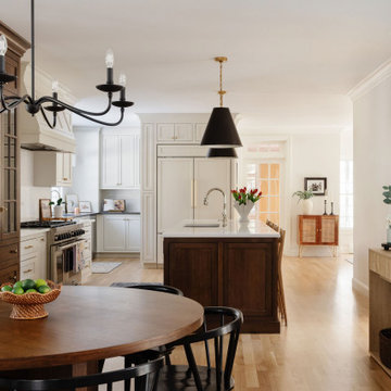
The original kitchen felt undersized for a 4,500-square-foot home, with adjacent formal spaces left unused and disconnected from daily life. The homeowners envisioned a larger, more welcoming kitchen that could better support cooking, entertaining, and gathering.
The renovation reworked the layout by incorporating the underutilized sitting room, allowing the kitchen to expand and open directly to the formal dining area. This created a more spacious and highly functional flow between spaces. A 10-foot walnut-stained island anchors the kitchen, complemented by a matching glass-front curio cabinet, chef-grade appliances, and dual sinks designed to support multiple cooks. A large window above the sink brings in natural light and frames views of the backyard, while a dedicated scullery provides additional pantry storage and prep space, keeping the main kitchen organized.
The result is a kitchen that feels open, intentional, and well-suited for both everyday living and entertaining.

 River Valley Landscapes
Blending contemporary forms and lush plantings, this Garden maximizes the sensory experience of the materials and planting from inside and outside the home. The garden occupies an interior courtyard framed by four interior walls. The home, designed by Architect Cliff May was built in 1948 and the following year was featured in House Beautiful Magazine. The clients list of needs and desires was brief. They wanted a space that would complement the mid century modern home and provide visual interest from inside the home. Some form of water was also requested. They had a budget of $30,000. In order to stay within their budget the clients performed the demolition of the old garden. The designer’s intent was to create a garden that would possess a clear sculptural quality and would be as visually striking from inside the home as it would be from inside the courtyard. The strategy behind the design was to use hardscape materials characterized by simple geometric forms and a planting palette that would emphasize form over color, and then to arrange the materials to achieve an interpretation of modern aesthetic.
The views from inside the homes three main living rooms present the garden as a graphic composition of space, hardscape materials and planting. Inside the courtyard the edges are defined by stone and planting. The floor is composed of rectangular slabs of Teakwood flagstone with a counterpoint of Mexican beach pebbles set within the joints and around the edges. Concrete along the edges of the Teakwood pads reduces migration of the modified stone and sand base. The contrast of the Mexican beach pebbles accentuates the pattern of the flagstone. The outside perimeter of the pebbles is contained with low profile edging. An existing catch drain was utilized for storm water runoff. A concrete block pier set on a concrete footing is covered with black stucco and provides a perch for a custom made copper bowl that circulates water into the L shaped water feature. The water features subterranean basin is constructed of pressure treated wood with a custom box liner insert. Since the Teakwood flagstone was unavailable as coping for the water feature, the designer chose Shawnee Buff stone to complement the Teakwood flagstone. The subtle sound of water spilling from the copper bowl and the reflective qualities of the water help to create an atmosphere of relaxation. The planting is composed of shades of green with white flowers in order to accentuate the graphic design. ‘Justin Brouwer’ Boxwood, ‘Sum and Substance’ Hosta, white Anemones, black bamboo and ornamental grasses contrast dramatically with the clean lines of the hardscape elements. The black bamboo is set in 30” diameter concrete containers to control the vigorous plant from spreading.
The construction of the interior courtyard space challenged the building team. They set up baffles between the front door and the door to the courtyard as well as temporary protection over the floor to allow the process to move forward without too much disturbance to the client’s lives. All of the materials were shuffled through the temporary portal.
The clients love the space and recently said that “the design is so well thought out and simple that they would never get tired of it.” The designs sculptural quality compliments the modern feel of the home and creates a sublime yet dramatic view from within the house or within the courtyard. The clients plan to purchase two black Bertoia Diamond chairs with red cushions which should perfectly integrate with the space.

 The Aldrich Company - Landscape Design
Vivid colors of yellow, blue and green compliment this Mediterranean vignette.
Photo of a mid-sized mediterranean full sun landscaping in Santa Barbara for summer.
Photo of a mid-sized mediterranean full sun landscaping in Santa Barbara for summer.
Sponsored
Delaware, OH
Buckeye Basements, Inc.
Central Ohio's Basement Finishing ExpertsBest Of Houzz '13-'21

 NILES
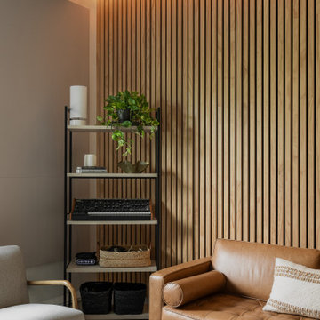
This 2022 project was a fully custom mix and writing suite designed for multi-Grammy and Dove Award–winning producer and songwriter Kyle Lee. The goal was to create an environment that mirrors his creative workflow—quiet, natural, highly accurate, and intentionally crafted for long sessions of collaboration and focused work.
The layout is compact but feels open thanks to high ceilings, soft daylight from the surrounding windows, and a palette of warm textures and natural materials. The room maintains a clean, grounded aesthetic without sacrificing technical performance, balancing style and acoustical precision in a way that supports both creativity and accuracy.
Acoustic isolation was a core priority. The suite is fully separated from the rest of the home using sound-reducing wall assemblies, custom bass management including a full soft-ceiling trap and a false rear wall trap, and full-lite doors designed for controlled leakage. The result is a private, self-contained environment that integrates seamlessly with the home’s flow yet transforms into a focused creative space the moment the doors close.
Monitoring was built around Kyle’s preferred ATC SCM45A loudspeakers, paired with Dynaudio subwoofers and calibrated specifically to the room’s frequency response. Every treatment, material, and speaker position was selected to ensure what Kyle hears while mixing precisely translates to the final master.
The finished suite delivers an effortless feel with professional-grade performance—an inspiring, accurate, and dependable space built to support Kyle’s work at the highest level.
 NILES
This 2022 project was a fully custom mix and writing suite designed for multi-Grammy and Dove Award–winning producer and songwriter Kyle Lee. The goal was to create an environment that mirrors his creative workflow—quiet, natural, highly accurate, and intentionally crafted for long sessions of collaboration and focused work.
The layout is compact but feels open thanks to high ceilings, soft daylight from the surrounding windows, and a palette of warm textures and natural materials. The room maintains a clean, grounded aesthetic without sacrificing technical performance, balancing style and acoustical precision in a way that supports both creativity and accuracy.
Acoustic isolation was a core priority. The suite is fully separated from the rest of the home using sound-reducing wall assemblies, custom bass management including a full soft-ceiling trap and a false rear wall trap, and full-lite doors designed for controlled leakage. The result is a private, self-contained environment that integrates seamlessly with the home’s flow yet transforms into a focused creative space the moment the doors close.
Monitoring was built around Kyle’s preferred ATC SCM45A loudspeakers, paired with Dynaudio subwoofers and calibrated specifically to the room’s frequency response. Every treatment, material, and speaker position was selected to ensure what Kyle hears while mixing precisely translates to the final master.
The finished suite delivers an effortless feel with professional-grade performance—an inspiring, accurate, and dependable space built to support Kyle’s work at the highest level.
239