
Search results for "Feeling isolated" in Home Design Ideas

 User
Photo Credit: Catherine McNeal, Lifestyled Staging & Redesign
This spacious young colonial home built in 2007 features three bedrooms and baths, gourmet kitchen, stunning two story entry hall, huge full basement and so much more! Located on a pastoral country road which is quite rural without feeling isolated.

 Kitchens Direct, Inc
Prior to being renovated, the existing rooms of this home were compartmentalized into claustrophobic sections, barely serving their individual functions in relative isolation. With a belief that utility need not exist independent of comfort, we looked to open up and expand the kitchen space into an existing porch. We feel this answered the client's call for a combined kitchen and living space while improving on all functional elements of the design. Throughout the project we would keep our focus on the goal of bringing the home into the modern age, without sacrificing the client's desire for a comfortable, family friendly feel.
Photographed by: Skylim Photography
 Kitchens Direct, Inc
Prior to being renovated, the existing rooms of this home were compartmentalized into claustrophobic sections, barely serving their individual functions in relative isolation. With a belief that utility need not exist independent of comfort, we looked to open up and expand the kitchen space into an existing porch. We feel this answered the client's call for a combined kitchen and living space while improving on all functional elements of the design. Throughout the project we would keep our focus on the goal of bringing the home into the modern age, without sacrificing the client's desire for a comfortable, family friendly feel.
Photographed by: Skylim Photography
Find the right local pro for your project

Eclectic kitchen photo in Los Angeles with dark wood cabinets, stainless steel appliances and an island
 User
Photo Credit: Catherine McNeal, Lifestyled Staging & Redesign
This spacious young colonial home built in 2007 features three bedrooms and baths, gourmet kitchen, stunning two story entry hall, huge full basement and so much more! Located on a pastoral country road which is quite rural without feeling isolated.

 CMM Custom Homes
sean litchfield
Example of a mid-sized beach style open concept medium tone wood floor living room design in New York with beige walls
Example of a mid-sized beach style open concept medium tone wood floor living room design in New York with beige walls
 Kitchens Direct, Inc
Prior to being renovated, the existing rooms of this home were compartmentalized into claustrophobic sections, barely serving their individual functions in relative isolation. With a belief that utility need not exist independent of comfort, we looked to open up and expand the kitchen space into an existing porch. We feel this answered the client's call for a combined kitchen and living space while improving on all functional elements of the design. Throughout the project we would keep our focus on the goal of bringing the home into the modern age, without sacrificing the client's desire for a comfortable, family friendly feel.
Photographed by: Skylim Photography
Sponsored
Sunbury, OH

J.Holderby - Renovations
Franklin County's Leading General Contractors - 2X Best of Houzz!

 Oscar Interiors
Hideaway, Le Marche - San Marino, Italy
A historical Hideaway.
Image courtesy on the realtor, Leo Trippi.
A well-hidden place where the spirit finds its peace, nested between the Romagna, the Marches and Tuscany. Entering the gate, one leaves behind the pace of chaotic lives, and abandons itself to the joy of living of this ancient land. It is meant to be understood as a site of experience, where nature, culture, history and pleasure are elevated to the centre of things in order to finally rediscover it in oneself. A sort of “back to the simplicity”, aiming to dedicate oneself to observation and drawing from it valuable experiences for one’s life. Each of the three houses presents itself as an unexpected world in its own right, closed in on itself and yet a harmonious part of the whole, waiting to be enlivened by lively laughter, animated conversation and playfulness. This territory is a paradise for lovers of nature and the great outdoors. The sheer variety of places and landscapes enables visitors to take excursions on foot, on horseback or by mountain bike. History and architecture enthusiasts can follow an itinerary of strongholds and castles dotted around the area. Lovers of gourmet food will discover a full range of traditional dishes and quality local produce all year round. The rich variety of museums enables exploration into the rural arts, medieval architecture, archaeological finds and contemporary art.

 Betty Wasserman Art & Interiors
A spacious and open kitchen design was ideal for these clients, who wanted a home for entertaining. The traditional white shaker cabinets offer an updated feel when combined with the slate grey countertops, stainless steel appliances, and glazed subway tile backsplash. A convenient banquet is subtly placed to the side of the kitchen, offering an accessible place to sit with family without being isolated from them.

 Lindye Galloway Interiors
Jasmine Star
Inspiration for a large 1950s guest light wood floor bedroom remodel in Orange County with gray walls and no fireplace
Inspiration for a large 1950s guest light wood floor bedroom remodel in Orange County with gray walls and no fireplace
 TKS Design Group
Download our free ebook, Creating the Ideal Kitchen. DOWNLOAD NOW
Lakefront property in the northwest suburbs of Chicago is hard to come by, so when we were hired by this young family with exactly that, we were immediately inspired by not just the unusually large footprint of this 1950’s colonial revival but also the lovely views of the manmade lake it was sited on. The large 5-bedroom home was solidly stuck in the 1980’s, but we saw tons of potential. We started out by updating the existing staircase with a fresh coat of paint and adding new herringbone slate to the entry hall.
The powder room off the entryway also got a refresh - new flooring, new cabinets and fixtures. We ran the new slate right through into this space for some consistency. A fun wallpaper and shiplap trim add a welcoming feel and set the tone for the home.
Next, we tackled the kitchen. Located away from the rest of the first floor, the kitchen felt a little isolated, so we immediately began planning for how to better connect it to the rest of the first floor. We landed on removing the wall between the kitchen and dining room and designed a modified galley style space with separate cooking and clean up zones. The cooking zone consists of the refrigerator, prep sink and cooktop, along with a nice long run of prep space at the island. The cleanup side of the kitchen consists of the main sink and dishwasher. Both areas are situated so that the user can view the lake during prep work and cleanup!
One of the home’s main puzzles was how to incorporate the mudroom and area in front of the patio doors at the back of the house. We already had a breakfast table area, so the space by the patio doors was a bit of a no man’s land. We decided to separate the kitchen proper from what became the new mudroom with a large set of barn doors. That way you can quickly hide any mudroom messes but have easy access to the light coming in through the patio doors as well as the outdoor grilling station. We also love the impact the barn doors add to the overall space.
The homeowners’ first words to us were “it’s time to ditch the brown,” so we did! We chose a lovely blue pallet that reflects the home’s location on the lake which is also vibrant yet easy on the eye. Countertops are white quartz, and the natural oak floor works well with the other honey accents. The breakfast table was given a refresh with new chairs, chandelier and window treatments that frame the gorgeous views of the lake out the back.
We coordinated the slate mudroom flooring with that used in the home’s main entrance for a consistent feel. The storage area consists of open and closed storage to allow for some clutter control as needed.
Next on our “to do” list was revamping the dated brown bar area in the neighboring dining room. We eliminated the clutter by adding some closed cabinets and did some easy updates to help the space feel more current. One snag we ran into here was the discovery of a beam above the existing open shelving that had to be modified with a smaller structural beam to allow for our new design to work. This was an unexpected surprise, but in the end we think it was well worth it!
We kept the colors here a bit more muted to blend with the homeowner’s existing furnishings. Open shelving and polished nickel hardware add some simple detail to the new entertainment zone which also looks out onto the lake!
Next we tackled the upstairs starting with the homeowner’s son’s bath. The bath originally had both a tub shower and a separate shower, so we decided to swap out the shower for a new laundry area. This freed up some space downstairs in what used to be the mudroom/laundry room and is much more convenient for daily laundry needs.
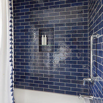
We continued the blue palette here with navy cabinetry and the navy tile in the shower. Porcelain floor tile and chrome fixtures keep maintenance to a minimum while matte black mirrors and lighting add some depth the design. A low maintenance runner adds some warmth underfoot and ties the whole space together.
We added a pocket door to the bathroom to minimize interference with the door swings. The left door of the laundry closet is on a 180 degree hinge to allow for easy full access to the machines. Next we tackled the master bath which is an en suite arrangement. The original was typical of the 1980’s with the vanity outside of the bathroom, situated near the master closet. And the brown theme continued here with multiple shades of brown.
Our first move was to segment off the bath and the closet from the master bedroom. We created a short hall from the bedroom to the bathroom with his and hers walk-in closets on the left and right as well as a separate toilet closet outside of the main bathroom for privacy and flexibility.
The original bathroom had a giant soaking tub with steps (dangerous!) as well as a small shower that did not work well for our homeowner who is 6’3”. With other bathtubs in the home, they decided to eliminate the tub and create an oversized shower which takes up the space where the old tub was located. The double vanity is on the opposite wall and a bench is located under the window for morning conversations and a place to set a couple of towels.
The pallet in here is light and airy with a mix of blond wood, creamy porcelain and marble tile, and brass accents. A simple roman shade adds some texture and it’s top-down mechanism allows for light and privacy.
This large whole house remodel gave our homeowners not only the ability to maximize the potential of their home but also created a lovely new frame from which to view their fabulous lake views.
Designed by: Susan Klimala, CKD, CBD
Photography by: Michael Kaskel
For more information on kitchen and bath design ideas go to: www.kitchenstudio-ge.com


Sponsored
Sunbury, OH
J.Holderby - Renovations
Franklin County's Leading General Contractors - 2X Best of Houzz!

 Angie Keyes CKBD
This Condo has been in the family since it was first built. And it was in desperate need of being renovated. The kitchen was isolated from the rest of the condo. The laundry space was an old pantry that was converted. We needed to open up the kitchen to living space to make the space feel larger. By changing the entrance to the first guest bedroom and turn in a den with a wonderful walk in owners closet.
Then we removed the old owners closet, adding that space to the guest bath to allow us to make the shower bigger. In addition giving the vanity more space.
The rest of the condo was updated. The master bath again was tight, but by removing walls and changing door swings we were able to make it functional and beautiful all that the same time.


 Amazing Spaces
The existing U-shaped kitchen was tucked away in a small corner while the dining table was swimming in a room much too large for its size. The client’s needs and the architecture of the home made it apparent that the perfect design solution for the home was to swap the spaces.
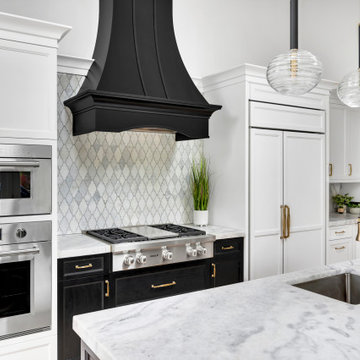
The homeowners entertain frequently and wanted the new layout to accommodate a lot of counter seating, a bar/buffet for serving hors d’oeuvres, an island with prep sink, and all new appliances. They had a strong preference that the hood be a focal point and wanted to go beyond a typical white color scheme even though they wanted white cabinets.
While moving the kitchen to the dining space gave us a generous amount of real estate to work with, two of the exterior walls are occupied with full-height glass creating a challenge how best to fulfill their wish list. We used one available wall for the needed tall appliances, taking advantage of its height to create the hood as a focal point. We opted for both a peninsula and island instead of one large island in order to maximize the seating requirements and create a barrier when entertaining so guests do not flow directly into the work area of the kitchen. This also made it possible to add a second sink as requested. Lastly, the peninsula sets up a well-defined path to the new dining room without feeling like you are walking through the kitchen. We used the remaining fourth wall for the bar/buffet.
Black cabinetry adds strong contrast in several areas of the new kitchen. Wire mesh wall cabinet doors at the bar and gold accents on the hardware, light fixtures, faucets and furniture add further drama to the concept. The focal point is definitely the black hood, looking both dramatic and cohesive at the same time.
 Betty Wasserman Art & Interiors
A spacious and open kitchen design was ideal for these clients, who wanted a home for entertaining. The traditional white shaker cabinets offer an updated feel when combined with the slate gray countertops, stainless steel appliances, and glazed subway tile backsplash. A convenient banquet is subtly placed to the side of the kitchen, offering an accessible place to sit with family without being isolated from them.


 HOME SOLUTIONS
The narrow doorway leading into this 60's kitchen left the room feeling isolated and dated. An entire wall was occupied by a door leading to the garage and a large radiator under a window. Moving the garage entrance into another room, converting the radiator into a toe kick heater and installing a large header over the entrance to the kitchen allowed the formation of the galley kitchen with plenty of room to move around, and a peninsula off the end of the U-shaped layout creates an eat-in space.

 RDM Architecture
This project started out as an enclosed 50's style galley kitchen with a pass through into the family room and a weirdly isolated pantry at the back of the kitchen. By opening a large section of the wall into the family room with an upset beam and capturing the space of the pantry we were able to add a large island, large pantry cabinets and still end up with more linear feet of counter space. The space has a better connection to the rest of the house and feels bright and open.

 Carpenter & MacNeille
Michael J. Lee Photography
Example of a classic deck design in Boston with no cover
Example of a classic deck design in Boston with no cover
8