
Search results for "Footprint" in Home Design Ideas
 Isla Homes
Ryan Gamma Photography
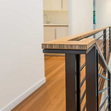
Example of a mid-sized minimalist wooden straight open staircase design in Tampa
Example of a mid-sized minimalist wooden straight open staircase design in Tampa
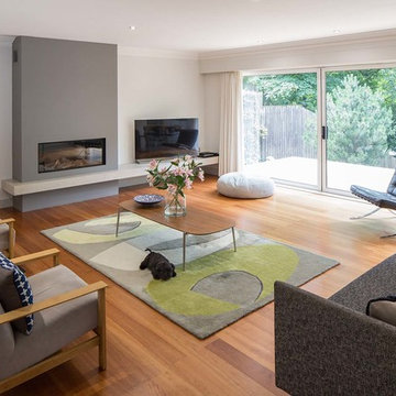
 Footprint Architects Ltd
The key design driver for the project was to create a simple but contemporary extension that responded to the existing dramatic topography in the property’s rear garden. The concept was to provide a single elegant form, cantilevering out into the tree canopies and over the landscape. Conceived as a house within the tree canopies the extension is clad in sweet chestnut which enhances the relationship to the surrounding mature trees. Large sliding glass panels link the inside spaces to its unique environment. Internally the design successfully resolves the Client’s brief to provide an open plan and fluid layout, that subtly defines distinct living and dining areas. The scheme was completed in April 2016
 ZeroEnergy Design
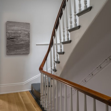
This renovated brick rowhome in Boston’s South End offers a modern aesthetic within a historic structure, creative use of space, exceptional thermal comfort, a reduced carbon footprint, and a passive stream of income.
DESIGN PRIORITIES. The goals for the project were clear - design the primary unit to accommodate the family’s modern lifestyle, rework the layout to create a desirable rental unit, improve thermal comfort and introduce a modern aesthetic. We designed the street-level entry as a shared entrance for both the primary and rental unit. The family uses it as their everyday entrance - we planned for bike storage and an open mudroom with bench and shoe storage to facilitate the change from shoes to slippers or bare feet as they enter their home. On the main level, we expanded the kitchen into the dining room to create an eat-in space with generous counter space and storage, as well as a comfortable connection to the living space. The second floor serves as master suite for the couple - a bedroom with a walk-in-closet and ensuite bathroom, and an adjacent study, with refinished original pumpkin pine floors. The upper floor, aside from a guest bedroom, is the child's domain with interconnected spaces for sleeping, work and play. In the play space, which can be separated from the work space with new translucent sliding doors, we incorporated recreational features inspired by adventurous and competitive television shows, at their son’s request.
MODERN MEETS TRADITIONAL. We left the historic front facade of the building largely unchanged - the security bars were removed from the windows and the single pane windows were replaced with higher performing historic replicas. We designed the interior and rear facade with a vision of warm modernism, weaving in the notable period features. Each element was either restored or reinterpreted to blend with the modern aesthetic. The detailed ceiling in the living space, for example, has a new matte monochromatic finish, and the wood stairs are covered in a dark grey floor paint, whereas the mahogany doors were simply refinished. New wide plank wood flooring with a neutral finish, floor-to-ceiling casework, and bold splashes of color in wall paint and tile, and oversized high-performance windows (on the rear facade) round out the modern aesthetic.
RENTAL INCOME. The existing rowhome was zoned for a 2-family dwelling but included an undesirable, single-floor studio apartment at the garden level with low ceiling heights and questionable emergency egress. In order to increase the quality and quantity of space in the rental unit, we reimagined it as a two-floor, 1 or 2 bedroom, 2 bathroom apartment with a modern aesthetic, increased ceiling height on the lowest level and provided an in-unit washer/dryer. The apartment was listed with Jackie O'Connor Real Estate and rented immediately, providing the owners with a source of passive income.
ENCLOSURE WITH BENEFITS. The homeowners sought a minimal carbon footprint, enabled by their urban location and lifestyle decisions, paired with the benefits of a high-performance home. The extent of the renovation allowed us to implement a deep energy retrofit (DER) to address air tightness, insulation, and high-performance windows. The historic front facade is insulated from the interior, while the rear facade is insulated on the exterior. Together with these building enclosure improvements, we designed an HVAC system comprised of continuous fresh air ventilation, and an efficient, all-electric heating and cooling system to decouple the house from natural gas. This strategy provides optimal thermal comfort and indoor air quality, improved acoustic isolation from street noise and neighbors, as well as a further reduced carbon footprint. We also took measures to prepare the roof for future solar panels, for when the South End neighborhood’s aging electrical infrastructure is upgraded to allow them.
URBAN LIVING. The desirable neighborhood location allows the both the homeowners and tenant to walk, bike, and use public transportation to access the city, while each charging their respective plug-in electric cars behind the building to travel greater distances.
OVERALL. The understated rowhouse is now ready for another century of urban living, offering the owners comfort and convenience as they live life as an expression of their values.
Eric Roth Photo
Find the right local pro for your project
 Copper Sky Design + Remodel
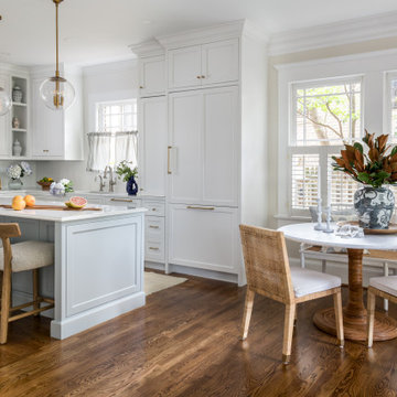
A quintessential 1925 bungalow located in the charming neighborhood of Virginia Highland in Atlanta, this project included a renovation of the kitchen, family room and powder room on the first floor, and the laundry and primary bath on the second. The Copper Sky Design + Remodel team reconfigured the first floor to better accommodate additional cabinetry and an island in the kitchen by borrowing space from what was a full bathroom and converting it to a half bath. Upstairs, unfinished attic space was converted to a roomy laundry room while the 200 square foot primary bath remained in its original footprint.
 Charles Hilton Architects
Alice Washburn Award 2013 - Winner - Accessory Building
Charles Hilton Architects
Photography: Woodruff Brown
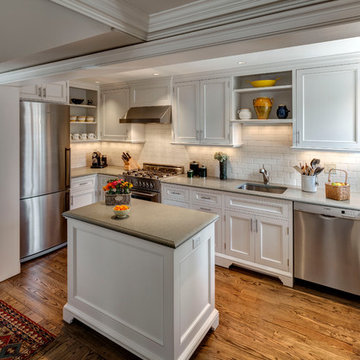
Inspiration for a small country u-shaped medium tone wood floor kitchen remodel in New York with an undermount sink, recessed-panel cabinets, white cabinets, white backsplash, subway tile backsplash, stainless steel appliances and an island
Inspiration for a small country u-shaped medium tone wood floor kitchen remodel in New York with an undermount sink, recessed-panel cabinets, white cabinets, white backsplash, subway tile backsplash, stainless steel appliances and an island
 Footprint Architects Ltd
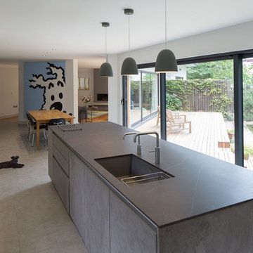
The key design driver for the project was to create a simple but contemporary extension that responded to the existing dramatic topography in the property’s rear garden. The concept was to provide a single elegant form, cantilevering out into the tree canopies and over the landscape. Conceived as a house within the tree canopies the extension is clad in sweet chestnut which enhances the relationship to the surrounding mature trees. Large sliding glass panels link the inside spaces to its unique environment. Internally the design successfully resolves the Client’s brief to provide an open plan and fluid layout, that subtly defines distinct living and dining areas. The scheme was completed in April 2016
 McGuire + Co. Kitchen & Bath
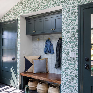
Design-build remodel in Wakefield, MA, featuring a kitchen with a bar area and mudroom space. (#ProjectEclecticEnvy) This remodel showcases painted frameless cabinetry in Rookwood Green, with a white textured subway tile backsplash, seamlessly integrated into a U-shaped layout with a peninsula for seating. The appliance suite in matte black adds contrast, accented with brass and German bronze hardware. A Silgranit apron sink with a fabric skirt and a brass bridge faucet introduce traditional charm. The bar area features a medium gray quartz countertop that mimics concrete, a highly textured geometric backsplash, and a concealed framed television. The mudroom space includes custom built-in storage with a stained bench top and continues the bar area’s backsplash tile. An 8” charcoal hexagon floor tile and Hygge & West Piedmont Wallpaper in Pine - a large-scale patterned wallpaper featuring foxes, birds, and florals - tie the space together with bold character.
 ZeroEnergy Design
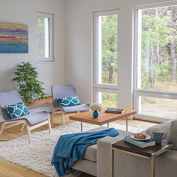
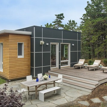
This modern green home offers both a vacation destination on Cape Cod near local family members and an opportunity for rental income.
FAMILY ROOTS. A West Coast couple living in the San Francisco Bay Area sought a permanent East Coast vacation home near family members living on Cape Cod. As academic professionals focused on sustainability, they sought a green, energy efficient home that was well-aligned with their values. With no green homes available for sale on Cape Cod, they decided to purchase land near their family and build their own.
SLOPED SITE. Comprised of a 3/4 acre lot nestled in the pines, the steeply sloping terrain called for a plan that embraced and took advantage of the slope. Of equal priority was optimizing solar exposure, preserving privacy from abutters, and creating outdoor living space. The design accomplished these goals with a simple, rectilinear form, offering living space on the both entry and lower/basement levels. The stepped foundation allows for a walk-out basement level with light-filled living space on the down-hill side of the home. The traditional basement on the eastern, up-hill side houses mechanical equipment and a home gym. The house welcomes natural light throughout, captures views of the forest, and delivers entertainment space that connects indoor living space to outdoor deck and dining patio.
MODERN VISION. The clean building form and uncomplicated finishes pay homage to the modern architectural legacy on the outer Cape. Durable and economical fiber cement panels, fixed with aluminum channels, clad the primary form. Cedar clapboards provide a visual accent at the south-facing living room, which extends a single roof plane to cover the entry porch.
SMART USE OF SPACE. On the entry level, the “L”-shaped living, dining, and kitchen space connects to the exterior living, dining, and grilling spaces to effectively double the home’s summertime entertainment area. Placed at the western end of the entry level (where it can retain privacy but still claim expansive downhill views) is the master suite with a built-in study. The lower level has two guest bedrooms, a second full bathroom, and laundry. The flexibility of the space—crucial in a house with a modest footprint—emerges in one of the guest bedrooms, which doubles as home office by opening the barn-style double doors to connect it to the bright, airy open stair leading up to the entry level. Thoughtful design, generous ceiling heights and large windows transform the modest 1,100 sf* footprint into a well-lit, spacious home. *(total finished space is 1800 sf)
RENTAL INCOME. The property works for its owners by netting rental income when the owners are home in San Francisco. The house especially caters to vacationers bound for nearby Mayo Beach and includes an outdoor shower adjacent to the lower level entry door. In contrast to the bare bones cottages that are typically available on the Cape, this home offers prospective tenants a modern aesthetic, paired with luxurious and green features. Durable finishes inside and out will ensure longevity with the heavier use that comes with a rental property.
COMFORT YEAR-ROUND. The home is super-insulated and air-tight, with mechanical ventilation to provide continuous fresh air from the outside. High performance triple-paned windows complement the building enclosure and maximize passive solar gain while ensuring a warm, draft-free winter, even when sitting close to the glass. A properly sized air source heat pump offers efficient heating & cooling, and includes a carefully designed the duct distribution system to provide even comfort throughout the house. The super-insulated envelope allows us to significantly reduce the equipment capacity, duct size, and airflow quantities, while maintaining unparalleled thermal comfort.
ENERGY EFFICIENT. The building’s shell and mechanical systems play instrumental roles in the home’s exceptional performance. The building enclosure reduces the most significant energy glutton: heating. Continuous super-insulation, thorough air sealing, triple-pane windows, and passive solar gain work together to yield a miniscule heating load. All active energy consumers are extremely efficient: an air source heat pump for heating and cooling, a heat pump hot water heater, LED lighting, energy recovery ventilation (ERV), and high efficiency appliances. The result is a home that uses 70% less energy than a similar new home built to code requirements.
OVERALL. The home embodies the owners’ goals and values while comprehensively enabling thermal comfort, energy efficiency, a vacation respite, and supplementary income.
PROJECT TEAM
ZeroEnergy Design - Architect & Mechanical Designer
A.F. Hultin & Co. - Contractor
Pamet Valley Landscape Design - Landscape & Masonry
Lisa Finch - Original Artwork
European Architectural Supply - Windows
Eric Roth Photography - Photography

 ZeroEnergy Design
This modern green home offers both a vacation destination on Cape Cod near local family members and an opportunity for rental income.
FAMILY ROOTS. A West Coast couple living in the San Francisco Bay Area sought a permanent East Coast vacation home near family members living on Cape Cod. As academic professionals focused on sustainability, they sought a green, energy efficient home that was well-aligned with their values. With no green homes available for sale on Cape Cod, they decided to purchase land near their family and build their own.
SLOPED SITE. Comprised of a 3/4 acre lot nestled in the pines, the steeply sloping terrain called for a plan that embraced and took advantage of the slope. Of equal priority was optimizing solar exposure, preserving privacy from abutters, and creating outdoor living space. The design accomplished these goals with a simple, rectilinear form, offering living space on the both entry and lower/basement levels. The stepped foundation allows for a walk-out basement level with light-filled living space on the down-hill side of the home. The traditional basement on the eastern, up-hill side houses mechanical equipment and a home gym. The house welcomes natural light throughout, captures views of the forest, and delivers entertainment space that connects indoor living space to outdoor deck and dining patio.
MODERN VISION. The clean building form and uncomplicated finishes pay homage to the modern architectural legacy on the outer Cape. Durable and economical fiber cement panels, fixed with aluminum channels, clad the primary form. Cedar clapboards provide a visual accent at the south-facing living room, which extends a single roof plane to cover the entry porch.
SMART USE OF SPACE. On the entry level, the “L”-shaped living, dining, and kitchen space connects to the exterior living, dining, and grilling spaces to effectively double the home’s summertime entertainment area. Placed at the western end of the entry level (where it can retain privacy but still claim expansive downhill views) is the master suite with a built-in study. The lower level has two guest bedrooms, a second full bathroom, and laundry. The flexibility of the space—crucial in a house with a modest footprint—emerges in one of the guest bedrooms, which doubles as home office by opening the barn-style double doors to connect it to the bright, airy open stair leading up to the entry level. Thoughtful design, generous ceiling heights and large windows transform the modest 1,100 sf* footprint into a well-lit, spacious home. *(total finished space is 1800 sf)
RENTAL INCOME. The property works for its owners by netting rental income when the owners are home in San Francisco. The house especially caters to vacationers bound for nearby Mayo Beach and includes an outdoor shower adjacent to the lower level entry door. In contrast to the bare bones cottages that are typically available on the Cape, this home offers prospective tenants a modern aesthetic, paired with luxurious and green features. Durable finishes inside and out will ensure longevity with the heavier use that comes with a rental property.
COMFORT YEAR-ROUND. The home is super-insulated and air-tight, with mechanical ventilation to provide continuous fresh air from the outside. High performance triple-paned windows complement the building enclosure and maximize passive solar gain while ensuring a warm, draft-free winter, even when sitting close to the glass. A properly sized air source heat pump offers efficient heating & cooling, and includes a carefully designed the duct distribution system to provide even comfort throughout the house. The super-insulated envelope allows us to significantly reduce the equipment capacity, duct size, and airflow quantities, while maintaining unparalleled thermal comfort.
ENERGY EFFICIENT. The building’s shell and mechanical systems play instrumental roles in the home’s exceptional performance. The building enclosure reduces the most significant energy glutton: heating. Continuous super-insulation, thorough air sealing, triple-pane windows, and passive solar gain work together to yield a miniscule heating load. All active energy consumers are extremely efficient: an air source heat pump for heating and cooling, a heat pump hot water heater, LED lighting, energy recovery ventilation (ERV), and high efficiency appliances. The result is a home that uses 70% less energy than a similar new home built to code requirements.
OVERALL. The home embodies the owners’ goals and values while comprehensively enabling thermal comfort, energy efficiency, a vacation respite, and supplementary income.
PROJECT TEAM
ZeroEnergy Design - Architect & Mechanical Designer
A.F. Hultin & Co. - Contractor
Pamet Valley Landscape Design - Landscape & Masonry
Lisa Finch - Original Artwork
European Architectural Supply - Windows
Eric Roth Photography - Photography

 Aquatica Plumbing Group
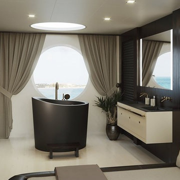
The True Ofuro Mini came about as the direct result of your requests. It too is inspired by the ancient traditions of Japanese bathing that led to the development of our incredibly popular True Ofuro. It too draws on the best ergonomic principles to sculpt a bath with internal seating and built-in headrest, made available in a very compact footprint to fit into even the smallest bathrooms. In fact, Aquatica’s clever designers have managed to create this ‘small and tall’ tub, deep enough for full body soaking in a footprint of just 43”.
Now we have made one more important innovation to the Ofuro Mini - the addition of a stunning graphite black option, using our award-winning and ground-breaking AquateX™ solid surface composite. Just think how that might look in your bathroom!
It is taller and deeper and features a slightly elevated rim for improved neck and head support, as well as a convenient ergonomic built-in seat, allowing the body to comfortably emerge to maximum water capacity. The height of the True Ofuro Mini Japanese style soaking bathtub is substantially taller than the original True Ofuro bathtub, and therefore we recommend people who are shorter than 170cm also purchase our stylish teak wood step.
Aquatica’s international industrial design team, used advanced CAD tools, modeling and repeated testing with real size prototype units so that we could reach the optimal balance between ergonomic comfort and visual appeal.
Our AquateX™ material is the star in this Japanese soaking tub as it retains heat much longer and also has a silky and velvety surface. This bathtub is currently one of our most space conscious bathtubs at a size of 43" x 43" (1090x1090mm), making the freestanding and petite construction of this Japanese style bathtub easy to be installed in any sized bathroom.
 Adrienne DeRosa
Photo: Adrienne DeRosa © 2015 Houzz
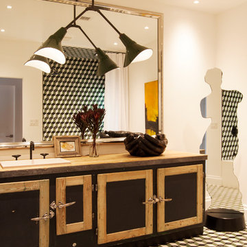
Weiss and Carpenter chose to outfit the guest bath in a way that perfectly exemplifies their design philosophy of old-meets-new. Fashioned from an antique butchers freezer, the vanity maintains all of its original features, including the wooden top and worn paint. "Keeping elements from the past not only interests us aesthetically," explains Will, "it also works with our strong held dedication to environmentally sensitive construction. Our view is that by repurposing antiques and found objects, we can lessen our carbon footprint and minimize our individual effect on the environ-
ment."
Following the industrial vibe of the vanity, an antique French pendant hangs above. Finished in dark green enamel, it is a subtle statement piece in the room. The overall arrangement of the space comes together with encaustic mission tile. Graphic and lively, the cement tiles grace the room with a sophisticated sense of humor.
Tile: Harlequin, Original Mission Tile; Taps: Brooklyn 31, Watermark Designs
 CHRISTOPHER STROM ARCHITECTS
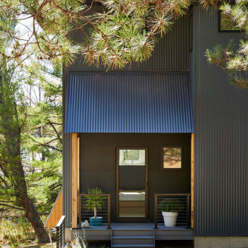
Sommerhus is a private retreat for two empty-nesters. The clients purchased the previous cabin after falling in love with its location on a private, lakefront peninsula. However, this beautiful site was a challenging site to build on, due to its position sandwiched between the lake and protected wet land. The clients disliked the old cabin because it could only be used in the summer months, due to its lack of both insulation and heat. In addition, it was too small for their needs. They wanted to build a new, larger retreat, but were met with yet another constraint: the new cabin would be limited to the previous cabin’s small footprint. Thus, they decided to approach an architect to design their dream cabin.
As the clients described, “We visited Denmark for a family wedding in 2015, and while biking near Gilleleje, a fishing village on the Baltic Sea, we fell in love with the aesthetic of ‘Sommerhus’: dark exteriors, clean, simple lines, and lots of windows.” We set out to design a cabin that fit this aesthetic while also meeting the site’s constraints.
The clients were committed to keeping all existing trees on their site. In addition, zoning codes required the new retreat to stay within the previous cabin's small footprint. Thus, to maximize the square footage of the cabin without removing trees or expanding the footprint, the new structure had to grow vertically. At the same time, the clients wanted to be good neighbors. To them, this meant that their cabin should disappear into the woods, especially when viewed from the lake. To accomplish both these requests, the architect selected a dark exterior metal façade that would visually retreat into the trees. The metal siding is a modern, low-maintenance, and cost-effective solution, especially when compared to traditional wood siding. Warm wood on the soffits of the large roof overhang contrast with the metal siding. Sommerhus's resulting exterior is just as the clients’ requested: boldly modern yet respectful of the serene surroundings.
The homeowners desired a beach-house-inspired interior, full of light and warmth, in contrast to the dark exterior. As the homeowner explained, “I wanted it to feel like a porch inside.” To achieve this, the living room has two walls of sliding glass doors that connect to the wrap-around porch. This creates a beautiful, indoor-outdoor living space. The crisp and bright kitchen also connects to the porch with the window that opens to an outdoor counter - perfect for passing food and drinks to those lounging on the porch. The kitchen is open to the rest of the first-floor entertaining space, and brings a playful, beach-house feel to the cabin.
After the completion of the project, the homeowners remarked, “Working with Christopher and Eric [of CSA] was a wonderful experience. We absolutely love our home, and each season on the lake is more special than the last.”
 RAJ Kitchen and Bath, LLC
 “Full apartment design”.
IF you have not yet seen this apartment conversion before, we strongly urge you to go to the bottom left of this page and click on the short 2-minutes video. It would put a lot of things into perspective when you come back and continue reading this.
It is true we were literally handed the keys and told a list of things that they wanted to have happen and we were to go into the apartment, look at the space and come up with a design that would satisfy all of that need. UNTIL we showed up! The unit had really seen some better days but we knew we had to look past that and come up with a concept that would work for them.
The immediate challenges were centered around 3 big ideas:
1. Adding a second bedroom to the already small footprint
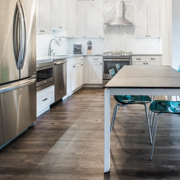
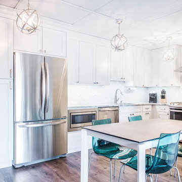
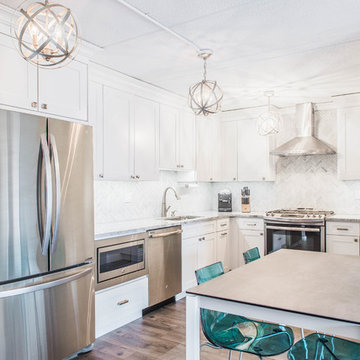
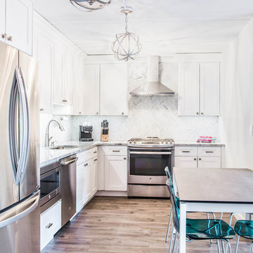
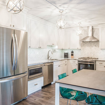
2. Figuring out a way to make the kitchen bigger, better and brighter
3. Creating a master room walk in closet
It’s always difficult to add new rooms into existing footprint without expanding out or up and not incurring any opportunity cost. In this case, that was exactly what we had to do. Item one and two above had to be tackled as one. We went ahead and switched out the location of the dining room and eliminating an area where there was a “nook” type eat-in area. By doing so, we were able to cut right into that footprint and change the layout of the kitchen.
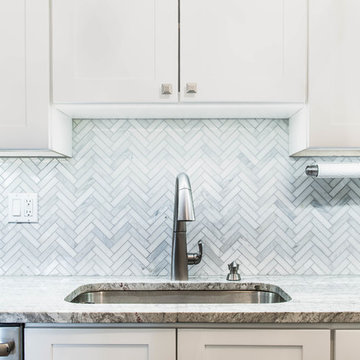
That one move allowed us to dig into the kitchen design because it was now the main focal point in the apartment. It was no longer an option to keep it in that tiny hole where it was, so we had to ensure that this design was functional and aesthetically pleasing at the same time. By adding the table into the space where an Island typically would go, we were able to both cut cost and still provide a dining experience. The Table serves as an Island as well when cooking.
We then proceeded to block in the existing doorway to the dining room. By doing this, we were able to create a full room which allowed us to put a door on the other side and called that room Bedroom #2. This was easier to do because all of the mechanicals were already in that space (light, heater and windows). By shifting things around, we also achieved a huge wall to wall closet from inside. PERFECT!
Then we moved into the Single bedroom. We thought it was a big room with a small closet, so by creatively adding an L shaped wall and steal some footprint into the bedroom side, we were able to put a door on that new room and design it for the walk-in closet. Even after this, the bedroom still holds a queen size bed with 2 night stands, a TV on the wall, a sitting chair and plenty of room to walk around. This was done by rethinking the location for the bed and night stands.
The bathroom was gutted to make sure there was no leaks and rebuild from the ground up. We kept all of the plumbing where it was, added a new vanity, medicine cabinet, tiles and lighting and it was done.
From there, the rest of the unit had new flooring all throughout, paint, and lighting. After completion and walk through, this project was handed over back to the clients.
Execution and collaboration between all the trades were: Reggie and his team from Premier Interiors and Rohan from RD Mechanical Services.
p.s. Please see our website to see the video.
 RAJ Kitchen and Bath, LLC
 “Full apartment design”.
IF you have not yet seen this apartment conversion before, we strongly urge you to go to the bottom left of this page and click on the short 2-minutes video. It would put a lot of things into perspective when you come back and continue reading this.
It is true we were literally handed the keys and told a list of things that they wanted to have happen and we were to go into the apartment, look at the space and come up with a design that would satisfy all of that need. UNTIL we showed up! The unit had really seen some better days but we knew we had to look past that and come up with a concept that would work for them.
The immediate challenges were centered around 3 big ideas:
1. Adding a second bedroom to the already small footprint
2. Figuring out a way to make the kitchen bigger, better and brighter
3. Creating a master room walk in closet
It’s always difficult to add new rooms into existing footprint without expanding out or up and not incurring any opportunity cost. In this case, that was exactly what we had to do. Item one and two above had to be tackled as one. We went ahead and switched out the location of the dining room and eliminating an area where there was a “nook” type eat-in area. By doing so, we were able to cut right into that footprint and change the layout of the kitchen.
That one move allowed us to dig into the kitchen design because it was now the main focal point in the apartment. It was no longer an option to keep it in that tiny hole where it was, so we had to ensure that this design was functional and aesthetically pleasing at the same time. By adding the table into the space where an Island typically would go, we were able to both cut cost and still provide a dining experience. The Table serves as an Island as well when cooking.
We then proceeded to block in the existing doorway to the dining room. By doing this, we were able to create a full room which allowed us to put a door on the other side and called that room Bedroom #2. This was easier to do because all of the mechanicals were already in that space (light, heater and windows). By shifting things around, we also achieved a huge wall to wall closet from inside. PERFECT!
Then we moved into the Single bedroom. We thought it was a big room with a small closet, so by creatively adding an L shaped wall and steal some footprint into the bedroom side, we were able to put a door on that new room and design it for the walk-in closet. Even after this, the bedroom still holds a queen size bed with 2 night stands, a TV on the wall, a sitting chair and plenty of room to walk around. This was done by rethinking the location for the bed and night stands.
The bathroom was gutted to make sure there was no leaks and rebuild from the ground up. We kept all of the plumbing where it was, added a new vanity, medicine cabinet, tiles and lighting and it was done.
From there, the rest of the unit had new flooring all throughout, paint, and lighting. After completion and walk through, this project was handed over back to the clients.
Execution and collaboration between all the trades were: Reggie and his team from Premier Interiors and Rohan from RD Mechanical Services.
p.s. Please see our website to see the video.
 RAJ Kitchen and Bath, LLC
 “Full apartment design”.
IF you have not yet seen this apartment conversion before, we strongly urge you to go to the bottom left of this page and click on the short 2-minutes video. It would put a lot of things into perspective when you come back and continue reading this.
It is true we were literally handed the keys and told a list of things that they wanted to have happen and we were to go into the apartment, look at the space and come up with a design that would satisfy all of that need. UNTIL we showed up! The unit had really seen some better days but we knew we had to look past that and come up with a concept that would work for them.
The immediate challenges were centered around 3 big ideas:
1. Adding a second bedroom to the already small footprint
2. Figuring out a way to make the kitchen bigger, better and brighter
3. Creating a master room walk in closet
It’s always difficult to add new rooms into existing footprint without expanding out or up and not incurring any opportunity cost. In this case, that was exactly what we had to do. Item one and two above had to be tackled as one. We went ahead and switched out the location of the dining room and eliminating an area where there was a “nook” type eat-in area. By doing so, we were able to cut right into that footprint and change the layout of the kitchen.
That one move allowed us to dig into the kitchen design because it was now the main focal point in the apartment. It was no longer an option to keep it in that tiny hole where it was, so we had to ensure that this design was functional and aesthetically pleasing at the same time. By adding the table into the space where an Island typically would go, we were able to both cut cost and still provide a dining experience. The Table serves as an Island as well when cooking.
We then proceeded to block in the existing doorway to the dining room. By doing this, we were able to create a full room which allowed us to put a door on the other side and called that room Bedroom #2. This was easier to do because all of the mechanicals were already in that space (light, heater and windows). By shifting things around, we also achieved a huge wall to wall closet from inside. PERFECT!
Then we moved into the Single bedroom. We thought it was a big room with a small closet, so by creatively adding an L shaped wall and steal some footprint into the bedroom side, we were able to put a door on that new room and design it for the walk-in closet. Even after this, the bedroom still holds a queen size bed with 2 night stands, a TV on the wall, a sitting chair and plenty of room to walk around. This was done by rethinking the location for the bed and night stands.
The bathroom was gutted to make sure there was no leaks and rebuild from the ground up. We kept all of the plumbing where it was, added a new vanity, medicine cabinet, tiles and lighting and it was done.
From there, the rest of the unit had new flooring all throughout, paint, and lighting. After completion and walk through, this project was handed over back to the clients.
Execution and collaboration between all the trades were: Reggie and his team from Premier Interiors and Rohan from RD Mechanical Services.
p.s. Please see our website to see the video.
 RAJ Kitchen and Bath, LLC
 “Full apartment design”.
IF you have not yet seen this apartment conversion before, we strongly urge you to go to the bottom left of this page and click on the short 2-minutes video. It would put a lot of things into perspective when you come back and continue reading this.
It is true we were literally handed the keys and told a list of things that they wanted to have happen and we were to go into the apartment, look at the space and come up with a design that would satisfy all of that need. UNTIL we showed up! The unit had really seen some better days but we knew we had to look past that and come up with a concept that would work for them.
The immediate challenges were centered around 3 big ideas:
1. Adding a second bedroom to the already small footprint
2. Figuring out a way to make the kitchen bigger, better and brighter
3. Creating a master room walk in closet
It’s always difficult to add new rooms into existing footprint without expanding out or up and not incurring any opportunity cost. In this case, that was exactly what we had to do. Item one and two above had to be tackled as one. We went ahead and switched out the location of the dining room and eliminating an area where there was a “nook” type eat-in area. By doing so, we were able to cut right into that footprint and change the layout of the kitchen.
That one move allowed us to dig into the kitchen design because it was now the main focal point in the apartment. It was no longer an option to keep it in that tiny hole where it was, so we had to ensure that this design was functional and aesthetically pleasing at the same time. By adding the table into the space where an Island typically would go, we were able to both cut cost and still provide a dining experience. The Table serves as an Island as well when cooking.
We then proceeded to block in the existing doorway to the dining room. By doing this, we were able to create a full room which allowed us to put a door on the other side and called that room Bedroom #2. This was easier to do because all of the mechanicals were already in that space (light, heater and windows). By shifting things around, we also achieved a huge wall to wall closet from inside. PERFECT!
Then we moved into the Single bedroom. We thought it was a big room with a small closet, so by creatively adding an L shaped wall and steal some footprint into the bedroom side, we were able to put a door on that new room and design it for the walk-in closet. Even after this, the bedroom still holds a queen size bed with 2 night stands, a TV on the wall, a sitting chair and plenty of room to walk around. This was done by rethinking the location for the bed and night stands.
The bathroom was gutted to make sure there was no leaks and rebuild from the ground up. We kept all of the plumbing where it was, added a new vanity, medicine cabinet, tiles and lighting and it was done.
From there, the rest of the unit had new flooring all throughout, paint, and lighting. After completion and walk through, this project was handed over back to the clients.
Execution and collaboration between all the trades were: Reggie and his team from Premier Interiors and Rohan from RD Mechanical Services.
p.s. Please see our website to see the video.
 RAJ Kitchen and Bath, LLC
 “Full apartment design”.
IF you have not yet seen this apartment conversion before, we strongly urge you to go to the bottom left of this page and click on the short 2-minutes video. It would put a lot of things into perspective when you come back and continue reading this.
It is true we were literally handed the keys and told a list of things that they wanted to have happen and we were to go into the apartment, look at the space and come up with a design that would satisfy all of that need. UNTIL we showed up! The unit had really seen some better days but we knew we had to look past that and come up with a concept that would work for them.
The immediate challenges were centered around 3 big ideas:
1. Adding a second bedroom to the already small footprint
2. Figuring out a way to make the kitchen bigger, better and brighter
3. Creating a master room walk in closet
It’s always difficult to add new rooms into existing footprint without expanding out or up and not incurring any opportunity cost. In this case, that was exactly what we had to do. Item one and two above had to be tackled as one. We went ahead and switched out the location of the dining room and eliminating an area where there was a “nook” type eat-in area. By doing so, we were able to cut right into that footprint and change the layout of the kitchen.
That one move allowed us to dig into the kitchen design because it was now the main focal point in the apartment. It was no longer an option to keep it in that tiny hole where it was, so we had to ensure that this design was functional and aesthetically pleasing at the same time. By adding the table into the space where an Island typically would go, we were able to both cut cost and still provide a dining experience. The Table serves as an Island as well when cooking.
We then proceeded to block in the existing doorway to the dining room. By doing this, we were able to create a full room which allowed us to put a door on the other side and called that room Bedroom #2. This was easier to do because all of the mechanicals were already in that space (light, heater and windows). By shifting things around, we also achieved a huge wall to wall closet from inside. PERFECT!
Then we moved into the Single bedroom. We thought it was a big room with a small closet, so by creatively adding an L shaped wall and steal some footprint into the bedroom side, we were able to put a door on that new room and design it for the walk-in closet. Even after this, the bedroom still holds a queen size bed with 2 night stands, a TV on the wall, a sitting chair and plenty of room to walk around. This was done by rethinking the location for the bed and night stands.
The bathroom was gutted to make sure there was no leaks and rebuild from the ground up. We kept all of the plumbing where it was, added a new vanity, medicine cabinet, tiles and lighting and it was done.
From there, the rest of the unit had new flooring all throughout, paint, and lighting. After completion and walk through, this project was handed over back to the clients.
Execution and collaboration between all the trades were: Reggie and his team from Premier Interiors and Rohan from RD Mechanical Services.
p.s. Please see our website to see the video.
 RAJ Kitchen and Bath, LLC
 “Full apartment design”.
IF you have not yet seen this apartment conversion before, we strongly urge you to go to the bottom left of this page and click on the short 2-minutes video. It would put a lot of things into perspective when you come back and continue reading this.
It is true we were literally handed the keys and told a list of things that they wanted to have happen and we were to go into the apartment, look at the space and come up with a design that would satisfy all of that need. UNTIL we showed up! The unit had really seen some better days but we knew we had to look past that and come up with a concept that would work for them.
The immediate challenges were centered around 3 big ideas:
1. Adding a second bedroom to the already small footprint
2. Figuring out a way to make the kitchen bigger, better and brighter
3. Creating a master room walk in closet
It’s always difficult to add new rooms into existing footprint without expanding out or up and not incurring any opportunity cost. In this case, that was exactly what we had to do. Item one and two above had to be tackled as one. We went ahead and switched out the location of the dining room and eliminating an area where there was a “nook” type eat-in area. By doing so, we were able to cut right into that footprint and change the layout of the kitchen.
That one move allowed us to dig into the kitchen design because it was now the main focal point in the apartment. It was no longer an option to keep it in that tiny hole where it was, so we had to ensure that this design was functional and aesthetically pleasing at the same time. By adding the table into the space where an Island typically would go, we were able to both cut cost and still provide a dining experience. The Table serves as an Island as well when cooking.
We then proceeded to block in the existing doorway to the dining room. By doing this, we were able to create a full room which allowed us to put a door on the other side and called that room Bedroom #2. This was easier to do because all of the mechanicals were already in that space (light, heater and windows). By shifting things around, we also achieved a huge wall to wall closet from inside. PERFECT!
Then we moved into the Single bedroom. We thought it was a big room with a small closet, so by creatively adding an L shaped wall and steal some footprint into the bedroom side, we were able to put a door on that new room and design it for the walk-in closet. Even after this, the bedroom still holds a queen size bed with 2 night stands, a TV on the wall, a sitting chair and plenty of room to walk around. This was done by rethinking the location for the bed and night stands.
The bathroom was gutted to make sure there was no leaks and rebuild from the ground up. We kept all of the plumbing where it was, added a new vanity, medicine cabinet, tiles and lighting and it was done.
From there, the rest of the unit had new flooring all throughout, paint, and lighting. After completion and walk through, this project was handed over back to the clients.
Execution and collaboration between all the trades were: Reggie and his team from Premier Interiors and Rohan from RD Mechanical Services.
p.s. Please see our website to see the video.
12