
Search results for "Formal captures" in Home Design Ideas
 Modern Wicker & Outdoor Furniture
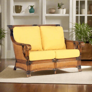
The South Sea Rattan Pacifica indoor loveseat captures the beauty of hand woven natural rattan and wicker with a stunning antique Walnut finish with natural peel and leather wrapping. Constructed of rattan pole which is one of nature's strongest organic materials and is both eco-friendly and highly renewable, this furniture is extremely durable and aesthetically stunning. The Pacifica collection's refined craftsmanship and versatility transitions effortlessly from formal entertaining to lounging with your feet up. Choose from various indoor wicker seating and dining options. We also offer a wide selection of premium indoor cushion fabrics to compliment any home décor.
 NMB Custom Homes & Renovations
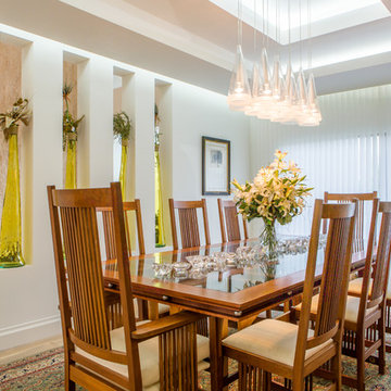
This picture cannot capture the uniqueness of this room. The ceiling has a multi-level uplit detail. Through the interesting drywall cutouts, you can see the foyer and front door.
 Katie Hutchison Studio
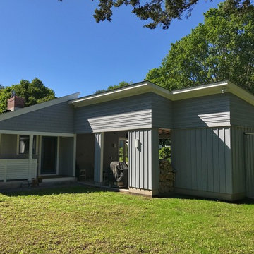
Constructed in two phases, this renovation, with a few small additions, touched nearly every room in this late ‘50’s ranch house. The owners raised their family within the original walls and love the house’s location, which is not far from town and also borders conservation land. But they didn’t love how chopped up the house was and the lack of exposure to natural daylight and views of the lush rear woods. Plus, they were ready to de-clutter for a more stream-lined look. As a result, KHS collaborated with them to create a quiet, clean design to support the lifestyle they aspire to in retirement.
To transform the original ranch house, KHS proposed several significant changes that would make way for a number of related improvements. Proposed changes included the removal of the attached enclosed breezeway (which had included a stair to the basement living space) and the two-car garage it partially wrapped, which had blocked vital eastern daylight from accessing the interior. Together the breezeway and garage had also contributed to a long, flush front façade. In its stead, KHS proposed a new two-car carport, attached storage shed, and exterior basement stair in a new location. The carport is bumped closer to the street to relieve the flush front facade and to allow access behind it to eastern daylight in a relocated rear kitchen. KHS also proposed a new, single, more prominent front entry, closer to the driveway to replace the former secondary entrance into the dark breezeway and a more formal main entrance that had been located much farther down the facade and curiously bordered the bedroom wing.
Inside, low ceilings and soffits in the primary family common areas were removed to create a cathedral ceiling (with rod ties) over a reconfigured semi-open living, dining, and kitchen space. A new gas fireplace serving the relocated dining area -- defined by a new built-in banquette in a new bay window -- was designed to back up on the existing wood-burning fireplace that continues to serve the living area. A shared full bath, serving two guest bedrooms on the main level, was reconfigured, and additional square footage was captured for a reconfigured master bathroom off the existing master bedroom. A new whole-house color palette, including new finishes and new cabinetry, complete the transformation. Today, the owners enjoy a fresh and airy re-imagining of their familiar ranch house.
Photos by Katie Hutchison
Find the right local pro for your project
 EVA Architecture, LLC
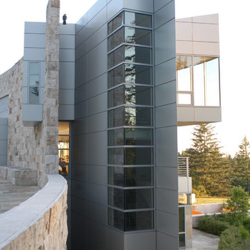
The Lakota Residence occupies a spectacular 10-acre site in the hills above northwest Portland, Oregon. The residence consists of a main house of nearly 10,000 sf and a caretakers cottage/guest house of 1,200 sf over a shop/garage. Both have been sited to capture the four mountain Cascade panorama plus views to the city and the Columbia River gorge while maintaining an internal privacy. The buildings are set in a highly manicured and refined immediate site set within a largely forested environment complete with a variety of wildlife.
Successful business people, the owners desired an elegant but "edgey" retreat that would accommodate an active social life while still functional as "mission control" for their construction materials business. There are days at a time when business is conducted from Lakota. The three-level main house has been benched into an edge of the site. Entry to the middle or main floor occurs from the south with the entry framing distant views to Mt. St. Helens and Mt. Rainier. Conceived as a ruin upon which a modernist house has been built, the radiused and largely opaque stone wall anchors a transparent steel and glass north elevation that consumes the view. Recreational spaces and garage occupy the lower floor while the upper houses sleeping areas at the west end and office functions to the east.
Obsessive with their concern for detail, the owners were involved daily on site during the construction process. Much of the interiors were sketched on site and mocked up at full scale to test formal concepts. Eight years from site selection to move in, the Lakota Residence is a project of the old school process.
 Bella Homes Inc
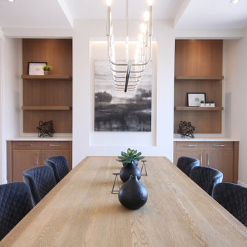
Large formal dining room with inverted ceiling feature. Multiple built-in white oak, micro-shaker cabinetry, quartz countertops with warm marble veining, art niche, polished nickel hardware, and lighting. White oak panels and shelving for accents. Large floor to ceiling windows to capture all the natural light and views
 Carlton Edwards
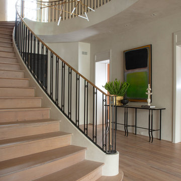
Curvacious. Continuous. Light. An elegant architectural staircase in a European influenced contemporary home.
The light is captured effortlessly as it moves across the plaster warming the color palette and coincides with the reclaimed white oak and limestone on the exterior of the house.
The flooring is 2 1/4" but varies with widths and patterns throughout the house topped with the Rubio monicoat stain.
The overhead light fixture is a custom Carlton Edwards design fabricated in Memphis.
On either side of the custom iron and brass console table are paneled jambs that lead into the dining room. Charcoal metallic paint finish coincides and compliments the iron railing and steel doors in the formal salon beyond.
 Dale Cohen Designstudio
Asked by her client to review a typically mundane South Hampton ‘50s saltbox because “the last designer they talked to said they would have to add on to make the house anything,” Ms. Cohen approached the renovation in exactly the opposite manner. To refine the small building footprint, precise architectural gestures were used with a series of finely calibrated moments make the space more gracious and welcoming. Architectural acts were bold in concept but not in actual construction work; such as capturing the car garage to add a hyper modern sunroom/den along with a powder room and laundry. Reconfiguring one side of the house’s roofline to manipulate the space into a sensational master suite saved the north side of the house from remaining an un-useful attic space. This inner sanctum of bedroom and master bath is reminiscent of a Hampton’s beachscape in all its elegance and minimalism. The only square footage actually added was a tiny 4X4 corner as an addition to the front entry, oddly an essential piece of real estate to make an actual vestibule. All these refinements make for a crafted, articulate result rather than bowing to the bigger is better theme, which is more prevalent in the Hamptons.
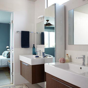
The function of the plan and the accompanying finishes are impressive. The Jack and Jill bathroom, an invention of the American post-war housing boom, was outfitted in handsome walnut Duravit vanity cabinets and neutral finishes. The master bath, with its expansive skylights, might be mistaken for a conceptual art installation due to its evocative marble countertop in striped ethereal hues. Finally, Ms. Cohen uses wallpaper like a museum curator, hanging an iconic Knoll pattern to punctuate the dining/media space.
Each room in the house was sculpted via a palette of watercolor blue of varying saturations. Fabrics were culled from the greats of modernist textiles, Maharam’s Quatrefoil pattern in blue and Knoll classic Sway pattern in sea shades. The blue on white “beach” scheme runs from a soft cotton candy sky in the girl’s room to an immersive David Sutherland Park Bark wallpaper in the powder room. This intellectual inquiry as to what are the true colors at the beach belays the sophistication that surpasses the usual nautical curse of the average beach house. Out of the corner of your eye, in almost every quadrant of the house, is a burst of colorful expression and delight; this serves as Ms. Cohen’s painterly gift to the client.
Ms. Cohen’s hidden strength is her ability to choreograph a seating area. Whether it is a formal living room or the ultimate hang out spot, each space has the right amount of distance, intimacy and dare I say intrigue to make the arrangements inviting. Each conversation, because it really looks like a fine chat can be had, has an elegant side table ready for duty and all tête-à-têtes are regulated to a sumptuous area rugs. Habitants in Ms. Cohen’s world only work through deep discourse.
Sponsored
Fredericksburg, OH

High Point Cabinets
Columbus' Experienced Custom Cabinet Builder | 4x Best of Houzz Winner
 LA Precast Mantels
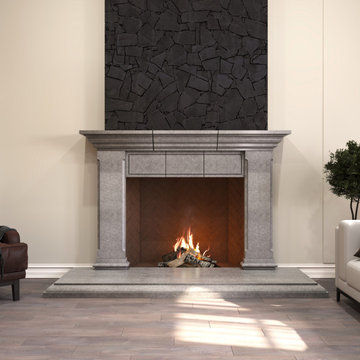
Create a warm and timeless focal point with our traditional precast fireplace mantels, inspired by classic architectural designs. Crafted to capture the elegance of hand-carved stone, these mantels feature refined details, balanced proportions, and enduring craftsmanship. Precast construction ensures consistent quality, durability, and a beautiful finish suitable for both formal living spaces and cozy interiors. Perfect for traditional, transitional, and luxury homes, our mantels add character, sophistication, and lasting value while providing an easy and reliable installation solution.
 Laplante Construction Inc.
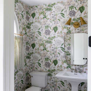
This powder room captures a Grandmillennial aesthetic for a sophisticated mix of classic, slightly preppy tradition with a lively, youthful twist. The space makes an immediate statement with Thibaut’s large-scale “Hill Garden” floral wallpaper in a timeless green-and-cream chinoiserie-inspired palette, setting a botanical yet elegant tone. A black-and-white marble-look
checkerboard floor grounds the room, adding a touch of formality and enduring style. The traditional pedestal sink, complemented by brass lighting and an aged brass mirror, channels the refined spirit of the early 20th century. Layered, romantic details appear in the pleated café curtain, also by Thibaut, and charming wicker accessories, infusing texture and warmth. Altogether, the room feels like something a stylish, thirty-something—who grew up visiting her chic grandmother’s English country house—would design today: spirited, nostalgic.
 Dale Cohen Designstudio
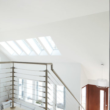
Asked by her client to review a typically mundane South Hampton ‘50s saltbox because “the last designer they talked to said they would have to add on to make the house anything,” Ms. Cohen approached the renovation in exactly the opposite manner. To refine the small building footprint, precise architectural gestures were used with a series of finely calibrated moments make the space more gracious and welcoming. Architectural acts were bold in concept but not in actual construction work; such as capturing the car garage to add a hyper modern sunroom/den along with a powder room and laundry. Reconfiguring one side of the house’s roofline to manipulate the space into a sensational master suite saved the north side of the house from remaining an un-useful attic space. This inner sanctum of bedroom and master bath is reminiscent of a Hampton’s beachscape in all its elegance and minimalism. The only square footage actually added was a tiny 4X4 corner as an addition to the front entry, oddly an essential piece of real estate to make an actual vestibule. All these refinements make for a crafted, articulate result rather than bowing to the bigger is better theme, which is more prevalent in the Hamptons.
The function of the plan and the accompanying finishes are impressive. The Jack and Jill bathroom, an invention of the American post-war housing boom, was outfitted in handsome walnut Duravit vanity cabinets and neutral finishes. The master bath, with its expansive skylights, might be mistaken for a conceptual art installation due to its evocative marble countertop in striped ethereal hues. Finally, Ms. Cohen uses wallpaper like a museum curator, hanging an iconic Knoll pattern to punctuate the dining/media space.
Each room in the house was sculpted via a palette of watercolor blue of varying saturations. Fabrics were culled from the greats of modernist textiles, Maharam’s Quatrefoil pattern in blue and Knoll classic Sway pattern in sea shades. The blue on white “beach” scheme runs from a soft cotton candy sky in the girl’s room to an immersive David Sutherland Park Bark wallpaper in the powder room. This intellectual inquiry as to what are the true colors at the beach belays the sophistication that surpasses the usual nautical curse of the average beach house. Out of the corner of your eye, in almost every quadrant of the house, is a burst of colorful expression and delight; this serves as Ms. Cohen’s painterly gift to the client.
Ms. Cohen’s hidden strength is her ability to choreograph a seating area. Whether it is a formal living room or the ultimate hang out spot, each space has the right amount of distance, intimacy and dare I say intrigue to make the arrangements inviting. Each conversation, because it really looks like a fine chat can be had, has an elegant side table ready for duty and all tête-à-têtes are regulated to a sumptuous area rugs. Habitants in Ms. Cohen’s world only work through deep discourse.
 Misiaszek Turpin pllc
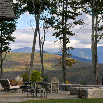
Resting upon a 120-acre rural hillside, this 17,500 square-foot residence has unencumbered mountain views to the east, south and west. The exterior design palette for the public side is a more formal Tudor style of architecture, including intricate brick detailing; while the materials for the private side tend toward a more casual mountain-home style of architecture with a natural stone base and hand-cut wood siding.
Primary living spaces and the master bedroom suite, are located on the main level, with guest accommodations on the upper floor of the main house and upper floor of the garage. The interior material palette was carefully chosen to match the stunning collection of antique furniture and artifacts, gathered from around the country. From the elegant kitchen to the cozy screened porch, this residence captures the beauty of the White Mountains and embodies classic New Hampshire living.
Photographer: Joseph St. Pierre
 TVL Creative Ltd.
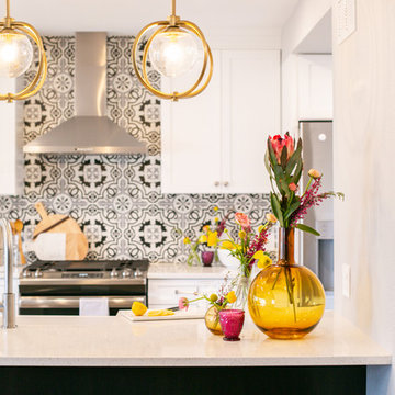
Cramped kitchen be gone! That was the project motto and top priority. The goal was to transform the current layout from multiple smaller spaces into a connected whole that would activate the main level for our clients, a young family of four.
The biggest obstacle was the wall dividing the kitchen and the dining room. Removing this wall was central to opening up and integrating the main living spaces, but the existing ductwork that ran right through the center of the wall posed a design challenge, er design opportunity. The resulting design solution features a central pantry that captures the ductwork and provides valuable storage- especially when compared to the original kitchen's 18" wide pantry cabinet. The pantry also anchors the kitchen island and serves as a visual separation of space between the kitchen and homework area.
Through our design development process, we learned the formal living room was of no service to their lifestyle and therefore space they rarely spent time in. With that in mind, we proposed to eliminate the unused living room and make it the new dining room. Relocating the dining room to this space inherently felt right given the soaring ceiling and ample room for holiday dinners and celebrations. The new dining room was spacious enough for us to incorporate a conversational seating area in the warm, south-facing window alcove.
Now what to do with the old dining room?! To answer that question we took inspiration from our clients' shared profession in education and developed a craft area/homework station for both of their boys. The semi-custom cabinetry of the desk area carries over to the adjacent wall and forms window bench base with storage that we topped with butcher block for a touch of warmth. While the boys are young, the bench drawers are the perfect place for a stash of toys close to the kitchen.
The kitchen begins just beyond the window seat with their refrigerator enclosure. Opposite the refrigerator is the new pantry with twenty linear feet of shelving and space for brooms and a stick vacuum. Extending from the backside of the pantry the kitchen island design incorporates counter seating on the family room side and a cabinetry configuration on the kitchen side with drawer storage, a trashcan center, farmhouse sink, and dishwasher.
We took careful time in design and execution to align the range and sink because while it might seem like a small detail, it plays an important role in supporting the symmetrical configuration of the back wall of the kitchen. The rear wall design utilizes an appliance garage mirrors the visual impact of the refrigerator enclosure and helps keep the now open kitchen tidy. Between the appliance garage and refrigerator enclosure is the cooking zone with 30" of cabinetry and work surface on either side of the range, a chimney style vent hood, and a bold graphic tile backsplash.
The backsplash is just one of many personal touches we added to the space to reflect our client's modern eclectic style and love of color. Swooping lines of the mid-mod style barstools compliment the pendants and backsplash pattern. A pop of vibrant green on the frame of the pantry door adds a fresh wash of color to an otherwise neutral space. The big show stopper is the custom charcoal gray and copper chevron wall installation in the dining room. This was an idea our clients softly suggested, and we excitedly embraced the opportunity. It is also a kickass solution to the head-scratching design dilemma of how to fill a large and lofty wall.
We are so grateful to bring this design to life for our clients and now dear friends.
 Betsy Bassett Interiors
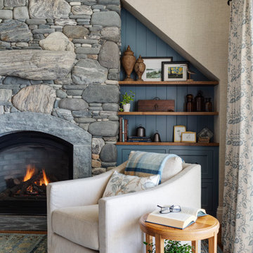
This Maine residence reimagines the traditional coastal cottage, expanding its vernacular across more than 8,000 square feet of thoughtfully designed living space. Every room captures dramatic views of the rugged coastline, complemented by carefully curated fabrics and textures that echo the natural landscape. The grand foyer flows seamlessly into a formal living room and an intimate reading nook. At the heart of the home, a chef's kitchen opens to a custom walk-in pantry and a striking walnut bar. The first floor is completed by an elegant dining room and a four-seasons family room that blurs the boundary between interior and exterior. The primary suite features a custom fireplace crafted from locally sourced stone, while the primary bathroom frames unobstructed ocean vistas. The second floor also includes two guest bedrooms, a luxurious laundry room, and dedicated spaces for both homeowners—an art studio and a sophisticated lounge. The lower level reveals an unexpected delight: a two-lane bowling alley enhanced by custom-designed wallpaper, adding a playful counterpoint to the home's refined coastal elegance.
Sponsored
Columbus, OH

Structural Remodeling
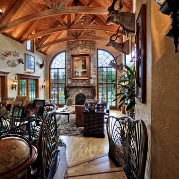
Franklin County's Heavy Timber Specialists | Best of Houzz 2020!
 Katie Hutchison Studio
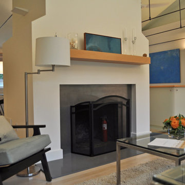
Constructed in two phases, this renovation, with a few small additions, touched nearly every room in this late ‘50’s ranch house. The owners raised their family within the original walls and love the house’s location, which is not far from town and also borders conservation land. But they didn’t love how chopped up the house was and the lack of exposure to natural daylight and views of the lush rear woods. Plus, they were ready to de-clutter for a more stream-lined look. As a result, KHS collaborated with them to create a quiet, clean design to support the lifestyle they aspire to in retirement.
To transform the original ranch house, KHS proposed several significant changes that would make way for a number of related improvements. Proposed changes included the removal of the attached enclosed breezeway (which had included a stair to the basement living space) and the two-car garage it partially wrapped, which had blocked vital eastern daylight from accessing the interior. Together the breezeway and garage had also contributed to a long, flush front façade. In its stead, KHS proposed a new two-car carport, attached storage shed, and exterior basement stair in a new location. The carport is bumped closer to the street to relieve the flush front facade and to allow access behind it to eastern daylight in a relocated rear kitchen. KHS also proposed a new, single, more prominent front entry, closer to the driveway to replace the former secondary entrance into the dark breezeway and a more formal main entrance that had been located much farther down the facade and curiously bordered the bedroom wing.
Inside, low ceilings and soffits in the primary family common areas were removed to create a cathedral ceiling (with rod ties) over a reconfigured semi-open living, dining, and kitchen space. A new gas fireplace serving the relocated dining area -- defined by a new built-in banquette in a new bay window -- was designed to back up on the existing wood-burning fireplace that continues to serve the living area. A shared full bath, serving two guest bedrooms on the main level, was reconfigured, and additional square footage was captured for a reconfigured master bathroom off the existing master bedroom. A new whole-house color palette, including new finishes and new cabinetry, complete the transformation. Today, the owners enjoy a fresh and airy re-imagining of their familiar ranch house.
Photos by Katie Hutchison
 London Bay Homes
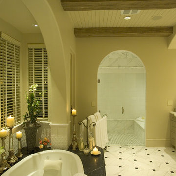
The Chianti III is a stunning model home in Mirada at The Estuary at Grey Oaks. Built by London Bay Homes, named America’s Best Builder in 2008, the Chianti features a stone façade reminiscent of the Italian countryside. This fully furnished four bedroom plus den/5th bedroom home features over 5,900 square feet of living space, a relaxing third-story viewing deck, perfect for stargazing, and formal living areas that blend comfortably into the home’s more casual outdoor living space. The Italian-influenced architecture carries over to the interior design that features stone walls and wood beams throughout the home. Large window areas capture magnificent vistas of the nearby lake and golf course beyond. The second-floor bonus room is perfect for entertaining friends over a game of billiards. The grand two-story home also includes a private study and home office center. Enjoy the view from a third level viewing deck with a fire place. This home showcases a wide array of unique design features throughout its 8,625 sq.ft total area.
Image ©Advanced Photography Specialists
 HR DESIGN DEPT
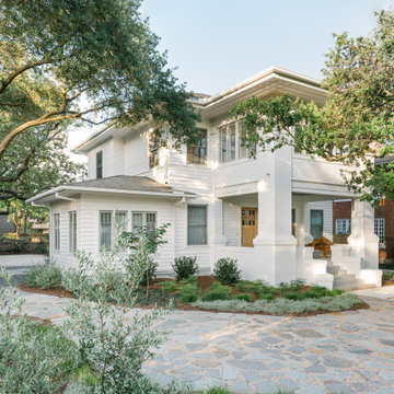
For years, early morning walks past this 1910 Craftsman in Houston's historic Avondale neighborhood left the new owners with lingering fantasies of making it their future home. When it became available, they acquired a home rich with history, but one nearly abolished. The home was once inhabited by Texas Governor (1931-1932) and founder of Humble Oil, Ross Sterling. But, renovations subdivided the home into multi-family rentals and destroyed original finishes. The developer driven modifications were abruptly halted by city red tags in 2018 after original windows were demolished and replaced with vinyl substitutes.
With a nearly clean slate on the interior, the HRDD renovation aims to be respectful to the original context while providing coplimentary modern surprises atypical to the era. One such example is a new opening that punctures through the second floor, extending to a roof skylight. Situated at the transition between formal and informal rooms on the first floor and common space on the second floor, this subtraction is lined with a scalloped wood screen. The screen is one of multiple moments within the home where texture will combine with minimal white surfaces, providing a backdrop to the owners' collection of antique Indian furniture pieces.
Additionally, a new detached replaced an existing dilapidated garage apartment and contains the owner's photography studio. Windows and a skylight are placed to capture coveted north light, ideal for photographing and editing. The main room remains an austere slate, with ceiling vaulting to a single aperture to create a dynamic moment that carries a dialogue to the opening in the main home.
 Katie Hutchison Studio
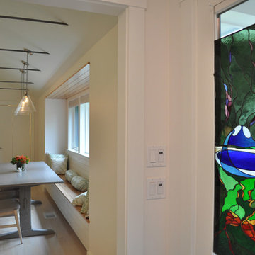
Constructed in two phases, this renovation, with a few small additions, touched nearly every room in this late ‘50’s ranch house. The owners raised their family within the original walls and love the house’s location, which is not far from town and also borders conservation land. But they didn’t love how chopped up the house was and the lack of exposure to natural daylight and views of the lush rear woods. Plus, they were ready to de-clutter for a more stream-lined look. As a result, KHS collaborated with them to create a quiet, clean design to support the lifestyle they aspire to in retirement.
To transform the original ranch house, KHS proposed several significant changes that would make way for a number of related improvements. Proposed changes included the removal of the attached enclosed breezeway (which had included a stair to the basement living space) and the two-car garage it partially wrapped, which had blocked vital eastern daylight from accessing the interior. Together the breezeway and garage had also contributed to a long, flush front façade. In its stead, KHS proposed a new two-car carport, attached storage shed, and exterior basement stair in a new location. The carport is bumped closer to the street to relieve the flush front facade and to allow access behind it to eastern daylight in a relocated rear kitchen. KHS also proposed a new, single, more prominent front entry, closer to the driveway to replace the former secondary entrance into the dark breezeway and a more formal main entrance that had been located much farther down the facade and curiously bordered the bedroom wing.
Inside, low ceilings and soffits in the primary family common areas were removed to create a cathedral ceiling (with rod ties) over a reconfigured semi-open living, dining, and kitchen space. A new gas fireplace serving the relocated dining area -- defined by a new built-in banquette in a new bay window -- was designed to back up on the existing wood-burning fireplace that continues to serve the living area. A shared full bath, serving two guest bedrooms on the main level, was reconfigured, and additional square footage was captured for a reconfigured master bathroom off the existing master bedroom. A new whole-house color palette, including new finishes and new cabinetry, complete the transformation. Today, the owners enjoy a fresh and airy re-imagining of their familiar ranch house.
Photos by Katie Hutchison

Sponsored
Columbus, OH
Structural Remodeling
Franklin County's Heavy Timber Specialists | Best of Houzz 2020!
 EVA Architecture, LLC
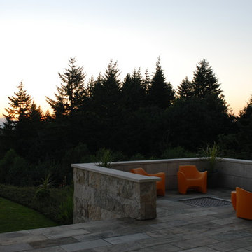
The Lakota Residence occupies a spectacular 10-acre site in the hills above northwest Portland, Oregon. The residence consists of a main house of nearly 10,000 sf and a caretakers cottage/guest house of 1,200 sf over a shop/garage. Both have been sited to capture the four mountain Cascade panorama plus views to the city and the Columbia River gorge while maintaining an internal privacy. The buildings are set in a highly manicured and refined immediate site set within a largely forested environment complete with a variety of wildlife.
Successful business people, the owners desired an elegant but "edgey" retreat that would accommodate an active social life while still functional as "mission control" for their construction materials business. There are days at a time when business is conducted from Lakota. The three-level main house has been benched into an edge of the site. Entry to the middle or main floor occurs from the south with the entry framing distant views to Mt. St. Helens and Mt. Rainier. Conceived as a ruin upon which a modernist house has been built, the radiused and largely opaque stone wall anchors a transparent steel and glass north elevation that consumes the view. Recreational spaces and garage occupy the lower floor while the upper houses sleeping areas at the west end and office functions to the east.
Obsessive with their concern for detail, the owners were involved daily on site during the construction process. Much of the interiors were sketched on site and mocked up at full scale to test formal concepts. Eight years from site selection to move in, the Lakota Residence is a project of the old school process.
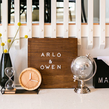 TVL Creative Ltd.
Cramped kitchen be gone! That was the project motto and top priority. The goal was to transform the current layout from multiple smaller spaces into a connected whole that would activate the main level for our clients, a young family of four.
The biggest obstacle was the wall dividing the kitchen and the dining room. Removing this wall was central to opening up and integrating the main living spaces, but the existing ductwork that ran right through the center of the wall posed a design challenge, er design opportunity. The resulting design solution features a central pantry that captures the ductwork and provides valuable storage- especially when compared to the original kitchen's 18" wide pantry cabinet. The pantry also anchors the kitchen island and serves as a visual separation of space between the kitchen and homework area.
Through our design development process, we learned the formal living room was of no service to their lifestyle and therefore space they rarely spent time in. With that in mind, we proposed to eliminate the unused living room and make it the new dining room. Relocating the dining room to this space inherently felt right given the soaring ceiling and ample room for holiday dinners and celebrations. The new dining room was spacious enough for us to incorporate a conversational seating area in the warm, south-facing window alcove.
Now what to do with the old dining room?! To answer that question we took inspiration from our clients' shared profession in education and developed a craft area/homework station for both of their boys. The semi-custom cabinetry of the desk area carries over to the adjacent wall and forms window bench base with storage that we topped with butcher block for a touch of warmth. While the boys are young, the bench drawers are the perfect place for a stash of toys close to the kitchen.
The kitchen begins just beyond the window seat with their refrigerator enclosure. Opposite the refrigerator is the new pantry with twenty linear feet of shelving and space for brooms and a stick vacuum. Extending from the backside of the pantry the kitchen island design incorporates counter seating on the family room side and a cabinetry configuration on the kitchen side with drawer storage, a trashcan center, farmhouse sink, and dishwasher.
We took careful time in design and execution to align the range and sink because while it might seem like a small detail, it plays an important role in supporting the symmetrical configuration of the back wall of the kitchen. The rear wall design utilizes an appliance garage mirrors the visual impact of the refrigerator enclosure and helps keep the now open kitchen tidy. Between the appliance garage and refrigerator enclosure is the cooking zone with 30" of cabinetry and work surface on either side of the range, a chimney style vent hood, and a bold graphic tile backsplash.
The backsplash is just one of many personal touches we added to the space to reflect our client's modern eclectic style and love of color. Swooping lines of the mid-mod style barstools compliment the pendants and backsplash pattern. A pop of vibrant green on the frame of the pantry door adds a fresh wash of color to an otherwise neutral space. The big show stopper is the custom charcoal gray and copper chevron wall installation in the dining room. This was an idea our clients softly suggested, and we excitedly embraced the opportunity. It is also a kickass solution to the head-scratching design dilemma of how to fill a large and lofty wall.
We are so grateful to bring this design to life for our clients and now dear friends.
 Evoscapes, Luxury Landscape Design and Build
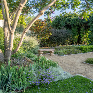
Nestled in the heart of Rancho Santa Fe, this breathtaking Italian-style estate draws inspiration from an award-winning parterre garden design. Impeccably manicured hedges, symmetrical pathways, and timeless European detailing create an atmosphere of elegance and grandeur. The meticulously planned layout captures the romance of old-world Italy, blending sculptural plantings with refined stonework to frame sweeping views of the property. Every element is designed for both visual harmony and lasting beauty, offering a luxurious outdoor experience worthy of a historic estate.
49