
Search results for "Friends pose" in Home Design Ideas
 TVL Creative Ltd.
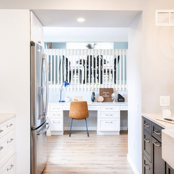
Cramped kitchen be gone! That was the project motto and top priority. The goal was to transform the current layout from multiple smaller spaces into a connected whole that would activate the main level for our clients, a young family of four.
The biggest obstacle was the wall dividing the kitchen and the dining room. Removing this wall was central to opening up and integrating the main living spaces, but the existing ductwork that ran right through the center of the wall posed a design challenge, er design opportunity. The resulting design solution features a central pantry that captures the ductwork and provides valuable storage- especially when compared to the original kitchen's 18" wide pantry cabinet. The pantry also anchors the kitchen island and serves as a visual separation of space between the kitchen and homework area.
Through our design development process, we learned the formal living room was of no service to their lifestyle and therefore space they rarely spent time in. With that in mind, we proposed to eliminate the unused living room and make it the new dining room. Relocating the dining room to this space inherently felt right given the soaring ceiling and ample room for holiday dinners and celebrations. The new dining room was spacious enough for us to incorporate a conversational seating area in the warm, south-facing window alcove.
Now what to do with the old dining room?! To answer that question we took inspiration from our clients' shared profession in education and developed a craft area/homework station for both of their boys. The semi-custom cabinetry of the desk area carries over to the adjacent wall and forms window bench base with storage that we topped with butcher block for a touch of warmth. While the boys are young, the bench drawers are the perfect place for a stash of toys close to the kitchen.
The kitchen begins just beyond the window seat with their refrigerator enclosure. Opposite the refrigerator is the new pantry with twenty linear feet of shelving and space for brooms and a stick vacuum. Extending from the backside of the pantry the kitchen island design incorporates counter seating on the family room side and a cabinetry configuration on the kitchen side with drawer storage, a trashcan center, farmhouse sink, and dishwasher.
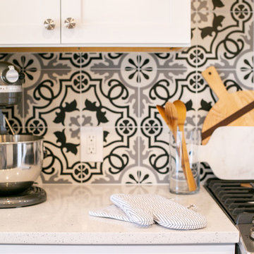
We took careful time in design and execution to align the range and sink because while it might seem like a small detail, it plays an important role in supporting the symmetrical configuration of the back wall of the kitchen. The rear wall design utilizes an appliance garage mirrors the visual impact of the refrigerator enclosure and helps keep the now open kitchen tidy. Between the appliance garage and refrigerator enclosure is the cooking zone with 30" of cabinetry and work surface on either side of the range, a chimney style vent hood, and a bold graphic tile backsplash.
The backsplash is just one of many personal touches we added to the space to reflect our client's modern eclectic style and love of color. Swooping lines of the mid-mod style barstools compliment the pendants and backsplash pattern. A pop of vibrant green on the frame of the pantry door adds a fresh wash of color to an otherwise neutral space. The big show stopper is the custom charcoal gray and copper chevron wall installation in the dining room. This was an idea our clients softly suggested, and we excitedly embraced the opportunity. It is also a kickass solution to the head-scratching design dilemma of how to fill a large and lofty wall.
We are so grateful to bring this design to life for our clients and now dear friends.
 Grandin Road
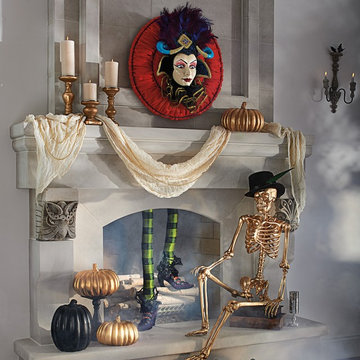
Our Temptress Mantel Scene invites guests to the party, who take creepy couture well beyond traditional orange and black. Our 5-foot skeleton brings the bling in gold–skull to toe bones–featuring hinged joints for posing or dressing to suit the soiree. His friend, the witch? She’s only halfway-committed to the event… And whatever you do, don’t get caught staring at the exquisite, handpainted details of the Temptress, perched high above the room in feathers and lace. She draws you in, but you can’t be sure what she’ll do.
 Maugel DeStefano Architects
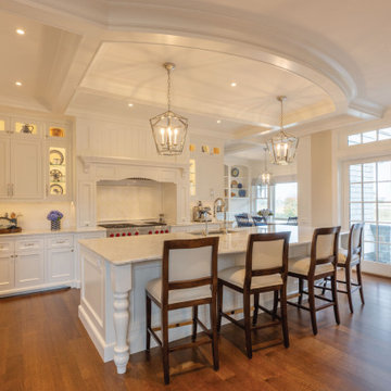
Crafted with a relaxed and effortless charm, this 5,600 SF shingle-style home offers views to the Isles of Shoals. The clients' goal was to create a warm and welcoming home that radiated both elegance and comfort while easily accommodating their newest additions to the family: their grandchildren.
Despite the challenge posed by the lot's unique shape, the team worked hard so that the design seamlessly integrates with the property, avoiding any sense of imposition to the land or its inhabitants. To overcome this obstacle, the design team incorporated a custom fit angle into the floor plan, defining the open-concept rooms and perfectly aligning with the clients' vision of a friendly and casual space.
The heart of the home lies in the open kitchen, with a generous granite island, a cozy breakfast nook, and adjacent open sitting areas. To ensure that the beauty of the Seacoast is always within sight, 30 strategically placed windows grace the waterside of the home, capturing the essence of the Shoals and inviting refreshing sea breezes into the interior.
Find the right local pro for your project
 Temescal Sustainable Interior Design
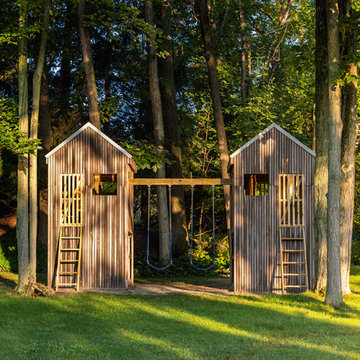
Set inside a circle of 100-year-old maple and oak trees, while complimenting the main home’s architecture, these ‘tree houses’ give shelter, space for imagination & safe play outdoors for twins. Mimicking the trees’ height and scale, and mirrored in each of their designs, these two 6 foot square base by 14 foot tall twin play structures allow for each child to have its own personal space, yet are connected at the center swings.
These unique treehouses have been built with sustainable sourcing and upcycled construction methods. When Martine Ilana, Principal designer of Temescal, considered what a ‘treehouse’ would look like for her twins, immediately it’s ideation was focused on keeping the integrity of the forest and problem solving how to use as many repurposed and sustainable materials as possible.
Accessing the incredible selection of salvage materials from a salvage yard in Detroit, Temescal was able to source non-toxic, and structurally sound woods to build the structure itself.
Healthy building materials include: Metal Roofing and Water based Low VOC paints. A slatted exterior structure was designed to create a rain screen and in addition complement the Main home’s exterior design. Designed with an end of life intention for longevity and a easy means to pull apart these structures apart once the children are older, the foundations can be used for a future ADU.
The slide posed the largest problem to source as recycled plastic slides are not made available to residential projects by US based manufactures and repurposed from Facebook marketplace hit many dead ends. Ultimately, she chose to use a HDPE high density polyurethane plastic slide that would allow for its material to be recycled once at the end of this life.
Every detail, both in their exterior and interior, of these upcycled treehouses was considered with care and an artistic touch that enhances the landscape and forest surrounding them.
 TVL Creative Ltd.
Cramped kitchen be gone! That was the project motto and top priority. The goal was to transform the current layout from multiple smaller spaces into a connected whole that would activate the main level for our clients, a young family of four.
The biggest obstacle was the wall dividing the kitchen and the dining room. Removing this wall was central to opening up and integrating the main living spaces, but the existing ductwork that ran right through the center of the wall posed a design challenge, er design opportunity. The resulting design solution features a central pantry that captures the ductwork and provides valuable storage- especially when compared to the original kitchen's 18" wide pantry cabinet. The pantry also anchors the kitchen island and serves as a visual separation of space between the kitchen and homework area.
Through our design development process, we learned the formal living room was of no service to their lifestyle and therefore space they rarely spent time in. With that in mind, we proposed to eliminate the unused living room and make it the new dining room. Relocating the dining room to this space inherently felt right given the soaring ceiling and ample room for holiday dinners and celebrations. The new dining room was spacious enough for us to incorporate a conversational seating area in the warm, south-facing window alcove.
Now what to do with the old dining room?! To answer that question we took inspiration from our clients' shared profession in education and developed a craft area/homework station for both of their boys. The semi-custom cabinetry of the desk area carries over to the adjacent wall and forms window bench base with storage that we topped with butcher block for a touch of warmth. While the boys are young, the bench drawers are the perfect place for a stash of toys close to the kitchen.
The kitchen begins just beyond the window seat with their refrigerator enclosure. Opposite the refrigerator is the new pantry with twenty linear feet of shelving and space for brooms and a stick vacuum. Extending from the backside of the pantry the kitchen island design incorporates counter seating on the family room side and a cabinetry configuration on the kitchen side with drawer storage, a trashcan center, farmhouse sink, and dishwasher.
We took careful time in design and execution to align the range and sink because while it might seem like a small detail, it plays an important role in supporting the symmetrical configuration of the back wall of the kitchen. The rear wall design utilizes an appliance garage mirrors the visual impact of the refrigerator enclosure and helps keep the now open kitchen tidy. Between the appliance garage and refrigerator enclosure is the cooking zone with 30" of cabinetry and work surface on either side of the range, a chimney style vent hood, and a bold graphic tile backsplash.
The backsplash is just one of many personal touches we added to the space to reflect our client's modern eclectic style and love of color. Swooping lines of the mid-mod style barstools compliment the pendants and backsplash pattern. A pop of vibrant green on the frame of the pantry door adds a fresh wash of color to an otherwise neutral space. The big show stopper is the custom charcoal gray and copper chevron wall installation in the dining room. This was an idea our clients softly suggested, and we excitedly embraced the opportunity. It is also a kickass solution to the head-scratching design dilemma of how to fill a large and lofty wall.
We are so grateful to bring this design to life for our clients and now dear friends.
 Maugel DeStefano Architects
Crafted with a relaxed and effortless charm, this 5,600 SF shingle-style home offers views to the Isles of Shoals. The clients' goal was to create a warm and welcoming home that radiated both elegance and comfort while easily accommodating their newest additions to the family: their grandchildren.
Despite the challenge posed by the lot's unique shape, the team worked hard so that the design seamlessly integrates with the property, avoiding any sense of imposition to the land or its inhabitants. To overcome this obstacle, the design team incorporated a custom fit angle into the floor plan, defining the open-concept rooms and perfectly aligning with the clients' vision of a friendly and casual space.
The heart of the home lies in the open kitchen, with a generous granite island, a cozy breakfast nook, and adjacent open sitting areas. To ensure that the beauty of the Seacoast is always within sight, 30 strategically placed windows grace the waterside of the home, capturing the essence of the Shoals and inviting refreshing sea breezes into the interior.

 Klopf Architecture
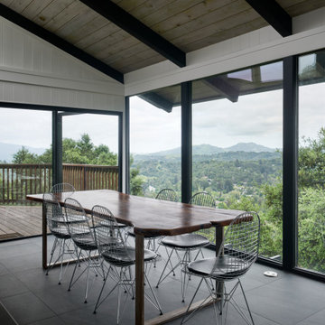
Set in a quiet neighborhood and framed by mature trees, this residence presented a unique opportunity: to thoughtfully evolve a custom mid-century modern home into a space that supports the everyday rhythms of a growing family. With a deep respect for the home’s original architecture, Klopf Architecture reimagined the house to better meet the needs of its owners—introducing functional improvements while preserving the spirit and character of its mid-century roots.
The clients approached Klopf Architecture with a clear vision: refresh their home while seamlessly integrating new programmatic elements. Key goals included clarifying and enhancing the entry sequence; connecting the detached garage to the main house with a practical yet architecturally intentional intervention; adding functional spaces such as a mudroom and laundry room; expanding and remodeling the primary suite’s bathroom and closet; and creating a more engaging outdoor space that capitalized on the site’s impressive views, featuring a fire pit and outdoor kitchen.
As a couple with distinct yet complementary perspectives—one focused on modern functionality and technology, and the other dedicated to preserving the home’s architectural integrity—their collaboration with Klopf Architecture resulted in a solution that harmonized both ideals. Their shared commitment to improving the livability of their home led to a design dialogue rooted in balance. This dynamic partnership shaped the direction of the renovation, ensuring that every decision honored the spirit of the original home while aligning with the practical needs of their growing family.
Designing within the constraints of the sloped site posed one of the project’s central challenges. The detached garage sat at a higher elevation than the main house, requiring a solution that ensured architectural and geometric compatibility between the two structures. Rather than create a purely utilitarian link, Klopf Architecture introduced an intentional connection that contributes to the overall architectural language. A notable pinch point in the plan—where differing geometries converged—was treated as a hinge point, turning a potentially awkward juncture into an architectural feature. This area now functions as both a transition and a moment of design interest that unifies the overall plan.
The design also addressed the underutilized outdoor area, which was located in a shadowed portion of the site with geometrical limitations. A new connection to the rear deck was created in this same area, making the outdoor space more useful and inviting. Klopf Architecture introduced carefully positioned openings and spatial improvements that forged a strong visual and functional connection between indoor and outdoor spaces. The outdoor area now reads as a deliberate extension of the home, embracing natural light and emphasizing the dramatic views.
Working through multiple design iterations, Klopf Architecture crafted a solution that preserved the architectural language of the original home while supporting the functional needs of modern life. The garage-to-house connection became more than a passage—it evolved into an architectural moment of transition. A new mudroom and laundry space enhanced convenience without compromising the clean lines of the design. The primary suite was expanded to create a private, serene retreat. The reimagined backyard, complete with fire pit and kitchen, now plays a vital role in the family’s daily routine and social life.
Outcomes and Lasting Impact
The result is a home that balances heritage with contemporary design, technical precision with design sensibility. The redesign not only met the clients’ initial goals but also exceeded expectations in its ability to seamlessly blend past and present, function and beauty, making the outdoor kitchen a favorite gathering place.
Beyond aesthetics, the renovation has significantly improved daily life for the family. The newly integrated garage connection has streamlined routines, providing a seamless transition between arriving home, storing belongings, and entering the main living spaces. The expanded primary suite offers a retreat-like atmosphere, creating a private space to unwind at the end of the day. The redesigned outdoor areas have also become an extension of their lifestyle—whether it's casual family dinners around the fire pit, entertaining friends in the outdoor kitchen, or simply enjoying the view from the reimagined backyard.
Through a thoughtful and strategic approach, the house has been successfully evolved into a home that remains true to its mid-century modern roots while enhancing livability, functionality, and the overall quality of life for the modern-day owners.
Klopf Architecture Team: Geoffrey Campen, Fernanda Bernardes
Architectural Interior Design: Klopf Architecture
Structural Engineer: Base Design Inc.
Contractor: Golden Snail Builders
Photography: Mariko Reed
Year Completed:2022
 J Design Group - Interior Designers Miami - Modern
Memorabilia Room
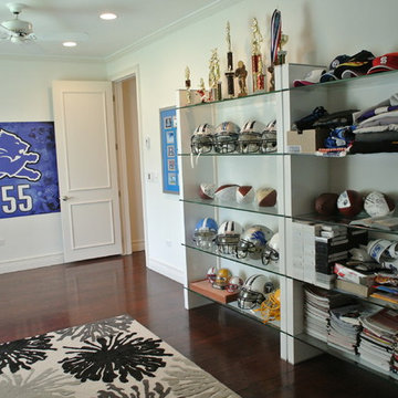
At the far end of the memorabilia room, poles used to hang cleats from significant games flank a Fathead poster of two “Tulloch” poses. Trophies are showcased and footballs line the walls, while a spirited area rug reminiscent of cheerleaders’ pom-poms adds a touch of whimsy.
A TOUCHDOWN BY DESIGN
Interior design by Jennifer Corredor, J Design Group, Coral Gables, Florida
Text by Christine Davis
Photography by Pablo Corredor Miami, Florida
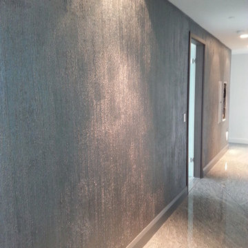
What did Detroit Lions linebacker, Stephen Tulloch, do when he needed a decorator for his new Miami 10,000-square-foot home? He tackled the situation by hiring interior designer Jennifer Corredor. Never defensive, he let her have run of the field. “He’d say, ‘Jen, do your thing,’” she says. And she did it well.
The first order of the day was to get a lay of the land and a feel for what he wanted. For his primary residence, Tulloch chose a home in Pinecrest, Florida. — a great family neighborhood known for its schools and ample lot sizes. “His lot is huge,” Corredor says. “He could practice his game there if he wanted.”
A laidback feeling permeates the suburban village, where mostly Mediterranean homes intermix with a few modern styles. With views toward the pool and a landscaped yard, Tulloch’s 10,000-square-foot home touches on both, a Mediterranean exterior with chic contemporary interiors.
Step inside, where high ceilings and a sculptural stairway with oak treads and linear spindles immediately capture the eye. “Knowing he was more inclined toward an uncluttered look, and taking into consideration his age and lifestyle, I naturally took the path of choosing more modern furnishings,” the designer says.
In the dining room, Tulloch specifically asked for a round table and Corredor found “Xilos Simplice” by Maxalto, a table that seats six to eight and has a Lazy Susan.
And just past the stairway, two armless chairs from Calligaris and a semi-round sofa shape the living room. In keeping with Tulloch’s desire for a simple no-fuss lifestyle, leather is often used for upholstery. “He preferred wipe-able areas,” she says. “Nearly everything in the living room is clad in leather.”
An architecturally striking, oak-coffered ceiling warms the family room, while Saturnia marble flooring grounds the space in cool comfort. “Since it’s just off the kitchen, this relaxed space provides the perfect place for family and friends to congregate — somewhere to hang out,” Corredor says. The deep-seated sofa wrapped in tan leather and Minotti armchairs in white join a pair of linen-clad ottomans for ample seating.
With eight bedrooms in the home, there was “plenty of space to repurpose,” Corredor says. “Five are used for sleeping quarters, but the others have been converted into a billiard room, a home office and the memorabilia room.” On the first floor, the billiard room is set for fun and entertainment with doors that open to the pool area.
The memorabilia room presented quite a challenge. Undaunted, Corredor delved into a seemingly never-ending collection of mementos to create a tribute to Tulloch’s career. “His team colors are blue and white, so we used those colors in this space,” she says.
In a nod to Tulloch’s career on and off the field, his home office displays awards, recognition plaques and photos from his foundation. A Copenhagen desk, Herman Miller chair and leather-topped credenza further an aura of masculinity.
All about relaxation, the master bedroom would not be complete without its own sitting area for viewing sports updates or late-night movies. Here, lounge chairs recline to create the perfect spot for Tulloch to put his feet up and watch TV. “He wanted it to be really comfortable,” Corredor says
A total redo was required in the master bath, where the now 12-foot-long shower is a far cry from those in a locker room. “This bath is more like a launching pad to get you going in the morning,” Corredor says.
“All in all, it’s a fun, warm and beautiful environment,” the designer says. “I wanted to create something unique, that would make my client proud and happy.” In Tulloch’s world, that’s a touchdown.
Your friendly Interior design firm in Miami at your service.
Contemporary - Modern Interior designs.
Top Interior Design Firm in Miami – Coral Gables.
Office,
Offices,
Kitchen,
Kitchens,
Bedroom,
Bedrooms,
Bed,
Queen bed,
King Bed,
Single bed,
House Interior Designer,
House Interior Designers,
Home Interior Designer,
Home Interior Designers,
Residential Interior Designer,
Residential Interior Designers,
Modern Interior Designers,
Miami Beach Designers,
Best Miami Interior Designers,
Miami Beach Interiors,
Luxurious Design in Miami,
Top designers,
Deco Miami,
Luxury interiors,
Miami modern,
Interior Designer Miami,
Contemporary Interior Designers,
Coco Plum Interior Designers,
Miami Interior Designer,
Sunny Isles Interior Designers,
Pinecrest Interior Designers,
Interior Designers Miami,
J Design Group interiors,
South Florida designers,
Best Miami Designers,
Miami interiors,
Miami décor,
Miami Beach Luxury Interiors,
Miami Interior Design,
Miami Interior Design Firms,
Beach front,
Top Interior Designers,
top décor,
Top Miami Decorators,
Miami luxury condos,
Top Miami Interior Decorators,
Top Miami Interior Designers,
Modern Designers in Miami,
modern interiors,
Modern,
Pent house design,
white interiors,
Miami, South Miami, Miami Beach, South Beach, Williams Island, Sunny Isles, Surfside, Fisher Island, Aventura, Brickell, Brickell Key, Key Biscayne, Coral Gables, CocoPlum, Coconut Grove, Pinecrest, Miami Design District, Golden Beach, Downtown Miami, Miami Interior Designers, Miami Interior Designer, Interior Designers Miami, Modern Interior Designers, Modern Interior Designer, Modern interior decorators, Contemporary Interior Designers, Interior decorators, Interior decorator, Interior designer, Interior designers, Luxury, modern, best, unique, real estate, decor
J Design Group – Miami Interior Design Firm – Modern – Contemporary
Contact us: (305) 444-4611 http://www.JDesignGroup.com
 TVL Creative Ltd.
Cramped kitchen be gone! That was the project motto and top priority. The goal was to transform the current layout from multiple smaller spaces into a connected whole that would activate the main level for our clients, a young family of four.
The biggest obstacle was the wall dividing the kitchen and the dining room. Removing this wall was central to opening up and integrating the main living spaces, but the existing ductwork that ran right through the center of the wall posed a design challenge, er design opportunity. The resulting design solution features a central pantry that captures the ductwork and provides valuable storage- especially when compared to the original kitchen's 18" wide pantry cabinet. The pantry also anchors the kitchen island and serves as a visual separation of space between the kitchen and homework area.
Through our design development process, we learned the formal living room was of no service to their lifestyle and therefore space they rarely spent time in. With that in mind, we proposed to eliminate the unused living room and make it the new dining room. Relocating the dining room to this space inherently felt right given the soaring ceiling and ample room for holiday dinners and celebrations. The new dining room was spacious enough for us to incorporate a conversational seating area in the warm, south-facing window alcove.
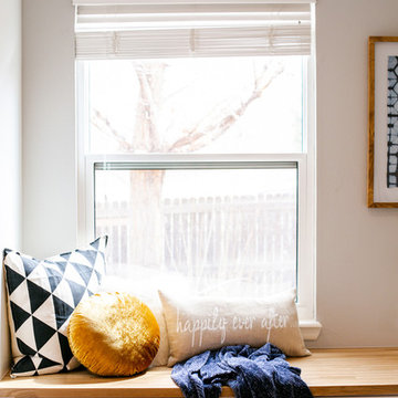
Now what to do with the old dining room?! To answer that question we took inspiration from our clients' shared profession in education and developed a craft area/homework station for both of their boys. The semi-custom cabinetry of the desk area carries over to the adjacent wall and forms window bench base with storage that we topped with butcher block for a touch of warmth. While the boys are young, the bench drawers are the perfect place for a stash of toys close to the kitchen.
The kitchen begins just beyond the window seat with their refrigerator enclosure. Opposite the refrigerator is the new pantry with twenty linear feet of shelving and space for brooms and a stick vacuum. Extending from the backside of the pantry the kitchen island design incorporates counter seating on the family room side and a cabinetry configuration on the kitchen side with drawer storage, a trashcan center, farmhouse sink, and dishwasher.
We took careful time in design and execution to align the range and sink because while it might seem like a small detail, it plays an important role in supporting the symmetrical configuration of the back wall of the kitchen. The rear wall design utilizes an appliance garage mirrors the visual impact of the refrigerator enclosure and helps keep the now open kitchen tidy. Between the appliance garage and refrigerator enclosure is the cooking zone with 30" of cabinetry and work surface on either side of the range, a chimney style vent hood, and a bold graphic tile backsplash.
The backsplash is just one of many personal touches we added to the space to reflect our client's modern eclectic style and love of color. Swooping lines of the mid-mod style barstools compliment the pendants and backsplash pattern. A pop of vibrant green on the frame of the pantry door adds a fresh wash of color to an otherwise neutral space. The big show stopper is the custom charcoal gray and copper chevron wall installation in the dining room. This was an idea our clients softly suggested, and we excitedly embraced the opportunity. It is also a kickass solution to the head-scratching design dilemma of how to fill a large and lofty wall.
We are so grateful to bring this design to life for our clients and now dear friends.
 KrimsonHAUS
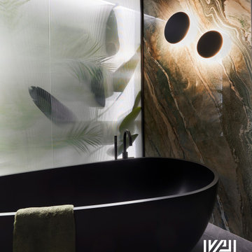
The existing layout posed peculiar challenges, with an "L" shaped configuration and a cramped shower area. Strikingly, the absence of windows pushed us to explore inventive design concepts.
 Maugel DeStefano Architects
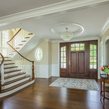
Crafted with a relaxed and effortless charm, this 5,600 SF shingle-style home offers views to the Isles of Shoals. The clients' goal was to create a warm and welcoming home that radiated both elegance and comfort while easily accommodating their newest additions to the family: their grandchildren.
Despite the challenge posed by the lot's unique shape, the team worked hard so that the design seamlessly integrates with the property, avoiding any sense of imposition to the land or its inhabitants. To overcome this obstacle, the design team incorporated a custom fit angle into the floor plan, defining the open-concept rooms and perfectly aligning with the clients' vision of a friendly and casual space.
The heart of the home lies in the open kitchen, with a generous granite island, a cozy breakfast nook, and adjacent open sitting areas. To ensure that the beauty of the Seacoast is always within sight, 30 strategically placed windows grace the waterside of the home, capturing the essence of the Shoals and inviting refreshing sea breezes into the interior.
 In Detail Interiors
Colorful and rich style
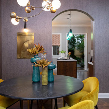
When a repeat client shows up on your doorstep with his third home to furnish and wants to start from scratch and go really bold, you just embrace him, scoot him right up to the resource room, and don’t ask questions! I mean, who does not love a client that embraces velvet, leather, silk and wallcoverings?
This lush, vibrant lounge space was all created from the want to really deep dive into something different, eclectic and more traveled. The original small, narrow, dimly lit room totally delivered on helping accomplish that mood. Mixing a little of that Ming dynasty-inspired strawberry red with a deep chocolate mohair on the sectional and cladding the room in a soft, amethyst woven wallcovering. We loved the interplay and “non-matchiness” that this space embraced.
Lighting and art were both about telling a story in this room – accenting conversational opportunities and an almost gallery-esque feel. Designating a more dynamic and unusual, sculptural feel – from the harder lines of the statement floor lamp in the living room across to the sprawling, slightly modern bloom of the dining area fixture.
Jewel of a space
The area rug had to ground the already bold furniture and lend itself to the darker wood floors, and a dusky green wool proved the ticket. We loved the almost pixelated pattern the hand-knotted wool lent to the overall design. A little hint of oxblood, chocolate and blue picked up in accents elsewhere, but the tone of almost jade really caught us about this piece.
Not enough can be said about the accent of a dining space either (which in terms of space planning was the only way to balance this long, narrow “hallway” of a room off the kitchen). Citron velvet on the low-profile chairs left the space feeling open, but fun for games and cocktail parties. Plus, the cerused wood dining table was a great complement – offering depth without a conflict to the existing flooring or nearby sectional.
Being able to view this space as a whole was very important to us! From the selection of sconces carried throughout (that wonky placement was existing and with so little opportunity to add cans we had to play up the new fixtures in a way that make them feel purposeful and desirable.), to the balance of color and temperature in each furniture grouping. Sometimes working floor to ceiling in an existing space can pose a lot of unique challenges when it comes to furnishing projects. However, we loved that the client embraced our drive to really punch up the visual feel of this living/dining combo. Also, we know the enjoyment he gets from the finished product is a testament to hunting for the right pieces, designing with unusual and luxe fabric combinations, and managing the inclusion of budget-friendly surprises that always balance a job well done.
What the client says
“From the moment that Cheryl arrived, I felt that she was definitely the designer that I needed to help facilitate & execute my vision for the space. I’m not the “cookie cutter” type, and I immediately realized that Cheryl had a knack for envisioning ideas that were unique, yet tasteful, timeless, and sophisticated.”
From its beginnings as a plain Jane envelope, this combination living/dining space becomes a study in texture and color!
 CHRISTOPHER STROM ARCHITECTS
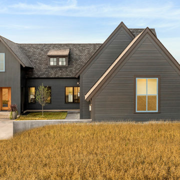
Eye-Land: Named for the expansive white oak savanna views, this beautiful 5,200-square foot family home offers seamless indoor/outdoor living with five bedrooms and three baths, and space for two more bedrooms and a bathroom.
The site posed unique design challenges. The home was ultimately nestled into the hillside, instead of placed on top of the hill, so that it didn’t dominate the dramatic landscape. The openness of the savanna exposes all sides of the house to the public, which required creative use of form and materials. The home’s one-and-a-half story form pays tribute to the site’s farming history. The simplicity of the gable roof puts a modern edge on a traditional form, and the exterior color palette is limited to black tones to strike a stunning contrast to the golden savanna.
The main public spaces have oversized south-facing windows and easy access to an outdoor terrace with views overlooking a protected wetland. The connection to the land is further strengthened by strategically placed windows that allow for views from the kitchen to the driveway and auto court to see visitors approach and children play. There is a formal living room adjacent to the front entry for entertaining and a separate family room that opens to the kitchen for immediate family to gather before and after mealtime.
 SUPERIOR CHIMNEY SERVICES CORPORATION
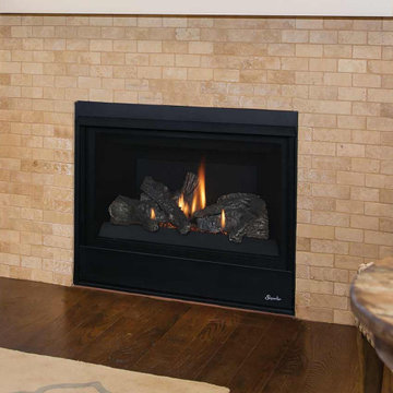
Is it necessary to clean gas fireplace? It’s intuitive that the dark black buildup of combustion needs to be cleaned from a typical wood burning fireplace, but is it needed to clean a gas fireplace? It’s gas…right? Gas fireplaces do not have a visible buildup of combustion, but should be cleaned at least once a year to prevent serious problems with the fireplace.
Gas vs. Wood Burning Fireplaces
When thinking of the inside of a family home, we think about the most comfortable room: the living room or family room. This is where the family meets, watches movies, and plays board games during rainy days, evenings and family time. It usually has a lofty, cozy couch and a wood burning fireplace. Nothing’s more comforting than falling asleep to the dim light of the fireplace and faint smell of burning wood. Nowadays, we have a close alternative to this old fashioned comfort: the gas fireplace. Gas fireplaces don’t leave much creosote behind, however gas fireplaces should be cleaned once a year, per the CSIA, due to dust, pet hair, insects, and other debris that can build up and cause performance problems. Chimney sweep are primarily for firewall worthiness assurance, cleaning and obstruction free assurance.
Gas fireplaces look similar to wood burning fireplaces, with a live flame. The logs inside the gas fireplace look real, but are not actually burning. Oftentimes, they are made of ceramic. A gas fireplace produces much less heat than a wood burning fireplace, but can retain more heat inside your home based on its type and configuration. Gas fireplaces can be low maintenance and energy friendly alternatives to a wood burning fireplace.
Some Signs to Clean Gas Fireplace
1. Buildup: Although gas fireplaces do not produce as much visible flammable and hazardous buildup, it does produce some corrosive substances and flue gasses that may settle inside your home without you knowing. Burning natural gas leaves a residue that must be cleaned annually. Failing to clean the residue may cause health risks if left untouched.
2. Technical Issues: There may be technical problems that are not visible, such as issues with the burner. Gas fireplaces are usually built to last long term but it’s imperative to check if there are any unnoticed technical issues at least once a year.
3. Gas Leaks: Over time, valves and pipes turn weaker and become corroded. It’s important to inspect these valves, as a gas leak is extremely hazardous. A certified chimney specialist must inspect and determine any damage or future damage to prevent this serious problem.
4. Condensation: Due to the high temperatures in the flue, there’s a buildup of condensation when the fireplace vapors are cooled. Natural gas exhaust also contains a high content of water vapor in emissions. The condensation reacts with byproducts and is acidic and corrosive, and must be cleaned at least once a year to not pose a potential health hazard.
It’s just as important to clean a gas fireplace at least once a year to prevent long term issues that could pose health risks if not cared for. A certified chimney professional from Superior Chimney will inspect and sweep the fireplace and ventilation system.
Contact us today to clean gas fireplace at 877-244-6349.
 Klopf Architecture
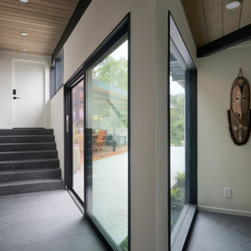
Set in a quiet neighborhood and framed by mature trees, this residence presented a unique opportunity: to thoughtfully evolve a custom mid-century modern home into a space that supports the everyday rhythms of a growing family. With a deep respect for the home’s original architecture, Klopf Architecture reimagined the house to better meet the needs of its owners—introducing functional improvements while preserving the spirit and character of its mid-century roots.
The clients approached Klopf Architecture with a clear vision: refresh their home while seamlessly integrating new programmatic elements. Key goals included clarifying and enhancing the entry sequence; connecting the detached garage to the main house with a practical yet architecturally intentional intervention; adding functional spaces such as a mudroom and laundry room; expanding and remodeling the primary suite’s bathroom and closet; and creating a more engaging outdoor space that capitalized on the site’s impressive views, featuring a fire pit and outdoor kitchen.
As a couple with distinct yet complementary perspectives—one focused on modern functionality and technology, and the other dedicated to preserving the home’s architectural integrity—their collaboration with Klopf Architecture resulted in a solution that harmonized both ideals. Their shared commitment to improving the livability of their home led to a design dialogue rooted in balance. This dynamic partnership shaped the direction of the renovation, ensuring that every decision honored the spirit of the original home while aligning with the practical needs of their growing family.
Designing within the constraints of the sloped site posed one of the project’s central challenges. The detached garage sat at a higher elevation than the main house, requiring a solution that ensured architectural and geometric compatibility between the two structures. Rather than create a purely utilitarian link, Klopf Architecture introduced an intentional connection that contributes to the overall architectural language. A notable pinch point in the plan—where differing geometries converged—was treated as a hinge point, turning a potentially awkward juncture into an architectural feature. This area now functions as both a transition and a moment of design interest that unifies the overall plan.
The design also addressed the underutilized outdoor area, which was located in a shadowed portion of the site with geometrical limitations. A new connection to the rear deck was created in this same area, making the outdoor space more useful and inviting. Klopf Architecture introduced carefully positioned openings and spatial improvements that forged a strong visual and functional connection between indoor and outdoor spaces. The outdoor area now reads as a deliberate extension of the home, embracing natural light and emphasizing the dramatic views.
Working through multiple design iterations, Klopf Architecture crafted a solution that preserved the architectural language of the original home while supporting the functional needs of modern life. The garage-to-house connection became more than a passage—it evolved into an architectural moment of transition. A new mudroom and laundry space enhanced convenience without compromising the clean lines of the design. The primary suite was expanded to create a private, serene retreat. The reimagined backyard, complete with fire pit and kitchen, now plays a vital role in the family’s daily routine and social life.
Outcomes and Lasting Impact
The result is a home that balances heritage with contemporary design, technical precision with design sensibility. The redesign not only met the clients’ initial goals but also exceeded expectations in its ability to seamlessly blend past and present, function and beauty, making the outdoor kitchen a favorite gathering place.
Beyond aesthetics, the renovation has significantly improved daily life for the family. The newly integrated garage connection has streamlined routines, providing a seamless transition between arriving home, storing belongings, and entering the main living spaces. The expanded primary suite offers a retreat-like atmosphere, creating a private space to unwind at the end of the day. The redesigned outdoor areas have also become an extension of their lifestyle—whether it's casual family dinners around the fire pit, entertaining friends in the outdoor kitchen, or simply enjoying the view from the reimagined backyard.
Through a thoughtful and strategic approach, the house has been successfully evolved into a home that remains true to its mid-century modern roots while enhancing livability, functionality, and the overall quality of life for the modern-day owners.
Klopf Architecture Team: Geoffrey Campen, Fernanda Bernardes
Architectural Interior Design: Klopf Architecture
Structural Engineer: Base Design Inc.
Contractor: Golden Snail Builders
Photography: Mariko Reed
Year Completed:2022
 Klopf Architecture
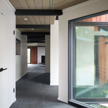
Set in a quiet neighborhood and framed by mature trees, this residence presented a unique opportunity: to thoughtfully evolve a custom mid-century modern home into a space that supports the everyday rhythms of a growing family. With a deep respect for the home’s original architecture, Klopf Architecture reimagined the house to better meet the needs of its owners—introducing functional improvements while preserving the spirit and character of its mid-century roots.
The clients approached Klopf Architecture with a clear vision: refresh their home while seamlessly integrating new programmatic elements. Key goals included clarifying and enhancing the entry sequence; connecting the detached garage to the main house with a practical yet architecturally intentional intervention; adding functional spaces such as a mudroom and laundry room; expanding and remodeling the primary suite’s bathroom and closet; and creating a more engaging outdoor space that capitalized on the site’s impressive views, featuring a fire pit and outdoor kitchen.
As a couple with distinct yet complementary perspectives—one focused on modern functionality and technology, and the other dedicated to preserving the home’s architectural integrity—their collaboration with Klopf Architecture resulted in a solution that harmonized both ideals. Their shared commitment to improving the livability of their home led to a design dialogue rooted in balance. This dynamic partnership shaped the direction of the renovation, ensuring that every decision honored the spirit of the original home while aligning with the practical needs of their growing family.
Designing within the constraints of the sloped site posed one of the project’s central challenges. The detached garage sat at a higher elevation than the main house, requiring a solution that ensured architectural and geometric compatibility between the two structures. Rather than create a purely utilitarian link, Klopf Architecture introduced an intentional connection that contributes to the overall architectural language. A notable pinch point in the plan—where differing geometries converged—was treated as a hinge point, turning a potentially awkward juncture into an architectural feature. This area now functions as both a transition and a moment of design interest that unifies the overall plan.
The design also addressed the underutilized outdoor area, which was located in a shadowed portion of the site with geometrical limitations. A new connection to the rear deck was created in this same area, making the outdoor space more useful and inviting. Klopf Architecture introduced carefully positioned openings and spatial improvements that forged a strong visual and functional connection between indoor and outdoor spaces. The outdoor area now reads as a deliberate extension of the home, embracing natural light and emphasizing the dramatic views.
Working through multiple design iterations, Klopf Architecture crafted a solution that preserved the architectural language of the original home while supporting the functional needs of modern life. The garage-to-house connection became more than a passage—it evolved into an architectural moment of transition. A new mudroom and laundry space enhanced convenience without compromising the clean lines of the design. The primary suite was expanded to create a private, serene retreat. The reimagined backyard, complete with fire pit and kitchen, now plays a vital role in the family’s daily routine and social life.
Outcomes and Lasting Impact
The result is a home that balances heritage with contemporary design, technical precision with design sensibility. The redesign not only met the clients’ initial goals but also exceeded expectations in its ability to seamlessly blend past and present, function and beauty, making the outdoor kitchen a favorite gathering place.
Beyond aesthetics, the renovation has significantly improved daily life for the family. The newly integrated garage connection has streamlined routines, providing a seamless transition between arriving home, storing belongings, and entering the main living spaces. The expanded primary suite offers a retreat-like atmosphere, creating a private space to unwind at the end of the day. The redesigned outdoor areas have also become an extension of their lifestyle—whether it's casual family dinners around the fire pit, entertaining friends in the outdoor kitchen, or simply enjoying the view from the reimagined backyard.
Through a thoughtful and strategic approach, the house has been successfully evolved into a home that remains true to its mid-century modern roots while enhancing livability, functionality, and the overall quality of life for the modern-day owners.
Klopf Architecture Team: Geoffrey Campen, Fernanda Bernardes
Architectural Interior Design: Klopf Architecture
Structural Engineer: Base Design Inc.
Contractor: Golden Snail Builders
Photography: Mariko Reed
Year Completed:2022
 TVL Creative Ltd.
Cramped kitchen be gone! That was the project motto and top priority. The goal was to transform the current layout from multiple smaller spaces into a connected whole that would activate the main level for our clients, a young family of four.
The biggest obstacle was the wall dividing the kitchen and the dining room. Removing this wall was central to opening up and integrating the main living spaces, but the existing ductwork that ran right through the center of the wall posed a design challenge, er design opportunity. The resulting design solution features a central pantry that captures the ductwork and provides valuable storage- especially when compared to the original kitchen's 18" wide pantry cabinet. The pantry also anchors the kitchen island and serves as a visual separation of space between the kitchen and homework area.
Through our design development process, we learned the formal living room was of no service to their lifestyle and therefore space they rarely spent time in. With that in mind, we proposed to eliminate the unused living room and make it the new dining room. Relocating the dining room to this space inherently felt right given the soaring ceiling and ample room for holiday dinners and celebrations. The new dining room was spacious enough for us to incorporate a conversational seating area in the warm, south-facing window alcove.
Now what to do with the old dining room?! To answer that question we took inspiration from our clients' shared profession in education and developed a craft area/homework station for both of their boys. The semi-custom cabinetry of the desk area carries over to the adjacent wall and forms window bench base with storage that we topped with butcher block for a touch of warmth. While the boys are young, the bench drawers are the perfect place for a stash of toys close to the kitchen.
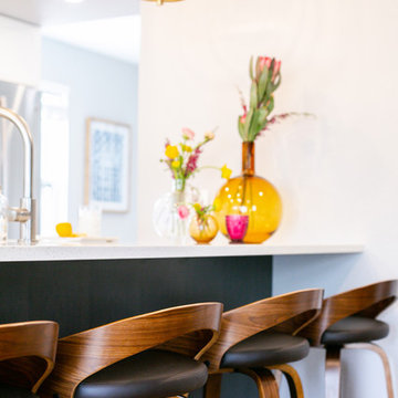
The kitchen begins just beyond the window seat with their refrigerator enclosure. Opposite the refrigerator is the new pantry with twenty linear feet of shelving and space for brooms and a stick vacuum. Extending from the backside of the pantry the kitchen island design incorporates counter seating on the family room side and a cabinetry configuration on the kitchen side with drawer storage, a trashcan center, farmhouse sink, and dishwasher.
We took careful time in design and execution to align the range and sink because while it might seem like a small detail, it plays an important role in supporting the symmetrical configuration of the back wall of the kitchen. The rear wall design utilizes an appliance garage mirrors the visual impact of the refrigerator enclosure and helps keep the now open kitchen tidy. Between the appliance garage and refrigerator enclosure is the cooking zone with 30" of cabinetry and work surface on either side of the range, a chimney style vent hood, and a bold graphic tile backsplash.
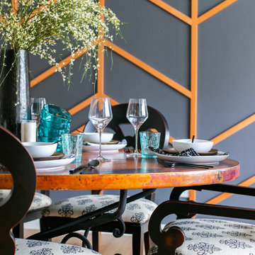
The backsplash is just one of many personal touches we added to the space to reflect our client's modern eclectic style and love of color. Swooping lines of the mid-mod style barstools compliment the pendants and backsplash pattern. A pop of vibrant green on the frame of the pantry door adds a fresh wash of color to an otherwise neutral space. The big show stopper is the custom charcoal gray and copper chevron wall installation in the dining room. This was an idea our clients softly suggested, and we excitedly embraced the opportunity. It is also a kickass solution to the head-scratching design dilemma of how to fill a large and lofty wall.
We are so grateful to bring this design to life for our clients and now dear friends.
 TVL Creative Ltd.
Cramped kitchen be gone! That was the project motto and top priority. The goal was to transform the current layout from multiple smaller spaces into a connected whole that would activate the main level for our clients, a young family of four.
The biggest obstacle was the wall dividing the kitchen and the dining room. Removing this wall was central to opening up and integrating the main living spaces, but the existing ductwork that ran right through the center of the wall posed a design challenge, er design opportunity. The resulting design solution features a central pantry that captures the ductwork and provides valuable storage- especially when compared to the original kitchen's 18" wide pantry cabinet. The pantry also anchors the kitchen island and serves as a visual separation of space between the kitchen and homework area.
Through our design development process, we learned the formal living room was of no service to their lifestyle and therefore space they rarely spent time in. With that in mind, we proposed to eliminate the unused living room and make it the new dining room. Relocating the dining room to this space inherently felt right given the soaring ceiling and ample room for holiday dinners and celebrations. The new dining room was spacious enough for us to incorporate a conversational seating area in the warm, south-facing window alcove.
Now what to do with the old dining room?! To answer that question we took inspiration from our clients' shared profession in education and developed a craft area/homework station for both of their boys. The semi-custom cabinetry of the desk area carries over to the adjacent wall and forms window bench base with storage that we topped with butcher block for a touch of warmth. While the boys are young, the bench drawers are the perfect place for a stash of toys close to the kitchen.
The kitchen begins just beyond the window seat with their refrigerator enclosure. Opposite the refrigerator is the new pantry with twenty linear feet of shelving and space for brooms and a stick vacuum. Extending from the backside of the pantry the kitchen island design incorporates counter seating on the family room side and a cabinetry configuration on the kitchen side with drawer storage, a trashcan center, farmhouse sink, and dishwasher.
We took careful time in design and execution to align the range and sink because while it might seem like a small detail, it plays an important role in supporting the symmetrical configuration of the back wall of the kitchen. The rear wall design utilizes an appliance garage mirrors the visual impact of the refrigerator enclosure and helps keep the now open kitchen tidy. Between the appliance garage and refrigerator enclosure is the cooking zone with 30" of cabinetry and work surface on either side of the range, a chimney style vent hood, and a bold graphic tile backsplash.
The backsplash is just one of many personal touches we added to the space to reflect our client's modern eclectic style and love of color. Swooping lines of the mid-mod style barstools compliment the pendants and backsplash pattern. A pop of vibrant green on the frame of the pantry door adds a fresh wash of color to an otherwise neutral space. The big show stopper is the custom charcoal gray and copper chevron wall installation in the dining room. This was an idea our clients softly suggested, and we excitedly embraced the opportunity. It is also a kickass solution to the head-scratching design dilemma of how to fill a large and lofty wall.
We are so grateful to bring this design to life for our clients and now dear friends.
 Radiance/In Place
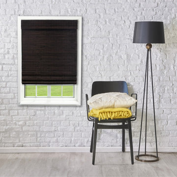
Relax the look of any room with the calm and comforting Cordless Espresso and Driftwood Flatweave Roman Shades. Environmentally friendly, private, textured natural shades (also called bamboo blinds, bamboo shades, or woven woods) stylishly reduce bright light and protect your furniture from fading. The rich wood tomes of natural shades are complimentary to trending rugs as well as many hardwood floors and furniture finished. Natural shades are textured window blinds that are available in many different colors and styles. They are popular window treatments for coastal and beach properties, lakeside or country cottages, and traditional or metropolitan homes. These new Roman Shades have no cords, so they are completely safe and pose no risk to small children, a safe and stylish way to decorate your home!
5