
Search results for "Friends pose" in Home Design Ideas
 TVL Creative Ltd.
Cramped kitchen be gone! That was the project motto and top priority. The goal was to transform the current layout from multiple smaller spaces into a connected whole that would activate the main level for our clients, a young family of four.
The biggest obstacle was the wall dividing the kitchen and the dining room. Removing this wall was central to opening up and integrating the main living spaces, but the existing ductwork that ran right through the center of the wall posed a design challenge, er design opportunity. The resulting design solution features a central pantry that captures the ductwork and provides valuable storage- especially when compared to the original kitchen's 18" wide pantry cabinet. The pantry also anchors the kitchen island and serves as a visual separation of space between the kitchen and homework area.
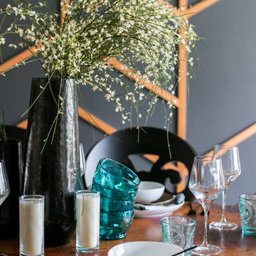
Through our design development process, we learned the formal living room was of no service to their lifestyle and therefore space they rarely spent time in. With that in mind, we proposed to eliminate the unused living room and make it the new dining room. Relocating the dining room to this space inherently felt right given the soaring ceiling and ample room for holiday dinners and celebrations. The new dining room was spacious enough for us to incorporate a conversational seating area in the warm, south-facing window alcove.
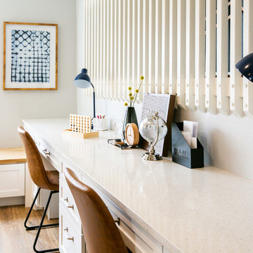
Now what to do with the old dining room?! To answer that question we took inspiration from our clients' shared profession in education and developed a craft area/homework station for both of their boys. The semi-custom cabinetry of the desk area carries over to the adjacent wall and forms window bench base with storage that we topped with butcher block for a touch of warmth. While the boys are young, the bench drawers are the perfect place for a stash of toys close to the kitchen.
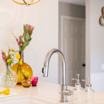
The kitchen begins just beyond the window seat with their refrigerator enclosure. Opposite the refrigerator is the new pantry with twenty linear feet of shelving and space for brooms and a stick vacuum. Extending from the backside of the pantry the kitchen island design incorporates counter seating on the family room side and a cabinetry configuration on the kitchen side with drawer storage, a trashcan center, farmhouse sink, and dishwasher.
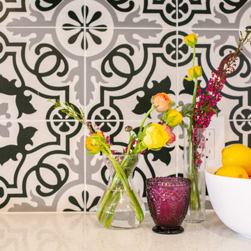
We took careful time in design and execution to align the range and sink because while it might seem like a small detail, it plays an important role in supporting the symmetrical configuration of the back wall of the kitchen. The rear wall design utilizes an appliance garage mirrors the visual impact of the refrigerator enclosure and helps keep the now open kitchen tidy. Between the appliance garage and refrigerator enclosure is the cooking zone with 30" of cabinetry and work surface on either side of the range, a chimney style vent hood, and a bold graphic tile backsplash.
The backsplash is just one of many personal touches we added to the space to reflect our client's modern eclectic style and love of color. Swooping lines of the mid-mod style barstools compliment the pendants and backsplash pattern. A pop of vibrant green on the frame of the pantry door adds a fresh wash of color to an otherwise neutral space. The big show stopper is the custom charcoal gray and copper chevron wall installation in the dining room. This was an idea our clients softly suggested, and we excitedly embraced the opportunity. It is also a kickass solution to the head-scratching design dilemma of how to fill a large and lofty wall.
We are so grateful to bring this design to life for our clients and now dear friends.
 SoCal Contractor
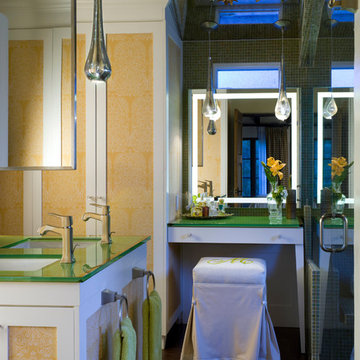
Master Bathroom Closet in a 1910 Spanish Revival home by LoriDennis.com Interior Design/ KenHayden.com Photography”
Trendy green tile and mosaic tile alcove shower photo in Los Angeles with an undermount sink, white cabinets, glass countertops and green countertops
Trendy green tile and mosaic tile alcove shower photo in Los Angeles with an undermount sink, white cabinets, glass countertops and green countertops

Find the right local pro for your project
 Maugel DeStefano Architects
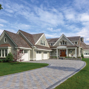
Crafted with a relaxed and effortless charm, this 5,600 SF shingle-style home offers views to the Isles of Shoals. The clients' goal was to create a warm and welcoming home that radiated both elegance and comfort while easily accommodating their newest additions to the family: their grandchildren.
Despite the challenge posed by the lot's unique shape, the team worked hard so that the design seamlessly integrates with the property, avoiding any sense of imposition to the land or its inhabitants. To overcome this obstacle, the design team incorporated a custom fit angle into the floor plan, defining the open-concept rooms and perfectly aligning with the clients' vision of a friendly and casual space.
The heart of the home lies in the open kitchen, with a generous granite island, a cozy breakfast nook, and adjacent open sitting areas. To ensure that the beauty of the Seacoast is always within sight, 30 strategically placed windows grace the waterside of the home, capturing the essence of the Shoals and inviting refreshing sea breezes into the interior.
 TVL Creative Ltd.
Cramped kitchen be gone! That was the project motto and top priority. The goal was to transform the current layout from multiple smaller spaces into a connected whole that would activate the main level for our clients, a young family of four.
The biggest obstacle was the wall dividing the kitchen and the dining room. Removing this wall was central to opening up and integrating the main living spaces, but the existing ductwork that ran right through the center of the wall posed a design challenge, er design opportunity. The resulting design solution features a central pantry that captures the ductwork and provides valuable storage- especially when compared to the original kitchen's 18" wide pantry cabinet. The pantry also anchors the kitchen island and serves as a visual separation of space between the kitchen and homework area.
Through our design development process, we learned the formal living room was of no service to their lifestyle and therefore space they rarely spent time in. With that in mind, we proposed to eliminate the unused living room and make it the new dining room. Relocating the dining room to this space inherently felt right given the soaring ceiling and ample room for holiday dinners and celebrations. The new dining room was spacious enough for us to incorporate a conversational seating area in the warm, south-facing window alcove.
Now what to do with the old dining room?! To answer that question we took inspiration from our clients' shared profession in education and developed a craft area/homework station for both of their boys. The semi-custom cabinetry of the desk area carries over to the adjacent wall and forms window bench base with storage that we topped with butcher block for a touch of warmth. While the boys are young, the bench drawers are the perfect place for a stash of toys close to the kitchen.
The kitchen begins just beyond the window seat with their refrigerator enclosure. Opposite the refrigerator is the new pantry with twenty linear feet of shelving and space for brooms and a stick vacuum. Extending from the backside of the pantry the kitchen island design incorporates counter seating on the family room side and a cabinetry configuration on the kitchen side with drawer storage, a trashcan center, farmhouse sink, and dishwasher.
We took careful time in design and execution to align the range and sink because while it might seem like a small detail, it plays an important role in supporting the symmetrical configuration of the back wall of the kitchen. The rear wall design utilizes an appliance garage mirrors the visual impact of the refrigerator enclosure and helps keep the now open kitchen tidy. Between the appliance garage and refrigerator enclosure is the cooking zone with 30" of cabinetry and work surface on either side of the range, a chimney style vent hood, and a bold graphic tile backsplash.
The backsplash is just one of many personal touches we added to the space to reflect our client's modern eclectic style and love of color. Swooping lines of the mid-mod style barstools compliment the pendants and backsplash pattern. A pop of vibrant green on the frame of the pantry door adds a fresh wash of color to an otherwise neutral space. The big show stopper is the custom charcoal gray and copper chevron wall installation in the dining room. This was an idea our clients softly suggested, and we excitedly embraced the opportunity. It is also a kickass solution to the head-scratching design dilemma of how to fill a large and lofty wall.
We are so grateful to bring this design to life for our clients and now dear friends.
 TVL Creative Ltd.
Cramped kitchen be gone! That was the project motto and top priority. The goal was to transform the current layout from multiple smaller spaces into a connected whole that would activate the main level for our clients, a young family of four.
The biggest obstacle was the wall dividing the kitchen and the dining room. Removing this wall was central to opening up and integrating the main living spaces, but the existing ductwork that ran right through the center of the wall posed a design challenge, er design opportunity. The resulting design solution features a central pantry that captures the ductwork and provides valuable storage- especially when compared to the original kitchen's 18" wide pantry cabinet. The pantry also anchors the kitchen island and serves as a visual separation of space between the kitchen and homework area.
Through our design development process, we learned the formal living room was of no service to their lifestyle and therefore space they rarely spent time in. With that in mind, we proposed to eliminate the unused living room and make it the new dining room. Relocating the dining room to this space inherently felt right given the soaring ceiling and ample room for holiday dinners and celebrations. The new dining room was spacious enough for us to incorporate a conversational seating area in the warm, south-facing window alcove.
Now what to do with the old dining room?! To answer that question we took inspiration from our clients' shared profession in education and developed a craft area/homework station for both of their boys. The semi-custom cabinetry of the desk area carries over to the adjacent wall and forms window bench base with storage that we topped with butcher block for a touch of warmth. While the boys are young, the bench drawers are the perfect place for a stash of toys close to the kitchen.
The kitchen begins just beyond the window seat with their refrigerator enclosure. Opposite the refrigerator is the new pantry with twenty linear feet of shelving and space for brooms and a stick vacuum. Extending from the backside of the pantry the kitchen island design incorporates counter seating on the family room side and a cabinetry configuration on the kitchen side with drawer storage, a trashcan center, farmhouse sink, and dishwasher.
We took careful time in design and execution to align the range and sink because while it might seem like a small detail, it plays an important role in supporting the symmetrical configuration of the back wall of the kitchen. The rear wall design utilizes an appliance garage mirrors the visual impact of the refrigerator enclosure and helps keep the now open kitchen tidy. Between the appliance garage and refrigerator enclosure is the cooking zone with 30" of cabinetry and work surface on either side of the range, a chimney style vent hood, and a bold graphic tile backsplash.
The backsplash is just one of many personal touches we added to the space to reflect our client's modern eclectic style and love of color. Swooping lines of the mid-mod style barstools compliment the pendants and backsplash pattern. A pop of vibrant green on the frame of the pantry door adds a fresh wash of color to an otherwise neutral space. The big show stopper is the custom charcoal gray and copper chevron wall installation in the dining room. This was an idea our clients softly suggested, and we excitedly embraced the opportunity. It is also a kickass solution to the head-scratching design dilemma of how to fill a large and lofty wall.
We are so grateful to bring this design to life for our clients and now dear friends.
 TVL Creative Ltd.
Cramped kitchen be gone! That was the project motto and top priority. The goal was to transform the current layout from multiple smaller spaces into a connected whole that would activate the main level for our clients, a young family of four.
The biggest obstacle was the wall dividing the kitchen and the dining room. Removing this wall was central to opening up and integrating the main living spaces, but the existing ductwork that ran right through the center of the wall posed a design challenge, er design opportunity. The resulting design solution features a central pantry that captures the ductwork and provides valuable storage- especially when compared to the original kitchen's 18" wide pantry cabinet. The pantry also anchors the kitchen island and serves as a visual separation of space between the kitchen and homework area.
Through our design development process, we learned the formal living room was of no service to their lifestyle and therefore space they rarely spent time in. With that in mind, we proposed to eliminate the unused living room and make it the new dining room. Relocating the dining room to this space inherently felt right given the soaring ceiling and ample room for holiday dinners and celebrations. The new dining room was spacious enough for us to incorporate a conversational seating area in the warm, south-facing window alcove.
Now what to do with the old dining room?! To answer that question we took inspiration from our clients' shared profession in education and developed a craft area/homework station for both of their boys. The semi-custom cabinetry of the desk area carries over to the adjacent wall and forms window bench base with storage that we topped with butcher block for a touch of warmth. While the boys are young, the bench drawers are the perfect place for a stash of toys close to the kitchen.
The kitchen begins just beyond the window seat with their refrigerator enclosure. Opposite the refrigerator is the new pantry with twenty linear feet of shelving and space for brooms and a stick vacuum. Extending from the backside of the pantry the kitchen island design incorporates counter seating on the family room side and a cabinetry configuration on the kitchen side with drawer storage, a trashcan center, farmhouse sink, and dishwasher.
We took careful time in design and execution to align the range and sink because while it might seem like a small detail, it plays an important role in supporting the symmetrical configuration of the back wall of the kitchen. The rear wall design utilizes an appliance garage mirrors the visual impact of the refrigerator enclosure and helps keep the now open kitchen tidy. Between the appliance garage and refrigerator enclosure is the cooking zone with 30" of cabinetry and work surface on either side of the range, a chimney style vent hood, and a bold graphic tile backsplash.
The backsplash is just one of many personal touches we added to the space to reflect our client's modern eclectic style and love of color. Swooping lines of the mid-mod style barstools compliment the pendants and backsplash pattern. A pop of vibrant green on the frame of the pantry door adds a fresh wash of color to an otherwise neutral space. The big show stopper is the custom charcoal gray and copper chevron wall installation in the dining room. This was an idea our clients softly suggested, and we excitedly embraced the opportunity. It is also a kickass solution to the head-scratching design dilemma of how to fill a large and lofty wall.
We are so grateful to bring this design to life for our clients and now dear friends.
 Maugel DeStefano Architects
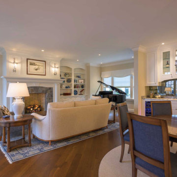
Crafted with a relaxed and effortless charm, this 5,600 SF shingle-style home offers views to the Isles of Shoals. The clients' goal was to create a warm and welcoming home that radiated both elegance and comfort while easily accommodating their newest additions to the family: their grandchildren.
Despite the challenge posed by the lot's unique shape, the team worked hard so that the design seamlessly integrates with the property, avoiding any sense of imposition to the land or its inhabitants. To overcome this obstacle, the design team incorporated a custom fit angle into the floor plan, defining the open-concept rooms and perfectly aligning with the clients' vision of a friendly and casual space.
The heart of the home lies in the open kitchen, with a generous granite island, a cozy breakfast nook, and adjacent open sitting areas. To ensure that the beauty of the Seacoast is always within sight, 30 strategically placed windows grace the waterside of the home, capturing the essence of the Shoals and inviting refreshing sea breezes into the interior.
 TVL Creative Ltd.
Cramped kitchen be gone! That was the project motto and top priority. The goal was to transform the current layout from multiple smaller spaces into a connected whole that would activate the main level for our clients, a young family of four.
The biggest obstacle was the wall dividing the kitchen and the dining room. Removing this wall was central to opening up and integrating the main living spaces, but the existing ductwork that ran right through the center of the wall posed a design challenge, er design opportunity. The resulting design solution features a central pantry that captures the ductwork and provides valuable storage- especially when compared to the original kitchen's 18" wide pantry cabinet. The pantry also anchors the kitchen island and serves as a visual separation of space between the kitchen and homework area.
Through our design development process, we learned the formal living room was of no service to their lifestyle and therefore space they rarely spent time in. With that in mind, we proposed to eliminate the unused living room and make it the new dining room. Relocating the dining room to this space inherently felt right given the soaring ceiling and ample room for holiday dinners and celebrations. The new dining room was spacious enough for us to incorporate a conversational seating area in the warm, south-facing window alcove.
Now what to do with the old dining room?! To answer that question we took inspiration from our clients' shared profession in education and developed a craft area/homework station for both of their boys. The semi-custom cabinetry of the desk area carries over to the adjacent wall and forms window bench base with storage that we topped with butcher block for a touch of warmth. While the boys are young, the bench drawers are the perfect place for a stash of toys close to the kitchen.
The kitchen begins just beyond the window seat with their refrigerator enclosure. Opposite the refrigerator is the new pantry with twenty linear feet of shelving and space for brooms and a stick vacuum. Extending from the backside of the pantry the kitchen island design incorporates counter seating on the family room side and a cabinetry configuration on the kitchen side with drawer storage, a trashcan center, farmhouse sink, and dishwasher.
We took careful time in design and execution to align the range and sink because while it might seem like a small detail, it plays an important role in supporting the symmetrical configuration of the back wall of the kitchen. The rear wall design utilizes an appliance garage mirrors the visual impact of the refrigerator enclosure and helps keep the now open kitchen tidy. Between the appliance garage and refrigerator enclosure is the cooking zone with 30" of cabinetry and work surface on either side of the range, a chimney style vent hood, and a bold graphic tile backsplash.
The backsplash is just one of many personal touches we added to the space to reflect our client's modern eclectic style and love of color. Swooping lines of the mid-mod style barstools compliment the pendants and backsplash pattern. A pop of vibrant green on the frame of the pantry door adds a fresh wash of color to an otherwise neutral space. The big show stopper is the custom charcoal gray and copper chevron wall installation in the dining room. This was an idea our clients softly suggested, and we excitedly embraced the opportunity. It is also a kickass solution to the head-scratching design dilemma of how to fill a large and lofty wall.
We are so grateful to bring this design to life for our clients and now dear friends.
 Maugel DeStefano Architects
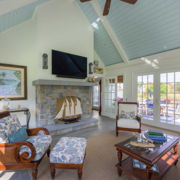
Crafted with a relaxed and effortless charm, this 5,600 SF shingle-style home offers views to the Isles of Shoals. The clients' goal was to create a warm and welcoming home that radiated both elegance and comfort while easily accommodating their newest additions to the family: their grandchildren.
Despite the challenge posed by the lot's unique shape, the team worked hard so that the design seamlessly integrates with the property, avoiding any sense of imposition to the land or its inhabitants. To overcome this obstacle, the design team incorporated a custom fit angle into the floor plan, defining the open-concept rooms and perfectly aligning with the clients' vision of a friendly and casual space.
The heart of the home lies in the open kitchen, with a generous granite island, a cozy breakfast nook, and adjacent open sitting areas. To ensure that the beauty of the Seacoast is always within sight, 30 strategically placed windows grace the waterside of the home, capturing the essence of the Shoals and inviting refreshing sea breezes into the interior.
 Temescal Sustainable Interior Design
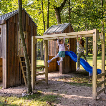
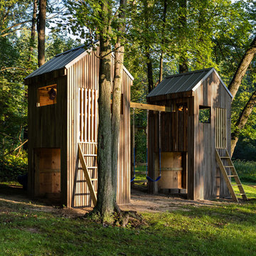
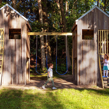
Set inside a circle of 100-year-old maple and oak trees, while complimenting the main home’s architecture, these ‘tree houses’ give shelter, space for imagination & safe play outdoors for twins. Mimicking the trees’ height and scale, and mirrored in each of their designs, these two 6 foot square base by 14 foot tall twin play structures allow for each child to have its own personal space, yet are connected at the center swings.
These unique treehouses have been built with sustainable sourcing and upcycled construction methods. When Martine Ilana, Principal designer of Temescal, considered what a ‘treehouse’ would look like for her twins, immediately it’s ideation was focused on keeping the integrity of the forest and problem solving how to use as many repurposed and sustainable materials as possible.
Accessing the incredible selection of salvage materials from a salvage yard in Detroit, Temescal was able to source non-toxic, and structurally sound woods to build the structure itself.
Healthy building materials include: Metal Roofing and Water based Low VOC paints. A slatted exterior structure was designed to create a rain screen and in addition complement the Main home’s exterior design. Designed with an end of life intention for longevity and a easy means to pull apart these structures apart once the children are older, the foundations can be used for a future ADU.
The slide posed the largest problem to source as recycled plastic slides are not made available to residential projects by US based manufactures and repurposed from Facebook marketplace hit many dead ends. Ultimately, she chose to use a HDPE high density polyurethane plastic slide that would allow for its material to be recycled once at the end of this life.
Every detail, both in their exterior and interior, of these upcycled treehouses was considered with care and an artistic touch that enhances the landscape and forest surrounding them.
 Temescal Sustainable Interior Design
Set inside a circle of 100-year-old maple and oak trees, while complimenting the main home’s architecture, these ‘tree houses’ give shelter, space for imagination & safe play outdoors for twins. Mimicking the trees’ height and scale, and mirrored in each of their designs, these two 6 foot square base by 14 foot tall twin play structures allow for each child to have its own personal space, yet are connected at the center swings.
These unique treehouses have been built with sustainable sourcing and upcycled construction methods. When Martine Ilana, Principal designer of Temescal, considered what a ‘treehouse’ would look like for her twins, immediately it’s ideation was focused on keeping the integrity of the forest and problem solving how to use as many repurposed and sustainable materials as possible.
Accessing the incredible selection of salvage materials from a salvage yard in Detroit, Temescal was able to source non-toxic, and structurally sound woods to build the structure itself.
Healthy building materials include: Metal Roofing and Water based Low VOC paints. A slatted exterior structure was designed to create a rain screen and in addition complement the Main home’s exterior design. Designed with an end of life intention for longevity and a easy means to pull apart these structures apart once the children are older, the foundations can be used for a future ADU.
The slide posed the largest problem to source as recycled plastic slides are not made available to residential projects by US based manufactures and repurposed from Facebook marketplace hit many dead ends. Ultimately, she chose to use a HDPE high density polyurethane plastic slide that would allow for its material to be recycled once at the end of this life.
Every detail, both in their exterior and interior, of these upcycled treehouses was considered with care and an artistic touch that enhances the landscape and forest surrounding them.
 Temescal Sustainable Interior Design
Set inside a circle of 100-year-old maple and oak trees, while complimenting the main home’s architecture, these ‘tree houses’ give shelter, space for imagination & safe play outdoors for twins. Mimicking the trees’ height and scale, and mirrored in each of their designs, these two 6 foot square base by 14 foot tall twin play structures allow for each child to have its own personal space, yet are connected at the center swings.
These unique treehouses have been built with sustainable sourcing and upcycled construction methods. When Martine Ilana, Principal designer of Temescal, considered what a ‘treehouse’ would look like for her twins, immediately it’s ideation was focused on keeping the integrity of the forest and problem solving how to use as many repurposed and sustainable materials as possible.
Accessing the incredible selection of salvage materials from a salvage yard in Detroit, Temescal was able to source non-toxic, and structurally sound woods to build the structure itself.
Healthy building materials include: Metal Roofing and Water based Low VOC paints. A slatted exterior structure was designed to create a rain screen and in addition complement the Main home’s exterior design. Designed with an end of life intention for longevity and a easy means to pull apart these structures apart once the children are older, the foundations can be used for a future ADU.
The slide posed the largest problem to source as recycled plastic slides are not made available to residential projects by US based manufactures and repurposed from Facebook marketplace hit many dead ends. Ultimately, she chose to use a HDPE high density polyurethane plastic slide that would allow for its material to be recycled once at the end of this life.
Every detail, both in their exterior and interior, of these upcycled treehouses was considered with care and an artistic touch that enhances the landscape and forest surrounding them.
 In Detail Interiors
Colorful and rich style
When a repeat client shows up on your doorstep with his third home to furnish and wants to start from scratch and go really bold, you just embrace him, scoot him right up to the resource room, and don’t ask questions! I mean, who does not love a client that embraces velvet, leather, silk and wallcoverings?
This lush, vibrant lounge space was all created from the want to really deep dive into something different, eclectic and more traveled. The original small, narrow, dimly lit room totally delivered on helping accomplish that mood. Mixing a little of that Ming dynasty-inspired strawberry red with a deep chocolate mohair on the sectional and cladding the room in a soft, amethyst woven wallcovering. We loved the interplay and “non-matchiness” that this space embraced.
Lighting and art were both about telling a story in this room – accenting conversational opportunities and an almost gallery-esque feel. Designating a more dynamic and unusual, sculptural feel – from the harder lines of the statement floor lamp in the living room across to the sprawling, slightly modern bloom of the dining area fixture.
Jewel of a space
The area rug had to ground the already bold furniture and lend itself to the darker wood floors, and a dusky green wool proved the ticket. We loved the almost pixelated pattern the hand-knotted wool lent to the overall design. A little hint of oxblood, chocolate and blue picked up in accents elsewhere, but the tone of almost jade really caught us about this piece.
Not enough can be said about the accent of a dining space either (which in terms of space planning was the only way to balance this long, narrow “hallway” of a room off the kitchen). Citron velvet on the low-profile chairs left the space feeling open, but fun for games and cocktail parties. Plus, the cerused wood dining table was a great complement – offering depth without a conflict to the existing flooring or nearby sectional.
Being able to view this space as a whole was very important to us! From the selection of sconces carried throughout (that wonky placement was existing and with so little opportunity to add cans we had to play up the new fixtures in a way that make them feel purposeful and desirable.), to the balance of color and temperature in each furniture grouping. Sometimes working floor to ceiling in an existing space can pose a lot of unique challenges when it comes to furnishing projects. However, we loved that the client embraced our drive to really punch up the visual feel of this living/dining combo. Also, we know the enjoyment he gets from the finished product is a testament to hunting for the right pieces, designing with unusual and luxe fabric combinations, and managing the inclusion of budget-friendly surprises that always balance a job well done.
What the client says
“From the moment that Cheryl arrived, I felt that she was definitely the designer that I needed to help facilitate & execute my vision for the space. I’m not the “cookie cutter” type, and I immediately realized that Cheryl had a knack for envisioning ideas that were unique, yet tasteful, timeless, and sophisticated.”
From its beginnings as a plain Jane envelope, this combination living/dining space becomes a study in texture and color!
 Temescal Sustainable Interior Design
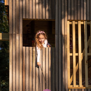
Set inside a circle of 100-year-old maple and oak trees, while complimenting the main home’s architecture, these ‘tree houses’ give shelter, space for imagination & safe play outdoors for twins. Mimicking the trees’ height and scale, and mirrored in each of their designs, these two 6 foot square base by 14 foot tall twin play structures allow for each child to have its own personal space, yet are connected at the center swings.
These unique treehouses have been built with sustainable sourcing and upcycled construction methods. When Martine Ilana, Principal designer of Temescal, considered what a ‘treehouse’ would look like for her twins, immediately it’s ideation was focused on keeping the integrity of the forest and problem solving how to use as many repurposed and sustainable materials as possible.
Accessing the incredible selection of salvage materials from a salvage yard in Detroit, Temescal was able to source non-toxic, and structurally sound woods to build the structure itself.
Healthy building materials include: Metal Roofing and Water based Low VOC paints. A slatted exterior structure was designed to create a rain screen and in addition complement the Main home’s exterior design. Designed with an end of life intention for longevity and a easy means to pull apart these structures apart once the children are older, the foundations can be used for a future ADU.
The slide posed the largest problem to source as recycled plastic slides are not made available to residential projects by US based manufactures and repurposed from Facebook marketplace hit many dead ends. Ultimately, she chose to use a HDPE high density polyurethane plastic slide that would allow for its material to be recycled once at the end of this life.
Every detail, both in their exterior and interior, of these upcycled treehouses was considered with care and an artistic touch that enhances the landscape and forest surrounding them.
 Temescal Sustainable Interior Design
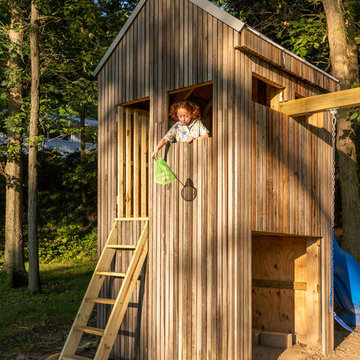
Set inside a circle of 100-year-old maple and oak trees, while complimenting the main home’s architecture, these ‘tree houses’ give shelter, space for imagination & safe play outdoors for twins. Mimicking the trees’ height and scale, and mirrored in each of their designs, these two 6 foot square base by 14 foot tall twin play structures allow for each child to have its own personal space, yet are connected at the center swings.
These unique treehouses have been built with sustainable sourcing and upcycled construction methods. When Martine Ilana, Principal designer of Temescal, considered what a ‘treehouse’ would look like for her twins, immediately it’s ideation was focused on keeping the integrity of the forest and problem solving how to use as many repurposed and sustainable materials as possible.
Accessing the incredible selection of salvage materials from a salvage yard in Detroit, Temescal was able to source non-toxic, and structurally sound woods to build the structure itself.
Healthy building materials include: Metal Roofing and Water based Low VOC paints. A slatted exterior structure was designed to create a rain screen and in addition complement the Main home’s exterior design. Designed with an end of life intention for longevity and a easy means to pull apart these structures apart once the children are older, the foundations can be used for a future ADU.
The slide posed the largest problem to source as recycled plastic slides are not made available to residential projects by US based manufactures and repurposed from Facebook marketplace hit many dead ends. Ultimately, she chose to use a HDPE high density polyurethane plastic slide that would allow for its material to be recycled once at the end of this life.
Every detail, both in their exterior and interior, of these upcycled treehouses was considered with care and an artistic touch that enhances the landscape and forest surrounding them.

 Tracstar Tree Experts
TREE REMOVAL SERVICES IN VIRGINIA BEACH
Your trees need maintenance, and sometimes removal. While we prefer to nurture your trees back to health, we recognize that tree removal is necessary for certain situations. We may determine that tree removal is a property owner’s best option when a tree is dead, diseased, or poses a risk to electrical lines and public safety.
Whether you’re a seasoned tree-owner or a first-timer, our high trained tree professionals are here to provide transparency and all the information you need for your tree removal in Virginia Beach. We believe in the power of local businesses and with that, the trust factor you get when working with a company that has Virginia Beach roots. Our friendly and knowledgeable sales professional, Theo, is here to answer any questions you may have from consultation all the way through to cleanup.
 Bell+Associates Architecture Inc.
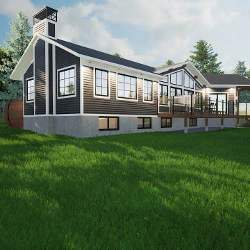
Nestled at the end of a private road on a forested riverfront property, our client’s cottage will be expanded on two sides to meet the needs of a growing extended family while maintaining the connection with the tranquil setting. The renovation/addition is designed to enhance the view of the river and welcome an abundance of natural sunlight from the southeast exposure. The original cottage was insulated and winterized, but the layout was a little too cozy when everyone gathered, and it was designed for warm-weather use. The vision is to expand it for use as our clients’ four-season retirement home and a comfortable vacation destination for their family and friends.
The spacious great room addition and dining room caters to large family gatherings and a new kitchen boasts a large island with seating, significantly more counter space, and a generous pantry. The spacious new entryway off the covered porch welcomes guests and makes it much easier to shed coats and boots during the colder months. The spacious walk-in closet in the front foyer provides plentiful storage space for outerwear, hats, boots, shoes, and more. The laundry is now conveniently located adjacent to the kitchen.
Creating a seamless transition between indoor and outdoor living spaces, the expansive new screened porch will accommodate family and friends as they gather to enjoy the beautiful view and warm breezes off the water without the annoyance of bugs.
On the lower level, the expanded space includes a new 5th bedroom, office, storage room and mechanical room. The exterior reflects a Modern Craftsman style, integrating existing with new to create a cohesive look.
The project posed a unique challenge due to the irregular lot and the need to work with the existing locations of the cottage and existing detached garage. Our team navigated these constraints, creating a design that optimizes the existing and new space and maintains a strong visual connection with the surrounding landscape.
 Bell+Associates Architecture Inc.
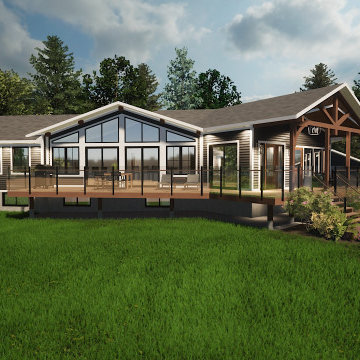
Nestled at the end of a private road on a forested riverfront property, our client’s cottage will be expanded on two sides to meet the needs of a growing extended family while maintaining the connection with the tranquil setting. The renovation/addition is designed to enhance the view of the river and welcome an abundance of natural sunlight from the southeast exposure. The original cottage was insulated and winterized, but the layout was a little too cozy when everyone gathered, and it was designed for warm-weather use. The vision is to expand it for use as our clients’ four-season retirement home and a comfortable vacation destination for their family and friends.
The spacious great room addition and dining room caters to large family gatherings and a new kitchen boasts a large island with seating, significantly more counter space, and a generous pantry. The spacious new entryway off the covered porch welcomes guests and makes it much easier to shed coats and boots during the colder months. The spacious walk-in closet in the front foyer provides plentiful storage space for outerwear, hats, boots, shoes, and more. The laundry is now conveniently located adjacent to the kitchen.
Creating a seamless transition between indoor and outdoor living spaces, the expansive new screened porch will accommodate family and friends as they gather to enjoy the beautiful view and warm breezes off the water without the annoyance of bugs.
On the lower level, the expanded space includes a new 5th bedroom, office, storage room and mechanical room. The exterior reflects a Modern Craftsman style, integrating existing with new to create a cohesive look.
The project posed a unique challenge due to the irregular lot and the need to work with the existing locations of the cottage and existing detached garage. Our team navigated these constraints, creating a design that optimizes the existing and new space and maintains a strong visual connection with the surrounding landscape.
 Budget Blinds Regina Weyburn Estevan
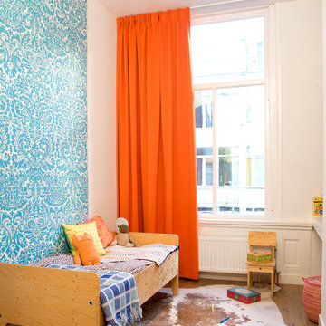
Safety comes first when considering what window coverings to use for your kid’s room. The number one hazard that window coverings pose for young children are dangling cords since playful curiosity can lead to strangulation. For this reason, cordless window coverings are essential.
www.budgetblinds.com/ReginaSouth
306-949-2300
1433 Hamilton St,
Regina, Saskatchewan
Call for your free in home consult.
7