
Search results for "Function" in Home Design Ideas
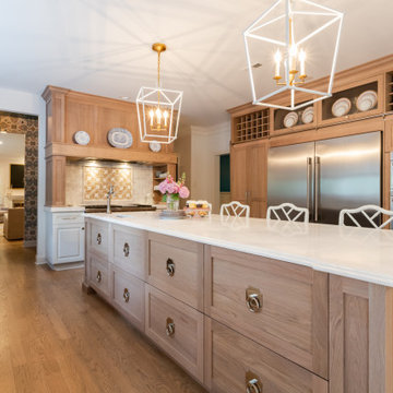

 Betsy Bassett Interiors
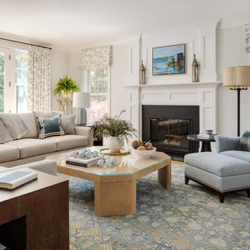
Living room - mid-sized transitional open concept medium tone wood floor living room idea in Boston with blue walls, a standard fireplace and a wood fireplace surround
 Element 5 Architecture
Andrea Calo
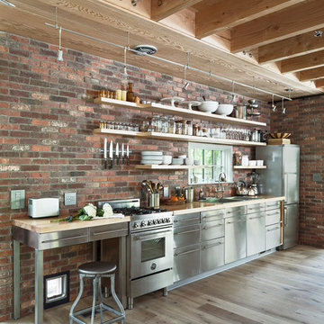
Kitchen - country single-wall light wood floor and beige floor kitchen idea in Austin with open cabinets, wood countertops, brick backsplash, stainless steel appliances and no island
Kitchen - country single-wall light wood floor and beige floor kitchen idea in Austin with open cabinets, wood countertops, brick backsplash, stainless steel appliances and no island
Find the right local pro for your project
 Bilotta Kitchen & Home
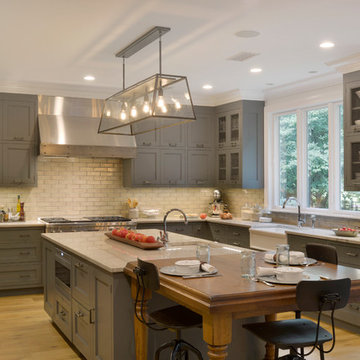
This expansive traditional kitchen by senior designer, Randy O'Kane and Architect, Clark Neuringer, features Bilotta Collection cabinet in a custom color. Randy says, the best part about working with this client was that she loves design – and not just interior but she also loves holiday decorating and she has a beautiful sense of aesthetic (and does everything to the nines). For her kitchen she wanted a barn-like feel and it absolutely had to be functional because she both bakes and cooks for her family and neighbors every day. And as the mother of four teenage girls she has a lot of people coming in and out of her home all the time. She wanted her kitchen to be comfortable – not untouchable and not too “done”. When she first met with Bilotta senior designer Randy O’Kane, her #1 comment was: “I’m experiencing white kitchen fatigue”. So right from the start finding the perfect color was the prime focus. The challenge was infusing a center hall colonial with a sense of warmth, comfort and that barn aesthetic without being too rustic which is why they went with a straight greenish grey paint vs. something distressed. The flooring, by Artisan Wood floors, looks reclaimed with its wider long planks and fumed finish. The barn door separating the laundry room and the kitchen was made from hand selected barn wood, made custom according to the client’s detailed specifications, and hung with sliding hardware. The kitchen hardware was really a window sash pull from Rocky Mountain that was repurposed as handles in a living bronze finish mounted horizontally. Glazed brick tile, by Ann Sacks, really helped to embrace the overall concept. Since a lot of parties are hosted out of that space, the kitchen, and butler’s pantry off to the side, needed a good flow as well as areas to bake and stage the creations. Double ovens were a must as well as a 48” Wolf Range and a Rangecraft hood – four ovens are going all the time. Beverage drawers were added to allow others to flow through the kitchen without disturbing the cook. Lots of storage was added for a well-stocked kitchen. A unique detail is double door wall cabinets, some with wire mesh to allow to see their dishes for easy access. In the butler’s pantry, instead of mesh they opted for antique mirror glass fronts. Countertops are a natural quartzite for care free use and a solid wood table, by Brooks Custom, extends of the island, removable for flexibility, making the kitchen and dining area very functional. One of the client’s antique pieces (a hutch) was incorporated into the kitchen to give it a more authentic look as well as another surface to decorate and provide storage. The lighting over the island and breakfast table has exposed Edison bulbs which hearkens to that “barn” lighting. For the sinks, they used a fireclay Herbeau farmhouse on the perimeter and an undermount Rohl sink on the island. Faucets are by Waterworks. Standing back and taking it all in it’s a wonderful collaboration of carefully designed working space and a warm gathering space for family and guests. Bilotta Designer: Randy O’Kane, Architect: Clark Neuringer Architects, posthumously. Photo Credit: Peter Krupenye

 Advance Design Studio, Ltd.
Jennifer and Dan have lived in their Deer Park Illinois home for 15 years, slowly making minor fixes like painting and decorating; but they had a new plan for their kitchen the entire time. An awkwardly placed garage door, and an island cooktop with a terrible downdraft made a full-scale kitchen remodel an absolute must. Jennifer had many ideas in mind and wanted to work with a company that could provide high-end work, while partnering with a designer that would tailor the kitchen to her ideas.
She was intrigued by the phrase “Common Sense Remodeling” in Advance Design’s feature she discovered while perusing an issue of the community’s Quintessential Barrington Magazine. Doing further research on the company’s website, as she looked through project profiles and read about Advance Design’s “Common Sense Remodeling” philosophy, she promptly scheduled an appointment to see if the people and ideas she read about were truly who they said they were. The more she read, the more she knew that the “Common Sense” approach to remodeling they described was exactly the type of company she was looking for.
The partnership was sealed after an initial consultation with Owner Todd Jurs and Project Designer Michelle Lecinski. They displayed a combination of friendliness, professionalism and respect that was unmatched by any of the other companies Jennifer talked to. She knew that with Advance Design, she would be able to retain the vision that she had in mind with high-quality craftsmanship.
“I reached out to Advance Design because of the ‘Common Sense Remodeling’ tagline,” Jennifer said. “That’s what lingered for me”. “Advance Design was the most respectful- of the house and of my design ideas, and the most professional of the handful of companies that looked at my project”.
Soon after the meeting Jennifer began working with Michelle on the project design. They quickly developed chemistry. Jennifer loved how Michelle researched and located every detail that Jennifer wanted for the kitchen. Between the two of them, every concept and idea was worked through and perfected. “Jennifer had definite ideas about what she wanted the new kitchen to look like, she just didn’t know how to bring it all together. We worked together really well to make her ideas into the practical reality necessary for a well-functioning kitchen, with the look and feel that she had envisioned”, says Michelle.
“Michelle was wonderful in using the CAD system she would show me new drawings every time we changed the layout while working through the design,” Jennifer said. “She was a really wonderful partner in execution, she made sure everything happened quickly and easily.”
The finished design drew out elements of Jennifer’s style and personality. The pair call the look “sophisticated farmhouse” to describe the kitchen renovation to family and friends. The result was a beautifully crafted, authentic-feeling space that satisfied Jennifer’s dreams 15 years in the making. The whole project consisted of a kitchen remodel, mudroom upgrade with powder room, and garage entry relocation. “The projects I personally like the best, are the ones that put the client’s dreams on display,” Project Designer Michelle said. “And this is one of those projects.”
The main focal point of the kitchen is custom zinc and brass ventilation hood with a vintage sheen, which was hand made to order by a small company in Indiana named Vogler Metalworking. “It’s like sculpture, a true work of art”, says Jennifer. Your eye is immediately drawn towards this elegant yet practical hood that eliminated the home’s downdraft problem and added a striking conversation piece at the same time. The carpenters had to use special gloves when transporting and installing it, so they didn’t smudge it with fingerprints. The beautiful hood centers proudly over the stunning black enamel and brass LaCornue Range. “I had a friend who had a LaCornue range and after learning how easy it was to cook perfect meals, I was convinced I wanted to have one”, says Jennifer. This unique, breathtaking combination anchors the entire kitchen and is apparent immediately as you walk into the great room the surrounds the space.
DuraSupreme Crestwood cabinets with a Kendall Panel add function and sophistication. A custom gray paint color paired with a storm blue was developed so that the new kitchen looked like it belonged to the existing space. Unlacquered brass faucets and hardware were important to Jennifer because she wanted the living finishes to age over time. Remarkable brass diamond mesh cabinet door inserts imported from the UK continue to add this one-of-a-kind kitchen renovation; giving it a “you won’t see this everywhere” quality. The use of old railcar flooring for the coffee bar countertop and reclaimed oak for the open shelving gives an authenticity to the space uncommon in kitchens today.
Jennifer and Michelle fell in love with the Limestone Grey Stone while they were investigating unique island countertop ideas. They liked the fact that the limestone as a living finish will age and change over time. Calcutta Miel Quartz countertops made for an excellent pairing around the perimeter, as it’s durable and perfect for cooking preparations. A textured white subway tile backsplash that runs to the ceiling keeps your eye moving towards the open shelving, and to the main focal point of the stunning range hood combination.
“The kitchen functions beautifully, and it’s gorgeous,” beams Jennifer as she gestures with both hands while smiling ear to ear. “The most important thing was I wanted a kitchen that had a wonderful flow, cooked beautiful meals and was a great gathering place for family and friends, and this space does that perfectly! Beauty wise, it turned out exactly how I had envisioned. I felt the function part was the hardest part, and that was nailed”!
Relocating the garage entry to the new mudroom was a huge priority and has finally separated the family’s arriving home functions from their kitchen. Now coats and shoes and bags have their own area for dropping once members arrive home. Matching gray DuraSupreme cabinetry helped create gorgeous, purposeful lockers for the family. A reclaimed vintage sink and custom wall paper were added to the tiny powder room to beautify the once previously only functional space. Advance Design was even able to create a custom space for their dog to sleep while the family is away.
“It was unbelievable that a project of this size was completed in such a short time, and I think that’s because of the large amount of planning and preparation that went into it,” Jennifer marveled, “When we started, we were ready, and everything was prepared”.
When it came to execution, Project Manager Justin Davis and his crew were quick, accessible, and organized. Projects like this kitchen are typically completed in as little as 8-10 weeks. Jennifer’s kitchen however despite the relocation of some challenging HVAC in a soffit and moving of an exterior door was completed remarkably fast in part because the team was working with an existing tile floor that ran throughout the first floor that the client really loved.
“You get to know these people really well because they’re living in your house while you’re living in your house. They were so fast and really good, it didn’t take as long as even planned” reported Jennifer. “I would text Justin and he always responded almost immediately. I got to know all the guys who were working in our house and they were all wonderful people”.
Details in a customized kitchen like this one require skill and care from the people who install it. “All the guys on the job were skilled at what the did. I wanted small details like little feet to look like furniture, that is where their carpentry skill came in to make these all perfect”, said Jennifer. “The tile guys were wonderful. They even let me determine how I wanted the texture with the grout to appear for a salt and pepper look; now that is a very skilled trade person making it custom”.
In Jennifer’s interview, she continued to reference Advance Design’s “Common Sense Remodeling”, so I took a minute to ask her exactly what that phrase meant to her and how it played out in her experience with her project and the Advance Design team. Here is what she said: “I was intrigued about Common Sense Remodeling and in my head that there would be clear costs and prices, great communication between the design team, the execution team and me”, said Jennifer. They did deliver on that, it was so clear about the cost breakdown, what I could expect from everyone who came to my house, and everything that we had ordered. That to me is the Common Sense”!
It’s great to see a client take literally our assertion that a well-planned remodeling project is simply “Common Sense”! She anticipated each step of the way would be clear, concise, and predictable, all the while protecting the outcome due to the careful upfront planning. “Advance Design delivered on their ‘Common Sense Remodeling’ promise,” Jennifer said. “From the design team, to the execution team - everything was straight forward like I imagined. The project turned out exactly how I envisioned, I enjoyed this process and absolutely would recommend Advance Design Studio to anyone.”

 BRIAN PAQUETTE INTERIORS
Haris Kenjar
Coastal white two-story wood exterior home idea in Seattle with a hip roof
Coastal white two-story wood exterior home idea in Seattle with a hip roof
 Alair Homes Plano
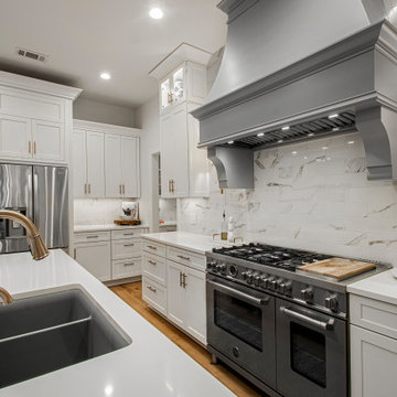
Our clients came to us wanting to maximize the space they had. They were not planning on moving anytime soon, as they loved their neighborhood. They wanted to renovate the front of their house, which included the front atrium, living room, kitchen, and powder bath. They hated their kitchen because it was completely closed off, had low ceilings, was dark and outdated, not to mention the floors were different in each of these rooms! The pantry was in the breakfast area and the kitchen table became a junk catcher, being the first thing you see when coming in from the garage/laundry room. In their living room, they wanted the spaces on either side of the fireplace to be symmetrical, whether that be bookshelves, a wet bar or closed off. Both parents are working professionals with no time and/or desire to design, create and figure this out on their own. They needed help figuring out how to reconfigure their current space in order to maximize what they already had, as they could not see an obvious solution. They could not envision how it would look so the fact that our designers were able to show them their new kitchen in 3D was pertinent.
We removed the pass-through windows that surrounded the atrium and front dining room, as well as the entire kitchen wall, completely opening up those two rooms. We removed a hall that used to lead between the kitchen and the living room since it was a complete waste of space! The ceilings were raised to 10’ in the kitchen and we were able to leave the skylight, letting in that natural light they wanted. We were able to give them a much larger pantry with tons of shelving and increase the size of their laundry room by utilizing the space of their old breakfast nook.
We relocated the door to the garage into their new elongated laundry room, built a wet bar across from their new larger pantry (with a pocket door) and the flow and functionality of these new spaces is just perfect! All new Waypoint cabinets were installed one two main kitchen surrounding walls painted Linen. Calacatta Bianco Polished Porcelain Tile 4x12 was used for the backsplash. A large eat-at island was installed, painted Stone, where the family can now gather for homework, meals, and mingling. The soft champagne bronze hardware and accent lighting really give this white and gray kitchen a soft classic look.
In the living room, we removed the built-in bookshelves to the left of the fireplace and closed off the wet-bar on the other side, giving them more space in their master suite. White Oak wood flooring, stained Putney, was installed throughout the entire new space, giving it the continuity they were looking for.
In the guest bathroom, Carrara white herringbone marble mosaic 12x12 tile was used on the shower floor and niche, while basic marble Bianco polished 12x24 porcelain tile was used on the walls. Luxart polished chrome traditional hardware gives this timeless bathroom the perfect shine.
Our clients are so happy with the new functionality and look of their space. It has definitely changed their lives in a way they could have never imagined!


 James Michael Howard
Lucas Allen
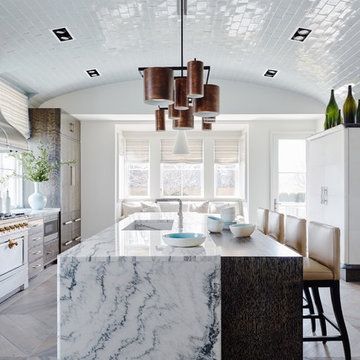
Inspiration for a large transitional medium tone wood floor eat-in kitchen remodel in New York with medium tone wood cabinets, marble countertops, white backsplash, subway tile backsplash, stainless steel appliances, an island and an integrated sink
Inspiration for a large transitional medium tone wood floor eat-in kitchen remodel in New York with medium tone wood cabinets, marble countertops, white backsplash, subway tile backsplash, stainless steel appliances, an island and an integrated sink
 Board & Vellum
Photos by Tina Witherspoon Photography.
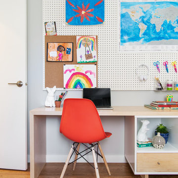
Example of a mid-sized and study space trendy gender-neutral medium tone wood floor and brown floor childrens' room design in Seattle with white walls
Example of a mid-sized and study space trendy gender-neutral medium tone wood floor and brown floor childrens' room design in Seattle with white walls
 Jaffe Architecture
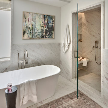
A serene primary bathroom wrapped in bookmatched marble creates a spa-like retreat in this reimagined Lincoln Park duplex. The freestanding soaking tub and walk-in shower with cantilevered bench offer a refined balance of sculptural form and everyday comfort. Subtle layering—textural rug, abstract artwork, and minimal fixtures—elevates the space with quiet luxury.
 Eric Reinholdt, Architect
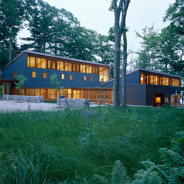
The building is comprised of three volumes, supported by a heavy timber frame, and set upon a terraced ground plane that closely follows the existing topography. Linking the volumes, the circulation path is highlighted by large cuts in the skin of the building. These cuts are infilled with a wood framed curtainwall of glass offset from the syncopated structural grid.
Eric Reinholdt - Project Architect/Lead Designer with Elliott, Elliott, Norelius Architecture
Photo: Brian Vanden Brink
 User
UserOur approach to the dining room wall was a key decision for the entire project. The wall was load bearing and the homeowners considered only removing half of it. In the end, keeping the overall open concept design was important to the homeowners, therefore we installed a load bearing beam in the ceiling. The beam was finished with drywall to be cohesive so it looked like it was a part of the original design. Now that the kitchen and dining room were open, paint colors were used to designate the spaces and create visual boundaries. This made each area feel like it’s its own space without using any structures.
The original L-shaped kitchen was cut short because of bay windows that overlooked the backyard patio. These windows were lost in the space and not functional; they were replaced with double French doors leading onto the patio. A brick layer was brought in to patch up the window swap and now it looks like the French doors always existed. New crown molding was installed throughout and painted to match the kitchen cabinets.
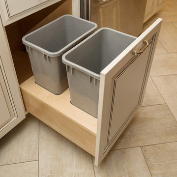
This window/door replacement allowed for a large pantry cabinet to be installed next to the refrigerator which was not in the old cabinet configuration. The replaced perimeter cabinets host custom storage solutions, like a mixer stand, spice organization, recycling center and functional corner cabinet with pull out shelving. The perimeter kitchen cabinets are painted with a glaze and the island is a cherry stain with glaze to amplify the raised panel door style.
We tripled the size of the kitchen island to expand countertop space. It seats five people and hosts charging stations for the family’s busy lifestyle. It was important that the cooktop in the island had a built in downdraft system because the homeowners did not want a ventilation hood in the center of the kitchen because it would obscure the open concept design.
The countertops are quartz and feature an under mount granite composite kitchen sink with a low divide center. The kitchen faucet, which features hands free and touch technology, and an instant hot water dispenser were added for convenience because of the homeowners’ busy lifestyle. The backsplash is a favorite, with a teal and red glass mosaic basket weave design. It stands out and holds its own among the expansive kitchen cabinets.
All recessed, under cabinet and decorative lights were installed on dimmer switches to allow the homeowners to adjust the lighting in each space of the project. All exterior and interior door hardware, hinges and knobs were replaced in oil rubbed bronze to match the dark stain throughout the space. The entire first floor remodel project uses 12x24 ceramic tile laid in a herringbone pattern. Since tile is typically cold, the flooring was also heated from below. This will also help with the homeowners’ original heating issues.
When accessorizing the kitchen, we used functional, everyday items the homeowners use like cutting boards, canisters for dry goods and place settings on the island. Ultimately, this project transformed their small, outdated kitchen into an expansive and functional workspace.
 AGA & Fired Earth Danmark
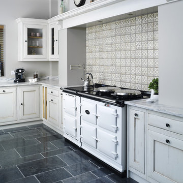
As kitchens grew larger throughout the 20th century to accommodate new inventions such as automatic washing machines, and smaller rooms like sculleries and larders were incorporated into the kitchen itself, a greater emphasis on utility and function ensued. In the post-war world the urge for a bright new future also made the most of new materials like plastic laminates which changed the face of kitchens in Europe for years to come. We wanted to reverse this trend and introduce a warmer and more liveable kitchen designed around our lifestyles. Bastide was born from this demand for beauty with utility; combining form and function with a continental twist.
Capturing the simplicity and charm of a country kitchen, Bastide is timeless, robust and built for a lifetime at the heart of your home, by applying heritage ideas to modern culture.

Sponsored
Columbus, OH

Structural Remodeling
Franklin County's Heavy Timber Specialists | Best of Houzz 2020!
 Cameo Kitchens
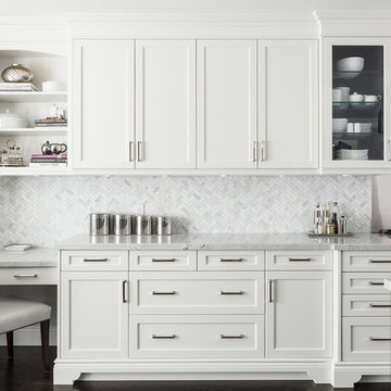
Kitchen - transitional dark wood floor and brown floor kitchen idea in Toronto with shaker cabinets, white cabinets, gray backsplash and stainless steel appliances
 cutlerschulze
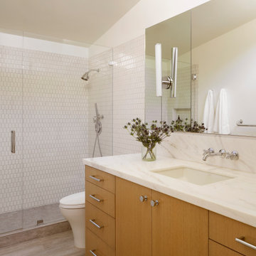
This meticulously restored mid-century modern bathroom evokes the era's signature style with a touch of modern luxury. Channeling the era's love of clean lines and geometric forms, vertical stacked tile graces the walls in a timeless arrangement. This design element creates a sense of height and spaciousness, while the frameless glass shower enclosure maintains an open and airy feel. The warm wood grain of the vanity and the soft lighting add warmth to the otherwise minimalist space. The natural stone countertop and polished nickel fixtures add a touch of luxury and elegance, while the simple lines and understated design remain true to the home's mid-century roots. The skylight allows ample natural light to flood the space, creating a bright and inviting atmosphere.

 Raad Studio
Marco Walker
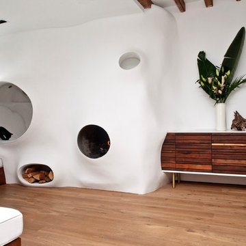
Living room - eclectic light wood floor and beige floor living room idea in New York with white walls
Living room - eclectic light wood floor and beige floor living room idea in New York with white walls
 Eva Quateman Interiors
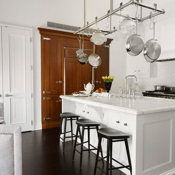
Bright white kitchen with large island
Werner Straube
Mid-sized transitional u-shaped dark wood floor, brown floor and tray ceiling eat-in kitchen photo in Chicago with recessed-panel cabinets, white cabinets, white backsplash, subway tile backsplash, stainless steel appliances, a double-bowl sink, marble countertops, an island and white countertops
Mid-sized transitional u-shaped dark wood floor, brown floor and tray ceiling eat-in kitchen photo in Chicago with recessed-panel cabinets, white cabinets, white backsplash, subway tile backsplash, stainless steel appliances, a double-bowl sink, marble countertops, an island and white countertops

 Lindy Design Build
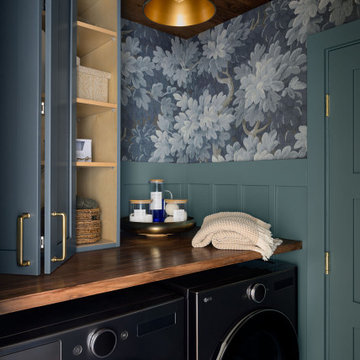
Our client wasn't ready to leave the home she loved, but a change in her health had made the upstairs bathroom harder to reach, and the main level didn't have a full bath. We converted one bay of her three-car garage into livable space, which gave us the room to build a fully accessible bathroom, a walk-in closet, and a proper mudroom and laundry on the level she actually lived on. Wide doorways. Heated floors. A curbless shower with a drain that disappears under the wall. Aged brass grab bars that read like jewelry rather than hospital equipment.
53