
Search results for "Functional" in Home Design Ideas
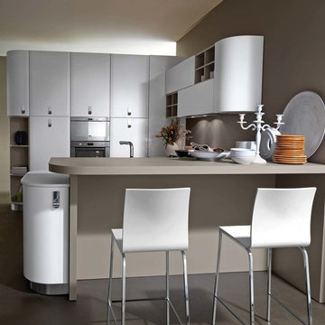
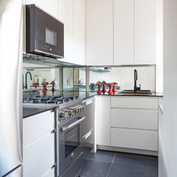
 KITCHITALIA
Architect and Urban Designer
Weinbrunner, in his book “Das
Architektonische Lehrbuch”, writes:
“Beauty lies in the perfect symbiosis
of form and function”. The exclusive
concept behind the VENERE kitchen
project is based on this concept
of symbiosis, where practical and
functional needs are integrated with
ergonomic design to create a model
that is both beautiful and highly
functional.
 Modern Citi Group: Renovations & Remodeling
Modern Citi Group helped Andrew and Malabika in their renovation journey, as they sought to transform their 2,400 sq ft apartment in Sutton Place.
This comprehensive renovation project encompassed both architectural and construction components. On the architectural front, it involved a legal combination of the two units and layout adjustments to enhance the overall functionality, create an open floor plan and improve the flow of the residence. The construction aspect of the remodel included all areas of the home: the kitchen and dining room, the living room, three bedrooms, the master bathroom, a powder room, and an office/den.
Throughout the renovation process, the primary objective remained to modernize the apartment while ensuring it aligned with the family’s lifestyle and needs. The design challenge was to deliver the modern aesthetics and functionality while preserving some of the existing design features. The designers worked on several layouts and design visualizations so they had options. Finally, the choice was made and the family felt confident in their decision.
From the moment the permits were approved, our construction team set out to transform every corner of this space. During the building phase, we meticulously refinished floors, walls, and ceilings, replaced doors, and updated electrical and plumbing systems.
The main focus of the renovation was to create a seamless flow between the living room, formal dining room, and open kitchen. A stunning waterfall peninsula with pendant lighting, along with Statuario Nuvo Quartz countertop and backsplash, elevated the aesthetics. Matte white cabinetry was added to enhance functionality and storage in the newly remodeled kitchen.
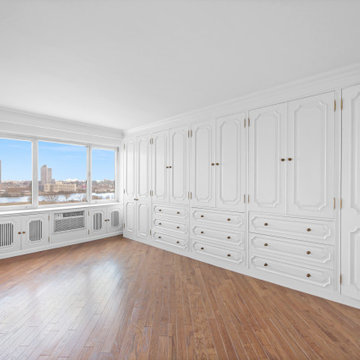
The three bedrooms were elevated with refinished built-in wardrobes and custom closet solutions, adding both usability and elegance. The fully reconfigured master suite bathroom, included a linen closet, elegant Beckett double vanity, MSI Crystal Bianco wall and floor tile, and high-end Delta and Kohler fixtures.
In addition to the comprehensive renovation of the living spaces, we've also transformed the office/entertainment room with the same great attention to detail. Complete with a sleek wet bar featuring a wine fridge, Empira White countertop and backsplash, and a convenient adjacent laundry area with a renovated powder room.
In a matter of several months, Modern Citi Group has redefined luxury living through this meticulous remodel, ensuring every inch of the space reflects unparalleled sophistication, modern functionality, and the unique taste of its owners.
 Daniels Design & Remodeling
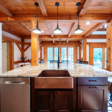
Our homeowners wanted to improve their kitchen layout at their lake house and wanted an open, functional flow with increased storage, lighting and trending styles. We removed a non-bearing wall between kitchen and great room and created an area for a large island. These changes brought in their thirst for abundant, natural light and solved the bottleneck that occurred in the old space when the refrigerator was in use. The new layout provides ample storage space and open stations for friends and family to gather while entertaining. Updating the kitchen and living space enhances the function of the home.We converted existing outdated materials to be more attractive and functional: lighting, cabinetry, flooring, and tiled surfaces. We found ways to provide innovative materials for our homeowners’ selections by maintaining the use of the existing knotty pine beams, ceiling and posts and working with the existing ‘cottage feel’ while updating fixtures, finishes and flow through the space. Warm design elements are evident through use of copper accents like the hood, faucets, sink and cabinet pulls.
Find the right local pro for your project
 Modern Citi Group: Renovations & Remodeling
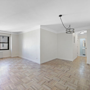
Modern Citi Group recently collaborated with Amelia and Jeremy to reimagine their newly purchased Junior-4 apartment with a complete remodel. This exciting renovation transformed the layout to add a second bedroom, a full second bathroom, and an updated kitchen layout. The goal was to create a functional, family-friendly floor plan and a modern, visually appealing space tailored to their lifestyle.
Our design team faced the challenge of balancing modern aesthetics with a strict budget. After exploring multiple layout options and visualizations, Amelia and Jeremy chose a design they felt best suited their vision.
The construction team brought the design to life, converting the dining room into a second bedroom with a large closet. The kitchen layout was reconfigured to feature an island, additional storage, and ergonomic functionality. We transformed a powder room into a full second bathroom with a walk-in shower and re-purposed the walk-in closet off the primary bedroom into a home office with a built-in desk.
Our professionals refinished floors, walls, and ceilings, upgraded plumbing and electrical systems, and installed additional lighting throughout to optimize flow and functionality.
The kitchen featured solid wood cabinetry, quartz countertops, and a porcelain tile floor. Neutral gray-blue cabinets complement the Empira White stone and matte black hardware, creating a sleek, fashion-forward space.
Both bathrooms were reimagined with luxurious new tiling, stylish fixtures, and upgraded plumbing and lighting. The powder room was converted into a full bathroom with a walk-in shower, featuring Arabescato Marble porcelain tiles and Benjamin Moore Palladian Blue walls to unify the kitchen and bath designs. High-quality fixtures from Delta and Kohler added a refined touch.
In just a few short months, Modern Citi Group transformed an outdated apartment into a sleek, modern home. The remodel beautifully combines style, comfort, and functionality, creating a space that's both elevated and efficient.
 D&G Construction
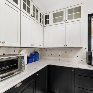
This kitchen remodel was designed to make a statement—balancing bold character with refined craftsmanship to create a space that’s both highly functional and visually unforgettable.
At the heart of the design is a striking contrast palette. Crisp white perimeter cabinetry keeps the space bright and open, while rich black lower cabinets and a substantial island ground the room with depth and sophistication. The oversized island serves as both a functional workspace and a central gathering point, topped with a dramatic stone surface that adds movement and texture.
The flooring plays a defining role in the overall aesthetic. A custom black-and-white patterned tile layout introduces energy and personality, transforming the kitchen into a true design centerpiece while maintaining a timeless appeal. This bold foundation is thoughtfully balanced by clean lines, classic shaker cabinetry, and elegant hardware selections.
Functionality was a key driver throughout the project. The layout maximizes workflow efficiency with dedicated zones for cooking, prep, and cleanup. A professional-grade range anchors the island, while the farmhouse sink positioned beneath large windows brings in natural light and enhances the everyday experience. Custom storage solutions—including extended cabinetry, integrated dish storage, and built-in appliance areas—ensure everything has its place without compromising the clean aesthetic.
Lighting was carefully layered to elevate both form and function. Statement pendant fixtures above the island add architectural interest, while recessed lighting provides consistent illumination throughout the space.
The result is a kitchen that feels both elevated and livable—where bold design choices meet practical everyday use. It’s a space designed not just to cook in, but to gather, entertain, and truly enjoy.

 Drury Design
THE SETUP
Sam’s clients wanted to update their hall bathroom used by their three children. The goal was to create a space that is both kid-friendly and elegant, ensuring it remains functional and stylish as the children grow. The original bathroom felt confined due to dark materials and a single-sink vanity. The challenge was to find a design that looks great now and in the future.
Design objectives:
Create a sense of spaciousness
Increase storage for bathroom necessities and daily routines
Enhance lighting
THE REMODEL
Design challenges to be solved:
No structural changes – must keep the tub and wall structure
Transforming a small, dark space into a bright, open one without adding a new window
Multi-user-minded – Improving functionality for multiple users simultaneously
Timeless & kid-friendly – create a comfy kid-friendly look that won’t appear dated as the kids grow older
THE RENEWED SPACE
Design solutions:
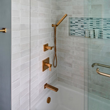
Slimmer Tub and Sliding Shower Door installed to free up functional space, making the bathroom feel larger.
Lighter Materials used to reflect more light and add a vibrant feel. Open shelves above the toilet provide storage without making the space feel cramped, while allowing light from the existing window to permeate.
Dual Sink Vanity added, and split the mirror into two, creating individual stations for the kids and enhancing usability during busy routines.
Kid-Friendly Features – Incorporated toe-kick lighting that works as a nightlight, a lower-mounted shower handheld, and a large, accessible shower niche. The geometric shapes and blue color palette contribute to a fun yet sophisticated look.
The clients are thrilled with the transformation. The bathroom is now fun and elegant, providing a timeless look that will grow with the kids. They appreciate the increased functionality and the bright, open feel of the space.
This remodel successfully blends practical solutions with stylish design, ensuring the hall bathroom meets the needs of a busy family while maintaining a sophisticated look.

Sponsored
Columbus, OH

Structural Remodeling
Franklin County's Heavy Timber Specialists | Best of Houzz 2020!
 Modern Citi Group: Renovations & Remodeling
Modern Citi Group helped Andrew and Malabika in their renovation journey, as they sought to transform their 2,400 sq ft apartment in Sutton Place.
This comprehensive renovation project encompassed both architectural and construction components. On the architectural front, it involved a legal combination of the two units and layout adjustments to enhance the overall functionality, create an open floor plan and improve the flow of the residence. The construction aspect of the remodel included all areas of the home: the kitchen and dining room, the living room, three bedrooms, the master bathroom, a powder room, and an office/den.
Throughout the renovation process, the primary objective remained to modernize the apartment while ensuring it aligned with the family’s lifestyle and needs. The design challenge was to deliver the modern aesthetics and functionality while preserving some of the existing design features. The designers worked on several layouts and design visualizations so they had options. Finally, the choice was made and the family felt confident in their decision.
From the moment the permits were approved, our construction team set out to transform every corner of this space. During the building phase, we meticulously refinished floors, walls, and ceilings, replaced doors, and updated electrical and plumbing systems.
The main focus of the renovation was to create a seamless flow between the living room, formal dining room, and open kitchen. A stunning waterfall peninsula with pendant lighting, along with Statuario Nuvo Quartz countertop and backsplash, elevated the aesthetics. Matte white cabinetry was added to enhance functionality and storage in the newly remodeled kitchen.
The three bedrooms were elevated with refinished built-in wardrobes and custom closet solutions, adding both usability and elegance. The fully reconfigured master suite bathroom, included a linen closet, elegant Beckett double vanity, MSI Crystal Bianco wall and floor tile, and high-end Delta and Kohler fixtures.
In addition to the comprehensive renovation of the living spaces, we've also transformed the office/entertainment room with the same great attention to detail. Complete with a sleek wet bar featuring a wine fridge, Empira White countertop and backsplash, and a convenient adjacent laundry area with a renovated powder room.
In a matter of several months, Modern Citi Group has redefined luxury living through this meticulous remodel, ensuring every inch of the space reflects unparalleled sophistication, modern functionality, and the unique taste of its owners.
 Ridgewood Home Construction
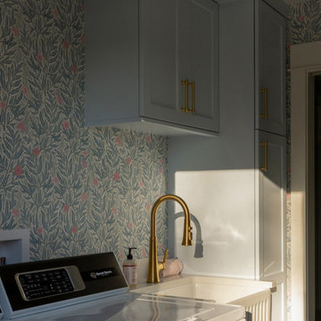
This Byron Center whole-home remodel focused on making the house functional and comfortable for a family with school-age kids. The lower level needed to become a gathering space for relaxing and entertaining, complete with a dedicated craft room. The laundry room and mudroom upstairs needed a full renovation to handle the family's daily routine.
Our team designed the lower level around a custom live-edge countertop the homeowner selected for the kitchenette and bar, balancing its rustic character with a gold tile backsplash and fixtures. Upstairs, we installed dry-away racks in the laundry room and added an inviting color palette. Custom lockers were built into the mudroom to fit the family's routine.
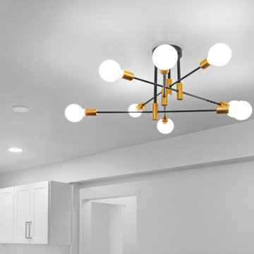
The homeowner had already chosen standout light fixtures before the project began, and our designer, Alissa, worked them into the design, making them a true accent feature. We also preserved the home's existing laundry chute, which ran from the second floor down to the laundry room, by tucking it neatly into a cabinet rather than tearing it out. The result is a home that balances fun and function throughout, with every space tailored to how this family lives.
 NK Construction And Design Inc
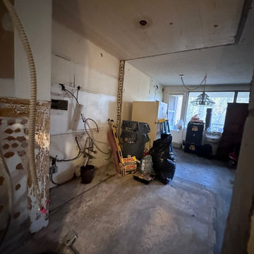
In this meticulously executed kitchen remodeling project, we transformed the space into a stunning open-plan design. Walls were skillfully removed, creating a seamless flow and maximizing the sense of openness. The centerpiece of the renovation is a spacious, well-crafted island that not only enhances functionality but also serves as a focal point, combining aesthetics with practicality. The attention to detail and thoughtful design choices make this kitchen a harmonious blend of beauty and functionality.
In addition to the structural enhancements, this comprehensive kitchen remodel extends to the flooring, where luxurious vinyl planks have been seamlessly integrated, elevating both style and durability. The project also involved a modernization of the electrical infrastructure, with the meticulous replacement of outdated wiring and fixtures. A new ceiling, adorned with energy-efficient LED recessed lighting, further enhances the ambiance, providing both aesthetic appeal and functional illumination to complement the transformed space. This multifaceted approach ensures that every aspect of the kitchen aligns with contemporary design standards and functional efficiency.
 Couture Window Fashions
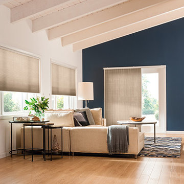
The different styles of modern taste Couture has designed various styles that meet today’s tastes, which are all capable of effectively satisfying the different needs for performing, functioning and appealing qualities.
Couture Sheer Horizontal Shades offers an innovative decorative design and functionality through a unique three-dimension structure. An acoustic absorption effect is formed by the internal spacing of three-dimensional structure.
Couture Sheer Shades is energy efficient and offers UV protection superior functionality by adjusting and angle other vane to limit the amount light transmitted.
Components are available in 15 color and variety of option for both components and fabrics allow you the best possible color and functionality match.
 Ridgewood Home Construction
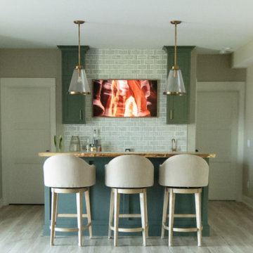
This Byron Center whole-home remodel focused on making the house functional and comfortable for a family with school-age kids. The lower level needed to become a gathering space for relaxing and entertaining, complete with a dedicated craft room. The laundry room and mudroom upstairs needed a full renovation to handle the family's daily routine.
Our team designed the lower level around a custom live-edge countertop the homeowner selected for the kitchenette and bar, balancing its rustic character with a gold tile backsplash and fixtures. Upstairs, we installed dry-away racks in the laundry room and added an inviting color palette. Custom lockers were built into the mudroom to fit the family's routine.
The homeowner had already chosen standout light fixtures before the project began, and our designer, Alissa, worked them into the design, making them a true accent feature. We also preserved the home's existing laundry chute, which ran from the second floor down to the laundry room, by tucking it neatly into a cabinet rather than tearing it out. The result is a home that balances fun and function throughout, with every space tailored to how this family lives.
 USI Design & Remodeling
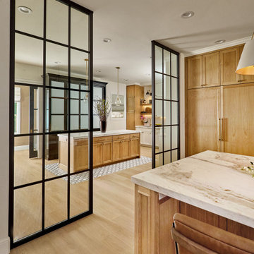
Located in Argyle, Texas, this comprehensive whole-home renovation was conceived as a response to a family whose lifestyle had outgrown the limitations of the existing residence. USI Design & Remodeling reimagined the home's interior architecture, transforming a collection of compartmentalized rooms into a cohesive environment designed for modern living, entertaining, and daily comfort. The project encompassed the kitchen, family room, dining room, lounge, office, primary bathroom, and supporting circulation spaces, creating a unified experience that feels both expansive and intentional.
At the heart of the renovation is a completely reconfigured kitchen and gathering space designed around functionality, hospitality, and visual connection. Architectural barriers were removed to improve sightlines and circulation, allowing the kitchen, dining, and family spaces to function as a single integrated living environment. Adjacent to the kitchen, the former pantry, laundry, and service corridor were reimagined as a hybrid scullery and utility suite, creating a highly functional support space that discreetly accommodates food preparation, storage, organization, and household operations without compromising the elegance of the primary living areas.
The renovation extends beyond aesthetics to create a home tailored to the family's evolving needs. Consistent architectural detailing, layered textures, and thoughtful proportions establish continuity throughout the residence, allowing each room to feel connected to the larger design narrative. The result is a sophisticated yet approachable home that balances practical performance with timeless design, delivering a renewed living experience that is both highly functional and distinctly luxurious.


 EA Home Design
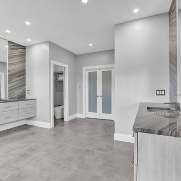
We are thrilled to unveil our latest bathroom remodeling project, a seamless blend of modern design and functional elegance. Here's a glimpse into the transformation:
1. Contemporary Palette: The choice of a grey color tile sets a sophisticated and neutral backdrop, allowing the features of the bathroom to shine. This hue not only exudes a sense of calm but also complements the contemporary design elements we've incorporated.
2. Warmth Underfoot: One of the standout features of this remodel is the heated flooring that runs under all the tiled areas. This luxurious addition ensures that even on the coldest mornings, your feet are greeted with a warm embrace, elevating the comfort level of the bathroom.
3. Enhanced Layout: Recognizing the need for more convenience, we repositioned the shower and introduced a second toilet room. This not only maximizes the use of space but also ensures that the bathroom can cater to multiple users without any hassle.
4. Dual Shower Spaces: By eliminating two angles in the bathroom's corner, we've carved out space for two distinct shower areas. This design choice not only adds a touch of luxury but also offers a versatile bathing experience tailored to individual preferences.
5. Wet Room Wonder: The shower and tub area now reside within a waterproof wet room. This innovative design ensures that water stays where it's supposed to, eliminating the need for a curb and offering a sleek, uninterrupted flow to the space.
6. Floating Vanities: Our floating vanities are more than just a design statement. They create an illusion of space, making the bathroom appear larger and more open. Paired with a stunning stone backsplash, they offer a perfect blend of style and functionality.
7. Illuminated Elegance: The mirrors, with their integrated lights, are the pièce de résistance. They not only enhance the aesthetic appeal of the bathroom but also ensure optimal lighting, making daily grooming tasks a breeze.
This bathroom remodel is a testament to our commitment to marrying design with functionality. Every element, from the choice of tiles to the heated floors, has been thoughtfully chosen to create a space that is not just visually appealing but also supremely functional and comfortable. We invite you to step in and experience this modern oasis for yourself.
 Modern Citi Group: Renovations & Remodeling
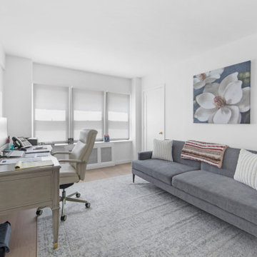
Modern Citi Group worked with Robyn on remodeling her newly purchased professional space in Murray Hill. This exciting renovation project included a full remodel of two bathrooms, kitchen, and three offices as well as the main waiting area. The primary objective was to modernize the space for professional aesthetics and functionality while adhering to the strict timeline and budget.
Every renovation project starts with the planning phase led by the project planners. During the in-person visit, Anna captured a 360 tour of the space to get accurate measurements and fast-track the project as well as align with the client on their design vision, remodeling priorities and budget.
The design challenge was to deliver modern aesthetics and functionality for a professional office while keeping the project within budget. The designers worked on several layouts and design visualizations so the client had options. Finally, the choice was made and Robyn felt confident in her decision.
The construction team transformed every corner of the space, breathing new life into it. They replaced the floors, refinished the walls and ceilings, installed new doors and windows, upgraded plumbing and electrical systems, and redesigned the office layout for optimal functionality and flow. Updated closet configuration with custom shelving, light fixtures and sliding barn doors enhanced the ergonomics of the work space.
The newly remodeled kitchen featured sleek matte white cabinetry and stunning quartz countertops, enhancing both functionality and storage. The bathrooms were masterfully renovated with exquisite new tiling, stylish fixtures, and upgraded plumbing and lighting.
In just a few weeks, Modern Citi Group has redefined the old apartment, transforming it into a sophisticated and professional space through this meticulous remodel. The result is a stunning blend of style, comfort, and efficiency. This remodel enhanced both employee satisfaction and new business for Robyn.
 LAZZONI
Overlooking the iconic Bosphorus Strait, this Istanbul condominium blends contemporary comfort with panoramic sea and city views. Furnished by LAZZONI, the living room and bedroom reflect a refined approach to modern living, inspired by the calming principles of Japandi design—a fusion of Japanese minimalism and Scandinavian functionality.
Natural textures, muted tones, and clean-lined furniture bring warmth and simplicity to the space. In the living area, soft upholstery and sleek surfaces emphasize light and openness, while the bedroom offers a peaceful, uncluttered retreat. Every detail—from layout to materials—was chosen to embody balance, intentionality, and a sense of grounded tranquility.
This project captures LAZZONI’s vision of design-led serenity, where elevated interiors connect with both natural surroundings and everyday function.
In the living space, a clean-lined modular sofa anchors the room, complemented by sleek accent pieces that reflect natural light and enhance the open layout. The bedroom continues the theme of minimal comfort, with soft textures, warm tones, and space-maximizing elements ideal for high-rise living.
This project reflects LAZZONI’s vision of modern luxury, where every piece is tailored to elevate daily life while staying rooted in simplicity and function—all set against one of the most captivating backdrops in the world.
 Builders, LLC
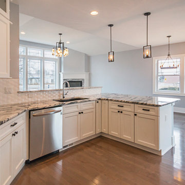
This custom craftsman home located in Flemington, NJ was created for our client who wanted to find the perfect balance of accommodating the needs of their family, while being conscientious of not compromising on quality.
The heart of the home was designed around an open living space and functional kitchen that would accommodate entertaining, as well as every day life. Our team worked closely with the client to choose a a home design and floor plan that was functional and of the highest quality.
Craftsman-style kitchen lighting is about function, but its strong geometric lines also add visual flair. Shaker style cabinetry also provides this kitchen with functionality and simple lines without any detailed carvings or ornamentation.
 Homes And Such LLC
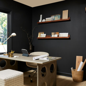
Peek a look at this moody home office which perfectly combines the tradition of this home with a moody modern vibe. This office packs function with a large desk, and functional faves that are perfect for brainstorming, planning or presenting.
 Leslie Cohen Design
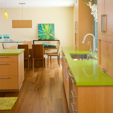
Originally from Hawaii, my clients wanted to incorporate the warmth and color of the islands into their California ranch home. Their requests:
• Comfortable, serene, uncluttered design
• Natural elements
• Kitchen more open to dining
• Arrangement to accommodate new flat-screen TV viewing
Hosting constant visitors, my clients live in their kitchen and enjoy cooking.
For Hawaiian colors, I used green quartz, glass tile and counters, iroko flooring, hemlock cabinets, and an unusual slate limestone.
To create a lighter, more welcoming space I removed the wall between the dining room and kitchen and increased the entry wall length to create a better kitchen/dining/entry relationship. I added a wall between the family room and kitchen to house tall kitchen elements on one side and TV equipment on the other, as well as create a natural transition for the ceiling height changes.
Features:
• Ventilated drawers
• Composting sink
• Energy-efficient lighting
• Silent hood and dishwasher
When it came to their master bath, my clients requested:
• Spa-feeling
• Shower for two
• Functional makeup area
• Two sinks
• Linen storage
• Walk-in closet
• Separate toilet compartment
• Door to backyard for pool access.
I rearranged the space for convenience and function and created an open shower with double rain and hand-showers, a shallow makeup counter (easy to get close to the mirror), plentiful storage, and seating.
Shades of blue and green create a sense of “spa”. Blended textures of honed limestone countertops, slate, glass tile, large-format and mosaic porcelain tile, glass pebbles, granite tile, and ceramic tiles are earthy yet refined. Horizontal patterns create serenity.
Storage:
• Tall louvered linen cabinet
• Flush medicine cabinets
• His-and-her pullouts at each end of the vanity
• Multiple shower niches
• Function-packed walk-in closet
• Toilet roll cabinet in toilet vestibule
• Bedroom armoire
Function:
• Seating in shower
• Seating in main bath
• Convenient towel bars
• Silent, powerful vent fans
• Good lighting
• Textured glass windows add light and privacy.
Ed Gohlich photographer
 Ridgewood Home Construction
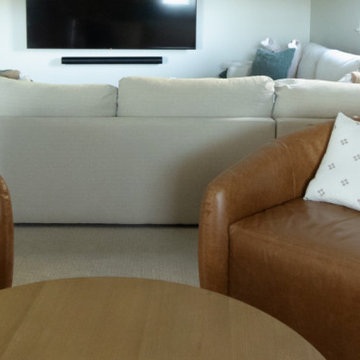
This Byron Center whole-home remodel focused on making the house functional and comfortable for a family with school-age kids. The lower level needed to become a gathering space for relaxing and entertaining, complete with a dedicated craft room. The laundry room and mudroom upstairs needed a full renovation to handle the family's daily routine.
Our team designed the lower level around a custom live-edge countertop the homeowner selected for the kitchenette and bar, balancing its rustic character with a gold tile backsplash and fixtures. Upstairs, we installed dry-away racks in the laundry room and added an inviting color palette. Custom lockers were built into the mudroom to fit the family's routine.
The homeowner had already chosen standout light fixtures before the project began, and our designer, Alissa, worked them into the design, making them a true accent feature. We also preserved the home's existing laundry chute, which ran from the second floor down to the laundry room, by tucking it neatly into a cabinet rather than tearing it out. The result is a home that balances fun and function throughout, with every space tailored to how this family lives.
157