
Search results for "Functioning appropriately" in Home Design Ideas
 TKS Design Group
Download our free ebook, Creating the Ideal Kitchen. DOWNLOAD NOW
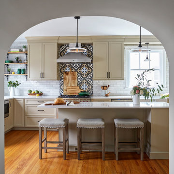
The homeowners came to us looking to update the kitchen in their historic 1897 home. The home had gone through an extensive renovation several years earlier that added a master bedroom suite and updates to the front façade. The kitchen however was not part of that update and a prior 1990’s update had left much to be desired. The client is an avid cook, and it was just not very functional for the family.
The original kitchen was very choppy and included a large eat in area that took up more than its fair share of the space. On the wish list was a place where the family could comfortably congregate, that was easy and to cook in, that feels lived in and in check with the rest of the home’s décor. They also wanted a space that was not cluttered and dark – a happy, light and airy room. A small powder room off the space also needed some attention so we set out to include that in the remodel as well.
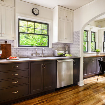
See that arch in the neighboring dining room? The homeowner really wanted to make the opening to the dining room an arch to match, so we incorporated that into the design.
Another unfortunate eyesore was the state of the ceiling and soffits. Turns out it was just a series of shortcuts from the prior renovation, and we were surprised and delighted that we were easily able to flatten out almost the entire ceiling with a couple of little reworks.
Other changes we made were to add new windows that were appropriate to the new design, which included moving the sink window over slightly to give the work zone more breathing room. We also adjusted the height of the windows in what was previously the eat-in area that were too low for a countertop to work. We tried to keep an old island in the plan since it was a well-loved vintage find, but the tradeoff for the function of the new island was not worth it in the end. We hope the old found a new home, perhaps as a potting table.
Designed by: Susan Klimala, CKD, CBD
Photography by: Michael Kaskel
For more information on kitchen and bath design ideas go to: www.kitchenstudio-ge.com
 TKS Design Group
Download our free ebook, Creating the Ideal Kitchen. DOWNLOAD NOW
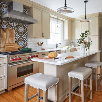
The homeowners came to us looking to update the kitchen in their historic 1897 home. The home had gone through an extensive renovation several years earlier that added a master bedroom suite and updates to the front façade. The kitchen however was not part of that update and a prior 1990’s update had left much to be desired. The client is an avid cook, and it was just not very functional for the family.
The original kitchen was very choppy and included a large eat in area that took up more than its fair share of the space. On the wish list was a place where the family could comfortably congregate, that was easy and to cook in, that feels lived in and in check with the rest of the home’s décor. They also wanted a space that was not cluttered and dark – a happy, light and airy room. A small powder room off the space also needed some attention so we set out to include that in the remodel as well.
See that arch in the neighboring dining room? The homeowner really wanted to make the opening to the dining room an arch to match, so we incorporated that into the design.
Another unfortunate eyesore was the state of the ceiling and soffits. Turns out it was just a series of shortcuts from the prior renovation, and we were surprised and delighted that we were easily able to flatten out almost the entire ceiling with a couple of little reworks.
Other changes we made were to add new windows that were appropriate to the new design, which included moving the sink window over slightly to give the work zone more breathing room. We also adjusted the height of the windows in what was previously the eat-in area that were too low for a countertop to work. We tried to keep an old island in the plan since it was a well-loved vintage find, but the tradeoff for the function of the new island was not worth it in the end. We hope the old found a new home, perhaps as a potting table.
Designed by: Susan Klimala, CKD, CBD
Photography by: Michael Kaskel
For more information on kitchen and bath design ideas go to: www.kitchenstudio-ge.com
 Kathleen Jennison
An Arts & Crafts Bungalow is one of my favorite styles of homes. We have quite a few of them in our Stockton Mid-Town area. And when C&L called us to help them remodel their 1923 American Bungalow, I was beyond thrilled.
As per usual, when we get a new inquiry, we quickly Google the project location while we are talking to you on the phone. My excitement escalated when I saw the Google Earth Image of the sweet Sage Green bungalow in Mid-Town Stockton. "Yes, we would be interested in working with you," I said trying to keep my cool.
But what made it even better was meeting C&L and touring their home, because they are the nicest young couple, eager to make their home period perfect. Unfortunately, it had been slightly molested by some bad house-flippers, and we needed to bring the bathroom back to it "roots."
We knew we had to banish the hideous brown tile and cheap vanity quickly. But C&L complained about the condensation problems and the constant fight with mold. This immediately told me that improper remodeling had occurred and we needed to remedy that right away.
The Before: Frustrations with a Botched Remodel
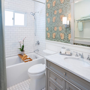
The bathroom needed to be brought back to period appropriate design with all the functionality of a modern bathroom. We thought of things like marble countertop, white mosaic floor tiles, white subway tile, board and batten molding, and of course a fabulous wallpaper.
This small (and only) bathroom on a tight budget required a little bit of design sleuthing to figure out how we could get the proper look and feel. Our goal was to determine where to splurge and where to economize and how to complete the remodel as quickly as possible because C&L would have to move out while construction was going on.
The Process: Hard Work to Remedy Design and Function
During our initial design study, (which included 2 hours in the owners’ home), we noticed framed images of William Morris Arts and Crafts textile patterns and knew this would be our design inspiration. We presented C&L with three options and they quickly selected the Pimpernel Design Concept.
We had originally selected the Black and Olive colors with a black vanity, mirror, and black and white floor tile. C&L liked it but weren’t quite sure about the black, We went back to the drawing board and decided the William & Co Pimpernel Wallpaper in Bayleaf and Manilla color with a softer gray painted vanity and mirror and white floor tile was more to their liking.
After the Design Concept was approved, we went to work securing the building permit, procuring all the elements, and scheduling our trusted tradesmen to perform the work.
We did uncover some shoddy work by the flippers such as live electrical wires hidden behind the wall, plumbing venting cut-off and buried in the walls (hence the constant dampness), the tub barely balancing on two fence boards across the floor joist, and no insulation on the exterior wall.
All of the previous blunders were fixed and the bathroom put back to its previous glory. We could feel the house thanking us for making it pretty again.
The After Reveal: Cohesive Design Decisions
We selected a simple white subway tile for the tub/shower. This is always classic and in keeping with the style of the house.
We selected a pre-fab vanity and mirror, but they look rich with the quartz countertop. There is much more storage in this small vanity than you would think.
The Transformation: A Period Perfect Refresh
We began the remodel just as the pandemic reared and stay-in-place orders went into effect. As C&L were already moved out and living with relatives, we got the go-ahead from city officials to get the work done (after all, how can you shelter in place without a bathroom?).
All our tradesmen were scheduled to work so that only one crew was on the job site at a time. We stayed on the original schedule with only a one week delay.
The end result is the sweetest little bathroom I've ever seen (and I can't wait to start work on C&L's kitchen next).
Thank you for joining me in this project transformation. I hope this inspired you to think about being creative with your design projects, determining what works best in keeping with the architecture of your space, and carefully assessing how you can have the best life in your home.
Find the right local pro for your project





Sponsored
Columbus, OH

Structural Remodeling
Franklin County's Heavy Timber Specialists | Best of Houzz 2020!
 TKS Design Group
Download our free ebook, Creating the Ideal Kitchen. DOWNLOAD NOW
The homeowners came to us looking to update the kitchen in their historic 1897 home. The home had gone through an extensive renovation several years earlier that added a master bedroom suite and updates to the front façade. The kitchen however was not part of that update and a prior 1990’s update had left much to be desired. The client is an avid cook, and it was just not very functional for the family.
The original kitchen was very choppy and included a large eat in area that took up more than its fair share of the space. On the wish list was a place where the family could comfortably congregate, that was easy and to cook in, that feels lived in and in check with the rest of the home’s décor. They also wanted a space that was not cluttered and dark – a happy, light and airy room. A small powder room off the space also needed some attention so we set out to include that in the remodel as well.
See that arch in the neighboring dining room? The homeowner really wanted to make the opening to the dining room an arch to match, so we incorporated that into the design.
Another unfortunate eyesore was the state of the ceiling and soffits. Turns out it was just a series of shortcuts from the prior renovation, and we were surprised and delighted that we were easily able to flatten out almost the entire ceiling with a couple of little reworks.
Other changes we made were to add new windows that were appropriate to the new design, which included moving the sink window over slightly to give the work zone more breathing room. We also adjusted the height of the windows in what was previously the eat-in area that were too low for a countertop to work. We tried to keep an old island in the plan since it was a well-loved vintage find, but the tradeoff for the function of the new island was not worth it in the end. We hope the old found a new home, perhaps as a potting table.
Designed by: Susan Klimala, CKD, CBD
Photography by: Michael Kaskel
For more information on kitchen and bath design ideas go to: www.kitchenstudio-ge.com
 TKS Design Group
Free ebook, Creating the Ideal Kitchen. DOWNLOAD NOW
Having a space for their teenage kids to hang out after school, study and interact with Mom & Dad was at the top of the list for this remodel. The 1928 home, sits in a lovely Glen Ellyn neighborhood, near downtown and near all the action of the local high school and lake. It’s was a great house with great bones but the kitchen was in need of some TLC. The remodel project had been a long time coming, and since both the homeowners work from home, they had been nervous about disrupting their bustling daily schedules to get the project in motion.
Once we had a plan in place, we dug in and got to work. The first step was to remove a non-load bearing wall between the kitchen and dining room. We then reworked the space a bit, eliminating a redundant passage way to the hall, and reworking a closet to allow for a large galley style kitchen and small bar area open to the dining room. The new kitchen has a small peninsula for the family to have casual meals and for the kids to hang out after school. A window was eliminated to give more space for cabinetry and storage, and another window was made larger to allow for a grander view into the backyard.
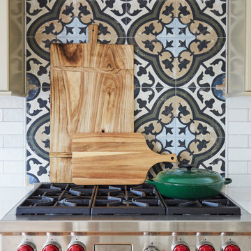
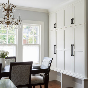
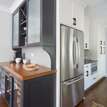
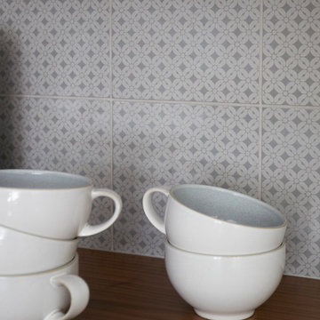
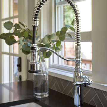
We decided upon a layered approach to this space to provide character appropriate to the older home. White painted cabinetry provides a backdrop for interesting touches such as gray herringbone tile, a reeded farmhouse sink and bronze hardware and lighting. The bar has its own unique look featuring gray cabinetry with a patterned cement tile backsplash and walnut top. A bar fridge, glass cabinets and baskets for tucking away homework give this little multi-functional area loads of character. A miniature mudroom area was also added to the dining room so that the new space can be kept neat and tidy.
The stylish result looks both appropriate to the 1928 home and provides loads of functionality for this active family that can now take advantage of every square inch their home.
Designed by: Susan Klimala, CKD, CBD
Photography by: Michael Alan Kaskel
For more information on kitchen and bath design ideas go to: www.kitchenstudio-ge.com
 TKS Design Group
Free ebook, Creating the Ideal Kitchen. DOWNLOAD NOW
Having a space for their teenage kids to hang out after school, study and interact with Mom & Dad was at the top of the list for this remodel. The 1928 home, sits in a lovely Glen Ellyn neighborhood, near downtown and near all the action of the local high school and lake. It’s was a great house with great bones but the kitchen was in need of some TLC. The remodel project had been a long time coming, and since both the homeowners work from home, they had been nervous about disrupting their bustling daily schedules to get the project in motion.
Once we had a plan in place, we dug in and got to work. The first step was to remove a non-load bearing wall between the kitchen and dining room. We then reworked the space a bit, eliminating a redundant passage way to the hall, and reworking a closet to allow for a large galley style kitchen and small bar area open to the dining room. The new kitchen has a small peninsula for the family to have casual meals and for the kids to hang out after school. A window was eliminated to give more space for cabinetry and storage, and another window was made larger to allow for a grander view into the backyard.
We decided upon a layered approach to this space to provide character appropriate to the older home. White painted cabinetry provides a backdrop for interesting touches such as gray herringbone tile, a reeded farmhouse sink and bronze hardware and lighting. The bar has its own unique look featuring gray cabinetry with a patterned cement tile backsplash and walnut top. A bar fridge, glass cabinets and baskets for tucking away homework give this little multi-functional area loads of character. A miniature mudroom area was also added to the dining room so that the new space can be kept neat and tidy.
The stylish result looks both appropriate to the 1928 home and provides loads of functionality for this active family that can now take advantage of every square inch their home.
Designed by: Susan Klimala, CKD, CBD
Photography by: Michael Alan Kaskel
For more information on kitchen and bath design ideas go to: www.kitchenstudio-ge.com
 TKS Design Group
Free ebook, Creating the Ideal Kitchen. DOWNLOAD NOW
Having a space for their teenage kids to hang out after school, study and interact with Mom & Dad was at the top of the list for this remodel. The 1928 home, sits in a lovely Glen Ellyn neighborhood, near downtown and near all the action of the local high school and lake. It’s was a great house with great bones but the kitchen was in need of some TLC. The remodel project had been a long time coming, and since both the homeowners work from home, they had been nervous about disrupting their bustling daily schedules to get the project in motion.
Once we had a plan in place, we dug in and got to work. The first step was to remove a non-load bearing wall between the kitchen and dining room. We then reworked the space a bit, eliminating a redundant passage way to the hall, and reworking a closet to allow for a large galley style kitchen and small bar area open to the dining room. The new kitchen has a small peninsula for the family to have casual meals and for the kids to hang out after school. A window was eliminated to give more space for cabinetry and storage, and another window was made larger to allow for a grander view into the backyard.
We decided upon a layered approach to this space to provide character appropriate to the older home. White painted cabinetry provides a backdrop for interesting touches such as gray herringbone tile, a reeded farmhouse sink and bronze hardware and lighting. The bar has its own unique look featuring gray cabinetry with a patterned cement tile backsplash and walnut top. A bar fridge, glass cabinets and baskets for tucking away homework give this little multi-functional area loads of character. A miniature mudroom area was also added to the dining room so that the new space can be kept neat and tidy.
The stylish result looks both appropriate to the 1928 home and provides loads of functionality for this active family that can now take advantage of every square inch their home.
Designed by: Susan Klimala, CKD, CBD
Photography by: Michael Alan Kaskel
For more information on kitchen and bath design ideas go to: www.kitchenstudio-ge.com
 TKS Design Group
Free ebook, Creating the Ideal Kitchen. DOWNLOAD NOW
Having a space for their teenage kids to hang out after school, study and interact with Mom & Dad was at the top of the list for this remodel. The 1928 home, sits in a lovely Glen Ellyn neighborhood, near downtown and near all the action of the local high school and lake. It’s was a great house with great bones but the kitchen was in need of some TLC. The remodel project had been a long time coming, and since both the homeowners work from home, they had been nervous about disrupting their bustling daily schedules to get the project in motion.
Once we had a plan in place, we dug in and got to work. The first step was to remove a non-load bearing wall between the kitchen and dining room. We then reworked the space a bit, eliminating a redundant passage way to the hall, and reworking a closet to allow for a large galley style kitchen and small bar area open to the dining room. The new kitchen has a small peninsula for the family to have casual meals and for the kids to hang out after school. A window was eliminated to give more space for cabinetry and storage, and another window was made larger to allow for a grander view into the backyard.
We decided upon a layered approach to this space to provide character appropriate to the older home. White painted cabinetry provides a backdrop for interesting touches such as gray herringbone tile, a reeded farmhouse sink and bronze hardware and lighting. The bar has its own unique look featuring gray cabinetry with a patterned cement tile backsplash and walnut top. A bar fridge, glass cabinets and baskets for tucking away homework give this little multi-functional area loads of character. A miniature mudroom area was also added to the dining room so that the new space can be kept neat and tidy.
The stylish result looks both appropriate to the 1928 home and provides loads of functionality for this active family that can now take advantage of every square inch their home.
Designed by: Susan Klimala, CKD, CBD
Photography by: Michael Alan Kaskel
For more information on kitchen and bath design ideas go to: www.kitchenstudio-ge.com


 Younger Homes
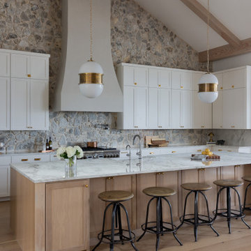
Inspiration for a huge transitional u-shaped light wood floor, beige floor and exposed beam open concept kitchen remodel in Austin with a farmhouse sink, recessed-panel cabinets, beige cabinets, multicolored backsplash, stone tile backsplash, stainless steel appliances, an island and white countertops
 TKS Design Group
Download our free ebook, Creating the Ideal Kitchen. DOWNLOAD NOW
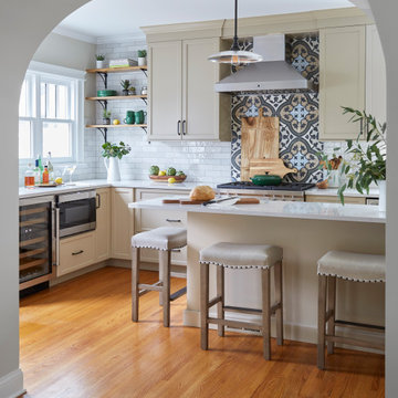
The homeowners came to us looking to update the kitchen in their historic 1897 home. The home had gone through an extensive renovation several years earlier that added a master bedroom suite and updates to the front façade. The kitchen however was not part of that update and a prior 1990’s update had left much to be desired. The client is an avid cook, and it was just not very functional for the family.
The original kitchen was very choppy and included a large eat in area that took up more than its fair share of the space. On the wish list was a place where the family could comfortably congregate, that was easy and to cook in, that feels lived in and in check with the rest of the home’s décor. They also wanted a space that was not cluttered and dark – a happy, light and airy room. A small powder room off the space also needed some attention so we set out to include that in the remodel as well.
See that arch in the neighboring dining room? The homeowner really wanted to make the opening to the dining room an arch to match, so we incorporated that into the design.
Another unfortunate eyesore was the state of the ceiling and soffits. Turns out it was just a series of shortcuts from the prior renovation, and we were surprised and delighted that we were easily able to flatten out almost the entire ceiling with a couple of little reworks.
Other changes we made were to add new windows that were appropriate to the new design, which included moving the sink window over slightly to give the work zone more breathing room. We also adjusted the height of the windows in what was previously the eat-in area that were too low for a countertop to work. We tried to keep an old island in the plan since it was a well-loved vintage find, but the tradeoff for the function of the new island was not worth it in the end. We hope the old found a new home, perhaps as a potting table.
Designed by: Susan Klimala, CKD, CBD
Photography by: Michael Kaskel
For more information on kitchen and bath design ideas go to: www.kitchenstudio-ge.com
 Craftsman Design and Renovation
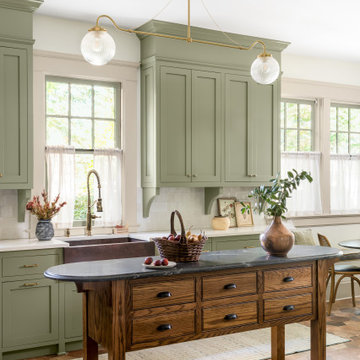
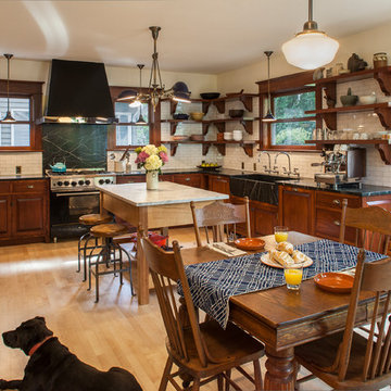
The original kitchen was disjointed and lacked connection to the home and its history. The remodel opened the room to other areas of the home by incorporating an unused breakfast nook and enclosed porch to create a spacious new kitchen. It features stunning soapstone counters and range splash, era appropriate subway tiles, and hand crafted floating shelves. Ceasarstone on the island creates a durable, hardworking surface for prep work. A black Blue Star range anchors the space while custom inset fir cabinets wrap the walls and provide ample storage. Great care was given in restoring and recreating historic details for this charming Foursquare kitchen.
 TKS Design Group
Free ebook, Creating the Ideal Kitchen. DOWNLOAD NOW
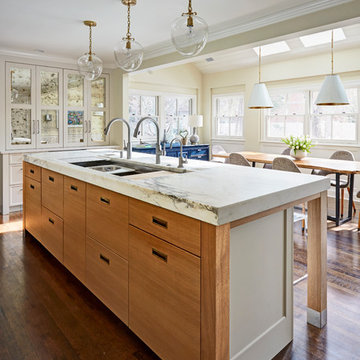
This large open concept kitchen and dining space was created by removing a load bearing wall between the old kitchen and a porch area. The new porch was insulated and incorporated into the overall space. The kitchen remodel was part of a whole house remodel so new quarter sawn oak flooring, a vaulted ceiling, windows and skylights were added.
A large calcutta marble topped island takes center stage. It houses a 5’ galley workstation - a sink that provides a convenient spot for prepping, serving, entertaining and clean up. A 36” induction cooktop is located directly across from the island for easy access. Two appliance garages on either side of the cooktop house small appliances that are used on a daily basis.
Honeycomb tile by Ann Sacks and open shelving along the cooktop wall add an interesting focal point to the room. Antique mirrored glass faces the storage unit housing dry goods and a beverage center. “I chose details for the space that had a bit of a mid-century vibe that would work well with what was originally a 1950s ranch. Along the way a previous owner added a 2nd floor making it more of a Cape Cod style home, a few eclectic details felt appropriate”, adds Klimala.
The wall opposite the cooktop houses a full size fridge, freezer, double oven, coffee machine and microwave. “There is a lot of functionality going on along that wall”, adds Klimala. A small pull out countertop below the coffee machine provides a spot for hot items coming out of the ovens.
The rooms creamy cabinetry is accented by quartersawn white oak at the island and wrapped ceiling beam. The golden tones are repeated in the antique brass light fixtures.
“This is the second kitchen I’ve had the opportunity to design for myself. My taste has gotten a little less traditional over the years, and although I’m still a traditionalist at heart, I had some fun with this kitchen and took some chances. The kitchen is super functional, easy to keep clean and has lots of storage to tuck things away when I’m done using them. The casual dining room is fabulous and is proving to be a great spot to linger after dinner. We love it!”
Designed by: Susan Klimala, CKD, CBD
For more information on kitchen and bath design ideas go to: www.kitchenstudio-ge.com
 TKS Design Group
Download our free ebook, Creating the Ideal Kitchen. DOWNLOAD NOW
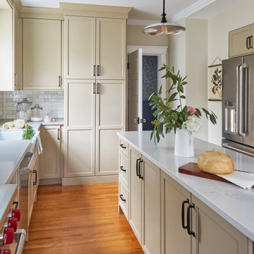
The homeowners came to us looking to update the kitchen in their historic 1897 home. The home had gone through an extensive renovation several years earlier that added a master bedroom suite and updates to the front façade. The kitchen however was not part of that update and a prior 1990’s update had left much to be desired. The client is an avid cook, and it was just not very functional for the family.
The original kitchen was very choppy and included a large eat in area that took up more than its fair share of the space. On the wish list was a place where the family could comfortably congregate, that was easy and to cook in, that feels lived in and in check with the rest of the home’s décor. They also wanted a space that was not cluttered and dark – a happy, light and airy room. A small powder room off the space also needed some attention so we set out to include that in the remodel as well.
See that arch in the neighboring dining room? The homeowner really wanted to make the opening to the dining room an arch to match, so we incorporated that into the design.
Another unfortunate eyesore was the state of the ceiling and soffits. Turns out it was just a series of shortcuts from the prior renovation, and we were surprised and delighted that we were easily able to flatten out almost the entire ceiling with a couple of little reworks.
Other changes we made were to add new windows that were appropriate to the new design, which included moving the sink window over slightly to give the work zone more breathing room. We also adjusted the height of the windows in what was previously the eat-in area that were too low for a countertop to work. We tried to keep an old island in the plan since it was a well-loved vintage find, but the tradeoff for the function of the new island was not worth it in the end. We hope the old found a new home, perhaps as a potting table.
Designed by: Susan Klimala, CKD, CBD
Photography by: Michael Kaskel
For more information on kitchen and bath design ideas go to: www.kitchenstudio-ge.com
 TKS Design Group
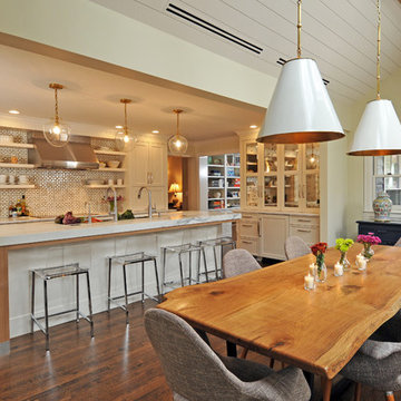
This large open concept kitchen and dining space was created by removing a load bearing wall between the old kitchen and a porch area. The new porch was insulated and incorporated into the overall space.
The kitchen remodel was part of a whole house remodel so new quarter sawn oak flooring,a vaulted ceiling, windows and skylights were added.
A large calcutta marble topped island takes center stage. It houses a 5’ galley workstation - a sink that provides a convenient spot for prepping, serving, entertaining and clean up. A 36” induction cooktop is located directly across from the island for easy access. Two appliance garages on either side of the cooktop house small appliances that are used on a daily basis.
Honeycomb tile by Ann Sacks and open shelving along the cooktop wall add an interesting focal point to the room. Antique mirrored glass faces the storage unit housing dry goods and a beverage center. “I chose details for the space that had a bit of a mid-century vibe that would work well with what was originally a 1950s ranch. Along the way a previous owner added a 2nd floor making it more of a Cape Cod style home, a few eclectic details felt appropriate”, adds Klimala.
The wall opposite the cooktop houses a full size fridge, freezer, double oven, coffee machine and microwave. “There is a lot of functionality going on along that wall”, adds Klimala. A small pull out countertop below the coffee machine provides a spot for hot items coming out of the ovens.
The rooms creamy cabinetry is accented by quartersawn white oak at the island and wrapped ceiling beam. The golden tones are repeated in the antique brass light fixtures.
“This is the second kitchen I’ve had the opportunity to design for myself. My taste has gotten a little less traditional over the years, and although I’m still a traditionalist at heart, I had some fun with this kitchen and took some chances. The kitchen is super functional, easy to keep clean and has lots of storage to tuck things away when I’m done using them. The casual dining room is fabulous and is proving to be a great spot to linger after dinner. We love it!”
Designed by: Susan Klimala, CKD, CBD
Photography by: Carlos Vergara
For more information on kitchen and bath design ideas go to: www.kitchenstudio-ge.com
 Nicole Arnold Interiors
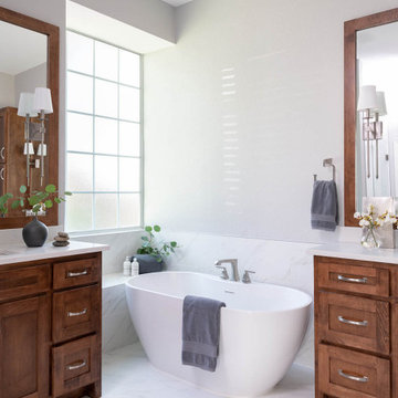
This 1990s home needed some updates in key areas of the home. We refreshed the family room mantel with a new profile and designer tile to liven up the living space, then took the home’s multiple bathrooms to a whole new level. In the master bathroom, we took out the builder grade tub and added a sleek soaker tub with more functional his and her vanities. For less maintenance, we used ceramic porcelain tile that replicates the marble the homeowners admired. In a smaller secondary bathroom, the floor is the star of the show and is appropriately complemented by the undulating quasi subway tile revealing subtle variations. We also repurposed their existing vanity and maintained a craftsman feel with clean-lined accessories to stay pristine. The third bathroom embraces simplicity with subtle texture, from the navy concrete looking floors to the unique ombre coloration in the 4×8” shower tile. We kept the overall design simple, leaving all the design details to exude from the variation in the tiles themselves.
9