
Search results for "Functioning appropriately" in Home Design Ideas
 Medallion Cabinetry
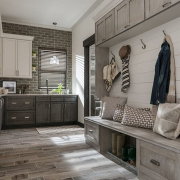
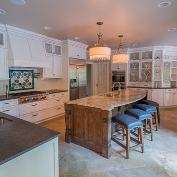
This culinary kitchen design has a transitional style and incorporates beautiful clean lines. The designer selected a beautiful combination of three different finishes from Medallion to create a well-designed and functional space to satisfy your inner chef. The custom designed kitchen island showcases our Greystone finish from the New Stoney Brooke Collection and creates defined cooking, cleaning, and prep zones within the overall space.
Medallion’s new Stoney Brooke Collection is uniquely textured in subtle shades of grays and browns. This unique finish is achieved by artfully brushing multiple glaze materials onto a stained surface. The varying shades of this glaze application create a subtle textural feel and appearance.
The component hood creates a function focal point and is finished in both Greystone and our new Irish Crème painted finish. The Irish Crème wall cabinetry coordinates beautifully with the Smoke stained base cabinets which provide a neutral backdrop for your culinary creations.
Extend the style and well-appropriated design of your kitchen into the pantry. Select coordinating cabinetry and specialized storage options to fit your culinary needs.
Find a Medallion Showroom near you today: http://www.medallioncabinetry.com/DealerLocator
 TKS Design Group
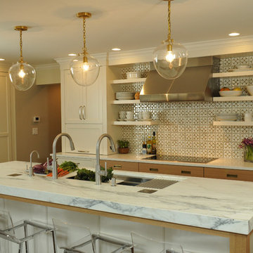
This large open concept kitchen and dining space was created by removing a load bearing wall between the old kitchen and a porch area. The new porch was insulated and incorporated into the overall space.
The kitchen remodel was part of a whole house remodel so new quarter sawn oak flooring,a vaulted ceiling, windows and skylights were added.
A large calcutta marble topped island takes center stage. It houses a 5’ galley workstation - a sink that provides a convenient spot for prepping, serving, entertaining and clean up. A 36” induction cooktop is located directly across from the island for easy access. Two appliance garages on either side of the cooktop house small appliances that are used on a daily basis.
Honeycomb tile by Ann Sacks and open shelving along the cooktop wall add an interesting focal point to the room. Antique mirrored glass faces the storage unit housing dry goods and a beverage center. “I chose details for the space that had a bit of a mid-century vibe that would work well with what was originally a 1950s ranch. Along the way a previous owner added a 2nd floor making it more of a Cape Cod style home, a few eclectic details felt appropriate”, adds Klimala.
The wall opposite the cooktop houses a full size fridge, freezer, double oven, coffee machine and microwave. “There is a lot of functionality going on along that wall”, adds Klimala. A small pull out countertop below the coffee machine provides a spot for hot items coming out of the ovens.
The rooms creamy cabinetry is accented by quartersawn white oak at the island and wrapped ceiling beam. The golden tones are repeated in the antique brass light fixtures.
“This is the second kitchen I’ve had the opportunity to design for myself. My taste has gotten a little less traditional over the years, and although I’m still a traditionalist at heart, I had some fun with this kitchen and took some chances. The kitchen is super functional, easy to keep clean and has lots of storage to tuck things away when I’m done using them. The casual dining room is fabulous and is proving to be a great spot to linger after dinner. We love it!”
Designed by: Susan Klimala, CKD, CBD
Photography by: Carlos Vergara
For more information on kitchen and bath design ideas go to: www.kitchenstudio-ge.com
 Medallion Cabinetry
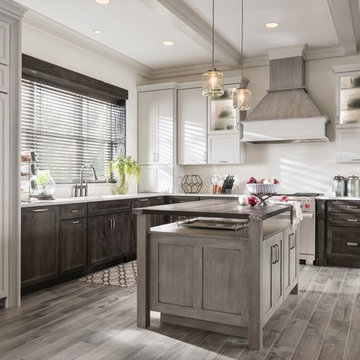
This culinary kitchen design has a transitional style and incorporates beautiful clean lines. The designer selected a beautiful combination of three different finishes from Medallion to create a well-designed and functional space to satisfy your inner chef. The custom designed kitchen island showcases our Greystone finish from the New Stoney Brooke Collection and creates defined cooking, cleaning, and prep zones within the overall space.
Medallion’s new Stoney Brooke Collection is uniquely textured in subtle shades of grays and browns. This unique finish is achieved by artfully brushing multiple glaze materials onto a stained surface. The varying shades of this glaze application create a subtle textural feel and appearance.
The component hood creates a function focal point and is finished in both Greystone and our new Irish Crème painted finish. The Irish Crème wall cabinetry coordinates beautifully with the Smoke stained base cabinets which provide a neutral backdrop for your culinary creations.
Extend the style and well-appropriated design of your kitchen into the pantry. Select coordinating cabinetry and specialized storage options to fit your culinary needs.
Find a Medallion Showroom near you today: http://www.medallioncabinetry.com/DealerLocator
Find the right local pro for your project
 SURROUNDS Landscape Architecture + Construction
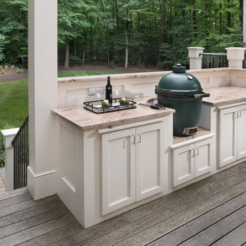
Our client desired a functional, tasteful, and improved environment to compliment their home. The overall goal was to create a landscape that was subtle and not overdone. The client was highly focused on their deck environment that would span across the rear of the house with an area for a Jacuzzi as well. A portion of the deck has a screened in porch due to the naturally buggy environment since the home is situated in the woods and a low area. A mosquito repellent injection system was incorporated into the irrigation system to help with the bug issue. We improved circulation of the driveway, increased the overall curb appeal of the entrance of the home, and created a scaled and proportional outdoor living environment for the clients to enjoy. The client has religious guidelines that needed to be adhered to with the overall function and design of the landscape, which included an arbor over the deck to support a Sukkah and a Green Egg smoker to cook Kosher foods. Two columns were added at the driveway entrance with lights to help define their driveway entrance since it's the end of a long pipe-stem. New light fixtures were also added to the rear of the house.
Our client desired multiple amenities with a limited budget, so everything had to be value engineered through the design and construction process. There is heavy deer pressure on the site, a mosquito issue, low site elevations, flat topography, poor soil, and overall poor drainage of the site. The original driveway was not sized appropriately and the front porch had structural issues, as well as leaked water onto the landing below. The septic tank was also situated close to the rear of the house and had to be contemplated during the design process.
Photography: Morgan Howarth. Landscape Architect: Howard Cohen, Surrounds Inc.
 Molidor Custom Builders, Inc.
This Kitchen located in a traditional Tudor-style home in Lake Forest, IL needed a drastic change to reflect the sophisticated style and personality of the young, modern family with its executive yet family-oriented lifestyle. Our clients presented us with multiple design and functionality challenges including, but not limited to their kitchen feeling dark and enclosed even with their wonderful 9’ ceilings. There was a true lack of connection between their family room and kitchen, which made it difficult for them to enjoy their time together as a young family. The kitchen lacked storage, included a small desk area used for storing china, and a broken working triangle between appliances and prep areas.
From the client’s lackluster kitchen we set out to provide them with functional and attractive solutions to maximize their storage, space and provide quality that would stand the test of time.
We started by changing the orientation of the kitchen in turn opening up the exterior wall with beautiful French sliding patio doors that originally housed an under-sized window where under perched the kitchen sink. Instantly ample light poured into the space connecting the wooded lot to the kitchen as well as large deck for entertaining. We also opened the adjoining wall to the family room, which allotted open passage and a clear view to join the family space together. A bar height countertop was added for entertaining yet allowed for some visual separation between the spaces. We added spice drawers, towel pull outs at the sink and a wall of display and china cabinetry that mimic the cabinetry designed in the family room with beautiful, serpentine curved mullions by a floating banquette in the breakfast nook.
The exterior runs of the kitchen cabinetry are custom-made and hand finished with a beautiful warm white paint and café latte glaze. With espresso brown marble counters. The center ten-foot island is a rustic alder furniture-grade beauty with hand-turned legs and beautiful shaker panel doors and green marble top that brings in the tones of the teals, creams and browns running through the space. All of this sets on top of a beautiful twelve by twenty-four stone tile laid in an angled herringbone pattern. The kitchen backsplash is a custom tone crackle subway tile with a custom colored hand-cut Ann Sacks glass mosaic representing escargot over the professional-grade oven, surrounded by a hand-poured teal glass border.
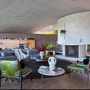
The great room appeared extremely dark despite having large windows that reached towards the vaulted ceilings. The client felt attention was not drawn to the outside. The solution we drafted included pulling the mullions out of the windows and painting the trim work white. The fireplace was on one wall and the television on another. With the current furniture arrangements the back would have been to the fireplace. We changed the orientation of the room by placing the television over the fireplace in a recessed niche trimmed with stone and faced the upper portion in silk and the lower in large-format travertine. In creating a more intriguing fireplace façade we provided a focus for the furniture grouping to sit within. An oversized section with extra deep seating allows for a comfortable place to perch and spend family time while watching movies. The lighting in the space prior was not adequate so we created the addition of a small chandelier over the game table near the windows and added volume to the ceiling by including a larger chandelier central within the room with more candles. These changes helped update the formerly outdated dark and dreary space.
With the bones of the room uplifted we drew our attention to adding detail in furnishings and window treatments. We accented the room with subtle patterning on top of bold color choices. The chairs offer depth and dimension with the green citron accented seats and peacock-patterned back fabric that help tone the colors down. To lighting the space we added an oversized cocktail ottoman that floats beautifully within the space and brings in the blue accents with button tufts as a peek-a-boo effect within. The sliding tray works perfectly to function as both a cocktail table and place to rest one’s feet. The game table in the rear of the room has an inlaid cross-cut branch marquis within the top and is surrounded by clean-lined chairs and a curved banquette perfect for a family to play games at and spend their quality time. Beautiful bounding window treatments drape the two-story window wall with an over-sized medallion patterned top treatment cascading into solid blue striated fabric trimmed with beaded shell trim for an appropriately dynamic finishing touch to the space.
The kitchen and family room meld beautifully together and offer a crisp yet welcoming feel to the home in keeping with the Tudor styling and modern family needs. It’s a space truly to be enjoyed by all who visit.
Katherine Elizabeth Designs

 Kathleen Jennison
An Arts & Crafts Bungalow is one of my favorite styles of homes. We have quite a few of them in our Stockton Mid-Town area. And when C&L called us to help them remodel their 1923 American Bungalow, I was beyond thrilled.
As per usual, when we get a new inquiry, we quickly Google the project location while we are talking to you on the phone. My excitement escalated when I saw the Google Earth Image of the sweet Sage Green bungalow in Mid-Town Stockton. "Yes, we would be interested in working with you," I said trying to keep my cool.
But what made it even better was meeting C&L and touring their home, because they are the nicest young couple, eager to make their home period perfect. Unfortunately, it had been slightly molested by some bad house-flippers, and we needed to bring the bathroom back to it "roots."
We knew we had to banish the hideous brown tile and cheap vanity quickly. But C&L complained about the condensation problems and the constant fight with mold. This immediately told me that improper remodeling had occurred and we needed to remedy that right away.
The Before: Frustrations with a Botched Remodel
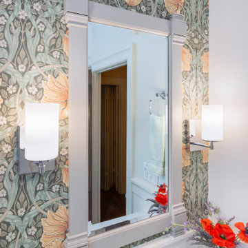
The bathroom needed to be brought back to period appropriate design with all the functionality of a modern bathroom. We thought of things like marble countertop, white mosaic floor tiles, white subway tile, board and batten molding, and of course a fabulous wallpaper.
This small (and only) bathroom on a tight budget required a little bit of design sleuthing to figure out how we could get the proper look and feel. Our goal was to determine where to splurge and where to economize and how to complete the remodel as quickly as possible because C&L would have to move out while construction was going on.
The Process: Hard Work to Remedy Design and Function
During our initial design study, (which included 2 hours in the owners’ home), we noticed framed images of William Morris Arts and Crafts textile patterns and knew this would be our design inspiration. We presented C&L with three options and they quickly selected the Pimpernel Design Concept.
We had originally selected the Black and Olive colors with a black vanity, mirror, and black and white floor tile. C&L liked it but weren’t quite sure about the black, We went back to the drawing board and decided the William & Co Pimpernel Wallpaper in Bayleaf and Manilla color with a softer gray painted vanity and mirror and white floor tile was more to their liking.
After the Design Concept was approved, we went to work securing the building permit, procuring all the elements, and scheduling our trusted tradesmen to perform the work.
We did uncover some shoddy work by the flippers such as live electrical wires hidden behind the wall, plumbing venting cut-off and buried in the walls (hence the constant dampness), the tub barely balancing on two fence boards across the floor joist, and no insulation on the exterior wall.
All of the previous blunders were fixed and the bathroom put back to its previous glory. We could feel the house thanking us for making it pretty again.
The After Reveal: Cohesive Design Decisions
We selected a simple white subway tile for the tub/shower. This is always classic and in keeping with the style of the house.
We selected a pre-fab vanity and mirror, but they look rich with the quartz countertop. There is much more storage in this small vanity than you would think.
The Transformation: A Period Perfect Refresh
We began the remodel just as the pandemic reared and stay-in-place orders went into effect. As C&L were already moved out and living with relatives, we got the go-ahead from city officials to get the work done (after all, how can you shelter in place without a bathroom?).
All our tradesmen were scheduled to work so that only one crew was on the job site at a time. We stayed on the original schedule with only a one week delay.
The end result is the sweetest little bathroom I've ever seen (and I can't wait to start work on C&L's kitchen next).
Thank you for joining me in this project transformation. I hope this inspired you to think about being creative with your design projects, determining what works best in keeping with the architecture of your space, and carefully assessing how you can have the best life in your home.


 DEANE Inc | Distinctive Design & Cabinetry
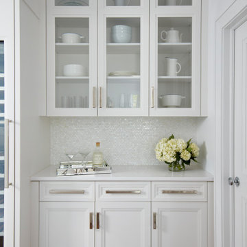
This kitchen features matching double islands – one as a prep work workstation and the second for entertaining/gathering – both serving different yet equally important functions and appropriate to the grand scale of the house. One of the designer’s favorite features is the dropped ceiling above the islands (which is backlit) which connects and balances the spaces. The cabinetry is a 5/4 thick overlay door in a transitional slant style, and houses multiple refrigeration and freezer units and appliance storage. The kitchen is fully equipped with every modern appliance a cook could want – from a steam oven, wine column, double ovens and a coffee station. The island is a driftwood-finished white oak, and the countertops are nano glass with the exception of the waterfall-edge island in statuary marble. The exquisite backsplash is a shimmery mother of pearl, which adds sparkle and shine throughout the space. The custom-designed enamel-covered hood is the show-stopping focal point of the room.
 SURROUNDS Landscape Architecture + Construction
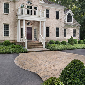
Our client desired a functional, tasteful, and improved environment to compliment their home. The overall goal was to create a landscape that was subtle and not overdone. The client was highly focused on their deck environment that would span across the rear of the house with an area for a Jacuzzi as well. A portion of the deck has a screened in porch due to the naturally buggy environment since the home is situated in the woods and a low area. A mosquito repellent injection system was incorporated into the irrigation system to help with the bug issue. We improved circulation of the driveway, increased the overall curb appeal of the entrance of the home, and created a scaled and proportional outdoor living environment for the clients to enjoy. The client has religious guidelines that needed to be adhered to with the overall function and design of the landscape, which included an arbor over the deck to support a Sukkah and a Green Egg smoker to cook Kosher foods. Two columns were added at the driveway entrance with lights to help define their driveway entrance since it's the end of a long pipe-stem. New light fixtures were also added to the rear of the house.
Our client desired multiple amenities with a limited budget, so everything had to be value engineered through the design and construction process. There is heavy deer pressure on the site, a mosquito issue, low site elevations, flat topography, poor soil, and overall poor drainage of the site. The original driveway was not sized appropriately and the front porch had structural issues, as well as leaked water onto the landing below. The septic tank was also situated close to the rear of the house and had to be contemplated during the design process.
Photography: Morgan Howarth. Landscape Architect: Howard Cohen, Surrounds Inc.
 Paragon Custom Builders
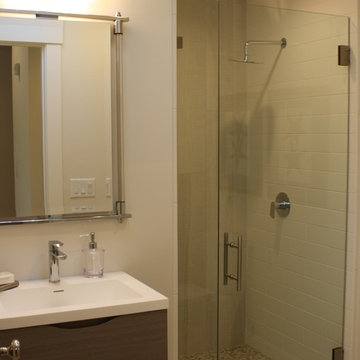
Appropriate proportions allow even the smallest bathrooms to function properly.
Alcove shower - small modern brown tile and porcelain tile porcelain tile alcove shower idea in San Francisco with flat-panel cabinets, dark wood cabinets, white walls, an integrated sink and solid surface countertops
Alcove shower - small modern brown tile and porcelain tile porcelain tile alcove shower idea in San Francisco with flat-panel cabinets, dark wood cabinets, white walls, an integrated sink and solid surface countertops
 DEANE Inc | Distinctive Design & Cabinetry
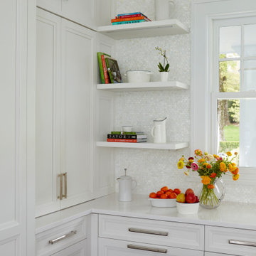
This kitchen features matching double islands – one as a prep work workstation and the second for entertaining/gathering – both serving different yet equally important functions and appropriate to the grand scale of the house. One of the designer’s favorite features is the dropped ceiling above the islands (which is backlit) which connects and balances the spaces. The cabinetry is a 5/4 thick overlay door in a transitional slant style, and houses multiple refrigeration and freezer units and appliance storage. The kitchen is fully equipped with every modern appliance a cook could want – from a steam oven, wine column, double ovens and a coffee station. The island is a driftwood-finished white oak, and the countertops are nano glass with the exception of the waterfall-edge island in statuary marble. The exquisite backsplash is a shimmery mother of pearl, which adds sparkle and shine throughout the space. The custom-designed enamel-covered hood is the show-stopping focal point of the room.
 Advance Design Studio, Ltd.
Curtis and Peggy had been thinking of a kitchen remodel for quite some time, but they knew their house would have a unique set of challenges. Their older Victorian house was built in 1891. The kitchen cabinetry was original, and they wanted to keep the authenticity of their period home while adding modern comforts that would improve their quality of life.
A friend recommended Advance Design Studio for their exceptional experience and quality of work. After meeting with designer Michelle Lecinski at Advance Design, they were confident they could partner with Advance to accomplish the unique kitchen renovation they’d been talking about for years. “We wanted to do the kitchen for a long, long time,” Curtis said. “(We asked ourselves) what are we actually going to do? How are we going to do this? And who are we going to find to do exactly what we want?”
The goal for the project was to keep the home renovation and new kitchen feeling authentic to the time in which it was built. They desperately wanted the modern comforts that come with a larger refrigerator and the dishwasher that they never had! The old home was also a bit drafty so adding a fireplace, wall insulation and new windows became a priority. They very much wanted to create a comfortable hearth room adjacent to the kitchen, complete with old world brick.
The original cabinetry had to go to make way for beautiful new kitchen cabinetry that appears as if it was a hundred years old, but with all the benefits of cutting-edge storage, self-closing drawers, and a brand-new look. “We just wanted to keep it old looking, but with some modern updates,” Peggy said.
Dura Supreme Highland Cabinets with a Heritage Old World Painted Finish replaced the original 1891 cabinets. The hand-applied careful rubbed-off detailing makes these exquisite cabinets look as if they came from a far-gone era. Despite the small size of the kitchen, Peggy, Curtis and Michelle utilized every inch with custom cabinet sizes to increase storage capacity. The custom cabinets allowed for the addition of a 24” Fisher Paykel dishwasher with a concealing Dura Supreme door panel. Michelle was also able to work into the new design a larger 30” Fisher Paykel French refrigerator. “We made every ¼ inch count in this small space,” designer Michelle said. “Having the ability to custom size the cabinetry was the only way to achieve this.”
“The kitchen essentially was designed around the Heartland Vintage range and oven,” says Michelle. A classic appliance that combines nostalgic beauty and craftsmanship for modern cooking, with nickel plated trim and elegantly shaped handles and legs; the not to miss range is a striking focal point of the entire room and an engaging conversation piece.
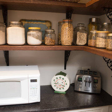
Granite countertops in Kodiak Satin with subtle veining kept with the old-world style. The delicate porcelain La Vie Crackle Sonoma tile kitchen backsplash compliments the home’s style perfectly. A handcrafted passthrough designed to show off Peggy’s fine china was custom built by project carpenters Justin Davis and Jeff Dallain to physically and visually open the space. Additional storage was created in the custom panty room with Latte Edinburg cabinets, hand-made weathered wood shelving with authentic black iron brackets, and an intricate tin copper ceiling.
Peggy and Curtis loved the idea of adding a Vermont stove to make the hearth-room not only functional, but a truly beckoning place to be. A stunning Bordeaux red Vermont Castings Stove with crisp black ventilation was chosen and combined with the authentic reclaimed Chicago brick wall. Advance’s talented carpenters custom-built elegant weathered shelves to house family memorabilia, installed carefully chosen barn sconces, and made the hearth room an inviting place to relax with a cup of coffee and a good book.
“Peggy and Curtis’ project was so much fun to work on. Creating a space that looks and feels like it always belonged in this beautiful old Victorian home is a designer’s dream. To see the delight in their faces when they saw the design details coming together truly made it worth the time and effort that went into making the very compact kitchen space work”, said Michelle. “The result is an amazing custom kitchen, packed with functionality in every inch, nook and cranny!” exclaims Michelle.
The renovation didn’t end with the kitchen. New Pella windows were added to help lessen the drafts. The removal of the original windows and trim necessitated the re-creation of hand-made corbels and trim details no longer available today. The talented carpenter team came to the rescue, crafting new pieces and masterfully finishing them as if they were always there. New custom gutters were formed and installed with a front entry rework necessary to accommodate the changes.
The whole house functions better, but it still feels like the original 1891 home. “From start to finish it’s just a much better space than we used to have,” Peggy said. “Jeff and Justin were amazing.” Curtis added; “We were lucky to find Advance Design, because they really came through for us. I loved that they had everything in house, anything you needed to have done, they could do it”.
 Moss Building & Design
Our MOSS customers wanted to update both their main level powder room as well as their upstairs hallway bathrooms in their Alexandria home. Both were original to the home and had design flaws that impeded their functionality – in addition, both, aesthetically, were outdated and desperately needed a fresh look.
The homeowners knew that the powder room would have to maintain its original (small) square footage, however, they were hoping to be able to use the space more effectively and efficiently. Replacing the pedestal sink with a cabinet that would allow storage was a key first step and adding board and batten to the walls completely changed the perception of the room’s size. Add in new paint colors and fixtures and the space looks brand new!
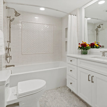
The upstairs bathroom, used by the homeowners’ children and guests, was from a bygone era of design, with salmon pink colored tiles on the shower/tub walls. In addition, the tub wasn’t the full length of the bathroom and was instead blocked in with additional tiling to create an unnecessary large shelf/seating area at one end. Replacing the tile on the walls and the floor with more beautiful, neutral grey and white marble tile immediately updated the space, and the new cabinet, vanity, mirrors, and lighting all contributed to creating the bathroom that better suits our customers' needs. Bonus: the new bathtub fits appropriately and makes much more sense to the room!

Sponsored
Columbus, OH

Structural Remodeling
Franklin County's Heavy Timber Specialists | Best of Houzz 2020!
 Moss Building & Design
Our MOSS customers wanted to update both their main level powder room as well as their upstairs hallway bathrooms in their Alexandria home. Both were original to the home and had design flaws that impeded their functionality – in addition, both, aesthetically, were outdated and desperately needed a fresh look.
The homeowners knew that the powder room would have to maintain its original (small) square footage, however, they were hoping to be able to use the space more effectively and efficiently. Replacing the pedestal sink with a cabinet that would allow storage was a key first step and adding board and batten to the walls completely changed the perception of the room’s size. Add in new paint colors and fixtures and the space looks brand new!
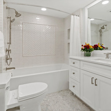
The upstairs bathroom, used by the homeowners’ children and guests, was from a bygone era of design, with salmon pink colored tiles on the shower/tub walls. In addition, the tub wasn’t the full length of the bathroom and was instead blocked in with additional tiling to create an unnecessary large shelf/seating area at one end. Replacing the tile on the walls and the floor with more beautiful, neutral grey and white marble tile immediately updated the space, and the new cabinet, vanity, mirrors, and lighting all contributed to creating the bathroom that better suits our customers' needs. Bonus: the new bathtub fits appropriately and makes much more sense to the room!
 Moss Building & Design
Our MOSS customers wanted to update both their main level powder room as well as their upstairs hallway bathrooms in their Alexandria home. Both were original to the home and had design flaws that impeded their functionality – in addition, both, aesthetically, were outdated and desperately needed a fresh look.
The homeowners knew that the powder room would have to maintain its original (small) square footage, however, they were hoping to be able to use the space more effectively and efficiently. Replacing the pedestal sink with a cabinet that would allow storage was a key first step and adding board and batten to the walls completely changed the perception of the room’s size. Add in new paint colors and fixtures and the space looks brand new!
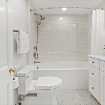
The upstairs bathroom, used by the homeowners’ children and guests, was from a bygone era of design, with salmon pink colored tiles on the shower/tub walls. In addition, the tub wasn’t the full length of the bathroom and was instead blocked in with additional tiling to create an unnecessary large shelf/seating area at one end. Replacing the tile on the walls and the floor with more beautiful, neutral grey and white marble tile immediately updated the space, and the new cabinet, vanity, mirrors, and lighting all contributed to creating the bathroom that better suits our customers' needs. Bonus: the new bathtub fits appropriately and makes much more sense to the room!
 Moss Building & Design
Our MOSS customers wanted to update both their main level powder room as well as their upstairs hallway bathrooms in their Alexandria home. Both were original to the home and had design flaws that impeded their functionality – in addition, both, aesthetically, were outdated and desperately needed a fresh look.
The homeowners knew that the powder room would have to maintain its original (small) square footage, however, they were hoping to be able to use the space more effectively and efficiently. Replacing the pedestal sink with a cabinet that would allow storage was a key first step and adding board and batten to the walls completely changed the perception of the room’s size. Add in new paint colors and fixtures and the space looks brand new!
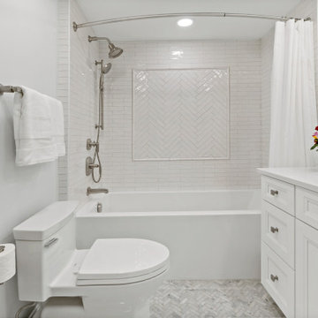
The upstairs bathroom, used by the homeowners’ children and guests, was from a bygone era of design, with salmon pink colored tiles on the shower/tub walls. In addition, the tub wasn’t the full length of the bathroom and was instead blocked in with additional tiling to create an unnecessary large shelf/seating area at one end. Replacing the tile on the walls and the floor with more beautiful, neutral grey and white marble tile immediately updated the space, and the new cabinet, vanity, mirrors, and lighting all contributed to creating the bathroom that better suits our customers' needs. Bonus: the new bathtub fits appropriately and makes much more sense to the room!
 Moss Building & Design
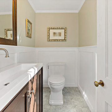
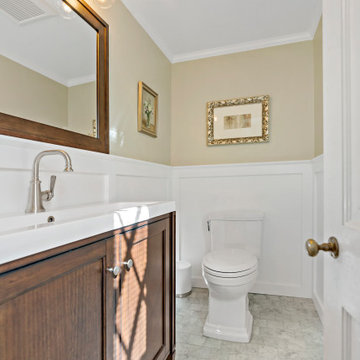
Our MOSS customers wanted to update both their main level powder room as well as their upstairs hallway bathrooms in their Alexandria home. Both were original to the home and had design flaws that impeded their functionality – in addition, both, aesthetically, were outdated and desperately needed a fresh look.
The homeowners knew that the powder room would have to maintain its original (small) square footage, however, they were hoping to be able to use the space more effectively and efficiently. Replacing the pedestal sink with a cabinet that would allow storage was a key first step and adding board and batten to the walls completely changed the perception of the room’s size. Add in new paint colors and fixtures and the space looks brand new!
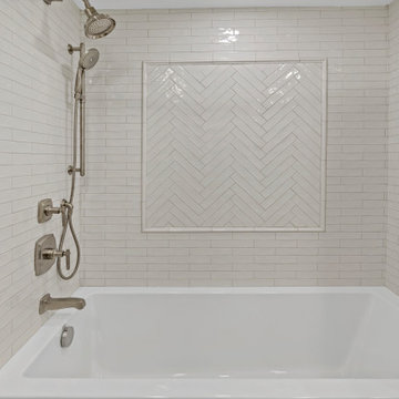
The upstairs bathroom, used by the homeowners’ children and guests, was from a bygone era of design, with salmon pink colored tiles on the shower/tub walls. In addition, the tub wasn’t the full length of the bathroom and was instead blocked in with additional tiling to create an unnecessary large shelf/seating area at one end. Replacing the tile on the walls and the floor with more beautiful, neutral grey and white marble tile immediately updated the space, and the new cabinet, vanity, mirrors, and lighting all contributed to creating the bathroom that better suits our customers' needs. Bonus: the new bathtub fits appropriately and makes much more sense to the room!
 Moss Building & Design
Our MOSS customers wanted to update both their main level powder room as well as their upstairs hallway bathrooms in their Alexandria home. Both were original to the home and had design flaws that impeded their functionality – in addition, both, aesthetically, were outdated and desperately needed a fresh look.
The homeowners knew that the powder room would have to maintain its original (small) square footage, however, they were hoping to be able to use the space more effectively and efficiently. Replacing the pedestal sink with a cabinet that would allow storage was a key first step and adding board and batten to the walls completely changed the perception of the room’s size. Add in new paint colors and fixtures and the space looks brand new!
The upstairs bathroom, used by the homeowners’ children and guests, was from a bygone era of design, with salmon pink colored tiles on the shower/tub walls. In addition, the tub wasn’t the full length of the bathroom and was instead blocked in with additional tiling to create an unnecessary large shelf/seating area at one end. Replacing the tile on the walls and the floor with more beautiful, neutral grey and white marble tile immediately updated the space, and the new cabinet, vanity, mirrors, and lighting all contributed to creating the bathroom that better suits our customers' needs. Bonus: the new bathtub fits appropriately and makes much more sense to the room!
 Moss Building & Design
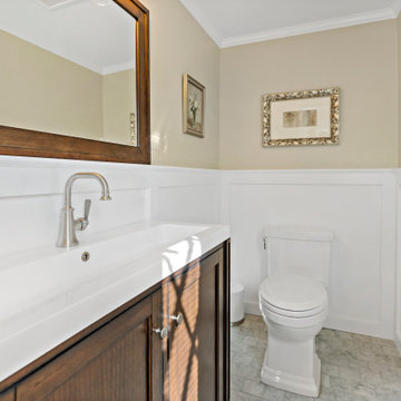
Our MOSS customers wanted to update both their main level powder room as well as their upstairs hallway bathrooms in their Alexandria home. Both were original to the home and had design flaws that impeded their functionality – in addition, both, aesthetically, were outdated and desperately needed a fresh look.
The homeowners knew that the powder room would have to maintain its original (small) square footage, however, they were hoping to be able to use the space more effectively and efficiently. Replacing the pedestal sink with a cabinet that would allow storage was a key first step and adding board and batten to the walls completely changed the perception of the room’s size. Add in new paint colors and fixtures and the space looks brand new!
The upstairs bathroom, used by the homeowners’ children and guests, was from a bygone era of design, with salmon pink colored tiles on the shower/tub walls. In addition, the tub wasn’t the full length of the bathroom and was instead blocked in with additional tiling to create an unnecessary large shelf/seating area at one end. Replacing the tile on the walls and the floor with more beautiful, neutral grey and white marble tile immediately updated the space, and the new cabinet, vanity, mirrors, and lighting all contributed to creating the bathroom that better suits our customers' needs. Bonus: the new bathtub fits appropriately and makes much more sense to the room!
 Moss Building & Design
Our MOSS customers wanted to update both their main level powder room as well as their upstairs hallway bathrooms in their Alexandria home. Both were original to the home and had design flaws that impeded their functionality – in addition, both, aesthetically, were outdated and desperately needed a fresh look.
The homeowners knew that the powder room would have to maintain its original (small) square footage, however, they were hoping to be able to use the space more effectively and efficiently. Replacing the pedestal sink with a cabinet that would allow storage was a key first step and adding board and batten to the walls completely changed the perception of the room’s size. Add in new paint colors and fixtures and the space looks brand new!
The upstairs bathroom, used by the homeowners’ children and guests, was from a bygone era of design, with salmon pink colored tiles on the shower/tub walls. In addition, the tub wasn’t the full length of the bathroom and was instead blocked in with additional tiling to create an unnecessary large shelf/seating area at one end. Replacing the tile on the walls and the floor with more beautiful, neutral grey and white marble tile immediately updated the space, and the new cabinet, vanity, mirrors, and lighting all contributed to creating the bathroom that better suits our customers' needs. Bonus: the new bathtub fits appropriately and makes much more sense to the room!
13