
Search results for "Future client" in Home Design Ideas

 Vartanian Custom Cabinets
Enclosed kitchen - large shabby-chic style l-shaped light wood floor and brown floor enclosed kitchen idea in Boston with a farmhouse sink, beaded inset cabinets, white cabinets, marble countertops, gray backsplash, mosaic tile backsplash, paneled appliances and an island

 Silver Maple Construction LLC
photos by Susan Teare • www.susanteare.com
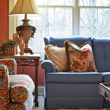
Small mountain style medium tone wood floor living room photo in Burlington with a wood stove and beige walls
Small mountain style medium tone wood floor living room photo in Burlington with a wood stove and beige walls
 ASR DESIGN STUDIO
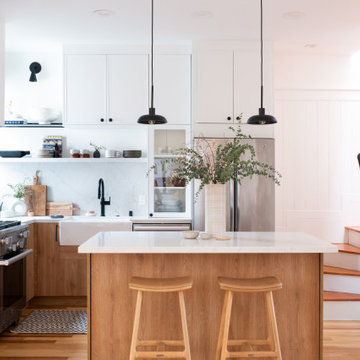
Built in 1907 and nestled into the beating heart of San Fran’s Bernal Heights neighbourhood, this adorable abode was an unpolished gem ready to be turned into our clients’ dream home.
Our mission was to gift Bonview with classic, natural and timeless style while setting it up with impressive functionality so that it was ready to be the pet-friendly, kid-friendly and entertaining-friendly home they needed it to be. Mission accepted!
Our clients’ vision was clear: They wanted whites, blacks and wood tones with texture and personality. Oh, and that spunky wine fridge? Yep, that was a non-negotiable. ?
“It’s not unusual for our friends and family to drop past unannounced any day of the week. And we love it!” They told us during our initial Design Therapy Sesh.
We knew immediately what she meant - we have an open-door policy with our families, too! Which was why we consciously created living spaces that were open, inviting and welcoming.
Now, the only problem our clients would have would be convincing their guests to leave!
Our clients also enjoyed cooking and baking casually, so we created an organized, intuitive and functional kitchen and pantry that made whipping up homemade dips and snacks for their game nights a breeze.
Find the right local pro for your project

 LEIVARS
Nick Smith Shaker style kitchen meets contemporary colours to add depth to the oversized kitchen. Industrial lighting and handles help give the kitchen a little bit of cool!

 Outside Collective
Christel Leung
Inspiration for a small modern full sun backyard concrete paver formal garden in San Francisco.
Inspiration for a small modern full sun backyard concrete paver formal garden in San Francisco.

 Harrell Design + Build
What our clients needed:
• Create a garden folly that doubles as a well-built shed for crafts and storage.
• Size the structure large enough for comfortable storage without dominating the garden.
• Discreetly locate the shed in the far corner of the rear yard while maintaining existing trees.
• Ensure that the structure is protected from the weather and carefully detailed to deter access of wildlife and rodents.
FUNCTION
• Construct the shed slab close to grade to permit easy access for bicycle storage, while building shed walls above grade to ensure against termites and dryrot.
• Install a French door and operable casement windows to admit plenty of daylight and provide views to the garden.
• Include rugged built-in work bench, shelves, bike racks and tool storage for a rustic well-organized and efficient space.
• Incorporate GFIC electrical service for safe access to power at this distant corner of the yard.
• Position energy-efficient interior lighting to ensure space can be used year-round.
• Switch control of exterior light from house and from shed for ease of command.
AESTHETICS
• Design and detail the shed to coordinate with the Arts and Crafts style house.
• Include an arbor for future flowering vines, further softening the shed’s garden presence.
• Simple and rustic interior surfaces ensure that the space is easy to clean.
• Create an aged and softly weathered appearance, and protect the exterior siding by finishing the cedar with a custom-colored semi-transparent stain.
INNOVATIVE MATERIALS AND CONSTRUCTION
• Factory-built components were pre-assembled to allow for a speedy assembly and for a shorter on-site construction schedule.
• Each component was easily transported through the yard without disturbing garden features.
• Decorative exterior trim frames the door and windows, while a simpler trim is used inside the unadorned shed.
OBSTACLE OVERCOME
• The structure is located in the corner of the yard to avoid disturbance of a curly willow tree.
• The low-profile structure is positioned close to property lines while staying beneath the allowable daylight plane for structures.
• To comply with daylight plane close to fence, the roof form combines hip and gable forms, with door located at gable end.
• The height of the modest interior is maximized, without exceeding the allowable building height.
CRAFTSMANSHIP
• The concrete slab was precisely formed and finished for ease of shed assembly before the factory-built components were delivered to site.
• Precision planning meant the pre-framed door fit exactly between raised concrete curb.

 Casework Inter Design
When the homeowners first purchased the 1925 house, it was compartmentalized, outdated, and completely unfunctional for their growing family. Casework designed the owner's previous kitchen and family room and was brought in to lead up the creative direction for the project. Casework teamed up with architect Paul Crowther and brother sister team Ainslie Davis on the addition and remodel of the Colonial.
The existing kitchen and powder bath were demoed and walls expanded to create a new footprint for the home. This created a much larger, more open kitchen and breakfast nook with mudroom, pantry and more private half bath. In the spacious kitchen, a large walnut island perfectly compliments the homes existing oak floors without feeling too heavy. Paired with brass accents, Calcutta Carrera marble countertops, and clean white cabinets and tile, the kitchen feels bright and open - the perfect spot for a glass of wine with friends or dinner with the whole family.
There was no official master prior to the renovations. The existing four bedrooms and one separate bathroom became two smaller bedrooms perfectly suited for the client’s two daughters, while the third became the true master complete with walk-in closet and master bath. There are future plans for a second story addition that would transform the current master into a guest suite and build out a master bedroom and bath complete with walk in shower and free standing tub.
Overall, a light, neutral palette was incorporated to draw attention to the existing colonial details of the home, like coved ceilings and leaded glass windows, that the homeowners fell in love with. Modern furnishings and art were mixed in to make this space an eclectic haven.
Sponsored
Columbus, OH

Wannemacher Interiors
Customized Award-Winning Interior Design Solutions in Franklin Cnty OH

 PBC Design + Build
Inspiration for a large timeless back porch remodel in Wilmington with a roof extension
 TKS Design Group
Download our free ebook, Creating the Ideal Kitchen. DOWNLOAD NOW
This client was referred to us from a past client. They are a busy 2-career household with young children and enjoy entertaining friends and family in their home. They have a beautiful open concept home but unfortunately the kitchen was not fitting for the rest of the home. They were not quite sure what to do with the space. We talked about trying to refresh it or do more of a minor remodel, but in the end they decided a full gut would get them to where they wanted to be.
One problem was there was no place for guests to hang out other than the large and awkward banquette area. The brick wall and tiled hood area were feeling a bit dated and tired. The space was just not functional for their lifestyle. There was no prep space near the cooktop and no landing area for items coming out of the ovens or refrigerator, plus a big dead zone in the center of the room.
Banquettes, like the one they previously had in the space, are great for small spaces, but when they get really large like this one, it makes getting in and out of the seating area awkward and uncomfortable. Plus, there was room for a large table, so we eliminated the awkward built in.
We started by removing the faux brick wall between the kitchen and back entry. We relocated the entry to the garage over a couple feet in order to get every last inch out of the new kitchen. We also made the decision to close up the primary window that faced the pretty ho hum brick wall of the neighbor’s house. There was plenty of light coming in from the seating area, so we just didn’t feel the window was adding much to the room.
Construction went smoothy. There was a bit of rework with electrical, flooring and HVAC, but in the end, we think it was well worth it.
The clients really wanted a sleek contemporary look, and we originally had planned for a full height slab backsplash, but due to it’s size, it was a budget buster. Instead, we got creative and settled on large format porcelain tiles that have a similar feel but were a fraction of the cost. We made sure the wall was plumb and level so that the fit and finish would mimic that of slab material.
The final space was quite a change. A large prep sink sits directly across from the new pro-style range with plenty additional prep space on the large island. The refrigerator and ovens now have miles of landing space, and a nice tight work triangle makes cooking a breeze.
Since we wanted a more contemporary feel, not many wall cabinets were included. Instead, we outfitted some of the drawers for dish storage with a peg system. Two large pantries flanking the refrigerator hold baking supplies and small appliances. Large drawers by the cooktop hold pots and pans, and an appliance garage tucked away to the left of the range hides away miscellaneous items. The large island also houses a microwave drawer and tons of storage, most of which is drawers offering maximum convenience.
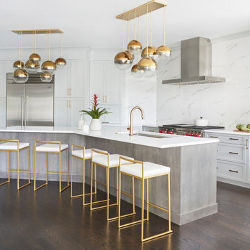
The island now seats 5-6 people comfortably along with the new table in the seating area which can seat up to 8. Entertaining will be a breeze in this space. With such a clean backdrop, we knew we would need some drama with the lighting, so we chose two sets of staggered pendants, which we adjusted for the right visual balance above the island.
We also included a small coffee station to the right of the main kitchen, which helps keep the coffee clutter out of the kitchen proper. Two tones of complimentary gray are featured in this kitchen. The perimeter is a light gray that reads almost white. The island is a gray stain that adds some depth and interest with the visible wood texture. The countertops are clean white quartz, and the hardware, barstools and light fixtures add warm brass tones. I see lots of cooking and entertaining with family and friends in the near future in this bright and airy new space.
Designed by: Susan Klimala, CKD, CBD
Photography by: Michael Kaskel
For more information on kitchen and bath design ideas go to: www.kitchenstudio-ge.com

 Klopf Architecture
’s client, a family of four with young children, wanted to update their recently purchased home to meet their growing needs across generations. It was essential to maintain the mid-century modern style throughout the project but most importantly, they wanted more natural light brought into the dark kitchen and cramped bathrooms while creating a smoother connection between the kitchen, dining and family room.
The kitchen was expanded into the dining area, using part of the original kitchen area as a butler's pantry. With the main kitchen brought out into an open space with new larger windows and two skylights the space became light, open, and airy. Custom cabinetry from Henrybuilt throughout the kitchen and butler's pantry brought functionality to the space. Removing the wall between the kitchen and dining room, and widening the opening from the dining room to the living room created a more open and natural flow between the spaces.
New redwood siding was installed in the entry foyer to match the original siding in the family room so it felt original to the house and consistent between the spaces. Oak flooring was installed throughout the house enhancing the movement between the new kitchen and adjacent areas.
The two original bathrooms felt dark and cramped so they were expanded and also feature larger windows, modern fixtures and new Heath tile throughout. Custom vanities also from Henrybuilt bring a unified look and feel from the kitchen into the new bathrooms. Designs included plans for a future in-law unit to accommodate the needs of an older generation.
The house is much brighter, feels more unified with wider open site lines that provide the family with a better transition and seamless connection between spaces.
This mid-century modern remodel is a 2,743 sf, 4 bedroom/3 bath home located in Lafayette, CA.
Klopf Architecture Project Team: John Klopf and Angela Todorova
Contractor: Don Larwood
Structural Engineer: Sezen & Moon Structural Engineering, Inc.
Landscape Designer: n/a
Photography ©2018 Scott Maddern
Location: Lafayette, CA
Year completed: 2018
Link to photos: https://www.dropbox.com/sh/aqxfwk7wdot9jja/AADWuIcsHHE-AGPfq13u5htda?dl=0

 HAVEN design+building llc
KITCHEN GREATROOM ADDITION, Vermont:
This 336 sq. ft. addition was the answer to our clients' dream of having a great cooking space and dining area that allowed them to take advantage of the gorgeous meadow/mountain views unique to this site. Originally built as a "starter home" the dwelling was lacking in natural light, and access to the available vista. Being an avid gardener and natural foods cook, our client needed a kitchen upgrade, food preparation space and lots of storage.
In the renovation the old kitchen space became a mudroom/laundry room and pantry, providing functionality that was previously unavailable in the small home.
The simple shaker cabinets and farmhouse style windows work perfectly with the country setting. The , Viking cooktop, and pop-up vent, corner banquette, and many cabinetry storage units were just a few of the carefully planned features that allowed us to make the best use of the modest space while keeping views free and clear.
This 336 sq. ft. addition was the answer to our clients' dream of having a great cooking space and dining area that allowed them to take advantage of the gorgeous meadow/mountain views unique to this site. Originally built as a "starter home" the dwelling was lacking in natural light, and access to the available vista. Being an avid gardener and natural foods cook, our client needed a kitchen upgrade, food preparation space and lots of storage.
In the renovation the old kitchen space became a mudroom/laundry room and pantry, providing functionality that was previously unavailable in the small home.
The simple shaker cabinets and farmhouse style windows work perfectly with the country setting. The , Viking cooktop, and pop-up vent, corner banquette, and many cabinetry storage units were just a few of the carefully planned features that allowed us to make the best use of the modest space while keeping views free and clear.

 The Artisans Group, Inc.
Winner of the 2018 Tour of Homes Best Remodel, this whole house re-design of a 1963 Bennet & Johnson mid-century raised ranch home is a beautiful example of the magic we can weave through the application of more sustainable modern design principles to existing spaces.
We worked closely with our client on extensive updates to create a modernized MCM gem.
Extensive alterations include:
- a completely redesigned floor plan to promote a more intuitive flow throughout
- vaulted the ceilings over the great room to create an amazing entrance and feeling of inspired openness
- redesigned entry and driveway to be more inviting and welcoming as well as to experientially set the mid-century modern stage
- the removal of a visually disruptive load bearing central wall and chimney system that formerly partitioned the homes’ entry, dining, kitchen and living rooms from each other
- added clerestory windows above the new kitchen to accentuate the new vaulted ceiling line and create a greater visual continuation of indoor to outdoor space
- drastically increased the access to natural light by increasing window sizes and opening up the floor plan
- placed natural wood elements throughout to provide a calming palette and cohesive Pacific Northwest feel
- incorporated Universal Design principles to make the home Aging In Place ready with wide hallways and accessible spaces, including single-floor living if needed
- moved and completely redesigned the stairway to work for the home’s occupants and be a part of the cohesive design aesthetic
- mixed custom tile layouts with more traditional tiling to create fun and playful visual experiences
- custom designed and sourced MCM specific elements such as the entry screen, cabinetry and lighting
- development of the downstairs for potential future use by an assisted living caretaker
- energy efficiency upgrades seamlessly woven in with much improved insulation, ductless mini splits and solar gain
 Signature Designs Kitchen | Bath | Interiors
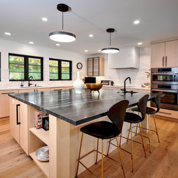
New to the area, this client wanted to modernize and clean up this older 1980's home on one floor covering 3500 sq ft. on the golf course. Clean lines and a neutral material palette blends the home into the landscape, while careful craftsmanship gives the home a clean and contemporary appearance.
We first met the client when we were asked to re-design the client future kitchen. The layout was not making any progress with the architect, so they asked us to step and give them a hand. The outcome is wonderful, full and expanse kitchen. The kitchen lead to assisting the client throughout the entire home.
We were also challenged to meet the clients desired design details but also to meet a certain budget number.
Glad your enjoying the project.
The light fixture over the island is Asteria LED Pendant Lightby Soren Ravn Christensen from UMAGE
The windows are from Pella


 Drewett Works
The genesis of design for this desert retreat was the informal dining area in which the clients, along with family and friends, would gather.
Located in north Scottsdale’s prestigious Silverleaf, this ranch hacienda offers 6,500 square feet of gracious hospitality for family and friends. Focused around the informal dining area, the home’s living spaces, both indoor and outdoor, offer warmth of materials and proximity for expansion of the casual dining space that the owners envisioned for hosting gatherings to include their two grown children, parents, and many friends.
The kitchen, adjacent to the informal dining, serves as the functioning heart of the home and is open to the great room, informal dining room, and office, and is mere steps away from the outdoor patio lounge and poolside guest casita. Additionally, the main house master suite enjoys spectacular vistas of the adjacent McDowell mountains and distant Phoenix city lights.
The clients, who desired ample guest quarters for their visiting adult children, decided on a detached guest casita featuring two bedroom suites, a living area, and a small kitchen. The guest casita’s spectacular bedroom mountain views are surpassed only by the living area views of distant mountains seen beyond the spectacular pool and outdoor living spaces.
Project Details | Desert Retreat, Silverleaf – Scottsdale, AZ
Architect: C.P. Drewett, AIA, NCARB; Drewett Works, Scottsdale, AZ
Builder: Sonora West Development, Scottsdale, AZ
Photographer: Dino Tonn
Featured in Phoenix Home and Garden, May 2015, “Sporting Style: Golf Enthusiast Christie Austin Earns Top Scores on the Home Front”
See more of this project here: http://drewettworks.com/desert-retreat-at-silverleaf/

 Sweetlake Interior Design LLC
Master bathroom design & build in Houston Texas. This master bathroom was custom designed specifically for our client. She wanted a luxurious bathroom with lots of detail, down to the last finish. Our original design had satin brass sink and shower fixtures. The client loved the satin brass plumbing fixtures, but was a bit apprehensive going with the satin brass plumbing fixtures. Feeling it would lock her down for a long commitment. So we worked a design out that allowed us to mix metal finishes. This way our client could have the satin brass look without the commitment of the plumbing fixtures. We started mixing metals by presenting a chandelier made by Curry & Company, the "Zenda Orb Chandelier" that has a mix of silver and gold. From there we added the satin brass, large round bar pulls, by "Lewis Dolin" and the satin brass door knobs from Emtek. We also suspended a gold mirror in the window of the makeup station. We used a waterjet marble from Tilebar, called "Abernethy Marble." The cobalt blue interior doors leading into the Master Bath set the gold fixtures just right.

 Ward Jewell Architect AIA
These clients came to my office looking for an architect who could design their "empty nest" home that would be the focus of their soon to be extended family. A place where the kids and grand kids would want to hang out: with a pool, open family room/ kitchen, garden; but also one-story so there wouldn't be any unnecessary stairs to climb. They wanted the design to feel like "old Pasadena" with the coziness and attention to detail that the era embraced. My sensibilities led me to recall the wonderful classic mansions of San Marino, so I designed a manor house clad in trim Bluestone with a steep French slate roof and clean white entry, eave and dormer moldings that would blend organically with the future hardscape plan and thoughtfully landscaped grounds.
The site was a deep, flat lot that had been half of the old Joan Crawford estate; the part that had an abandoned swimming pool and small cabana. I envisioned a pavilion filled with natural light set in a beautifully planted park with garden views from all sides. Having a one-story house allowed for tall and interesting shaped ceilings that carved into the sheer angles of the roof. The most private area of the house would be the central loggia with skylights ensconced in a deep woodwork lattice grid and would be reminiscent of the outdoor “Salas” found in early Californian homes. The family would soon gather there and enjoy warm afternoons and the wonderfully cool evening hours together.
Working with interior designer Jeffrey Hitchcock, we designed an open family room/kitchen with high dark wood beamed ceilings, dormer windows for daylight, custom raised panel cabinetry, granite counters and a textured glass tile splash. Natural light and gentle breezes flow through the many French doors and windows located to accommodate not only the garden views, but the prevailing sun and wind as well. The graceful living room features a dramatic vaulted white painted wood ceiling and grand fireplace flanked by generous double hung French windows and elegant drapery. A deeply cased opening draws one into the wainscot paneled dining room that is highlighted by hand painted scenic wallpaper and a barrel vaulted ceiling. The walnut paneled library opens up to reveal the waterfall feature in the back garden. Equally picturesque and restful is the view from the rotunda in the master bedroom suite.
Architect: Ward Jewell Architect, AIA
Interior Design: Jeffrey Hitchcock Enterprises
Contractor: Synergy General Contractors, Inc.
Landscape Design: LZ Design Group, Inc.
Photography: Laura Hull
 Casework Inter Design
When the homeowners first purchased the 1925 house, it was compartmentalized, outdated, and completely unfunctional for their growing family. Casework designed the owner's previous kitchen and family room and was brought in to lead up the creative direction for the project. Casework teamed up with architect Paul Crowther and brother sister team Ainslie Davis on the addition and remodel of the Colonial.
The existing kitchen and powder bath were demoed and walls expanded to create a new footprint for the home. This created a much larger, more open kitchen and breakfast nook with mudroom, pantry and more private half bath. In the spacious kitchen, a large walnut island perfectly compliments the homes existing oak floors without feeling too heavy. Paired with brass accents, Calcutta Carrera marble countertops, and clean white cabinets and tile, the kitchen feels bright and open - the perfect spot for a glass of wine with friends or dinner with the whole family.
There was no official master prior to the renovations. The existing four bedrooms and one separate bathroom became two smaller bedrooms perfectly suited for the client’s two daughters, while the third became the true master complete with walk-in closet and master bath. There are future plans for a second story addition that would transform the current master into a guest suite and build out a master bedroom and bath complete with walk in shower and free standing tub.
Overall, a light, neutral palette was incorporated to draw attention to the existing colonial details of the home, like coved ceilings and leaded glass windows, that the homeowners fell in love with. Modern furnishings and art were mixed in to make this space an eclectic haven.
Sponsored
Delaware, OH

Buckeye Basements, Inc.
Central Ohio's Basement Finishing ExpertsBest Of Houzz '13-'21

 Orlando Interior Photography
Russell Hart - Orlando Interior Photography
Inspiration for a large contemporary carpeted and multicolored floor home theater remodel in Orlando with beige walls and a media wall
Inspiration for a large contemporary carpeted and multicolored floor home theater remodel in Orlando with beige walls and a media wall

 Vetter Architects
The client’s request was quite common - a typical 2800 sf builder home with 3 bedrooms, 2 baths, living space, and den. However, their desire was for this to be “anything but common.” The result is an innovative update on the production home for the modern era, and serves as a direct counterpoint to the neighborhood and its more conventional suburban housing stock, which focus views to the backyard and seeks to nullify the unique qualities and challenges of topography and the natural environment.
The Terraced House cautiously steps down the site’s steep topography, resulting in a more nuanced approach to site development than cutting and filling that is so common in the builder homes of the area. The compact house opens up in very focused views that capture the natural wooded setting, while masking the sounds and views of the directly adjacent roadway. The main living spaces face this major roadway, effectively flipping the typical orientation of a suburban home, and the main entrance pulls visitors up to the second floor and halfway through the site, providing a sense of procession and privacy absent in the typical suburban home.
Clad in a custom rain screen that reflects the wood of the surrounding landscape - while providing a glimpse into the interior tones that are used. The stepping “wood boxes” rest on a series of concrete walls that organize the site, retain the earth, and - in conjunction with the wood veneer panels - provide a subtle organic texture to the composition.
The interior spaces wrap around an interior knuckle that houses public zones and vertical circulation - allowing more private spaces to exist at the edges of the building. The windows get larger and more frequent as they ascend the building, culminating in the upstairs bedrooms that occupy the site like a tree house - giving views in all directions.
The Terraced House imports urban qualities to the suburban neighborhood and seeks to elevate the typical approach to production home construction, while being more in tune with modern family living patterns.
Overview:
Elm Grove
Size:
2,800 sf,
3 bedrooms, 2 bathrooms
Completion Date:
September 2014
Services:
Architecture, Landscape Architecture
Interior Consultants: Amy Carman Design

 b9 architects
Our client’s goal was to create a small, high-performance, healthy home for herself and her teenage son while providing a place for her father to age in place. An attached private accessory dwelling provides a space for him as well as flexibility in the future. The new home was designed to minimize its footprint on site, made smaller than the original 1930’s house.
Embracing adaptability and efficiency, the residence includes two dwellings: a one-bedroom 795 square-foot accessory dwelling at the lower grade and a two-story 1330 square-foot primary dwelling located above. Involved in all aspects of project execution, our client oversaw the process by living in a used trailer parked in the backyard throughout the project’s construction. Family-Share focused on maximizing the footprint’s performance, access to natural light and the health of the occupants. Sustainable features include high-performance glazing, solar preheat for domestic and hot water in-floor heating and reclaimed fir car decking rainscreen siding.
4