
Search results for "Future directions" in Home Design Ideas
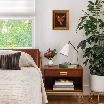
 Casework Inter Design
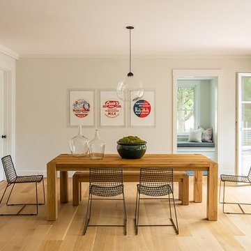
When the homeowners first purchased the 1925 house, it was compartmentalized, outdated, and completely unfunctional for their growing family. Casework designed the owner's previous kitchen and family room and was brought in to lead up the creative direction for the project. Casework teamed up with architect Paul Crowther and brother sister team Ainslie Davis on the addition and remodel of the Colonial.
The existing kitchen and powder bath were demoed and walls expanded to create a new footprint for the home. This created a much larger, more open kitchen and breakfast nook with mudroom, pantry and more private half bath. In the spacious kitchen, a large walnut island perfectly compliments the homes existing oak floors without feeling too heavy. Paired with brass accents, Calcutta Carrera marble countertops, and clean white cabinets and tile, the kitchen feels bright and open - the perfect spot for a glass of wine with friends or dinner with the whole family.
There was no official master prior to the renovations. The existing four bedrooms and one separate bathroom became two smaller bedrooms perfectly suited for the client’s two daughters, while the third became the true master complete with walk-in closet and master bath. There are future plans for a second story addition that would transform the current master into a guest suite and build out a master bedroom and bath complete with walk in shower and free standing tub.
Overall, a light, neutral palette was incorporated to draw attention to the existing colonial details of the home, like coved ceilings and leaded glass windows, that the homeowners fell in love with. Modern furnishings and art were mixed in to make this space an eclectic haven.
 Home Design & Decor Magazine
Mark Menjivar
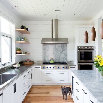
Inspiration for a transitional l-shaped medium tone wood floor kitchen remodel in Austin with an integrated sink, shaker cabinets, white cabinets, stainless steel countertops, gray backsplash, stainless steel appliances, an island and marble backsplash
Inspiration for a transitional l-shaped medium tone wood floor kitchen remodel in Austin with an integrated sink, shaker cabinets, white cabinets, stainless steel countertops, gray backsplash, stainless steel appliances, an island and marble backsplash
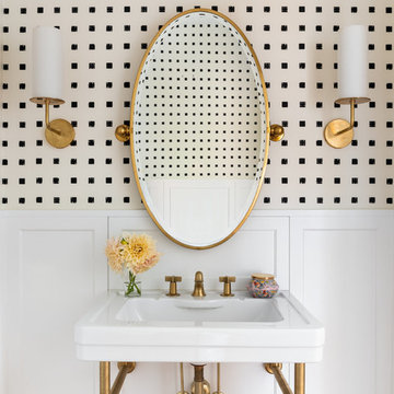 Casework Inter Design
When the homeowners first purchased the 1925 house, it was compartmentalized, outdated, and completely unfunctional for their growing family. Casework designed the owner's previous kitchen and family room and was brought in to lead up the creative direction for the project. Casework teamed up with architect Paul Crowther and brother sister team Ainslie Davis on the addition and remodel of the Colonial.
The existing kitchen and powder bath were demoed and walls expanded to create a new footprint for the home. This created a much larger, more open kitchen and breakfast nook with mudroom, pantry and more private half bath. In the spacious kitchen, a large walnut island perfectly compliments the homes existing oak floors without feeling too heavy. Paired with brass accents, Calcutta Carrera marble countertops, and clean white cabinets and tile, the kitchen feels bright and open - the perfect spot for a glass of wine with friends or dinner with the whole family.
There was no official master prior to the renovations. The existing four bedrooms and one separate bathroom became two smaller bedrooms perfectly suited for the client’s two daughters, while the third became the true master complete with walk-in closet and master bath. There are future plans for a second story addition that would transform the current master into a guest suite and build out a master bedroom and bath complete with walk in shower and free standing tub.
Overall, a light, neutral palette was incorporated to draw attention to the existing colonial details of the home, like coved ceilings and leaded glass windows, that the homeowners fell in love with. Modern furnishings and art were mixed in to make this space an eclectic haven.
Find the right local pro for your project
 Our Town Plans
Faith Allen
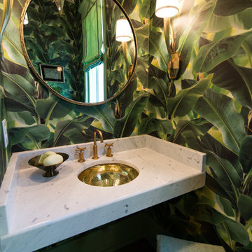
Example of a mid-sized island style powder room design in Atlanta with green walls, an undermount sink, marble countertops and white countertops
Example of a mid-sized island style powder room design in Atlanta with green walls, an undermount sink, marble countertops and white countertops
 ZeroEnergy Design
This LEED Platinum certified house reflects the homeowner's desire for an exceptionally healthy and comfortable living environment, within a traditional neighborhood.
INFILL SITE. The family, who moved from another area of Wellesley, sought out this property to be within walking distance of the high school and downtown area. An existing structure on the tight lot was removed to make way for the new home. 84% of the construction waste, from both the previous structure and the new home, was diverted from a landfill. ZED designed to preserve the existing mature trees on the perimeter of the property to minimize site impacts, and to maintain the character of the neighborhood as well as privacy on the site.
EXTERIOR EXPRESSION. The street facade of the home relates to the local New England vernacular. The rear uses contemporary language, a nod to the family’s Californian roots, to incorporate a roof deck, solar panels, outdoor living space, and the backyard swimming pool. ZED’s careful planning avoided to the need to face the garage doors towards the street, a common syndrome of a narrow lot.
THOUGHTFUL SPACE. Homes with dual entries can often result in duplicate and unused spaces. In this home, the everyday and formal entry areas are one and the same; the front and garage doors share the entry program of coat closets, mudroom storage with bench for removing your shoes, and a laundry room with generous closets for the children's sporting equipment. The entry area leads directly to the living space, encompassing the kitchen, dining and sitting area areas in an L-shaped open plan arrangement. The kitchen is placed at the south-west corner of the space to allow for a strong connection to the dining, sitting and outdoor living spaces. A fire pit on the deck satisfies the family’s desire for an open flame while a sealed gas fireplace is used indoors - ZED’s preference after omitting gas burning appliances completely from an airtight home. A small study, with a window seat, is conveniently located just off of the living space. A first floor guest bedroom includes an accessible bathroom for aging visitors and can be used as a master suite to accommodate aging in place.
HEALTHY LIVING. The client requested a home that was easy to clean and would provide a respite from seasonal allergies and common contaminants that are found in many indoor spaces. ZED selected easy to clean solid surface flooring throughout, provided ample space for cleaning supplies on each floor, and designed a mechanical system with ventilation that provides a constant supply of fresh outdoor air. ZED selected durable materials, finishes, cabinetry, and casework with low or no volatile organic compounds (VOCs) and no added urea formaldehyde.
YEAR-ROUND COMFORT. The home is super insulated and air-tight, paired with high performance triple-paned windows, to ensure it is draft-free throughout the winter (even when in front of the large windows and doors). ZED designed a right-sized heating and cooling system to pair with the thermally improved building enclosure to ensure year-round comfort. The glazing on the home maximizes passive solar gains, and facilitates cross ventilation and daylighting.
ENERGY EFFICIENT. As one of the most energy efficient houses built to date in Wellesley, the home highlights a practical solution for Massachusetts. First, the building enclosure reduces the largest energy requirement for typical houses (heating). Super-insulation, exceptional air sealing, a thermally broken wall assembly, triple pane windows, and passive solar gain combine for a sizable heating load reduction. Second, within the house only efficient systems consume energy. These include an air source heat pump for heating & cooling, a heat pump hot water heater, LED lighting, energy recovery ventilation, and high efficiency appliances. Lastly, photovoltaics provide renewable energy help offset energy consumption. The result is an 89% reduction in energy use compared to a similar brand new home built to code requirements.
RESILIENT. The home will fare well in extreme weather events. During a winter power outage, heat loss will be very slow due to the super-insulated and airtight envelope– taking multiple days to drop to 60 degrees even with no heat source. An engineered drainage system, paired with careful the detailing of the foundation, will help to keep the finished basement dry. A generator will provide full operation of the all-electric house during a power outage.
OVERALL. The home is a reflection of the family goals and an expression of their values, beautifully enabling health, comfort, safety, resilience, and utility, all while respecting the planet.
ZED - Architect & Mechanical Designer
Bevilacqua Builders Inc - Contractor
Creative Land & Water Engineering - Civil Engineering
Barbara Peterson Landscape - Landscape Design
Nest & Company - Interior Furnishings
Eric Roth Photography - Photography
 Edgewater Design Group
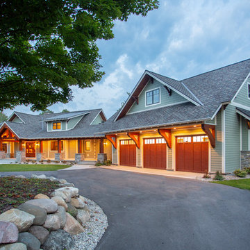
Our clients already had a cottage on Torch Lake that they loved to visit. It was a 1960s ranch that worked just fine for their needs. However, the lower level walkout became entirely unusable due to water issues. After purchasing the lot next door, they hired us to design a new cottage. Our first task was to situate the home in the center of the two parcels to maximize the view of the lake while also accommodating a yard area. Our second task was to take particular care to divert any future water issues. We took necessary precautions with design specifications to water proof properly, establish foundation and landscape drain tiles / stones, set the proper elevation of the home per ground water height and direct the water flow around the home from natural grade / drive. Our final task was to make appealing, comfortable, living spaces with future planning at the forefront. An example of this planning is placing a master suite on both the main level and the upper level. The ultimate goal of this home is for it to one day be at least a 3/4 of the year home and designed to be a multi-generational heirloom.
- Jacqueline Southby Photography
 Design Loves Detail
Aria Bethards
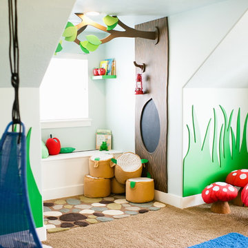
Kids' room - contemporary gender-neutral kids' room idea in Salt Lake City
Kids' room - contemporary gender-neutral kids' room idea in Salt Lake City


 Casework Inter Design
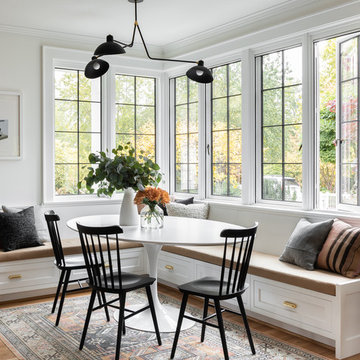
When the homeowners first purchased the 1925 house, it was compartmentalized, outdated, and completely unfunctional for their growing family. Casework designed the owner's previous kitchen and family room and was brought in to lead up the creative direction for the project. Casework teamed up with architect Paul Crowther and brother sister team Ainslie Davis on the addition and remodel of the Colonial.
The existing kitchen and powder bath were demoed and walls expanded to create a new footprint for the home. This created a much larger, more open kitchen and breakfast nook with mudroom, pantry and more private half bath. In the spacious kitchen, a large walnut island perfectly compliments the homes existing oak floors without feeling too heavy. Paired with brass accents, Calcutta Carrera marble countertops, and clean white cabinets and tile, the kitchen feels bright and open - the perfect spot for a glass of wine with friends or dinner with the whole family.
There was no official master prior to the renovations. The existing four bedrooms and one separate bathroom became two smaller bedrooms perfectly suited for the client’s two daughters, while the third became the true master complete with walk-in closet and master bath. There are future plans for a second story addition that would transform the current master into a guest suite and build out a master bedroom and bath complete with walk in shower and free standing tub.
Overall, a light, neutral palette was incorporated to draw attention to the existing colonial details of the home, like coved ceilings and leaded glass windows, that the homeowners fell in love with. Modern furnishings and art were mixed in to make this space an eclectic haven.
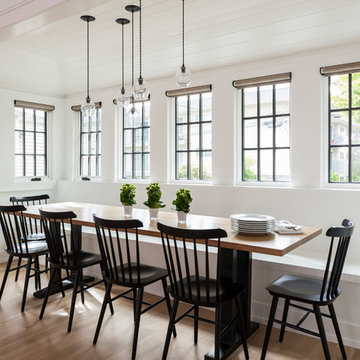
 RW Anderson Homes
Interior Design by ecd Design LLC
This newly remodeled home was transformed top to bottom. It is, as all good art should be “A little something of the past and a little something of the future.” We kept the old world charm of the Tudor style, (a popular American theme harkening back to Great Britain in the 1500’s) and combined it with the modern amenities and design that many of us have come to love and appreciate. In the process, we created something truly unique and inspiring.
RW Anderson Homes is the premier home builder and remodeler in the Seattle and Bellevue area. Distinguished by their excellent team, and attention to detail, RW Anderson delivers a custom tailored experience for every customer. Their service to clients has earned them a great reputation in the industry for taking care of their customers.
Working with RW Anderson Homes is very easy. Their office and design team work tirelessly to maximize your goals and dreams in order to create finished spaces that aren’t only beautiful, but highly functional for every customer. In an industry known for false promises and the unexpected, the team at RW Anderson is professional and works to present a clear and concise strategy for every project. They take pride in their references and the amount of direct referrals they receive from past clients.
RW Anderson Homes would love the opportunity to talk with you about your home or remodel project today. Estimates and consultations are always free. Call us now at 206-383-8084 or email Ryan@rwandersonhomes.com.
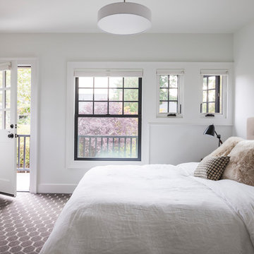 RW Anderson Homes
Interior Design by ecd Design LLC
This newly remodeled home was transformed top to bottom. It is, as all good art should be “A little something of the past and a little something of the future.” We kept the old world charm of the Tudor style, (a popular American theme harkening back to Great Britain in the 1500’s) and combined it with the modern amenities and design that many of us have come to love and appreciate. In the process, we created something truly unique and inspiring.
RW Anderson Homes is the premier home builder and remodeler in the Seattle and Bellevue area. Distinguished by their excellent team, and attention to detail, RW Anderson delivers a custom tailored experience for every customer. Their service to clients has earned them a great reputation in the industry for taking care of their customers.
Working with RW Anderson Homes is very easy. Their office and design team work tirelessly to maximize your goals and dreams in order to create finished spaces that aren’t only beautiful, but highly functional for every customer. In an industry known for false promises and the unexpected, the team at RW Anderson is professional and works to present a clear and concise strategy for every project. They take pride in their references and the amount of direct referrals they receive from past clients.
RW Anderson Homes would love the opportunity to talk with you about your home or remodel project today. Estimates and consultations are always free. Call us now at 206-383-8084 or email Ryan@rwandersonhomes.com.
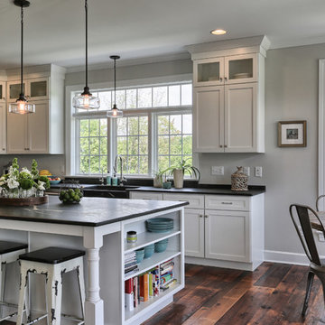
 Metzler Home Builders
Photo Credit: Annie M Design
Inspiration for a cottage dark wood floor eat-in kitchen remodel in Other with a farmhouse sink, shaker cabinets, white cabinets and an island
Inspiration for a cottage dark wood floor eat-in kitchen remodel in Other with a farmhouse sink, shaker cabinets, white cabinets and an island
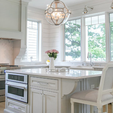
 Geneva Cabinet
 http://genevacabinet.com, GENEVA CABINET COMPANY, LLC , Lake Geneva, WI., Lake house with open kitchen,Shiloh cabinetry pained finish in Repose Grey, Essex door style with beaded inset, corner cabinet, decorative pulls, appliance panels, Definite Quartz Viareggio countertops
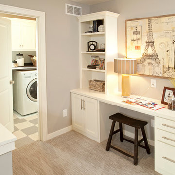
 Robert Thomas Homes
This home is built by Robert Thomas Homes located in Minnesota. Our showcase models are professionally staged. Please contact Ambiance at Home for information on furniture - 952.440.6757

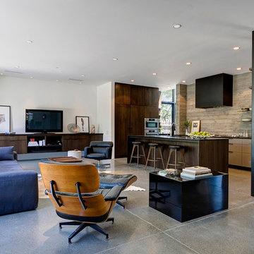
 a.d.d. concept + design
Inspiration for a large country concrete floor living room remodel in San Francisco
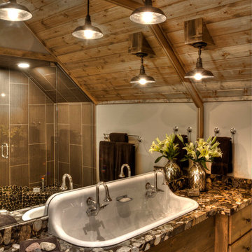
 Lands End Development - Designers & Builders
Bathroom - rustic brown tile bathroom idea in Minneapolis with a trough sink, shaker cabinets, medium tone wood cabinets and beige walls

 Highmark Builders
Professionally Staged by Ambience at Home
http://ambiance-athome.com/
Professionally Photographed by SpaceCrafting
http://spacecrafting.com
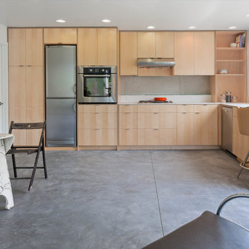
 b9 architects
Our client’s goal was to create a small, high-performance, healthy home for herself and her teenage son while providing a place for her father to age in place. An attached private accessory dwelling provides a space for him as well as flexibility in the future. The new home was designed to minimize its footprint on site, made smaller than the original 1930’s house.
Embracing adaptability and efficiency, the residence includes two dwellings: a one-bedroom 795 square-foot accessory dwelling at the lower grade and a two-story 1330 square-foot primary dwelling located above. Involved in all aspects of project execution, our client oversaw the process by living in a used trailer parked in the backyard throughout the project’s construction. Family-Share focused on maximizing the footprint’s performance, access to natural light and the health of the occupants. Sustainable features include high-performance glazing, solar preheat for domestic and hot water in-floor heating and reclaimed fir car decking rainscreen siding.

 User
UserMarcel Page Photography
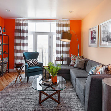
Inspiration for a small contemporary open concept light wood floor living room remodel in Chicago with orange walls and no fireplace
Inspiration for a small contemporary open concept light wood floor living room remodel in Chicago with orange walls and no fireplace

 Vetter Architects
The client’s request was quite common - a typical 2800 sf builder home with 3 bedrooms, 2 baths, living space, and den. However, their desire was for this to be “anything but common.” The result is an innovative update on the production home for the modern era, and serves as a direct counterpoint to the neighborhood and its more conventional suburban housing stock, which focus views to the backyard and seeks to nullify the unique qualities and challenges of topography and the natural environment.
The Terraced House cautiously steps down the site’s steep topography, resulting in a more nuanced approach to site development than cutting and filling that is so common in the builder homes of the area. The compact house opens up in very focused views that capture the natural wooded setting, while masking the sounds and views of the directly adjacent roadway. The main living spaces face this major roadway, effectively flipping the typical orientation of a suburban home, and the main entrance pulls visitors up to the second floor and halfway through the site, providing a sense of procession and privacy absent in the typical suburban home.
Clad in a custom rain screen that reflects the wood of the surrounding landscape - while providing a glimpse into the interior tones that are used. The stepping “wood boxes” rest on a series of concrete walls that organize the site, retain the earth, and - in conjunction with the wood veneer panels - provide a subtle organic texture to the composition.
The interior spaces wrap around an interior knuckle that houses public zones and vertical circulation - allowing more private spaces to exist at the edges of the building. The windows get larger and more frequent as they ascend the building, culminating in the upstairs bedrooms that occupy the site like a tree house - giving views in all directions.
The Terraced House imports urban qualities to the suburban neighborhood and seeks to elevate the typical approach to production home construction, while being more in tune with modern family living patterns.
Overview
Elm Grove
Size
2,800 sf
3 bedrooms, 2 bathrooms
Completion Date
September 2014
Services
Architecture, Landscape Architecture
Interior Consultants: Amy Carman Design
Steve Gotter

 TKS Design Group
Download our free ebook, Creating the Ideal Kitchen. DOWNLOAD NOW
This client was referred to us from a past client. They are a busy 2-career household with young children and enjoy entertaining friends and family in their home. They have a beautiful open concept home but unfortunately the kitchen was not fitting for the rest of the home. They were not quite sure what to do with the space. We talked about trying to refresh it or do more of a minor remodel, but in the end they decided a full gut would get them to where they wanted to be.
One problem was there was no place for guests to hang out other than the large and awkward banquette area. The brick wall and tiled hood area were feeling a bit dated and tired. The space was just not functional for their lifestyle. There was no prep space near the cooktop and no landing area for items coming out of the ovens or refrigerator, plus a big dead zone in the center of the room.
Banquettes, like the one they previously had in the space, are great for small spaces, but when they get really large like this one, it makes getting in and out of the seating area awkward and uncomfortable. Plus, there was room for a large table, so we eliminated the awkward built in.
We started by removing the faux brick wall between the kitchen and back entry. We relocated the entry to the garage over a couple feet in order to get every last inch out of the new kitchen. We also made the decision to close up the primary window that faced the pretty ho hum brick wall of the neighbor’s house. There was plenty of light coming in from the seating area, so we just didn’t feel the window was adding much to the room.
Construction went smoothy. There was a bit of rework with electrical, flooring and HVAC, but in the end, we think it was well worth it.
The clients really wanted a sleek contemporary look, and we originally had planned for a full height slab backsplash, but due to it’s size, it was a budget buster. Instead, we got creative and settled on large format porcelain tiles that have a similar feel but were a fraction of the cost. We made sure the wall was plumb and level so that the fit and finish would mimic that of slab material.
The final space was quite a change. A large prep sink sits directly across from the new pro-style range with plenty additional prep space on the large island. The refrigerator and ovens now have miles of landing space, and a nice tight work triangle makes cooking a breeze.
Since we wanted a more contemporary feel, not many wall cabinets were included. Instead, we outfitted some of the drawers for dish storage with a peg system. Two large pantries flanking the refrigerator hold baking supplies and small appliances. Large drawers by the cooktop hold pots and pans, and an appliance garage tucked away to the left of the range hides away miscellaneous items. The large island also houses a microwave drawer and tons of storage, most of which is drawers offering maximum convenience.
The island now seats 5-6 people comfortably along with the new table in the seating area which can seat up to 8. Entertaining will be a breeze in this space. With such a clean backdrop, we knew we would need some drama with the lighting, so we chose two sets of staggered pendants, which we adjusted for the right visual balance above the island.
We also included a small coffee station to the right of the main kitchen, which helps keep the coffee clutter out of the kitchen proper. Two tones of complimentary gray are featured in this kitchen. The perimeter is a light gray that reads almost white. The island is a gray stain that adds some depth and interest with the visible wood texture. The countertops are clean white quartz, and the hardware, barstools and light fixtures add warm brass tones. I see lots of cooking and entertaining with family and friends in the near future in this bright and airy new space.
Designed by: Susan Klimala, CKD, CBD
Photography by: Michael Kaskel
For more information on kitchen and bath design ideas go to: www.kitchenstudio-ge.com
1