
Search results for "Gain flows" in Home Design Ideas
 House of L
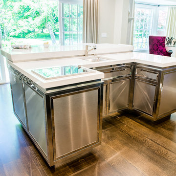
A traditional Georgian home receives an incredible transformation with an addition to expand the originally compact kitchen and create a pathway into the family room and dining area, opening the flow of the spaces that allow for fluid movement from each living space for the young family of four. Taking the lead from the client's desire to have a contemporary and edgier feel to their home's very classic facade, House of L worked with the architect's addition to the existing kitchen to design a kitchen that was incredibly functional and gorgeously dramatic, beckoning people to grab a barstool and hang out. Glossy macassar ebony wood is complimented with lacquered white cabinets for an amazing study in contrast. An oversized brushed nickel hood with polished nickel banding makes a presence on the feature wall of the kitchen. Brushed and polished nickel details are peppered in the landscape of this room, including the cabinets in the second island, a storage cabinet and automated hopper doors by Hafele on the refrigeration wall and all of the cabinet hardware, supplied and custom sized by Rajack. White quartz countertops by Hanstone in the Bianco Canvas colorway float on all the perimeter cabinets and the secondary island and creates a floating frame for the Palomino Quartzite that is a highlight in the kitchen and lends an organic feel to the clean lines of the millwork. The backsplash area behind the rangetop is a brick patterned mosaic blend of stone and glass, while surrounding walls have a layered sandstone tile that lend an incredible texture to the room. The light fixture hanging above the second island is by Wells Long and features faceted metal polygons with an amber gold interior. Woven linen drapes at window winks at the warmer tones in the room with a lustrous sheen that catches the natural light filtering in. The rift and sawn cut white oak floors are 8" planks that were fitted and finished on site to match the existing floor in the family and dining rooms. The clients were very clear on the appliances they needed the kitchen to accommodate. In addition to the vast expanses of wall space that were gained with the kitchen addition the larger footprint allowed for two sizeable islands and a host of cooking amenities, including a 48" rangetop, two double ovens, a warming drawer, and a built-in coffee maker by Miele and a 36" Refrigerator and Freezer and a beverage drawer by Subzero. A fabulous stainless steel Kallista sink by Mick De Giulio's series for the company is fitted in the first island which serves as a prep area, flanked by an Asko dishwasher to the right. A Dorenbracht faucet is a strong compliment to the scale of the sink. A smaller Kallista stainless sink is centered in the second island which has a secondary burner by Miele for overflow cooking.
Jason Miller, Pixelate
 JWH Design and Cabinetry LLC
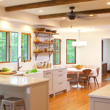
Previously a small and dark Tudor kitchen, these combined spaces let in light, flow and function...and gained even more charm.
Designer: Jennifer Howard, JWH
Contractor: JWH Construction Management
Photographer: Mick Hales
 Marvin
Architect: Patrick Ahearn Architect LLC
Construction: Rosbeck
BuildersInteriors: Slifer Designs
Photography By: Greg Premru
“Rigorously symmetrical yet relaxed in shape and proportions, this house is very well executed inside and out. It feels appropriately sized for its site and is well detailed. It’s by far the best of the Shingle Style submittals.”
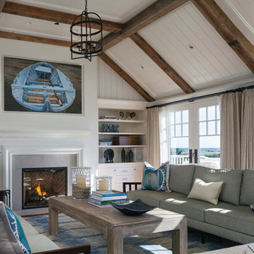
The project is a new construction of a family compound consisting of two new houses and associated site development along South Beach. Due to the topography of the nearby dunes, the living spaces of the main and guest houses were located on the second floor in order to gain the panoramic views of the ocean and extended coastline beyond. The challenge was to create a shingle-style island vernacular architecture that did not reflect the upside-down nature of the primary living space.
The inspiration was based on the desire to take a large program and break it into smaller architectural elements based on the idea that the homes could have originally been constructed in the 1920s or 1930s and then added onto over time. This concept of "implied history" is one that creates a legacy of a seaside architecture from the rich history of New England’s past, yet has evolved into how people want to live today.
The Marvin products, with their hurricane-resistant capabilities, were a clear choice based on this locale. The use of the folding door systems allowed for the ease of flow from indoor to outdoor spaces in a timeless way.
Find the right local pro for your project
 House of L
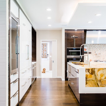
A traditional Georgian home receives an incredible transformation with an addition to expand the originally compact kitchen and create a pathway into the family room and dining area, opening the flow of the spaces that allow for fluid movement from each living space for the young family of four. Taking the lead from the client's desire to have a contemporary and edgier feel to their home's very classic facade, House of L worked with the architect's addition to the existing kitchen to design a kitchen that was incredibly functional and gorgeously dramatic, beckoning people to grab a barstool and hang out. Glossy macassar ebony wood is complimented with lacquered white cabinets for an amazing study in contrast. An oversized brushed nickel hood with polished nickel banding makes a presence on the feature wall of the kitchen. Brushed and polished nickel details are peppered in the landscape of this room, including the cabinets in the second island, a storage cabinet and automated hopper doors by Hafele on the refrigeration wall and all of the cabinet hardware, supplied and custom sized by Rajack. White quartz countertops by Hanstone in the Bianco Canvas colorway float on all the perimeter cabinets and the secondary island and creates a floating frame for the Palomino Quartzite that is a highlight in the kitchen and lends an organic feel to the clean lines of the millwork. The backsplash area behind the rangetop is a brick patterned mosaic blend of stone and glass, while surrounding walls have a layered sandstone tile that lend an incredible texture to the room. The light fixture hanging above the second island is by Wells Long and features faceted metal polygons with an amber gold interior. Woven linen drapes at window winks at the warmer tones in the room with a lustrous sheen that catches the natural light filtering in. The rift and sawn cut white oak floors are 8" planks that were fitted and finished on site to match the existing floor in the family and dining rooms. The clients were very clear on the appliances they needed the kitchen to accommodate. In addition to the vast expanses of wall space that were gained with the kitchen addition the larger footprint allowed for two sizeable islands and a host of cooking amenities, including a 48" rangetop, two double ovens, a warming drawer, and a built-in coffee maker by Miele and a 36" Refrigerator and Freezer and a beverage drawer by Subzero. A fabulous stainless steel Kallista sink by Mick De Giulio's series for the company is fitted in the first island which serves as a prep area, flanked by an Asko dishwasher to the right. A Dorenbracht faucet is a strong compliment to the scale of the sink. A smaller Kallista stainless sink is centered in the second island which has a secondary burner by Miele for overflow cooking.
Jason Miller, Pixelate
 The Artisans Group, Inc.
Winner of the 2018 Tour of Homes Best Remodel, this whole house re-design of a 1963 Bennet & Johnson mid-century raised ranch home is a beautiful example of the magic we can weave through the application of more sustainable modern design principles to existing spaces.
We worked closely with our client on extensive updates to create a modernized MCM gem.
Extensive alterations include:
- a completely redesigned floor plan to promote a more intuitive flow throughout
- vaulted the ceilings over the great room to create an amazing entrance and feeling of inspired openness
- redesigned entry and driveway to be more inviting and welcoming as well as to experientially set the mid-century modern stage
- the removal of a visually disruptive load bearing central wall and chimney system that formerly partitioned the homes’ entry, dining, kitchen and living rooms from each other
- added clerestory windows above the new kitchen to accentuate the new vaulted ceiling line and create a greater visual continuation of indoor to outdoor space
- drastically increased the access to natural light by increasing window sizes and opening up the floor plan
- placed natural wood elements throughout to provide a calming palette and cohesive Pacific Northwest feel
- incorporated Universal Design principles to make the home Aging In Place ready with wide hallways and accessible spaces, including single-floor living if needed
- moved and completely redesigned the stairway to work for the home’s occupants and be a part of the cohesive design aesthetic
- mixed custom tile layouts with more traditional tiling to create fun and playful visual experiences
- custom designed and sourced MCM specific elements such as the entry screen, cabinetry and lighting
- development of the downstairs for potential future use by an assisted living caretaker
- energy efficiency upgrades seamlessly woven in with much improved insulation, ductless mini splits and solar gain

 Hardy Interior Design
Chris Nascimento
Bathroom - mid-sized transitional master beige tile and porcelain tile porcelain tile bathroom idea in Portland with an undermount sink, raised-panel cabinets, medium tone wood cabinets, granite countertops, a two-piece toilet and beige walls
Bathroom - mid-sized transitional master beige tile and porcelain tile porcelain tile bathroom idea in Portland with an undermount sink, raised-panel cabinets, medium tone wood cabinets, granite countertops, a two-piece toilet and beige walls
 Pineapple House Interior Design
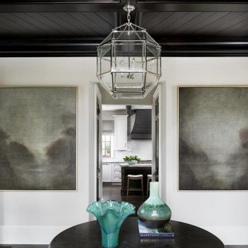
A young family with two small children was willing to renovate in order to create an open, livable home, conducive to seeing everywhere and being together. Their kitchen was isolated so was key to project’s success, as it is the central axis of the first level. Pineapple House decided to make it, literally, the “heart of the home.” We started at the front of the home and removed one of the two staircases, plus the existing powder room and pantry. In the space gained after removing the stairwell, pantry and powder room, we were able to reconfigure the entry. We created a new central hall, which was flanked by a new pantry and new powder room. This created symmetry, added a view and allowed natural light from the foyer to telegraph into the kitchen. We change the front door swing to enhance the view and the traffic flow upon entry into the house. The improvements were honored in 2018 when this home won an ASID Design Excellence Award for the year's Best Kitchen.
Galina Coada Photography

 Westover Landscape Design
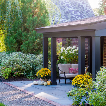
Not everyone would see the hidden beauty in the Yonkers property destined for the wrecking ball in 2000. But one family took the serious fixer-upper under their wing. Crumbling walls, overgrown maples (indeed, saplings were busting through the brick walls), and deer living in the basement was the state of affairs when Westover Landscape Design initially arrived on the scene. A year of intensive, meticulous, thoughtful renovation by the homeowner followed while the house was brought up to speed. When the last construction machine finally rumbled out, that’s when Robert Welsch and his crew began their odyssey.
The goal was to honor the newly restored relic and deliver it into the future with fitting surroundings. “We wanted to bring that treasure back to life,” Robert Welsch explains. Working closely with the homeowner as well as the city of Yonkers to guide the restoration, their first feat was to install a proper drainage system with catchments capable of keeping storm water from the massive roof flowing away. Before anything was visible on the surface, extensive work was accomplished underground. Meanwhile, a plan was drafted to honor the era of the house. Westover chose bluestone as the primary path material for its easy maintenance and simplicity when laying the swank configuration of pathways around the house and outward to an entertaining pavilion. By cleverly hemming the bluestone with period brick that echoes the building material for the house for continuity, the result is a smart and sophisticated finish to a promenade that constantly draws the family and their pets outdoors. Brick was also used to rebuild the walled gardens for the much-needed privacy in a close-knit Yonkers community. And a graceful wrought iron gate enhances the arrival experience. But walls and gates were not the only element to screen and reveal views—plant selection was critical.
Few landscapers would go the extra mile to find period perfect plants for a 19th Century restoration, but Robert Welsch saw the importance of authenticity in creating the mood. He repeated large trees—such as an exquisite London plane tree in the front yard—to balance the expression in the back. Recognizing the need for immediate stature, he selected a weeping willow to gain instant volume, giving the landscape a sense of deep roots. A weeping Camperdown elm adds sophisticated drama to the walled stroll gardens. Hydrangeas were incorporated for their billowy stature, easy maintenance, and long blooming season. Similarly, all the plants in residence play their part in the display that goes beyond the usual spring fling to extend throughout the growing season—offering visual interest even when they are not performing. From spring bulbs to autumn perennials, there is never a dull moment. Meanwhile, every step along the way was a collaboration working hand-in-hand with the homeowner and the city to make certain that the historic landmark status of the property was upheld and honored.
The result goes beyond a landscape that is just old faithful. It adds life to the picture, creating a jewel-like setting for the newly proud house. In a word, it is sublime. By planting wisely and using sustainable elements, the restored house and its surroundings are ready for the next generation and beyond. This Yonkers gem remains meticulously groomed under the watchful eye and skill of Westover Landscape Design’s team of gardeners—It’s a keeper.
 Saikley Architects
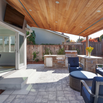
Our busy Silicon Valley clients asked us to convert their tight-quartered 1960’s ranch house to a gracious family home that would meet their long term needs. Ease of living was paramount, both in functionality and in ordered design.
The project was completed on a moderate budget.While retaining most of the structure of the existing house to avoid costly structural changes, we opened walls to improve the sight lines and flow of the house and bring in more light. We made small additions at the front and back bedrooms to gain space for the family and relatives. An existing underused patio area was improved with a simple outdoor kitchen and overhang to extend the living space to the outside. Costs were kept down with choices of modest materials.
Everything was made to be functional. Ample storage has been built into the right places. The details of the kitchen were carefully worked out to accommodate all the wishes of the various cooks in the family. The house is set up to be easy to keep clean. Acoustic walls separate living from bedroom spaces so adults can enjoy time together while children sleep. The outdoor kitchen has easy access to the indoor kitchen and the garage, and its setup promotes socializing while cooking outdoors.
A large part of the narrow back yard was previously unusable space due to a steep slope up to a neighbor’s higher fence. With a new retaining wall and some re-grading we took back more of the yard for the patio and play space on a new lawn.
The remodeled house is a mix of contemporary and traditional elements. Cool colors have a calming effect. Traditional items such as prairie style windows, trellis, mosaic tiles, and Shaker style cabinets, break down the scale in an otherwise streamlined, contemporary design. A new gabled roof with a broad arch at the front of the house marks the entry and resolves a challenging form where the central entry is set back from walls on both sides.
Photography: Kurt Manley
https://saikleyarchitects.com/portfolio/modern-ranch/
 Westover Landscape Design
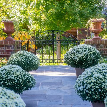
Not everyone would see the hidden beauty in the Yonkers property destined for the wrecking ball in 2000. But one family took the serious fixer-upper under their wing. Crumbling walls, overgrown maples (indeed, saplings were busting through the brick walls), and deer living in the basement was the state of affairs when Westover Landscape Design initially arrived on the scene. A year of intensive, meticulous, thoughtful renovation by the homeowner followed while the house was brought up to speed. When the last construction machine finally rumbled out, that’s when Robert Welsch and his crew began their odyssey.
The goal was to honor the newly restored relic and deliver it into the future with fitting surroundings. “We wanted to bring that treasure back to life,” Robert Welsch explains. Working closely with the homeowner as well as the city of Yonkers to guide the restoration, their first feat was to install a proper drainage system with catchments capable of keeping storm water from the massive roof flowing away. Before anything was visible on the surface, extensive work was accomplished underground. Meanwhile, a plan was drafted to honor the era of the house. Westover chose bluestone as the primary path material for its easy maintenance and simplicity when laying the swank configuration of pathways around the house and outward to an entertaining pavilion. By cleverly hemming the bluestone with period brick that echoes the building material for the house for continuity, the result is a smart and sophisticated finish to a promenade that constantly draws the family and their pets outdoors. Brick was also used to rebuild the walled gardens for the much-needed privacy in a close-knit Yonkers community. And a graceful wrought iron gate enhances the arrival experience. But walls and gates were not the only element to screen and reveal views—plant selection was critical.
Few landscapers would go the extra mile to find period perfect plants for a 19th Century restoration, but Robert Welsch saw the importance of authenticity in creating the mood. He repeated large trees—such as an exquisite London plane tree in the front yard—to balance the expression in the back. Recognizing the need for immediate stature, he selected a weeping willow to gain instant volume, giving the landscape a sense of deep roots. A weeping Camperdown elm adds sophisticated drama to the walled stroll gardens. Hydrangeas were incorporated for their billowy stature, easy maintenance, and long blooming season. Similarly, all the plants in residence play their part in the display that goes beyond the usual spring fling to extend throughout the growing season—offering visual interest even when they are not performing. From spring bulbs to autumn perennials, there is never a dull moment. Meanwhile, every step along the way was a collaboration working hand-in-hand with the homeowner and the city to make certain that the historic landmark status of the property was upheld and honored.
The result goes beyond a landscape that is just old faithful. It adds life to the picture, creating a jewel-like setting for the newly proud house. In a word, it is sublime. By planting wisely and using sustainable elements, the restored house and its surroundings are ready for the next generation and beyond. This Yonkers gem remains meticulously groomed under the watchful eye and skill of Westover Landscape Design’s team of gardeners—It’s a keeper.
 House of L
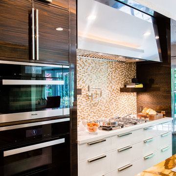
A traditional Georgian home receives an incredible transformation with an addition to expand the originally compact kitchen and create a pathway into the family room and dining area, opening the flow of the spaces that allow for fluid movement from each living space for the young family of four. Taking the lead from the client's desire to have a contemporary and edgier feel to their home's very classic facade, House of L worked with the architect's addition to the existing kitchen to design a kitchen that was incredibly functional and gorgeously dramatic, beckoning people to grab a barstool and hang out. Glossy macassar ebony wood is complimented with lacquered white cabinets for an amazing study in contrast. An oversized brushed nickel hood with polished nickel banding makes a presence on the feature wall of the kitchen. Brushed and polished nickel details are peppered in the landscape of this room, including the cabinets in the second island, a storage cabinet and automated hopper doors by Hafele on the refrigeration wall and all of the cabinet hardware, supplied and custom sized by Rajack. White quartz countertops by Hanstone in the Bianco Canvas colorway float on all the perimeter cabinets and the secondary island and creates a floating frame for the Palomino Quartzite that is a highlight in the kitchen and lends an organic feel to the clean lines of the millwork. The backsplash area behind the rangetop is a brick patterned mosaic blend of stone and glass, while surrounding walls have a layered sandstone tile that lend an incredible texture to the room. The light fixture hanging above the second island is by Wells Long and features faceted metal polygons with an amber gold interior. Woven linen drapes at window winks at the warmer tones in the room with a lustrous sheen that catches the natural light filtering in. The rift and sawn cut white oak floors are 8" planks that were fitted and finished on site to match the existing floor in the family and dining rooms. The clients were very clear on the appliances they needed the kitchen to accommodate. In addition to the vast expanses of wall space that were gained with the kitchen addition the larger footprint allowed for two sizeable islands and a host of cooking amenities, including a 48" rangetop, two double ovens, a warming drawer, and a built-in coffee maker by Miele and a 36" Refrigerator and Freezer and a beverage drawer by Subzero. A fabulous stainless steel Kallista sink by Mick De Giulio's series for the company is fitted in the first island which serves as a prep area, flanked by an Asko dishwasher to the right. A Dorenbracht faucet is a strong compliment to the scale of the sink. A smaller Kallista stainless sink is centered in the second island which has a secondary burner by Miele for overflow cooking.
Jason Miller, Pixelate
 User
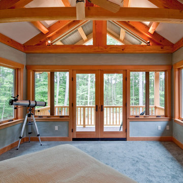
UserThe private home, reminiscent of Maine lodges and family camps, was designed to be a sanctuary for the family and their many relatives. Lassel Architects worked closely with the owners to meet their needs and wishes and collaborated thoroughly with the builder during the construction process to provide a meticulously crafted home.
The open-concept plan, framed by a unique timber frame inspired by Greene & Greene’s designs, provides large open spaces for entertaining with generous views to the lake, along with sleeping lofts that comfortably host a crowd overnight. Each of the family members' bedrooms was configured to provide a view to the lake. The bedroom wings pivot off a staircase which winds around a natural tree trunk up to a tower room with 360-degree views of the surrounding lake and forest. All interiors are framed with natural wood and custom-built furniture and cabinets reinforce daily use and activities.
The family enjoys the home throughout the entire year; therefore careful attention was paid to insulation, air tightness and efficient mechanical systems, including in-floor heating. The house was integrated into the natural topography of the site to connect the interior and exterior spaces and encourage an organic circulation flow. Solar orientation and summer and winter sun angles were studied to shade in the summer and take advantage of passive solar gain in the winter.
Equally important was the use of natural ventilation. The design takes into account cross-ventilation for each bedroom while high and low awning windows to allow cool air to move through the home replacing warm air in the upper floor. The tower functions as a private space with great light and views with the advantage of the Venturi effect on warm summer evenings.
Sandy Agrafiotis
 Thompson Remodeling
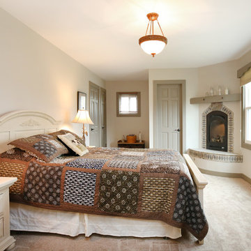
When dreaming about the perfect master suite remodel, there are two important ingredients that are always in the mix– the closet space and the master bath. Too often, existing homes will have small closets and baths in the master suite leaving homeowners frustrated and ultimately unsatisfied. At Thompson Remodeling, we have seen our share of strange configurations, but that’s part of the fun. We enjoy the challenge of reconfiguring space to make it work better for our clients.
In this recent master suite remodel, the existing floor plan had a small bath with vanities located in the bedroom not the bath, two reach-in closets, and a massive closet with a vaulted ceiling and skylight. Now, who doesn’t love a great big closet? But this one was roughly 11’x 14’ – big enough to be a bedroom!
To start, we decided to get rid of the two reach-in closets to make the main section of the bedroom larger, a gain of 66 square feet. In the massive closet space we designed a spacious bathroom and dressing area. With a window and skylight already in place, there is a ton of natural light. Next, we swapped the original bath space out for a closet.
The flow of this master bedroom is so much better now! Before, you would walk in to the room and be facing a double vanity sink. Now, there’s a small entryway that leads to a much more open and inviting space. The homeowners wanted an organic feel to the space and we used an existing corner fireplace to set the tone. Cream, muted grays and taupes are mixed with natural and weathered woods throughout.
We replaced glass block with a barn door made of reclaimed wood. This creates a beautiful focal point in the room.
In the bathroom, quartz countertops are accented with a stone mosaic backsplash. Maple cabinets with a java finish are a rich offset to the lighter wood vanity mirror and heated ceramic floor.
We think this new master suite remodel is stunning! What a major improvement in the functionality of the entire space.


 User
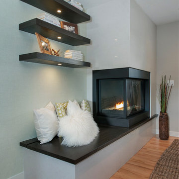
Userfireplace with floating shelves and LED lights
MHB Photo-Graf
This contemporary open concept is warm and inviting and centered around a sleek, clean kitchen making this main floor perfect for entertaining. The dark material gun metal ebony lower cabinets are accented by the ceasarstone frosty carrina countertops and ames tile and stone cobblestone pewter backsplash. The kitchen ties in the custom built-in entry bench and storage and flows into the dining and living areas. The original oak hardwood floors were refinished with a clear coat. The space is made brighter by the PLYGEM VISTA SERIES, ECO GAIN 180, DG WITH ARGON windows and subtle recessed lighting. The offset fireplace provides ambiance to the entire space. It is balanced by floating shelves with spot lighting and an exquisite bench.
 Kia Designs
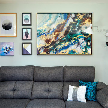
Got a big space to fill? Don't be scared to mix artworks. If you have a big piece, it might not necessarily go best in the centre.
Inspiration for a small contemporary open concept dark wood floor and brown floor living room remodel in London with blue walls, no fireplace and no tv
Inspiration for a small contemporary open concept dark wood floor and brown floor living room remodel in London with blue walls, no fireplace and no tv
 R Designs, LLC.
Mike Boatman
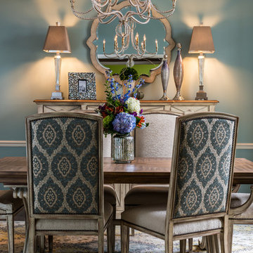
Example of a transitional carpeted enclosed dining room design in Kansas City with blue walls and no fireplace
Example of a transitional carpeted enclosed dining room design in Kansas City with blue walls and no fireplace

 Marvin
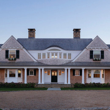
Architect: Patrick Ahearn Architect LLC
Construction: Rosbeck
BuildersInteriors: Slifer Designs
Photography By: Greg Premru
“Rigorously symmetrical yet relaxed in shape and proportions, this house is very well executed inside and out. It feels appropriately sized for its site and is well detailed. It’s by far the best of the Shingle Style submittals.”
The project is a new construction of a family compound consisting of two new houses and associated site development along South Beach. Due to the topography of the nearby dunes, the living spaces of the main and guest houses were located on the second floor in order to gain the panoramic views of the ocean and extended coastline beyond. The challenge was to create a shingle-style island vernacular architecture that did not reflect the upside-down nature of the primary living space.
The inspiration was based on the desire to take a large program and break it into smaller architectural elements based on the idea that the homes could have originally been constructed in the 1920s or 1930s and then added onto over time. This concept of "implied history" is one that creates a legacy of a seaside architecture from the rich history of New England’s past, yet has evolved into how people want to live today.
The Marvin products, with their hurricane-resistant capabilities, were a clear choice based on this locale. The use of the folding door systems allowed for the ease of flow from indoor to outdoor spaces in a timeless way.
 User
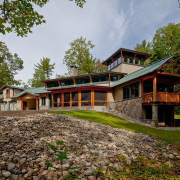
UserThe private home, reminiscent of Maine lodges and family camps, was designed to be a sanctuary for the family and their many relatives. Lassel Architects worked closely with the owners to meet their needs and wishes and collaborated thoroughly with the builder during the construction process to provide a meticulously crafted home.
The open-concept plan, framed by a unique timber frame inspired by Greene & Greene’s designs, provides large open spaces for entertaining with generous views to the lake, along with sleeping lofts that comfortably host a crowd overnight. Each of the family members' bedrooms was configured to provide a view to the lake. The bedroom wings pivot off a staircase which winds around a natural tree trunk up to a tower room with 360-degree views of the surrounding lake and forest. All interiors are framed with natural wood and custom-built furniture and cabinets reinforce daily use and activities.
The family enjoys the home throughout the entire year; therefore careful attention was paid to insulation, air tightness and efficient mechanical systems, including in-floor heating. The house was integrated into the natural topography of the site to connect the interior and exterior spaces and encourage an organic circulation flow. Solar orientation and summer and winter sun angles were studied to shade in the summer and take advantage of passive solar gain in the winter.
Equally important was the use of natural ventilation. The design takes into account cross-ventilation for each bedroom while high and low awning windows to allow cool air to move through the home replacing warm air in the upper floor. The tower functions as a private space with great light and views with the advantage of the Venturi effect on warm summer evenings.
Sandy Agrafiotis
 Dwellify
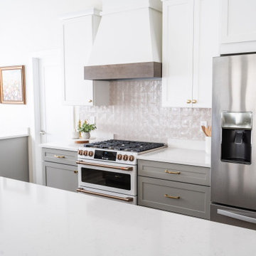
The transformation of this outdated kitchen was nothing short of remarkable, as it evolved into a tranquil and inviting space infused with subtle hues of peaceful blue. A dramatic shift was initiated by removing the outdated, yellow-toned wood cabinets, which instantly brightened and modernized the room. By strategically removing select cabinets and replacing them with floating shelves, the space gained an airy and open feel, allowing for both practical storage and stylish display. The decision to square off the layout by eliminating an awkward landing/island and introducing a spacious, 11-foot island with barstool counter space proved to be a game-changer, enhancing flow and functionality while maximizing the room's potential. To further enhance the serene ambiance, subtle shades of peaceful blues and greens were introduced between the backsplash and lower cabinets, creating a soothing backdrop for culinary endeavors. The cool blue tones were elegantly complemented by the addition of gold hardware, adding a touch of sophistication and warmth to the space. The result? A peaceful and bright kitchen that seamlessly blends style with functionality, providing the perfect setting for both cooking and entertaining alike.
13