
Search results for "Gain flows" in Home Design Ideas
 Katie Hutchison Studio
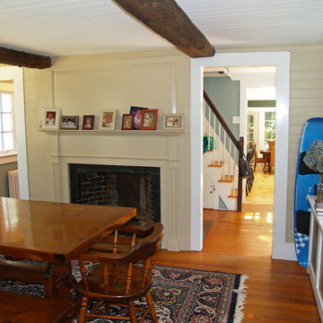
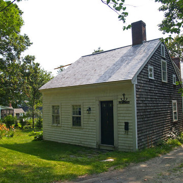
With two small children and a third on the way, the owners of an original eighteenth century Cape were quickly out-growing it, but they had no desire to move away from the Cape Cod home and location they loved. They simply needed a reconfigured layout and more space. Their goals included repurposing some existing rooms, adding a new kitchen/family area plus screen porch on the first level, and creating a master suite and roof deck with an outdoor shower on the second level, connected by a new stair.
Our challenge was to improve the flow between existing spaces, and design the two-story addition without overwhelming the pint-sized original Cape. We took advantage of the lower grade at the rear of the property to step the first floor of the addition down two steps from the existing main level. This allowed us to align the second floor in the addition with the existing second floor, while gaining ceiling height in the new first-floor kitchen/family area. We composed a cross-gabled form for the addition to improve the second floor headroom, while maintaining the existing eave line. We then extended some existing shed dormers to gain headroom and enhance function. We also expanded the outdoor living area with privacy walls along the roof deck.
New, larger, double–hung windows that match the lite configuration of the existing windows, along with new side-wall shingles and trim which resemble the existing exterior treatment help to tie the new addition to the old Cape. Though there’s no mistaking the new for the old, the two are simpatico.
Katie Hutchison Studio collaborated with Geoffrey Koper Architect of Yarmouth Port, Mass. on the Yarmouth Port Antique Cape Renovation and Addition. Kitchen fit-out and interior finishes, fixtures, and furnishings by others.
photo by Katie Hutchison
 Thomas Roszak Architecture, LLC
Photo credit: Scott McDonald @ Hedrich Blessing
7RR-Ecohome:
The design objective was to build a house for a couple recently married who both had kids from previous marriages. How to bridge two families together?
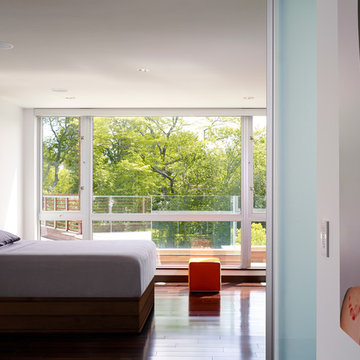
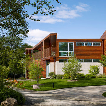
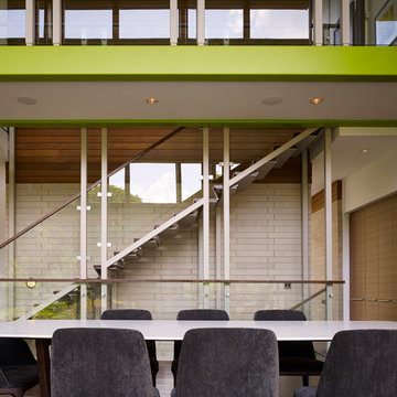
The design looks forward in terms of how people live today. The home is an experiment in transparency and solid form; removing borders and edges from outside to inside the house, and to really depict “flowing and endless space”. The house floor plan is derived by pushing and pulling the house’s form to maximize the backyard and minimize the public front yard while welcoming the sun in key rooms by rotating the house 45-degrees to true north. The angular form of the house is a result of the family’s program, the zoning rules, the lot’s attributes, and the sun’s path. We wanted to construct a house that is smart and efficient in terms of construction and energy, both in terms of the building and the user. We could tell a story of how the house is built in terms of the constructability, structure and enclosure, with a nod to Japanese wood construction in the method in which the siding is installed and the exposed interior beams are placed in the double height space. We engineered the house to be smart which not only looks modern but acts modern; every aspect of user control is simplified to a digital touch button, whether lights, shades, blinds, HVAC, communication, audio, video, or security. We developed a planning module based on a 6-foot square room size and a 6-foot wide connector called an interstitial space for hallways, bathrooms, stairs and mechanical, which keeps the rooms pure and uncluttered. The house is 6,200 SF of livable space, plus garage and basement gallery for a total of 9,200 SF. A large formal foyer celebrates the entry and opens up to the living, dining, kitchen and family rooms all focused on the rear garden. The east side of the second floor is the Master wing and a center bridge connects it to the kid’s wing on the west. Second floor terraces and sunscreens provide views and shade in this suburban setting. The playful mathematical grid of the house in the x, y and z axis also extends into the layout of the trees and hard-scapes, all centered on a suburban one-acre lot.
Many green attributes were designed into the home; Ipe wood sunscreens and window shades block out unwanted solar gain in summer, but allow winter sun in. Patio door and operable windows provide ample opportunity for natural ventilation throughout the open floor plan. Minimal windows on east and west sides to reduce heat loss in winter and unwanted gains in summer. Open floor plan and large window expanse reduces lighting demands and maximizes available daylight. Skylights provide natural light to the basement rooms. Durable, low-maintenance exterior materials include stone, ipe wood siding and decking, and concrete roof pavers. Design is based on a 2' planning grid to minimize construction waste. Basement foundation walls and slab are highly insulated. FSC-certified walnut wood flooring was used. Light colored concrete roof pavers to reduce cooling loads by as much as 15%. 2x6 framing allows for more insulation and energy savings. Super efficient windows have low-E argon gas filled units, and thermally insulated aluminum frames. Permeable brick and stone pavers reduce the site’s storm-water runoff. Countertops use recycled composite materials. Energy-Star rated furnaces and smart thermostats are located throughout the house to minimize duct runs and avoid energy loss. Energy-Star rated boiler that heats up both radiant floors and domestic hot water. Low-flow toilets and plumbing fixtures are used to conserve water usage. No VOC finish options and direct venting fireplaces maintain a high interior air quality. Smart home system controls lighting, HVAC, and shades to better manage energy use. Plumbing runs through interior walls reducing possibilities of heat loss and freezing problems. A large food pantry was placed next to kitchen to reduce trips to the grocery store. Home office reduces need for automobile transit and associated CO2 footprint. Plan allows for aging in place, with guest suite than can become the master suite, with no need to move as family members mature.
 Thomas Roszak Architecture, LLC
Photo credit: Scott McDonald @ Hedrich Blessing
7RR-Ecohome:
The design objective was to build a house for a couple recently married who both had kids from previous marriages. How to bridge two families together?
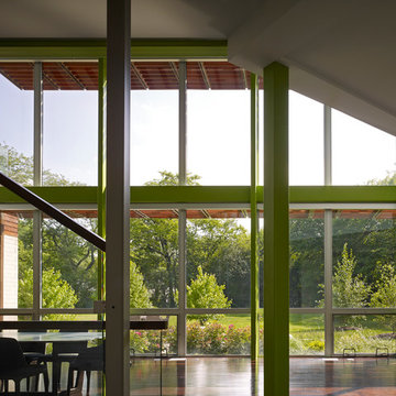
The design looks forward in terms of how people live today. The home is an experiment in transparency and solid form; removing borders and edges from outside to inside the house, and to really depict “flowing and endless space”. The house floor plan is derived by pushing and pulling the house’s form to maximize the backyard and minimize the public front yard while welcoming the sun in key rooms by rotating the house 45-degrees to true north. The angular form of the house is a result of the family’s program, the zoning rules, the lot’s attributes, and the sun’s path. We wanted to construct a house that is smart and efficient in terms of construction and energy, both in terms of the building and the user. We could tell a story of how the house is built in terms of the constructability, structure and enclosure, with a nod to Japanese wood construction in the method in which the siding is installed and the exposed interior beams are placed in the double height space. We engineered the house to be smart which not only looks modern but acts modern; every aspect of user control is simplified to a digital touch button, whether lights, shades, blinds, HVAC, communication, audio, video, or security. We developed a planning module based on a 6-foot square room size and a 6-foot wide connector called an interstitial space for hallways, bathrooms, stairs and mechanical, which keeps the rooms pure and uncluttered. The house is 6,200 SF of livable space, plus garage and basement gallery for a total of 9,200 SF. A large formal foyer celebrates the entry and opens up to the living, dining, kitchen and family rooms all focused on the rear garden. The east side of the second floor is the Master wing and a center bridge connects it to the kid’s wing on the west. Second floor terraces and sunscreens provide views and shade in this suburban setting. The playful mathematical grid of the house in the x, y and z axis also extends into the layout of the trees and hard-scapes, all centered on a suburban one-acre lot.
Many green attributes were designed into the home; Ipe wood sunscreens and window shades block out unwanted solar gain in summer, but allow winter sun in. Patio door and operable windows provide ample opportunity for natural ventilation throughout the open floor plan. Minimal windows on east and west sides to reduce heat loss in winter and unwanted gains in summer. Open floor plan and large window expanse reduces lighting demands and maximizes available daylight. Skylights provide natural light to the basement rooms. Durable, low-maintenance exterior materials include stone, ipe wood siding and decking, and concrete roof pavers. Design is based on a 2' planning grid to minimize construction waste. Basement foundation walls and slab are highly insulated. FSC-certified walnut wood flooring was used. Light colored concrete roof pavers to reduce cooling loads by as much as 15%. 2x6 framing allows for more insulation and energy savings. Super efficient windows have low-E argon gas filled units, and thermally insulated aluminum frames. Permeable brick and stone pavers reduce the site’s storm-water runoff. Countertops use recycled composite materials. Energy-Star rated furnaces and smart thermostats are located throughout the house to minimize duct runs and avoid energy loss. Energy-Star rated boiler that heats up both radiant floors and domestic hot water. Low-flow toilets and plumbing fixtures are used to conserve water usage. No VOC finish options and direct venting fireplaces maintain a high interior air quality. Smart home system controls lighting, HVAC, and shades to better manage energy use. Plumbing runs through interior walls reducing possibilities of heat loss and freezing problems. A large food pantry was placed next to kitchen to reduce trips to the grocery store. Home office reduces need for automobile transit and associated CO2 footprint. Plan allows for aging in place, with guest suite than can become the master suite, with no need to move as family members mature.
Find the right local pro for your project
 Katie Hutchison Studio
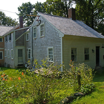
With two small children and a third on the way, the owners of an original eighteenth century Cape were quickly out-growing it, but they had no desire to move away from the Cape Cod home and location they loved. They simply needed a reconfigured layout and more space. Their goals included repurposing some existing rooms, adding a new kitchen/family area plus screen porch on the first level, and creating a master suite and roof deck with an outdoor shower on the second level, connected by a new stair.
Our challenge was to improve the flow between existing spaces, and design the two-story addition without overwhelming the pint-sized original Cape. We took advantage of the lower grade at the rear of the property to step the first floor of the addition down two steps from the existing main level. This allowed us to align the second floor in the addition with the existing second floor, while gaining ceiling height in the new first-floor kitchen/family area. We composed a cross-gabled form for the addition to improve the second floor headroom, while maintaining the existing eave line. We then extended some existing shed dormers to gain headroom and enhance function. We also expanded the outdoor living area with privacy walls along the roof deck.
New, larger, double–hung windows that match the lite configuration of the existing windows, along with new side-wall shingles and trim which resemble the existing exterior treatment help to tie the new addition to the old Cape. Though there’s no mistaking the new for the old, the two are simpatico.
Katie Hutchison Studio collaborated with Geoffrey Koper Architect of Yarmouth Port, Mass. on the Yarmouth Port Antique Cape Renovation and Addition. Kitchen fit-out and interior finishes, fixtures, and furnishings by others.
photo by Katie Hutchison
 Thomas Roszak Architecture, LLC
Photo credit: Scott McDonald @ Hedrich Blessing
7RR-Ecohome:
The design objective was to build a house for a couple recently married who both had kids from previous marriages. How to bridge two families together?
The design looks forward in terms of how people live today. The home is an experiment in transparency and solid form; removing borders and edges from outside to inside the house, and to really depict “flowing and endless space”. The house floor plan is derived by pushing and pulling the house’s form to maximize the backyard and minimize the public front yard while welcoming the sun in key rooms by rotating the house 45-degrees to true north. The angular form of the house is a result of the family’s program, the zoning rules, the lot’s attributes, and the sun’s path. We wanted to construct a house that is smart and efficient in terms of construction and energy, both in terms of the building and the user. We could tell a story of how the house is built in terms of the constructability, structure and enclosure, with a nod to Japanese wood construction in the method in which the siding is installed and the exposed interior beams are placed in the double height space. We engineered the house to be smart which not only looks modern but acts modern; every aspect of user control is simplified to a digital touch button, whether lights, shades, blinds, HVAC, communication, audio, video, or security. We developed a planning module based on a 6-foot square room size and a 6-foot wide connector called an interstitial space for hallways, bathrooms, stairs and mechanical, which keeps the rooms pure and uncluttered. The house is 6,200 SF of livable space, plus garage and basement gallery for a total of 9,200 SF. A large formal foyer celebrates the entry and opens up to the living, dining, kitchen and family rooms all focused on the rear garden. The east side of the second floor is the Master wing and a center bridge connects it to the kid’s wing on the west. Second floor terraces and sunscreens provide views and shade in this suburban setting. The playful mathematical grid of the house in the x, y and z axis also extends into the layout of the trees and hard-scapes, all centered on a suburban one-acre lot.
Many green attributes were designed into the home; Ipe wood sunscreens and window shades block out unwanted solar gain in summer, but allow winter sun in. Patio door and operable windows provide ample opportunity for natural ventilation throughout the open floor plan. Minimal windows on east and west sides to reduce heat loss in winter and unwanted gains in summer. Open floor plan and large window expanse reduces lighting demands and maximizes available daylight. Skylights provide natural light to the basement rooms. Durable, low-maintenance exterior materials include stone, ipe wood siding and decking, and concrete roof pavers. Design is based on a 2' planning grid to minimize construction waste. Basement foundation walls and slab are highly insulated. FSC-certified walnut wood flooring was used. Light colored concrete roof pavers to reduce cooling loads by as much as 15%. 2x6 framing allows for more insulation and energy savings. Super efficient windows have low-E argon gas filled units, and thermally insulated aluminum frames. Permeable brick and stone pavers reduce the site’s storm-water runoff. Countertops use recycled composite materials. Energy-Star rated furnaces and smart thermostats are located throughout the house to minimize duct runs and avoid energy loss. Energy-Star rated boiler that heats up both radiant floors and domestic hot water. Low-flow toilets and plumbing fixtures are used to conserve water usage. No VOC finish options and direct venting fireplaces maintain a high interior air quality. Smart home system controls lighting, HVAC, and shades to better manage energy use. Plumbing runs through interior walls reducing possibilities of heat loss and freezing problems. A large food pantry was placed next to kitchen to reduce trips to the grocery store. Home office reduces need for automobile transit and associated CO2 footprint. Plan allows for aging in place, with guest suite than can become the master suite, with no need to move as family members mature.
 Katie Hutchison Studio
With two small children and a third on the way, the owners of an original eighteenth century Cape were quickly out-growing it, but they had no desire to move away from the Cape Cod home and location they loved. They simply needed a reconfigured layout and more space. Their goals included repurposing some existing rooms, adding a new kitchen/family area plus screen porch on the first level, and creating a master suite and roof deck with an outdoor shower on the second level, connected by a new stair.
Our challenge was to improve the flow between existing spaces, and design the two-story addition without overwhelming the pint-sized original Cape. We took advantage of the lower grade at the rear of the property to step the first floor of the addition down two steps from the existing main level. This allowed us to align the second floor in the addition with the existing second floor, while gaining ceiling height in the new first-floor kitchen/family area. We composed a cross-gabled form for the addition to improve the second floor headroom, while maintaining the existing eave line. We then extended some existing shed dormers to gain headroom and enhance function. We also expanded the outdoor living area with privacy walls along the roof deck.
New, larger, double–hung windows that match the lite configuration of the existing windows, along with new side-wall shingles and trim which resemble the existing exterior treatment help to tie the new addition to the old Cape. Though there’s no mistaking the new for the old, the two are simpatico.
Katie Hutchison Studio collaborated with Geoffrey Koper Architect of Yarmouth Port, Mass. on the Yarmouth Port Antique Cape Renovation and Addition. Kitchen fit-out and interior finishes, fixtures, and furnishings by others.
photo by Katie Hutchison
 Drury Design
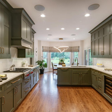
Design objectives for the remodel were aimed at maximizing the flow and functionality of a foodie-level kitchen with multiple cooks, while enhancing the family’s preferences for spending time in the space together:
Create a better workflow
Space out the appliances for better use of the kitchen area
Make the space feel larger visually
Update all materials so the kitchen isn’t all wood
No seating at an island or peninsula
Larger walkways
Brighten up the space with more lights and lighter colors
THE REMODEL
Design challenges to be solved:
The idea was to work within the current walls of the kitchen. Without removing walls, it was more of a challenge to give the kitchen a larger, new feel.
An island in the middle area was part of the original vision. Could a different countertop arrangement incorporate the same purpose?
The homeowners are big cooks so creating room for a larger refrigerator and more countertop space by the range were musts!
The sink and range were originally right next to each other, making things tough for two cooks to work at the same time. How could the new space allow for two work areas while minimizing traffic jams?
THE RENEWED SPACE
Design solutions fell into place once the overall layout was revamped to improve flow and functionality:
The refrigerator was originally in the middle of the main walkway. To gain more walk space and room for a larger refrigerator, we moved this appliance to the back wall.
The final design still has a peninsula but we flipped it to the opposite wall. This way, the walkway is more accommodating for traffic entering and exiting through the back garage door. This also gave way to a longer run of countertop space along the cooking wall.
To take cooking to another level, we implemented a speed oven!
The large window by the eating area is also nice for cooks to see, so we kept the sink in the peninsula.
To gain space for storage and make the kitchen feel larger, we brought the wall cabinets all the way to the ceiling. What once felt tight now feels grand!

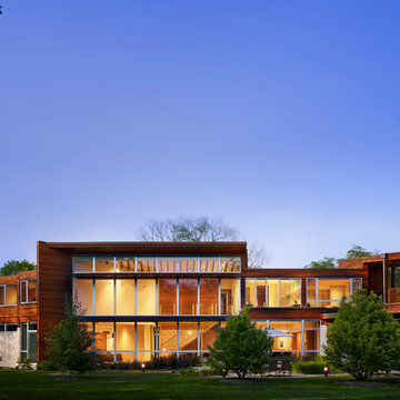 Thomas Roszak Architecture, LLC
Photo credit: Scott McDonald @ Hedrich Blessing
7RR-Ecohome:
The design objective was to build a house for a couple recently married who both had kids from previous marriages. How to bridge two families together?
The design looks forward in terms of how people live today. The home is an experiment in transparency and solid form; removing borders and edges from outside to inside the house, and to really depict “flowing and endless space”. The house floor plan is derived by pushing and pulling the house’s form to maximize the backyard and minimize the public front yard while welcoming the sun in key rooms by rotating the house 45-degrees to true north. The angular form of the house is a result of the family’s program, the zoning rules, the lot’s attributes, and the sun’s path. We wanted to construct a house that is smart and efficient in terms of construction and energy, both in terms of the building and the user. We could tell a story of how the house is built in terms of the constructability, structure and enclosure, with a nod to Japanese wood construction in the method in which the siding is installed and the exposed interior beams are placed in the double height space. We engineered the house to be smart which not only looks modern but acts modern; every aspect of user control is simplified to a digital touch button, whether lights, shades, blinds, HVAC, communication, audio, video, or security. We developed a planning module based on a 6-foot square room size and a 6-foot wide connector called an interstitial space for hallways, bathrooms, stairs and mechanical, which keeps the rooms pure and uncluttered. The house is 6,200 SF of livable space, plus garage and basement gallery for a total of 9,200 SF. A large formal foyer celebrates the entry and opens up to the living, dining, kitchen and family rooms all focused on the rear garden. The east side of the second floor is the Master wing and a center bridge connects it to the kid’s wing on the west. Second floor terraces and sunscreens provide views and shade in this suburban setting. The playful mathematical grid of the house in the x, y and z axis also extends into the layout of the trees and hard-scapes, all centered on a suburban one-acre lot.
Many green attributes were designed into the home; Ipe wood sunscreens and window shades block out unwanted solar gain in summer, but allow winter sun in. Patio door and operable windows provide ample opportunity for natural ventilation throughout the open floor plan. Minimal windows on east and west sides to reduce heat loss in winter and unwanted gains in summer. Open floor plan and large window expanse reduces lighting demands and maximizes available daylight. Skylights provide natural light to the basement rooms. Durable, low-maintenance exterior materials include stone, ipe wood siding and decking, and concrete roof pavers. Design is based on a 2' planning grid to minimize construction waste. Basement foundation walls and slab are highly insulated. FSC-certified walnut wood flooring was used. Light colored concrete roof pavers to reduce cooling loads by as much as 15%. 2x6 framing allows for more insulation and energy savings. Super efficient windows have low-E argon gas filled units, and thermally insulated aluminum frames. Permeable brick and stone pavers reduce the site’s storm-water runoff. Countertops use recycled composite materials. Energy-Star rated furnaces and smart thermostats are located throughout the house to minimize duct runs and avoid energy loss. Energy-Star rated boiler that heats up both radiant floors and domestic hot water. Low-flow toilets and plumbing fixtures are used to conserve water usage. No VOC finish options and direct venting fireplaces maintain a high interior air quality. Smart home system controls lighting, HVAC, and shades to better manage energy use. Plumbing runs through interior walls reducing possibilities of heat loss and freezing problems. A large food pantry was placed next to kitchen to reduce trips to the grocery store. Home office reduces need for automobile transit and associated CO2 footprint. Plan allows for aging in place, with guest suite than can become the master suite, with no need to move as family members mature.
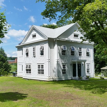
 U.S. Green Building Council (USGBC)
LEED Certification Level: V4
Builder: BPC Green Builders, LLC
Architect: Trillium Architects
The Taft School faculty home serves as a high performance residence and learning lab for students. The project also earned certification through ENERGY STAR, Indoor airPLUS, Water Sense, PHIUS, and Department of Energy Zero Energy Ready Homes with Living Building Challenge Petal recognition pending. The project team was honored with third place in the 2014 Connecticut Zero Energy Home Challenge. Excluding the photovoltaic installation the HERS index was 33, and with the 13.1 kW the HERS index is -14. A year of utility bills show the home is producing more electricity than it uses.
Located on a quiet street adjacent to campus the existing, historic home was deconstructed and materials donated or reused where possible. Challenged to find high efficiency windows that were historic commission acceptable, the team installed Klearwall awnings or casements over fixed glass (to mimic double hungs) with simulated divided lites (u-values as low as 0.13). A high solar heat gain coefficient (0.58) facilitates the passive solar gain for winter months, while well designed overhangs and a pergola shade summer sun. Double stud walls have 2¼” closed cell foam plus 8½” dense pack cellulose for a R-49 cavity. The exterior sheathing is R-6.6 Zip Wall System with taped seams to create the continuous air barrier. Inside the solid concrete foundation is 3” closed cell foam behind 2x4 stud walls and R-32 cellulose in the cavity. Prefabricated TJI joists frame the attic floor, an insulated “room” houses the heat recovery ventilator and ductwork, and blown in cellulose blankets it all in R-86. The house tested 0.6ACH50 proving the effectiveness of its air-tight envelope and attention to air sealing.
Heating and cooling is provided by efficient air source heat pumps (9.2 HSPF, 16.5 SEER) and delivered by short duct runs which tested extremely tight. A heat pump water heater provides domestic hot water and an on-demand switch, with an occupancy sensor at each bath, ensures hot water is delivered fast and efficiently. Low flow fixtures are WaterSense certified, appliances are Energy Star labeled, and all LED lighting. A Zehnder Novus 300 (93.3% efficient) HRV supplies 112 cfm of continuous fresh air while using only 32 watts of power and running quietly. The homeowners control the mechanical ventilation through the intuitive wall-mounted control pad to shut off or increase the ventilation. Chemicals and contaminants were reduced by using low VOC and GreenGuard certified sealants, adhesives, primers, and paints. A walk-off matt at the side entry and hardwood floors help control dirt and dust. The granite front steps were salvaged and local stone used for the patio and stone walls. Storm water runoff from the roof, patio, and driveway is managed by the rain garden. The native landscaping is low maintenance, a community garden produces vegetables, and the chicken coop is powered by its own roof mounted PV panels.
Taft School Director of Environmental Stewardship, Carly Borken has used the design and construction process as a teaching tool for her science classes. With access to the home monitoring system they can virtually access the residents’ consumption.
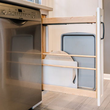
 North Shore Kitchen & Bath
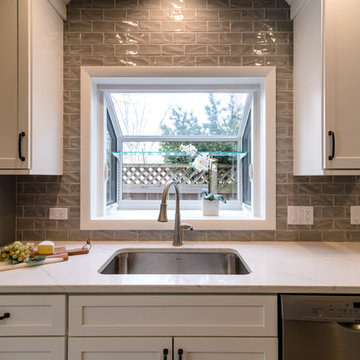
With this kitchen needing an update, we took the opportunity to move things around slightly to greatly improve the flow of the kitchen. By moving the refrigerator to the dining room side, it increased the flow coming into the kitchen from the entryway significantly. We also moved the sink to be centered on the window, allowing us a creative storage solution at the end of the dishwasher for cookie sheets, trays or cutting boards. We also removed the very large soffits (nearly 2' high) and were able to gain additional storage by taking the cabinetry all the way to the ceiling. By adding heated floors in this kitchen, it helps make this a nice cozy space to cook in. Using white cabinetry and adding in extra can lighting this space now looks and feel larger, brighter and more open. The grey textured subway tile and dark gunmetal hardware adds a bit of fun to the space, along with some contrast against the white cabinetry and countertops.
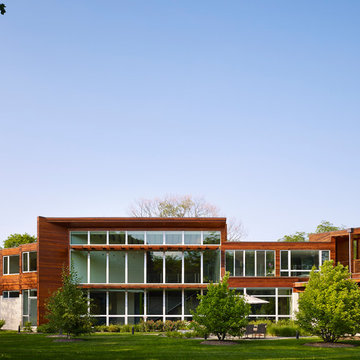 Thomas Roszak Architecture, LLC
Photo credit: Scott McDonald @ Hedrich Blessing
7RR-Ecohome:
The design objective was to build a house for a couple recently married who both had kids from previous marriages. How to bridge two families together?
The design looks forward in terms of how people live today. The home is an experiment in transparency and solid form; removing borders and edges from outside to inside the house, and to really depict “flowing and endless space”. The house floor plan is derived by pushing and pulling the house’s form to maximize the backyard and minimize the public front yard while welcoming the sun in key rooms by rotating the house 45-degrees to true north. The angular form of the house is a result of the family’s program, the zoning rules, the lot’s attributes, and the sun’s path. We wanted to construct a house that is smart and efficient in terms of construction and energy, both in terms of the building and the user. We could tell a story of how the house is built in terms of the constructability, structure and enclosure, with a nod to Japanese wood construction in the method in which the siding is installed and the exposed interior beams are placed in the double height space. We engineered the house to be smart which not only looks modern but acts modern; every aspect of user control is simplified to a digital touch button, whether lights, shades, blinds, HVAC, communication, audio, video, or security. We developed a planning module based on a 6-foot square room size and a 6-foot wide connector called an interstitial space for hallways, bathrooms, stairs and mechanical, which keeps the rooms pure and uncluttered. The house is 6,200 SF of livable space, plus garage and basement gallery for a total of 9,200 SF. A large formal foyer celebrates the entry and opens up to the living, dining, kitchen and family rooms all focused on the rear garden. The east side of the second floor is the Master wing and a center bridge connects it to the kid’s wing on the west. Second floor terraces and sunscreens provide views and shade in this suburban setting. The playful mathematical grid of the house in the x, y and z axis also extends into the layout of the trees and hard-scapes, all centered on a suburban one-acre lot.
Many green attributes were designed into the home; Ipe wood sunscreens and window shades block out unwanted solar gain in summer, but allow winter sun in. Patio door and operable windows provide ample opportunity for natural ventilation throughout the open floor plan. Minimal windows on east and west sides to reduce heat loss in winter and unwanted gains in summer. Open floor plan and large window expanse reduces lighting demands and maximizes available daylight. Skylights provide natural light to the basement rooms. Durable, low-maintenance exterior materials include stone, ipe wood siding and decking, and concrete roof pavers. Design is based on a 2' planning grid to minimize construction waste. Basement foundation walls and slab are highly insulated. FSC-certified walnut wood flooring was used. Light colored concrete roof pavers to reduce cooling loads by as much as 15%. 2x6 framing allows for more insulation and energy savings. Super efficient windows have low-E argon gas filled units, and thermally insulated aluminum frames. Permeable brick and stone pavers reduce the site’s storm-water runoff. Countertops use recycled composite materials. Energy-Star rated furnaces and smart thermostats are located throughout the house to minimize duct runs and avoid energy loss. Energy-Star rated boiler that heats up both radiant floors and domestic hot water. Low-flow toilets and plumbing fixtures are used to conserve water usage. No VOC finish options and direct venting fireplaces maintain a high interior air quality. Smart home system controls lighting, HVAC, and shades to better manage energy use. Plumbing runs through interior walls reducing possibilities of heat loss and freezing problems. A large food pantry was placed next to kitchen to reduce trips to the grocery store. Home office reduces need for automobile transit and associated CO2 footprint. Plan allows for aging in place, with guest suite than can become the master suite, with no need to move as family members mature.
 Katie Hutchison Studio
With two small children and a third on the way, the owners of an original eighteenth century Cape were quickly out-growing it, but they had no desire to move away from the Cape Cod home and location they loved. They simply needed a reconfigured layout and more space. Their goals included repurposing some existing rooms, adding a new kitchen/family area plus screen porch on the first level, and creating a master suite and roof deck with an outdoor shower on the second level, connected by a new stair.
Our challenge was to improve the flow between existing spaces, and design the two-story addition without overwhelming the pint-sized original Cape. We took advantage of the lower grade at the rear of the property to step the first floor of the addition down two steps from the existing main level. This allowed us to align the second floor in the addition with the existing second floor, while gaining ceiling height in the new first-floor kitchen/family area. We composed a cross-gabled form for the addition to improve the second floor headroom, while maintaining the existing eave line. We then extended some existing shed dormers to gain headroom and enhance function. We also expanded the outdoor living area with privacy walls along the roof deck.
New, larger, double–hung windows that match the lite configuration of the existing windows, along with new side-wall shingles and trim which resemble the existing exterior treatment help to tie the new addition to the old Cape. Though there’s no mistaking the new for the old, the two are simpatico.
Katie Hutchison Studio collaborated with Geoffrey Koper Architect of Yarmouth Port, Mass. on the Yarmouth Port Antique Cape Renovation and Addition. Kitchen fit-out and interior finishes, fixtures, and furnishings by others.
photo by Katie Hutchison
 Thomas Roszak Architecture, LLC
Photo credit: Scott McDonald @ Hedrich Blessing
7RR-Ecohome:
The design objective was to build a house for a couple recently married who both had kids from previous marriages. How to bridge two families together?
The design looks forward in terms of how people live today. The home is an experiment in transparency and solid form; removing borders and edges from outside to inside the house, and to really depict “flowing and endless space”. The house floor plan is derived by pushing and pulling the house’s form to maximize the backyard and minimize the public front yard while welcoming the sun in key rooms by rotating the house 45-degrees to true north. The angular form of the house is a result of the family’s program, the zoning rules, the lot’s attributes, and the sun’s path. We wanted to construct a house that is smart and efficient in terms of construction and energy, both in terms of the building and the user. We could tell a story of how the house is built in terms of the constructability, structure and enclosure, with a nod to Japanese wood construction in the method in which the siding is installed and the exposed interior beams are placed in the double height space. We engineered the house to be smart which not only looks modern but acts modern; every aspect of user control is simplified to a digital touch button, whether lights, shades, blinds, HVAC, communication, audio, video, or security. We developed a planning module based on a 6-foot square room size and a 6-foot wide connector called an interstitial space for hallways, bathrooms, stairs and mechanical, which keeps the rooms pure and uncluttered. The house is 6,200 SF of livable space, plus garage and basement gallery for a total of 9,200 SF. A large formal foyer celebrates the entry and opens up to the living, dining, kitchen and family rooms all focused on the rear garden. The east side of the second floor is the Master wing and a center bridge connects it to the kid’s wing on the west. Second floor terraces and sunscreens provide views and shade in this suburban setting. The playful mathematical grid of the house in the x, y and z axis also extends into the layout of the trees and hard-scapes, all centered on a suburban one-acre lot.
Many green attributes were designed into the home; Ipe wood sunscreens and window shades block out unwanted solar gain in summer, but allow winter sun in. Patio door and operable windows provide ample opportunity for natural ventilation throughout the open floor plan. Minimal windows on east and west sides to reduce heat loss in winter and unwanted gains in summer. Open floor plan and large window expanse reduces lighting demands and maximizes available daylight. Skylights provide natural light to the basement rooms. Durable, low-maintenance exterior materials include stone, ipe wood siding and decking, and concrete roof pavers. Design is based on a 2' planning grid to minimize construction waste. Basement foundation walls and slab are highly insulated. FSC-certified walnut wood flooring was used. Light colored concrete roof pavers to reduce cooling loads by as much as 15%. 2x6 framing allows for more insulation and energy savings. Super efficient windows have low-E argon gas filled units, and thermally insulated aluminum frames. Permeable brick and stone pavers reduce the site’s storm-water runoff. Countertops use recycled composite materials. Energy-Star rated furnaces and smart thermostats are located throughout the house to minimize duct runs and avoid energy loss. Energy-Star rated boiler that heats up both radiant floors and domestic hot water. Low-flow toilets and plumbing fixtures are used to conserve water usage. No VOC finish options and direct venting fireplaces maintain a high interior air quality. Smart home system controls lighting, HVAC, and shades to better manage energy use. Plumbing runs through interior walls reducing possibilities of heat loss and freezing problems. A large food pantry was placed next to kitchen to reduce trips to the grocery store. Home office reduces need for automobile transit and associated CO2 footprint. Plan allows for aging in place, with guest suite than can become the master suite, with no need to move as family members mature.


 San Luis Kitchen Co.
Surrounded by vineyards, horse ranches, and open land, the home is in a great location that is reasonably close to town while retaining a secluded air.
Our homeowners have enjoyed their country retreat for many years. They are blessed with a large extended family and love to host gatherings and entertain weekend guests. The only drawback to their gracious home was the drab and malfunctioning kitchen. First off, the cabinets were an out-dated whitewashed oak. Uggh! High ceilings were a plus feature that was negated by bizarrely stacked wall cabinets – making you think that maybe the original “designer” forgot about the 9 foot ceiling height. More likely, the original cabinets were stock items that didn’t come in the right size for the house. You can also see the lovely fluorescent light box tacked to the middle of the ceiling over the island. Why? Was there no thought to the style shown in the rest of the house?
Secondly, the homeowners were fighting with a poor kitchen layout. The large built-in refrigerator and separate freezer were placed right in the main traffic flow from the hall, there was not enough counter space to the right of the sink, the dishwasher was crammed right next to the fridge, and a broom closet took up prime real estate next to the cook-top. Now, remember, guests are frequent in this home and often several people were trying to use the kitchen at one time. Cross traffic and outright pile-ups were inevitable as some folks gathered veggies from the fridge to sauté at the cook-top while others were rinsing used dishes for the dishwasher and still others were taking frozen items to the prep sink and then the microwave. Don’t get me started about the trash and recycling receptacles – complete inconvenience to all!
So, our homeowners – the poor, benighted souls – were desperate for a remodel when they found San Luis Kitchen. On their first visit to our showroom, the couple fell in love with our French Country display. The display features soft white cabinets in a distressed cottage finish with a contrasting dark island and armoire; our homeowners were smitten. We knew everyone was up to the challenge and so we got right down to work.
We visited their home and measured their kitchen. While we were there, we took stock of the house’s overall style and the homeowner’s décor. We asked what they liked best about their home, what worked well and what didn’t. We found that they loved their arched passageways, the trim details on their mantle and the soft curves of the posts at their stair rail. They also showed us many photos of kitchens that they liked – both from magazines and on-line. Using this information, we went back to the office and pulled together a design.
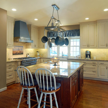
We suggested swinging the refrigerator and freezer 90 degrees and setting them in place of the existing oven and hutch area. This brings them out of the traffic flow and into a comfortable relationship to the island counter. The fridge and freezer the homeowners chose were mismatched in width – we disguised the difference using custom detailing on the decorative panels. Deep storage cabinets above fill out the space.
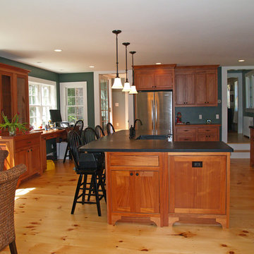
Moving the fridge/freezer gained lots of luxurious counter space to the right of the new farmhouse sink. We placed the broom closet near the hall and tucked the microwave behind closed cabinet doors (which tuck away when open) to the left of it. The beautiful existing wood floor insisted that the island remain in the same location, however we replaced it with luscious cherry cabinets in an antique burnished finish. The island retained its prep sink and gained a wine refrigerator and both a trash compactor and double bin recycling cabinet. A decorative pot rack now hangs in place of the ugly old fluorescent lights.
The highlight of the new kitchen is the La Cornue range in a bright and bold blue! The homeowners traveled to a Bay area appliance showroom to see the ranges in person before purchasing to make sure that the ovens were of suitable size and that blue was truly the right color. The range was perfect, so it was purchased. The matching blue hood was created on site using a standard stainless hood as the base and painting a tapered drywall cover. To either side of the range we placed pullout base cabinets for oils and spices and such, each fronted with a turned post chosen to echo their stairway balusters. We also chose cabinet trim (crown, light rail and toe base) to harmonize with the homes existing details.
We knew for sure that the completed kitchen was a success when the happy homeowners reported to us that over Thanksgiving they had five cooks working in the space with no conflict whatsoever. That’s a true complement to our design – Thank You!
 North Shore Kitchen & Bath
With this kitchen needing an update, we took the opportunity to move things around slightly to greatly improve the flow of the kitchen. By moving the refrigerator to the dining room side, it increased the flow coming into the kitchen from the entryway significantly. We also moved the sink to be centered on the window, allowing us a creative storage solution at the end of the dishwasher for cookie sheets, trays or cutting boards. We also removed the very large soffits (nearly 2' high) and were able to gain additional storage by taking the cabinetry all the way to the ceiling. By adding heated floors in this kitchen, it helps make this a nice cozy space to cook in. Using white cabinetry and adding in extra can lighting this space now looks and feel larger, brighter and more open. The grey textured subway tile and dark gunmetal hardware adds a bit of fun to the space, along with some contrast against the white cabinetry and countertops.
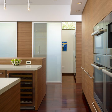 Thomas Roszak Architecture, LLC
Photo credit: Scott McDonald @ Hedrich Blessing
7RR-Ecohome:
The design objective was to build a house for a couple recently married who both had kids from previous marriages. How to bridge two families together?
The design looks forward in terms of how people live today. The home is an experiment in transparency and solid form; removing borders and edges from outside to inside the house, and to really depict “flowing and endless space”. The house floor plan is derived by pushing and pulling the house’s form to maximize the backyard and minimize the public front yard while welcoming the sun in key rooms by rotating the house 45-degrees to true north. The angular form of the house is a result of the family’s program, the zoning rules, the lot’s attributes, and the sun’s path. We wanted to construct a house that is smart and efficient in terms of construction and energy, both in terms of the building and the user. We could tell a story of how the house is built in terms of the constructability, structure and enclosure, with a nod to Japanese wood construction in the method in which the siding is installed and the exposed interior beams are placed in the double height space. We engineered the house to be smart which not only looks modern but acts modern; every aspect of user control is simplified to a digital touch button, whether lights, shades, blinds, HVAC, communication, audio, video, or security. We developed a planning module based on a 6-foot square room size and a 6-foot wide connector called an interstitial space for hallways, bathrooms, stairs and mechanical, which keeps the rooms pure and uncluttered. The house is 6,200 SF of livable space, plus garage and basement gallery for a total of 9,200 SF. A large formal foyer celebrates the entry and opens up to the living, dining, kitchen and family rooms all focused on the rear garden. The east side of the second floor is the Master wing and a center bridge connects it to the kid’s wing on the west. Second floor terraces and sunscreens provide views and shade in this suburban setting. The playful mathematical grid of the house in the x, y and z axis also extends into the layout of the trees and hard-scapes, all centered on a suburban one-acre lot.
Many green attributes were designed into the home; Ipe wood sunscreens and window shades block out unwanted solar gain in summer, but allow winter sun in. Patio door and operable windows provide ample opportunity for natural ventilation throughout the open floor plan. Minimal windows on east and west sides to reduce heat loss in winter and unwanted gains in summer. Open floor plan and large window expanse reduces lighting demands and maximizes available daylight. Skylights provide natural light to the basement rooms. Durable, low-maintenance exterior materials include stone, ipe wood siding and decking, and concrete roof pavers. Design is based on a 2' planning grid to minimize construction waste. Basement foundation walls and slab are highly insulated. FSC-certified walnut wood flooring was used. Light colored concrete roof pavers to reduce cooling loads by as much as 15%. 2x6 framing allows for more insulation and energy savings. Super efficient windows have low-E argon gas filled units, and thermally insulated aluminum frames. Permeable brick and stone pavers reduce the site’s storm-water runoff. Countertops use recycled composite materials. Energy-Star rated furnaces and smart thermostats are located throughout the house to minimize duct runs and avoid energy loss. Energy-Star rated boiler that heats up both radiant floors and domestic hot water. Low-flow toilets and plumbing fixtures are used to conserve water usage. No VOC finish options and direct venting fireplaces maintain a high interior air quality. Smart home system controls lighting, HVAC, and shades to better manage energy use. Plumbing runs through interior walls reducing possibilities of heat loss and freezing problems. A large food pantry was placed next to kitchen to reduce trips to the grocery store. Home office reduces need for automobile transit and associated CO2 footprint. Plan allows for aging in place, with guest suite than can become the master suite, with no need to move as family members mature.
 LB Designs
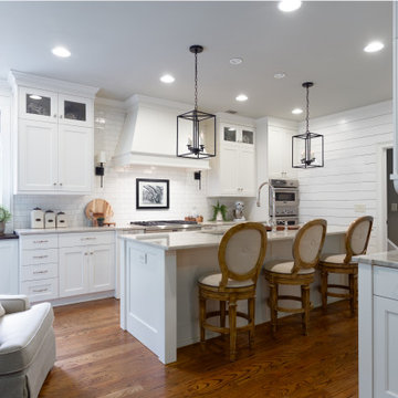
The original kitchen had lots of wasted space with little storage and improper function for this culinary, coffee loving, entertaining couple. To maximize this space, we designed an island with a large 5’ Galley Workstation Sink to gain flow and function. Incorporated eight professional appliances to aid this couple’s culinary passion. The coffee station which houses a built-in coffee maker with hidden coffee prep area was added to the adjoining bar which is a coffee and wine lovers dream. This kitchen features all Thermador appliances: Refrigerator, Oven, Steam Oven, Gas cooktop with griddle, and Dishwasher.
 Cure Design Group
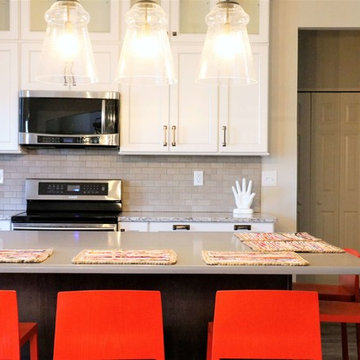
KITCHEN RENOVATION CURRENT CRAFTSMAN
This client started off just being curious about our services - what we could do, and if we could even help her update her kitchen. She and her husband with their two teenage kids have lived in their home for several years without updating anything since the house was originally built. They didn’t quite have a budget in mind yet. They didn’t know their style, or even if they had one. Their timeline was simple, “as fast as you can so we’re not without a kitchen for very long” (usually what we hear for kitchen updates).
After a very productive consultation: determining the scope of work and zeroing in on a budget, I was very excited to update this underwhelming space to something that is modern but timeless, something that is theirs. And, it was easy to see what type of design style they gravitated toward looking at the pieces they already own: Craftsman/Prairie Style. I left the meeting so excited to weave in yet another genre of design to my CDG portfolio! We circled in our contractor to discuss the changes they were looking to make and the scope of work that would be theirs. Then I was off to get designing:
// Because the kitchen’s footprint and the defined breakfast space delineated by the bay, we kept the perimeter cabinetry as it was originally laid out. We updated these cabinets to a beautiful soft Alabaster White with a Barn Wood Glaze to highlight the simplicity of the shaker style doors. We added transom cabinets above the uppers, with only the back wall having seeded glass inserts to highlight some of their collectables.
// The original shaped island was counter-productive (See what I did there?) in functionality and design. We squared this off to reduce some of the angles and gain more storage. We highlighted the new island with a contrasting oak cabinet in a dark finish, to pay our respects to the craftsman style, and topped with a concrete-like countertop as a nod to the Prairie Style, allowing the homeowners to gain two extra seats and a massive -uninterrupted- work surface.
// The small section of cabinetry between the garage entry and fridge now is the perfect dump-station for mail, electronics, whatever is in their hands when they come into the house; and completely hidden by the refrigerator.
// The disconnected cabinetry in the breakfast area makes for a great place to have a working office. Accessible from the kitchen or the adjacent great room, this is the perfect place for the kids to do their homework while mom and dad are putting together dinner. The base cabinets are built out for office-type storage: paper and pencil drawers, filing systems, and cord management. Additionally, the long counter provides a ton of worksurface to spread out.
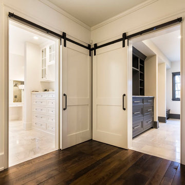
// The largest transformation was the pantry. We raised the height of the doorway and added huge custom designed bypass sliding barndoors. Finished with a dark stain to compliment the island and cut to inset 4 stained glass windows, typical of this style of design, and driving home the concept for the whole space.
// They were desperate to replace their flooring with something extremely durable to flow throughout the kitchen and the whole main level. This beautiful new flooring is actually a textured LVT(!) Which allowed them to save on overall cost and extend the life of their new flooring purchase.
// They loved their copper table, so we kept it and added new simple, mid-century modern chairs around it and a shiny new craftsman-style chandelier above. We added bright barstools in a burnt orange-red accent, and a bright woven rug to tie it all together.
// Because the kitchen renovation was shaping up to be pretty spectacular, they decided they needed to now replace their ‘now-these-look-a-little-too-old’ upholstered seating in the neighboring great room with 2 new sofas. We found the perfect sage-y-grey fabric which we covered on sofa frames that have and exposed oak-wood base, which we finished in a warm weathered grey.
// As every designer knows, a room isn’t finished until there’s something on the windows. Now that the new flooring was installed and every other room on the main level ‘seemed’ to be updated, we needed to update the window treatments in the dining, and great rooms to reflect their new design concept.
I hope you find the ‘after’ photos refreshing (as refreshing as it was for me to work on something that’s not a “Farm House” style that’s saturating the industry right now!) This was such a fun project and a great collaboration with our contractor.

 PropertyLark
The Pros and Cons of Fix and Flip Real Estate Investment
Last week, we covered The Pros and Cons of Buy and Hold Real Estate Investment for rental property investors. This week, we want to talk about the other most common type of real estate investment: “fix and flip.”
The Appeal of House Flipping
We all love the house flipping shows on HGTV and other reality channels. They’re great and they make the prospect of buying, renovating and flipping homes for big profits seem super sexy and fun. However, any experienced real estate investor will tell you it’s not quite as easy as they make it look. There’s a lot of work that goes into a successful fix and flip investment.
The basic premise of a fix and flip investment is pretty simple. You buy a property, usually one that needs some work and is available at a great price. You renovate the property, making the necessary repairs and upgrades to maximize its resale value. Then, you sell the property on the open market for the highest possible price. You get in and out as quickly as possible. Full-time flippers will move from property to property or will have multiple properties being worked on at the same time. Rather than the “buy and hold” strategy where you keep the house while earning rental income and equity over time, you are looking for the quick sale to earn your profits.
If you are going to explore house flipping—whether as a full-time career or just a side hustle—you will want to know exactly what you are getting into. That is why we are going to cover the pros and cons of fix and flip real estate investment in this article.
The Pros of Fix and Flip
Here are some of the pros of fix and flip investing:
Faster Return on Investment—The biggest appeal of fix and flip investing is that it gives you a quicker return on investment. Buy and hold will take you longer to see your ROI. House flipping allows you to see your full profit (hopefully) as soon as the house sells. The average house flip for an experienced investor is around six months. It may take longer for a first-timer who is just learning how to do certain things.
Fairly Safe Investment—As long as you do all your projections and calculations carefully and avoid any major problems along the way, house flipping is a relatively safe investment strategy compared to something as turbulent as the stock market. Real estate markets are generally predictable and the short time frame of a flip helps you avoid losses if the property happens to depreciate over a longer period of time.
Exciting—There is a reason why there are so many reality shows based around flipping and none based on buy and hold investing. It’s an exciting process to buy a home, gut it and completely renovate it. Then, you get the ultimate reward of selling it and collecting the profits—as long as you do things right.
The Cons of Fix and Flip
Here are some of the cons of fix and flip investing:
Upfront Expenses—A house flip will require a lot of upfront expenses. We’re not only talking about financing the house itself, but all the renovation costs and other expenses involved in the flip. You are laying out all that money at the beginning and only seeing your returns when the property sells. This can create cash flow issues and stress if you fall being schedule or go above your initial budget.
Taxes—House flips will usually create dramatic swings in income year over year, and that can increase your tax bill. You have to pace things correctly to take advantage of specific capital gains tax rules. Capital gains taxes are higher on any property owned less than a year, so you have to find that balance of how long you own any specific investment properties and how long it takes to complete the renovation and sale. Before you get too deep into fix and flip investing, you will want to talk with your tax advisor to make sure you have the right plan in place.
Surprises—All real estate investment is susceptible to surprises. You don’t always know what lies behind the walls until you start the renovation process. You cannot plan for everything as a real estate investor, but you have to be prepared for anything. It is a good idea to add some wiggle room in your budget and overestimate your renovation expenses/timeline to cover any surprises that may come up.
These are some of the biggest pros and cons of fix and flip real estate investment. Of course, there are other things you need to know as an investor, so be sure and do your homework in order to get the most out of your investment portfolio. Both fix and flip and buy and hold strategies can be highly lucrative if you do things right. There are no wrong answers, but there are wrong ways of doing things if you truly want to be successful in this field.
If you are looking for great investment properties to fix and flip, join the exclusive PropertyLark home buyers’ network. If you qualify, you’ll have access to our exclusive off-market deals and analytics tools that will help you identify the best investments and get the highest possible ROI. Fill out the contact form and questionnaire on the PropertyLark buyer’s site to apply!
 North Shore Kitchen & Bath
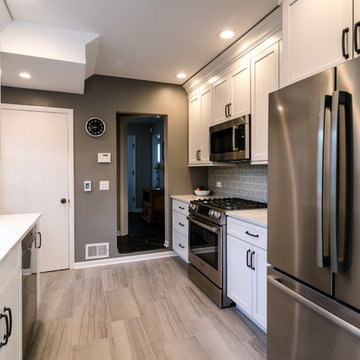
With this kitchen needing an update, we took the opportunity to move things around slightly to greatly improve the flow of the kitchen. By moving the refrigerator to the dining room side, it increased the flow coming into the kitchen from the entryway significantly. We also moved the sink to be centered on the window, allowing us a creative storage solution at the end of the dishwasher for cookie sheets, trays or cutting boards. We also removed the very large soffits (nearly 2' high) and were able to gain additional storage by taking the cabinetry all the way to the ceiling. By adding heated floors in this kitchen, it helps make this a nice cozy space to cook in. Using white cabinetry and adding in extra can lighting this space now looks and feel larger, brighter and more open. The grey textured subway tile and dark gunmetal hardware adds a bit of fun to the space, along with some contrast against the white cabinetry and countertops.
7