
Search results for "Gain flows" in Home Design Ideas
 Cure Design Group
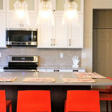
KITCHEN RENOVATION CURRENT CRAFTSMAN
This client started off just being curious about our services - what we could do, and if we could even help her update her kitchen. She and her husband with their two teenage kids have lived in their home for several years without updating anything since the house was originally built. They didn’t quite have a budget in mind yet. They didn’t know their style, or even if they had one. Their timeline was simple, “as fast as you can so we’re not without a kitchen for very long” (usually what we hear for kitchen updates).
After a very productive consultation: determining the scope of work and zeroing in on a budget, I was very excited to update this underwhelming space to something that is modern but timeless, something that is theirs. And, it was easy to see what type of design style they gravitated toward looking at the pieces they already own: Craftsman/Prairie Style. I left the meeting so excited to weave in yet another genre of design to my CDG portfolio! We circled in our contractor to discuss the changes they were looking to make and the scope of work that would be theirs. Then I was off to get designing:
// Because the kitchen’s footprint and the defined breakfast space delineated by the bay, we kept the perimeter cabinetry as it was originally laid out. We updated these cabinets to a beautiful soft Alabaster White with a Barn Wood Glaze to highlight the simplicity of the shaker style doors. We added transom cabinets above the uppers, with only the back wall having seeded glass inserts to highlight some of their collectables.
// The original shaped island was counter-productive (See what I did there?) in functionality and design. We squared this off to reduce some of the angles and gain more storage. We highlighted the new island with a contrasting oak cabinet in a dark finish, to pay our respects to the craftsman style, and topped with a concrete-like countertop as a nod to the Prairie Style, allowing the homeowners to gain two extra seats and a massive -uninterrupted- work surface.
// The small section of cabinetry between the garage entry and fridge now is the perfect dump-station for mail, electronics, whatever is in their hands when they come into the house; and completely hidden by the refrigerator.
// The disconnected cabinetry in the breakfast area makes for a great place to have a working office. Accessible from the kitchen or the adjacent great room, this is the perfect place for the kids to do their homework while mom and dad are putting together dinner. The base cabinets are built out for office-type storage: paper and pencil drawers, filing systems, and cord management. Additionally, the long counter provides a ton of worksurface to spread out.
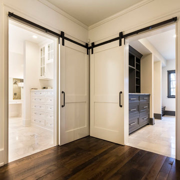
// The largest transformation was the pantry. We raised the height of the doorway and added huge custom designed bypass sliding barndoors. Finished with a dark stain to compliment the island and cut to inset 4 stained glass windows, typical of this style of design, and driving home the concept for the whole space.
// They were desperate to replace their flooring with something extremely durable to flow throughout the kitchen and the whole main level. This beautiful new flooring is actually a textured LVT(!) Which allowed them to save on overall cost and extend the life of their new flooring purchase.
// They loved their copper table, so we kept it and added new simple, mid-century modern chairs around it and a shiny new craftsman-style chandelier above. We added bright barstools in a burnt orange-red accent, and a bright woven rug to tie it all together.
// Because the kitchen renovation was shaping up to be pretty spectacular, they decided they needed to now replace their ‘now-these-look-a-little-too-old’ upholstered seating in the neighboring great room with 2 new sofas. We found the perfect sage-y-grey fabric which we covered on sofa frames that have and exposed oak-wood base, which we finished in a warm weathered grey.
// As every designer knows, a room isn’t finished until there’s something on the windows. Now that the new flooring was installed and every other room on the main level ‘seemed’ to be updated, we needed to update the window treatments in the dining, and great rooms to reflect their new design concept.
I hope you find the ‘after’ photos refreshing (as refreshing as it was for me to work on something that’s not a “Farm House” style that’s saturating the industry right now!) This was such a fun project and a great collaboration with our contractor.
 Cure Design Group
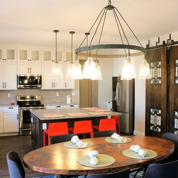
KITCHEN RENOVATION CURRENT CRAFTSMAN
This client started off just being curious about our services - what we could do, and if we could even help her update her kitchen. She and her husband with their two teenage kids have lived in their home for several years without updating anything since the house was originally built. They didn’t quite have a budget in mind yet. They didn’t know their style, or even if they had one. Their timeline was simple, “as fast as you can so we’re not without a kitchen for very long” (usually what we hear for kitchen updates).
After a very productive consultation: determining the scope of work and zeroing in on a budget, I was very excited to update this underwhelming space to something that is modern but timeless, something that is theirs. And, it was easy to see what type of design style they gravitated toward looking at the pieces they already own: Craftsman/Prairie Style. I left the meeting so excited to weave in yet another genre of design to my CDG portfolio! We circled in our contractor to discuss the changes they were looking to make and the scope of work that would be theirs. Then I was off to get designing:
// Because the kitchen’s footprint and the defined breakfast space delineated by the bay, we kept the perimeter cabinetry as it was originally laid out. We updated these cabinets to a beautiful soft Alabaster White with a Barn Wood Glaze to highlight the simplicity of the shaker style doors. We added transom cabinets above the uppers, with only the back wall having seeded glass inserts to highlight some of their collectables.
// The original shaped island was counter-productive (See what I did there?) in functionality and design. We squared this off to reduce some of the angles and gain more storage. We highlighted the new island with a contrasting oak cabinet in a dark finish, to pay our respects to the craftsman style, and topped with a concrete-like countertop as a nod to the Prairie Style, allowing the homeowners to gain two extra seats and a massive -uninterrupted- work surface.
// The small section of cabinetry between the garage entry and fridge now is the perfect dump-station for mail, electronics, whatever is in their hands when they come into the house; and completely hidden by the refrigerator.
// The disconnected cabinetry in the breakfast area makes for a great place to have a working office. Accessible from the kitchen or the adjacent great room, this is the perfect place for the kids to do their homework while mom and dad are putting together dinner. The base cabinets are built out for office-type storage: paper and pencil drawers, filing systems, and cord management. Additionally, the long counter provides a ton of worksurface to spread out.
// The largest transformation was the pantry. We raised the height of the doorway and added huge custom designed bypass sliding barndoors. Finished with a dark stain to compliment the island and cut to inset 4 stained glass windows, typical of this style of design, and driving home the concept for the whole space.
// They were desperate to replace their flooring with something extremely durable to flow throughout the kitchen and the whole main level. This beautiful new flooring is actually a textured LVT(!) Which allowed them to save on overall cost and extend the life of their new flooring purchase.
// They loved their copper table, so we kept it and added new simple, mid-century modern chairs around it and a shiny new craftsman-style chandelier above. We added bright barstools in a burnt orange-red accent, and a bright woven rug to tie it all together.
// Because the kitchen renovation was shaping up to be pretty spectacular, they decided they needed to now replace their ‘now-these-look-a-little-too-old’ upholstered seating in the neighboring great room with 2 new sofas. We found the perfect sage-y-grey fabric which we covered on sofa frames that have and exposed oak-wood base, which we finished in a warm weathered grey.
// As every designer knows, a room isn’t finished until there’s something on the windows. Now that the new flooring was installed and every other room on the main level ‘seemed’ to be updated, we needed to update the window treatments in the dining, and great rooms to reflect their new design concept.
I hope you find the ‘after’ photos refreshing (as refreshing as it was for me to work on something that’s not a “Farm House” style that’s saturating the industry right now!) This was such a fun project and a great collaboration with our contractor.
 North Shore Kitchen & Bath
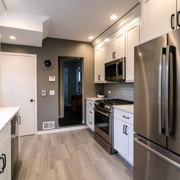
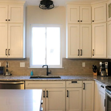
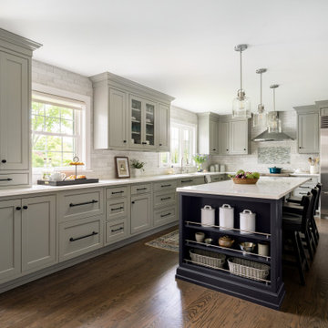
With this kitchen needing an update, we took the opportunity to move things around slightly to greatly improve the flow of the kitchen. By moving the refrigerator to the dining room side, it increased the flow coming into the kitchen from the entryway significantly. We also moved the sink to be centered on the window, allowing us a creative storage solution at the end of the dishwasher for cookie sheets, trays or cutting boards. We also removed the very large soffits (nearly 2' high) and were able to gain additional storage by taking the cabinetry all the way to the ceiling. By adding heated floors in this kitchen, it helps make this a nice cozy space to cook in. Using white cabinetry and adding in extra can lighting this space now looks and feel larger, brighter and more open. The grey textured subway tile and dark gunmetal hardware adds a bit of fun to the space, along with some contrast against the white cabinetry and countertops.
Find the right local pro for your project
 Medford Design-Build
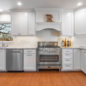
In these before shots, you can see the angled wall with the pass-through over the sink which overlooked the enclosed porch just off the kitchen. The after photos shows where we removed the angled wall, extended the cabinetry down the new wall, and installed a window over the new sink. Not only did the kitchen and breakfast area gain some square footage from the porch, but the extension of the new cabinets reaching all the way to the ceiling makes the walls seem taller. The bright white paint and strategically placed LED can lights add to the bright, polished finish.
Final photos by Impressia.net.
 LB Designs
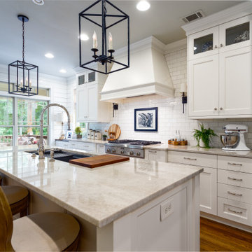
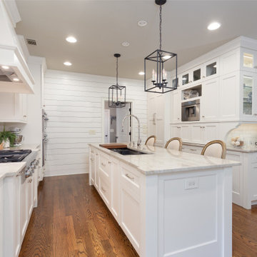
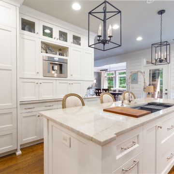
The original kitchen had lots of wasted space with little storage and improper function for this culinary, coffee loving, entertaining couple. To maximize this space, we designed an island with a large 5’ Galley Workstation Sink to gain flow and function. Incorporated eight professional appliances to aid this couple’s culinary passion. The coffee station which houses a built-in coffee maker with hidden coffee prep area was added to the adjoining bar which is a coffee and wine lovers dream. This kitchen features all Thermador appliances: Refrigerator, Oven, Steam Oven, Gas cooktop with griddle, and Dishwasher.
 Cure Design Group
KITCHEN RENOVATION CURRENT CRAFTSMAN
This client started off just being curious about our services - what we could do, and if we could even help her update her kitchen. She and her husband with their two teenage kids have lived in their home for several years without updating anything since the house was originally built. They didn’t quite have a budget in mind yet. They didn’t know their style, or even if they had one. Their timeline was simple, “as fast as you can so we’re not without a kitchen for very long” (usually what we hear for kitchen updates).
After a very productive consultation: determining the scope of work and zeroing in on a budget, I was very excited to update this underwhelming space to something that is modern but timeless, something that is theirs. And, it was easy to see what type of design style they gravitated toward looking at the pieces they already own: Craftsman/Prairie Style. I left the meeting so excited to weave in yet another genre of design to my CDG portfolio! We circled in our contractor to discuss the changes they were looking to make and the scope of work that would be theirs. Then I was off to get designing:
// Because the kitchen’s footprint and the defined breakfast space delineated by the bay, we kept the perimeter cabinetry as it was originally laid out. We updated these cabinets to a beautiful soft Alabaster White with a Barn Wood Glaze to highlight the simplicity of the shaker style doors. We added transom cabinets above the uppers, with only the back wall having seeded glass inserts to highlight some of their collectables.
// The original shaped island was counter-productive (See what I did there?) in functionality and design. We squared this off to reduce some of the angles and gain more storage. We highlighted the new island with a contrasting oak cabinet in a dark finish, to pay our respects to the craftsman style, and topped with a concrete-like countertop as a nod to the Prairie Style, allowing the homeowners to gain two extra seats and a massive -uninterrupted- work surface.
// The small section of cabinetry between the garage entry and fridge now is the perfect dump-station for mail, electronics, whatever is in their hands when they come into the house; and completely hidden by the refrigerator.
// The disconnected cabinetry in the breakfast area makes for a great place to have a working office. Accessible from the kitchen or the adjacent great room, this is the perfect place for the kids to do their homework while mom and dad are putting together dinner. The base cabinets are built out for office-type storage: paper and pencil drawers, filing systems, and cord management. Additionally, the long counter provides a ton of worksurface to spread out.
// The largest transformation was the pantry. We raised the height of the doorway and added huge custom designed bypass sliding barndoors. Finished with a dark stain to compliment the island and cut to inset 4 stained glass windows, typical of this style of design, and driving home the concept for the whole space.
// They were desperate to replace their flooring with something extremely durable to flow throughout the kitchen and the whole main level. This beautiful new flooring is actually a textured LVT(!) Which allowed them to save on overall cost and extend the life of their new flooring purchase.
// They loved their copper table, so we kept it and added new simple, mid-century modern chairs around it and a shiny new craftsman-style chandelier above. We added bright barstools in a burnt orange-red accent, and a bright woven rug to tie it all together.
// Because the kitchen renovation was shaping up to be pretty spectacular, they decided they needed to now replace their ‘now-these-look-a-little-too-old’ upholstered seating in the neighboring great room with 2 new sofas. We found the perfect sage-y-grey fabric which we covered on sofa frames that have and exposed oak-wood base, which we finished in a warm weathered grey.
// As every designer knows, a room isn’t finished until there’s something on the windows. Now that the new flooring was installed and every other room on the main level ‘seemed’ to be updated, we needed to update the window treatments in the dining, and great rooms to reflect their new design concept.
I hope you find the ‘after’ photos refreshing (as refreshing as it was for me to work on something that’s not a “Farm House” style that’s saturating the industry right now!) This was such a fun project and a great collaboration with our contractor.
 Tamara Rosenbloom Design LLC
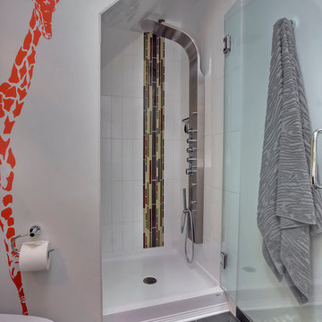
This bedroom is small and had a tiny existing closet and poor flow, so we had to get creative. We reworked the layout to allow for a walk in closet and replaced old carpet with bamboo flooring. By adding a loft bed, we gained a large custom desk space, complete with tool chest as desk storage. Since my client’s view of the ceiling got a little closer, we added interest with bold color and design. A contemporary dresser and comfortable reading chair round out the space. The existing bathroom had a leaking shower with odd angles. To save money, we kept the angles and added a European shower tower, maximizing luxury and function in a tight space. The wall mounted vanity is visually lighter than a traditional vanity and makes the room feel larger. And we can’t forget the giraffe – a fun and colorful accent for a true animal lover!
Photos by Mike Martin www.martinvisualtours.com

 LB Designs
The original kitchen had lots of wasted space with little storage and improper function for this culinary, coffee loving, entertaining couple. To maximize this space, we designed an island with a large 5’ Galley Workstation Sink to gain flow and function. Incorporated eight professional appliances to aid this couple’s culinary passion. The coffee station which houses a built-in coffee maker with hidden coffee prep area was added to the adjoining bar which is a coffee and wine lovers dream. This kitchen features all Thermador appliances: Refrigerator, Oven, Steam Oven, Gas cooktop with griddle, and Dishwasher.

 LB Designs
The original kitchen had lots of wasted space with little storage and improper function for this culinary, coffee loving, entertaining couple. To maximize this space, we designed an island with a large 5’ Galley Workstation Sink to gain flow and function. Incorporated eight professional appliances to aid this couple’s culinary passion. The coffee station which houses a built-in coffee maker with hidden coffee prep area was added to the adjoining bar which is a coffee and wine lovers dream. This kitchen features all Thermador appliances: Refrigerator, Oven, Steam Oven, Gas cooktop with griddle, and Dishwasher.
 Katie Hutchison Studio
With two small children and a third on the way, the owners of an original eighteenth century Cape were quickly out-growing it, but they had no desire to move away from the Cape Cod home and location they loved. They simply needed a reconfigured layout and more space. Their goals included repurposing some existing rooms, adding a new kitchen/family area plus screen porch on the first level, and creating a master suite and roof deck with an outdoor shower on the second level, connected by a new stair.
Our challenge was to improve the flow between existing spaces, and design the two-story addition without overwhelming the pint-sized original Cape. We took advantage of the lower grade at the rear of the property to step the first floor of the addition down two steps from the existing main level. This allowed us to align the second floor in the addition with the existing second floor, while gaining ceiling height in the new first-floor kitchen/family area. We composed a cross-gabled form for the addition to improve the second floor headroom, while maintaining the existing eave line. We then extended some existing shed dormers to gain headroom and enhance function. We also expanded the outdoor living area with privacy walls along the roof deck.
New, larger, double–hung windows that match the lite configuration of the existing windows, along with new side-wall shingles and trim which resemble the existing exterior treatment help to tie the new addition to the old Cape. Though there’s no mistaking the new for the old, the two are simpatico.
Katie Hutchison Studio collaborated with Geoffrey Koper Architect of Yarmouth Port, Mass. on the Yarmouth Port Antique Cape Renovation and Addition. Kitchen fit-out and interior finishes, fixtures, and furnishings by others.
photo by Katie Hutchison
 J. Myers & Associates - Interior Design Portland
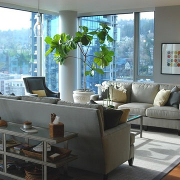
Performance fabrics were chosen for the durability of sunlight on this condo. Shades of grey with accents of yellow were the clients desires. Reworked an existing cocktail table from an old polished brass finish to a more updated brushed steel allowed us to be considerate on what we could rework rather then replace. Swivel chairs offer flexibility of conversation or watching the river flow by.
 Gayler Design Build
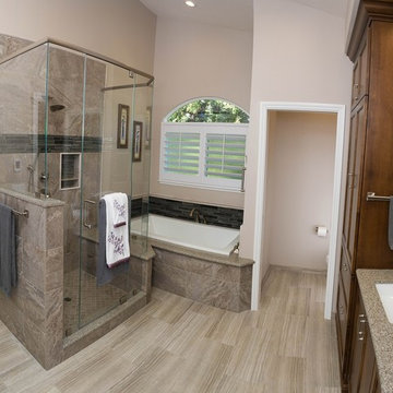
Open, light, and airy, this primary bath gained space and function. By removing unnecessary dust catching ledges from the space, the client gained a smooth transitioning look that brings comfort to the bathroom. Adding a large skylight brings more natural light to the space and a door was added between the bedroom and bath for privacy and quiet for those still sleeping. Alder cabinets with a New World finish and beautiful quartz counter tops add to this perfectly contrasting design. A stripe design on the floor tile creates a timeless movement throughout the space and the shower is accented with a beautiful mosaic glass tile; Strata Obsidian from Arizona Tile. Brushed nickel finishes on the hardware and accessories keep the space timeless and flows perfectly with the warm grey tones in the space. The paint color on the walls is Kelly Moore Malibu Beige, the ceiling and all trim is Kelly Moore Swiss Coffee. Beautiful!


 Drury Design
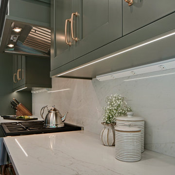
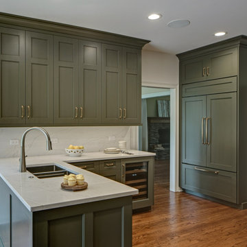
Design objectives for the remodel were aimed at maximizing the flow and functionality of a foodie-level kitchen with multiple cooks, while enhancing the family’s preferences for spending time in the space together:
Create a better workflow
Space out the appliances for better use of the kitchen area
Make the space feel larger visually
Update all materials so the kitchen isn’t all wood
No seating at an island or peninsula
Larger walkways
Brighten up the space with more lights and lighter colors
THE REMODEL
Design challenges to be solved:
The idea was to work within the current walls of the kitchen. Without removing walls, it was more of a challenge to give the kitchen a larger, new feel.
An island in the middle area was part of the original vision. Could a different countertop arrangement incorporate the same purpose?
The homeowners are big cooks so creating room for a larger refrigerator and more countertop space by the range were musts!
The sink and range were originally right next to each other, making things tough for two cooks to work at the same time. How could the new space allow for two work areas while minimizing traffic jams?
THE RENEWED SPACE
Design solutions fell into place once the overall layout was revamped to improve flow and functionality:
The refrigerator was originally in the middle of the main walkway. To gain more walk space and room for a larger refrigerator, we moved this appliance to the back wall.
The final design still has a peninsula but we flipped it to the opposite wall. This way, the walkway is more accommodating for traffic entering and exiting through the back garage door. This also gave way to a longer run of countertop space along the cooking wall.
To take cooking to another level, we implemented a speed oven!
The large window by the eating area is also nice for cooks to see, so we kept the sink in the peninsula.
To gain space for storage and make the kitchen feel larger, we brought the wall cabinets all the way to the ceiling. What once felt tight now feels grand!
 Drury Design
Design objectives for the remodel were aimed at maximizing the flow and functionality of a foodie-level kitchen with multiple cooks, while enhancing the family’s preferences for spending time in the space together:
Create a better workflow
Space out the appliances for better use of the kitchen area
Make the space feel larger visually
Update all materials so the kitchen isn’t all wood
No seating at an island or peninsula
Larger walkways
Brighten up the space with more lights and lighter colors
THE REMODEL
Design challenges to be solved:
The idea was to work within the current walls of the kitchen. Without removing walls, it was more of a challenge to give the kitchen a larger, new feel.
An island in the middle area was part of the original vision. Could a different countertop arrangement incorporate the same purpose?
The homeowners are big cooks so creating room for a larger refrigerator and more countertop space by the range were musts!
The sink and range were originally right next to each other, making things tough for two cooks to work at the same time. How could the new space allow for two work areas while minimizing traffic jams?
THE RENEWED SPACE
Design solutions fell into place once the overall layout was revamped to improve flow and functionality:
The refrigerator was originally in the middle of the main walkway. To gain more walk space and room for a larger refrigerator, we moved this appliance to the back wall.
The final design still has a peninsula but we flipped it to the opposite wall. This way, the walkway is more accommodating for traffic entering and exiting through the back garage door. This also gave way to a longer run of countertop space along the cooking wall.
To take cooking to another level, we implemented a speed oven!
The large window by the eating area is also nice for cooks to see, so we kept the sink in the peninsula.
To gain space for storage and make the kitchen feel larger, we brought the wall cabinets all the way to the ceiling. What once felt tight now feels grand!
 Gayler Design Build
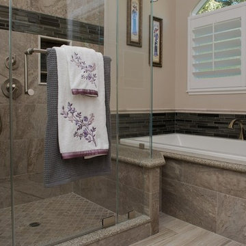
Open, light, and airy, this primary bath gained space and function. By removing unnecessary dust catching ledges from the space, the client gained a smooth transitioning look that brings comfort to the bathroom. Adding a large skylight brings more natural light to the space and a door was added between the bedroom and bath for privacy and quiet for those still sleeping. Alder cabinets with a New World finish and beautiful quartz counter tops add to this perfectly contrasting design. A stripe design on the floor tile creates a timeless movement throughout the space and the shower is accented with a beautiful mosaic glass tile; Strata Obsidian from Arizona Tile. Brushed nickel finishes on the hardware and accessories keep the space timeless and flows perfectly with the warm grey tones in the space. The paint color on the walls is Kelly Moore Malibu Beige, the ceiling and all trim is Kelly Moore Swiss Coffee. Beautiful!
 Drury Design
Design objectives for the remodel were aimed at maximizing the flow and functionality of a foodie-level kitchen with multiple cooks, while enhancing the family’s preferences for spending time in the space together:
Create a better workflow
Space out the appliances for better use of the kitchen area
Make the space feel larger visually
Update all materials so the kitchen isn’t all wood
No seating at an island or peninsula
Larger walkways
Brighten up the space with more lights and lighter colors
THE REMODEL
Design challenges to be solved:
The idea was to work within the current walls of the kitchen. Without removing walls, it was more of a challenge to give the kitchen a larger, new feel.
An island in the middle area was part of the original vision. Could a different countertop arrangement incorporate the same purpose?
The homeowners are big cooks so creating room for a larger refrigerator and more countertop space by the range were musts!
The sink and range were originally right next to each other, making things tough for two cooks to work at the same time. How could the new space allow for two work areas while minimizing traffic jams?
THE RENEWED SPACE
Design solutions fell into place once the overall layout was revamped to improve flow and functionality:
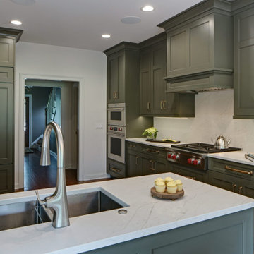
The refrigerator was originally in the middle of the main walkway. To gain more walk space and room for a larger refrigerator, we moved this appliance to the back wall.
The final design still has a peninsula but we flipped it to the opposite wall. This way, the walkway is more accommodating for traffic entering and exiting through the back garage door. This also gave way to a longer run of countertop space along the cooking wall.
To take cooking to another level, we implemented a speed oven!
The large window by the eating area is also nice for cooks to see, so we kept the sink in the peninsula.
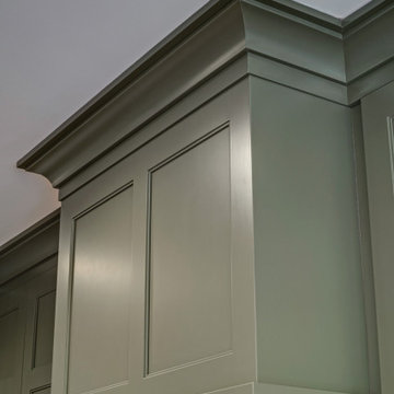
To gain space for storage and make the kitchen feel larger, we brought the wall cabinets all the way to the ceiling. What once felt tight now feels grand!
 User
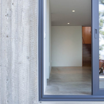
UserThe home creates a balance between modern architectural design and the incredible scenery surrounding it by preserving much of the natural landscape and taking advantage of natural sunlight and air flow.
Plans were drawn using passive house principles – showing a continuous insulation layer with appropriate thicknesses for the Montana climate around the entire conditioned space to minimize heat loss during winters and heat gain during summers. Overhangs and other shading devices allow the low winter sun into the building and keep the high summer sun out.
Glo European Windows A7 series was carefully selected for the Elk Ridge Passive House because of their High Solar Heat Gain Coefficient which allows the home to absorb free solar heat, and a low U-value to retain this heat once the sun sets.
The A7 windows were an excellent choice for durability and the ability to remain resilient in the harsh winter climate. Glo’s European hardware ensures smooth operation for fresh air and ventilation. The A7 windows from Glo were an easy choice for the Elk Ridge Passive House project.
 Drury Design
Design objectives for the remodel were aimed at maximizing the flow and functionality of a foodie-level kitchen with multiple cooks, while enhancing the family’s preferences for spending time in the space together:
Create a better workflow
Space out the appliances for better use of the kitchen area
Make the space feel larger visually
Update all materials so the kitchen isn’t all wood
No seating at an island or peninsula
Larger walkways
Brighten up the space with more lights and lighter colors
THE REMODEL
Design challenges to be solved:
The idea was to work within the current walls of the kitchen. Without removing walls, it was more of a challenge to give the kitchen a larger, new feel.
An island in the middle area was part of the original vision. Could a different countertop arrangement incorporate the same purpose?
The homeowners are big cooks so creating room for a larger refrigerator and more countertop space by the range were musts!
The sink and range were originally right next to each other, making things tough for two cooks to work at the same time. How could the new space allow for two work areas while minimizing traffic jams?
THE RENEWED SPACE
Design solutions fell into place once the overall layout was revamped to improve flow and functionality:
The refrigerator was originally in the middle of the main walkway. To gain more walk space and room for a larger refrigerator, we moved this appliance to the back wall.
The final design still has a peninsula but we flipped it to the opposite wall. This way, the walkway is more accommodating for traffic entering and exiting through the back garage door. This also gave way to a longer run of countertop space along the cooking wall.
To take cooking to another level, we implemented a speed oven!
The large window by the eating area is also nice for cooks to see, so we kept the sink in the peninsula.
To gain space for storage and make the kitchen feel larger, we brought the wall cabinets all the way to the ceiling. What once felt tight now feels grand!
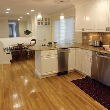
 Attleboro Kitchen and Bath
This Wayland condo breathed new lift after removing walls and creating a cozy eat-in space. We kept the kitchen's "U" shape but pushed the peninsula out slightly to gain more room in the kitchen. The addition of glass front cabinets and pantries bring storage and style together. The homeowner's request for a banquette presented a challenge for flow and space. By keeping the back low, we achieved the open floor plan feel. Now light flows throughout the space while still offering intimate vignettes to dine or relax.
8