
Search results for "Generate visual" in Home Design Ideas
 Drury Design
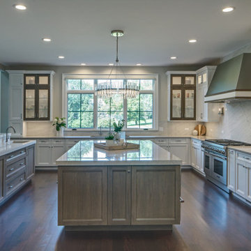
Our clients were ready to update their kitchen with soft and subtle colors to blend in with the home’s recently updated interior. It was also time to improve the layout. The kitchen needed to be reconfigured in order to facilitate a three-generation family and occasional entertaining.
Design Objectives
-Brighten up to blend with the home’s interior and flow into the adjacent family room area
-Incorporate specific storage for pantry items like bulk ingredients and small appliances
-Designate areas for a coffee bar, multiple prep areas and seating while highlighting a dry bar for display
-Keep clutter off of counters for a seamless design that facilitates visual flow through the entire area
Design Challenges
-Make a subtle statement with contrasting cabinets and countertops
-Incorporate a stand-alone, statement-making dry bar just outside the main kitchen space
-Design a statement hood that serves as a focal point without interrupting visual flow
-Update and add lighting to add more task, accent and overhead brightness.
-Have the space be usable for different tasks by different family members at the same time
-Create a space that looks classy and formal but is still inviting.
Design Solutions
-A soft grey stain and white paint were used on all the cabinets. On only the wall cabinets flanking the window was the grey introduced on the frame to make a pop against the white paint.
-The white-painted refrigerator and freezer door panel style is a custom reeded look that adds a soft contrasting detail against the main door style. Along with the open grey-stained interior cabinet above, it looks like a piece of furniture.
-The same soft tones were used for the countertops and a full, high backsplash of Chamonix quartzite that tied everything together. It’s an elegant backdrop for the hood.
-The Dry Bar, even though showcasing a dark stained cabinet, stays open and bright with a full mirror backsplash, wood retained glass floating shelves and glass wall cabinet doors. Brushed brass trim details and a fun light fixture add a pop of character.
-The same reeded door style as the refrigerator was used on the base doors of the dry bar to tie in with the kitchen.
-About 2/3 of the existing walk-in pantry was carved out for the new dry bar footprint while still keeping a shallow-depth pantry space for storage.
-The homeowners wanted a beautiful hood but didn’t want it to dominate the design. We kept the lines of the hood simple. The soft stainless steel body has a bottom accent that incorporates both the grey stain and white-painted cabinet colors.
-Even though the Kitchen had a lot of natural light from the large window, it was important to have task and subtle feature lighting. Recessed cans provide overall lighting while clear pendants shine down on the 2nd level of the seating area on the island.
-The circular clear chandelier is the statement piece over the main island while the pendants flanking the hood emphasize the quartzite backsplash and add as accent lighting in the evening along with the interior cabinet lights.
With three generations living in the home it was important to have areas that multiple family members could use at the same time without being in each other’s way. The design incorporates different zones like the coffee bar, charging station, dry bar and refrigerator drawers.
The softness of the colors and classic feel of the wood floor keep kitchen is inviting and calming.
 Drury Design
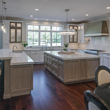
Our clients were ready to update their kitchen with soft and subtle colors to blend in with the home’s recently updated interior. It was also time to improve the layout. The kitchen needed to be reconfigured in order to facilitate a three-generation family and occasional entertaining.
Design Objectives
-Brighten up to blend with the home’s interior and flow into the adjacent family room area
-Incorporate specific storage for pantry items like bulk ingredients and small appliances
-Designate areas for a coffee bar, multiple prep areas and seating while highlighting a dry bar for display
-Keep clutter off of counters for a seamless design that facilitates visual flow through the entire area
Design Challenges
-Make a subtle statement with contrasting cabinets and countertops
-Incorporate a stand-alone, statement-making dry bar just outside the main kitchen space
-Design a statement hood that serves as a focal point without interrupting visual flow
-Update and add lighting to add more task, accent and overhead brightness.
-Have the space be usable for different tasks by different family members at the same time
-Create a space that looks classy and formal but is still inviting.
Design Solutions
-A soft grey stain and white paint were used on all the cabinets. On only the wall cabinets flanking the window was the grey introduced on the frame to make a pop against the white paint.
-The white-painted refrigerator and freezer door panel style is a custom reeded look that adds a soft contrasting detail against the main door style. Along with the open grey-stained interior cabinet above, it looks like a piece of furniture.
-The same soft tones were used for the countertops and a full, high backsplash of Chamonix quartzite that tied everything together. It’s an elegant backdrop for the hood.
-The Dry Bar, even though showcasing a dark stained cabinet, stays open and bright with a full mirror backsplash, wood retained glass floating shelves and glass wall cabinet doors. Brushed brass trim details and a fun light fixture add a pop of character.
-The same reeded door style as the refrigerator was used on the base doors of the dry bar to tie in with the kitchen.
-About 2/3 of the existing walk-in pantry was carved out for the new dry bar footprint while still keeping a shallow-depth pantry space for storage.
-The homeowners wanted a beautiful hood but didn’t want it to dominate the design. We kept the lines of the hood simple. The soft stainless steel body has a bottom accent that incorporates both the grey stain and white-painted cabinet colors.
-Even though the Kitchen had a lot of natural light from the large window, it was important to have task and subtle feature lighting. Recessed cans provide overall lighting while clear pendants shine down on the 2nd level of the seating area on the island.
-The circular clear chandelier is the statement piece over the main island while the pendants flanking the hood emphasize the quartzite backsplash and add as accent lighting in the evening along with the interior cabinet lights.
With three generations living in the home it was important to have areas that multiple family members could use at the same time without being in each other’s way. The design incorporates different zones like the coffee bar, charging station, dry bar and refrigerator drawers.
The softness of the colors and classic feel of the wood floor keep kitchen is inviting and calming.
 Drury Design
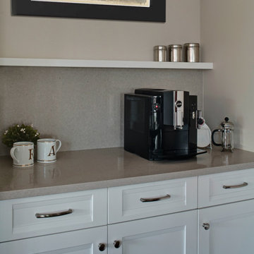
Our clients were ready to update their kitchen with soft and subtle colors to blend in with the home’s recently updated interior. It was also time to improve the layout. The kitchen needed to be reconfigured in order to facilitate a three-generation family and occasional entertaining.
Design Objectives
-Brighten up to blend with the home’s interior and flow into the adjacent family room area
-Incorporate specific storage for pantry items like bulk ingredients and small appliances
-Designate areas for a coffee bar, multiple prep areas and seating while highlighting a dry bar for display
-Keep clutter off of counters for a seamless design that facilitates visual flow through the entire area
Design Challenges
-Make a subtle statement with contrasting cabinets and countertops
-Incorporate a stand-alone, statement-making dry bar just outside the main kitchen space
-Design a statement hood that serves as a focal point without interrupting visual flow
-Update and add lighting to add more task, accent and overhead brightness.
-Have the space be usable for different tasks by different family members at the same time
-Create a space that looks classy and formal but is still inviting.
Design Solutions
-A soft grey stain and white paint were used on all the cabinets. On only the wall cabinets flanking the window was the grey introduced on the frame to make a pop against the white paint.
-The white-painted refrigerator and freezer door panel style is a custom reeded look that adds a soft contrasting detail against the main door style. Along with the open grey-stained interior cabinet above, it looks like a piece of furniture.
-The same soft tones were used for the countertops and a full, high backsplash of Chamonix quartzite that tied everything together. It’s an elegant backdrop for the hood.
-The Dry Bar, even though showcasing a dark stained cabinet, stays open and bright with a full mirror backsplash, wood retained glass floating shelves and glass wall cabinet doors. Brushed brass trim details and a fun light fixture add a pop of character.
-The same reeded door style as the refrigerator was used on the base doors of the dry bar to tie in with the kitchen.
-About 2/3 of the existing walk-in pantry was carved out for the new dry bar footprint while still keeping a shallow-depth pantry space for storage.
-The homeowners wanted a beautiful hood but didn’t want it to dominate the design. We kept the lines of the hood simple. The soft stainless steel body has a bottom accent that incorporates both the grey stain and white-painted cabinet colors.
-Even though the Kitchen had a lot of natural light from the large window, it was important to have task and subtle feature lighting. Recessed cans provide overall lighting while clear pendants shine down on the 2nd level of the seating area on the island.
-The circular clear chandelier is the statement piece over the main island while the pendants flanking the hood emphasize the quartzite backsplash and add as accent lighting in the evening along with the interior cabinet lights.
With three generations living in the home it was important to have areas that multiple family members could use at the same time without being in each other’s way. The design incorporates different zones like the coffee bar, charging station, dry bar and refrigerator drawers.
The softness of the colors and classic feel of the wood floor keep kitchen is inviting and calming.
Find the right local pro for your project
 Drury Design
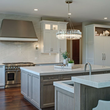
Our clients were ready to update their kitchen with soft and subtle colors to blend in with the home’s recently updated interior. It was also time to improve the layout. The kitchen needed to be reconfigured in order to facilitate a three-generation family and occasional entertaining.
Design Objectives
-Brighten up to blend with the home’s interior and flow into the adjacent family room area
-Incorporate specific storage for pantry items like bulk ingredients and small appliances
-Designate areas for a coffee bar, multiple prep areas and seating while highlighting a dry bar for display
-Keep clutter off of counters for a seamless design that facilitates visual flow through the entire area
Design Challenges
-Make a subtle statement with contrasting cabinets and countertops
-Incorporate a stand-alone, statement-making dry bar just outside the main kitchen space
-Design a statement hood that serves as a focal point without interrupting visual flow
-Update and add lighting to add more task, accent and overhead brightness.
-Have the space be usable for different tasks by different family members at the same time
-Create a space that looks classy and formal but is still inviting.
Design Solutions
-A soft grey stain and white paint were used on all the cabinets. On only the wall cabinets flanking the window was the grey introduced on the frame to make a pop against the white paint.
-The white-painted refrigerator and freezer door panel style is a custom reeded look that adds a soft contrasting detail against the main door style. Along with the open grey-stained interior cabinet above, it looks like a piece of furniture.
-The same soft tones were used for the countertops and a full, high backsplash of Chamonix quartzite that tied everything together. It’s an elegant backdrop for the hood.
-The Dry Bar, even though showcasing a dark stained cabinet, stays open and bright with a full mirror backsplash, wood retained glass floating shelves and glass wall cabinet doors. Brushed brass trim details and a fun light fixture add a pop of character.
-The same reeded door style as the refrigerator was used on the base doors of the dry bar to tie in with the kitchen.
-About 2/3 of the existing walk-in pantry was carved out for the new dry bar footprint while still keeping a shallow-depth pantry space for storage.
-The homeowners wanted a beautiful hood but didn’t want it to dominate the design. We kept the lines of the hood simple. The soft stainless steel body has a bottom accent that incorporates both the grey stain and white-painted cabinet colors.
-Even though the Kitchen had a lot of natural light from the large window, it was important to have task and subtle feature lighting. Recessed cans provide overall lighting while clear pendants shine down on the 2nd level of the seating area on the island.
-The circular clear chandelier is the statement piece over the main island while the pendants flanking the hood emphasize the quartzite backsplash and add as accent lighting in the evening along with the interior cabinet lights.
With three generations living in the home it was important to have areas that multiple family members could use at the same time without being in each other’s way. The design incorporates different zones like the coffee bar, charging station, dry bar and refrigerator drawers.
The softness of the colors and classic feel of the wood floor keep kitchen is inviting and calming.
 Drury Design
Our clients were ready to update their kitchen with soft and subtle colors to blend in with the home’s recently updated interior. It was also time to improve the layout. The kitchen needed to be reconfigured in order to facilitate a three-generation family and occasional entertaining.
Design Objectives
-Brighten up to blend with the home’s interior and flow into the adjacent family room area
-Incorporate specific storage for pantry items like bulk ingredients and small appliances
-Designate areas for a coffee bar, multiple prep areas and seating while highlighting a dry bar for display
-Keep clutter off of counters for a seamless design that facilitates visual flow through the entire area
Design Challenges
-Make a subtle statement with contrasting cabinets and countertops
-Incorporate a stand-alone, statement-making dry bar just outside the main kitchen space
-Design a statement hood that serves as a focal point without interrupting visual flow
-Update and add lighting to add more task, accent and overhead brightness.
-Have the space be usable for different tasks by different family members at the same time
-Create a space that looks classy and formal but is still inviting.
Design Solutions
-A soft grey stain and white paint were used on all the cabinets. On only the wall cabinets flanking the window was the grey introduced on the frame to make a pop against the white paint.
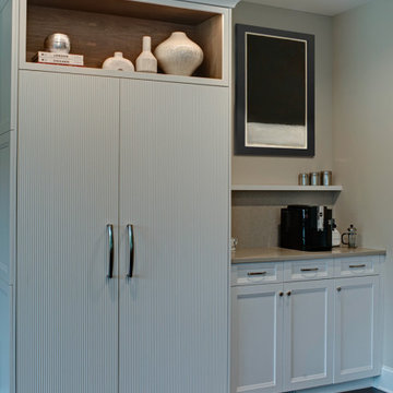
-The white-painted refrigerator and freezer door panel style is a custom reeded look that adds a soft contrasting detail against the main door style. Along with the open grey-stained interior cabinet above, it looks like a piece of furniture.
-The same soft tones were used for the countertops and a full, high backsplash of Chamonix quartzite that tied everything together. It’s an elegant backdrop for the hood.
-The Dry Bar, even though showcasing a dark stained cabinet, stays open and bright with a full mirror backsplash, wood retained glass floating shelves and glass wall cabinet doors. Brushed brass trim details and a fun light fixture add a pop of character.
-The same reeded door style as the refrigerator was used on the base doors of the dry bar to tie in with the kitchen.
-About 2/3 of the existing walk-in pantry was carved out for the new dry bar footprint while still keeping a shallow-depth pantry space for storage.
-The homeowners wanted a beautiful hood but didn’t want it to dominate the design. We kept the lines of the hood simple. The soft stainless steel body has a bottom accent that incorporates both the grey stain and white-painted cabinet colors.
-Even though the Kitchen had a lot of natural light from the large window, it was important to have task and subtle feature lighting. Recessed cans provide overall lighting while clear pendants shine down on the 2nd level of the seating area on the island.
-The circular clear chandelier is the statement piece over the main island while the pendants flanking the hood emphasize the quartzite backsplash and add as accent lighting in the evening along with the interior cabinet lights.
With three generations living in the home it was important to have areas that multiple family members could use at the same time without being in each other’s way. The design incorporates different zones like the coffee bar, charging station, dry bar and refrigerator drawers.
The softness of the colors and classic feel of the wood floor keep kitchen is inviting and calming.
 Advance Design Studio, Ltd.
Mike and Anne of Barrington Hills desperately needed to update and renovate both their kid’s hall bath and guest bath, and in their 1980’s home each project presented a different set of unique challenges to overcome. When they set out to identify the right remodeling company to partner with, it was important to find a company that could help them to visualize design solutions for the bath renovations. When they came across Advance Design Studio’s website, they were immediately drawn to the solution-oriented remodeling process and the family friendly company.
They say they chose Advance Design because of the integrated approach of “Common Sense Remodeling”, making the design, project management and construction all happen in one place. When they met with Project Designer Michelle Lecinski, they knew they chose the right company. “Michelle’s excellent work on the initial designs made it easy to proceed with Advance Design Studio,” Mike said.
Like most homeowners anticipating a big renovation project, they had some healthy fears; with two bathrooms being remodeled at the same time they worried about timeframes and staying within budget. With the help of Michelle, and the “Common Sense” guidelines, they were confident that Advance Design would stay true, orchestrating all the moving parts to stay within both the estimated timeline and budget.
The guest bath offered the biggest design challenge. A dormer obstruction made the already cramped shower awkward to access. Mike and Anne also wanted the shower size to be expanded, making it more accommodating. Working with Advance’s construction expert DJ Yurik, Michelle relocated the shower concealing the original dormer and creating a larger, more comfortable and aesthetically pleasing guest shower.
The unsightly and not at all user-friendly closet was removed and replaced with elegant White Maple Dura Supreme cabinetry with much improved function featuring dual tall linen cabinets, a special makeup area and two sinks, providing a dual vanity which was extremely important for better guest use.
The Fossil Brown quartz countertop is in pleasing contrast to the white cabinetry, and coordinates nicely with the mocha porcelain tile gracing the shower for an accent. The decorative glazed turquoise tile backsplash, tile border, and bottle niche adds a taste of marine green to the room, while marble-looking porcelain tile makes guests feel they are staying in a 5-star hotel. Polished nickel Kohler plumbing fixtures were chosen to add a touch of sophistication. This renovated guest bath is comfortable and elegant, and Anne and Mike’s house guests may never want to leave!
“The end result was updated and restyled bathrooms that the client will enjoy and increase the value of their home,” Designer Michelle said.
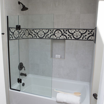
The children’s hall bath had its own set of challenges. The current placement of the sink was not conducive to the best use of the existing space, nor did it allow for any visual interest, something Advance’s designers always work to achieve even within the tight confines of a small bath. Advance removed the linen closet and used the gain in wall space to create a dramatic focal point on the vanity wall. They also took additional space that wasn’t being used for new Storm Gray Dura Supreme tall built-in linen cabinets, creating functional storage space that the former bath lacked. A customized glass splash panel was created for the bath, and the high ceilings with skylights were accented with a custom-made track lighting fixture featuring industrial pipe and cage materials.
Authentic cement encaustic tile was used wall to wall surrounding the vanity to create a dramatic and interesting back drop for the new elegant and stately furniture-like double sink wall. Hand-made encaustic tile originated in Western Europe beginning in the 1850’s and reminded Mike and Anne of tile they had seen and loved from their travels overseas. Today, encaustic tile has made a re-appearance in today’s modern bath design with its wide array of appealing patterns and artistic use of color.
Oil rubbed bronze Kohler fixtures echo the black accents in the beautiful tile pattern and reflect the matte black of the unique lighting detail. Easy to maintain Blanca Arabescato Quartz countertops add practicality and natural beauty and compliments the warm wood porcelain tile floors. This handsome bath has generated praise from friends and family even before it’s complete unveiling as photos of the space leaked out on social media! It’s not only completely functional to use, but especially pretty to look at.
“Advance Design Studio did a terrific job for us. We really appreciated how easy it was to work with them on a complex project of the complete remodeling of two bathrooms. They very capably handled all the details from design, to project management, to construction. It is a great group of people to work with and we would welcome the opportunity to work with them again anytime,” Mike said.
 Drury Design
Our clients were ready to update their kitchen with soft and subtle colors to blend in with the home’s recently updated interior. It was also time to improve the layout. The kitchen needed to be reconfigured in order to facilitate a three-generation family and occasional entertaining.
Design Objectives
-Brighten up to blend with the home’s interior and flow into the adjacent family room area
-Incorporate specific storage for pantry items like bulk ingredients and small appliances
-Designate areas for a coffee bar, multiple prep areas and seating while highlighting a dry bar for display
-Keep clutter off of counters for a seamless design that facilitates visual flow through the entire area
Design Challenges
-Make a subtle statement with contrasting cabinets and countertops
-Incorporate a stand-alone, statement-making dry bar just outside the main kitchen space
-Design a statement hood that serves as a focal point without interrupting visual flow
-Update and add lighting to add more task, accent and overhead brightness.
-Have the space be usable for different tasks by different family members at the same time
-Create a space that looks classy and formal but is still inviting.
Design Solutions
-A soft grey stain and white paint were used on all the cabinets. On only the wall cabinets flanking the window was the grey introduced on the frame to make a pop against the white paint.
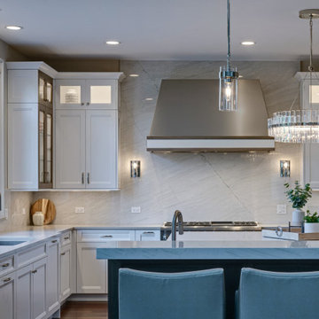
-The white-painted refrigerator and freezer door panel style is a custom reeded look that adds a soft contrasting detail against the main door style. Along with the open grey-stained interior cabinet above, it looks like a piece of furniture.
-The same soft tones were used for the countertops and a full, high backsplash of Chamonix quartzite that tied everything together. It’s an elegant backdrop for the hood.
-The Dry Bar, even though showcasing a dark stained cabinet, stays open and bright with a full mirror backsplash, wood retained glass floating shelves and glass wall cabinet doors. Brushed brass trim details and a fun light fixture add a pop of character.
-The same reeded door style as the refrigerator was used on the base doors of the dry bar to tie in with the kitchen.
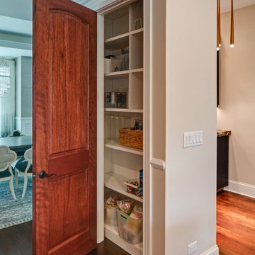
-About 2/3 of the existing walk-in pantry was carved out for the new dry bar footprint while still keeping a shallow-depth pantry space for storage.
-The homeowners wanted a beautiful hood but didn’t want it to dominate the design. We kept the lines of the hood simple. The soft stainless steel body has a bottom accent that incorporates both the grey stain and white-painted cabinet colors.
-Even though the Kitchen had a lot of natural light from the large window, it was important to have task and subtle feature lighting. Recessed cans provide overall lighting while clear pendants shine down on the 2nd level of the seating area on the island.
-The circular clear chandelier is the statement piece over the main island while the pendants flanking the hood emphasize the quartzite backsplash and add as accent lighting in the evening along with the interior cabinet lights.
With three generations living in the home it was important to have areas that multiple family members could use at the same time without being in each other’s way. The design incorporates different zones like the coffee bar, charging station, dry bar and refrigerator drawers.
The softness of the colors and classic feel of the wood floor keep kitchen is inviting and calming.


 Drury Design
Our clients were ready to update their kitchen with soft and subtle colors to blend in with the home’s recently updated interior. It was also time to improve the layout. The kitchen needed to be reconfigured in order to facilitate a three-generation family and occasional entertaining.
Design Objectives
-Brighten up to blend with the home’s interior and flow into the adjacent family room area
-Incorporate specific storage for pantry items like bulk ingredients and small appliances
-Designate areas for a coffee bar, multiple prep areas and seating while highlighting a dry bar for display
-Keep clutter off of counters for a seamless design that facilitates visual flow through the entire area
Design Challenges
-Make a subtle statement with contrasting cabinets and countertops
-Incorporate a stand-alone, statement-making dry bar just outside the main kitchen space
-Design a statement hood that serves as a focal point without interrupting visual flow
-Update and add lighting to add more task, accent and overhead brightness.
-Have the space be usable for different tasks by different family members at the same time
-Create a space that looks classy and formal but is still inviting.
Design Solutions
-A soft grey stain and white paint were used on all the cabinets. On only the wall cabinets flanking the window was the grey introduced on the frame to make a pop against the white paint.
-The white-painted refrigerator and freezer door panel style is a custom reeded look that adds a soft contrasting detail against the main door style. Along with the open grey-stained interior cabinet above, it looks like a piece of furniture.
-The same soft tones were used for the countertops and a full, high backsplash of Chamonix quartzite that tied everything together. It’s an elegant backdrop for the hood.
-The Dry Bar, even though showcasing a dark stained cabinet, stays open and bright with a full mirror backsplash, wood retained glass floating shelves and glass wall cabinet doors. Brushed brass trim details and a fun light fixture add a pop of character.
-The same reeded door style as the refrigerator was used on the base doors of the dry bar to tie in with the kitchen.
-About 2/3 of the existing walk-in pantry was carved out for the new dry bar footprint while still keeping a shallow-depth pantry space for storage.
-The homeowners wanted a beautiful hood but didn’t want it to dominate the design. We kept the lines of the hood simple. The soft stainless steel body has a bottom accent that incorporates both the grey stain and white-painted cabinet colors.
-Even though the Kitchen had a lot of natural light from the large window, it was important to have task and subtle feature lighting. Recessed cans provide overall lighting while clear pendants shine down on the 2nd level of the seating area on the island.
-The circular clear chandelier is the statement piece over the main island while the pendants flanking the hood emphasize the quartzite backsplash and add as accent lighting in the evening along with the interior cabinet lights.
With three generations living in the home it was important to have areas that multiple family members could use at the same time without being in each other’s way. The design incorporates different zones like the coffee bar, charging station, dry bar and refrigerator drawers.
The softness of the colors and classic feel of the wood floor keep kitchen is inviting and calming.
 Sierra Living Concepts Inc
Dimension: 45" W x 26" D X 69.5" H
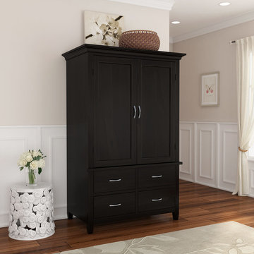
Tall, spacious and stunning, our Magaluf Solid Wood 4 Drawer Rustic Armoire is a dream come true for all those who want a storage unit boasting tons of style and amazing pragmatism.
Featuring 4 drawers and a wardrobe, the exterior of this rustic solid hardwood armoire is highly chic and sophisticated. The extended top is designed in the form of a decorative crown molding, the double-leaf wardrobe doors have a wainscot style recess and the feet have an attractive slant that adds to the aesthetics of this wardrobe armoire. The stainless steel hardware provides a nice contrast against the gorgeous espresso finish as well.
All 4 drawers on the exterior are highly spacious and provide opportunities for isolated storage for items you want to individually organize – a separate drawer for bags, documents, shoes and winter clothes. The wardrobe compartment opens up to reveal an inbuilt open shelf and a stainless steel hanging rod at the top.
Handcrafted from solid Rosewood, this rustic armoire cabinet redefines the modern luxury aesthetic with its elegant looks and sturdy build. It warrants an excellent heirloom quality that you can pass down to your next generation.
Its visual flexibility is also unparalleled. The design of this rustic solid hardwood armoire is extremely adaptable and can be easily set-up in a number of different interior design styles. It would look just as gorgeous in a contemporary setting as it would in a traditional, rustic, retro and even transitional style ambiance.
Special Features:
• 100% Handcrafted
• Solid Rosewood craftsmanship
• 4 exterior drawers
• Double-leaf wardrobe doors
• 1 open in-built shelf in the interior
• 1 stainless steel hanging rod in the interior
• Stainless steel hardware
• Dark espresso finish
• Gently slanting feet
• Can be custom-made to have adjustable/removable shelves upon request
• Visually versatile
• Heirloom quality
• Easy maintenance
Note: Real wood is a product of nature, and as such, no two pieces are alike. Variations in solid wood grain patterns are to be expected and make each furniture uniquely beautiful, just like us humans.
 Maple Mountain Fireplaces
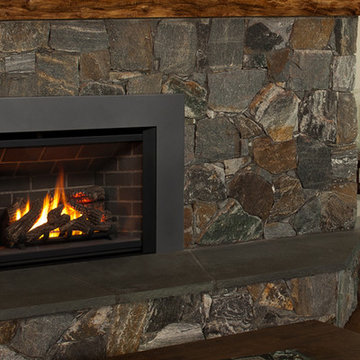
With over two decades of design innovation and four generations of Legend gas insert DNA, it’s no surprise that the Legend G3.5 exudes radiance, high efficiency and the ultimate in comfort control. A collection of contemporary trims frame an impressive viewing area, highlighting warm, glowing flames within. Fireplace surrounds include both 3 and 4-sided designs, providing flexible installation options and visual updates to your existing hearth.
A wide selection of finishes include - black powder coat, bronze powder coat, vintage iron powder coat and plated brushed nickel. Another industry first, Valor Dynamic Restrictor Technology (VDRT) automatically adjusts air flow within the fireplace, increasing thermal efficiencies. VDRT maximizes initial startup and improves overall performance in ways fixed restrictors cannot.
A contemporary update for existing spaces, the Legend G3.5 is a welcomed addition to the highly successful Legend Insert family.
 Drury Design
Our clients were ready to update their kitchen with soft and subtle colors to blend in with the home’s recently updated interior. It was also time to improve the layout. The kitchen needed to be reconfigured in order to facilitate a three-generation family and occasional entertaining.
Design Objectives
-Brighten up to blend with the home’s interior and flow into the adjacent family room area
-Incorporate specific storage for pantry items like bulk ingredients and small appliances
-Designate areas for a coffee bar, multiple prep areas and seating while highlighting a dry bar for display
-Keep clutter off of counters for a seamless design that facilitates visual flow through the entire area
Design Challenges
-Make a subtle statement with contrasting cabinets and countertops
-Incorporate a stand-alone, statement-making dry bar just outside the main kitchen space
-Design a statement hood that serves as a focal point without interrupting visual flow
-Update and add lighting to add more task, accent and overhead brightness.
-Have the space be usable for different tasks by different family members at the same time
-Create a space that looks classy and formal but is still inviting.
Design Solutions
-A soft grey stain and white paint were used on all the cabinets. On only the wall cabinets flanking the window was the grey introduced on the frame to make a pop against the white paint.
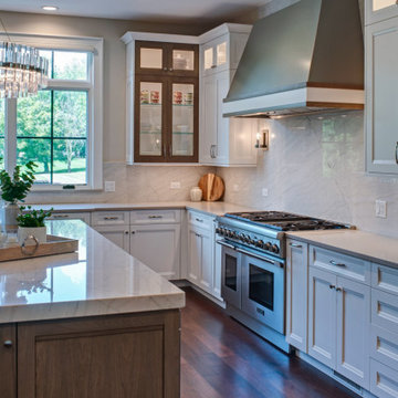
-The white-painted refrigerator and freezer door panel style is a custom reeded look that adds a soft contrasting detail against the main door style. Along with the open grey-stained interior cabinet above, it looks like a piece of furniture.
-The same soft tones were used for the countertops and a full, high backsplash of Chamonix quartzite that tied everything together. It’s an elegant backdrop for the hood.
-The Dry Bar, even though showcasing a dark stained cabinet, stays open and bright with a full mirror backsplash, wood retained glass floating shelves and glass wall cabinet doors. Brushed brass trim details and a fun light fixture add a pop of character.
-The same reeded door style as the refrigerator was used on the base doors of the dry bar to tie in with the kitchen.
-About 2/3 of the existing walk-in pantry was carved out for the new dry bar footprint while still keeping a shallow-depth pantry space for storage.
-The homeowners wanted a beautiful hood but didn’t want it to dominate the design. We kept the lines of the hood simple. The soft stainless steel body has a bottom accent that incorporates both the grey stain and white-painted cabinet colors.
-Even though the Kitchen had a lot of natural light from the large window, it was important to have task and subtle feature lighting. Recessed cans provide overall lighting while clear pendants shine down on the 2nd level of the seating area on the island.
-The circular clear chandelier is the statement piece over the main island while the pendants flanking the hood emphasize the quartzite backsplash and add as accent lighting in the evening along with the interior cabinet lights.
With three generations living in the home it was important to have areas that multiple family members could use at the same time without being in each other’s way. The design incorporates different zones like the coffee bar, charging station, dry bar and refrigerator drawers.
The softness of the colors and classic feel of the wood floor keep kitchen is inviting and calming.
 Miller-Roodell Architects Ltd
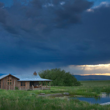
Set in Montana's tranquil Shields River Valley, the Shilo Ranch Compound is a collection of structures that were specifically built on a relatively smaller scale, to maximize efficiency. The main house has two bedrooms, a living area, dining and kitchen, bath and adjacent greenhouse, while two guest homes within the compound can sleep a total of 12 friends and family. There's also a common gathering hall, for dinners, games, and time together. The overall feel here is of sophisticated simplicity, with plaster walls, concrete and wood floors, and weathered boards for exteriors. The placement of each building was considered closely when envisioning how people would move through the property, based on anticipated needs and interests. Sustainability and consumption was also taken into consideration, as evidenced by the photovoltaic panels on roof of the garage, and the capability to shut down any of the compound's buildings when not in use.
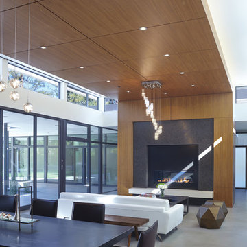
 ODS Architecture
Atherton has many large substantial homes - our clients purchased an existing home on a one acre flag-shaped lot and asked us to design a new dream home for them. The result is a new 7,000 square foot four-building complex consisting of the main house, six-car garage with two car lifts, pool house with a full one bedroom residence inside, and a separate home office /work out gym studio building. A fifty-foot swimming pool was also created with fully landscaped yards.
Given the rectangular shape of the lot, it was decided to angle the house to incoming visitors slightly so as to more dramatically present itself. The house became a classic u-shaped home but Feng Shui design principals were employed directing the placement of the pool house to better contain the energy flow on the site. The main house entry door is then aligned with a special Japanese red maple at the end of a long visual axis at the rear of the site. These angles and alignments set up everything else about the house design and layout, and views from various rooms allow you to see into virtually every space tracking movements of others in the home.
The residence is simply divided into two wings of public use, kitchen and family room, and the other wing of bedrooms, connected by the living and dining great room. Function drove the exterior form of windows and solid walls with a line of clerestory windows which bring light into the middle of the large home. Extensive sun shadow studies with 3D tree modeling led to the unorthodox placement of the pool to the north of the home, but tree shadow tracking showed this to be the sunniest area during the entire year.
Sustainable measures included a full 7.1kW solar photovoltaic array technically making the house off the grid, and arranged so that no panels are visible from the property. A large 16,000 gallon rainwater catchment system consisting of tanks buried below grade was installed. The home is California GreenPoint rated and also features sealed roof soffits and a sealed crawlspace without the usual venting. A whole house computer automation system with server room was installed as well. Heating and cooling utilize hot water radiant heated concrete and wood floors supplemented by heat pump generated heating and cooling.
A compound of buildings created to form balanced relationships between each other, this home is about circulation, light and a balance of form and function.
Photo by John Sutton Photography.


 TKS Design Group
Free ebook, Creating the Ideal Kitchen. DOWNLOAD NOW
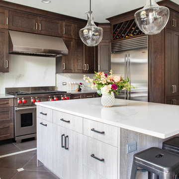
Our clients came in after thinking a long time about what to do with their kitchen – new cabinets or paint them, white kitchen or wood, custom or is semi-custom? All good questions to ask! They were committed to making this home for a while, they decided to do a full remodel. The kitchen was not living up to its potential both visually and functionally. The dark cabinets and countertop made the room feel dull. And the major drawback, a large corner pantry that was eating into the room, make it appear smaller than it was.
We started by ditching the corner pantry. It created a perfectly centered spot for the new professional range and made room for a much larger island that now houses a beverage center, microwave drawer, seating for three and tons of storage. The multi-generational family does a ton of cooking, so this kitchen gets used! We spent lots of time fine tuning the storage devices and planning where critical items would be stored. This included the new pantry area across from the refrigerator that houses small appliances and food staples.
Designed by: Susan Klimala, CKBD
Photography by: LOMA Studios
For more information on kitchen and bath design ideas go to: www.kitchenstudio-ge.com
 LM Builders Lodhra Modern
HOME
HOME
STUDIO
STUDIO
PROJECTS
PROJECTS
JOURNALS
JOURNALS
GALLERY
GALLERY
CONTACT US
CONTACT US
CONTACT US
CONTACT US
MENU
MENU
Project
320 Spencer Pl
Scroll down
Scroll down
Location
320 Spencer Pl, Paramus, NJ
Country
US
Project Type
Residential
Collaborator
Skyline Engineering Consultants
Photography
LM Studios
Year of Completion
2026
Size / Area
9000 m²
Status
Completed
Description
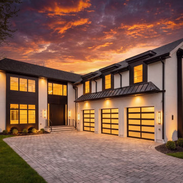
Lodhra Modern Builders completed this residential construction project with a focus on quality, precision, and long term value. From planning and site preparation through construction and final finishing, every phase was carefully managed to ensure a smooth and efficient building process.
The home was constructed to meet modern living standards while maintaining structural integrity and lasting durability. Attention to detail, quality craftsmanship, and effective project coordination played a key role in delivering a residence that is both functional and visually appealing.
This project reflects our commitment to building homes that combine comfort, reliability, and exceptional construction quality, resulting in a space designed to serve generations to come
 Wisdom Building Materials
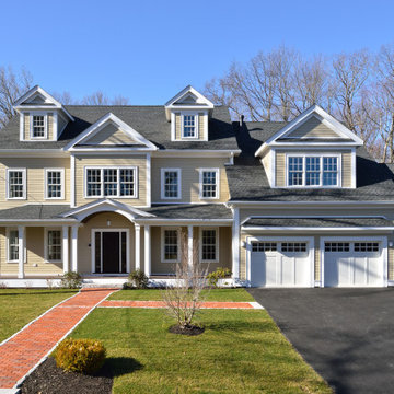
Last year, our residential sanctuary embarked on an awe-inspiring journey to redefine its aesthetic allure and fortify its longevity. Our canvas of choice? The Fiber Cement Board Solid Color Series siding, enveloping an expansive 200-square-meter canvas, and it's a true masterpiece in the making! ??
Why Fiber Cement, you ask? ?️ With its premium quality, unwavering durability, and unparalleled visual charm, it harmoniously synchronized with our creative vision. ?
Our heartfelt gratitude extends to our remarkable supplier! Their lightning-fast delivery services ensured we stayed on schedule, and their customer service was a class apart, addressing our inquiries with prompt professionalism. ??
But the real star of the show? The Fiber Cement Board Solid Color Series siding, which not only met but far exceeded our loftiest expectations. Its immaculate finish, a dazzling array of vibrant hues, and an unrivaled ability to stand up to the elements have not only revolutionized our home's façade but also fortified it for generations to come. ?️?
In a nutshell, our residential project in 2022 was a sensational triumph, all thanks to the extraordinary Fiber Cement Board Solid Color Series siding and the stellar support from our supplier. Today, we revel in a home exterior that marries timeless beauty with unwavering resilience. ? #HomeTransformation #FiberCementMagic #WisdomBuildingMaterials
 Native Edge Landscape
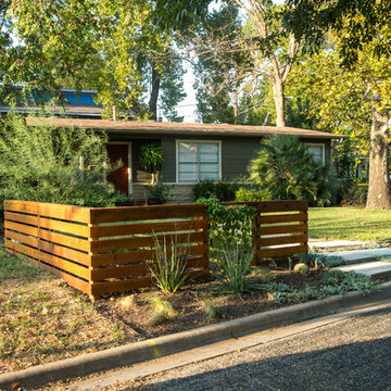
Another fun Crestview project! This young couple wanted a back yard that reflected their bohemian-eclectic style and could add additional privacy from the ever climbing construction around them. A place for “hanging out and drinking coffee or beer in the backyard.” But what was most exciting, was the air stream they had just purchased and were in the process of restoring. With the end goal of using it as a guest home for family and friends, we were challenged with creating a space that was cohesive and connected this new living space with the rest of the yard.
In the front we had another quark to fix. The sidewalk from their front door to the street suddenly stopped 5 feet from the curb, making a less than inviting entry for guests. So, creating a new usable entryway with additional curb appeal was a top priority.
We managed the entertainment space by using modern poured concrete pad’s as a focal. A poured concrete wall serves as a bench as well as creates a visual anchor for the patio area. To soften the hard materials, small plantings of succulents and ground cover were planted in the spaces between the pads. For a backdrop, a custom Cedar Plank wall and trellis combined to soften the vertical space and add plenty of privacy. The trellis is anchored by a Coral Vine to add interest. Cafe style lighting was strung across the area create a sense of intimacy.
We also completed the fence transition, and eliminated the grass areas that were not being utilized to reduce the amount of water waste in the landscape, and replaced these areas with beneficial plantings for the wildlife.
Overall, this landscape was completed with a cohesive Austin-friendly design in mind for these busy young professionals!
Caleb Kerr - http://www.calebkerr.com
Sponsored
Columbus, OH

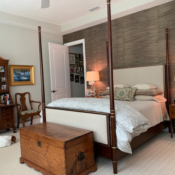
Snider & Metcalf Interior Design, LTD
Leading Interior Designers in Columbus, Ohio & Ponte Vedra, Florida
 Reico Kitchen & Bath
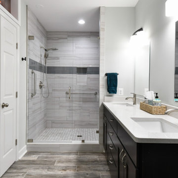
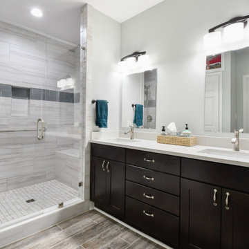
Designed by Catherine Neitzey of Reico Kitchen & Bath in Fredericksburg, VA in collaboration with Heritage Contracting Services, this transitional style inspired two-finish kitchen design features Merillat Classic Tolani Maple Kona and Merillat Masterpiece Montresano with Aged Picket Fence finish cabinets. The bathroom also features Tolani Maple Kona cabinetry. The kitchen includes an Imagery Glass Mosaic 3x6 in Rain material Glass GM07412 tile backsplash.
“We walked into Reico without an appointment, because 2 friends highly recommended them.
We were warmly greeted by Cat, even without an appointment,” said the client. “Cat listened, and then pulled out samples as she guided us patiently through the process. She brought to our attention a cabinet larger than the actual area in our plan. We were able to adjust before it was ordered. Her guidance, suggestions and attention to our likes and dislikes proved to be invaluable.”
“This project was remodeling a basement to add to a multi-generation home with an eye on creating a space to enjoy,” said Cat. “I hit it off with the client right away, meeting prior to selecting a contractor which changed the dynamic of our roles for the duration of the project.”
The client added, “One of the best services Reico provided was computer generated visuals. It helped us see what the overall look would be. The kitchen and bathroom are beyond our expectations. We love the look and the flow!”
“We changed the wall cabinet color as the space started to come together with all of the supporting selections made,” said Cat. “The Aged Picket Fence painted finish with its artisan random distressing contrasts the contemporary base cabinets and glass tile in the best way. It is such a warm version of today's popular white and gray color schemes. Added greens and textures really keep the space so warm and inviting.”
Photos by Tim Snyder Photography.
 Reico Kitchen & Bath
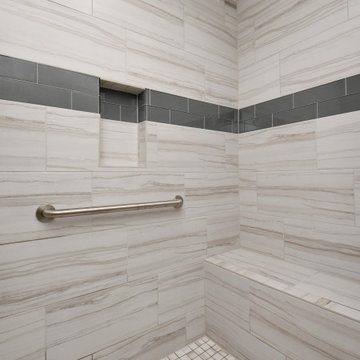
Designed by Catherine Neitzey of Reico Kitchen & Bath in Fredericksburg, VA in collaboration with Heritage Contracting Services, this transitional style inspired two-finish kitchen design features Merillat Classic Tolani Maple Kona and Merillat Masterpiece Montresano with Aged Picket Fence finish cabinets. The bathroom also features Tolani Maple Kona cabinetry. The kitchen includes an Imagery Glass Mosaic 3x6 in Rain material Glass GM07412 tile backsplash.
“We walked into Reico without an appointment, because 2 friends highly recommended them.
We were warmly greeted by Cat, even without an appointment,” said the client. “Cat listened, and then pulled out samples as she guided us patiently through the process. She brought to our attention a cabinet larger than the actual area in our plan. We were able to adjust before it was ordered. Her guidance, suggestions and attention to our likes and dislikes proved to be invaluable.”
“This project was remodeling a basement to add to a multi-generation home with an eye on creating a space to enjoy,” said Cat. “I hit it off with the client right away, meeting prior to selecting a contractor which changed the dynamic of our roles for the duration of the project.”
The client added, “One of the best services Reico provided was computer generated visuals. It helped us see what the overall look would be. The kitchen and bathroom are beyond our expectations. We love the look and the flow!”
“We changed the wall cabinet color as the space started to come together with all of the supporting selections made,” said Cat. “The Aged Picket Fence painted finish with its artisan random distressing contrasts the contemporary base cabinets and glass tile in the best way. It is such a warm version of today's popular white and gray color schemes. Added greens and textures really keep the space so warm and inviting.”
Photos by Tim Snyder Photography.
 Reico Kitchen & Bath
Designed by Catherine Neitzey of Reico Kitchen & Bath in Fredericksburg, VA in collaboration with Heritage Contracting Services, this transitional style inspired two-finish kitchen design features Merillat Classic Tolani Maple Kona and Merillat Masterpiece Montresano with Aged Picket Fence finish cabinets. The bathroom also features Tolani Maple Kona cabinetry. The kitchen includes an Imagery Glass Mosaic 3x6 in Rain material Glass GM07412 tile backsplash.
“We walked into Reico without an appointment, because 2 friends highly recommended them.
We were warmly greeted by Cat, even without an appointment,” said the client. “Cat listened, and then pulled out samples as she guided us patiently through the process. She brought to our attention a cabinet larger than the actual area in our plan. We were able to adjust before it was ordered. Her guidance, suggestions and attention to our likes and dislikes proved to be invaluable.”
“This project was remodeling a basement to add to a multi-generation home with an eye on creating a space to enjoy,” said Cat. “I hit it off with the client right away, meeting prior to selecting a contractor which changed the dynamic of our roles for the duration of the project.”
The client added, “One of the best services Reico provided was computer generated visuals. It helped us see what the overall look would be. The kitchen and bathroom are beyond our expectations. We love the look and the flow!”
“We changed the wall cabinet color as the space started to come together with all of the supporting selections made,” said Cat. “The Aged Picket Fence painted finish with its artisan random distressing contrasts the contemporary base cabinets and glass tile in the best way. It is such a warm version of today's popular white and gray color schemes. Added greens and textures really keep the space so warm and inviting.”
Photos by Tim Snyder Photography.
22