
Search results for "Generously check" in Home Design Ideas

 Donald Lococo Architects
A simple front facade consisting solely of ten-foot shuttered French doors radiates elegance in this new traditional foursquare home in Washington, D.C. Featured in Country Living magazine, the airy plan offers spaciousness in a limited-fronted site of the American foursquare house. The goal for the design was creating a contemporary foursquare style house. The family room and kitchen of this American foursquare interior are separated by a glassy built-in rather than walls, encouraging visual connection between the spaces in the four square house. Though nestled in the city, this American foursquare home feels like a classic country home.

 Jackson Design & Remodeling
For a client with an enthusiastic appreciation of retro design, this sunny ode to kitchens of the past is a cheerful and comforting retreat for today. The client wanted a kitchen that creatively expressed her fun, unconventional taste while providing all the modern conveniences of a contemporary home.
Space was borrowed from an existing office to provide more open area and easier navigation in the kitchen. Bright, optimistic yellow sets the tone in the room, with retro-inspired appliances in buttery yellow chosen as key elements of the design. A generous apron-front farm sink gleams with clean white enameled cast iron and is outfitted with a rare retro faucet with spray and scrub brush attachments. Black trim against the yellow ceramic tile countertops defines the kitchen’s lines. Simple maple cabinetry painted white with black ceramic knobs provides a modern level of storage.
Playful positioning of contrasting tiles on the floor presents a modern, quirky interpretation of the traditional checkerboard pattern in this classic kitchen with an original point of view.

 ZeroEnergy Design
This renovated brick rowhome in Boston’s South End offers a modern aesthetic within a historic structure, creative use of space, exceptional thermal comfort, a reduced carbon footprint, and a passive stream of income.
DESIGN PRIORITIES. The goals for the project were clear - design the primary unit to accommodate the family’s modern lifestyle, rework the layout to create a desirable rental unit, improve thermal comfort and introduce a modern aesthetic. We designed the street-level entry as a shared entrance for both the primary and rental unit. The family uses it as their everyday entrance - we planned for bike storage and an open mudroom with bench and shoe storage to facilitate the change from shoes to slippers or bare feet as they enter their home. On the main level, we expanded the kitchen into the dining room to create an eat-in space with generous counter space and storage, as well as a comfortable connection to the living space. The second floor serves as master suite for the couple - a bedroom with a walk-in-closet and ensuite bathroom, and an adjacent study, with refinished original pumpkin pine floors. The upper floor, aside from a guest bedroom, is the child's domain with interconnected spaces for sleeping, work and play. In the play space, which can be separated from the work space with new translucent sliding doors, we incorporated recreational features inspired by adventurous and competitive television shows, at their son’s request.
MODERN MEETS TRADITIONAL. We left the historic front facade of the building largely unchanged - the security bars were removed from the windows and the single pane windows were replaced with higher performing historic replicas. We designed the interior and rear facade with a vision of warm modernism, weaving in the notable period features. Each element was either restored or reinterpreted to blend with the modern aesthetic. The detailed ceiling in the living space, for example, has a new matte monochromatic finish, and the wood stairs are covered in a dark grey floor paint, whereas the mahogany doors were simply refinished. New wide plank wood flooring with a neutral finish, floor-to-ceiling casework, and bold splashes of color in wall paint and tile, and oversized high-performance windows (on the rear facade) round out the modern aesthetic.
RENTAL INCOME. The existing rowhome was zoned for a 2-family dwelling but included an undesirable, single-floor studio apartment at the garden level with low ceiling heights and questionable emergency egress. In order to increase the quality and quantity of space in the rental unit, we reimagined it as a two-floor, 1 or 2 bedroom, 2 bathroom apartment with a modern aesthetic, increased ceiling height on the lowest level and provided an in-unit washer/dryer. The apartment was listed with Jackie O'Connor Real Estate and rented immediately, providing the owners with a source of passive income.
ENCLOSURE WITH BENEFITS. The homeowners sought a minimal carbon footprint, enabled by their urban location and lifestyle decisions, paired with the benefits of a high-performance home. The extent of the renovation allowed us to implement a deep energy retrofit (DER) to address air tightness, insulation, and high-performance windows. The historic front facade is insulated from the interior, while the rear facade is insulated on the exterior. Together with these building enclosure improvements, we designed an HVAC system comprised of continuous fresh air ventilation, and an efficient, all-electric heating and cooling system to decouple the house from natural gas. This strategy provides optimal thermal comfort and indoor air quality, improved acoustic isolation from street noise and neighbors, as well as a further reduced carbon footprint. We also took measures to prepare the roof for future solar panels, for when the South End neighborhood’s aging electrical infrastructure is upgraded to allow them.
URBAN LIVING. The desirable neighborhood location allows the both the homeowners and tenant to walk, bike, and use public transportation to access the city, while each charging their respective plug-in electric cars behind the building to travel greater distances.
OVERALL. The understated rowhouse is now ready for another century of urban living, offering the owners comfort and convenience as they live life as an expression of their values.
Eric Roth Photo
Find the right local pro for your project

 TKS Design Group
Free ebook, Creating the Ideal Kitchen. DOWNLOAD NOW
One of my favorite things to work on is older homes with a bit of history because I find it an interesting challenge to marry the historical architectural features of a home with modern design elements that work well for my client’s current lifestyle.
This home was particularly fun because it was the second kitchen we had done for this family and was quite a departure from the style of the first kitchen.
The before shot of the kitchen shows a view from the family room. See the dropped ceiling? We were curious, was this just part of the design or was the dropped ceiling there to hide mechanicals? Well we soon found out that it was mostly decorative (yay!), and with the exception of a little bit of work to some plumbing from an upstairs bathroom and rerouting of the ventilation system within the original floor joists, we were in the clear, phew! The shot of the completed kitchen from roughly the same vantage point shows how much taller the ceilings are. It makes a huge difference in the feel of the space. Dark and gloomy turned fresh and light!
Another serious consideration was what do we do with the skinny transom window above the refrigerator. After much back and forth, we decided to eliminate it and do some open shelving instead. This ended up being one of the nicest areas in the room. I am calling it the “fun zone” because it houses all the barware, wine cubbies and a bar fridge — the perfect little buffet spot for entertaining. It is flanked on either side by pull out pantries that I’m sure will get a ton of use. Since the neighboring room has literally three walls of almost full height windows, the kitchen gets plenty of light.
The gold shelving brackets, large pendant fixtures over the island and the tile mural behind the range all pay subtle homage to the home’s prairie style architecture and bring a bit of sparkle to the room.
Even though the room is quite large, the work triangle is very tight with the large Subzero fridge, sink and range all nearby for easy maneuvering during meal prep. There is seating for four at the island, and work aisles are generous.
Designed by: Susan Klimala, CKD, CBD
Photography by: LOMA Studios
For more information on kitchen and bath design ideas go to: www.kitchenstudio-ge.com

 Magdalena Keck Interior Design
Photography: Chuck Choi
Inspiration for a contemporary dark wood floor hallway remodel in New York with white walls
Inspiration for a contemporary dark wood floor hallway remodel in New York with white walls

 Rehkamp Larson Architects, Inc.
Scott Amundson Photography
Mountain style kitchen photo in Minneapolis
Mountain style kitchen photo in Minneapolis

 Schuler Cabinetry
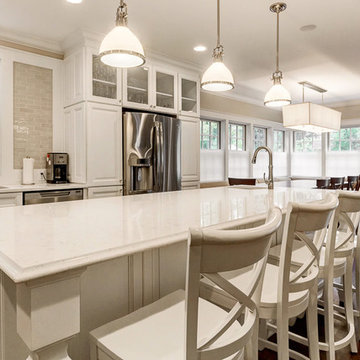
The simple lines of Denali and Hilton come together for a sensible approach to modern style; designed to complement today's busy lifestyle. Denali's textured surface offers rich dimensional flair, while Hilton adds a touch of glimmer with a reflective gloss surface. Both finishes come together on the island as a design focal point offering seating, a second sink and generous storage.
Sponsored
Columbus, OH

Hope Restoration & General Contracting
Columbus Design-Build, Kitchen & Bath Remodeling, Historic Renovations

 ARTO
That table looks petite then you count the chairs. How does he make seem cozy?
Large mid-century modern light wood floor kitchen/dining room combo photo in Los Angeles with white walls and no fireplace
Large mid-century modern light wood floor kitchen/dining room combo photo in Los Angeles with white walls and no fireplace

 A.Jennison Interiors
Photo - Jessica Glynn Photography
Inspiration for a transitional light wood floor kitchen remodel in New York with a farmhouse sink, open cabinets, white backsplash, subway tile backsplash, stainless steel appliances and an island
Inspiration for a transitional light wood floor kitchen remodel in New York with a farmhouse sink, open cabinets, white backsplash, subway tile backsplash, stainless steel appliances and an island
 Jennifer Chapman Designs
Karen Palmer Photography
Inspiration for a contemporary bathroom remodel in St Louis
Inspiration for a contemporary bathroom remodel in St Louis

 NMB Custom Homes & Renovations
I have received many inquiries regarding this cabinetry. While the product was beautiful, I cannot recommend the company that supplied it.
Custom summer kitchen. The cabinetry is not actual teak, but a man made composite product specially designed to hold up in the Florida elements.

 Crown Point Cabinetry
Part of a farmhouse remodel, this custom kitchen combines our traditional inset cabinetry with Mid-Century lighting fixtures, modern floating shelves and stainless appliances. The gorgeous table style island is topped with reclaimed wood, providing a generous work space that anchors the room. Cabinetry is finished in Truly Taupe. Hardware is un-laquered brass.
Photo by Crown Point Cabinetry
 Griffin Designs LLC
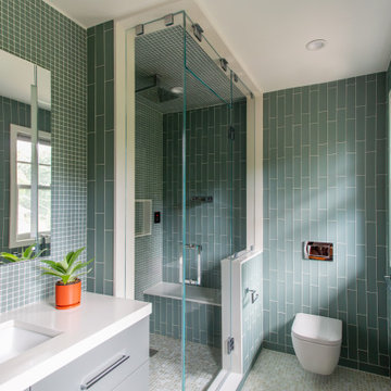
Smokey turquoise glass tiles cover this luxury bath with an interplay of stacked and gridded tile patterns that enhances the sophistication of the monochromatic palette.
Floor to ceiling glass panes define a breathtaking steam shower. Every detail takes the homeowner’s needs into account, including an in-wall waterfall element above the shower bench. Griffin Designs measured not only the space but also the seated homeowner to ensure a soothing stream of water that cascades onto the shoulders, hits just the right places, and melts away the stresses of the day.
Space conserving features such as the wall-hung toilet allowed for more flexibility in the layout. With more possibilities came more storage. Replacing the original pedestal sink, a bureau-style vanity spans four feet and offers six generously sized drawers. One drawer comes complete with outlets to discretely hide away accessories, like a hair dryer, while maximizing function. An additional recessed medicine cabinet measures almost six feet in height.
The comforts of this primary bath continue with radiant floor heating, a built-in towel warmer, and thoughtfully placed niches to hold all the bits and bobs in style.
Sponsored
Westerville, OH

Custom Home Works
Franklin County's Award-Winning Design, Build and Remodeling Expert

 Visbeen Architects
This cozy lake cottage skillfully incorporates a number of features that would normally be restricted to a larger home design. A glance of the exterior reveals a simple story and a half gable running the length of the home, enveloping the majority of the interior spaces. To the rear, a pair of gables with copper roofing flanks a covered dining area that connects to a screened porch. Inside, a linear foyer reveals a generous staircase with cascading landing. Further back, a centrally placed kitchen is connected to all of the other main level entertaining spaces through expansive cased openings. A private study serves as the perfect buffer between the homes master suite and living room. Despite its small footprint, the master suite manages to incorporate several closets, built-ins, and adjacent master bath complete with a soaker tub flanked by separate enclosures for shower and water closet. Upstairs, a generous double vanity bathroom is shared by a bunkroom, exercise space, and private bedroom. The bunkroom is configured to provide sleeping accommodations for up to 4 people. The rear facing exercise has great views of the rear yard through a set of windows that overlook the copper roof of the screened porch below.
Builder: DeVries & Onderlinde Builders
Interior Designer: Vision Interiors by Visbeen
Photographer: Ashley Avila Photography


 Klopf Architecture
, Arterra Landscape Architects and Henry Calvert of Calvert Ventures Designed and built a new warm, modern, Eichler-inspired, open, indoor-outdoor home on a deeper-than-usual San Mateo Highlands property where an original Eichler house had burned to the ground.
The owners wanted multi-generational living and larger spaces than the original home offered, but all parties agreed that the house should respect the neighborhood and blend in stylistically with the other Eichlers. At first the Klopf team considered re-using what little was left of the original home and expanding on it. But after discussions with the owner and builder, all parties agreed that the last few remaining elements of the house were not practical to re-use, so Klopf Architecture designed a new home that pushes the Eichler approach in new directions.
One disadvantage of Eichler production homes is that the house designs were not optimized for each specific lot. A new custom home offered the team a chance to start over. In this case, a longer house that opens up sideways to the south fit the lot better than the original square-ish house that used to open to the rear (west). Accordingly, the Klopf team designed an L-shaped “bar” house with a large glass wall with large sliding glass doors that faces sideways instead of to the rear like a typical Eichler. This glass wall opens to a pool and landscaped yard designed by Arterra Landscape Architects.
Driving by the house, one might assume at first glance it is an Eichler because of the horizontality, the overhanging flat roof eaves, the dark gray vertical siding, and orange solid panel front door, but the house is designed for the 21st Century and is not meant to be a “Likeler.” You won't see any posts and beams in this home. Instead, the ceiling decking is a western red cedar that covers over all the beams. Like Eichlers, this cedar runs continuously from inside to out, enhancing the indoor / outdoor feeling of the house, but unlike Eichlers it conceals a cavity for lighting, wiring, and insulation. Ceilings are higher, rooms are larger and more open, the master bathroom is light-filled and more generous, with a separate tub and shower and a separate toilet compartment, and there is plenty of storage. The garage even easily fits two of today's vehicles with room to spare.
A massive 49-foot by 12-foot wall of glass and the continuity of materials from inside to outside enhance the inside-outside living concept, so the owners and their guests can flow freely from house to pool deck to BBQ to pool and back.
During construction in the rough framing stage, Klopf thought the front of the house appeared too tall even though the house had looked right in the design renderings (probably because the house is uphill from the street). So Klopf Architecture paid the framer to change the roofline from how we had designed it to be lower along the front, allowing the home to blend in better with the neighborhood. One project goal was for people driving up the street to pass the home without immediately noticing there is an "imposter" on this lot, and making that change was essential to achieve that goal.
This 2,606 square foot, 3 bedroom, 3 bathroom Eichler-inspired new house is located in San Mateo in the heart of the Silicon Valley.
Klopf Architecture Project Team: John Klopf, AIA, Klara Kevane
Landscape Architect: Arterra Landscape Architects
Contractor: Henry Calvert of Calvert Ventures
Photography ©2016 Mariko Reed
Location: San Mateo, CA
Year completed: 2016

 Brion Jeannette Architecture
Gentle cascading curves make this 7500 sq. ft. home almost stealthy. At one with its environment, it is infused with a generous amount of natural light and the cooling coastal breezes of Corona del Mar, Ca. Natural materials and stone in a ledge rock pattern are combined with glass and steel to make this home uniquely spectacular. City and Coastal Commission approvals were secured.
Corona del Mar, California
Sponsored
Columbus, OH
Hope Restoration & General Contracting
Columbus Design-Build, Kitchen & Bath Remodeling, Historic Renovations

 Bart Reines Construction
Photo by Robin Hill
Mediterranean stucco exterior home idea in Miami
Mediterranean stucco exterior home idea in Miami

 The Robin Kencel Team
Striking and Sophisticated. This new residence offers the very best of contemporary design brought to life with the finest execution and attention to detail. Designed by notable Washington D.C architect. The 7,200 SQ FT main residence with separate guest house is set on 5+ acres of private property. Conveniently located in the Greenwich countryside and just minutes from the charming town of Armonk.
Enter the residence and step into a dramatic atrium Living Room with 22’ floor to ceiling windows, overlooking expansive grounds. At the heart of the house is a spacious gourmet kitchen featuring Italian made cabinetry with an ancillary catering kitchen. There are two master bedrooms, one at each end of the house and an additional three generously sized bedrooms each with en suite baths. There is a 1,200 sq ft. guest cottage to complete the compound.
A progressive sensibility merges with city sophistication in a pristine country setting. Truly special.

 User
Jeff Herr
Example of a small transitional white tile and subway tile mosaic tile floor alcove bathtub design in Atlanta with an integrated sink, a two-piece toilet and gray walls
Example of a small transitional white tile and subway tile mosaic tile floor alcove bathtub design in Atlanta with an integrated sink, a two-piece toilet and gray walls
1