
Search results for "Grade update" in Home Design Ideas
 Kustom Home Design
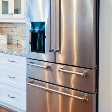
We created an open concept kitchen with keeping room from a closed off kitchen with tight layout. The oversized island comfortably seats 5 in an L-shaped arrangement. The white shaker style cabinets have a rustic, yet refined farmhouse look that is accentuated by the gorgeous oiled wood counter top. Ample island storage with specialized pull-outs, deep drawers and classic pulls make the island the heart of this home. The chef grade gas cooktop is crowned with a beautiful custom hood with vent insert and roman style brick wall tile with a herringbone pattern accent. The granite counters along the L-shaped outer walls blends the dark and light tones found through the home. A shiny metal farmhouse sink with dimpled texture is centered on the window overlooking the courtyard garden. Unique storage features such as a pull-out recycling center, pet food drawer, coffee station, recessed bread box / appliance garage, spice columns and plastic wrap pull-out provide ease of use and an organizers dream come true. A hidden walk-in pantry is seamlessly integrated into the cabinetry providing a secret reservoir of storage potential. Daylight floods the space and spills into the adjacent family room and formal dining room. Entertaining is easy in this clean crisp new kitchen redesigned for large family gatherings and intimate dinners at home. Photos By: Kimberly Kerl, Kustom Home Design
 JRP Design & Remodel
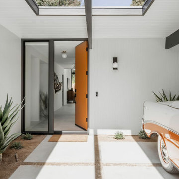
Eichler Orange is a stunning expression of mid-century modern architecture. The vision in modernizing this historic Eichler home with a 21st-century makeover was to honor the work of Joseph Eichler and restore it to the 1964 icon of California modernism it once was.
The clean aesthetics of this home features glass walls, post and beam, tongue and groove ceilings, and oversize porcelain tile floors throughout. The free-flowing indoor/outdoor floorplan is highlighted with a signature atrium, and all material selections were made to honor the time period. Custom cherry cabinets and warm slab walnut doors grace the interior.
This home had significant structural termite damage with three-quarters of the framing needing replacement. Additionally, the original house did not come close to meeting the current seismic codes. During reconstruction, we upgraded the post and beam structure with seismic hold-downs and concealed fasteners. The house lacked energy efficiency due to its flat roof and did not meet California’s current Title 24 energy-efficient standards. While honoring its era, this fully renovated residence is now updated with today’s energy efficiencies, including all-aluminum dual-glazed windows and doors, new spray foam insulation atop the flat roof, and tankless water heaters.
A new photovoltaic solar system was added. We abandoned the radiant floor heat and installed a new high-efficiency ductless heating and air units to each room. This increased the building’s performance and provided each room with its own thermostat and control. This system also allowed us to eliminate soffits and ductwork and maintain the exposed tongue and groove ceiling throughout the home.
The living space next to the family and dining room was repurposed to relocate the washer and dryer and allowed space to add a third bathroom. The primary bathroom was also reconfigured for a larger layout.
The sleek kitchen design includes frameless Crystal Cabinets, professional-grade Miele appliances, a large stainless steel Sub-Zero refrigerator/freezer, and a generous Caesarstone countertop workspace.
The outdoor backyard living space captures the natural beauty of Southern California and mid-century modern features, including drought-resistant landscaping with decomposed granite planter areas and all-new concrete hardscape. A new spa was added to the existing pool, along with a new BBQ area and firepit.
Photographer: Public 311 Design
 InnovationLand
Houston Interior Designer Lisha Maxey took this Museum District condo from the dated, mirrored walls of the 1980s to Mid Century Modern with a gallery look featuring the client's art collection.
"The place was covered with glued-down, floor-to-ceiling mirrors," says Lisha Maxey, senior designer for Homescapes of Houston and principal at LGH Design Services in Houston. "When we took them off the walls, the walls came apart. We ended up taking them down to the studs."
The makeover took six months to complete, primarily because of strict condo association rules that only gave the Houston interior designers very limited access to the elevator - through which all materials and team members had to go.
"Monday through Friday, we could only be noisy from 10 a.m. to 2 p.m., and if we had to do something extra loud, like sawing or drilling, we had to schedule it with the management and they had to communicate that to the condo owners. So it was just a lot of coordination. But a lot of Inner City Loopers live in these kinds of buildings, so we're used to handling that kind of thing."
The client, a child psychiatrist in her 60s, recently moved to Houston from northeast Texas to be with friends. After being widowed three years ago, she decided it was time to let go of the traditionally styled estate that wasn't really her style anyway. An avid diver who has traveled around the world to pursue her passion, she has amassed a large collection of art from her travels. Downsizing to 1,600 feet and wanting to go more contemporary, she wanted the display - and the look - more streamlined.
"She wanted clean lines and muted colors, with the main focus being her artwork," says Maxey. "So we made the space a palette for that."
Enter the white, gallery-grade paint she chose for the walls: "It's halfway between satin and flat," explains Maxey. "It's not glossy and it's not chalky - just very smooth and clean."
Adding to the gallery theme is the satin nickel track lighting with lamps aimed to highlight pieces of art. "This lighting has no wires," notes Maxey. "It's powered by a positive and negative conduit."
The new flooring throughout is a blended-grey porcelain tile that looks like wood planks. "It's gorgeous, natural-looking and combines all the beauty of wood with the durability of tile," says Maxey. "We used it throughout the condo to unify the space."
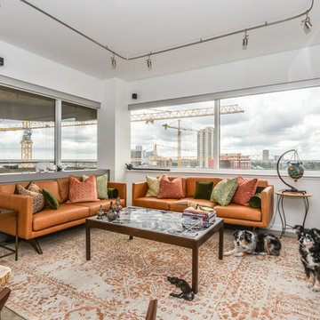
After Maxey started looking at the client's bright, vibrant, colorful artwork, she felt the palette couldn't stay as muted anymore. Hence the Mid Century Modern orange leather sofas from West Elm and chartruese chairs from Joybird, plus the throw pillows in different textures, patterns and shades of gold, orange and green.
The concave lines of the Danish-inspired chairs, she notes, help them look beautiful from all the way around - a key to designing spaces for loft living.
"The table in the living room is very interesting," notes Maxey. "It was handmade for the client in 1974 and has a signature on it from the artist. She was adamant about including the piece, which has all these hand-painted black-and-white art tiles on the top. I took one look at it and said 'It's not really going to go.'"
However, after cutting 6 inches off the bottom and making it look a little distressed, the table ended up being the perfect complement to the sofas.
The dining room table - from Design Within Reach - is a solid piece of mahogany, the chair upholstery a mix of grey velvet and leather and the legs a shiny brass. "The side chairs are leather and the end ones are velvet," says Maxey. "It's a nice textural mix that lends depth and texture."
The galley kitchen, meanwhile, has been lightened and brightened, with white quartz countertops and backsplashes mimicking the look of Carrara marble, stainless steel appliances and a velvet green bench seat for a punch of color. The cabinets are painted a cool grey color called "Silverplate."
The two bathrooms have been updated with contemporary white vanities and vessel sinks and the master bath now features a walk-in shower tiled in Dolomite white marble (the floor is Bianco Carrara marble mosaic, done in a herringbone pattern.
In the master bedroom, Homescapes of Houston knocked down a wall between two smaller closets with swing doors to make one large walk-in closet with pocket doors. The closet in the guest bedroom also came out 13 more inches.
The client's artwork throughout personalizes the space and tells the story of a life. There's a huge bowl of shells from the client's diving adventures, framed art from her child psychiatry patients and a 16th century wood carving from a monastery that's been in her family forever.
"Her collection is quite impressive," says Maxey. "There's even a framed piece of autographed songs written by John Lennon." (You can see this black-framed piece of art on the wall in the photo above of two green chairs).
"We're extremely happy with how the project turned out, and so is the client," says Maxey. "No expense was spared for her. It was a labor of love and we were excited to do it."
Find the right local pro for your project
 Kitchen Design Concepts
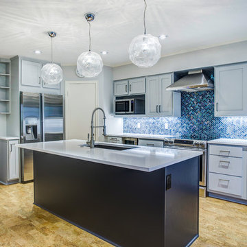
We must admit, we’ve got yet another show-stopping transformation! With keeping the cabinetry boxes (though few had to be replaced), swapping out drawer and drawer fronts with new ones, and updating all the finishes – we managed to give this space a renovation that could be confused for a full remodel! The combination of a vibrant new backsplash, a light painted cabinetry finish, and new fixtures, these cosmetic changes really made the kitchen become “brand new”. Want to learn more about this space and see how we went from “drab” to “fab” then keep reading!
Cabinetry
The cabinets boxes that needed to be replaced are from WW Woods Shiloh, Homestead door style, in maple wood. These cabinets were unfinished, as we finished the entire kitchen on-site with the rest of the new drawer and drawer fronts for a seamless look. The cabinet fronts that were replaced were from Woodmont cabinetry, in a paint grade maple, and a recessed panel profile door-style. As a result, the perimeter cabinets were painted in Sherwin Williams Tinsmith, the island in Sherwin Williams Sea Serpent, and a few interiors of the cabinets were painted in a Sherwin Williams Tinsmith.
Countertop
The countertops feature a 3 cm Caesarstone Vivid White quartz
Backsplash
The backsplash installed from countertops to the bottom of the furrdown are from Glazzio in the Oceania Herringbone Series, in Cobalt Sea, and are a 1×2 size. We love how vibrant it is!
Fixtures and Fittings
From Blanco, we have a Meridian semi-professional faucet in Satin Nickel, and a granite composite Precis 1-3/4 bowl sink in a finish of Cinder. The floating shelves are from Danver and are a stainless steel finish.
Flooring
The flooring is a cork material from Harris Cork in the Napa Collection, in a Fawn finish.
 Gather and Spruce Design Remodel
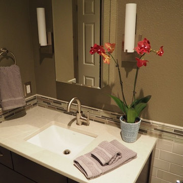
Lowry bathroom after remodel! A new vanity with quartz counter and an undercount sink really update this bathroom that was once very "builder grade".
Mid-sized transitional 3/4 gray tile and ceramic tile porcelain tile bathroom photo in Denver with an undermount sink, flat-panel cabinets, brown cabinets, quartz countertops, a one-piece toilet and beige walls
Mid-sized transitional 3/4 gray tile and ceramic tile porcelain tile bathroom photo in Denver with an undermount sink, flat-panel cabinets, brown cabinets, quartz countertops, a one-piece toilet and beige walls
 Renovisions
These South Shore of Boston homeowners are no different than many recent clients who show an interest in upgrading their dated and aged bathrooms. They are looking to modernize, reflecting today’s bath trends but also desire increased re-sale value with new fixtures, tile and ventilation system. Given the time we spend in our baths, it is not surprising. (A recent Houzz, survey found that 60% of people occupy their bathrooms for at least one hour per day plus 58% of people surveyed said they use their smart phone or tablet to handle a multitude of activities.)
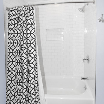
This stunning full bath Renovision involved replacing the existing builder-grade vanity, sink and faucet with striking dark blue cabinetry featuring a bank of three deep drawers on each side of a two-door sink base. This client likes the new standard vanity height, no 34.5” which allows more storage space for cosmetic and cleaning supply items.
Silestone’s Blanco Zeus countertop clearly modernizes the look and feel of this bath and doesn’t take away from the grey wood-look planked porcelain tiled floor which is on trend. The tub/shower walls with niche for shampoos and 3”x6” white subway tiles reflect a classic, clean and fresh look. The curved shower rod provides additional room while showering and its chrome finish ties in with the new shiny fixtures.
Adding a few architectural elements definitely enhanced this bath. Renovisions re-worked the existing closet space with a custom built piece which included open shelving to store bath towels and door(s) on the bottom to accommodate laundry hamper.
This furniture-look closet along with the window, trims and plantation shutters were color matched in the same white painted finish; stylish and sensible indeed!
 InnovationLand
Houston Interior Designer Lisha Maxey took this Museum District condo from the dated, mirrored walls of the 1980s to Mid Century Modern with a gallery look featuring the client's art collection.
"The place was covered with glued-down, floor-to-ceiling mirrors," says Lisha Maxey, senior designer for Homescapes of Houston and principal at LGH Design Services in Houston. "When we took them off the walls, the walls came apart. We ended up taking them down to the studs."
The makeover took six months to complete, primarily because of strict condo association rules that only gave the Houston interior designers very limited access to the elevator - through which all materials and team members had to go.
"Monday through Friday, we could only be noisy from 10 a.m. to 2 p.m., and if we had to do something extra loud, like sawing or drilling, we had to schedule it with the management and they had to communicate that to the condo owners. So it was just a lot of coordination. But a lot of Inner City Loopers live in these kinds of buildings, so we're used to handling that kind of thing."
The client, a child psychiatrist in her 60s, recently moved to Houston from northeast Texas to be with friends. After being widowed three years ago, she decided it was time to let go of the traditionally styled estate that wasn't really her style anyway. An avid diver who has traveled around the world to pursue her passion, she has amassed a large collection of art from her travels. Downsizing to 1,600 feet and wanting to go more contemporary, she wanted the display - and the look - more streamlined.
"She wanted clean lines and muted colors, with the main focus being her artwork," says Maxey. "So we made the space a palette for that."
Enter the white, gallery-grade paint she chose for the walls: "It's halfway between satin and flat," explains Maxey. "It's not glossy and it's not chalky - just very smooth and clean."
Adding to the gallery theme is the satin nickel track lighting with lamps aimed to highlight pieces of art. "This lighting has no wires," notes Maxey. "It's powered by a positive and negative conduit."
The new flooring throughout is a blended-grey porcelain tile that looks like wood planks. "It's gorgeous, natural-looking and combines all the beauty of wood with the durability of tile," says Maxey. "We used it throughout the condo to unify the space."
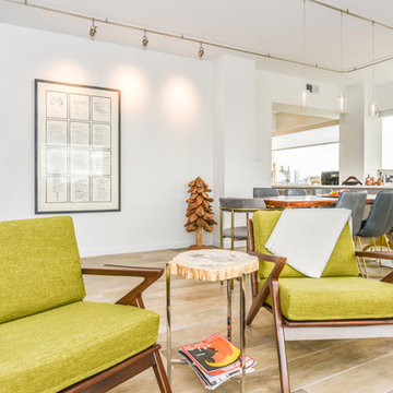
After Maxey started looking at the client's bright, vibrant, colorful artwork, she felt the palette couldn't stay as muted anymore. Hence the Mid Century Modern orange leather sofas from West Elm and chartruese chairs from Joybird, plus the throw pillows in different textures, patterns and shades of gold, orange and green.
The concave lines of the Danish-inspired chairs, she notes, help them look beautiful from all the way around - a key to designing spaces for loft living.
"The table in the living room is very interesting," notes Maxey. "It was handmade for the client in 1974 and has a signature on it from the artist. She was adamant about including the piece, which has all these hand-painted black-and-white art tiles on the top. I took one look at it and said 'It's not really going to go.'"
However, after cutting 6 inches off the bottom and making it look a little distressed, the table ended up being the perfect complement to the sofas.
The dining room table - from Design Within Reach - is a solid piece of mahogany, the chair upholstery a mix of grey velvet and leather and the legs a shiny brass. "The side chairs are leather and the end ones are velvet," says Maxey. "It's a nice textural mix that lends depth and texture."
The galley kitchen, meanwhile, has been lightened and brightened, with white quartz countertops and backsplashes mimicking the look of Carrara marble, stainless steel appliances and a velvet green bench seat for a punch of color. The cabinets are painted a cool grey color called "Silverplate."
The two bathrooms have been updated with contemporary white vanities and vessel sinks and the master bath now features a walk-in shower tiled in Dolomite white marble (the floor is Bianco Carrara marble mosaic, done in a herringbone pattern.
In the master bedroom, Homescapes of Houston knocked down a wall between two smaller closets with swing doors to make one large walk-in closet with pocket doors. The closet in the guest bedroom also came out 13 more inches.
The client's artwork throughout personalizes the space and tells the story of a life. There's a huge bowl of shells from the client's diving adventures, framed art from her child psychiatry patients and a 16th century wood carving from a monastery that's been in her family forever.
"Her collection is quite impressive," says Maxey. "There's even a framed piece of autographed songs written by John Lennon." (You can see this black-framed piece of art on the wall in the photo above of two green chairs).
"We're extremely happy with how the project turned out, and so is the client," says Maxey. "No expense was spared for her. It was a labor of love and we were excited to do it."
Sponsored
Columbus, OH

Snider & Metcalf Interior Design, LTD
Leading Interior Designers in Columbus, Ohio & Ponte Vedra, Florida
 Realty Restoration, LLC
Christopher Davison, AIA
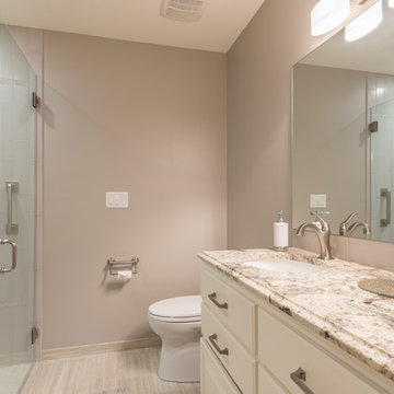
Walk-in shower - mid-sized traditional white tile and ceramic tile porcelain tile walk-in shower idea in Austin with an undermount sink, raised-panel cabinets, white cabinets, granite countertops and beige walls
Walk-in shower - mid-sized traditional white tile and ceramic tile porcelain tile walk-in shower idea in Austin with an undermount sink, raised-panel cabinets, white cabinets, granite countertops and beige walls
 Ridgecrest Designs
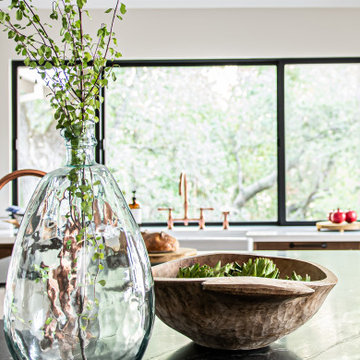
Situated at the top of the Eugene O'Neill National Historic Park in Danville, this mid-century modern hilltop home had great architectural features, but needed a kitchen update that spoke to the design style of the rest of the house. We would have to say this project was one of our most challenging when it came to blending the mid-century style of the house with a more eclectic and modern look that the clients were drawn to. But who doesn't love a good challenge? We removed the builder-grade cabinetry put in by a previous owner and took down a wall to open up the kitchen to the rest of the great room. The kitchen features a custom designed hood as well as custom cabinetry with an intricate beaded details that sets it apart from all of our other cabinetry designs. The pop of blue paired with the dark walnut creates an eye catching contrast. Ridgecrest also designed and fabricated solid steel wall cabinetry to store countertop appliances and display dishes and glasses. The copper accents on the range and faucets bring the design full circle and finish this gorgeous one-of-a-kind-kitchen off nicely.
 Ridgecrest Designs
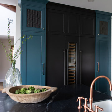
Situated at the top of the Eugene O'Neill National Historic Park in Danville, this mid-century modern hilltop home had great architectural features, but needed a kitchen update that spoke to the design style of the rest of the house. We would have to say this project was one of our most challenging when it came to blending the mid-century style of the house with a more eclectic and modern look that the clients were drawn to. But who doesn't love a good challenge? We removed the builder-grade cabinetry put in by a previous owner and took down a wall to open up the kitchen to the rest of the great room. The kitchen features a custom designed hood as well as custom cabinetry with an intricate beaded details that sets it apart from all of our other cabinetry designs. The pop of blue paired with the dark walnut creates an eye catching contrast. Ridgecrest also designed and fabricated solid steel wall cabinetry to store countertop appliances and display dishes and glasses. The copper accents on the range and faucets bring the design full circle and finish this gorgeous one-of-a-kind-kitchen off nicely.
 Ridgecrest Designs
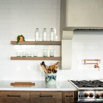
Situated at the top of the Eugene O'Neill National Historic Park in Danville, this mid-century modern hilltop home had great architectural features, but needed a kitchen update that spoke to the design style of the rest of the house. We would have to say this project was one of our most challenging when it came to blending the mid-century style of the house with a more eclectic and modern look that the clients were drawn to. But who doesn't love a good challenge? We removed the builder-grade cabinetry put in by a previous owner and took down a wall to open up the kitchen to the rest of the great room. The kitchen features a custom designed hood as well as custom cabinetry with an intricate beaded details that sets it apart from all of our other cabinetry designs. The pop of blue paired with the dark walnut creates an eye catching contrast. Ridgecrest also designed and fabricated solid steel wall cabinetry to store countertop appliances and display dishes and glasses. The copper accents on the range and faucets bring the design full circle and finish this gorgeous one-of-a-kind-kitchen off nicely.
 Sandra Hambley
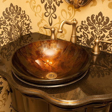
This gorgeous powder room was easy to update. The builder grade pedestal sink was replaced with a black vanity and vessel sink to give the small room some personality. Rich damask wallpaper dresses the walls and the ceiling is papered in a metallic gold. A new mirror and lighting completed the look.
 Pro-Land Landscape Construction Inc.
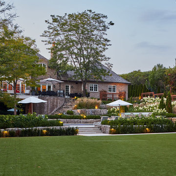
With a lengthy list of ideas about how to transform their backyard, the clients were excited to see what we could do. Existing features on site needed to be updated and in-cooperated within the design. The view from each angle of the property was already outstanding and we didn't want the design to feel out of place. We had to make the grade changes work to our advantage, each separate space had to have a purpose. The client wanted to use the property for charity events, so a large flat turf area was constructed at the back of the property, perfect for setting up tables, chairs and a stage if needed. It also created the perfect look out point into the back of the property, dropping off into a ravine. A lot of focus throughout the project was the plant selection. With a large amount of garden beds, we wanted to maintain a clean and formal look, while still offering seasonal interest. We did this by edging the beds with boxwoods, adding white hydrangeas throughout the beds for constant colour, and subtle pops of purple and yellow. This along with the already breathtaking natural backdrop of the space, is more than enough to make this project stand out.
Photographer: Jason Hartog Photography
Sponsored
Columbus, OH

HomeCraft Remodeling
Custom Craftsmanship & Build Solutions in Franklin County, Ohio
 Michael Nash Design, Build & Homes
 When the homeowners purchased this traditional colonial in Vienna, Virginia, they were already planning on making some serious changes. The home’s original floor plan was boxy and closed in, making traffic flow from one room to the next virtually non-existent. Additionally, the existing décor left a lot to be desired. Their vision was to open up the layout and create a more contemporary look using lots of light, soft colors and high end materials.
They decided to add a two-story addition to the back of the home’s existing breakfast room and the small upstairs bedroom above it. The old breakfast area was too small for their daily meals and their teenage son needed more space in his bedroom. They also decided to add a sunroom/family room to the left side of their old family room. This new room offers a vaulted ceiling with four skylights and lots of windows with a better view of the side and backyard.
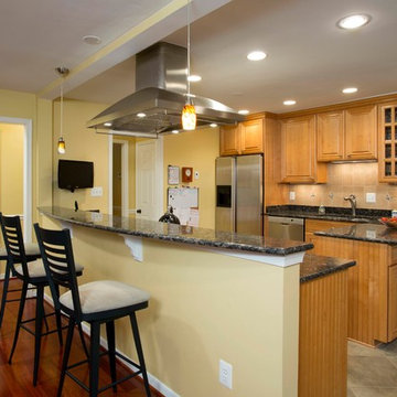
To create a more open floor plan, the team at Michael Nash Design, Build & Homes removed the load bearing wall between the kitchen and family room and installed a large beam to handle the second floor load. Not only did this open up the space, but it allowed for the addition of a breakfast bar.
The right side bearing wall of the old family room was also removed and replaced with structural beams. This action created a continuous flow between the new sunroom and old family room. Separated by a double-sided stone fireplace, this new sunroom is connected to a new outside sun deck built using a maintenance-free decking material. The old family room with new lighting now serves as a casual seating area. It also features an eight-foot long built-in desk.
The newly updated kitchen features granite countertops with matching tile backsplash, professional-quality appliances, a porcelain tile floor and custom cabinets, including a large pantry. The new breakfast room is more spacious and gets daylight from three different angles.
Upstairs, a new 12’ x 20’ bedroom is a great place for this teenage football fan to hang out. It provides significantly more closet space than the old room and lets in more sunlight as well.
The old laundry room was converted to a new mudroom with locker style cabinetry and a place for kids to store their bag packs. New plumbing and electrical were implemented in a new closet in an upper hallway to facilitate the new washer and dryer.
In this remodel, form and function have come together in an open concept design that meets the needs of the entire family.
 Design Matters
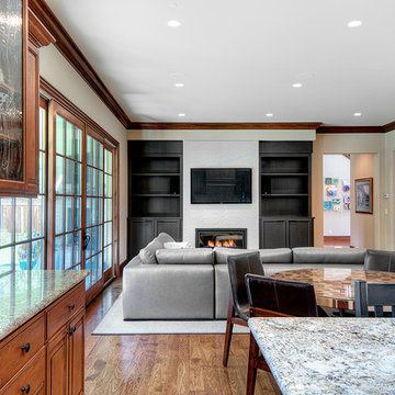
The view of the family room is open to the outdoors and the kitchen area. Bringing in a current gray colored cabinetry, silver gray custom sized sectional with a whimsical circular patterned ottoman and matching throw pillows, along with my custom designed glass and metal rolling coffee table bring uber function for this family home.
 Pro-Land Landscape Construction Inc.
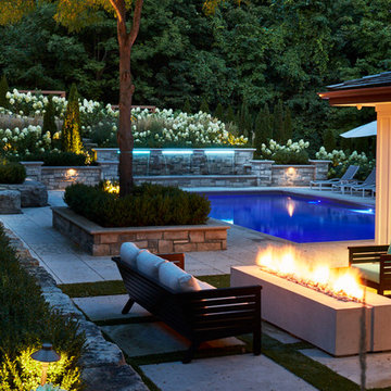
With a lengthy list of ideas about how to transform their backyard, the clients were excited to see what we could do. Existing features on site needed to be updated and in-cooperated within the design. The view from each angle of the property was already outstanding and we didn't want the design to feel out of place. We had to make the grade changes work to our advantage, each separate space had to have a purpose. The client wanted to use the property for charity events, so a large flat turf area was constructed at the back of the property, perfect for setting up tables, chairs and a stage if needed. It also created the perfect look out point into the back of the property, dropping off into a ravine. A lot of focus throughout the project was the plant selection. With a large amount of garden beds, we wanted to maintain a clean and formal look, while still offering seasonal interest. We did this by edging the beds with boxwoods, adding white hydrangeas throughout the beds for constant colour, and subtle pops of purple and yellow. This along with the already breathtaking natural backdrop of the space, is more than enough to make this project stand out.
Photographer: Jason Hartog Photography
 Michael Nash Design, Build & Homes
2011 NARI CAPITAL COTY GRAND AWARD WINNER
Having a small 10’ x 12’ kitchen tucked in the back corner of their home wasn’t working for this this young and growing family. Its cramped layout didn’t allow for a breakfast area and storage space was non-existent, both major issues for their busy day-to-day lifestyle. After consulting with Michael Nash Design, Build & Homes, they decided to build a 300 square foot addition onto the back of this 1960’s vintage split level.
The planned addition expanded and updated the home’s kitchen via a contemporary design, added plenty of storage and provided a much needed breakfast seating area. More importantly, it created a great place for the family to gather.
The new kitchen contains a 48” professional-grade range and a large built-in refrigerator, as well as lots of cabinetry and counter space to meet client’s storage needs. Use of lighter shaker style custom painted cabinetry with honed black counter tops has lightened the space tremendously. A large island with distress black cherry cabinetry ans a mahogany countertop was installed and has become the focal point of the kitchen.
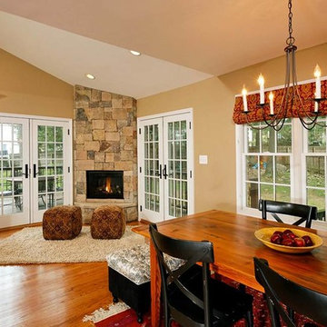
By removing a partition that previously separated the kitchen from the dining room, the new design has created a wide open floor plan. The casual dining room flows right into a casual seating area with a corner fireplace. French doors open onto a large new deck.
Best of all, the addition lets the family spend time together before, during and after mean preparation. It’s truly become the hearth of the home.
Sponsored
Columbus, OH
HomeCraft Remodeling
Custom Craftsmanship & Build Solutions in Franklin County, Ohio
 InnovationLand
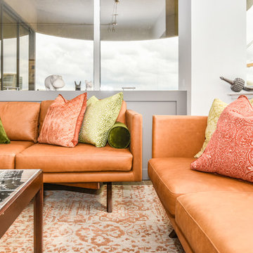
Houston Interior Designer Lisha Maxey took this Museum District condo from the dated, mirrored walls of the 1980s to Mid Century Modern with a gallery look featuring the client's art collection.
"The place was covered with glued-down, floor-to-ceiling mirrors," says Lisha Maxey, senior designer for Homescapes of Houston and principal at LGH Design Services in Houston. "When we took them off the walls, the walls came apart. We ended up taking them down to the studs."
The makeover took six months to complete, primarily because of strict condo association rules that only gave the Houston interior designers very limited access to the elevator - through which all materials and team members had to go.
"Monday through Friday, we could only be noisy from 10 a.m. to 2 p.m., and if we had to do something extra loud, like sawing or drilling, we had to schedule it with the management and they had to communicate that to the condo owners. So it was just a lot of coordination. But a lot of Inner City Loopers live in these kinds of buildings, so we're used to handling that kind of thing."
The client, a child psychiatrist in her 60s, recently moved to Houston from northeast Texas to be with friends. After being widowed three years ago, she decided it was time to let go of the traditionally styled estate that wasn't really her style anyway. An avid diver who has traveled around the world to pursue her passion, she has amassed a large collection of art from her travels. Downsizing to 1,600 feet and wanting to go more contemporary, she wanted the display - and the look - more streamlined.
"She wanted clean lines and muted colors, with the main focus being her artwork," says Maxey. "So we made the space a palette for that."
Enter the white, gallery-grade paint she chose for the walls: "It's halfway between satin and flat," explains Maxey. "It's not glossy and it's not chalky - just very smooth and clean."
Adding to the gallery theme is the satin nickel track lighting with lamps aimed to highlight pieces of art. "This lighting has no wires," notes Maxey. "It's powered by a positive and negative conduit."
The new flooring throughout is a blended-grey porcelain tile that looks like wood planks. "It's gorgeous, natural-looking and combines all the beauty of wood with the durability of tile," says Maxey. "We used it throughout the condo to unify the space."
After Maxey started looking at the client's bright, vibrant, colorful artwork, she felt the palette couldn't stay as muted anymore. Hence the Mid Century Modern orange leather sofas from West Elm and chartruese chairs from Joybird, plus the throw pillows in different textures, patterns and shades of gold, orange and green.
The concave lines of the Danish-inspired chairs, she notes, help them look beautiful from all the way around - a key to designing spaces for loft living.
"The table in the living room is very interesting," notes Maxey. "It was handmade for the client in 1974 and has a signature on it from the artist. She was adamant about including the piece, which has all these hand-painted black-and-white art tiles on the top. I took one look at it and said 'It's not really going to go.'"
However, after cutting 6 inches off the bottom and making it look a little distressed, the table ended up being the perfect complement to the sofas.
The dining room table - from Design Within Reach - is a solid piece of mahogany, the chair upholstery a mix of grey velvet and leather and the legs a shiny brass. "The side chairs are leather and the end ones are velvet," says Maxey. "It's a nice textural mix that lends depth and texture."
The galley kitchen, meanwhile, has been lightened and brightened, with white quartz countertops and backsplashes mimicking the look of Carrara marble, stainless steel appliances and a velvet green bench seat for a punch of color. The cabinets are painted a cool grey color called "Silverplate."
The two bathrooms have been updated with contemporary white vanities and vessel sinks and the master bath now features a walk-in shower tiled in Dolomite white marble (the floor is Bianco Carrara marble mosaic, done in a herringbone pattern.
In the master bedroom, Homescapes of Houston knocked down a wall between two smaller closets with swing doors to make one large walk-in closet with pocket doors. The closet in the guest bedroom also came out 13 more inches.
The client's artwork throughout personalizes the space and tells the story of a life. There's a huge bowl of shells from the client's diving adventures, framed art from her child psychiatry patients and a 16th century wood carving from a monastery that's been in her family forever.
"Her collection is quite impressive," says Maxey. "There's even a framed piece of autographed songs written by John Lennon." (You can see this black-framed piece of art on the wall in the photo above of two green chairs).
"We're extremely happy with how the project turned out, and so is the client," says Maxey. "No expense was spared for her. It was a labor of love and we were excited to do it."
 Inspired Designs
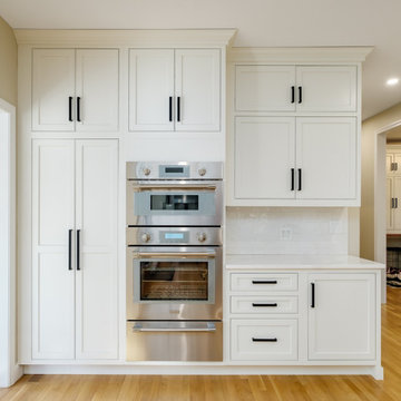
The original kitchen had the potential for greatness but was stuck in the 1990's era. We were able to re-design this kitchen into not only the homeowners’ “dream kitchen” but a space that allows for entertaining with ease. The updated kitchen boasts a large island for serving and seating, a 4’ Galley sink, commercial grade appliances, and storage accessories inside every cabinet.
 Cabinet-S-Top
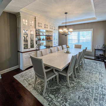
This dining room update includes custom-made paint grade cabinets in Middleton flat panel door style in SW6098 Pacer White paint.
Example of a mid-sized transitional medium tone wood floor and brown floor dining room design in Cleveland with white walls
Example of a mid-sized transitional medium tone wood floor and brown floor dining room design in Cleveland with white walls
39