
Search results for "Growing exponentially" in Home Design Ideas
 Lindy Design Build
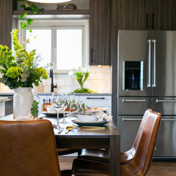
This 1950s home was sporting elements of the original kitchen and the dark space was not meeting our client’s needs. The original kitchen didn’t have much to offer in the way of functionality, so our first order of business was to create a design that would exponentially increase the usability of the kitchen. We brought in functional cabinetry, introduced uninterrupted work surfaces, and added plenty of lighting to brighten up their kitchen. They also wanted to open the new kitchen to the living room and create space for a larger dining table, so we started by removing the existing cabinetry that was visually cut the living space in two and minimized the power of the dramatic vaulted ceiling. We also extended the wood flooring into the kitchen as well to create seamless transitions between spaces.
We fell in love with the idea of a two-toned cabinetry design for this kitchen and ultimately went head over heels for clean white painted base cabinets and a textured wood-look melamine on the uppers. This gave us a crisp backdrop that allowed us to bring is fun forms like the black light fixture over the table and the gorgeous silhouettes on the hardware. We played a lot with directionality in this space. The elongated open shelves and rectangular backsplash tiles give us wonderfully clean horizontal lines, but to balance those out we brought in a vertical grain pattern on the wall cabinets and added long black cabinetry pulls that emphasize the verticality of the space. The clients have a green thumb and wanted to make sure we created a home for their growing plant collection. The open shelving gives us plenty of opportunities for foliage and to showcase fun kitchen accessories. This design feels like home and brings together the clean lines and crisp finishes our clients were looking.
 TVL Creative Ltd.
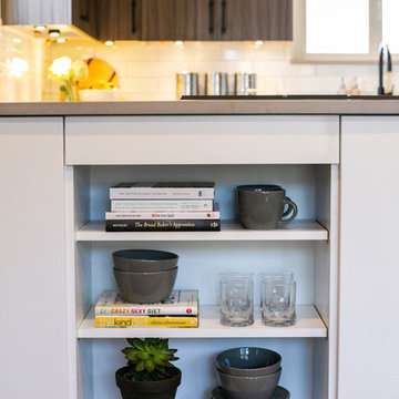
This 1950s home was sporting elements of the original kitchen and the dark space was not meeting our client’s needs. The original kitchen didn’t have much to offer in the way of functionality, so our first order of business was to create a design that would exponentially increase the usability of the kitchen. We brought in functional cabinetry, introduced uninterrupted work surfaces, and added plenty of lighting to brighten up their kitchen. They also wanted to open the new kitchen to the living room and create space for a larger dining table, so we started by removing the existing cabinetry that was visually cut the living space in two and minimized the power of the dramatic vaulted ceiling. We also extended the wood flooring into the kitchen as well to create seamless transitions between spaces. We fell in love with the idea of a two-toned cabinetry design for this kitchen and ultimately went head over heels for clean white painted base cabinets and a textured wood-look melamine on the uppers. This gave us a crisp backdrop that allowed us to bring is fun forms like the black light fixture over the table and the gorgeous silhouettes on the hardware. We played a lot with directionality in this space. The elongated open shelves and rectangular backsplash tiles give us wonderfully clean horizontal lines, but to balance those out we brought in a vertical grain pattern on the wall cabinets and added long black cabinetry pulls that emphasize the verticality of the space. The clients have a green thumb and wanted to make sure we created a home for their growing plant collection. The open shelving gives us plenty of opportunities for foliage and to showcase fun kitchen accessories. This design feels like home and brings together the clean lines and crisp finishes our clients were looking for.
 Lindy Design Build
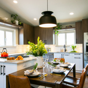
This 1950s home was sporting elements of the original kitchen and the dark space was not meeting our client’s needs. The original kitchen didn’t have much to offer in the way of functionality, so our first order of business was to create a design that would exponentially increase the usability of the kitchen. We brought in functional cabinetry, introduced uninterrupted work surfaces, and added plenty of lighting to brighten up their kitchen. They also wanted to open the new kitchen to the living room and create space for a larger dining table, so we started by removing the existing cabinetry that was visually cut the living space in two and minimized the power of the dramatic vaulted ceiling. We also extended the wood flooring into the kitchen as well to create seamless transitions between spaces.
We fell in love with the idea of a two-toned cabinetry design for this kitchen and ultimately went head over heels for clean white painted base cabinets and a textured wood-look melamine on the uppers. This gave us a crisp backdrop that allowed us to bring is fun forms like the black light fixture over the table and the gorgeous silhouettes on the hardware. We played a lot with directionality in this space. The elongated open shelves and rectangular backsplash tiles give us wonderfully clean horizontal lines, but to balance those out we brought in a vertical grain pattern on the wall cabinets and added long black cabinetry pulls that emphasize the verticality of the space. The clients have a green thumb and wanted to make sure we created a home for their growing plant collection. The open shelving gives us plenty of opportunities for foliage and to showcase fun kitchen accessories. This design feels like home and brings together the clean lines and crisp finishes our clients were looking.
Find the right local pro for your project
 Lindy Design Build
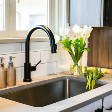
This 1950s home was sporting elements of the original kitchen and the dark space was not meeting our client’s needs. The original kitchen didn’t have much to offer in the way of functionality, so our first order of business was to create a design that would exponentially increase the usability of the kitchen. We brought in functional cabinetry, introduced uninterrupted work surfaces, and added plenty of lighting to brighten up their kitchen. They also wanted to open the new kitchen to the living room and create space for a larger dining table, so we started by removing the existing cabinetry that was visually cut the living space in two and minimized the power of the dramatic vaulted ceiling. We also extended the wood flooring into the kitchen as well to create seamless transitions between spaces.
We fell in love with the idea of a two-toned cabinetry design for this kitchen and ultimately went head over heels for clean white painted base cabinets and a textured wood-look melamine on the uppers. This gave us a crisp backdrop that allowed us to bring is fun forms like the black light fixture over the table and the gorgeous silhouettes on the hardware. We played a lot with directionality in this space. The elongated open shelves and rectangular backsplash tiles give us wonderfully clean horizontal lines, but to balance those out we brought in a vertical grain pattern on the wall cabinets and added long black cabinetry pulls that emphasize the verticality of the space. The clients have a green thumb and wanted to make sure we created a home for their growing plant collection. The open shelving gives us plenty of opportunities for foliage and to showcase fun kitchen accessories. This design feels like home and brings together the clean lines and crisp finishes our clients were looking.
 Lindy Design Build
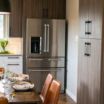
This 1950s home was sporting elements of the original kitchen and the dark space was not meeting our client’s needs. The original kitchen didn’t have much to offer in the way of functionality, so our first order of business was to create a design that would exponentially increase the usability of the kitchen. We brought in functional cabinetry, introduced uninterrupted work surfaces, and added plenty of lighting to brighten up their kitchen. They also wanted to open the new kitchen to the living room and create space for a larger dining table, so we started by removing the existing cabinetry that was visually cut the living space in two and minimized the power of the dramatic vaulted ceiling. We also extended the wood flooring into the kitchen as well to create seamless transitions between spaces.
We fell in love with the idea of a two-toned cabinetry design for this kitchen and ultimately went head over heels for clean white painted base cabinets and a textured wood-look melamine on the uppers. This gave us a crisp backdrop that allowed us to bring is fun forms like the black light fixture over the table and the gorgeous silhouettes on the hardware. We played a lot with directionality in this space. The elongated open shelves and rectangular backsplash tiles give us wonderfully clean horizontal lines, but to balance those out we brought in a vertical grain pattern on the wall cabinets and added long black cabinetry pulls that emphasize the verticality of the space. The clients have a green thumb and wanted to make sure we created a home for their growing plant collection. The open shelving gives us plenty of opportunities for foliage and to showcase fun kitchen accessories. This design feels like home and brings together the clean lines and crisp finishes our clients were looking.
 Lindy Design Build
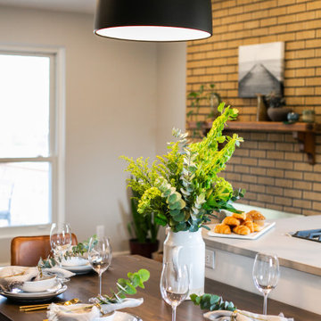
This 1950s home was sporting elements of the original kitchen and the dark space was not meeting our client’s needs. The original kitchen didn’t have much to offer in the way of functionality, so our first order of business was to create a design that would exponentially increase the usability of the kitchen. We brought in functional cabinetry, introduced uninterrupted work surfaces, and added plenty of lighting to brighten up their kitchen. They also wanted to open the new kitchen to the living room and create space for a larger dining table, so we started by removing the existing cabinetry that was visually cut the living space in two and minimized the power of the dramatic vaulted ceiling. We also extended the wood flooring into the kitchen as well to create seamless transitions between spaces.
We fell in love with the idea of a two-toned cabinetry design for this kitchen and ultimately went head over heels for clean white painted base cabinets and a textured wood-look melamine on the uppers. This gave us a crisp backdrop that allowed us to bring is fun forms like the black light fixture over the table and the gorgeous silhouettes on the hardware. We played a lot with directionality in this space. The elongated open shelves and rectangular backsplash tiles give us wonderfully clean horizontal lines, but to balance those out we brought in a vertical grain pattern on the wall cabinets and added long black cabinetry pulls that emphasize the verticality of the space. The clients have a green thumb and wanted to make sure we created a home for their growing plant collection. The open shelving gives us plenty of opportunities for foliage and to showcase fun kitchen accessories. This design feels like home and brings together the clean lines and crisp finishes our clients were looking.
 Lindy Design Build
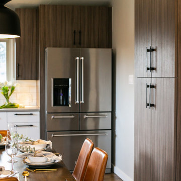
This 1950s home was sporting elements of the original kitchen and the dark space was not meeting our client’s needs. The original kitchen didn’t have much to offer in the way of functionality, so our first order of business was to create a design that would exponentially increase the usability of the kitchen. We brought in functional cabinetry, introduced uninterrupted work surfaces, and added plenty of lighting to brighten up their kitchen. They also wanted to open the new kitchen to the living room and create space for a larger dining table, so we started by removing the existing cabinetry that was visually cut the living space in two and minimized the power of the dramatic vaulted ceiling. We also extended the wood flooring into the kitchen as well to create seamless transitions between spaces.
We fell in love with the idea of a two-toned cabinetry design for this kitchen and ultimately went head over heels for clean white painted base cabinets and a textured wood-look melamine on the uppers. This gave us a crisp backdrop that allowed us to bring is fun forms like the black light fixture over the table and the gorgeous silhouettes on the hardware. We played a lot with directionality in this space. The elongated open shelves and rectangular backsplash tiles give us wonderfully clean horizontal lines, but to balance those out we brought in a vertical grain pattern on the wall cabinets and added long black cabinetry pulls that emphasize the verticality of the space. The clients have a green thumb and wanted to make sure we created a home for their growing plant collection. The open shelving gives us plenty of opportunities for foliage and to showcase fun kitchen accessories. This design feels like home and brings together the clean lines and crisp finishes our clients were looking.

 Lindy Design Build
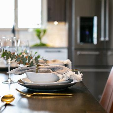
This 1950s home was sporting elements of the original kitchen and the dark space was not meeting our client’s needs. The original kitchen didn’t have much to offer in the way of functionality, so our first order of business was to create a design that would exponentially increase the usability of the kitchen. We brought in functional cabinetry, introduced uninterrupted work surfaces, and added plenty of lighting to brighten up their kitchen. They also wanted to open the new kitchen to the living room and create space for a larger dining table, so we started by removing the existing cabinetry that was visually cut the living space in two and minimized the power of the dramatic vaulted ceiling. We also extended the wood flooring into the kitchen as well to create seamless transitions between spaces.
We fell in love with the idea of a two-toned cabinetry design for this kitchen and ultimately went head over heels for clean white painted base cabinets and a textured wood-look melamine on the uppers. This gave us a crisp backdrop that allowed us to bring is fun forms like the black light fixture over the table and the gorgeous silhouettes on the hardware. We played a lot with directionality in this space. The elongated open shelves and rectangular backsplash tiles give us wonderfully clean horizontal lines, but to balance those out we brought in a vertical grain pattern on the wall cabinets and added long black cabinetry pulls that emphasize the verticality of the space. The clients have a green thumb and wanted to make sure we created a home for their growing plant collection. The open shelving gives us plenty of opportunities for foliage and to showcase fun kitchen accessories. This design feels like home and brings together the clean lines and crisp finishes our clients were looking.
 Lindy Design Build
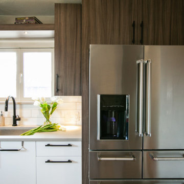
This 1950s home was sporting elements of the original kitchen and the dark space was not meeting our client’s needs. The original kitchen didn’t have much to offer in the way of functionality, so our first order of business was to create a design that would exponentially increase the usability of the kitchen. We brought in functional cabinetry, introduced uninterrupted work surfaces, and added plenty of lighting to brighten up their kitchen. They also wanted to open the new kitchen to the living room and create space for a larger dining table, so we started by removing the existing cabinetry that was visually cut the living space in two and minimized the power of the dramatic vaulted ceiling. We also extended the wood flooring into the kitchen as well to create seamless transitions between spaces.
We fell in love with the idea of a two-toned cabinetry design for this kitchen and ultimately went head over heels for clean white painted base cabinets and a textured wood-look melamine on the uppers. This gave us a crisp backdrop that allowed us to bring is fun forms like the black light fixture over the table and the gorgeous silhouettes on the hardware. We played a lot with directionality in this space. The elongated open shelves and rectangular backsplash tiles give us wonderfully clean horizontal lines, but to balance those out we brought in a vertical grain pattern on the wall cabinets and added long black cabinetry pulls that emphasize the verticality of the space. The clients have a green thumb and wanted to make sure we created a home for their growing plant collection. The open shelving gives us plenty of opportunities for foliage and to showcase fun kitchen accessories. This design feels like home and brings together the clean lines and crisp finishes our clients were looking.
 TVL Creative Ltd.
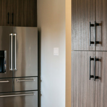
This 1950s home was sporting elements of the original kitchen and the dark space was not meeting our client’s needs. The original kitchen didn’t have much to offer in the way of functionality, so our first order of business was to create a design that would exponentially increase the usability of the kitchen. We brought in functional cabinetry, introduced uninterrupted work surfaces, and added plenty of lighting to brighten up their kitchen. They also wanted to open the new kitchen to the living room and create space for a larger dining table, so we started by removing the existing cabinetry that was visually cut the living space in two and minimized the power of the dramatic vaulted ceiling. We also extended the wood flooring into the kitchen as well to create seamless transitions between spaces. We fell in love with the idea of a two-toned cabinetry design for this kitchen and ultimately went head over heels for clean white painted base cabinets and a textured wood-look melamine on the uppers. This gave us a crisp backdrop that allowed us to bring is fun forms like the black light fixture over the table and the gorgeous silhouettes on the hardware. We played a lot with directionality in this space. The elongated open shelves and rectangular backsplash tiles give us wonderfully clean horizontal lines, but to balance those out we brought in a vertical grain pattern on the wall cabinets and added long black cabinetry pulls that emphasize the verticality of the space. The clients have a green thumb and wanted to make sure we created a home for their growing plant collection. The open shelving gives us plenty of opportunities for foliage and to showcase fun kitchen accessories. This design feels like home and brings together the clean lines and crisp finishes our clients were looking for.
 TVL Creative Ltd.
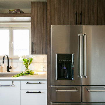
This 1950s home was sporting elements of the original kitchen and the dark space was not meeting our client’s needs. The original kitchen didn’t have much to offer in the way of functionality, so our first order of business was to create a design that would exponentially increase the usability of the kitchen. We brought in functional cabinetry, introduced uninterrupted work surfaces, and added plenty of lighting to brighten up their kitchen. They also wanted to open the new kitchen to the living room and create space for a larger dining table, so we started by removing the existing cabinetry that was visually cut the living space in two and minimized the power of the dramatic vaulted ceiling. We also extended the wood flooring into the kitchen as well to create seamless transitions between spaces. We fell in love with the idea of a two-toned cabinetry design for this kitchen and ultimately went head over heels for clean white painted base cabinets and a textured wood-look melamine on the uppers. This gave us a crisp backdrop that allowed us to bring is fun forms like the black light fixture over the table and the gorgeous silhouettes on the hardware. We played a lot with directionality in this space. The elongated open shelves and rectangular backsplash tiles give us wonderfully clean horizontal lines, but to balance those out we brought in a vertical grain pattern on the wall cabinets and added long black cabinetry pulls that emphasize the verticality of the space. The clients have a green thumb and wanted to make sure we created a home for their growing plant collection. The open shelving gives us plenty of opportunities for foliage and to showcase fun kitchen accessories. This design feels like home and brings together the clean lines and crisp finishes our clients were looking for.
 TVL Creative Ltd.
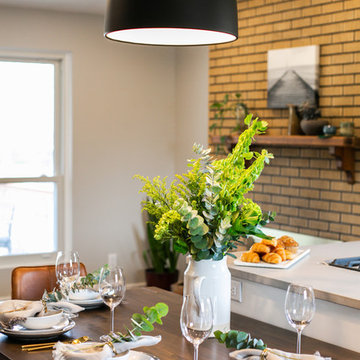
This 1950s home was sporting elements of the original kitchen and the dark space was not meeting our client’s needs. The original kitchen didn’t have much to offer in the way of functionality, so our first order of business was to create a design that would exponentially increase the usability of the kitchen. We brought in functional cabinetry, introduced uninterrupted work surfaces, and added plenty of lighting to brighten up their kitchen. They also wanted to open the new kitchen to the living room and create space for a larger dining table, so we started by removing the existing cabinetry that was visually cut the living space in two and minimized the power of the dramatic vaulted ceiling. We also extended the wood flooring into the kitchen as well to create seamless transitions between spaces. We fell in love with the idea of a two-toned cabinetry design for this kitchen and ultimately went head over heels for clean white painted base cabinets and a textured wood-look melamine on the uppers. This gave us a crisp backdrop that allowed us to bring is fun forms like the black light fixture over the table and the gorgeous silhouettes on the hardware. We played a lot with directionality in this space. The elongated open shelves and rectangular backsplash tiles give us wonderfully clean horizontal lines, but to balance those out we brought in a vertical grain pattern on the wall cabinets and added long black cabinetry pulls that emphasize the verticality of the space. The clients have a green thumb and wanted to make sure we created a home for their growing plant collection. The open shelving gives us plenty of opportunities for foliage and to showcase fun kitchen accessories. This design feels like home and brings together the clean lines and crisp finishes our clients were looking for.
 LG Kramer Flooring
FINAL - Living room
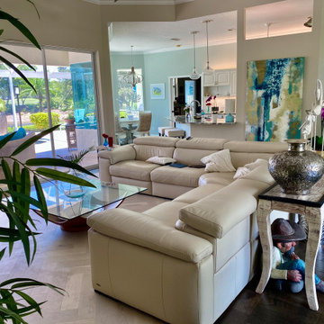
In the living room we decided to place a wood herringbone inlay, with a custom border as it made for a perfect integration with existing wood floors. Keep in mind that this area needed to be in installed by LG Kramer Flooring's elite certified master craftsman, as herringbone is a very complex and intensive install. If the layout veers off slightly, the mistake can grow exponentially into an installation disaster. That's why, as with many wood flooring installations, the planning and measuring that happens before a single slat is laid is so vital. Herringbone merits extra caution, because it is an unforgiving pattern.
If you are ready to be "floored" by LG Kramer Flooring certified installers give us a call or text at 941-587-3804
Need some inspiration? Visit LGKramerFlooring.com to see a gallery of what we are doing around town!
 TVL Creative Ltd.
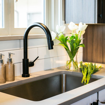
This 1950s home was sporting elements of the original kitchen and the dark space was not meeting our client’s needs. The original kitchen didn’t have much to offer in the way of functionality, so our first order of business was to create a design that would exponentially increase the usability of the kitchen. We brought in functional cabinetry, introduced uninterrupted work surfaces, and added plenty of lighting to brighten up their kitchen. They also wanted to open the new kitchen to the living room and create space for a larger dining table, so we started by removing the existing cabinetry that was visually cut the living space in two and minimized the power of the dramatic vaulted ceiling. We also extended the wood flooring into the kitchen as well to create seamless transitions between spaces. We fell in love with the idea of a two-toned cabinetry design for this kitchen and ultimately went head over heels for clean white painted base cabinets and a textured wood-look melamine on the uppers. This gave us a crisp backdrop that allowed us to bring is fun forms like the black light fixture over the table and the gorgeous silhouettes on the hardware. We played a lot with directionality in this space. The elongated open shelves and rectangular backsplash tiles give us wonderfully clean horizontal lines, but to balance those out we brought in a vertical grain pattern on the wall cabinets and added long black cabinetry pulls that emphasize the verticality of the space. The clients have a green thumb and wanted to make sure we created a home for their growing plant collection. The open shelving gives us plenty of opportunities for foliage and to showcase fun kitchen accessories. This design feels like home and brings together the clean lines and crisp finishes our clients were looking for.
 Lindy Design Build
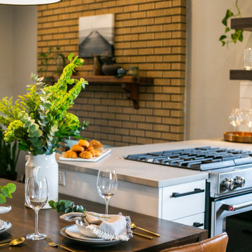
This 1950s home was sporting elements of the original kitchen and the dark space was not meeting our client’s needs. The original kitchen didn’t have much to offer in the way of functionality, so our first order of business was to create a design that would exponentially increase the usability of the kitchen. We brought in functional cabinetry, introduced uninterrupted work surfaces, and added plenty of lighting to brighten up their kitchen. They also wanted to open the new kitchen to the living room and create space for a larger dining table, so we started by removing the existing cabinetry that was visually cut the living space in two and minimized the power of the dramatic vaulted ceiling. We also extended the wood flooring into the kitchen as well to create seamless transitions between spaces.
We fell in love with the idea of a two-toned cabinetry design for this kitchen and ultimately went head over heels for clean white painted base cabinets and a textured wood-look melamine on the uppers. This gave us a crisp backdrop that allowed us to bring is fun forms like the black light fixture over the table and the gorgeous silhouettes on the hardware. We played a lot with directionality in this space. The elongated open shelves and rectangular backsplash tiles give us wonderfully clean horizontal lines, but to balance those out we brought in a vertical grain pattern on the wall cabinets and added long black cabinetry pulls that emphasize the verticality of the space. The clients have a green thumb and wanted to make sure we created a home for their growing plant collection. The open shelving gives us plenty of opportunities for foliage and to showcase fun kitchen accessories. This design feels like home and brings together the clean lines and crisp finishes our clients were looking.
 Lindy Design Build
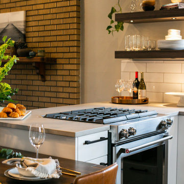
This 1950s home was sporting elements of the original kitchen and the dark space was not meeting our client’s needs. The original kitchen didn’t have much to offer in the way of functionality, so our first order of business was to create a design that would exponentially increase the usability of the kitchen. We brought in functional cabinetry, introduced uninterrupted work surfaces, and added plenty of lighting to brighten up their kitchen. They also wanted to open the new kitchen to the living room and create space for a larger dining table, so we started by removing the existing cabinetry that was visually cut the living space in two and minimized the power of the dramatic vaulted ceiling. We also extended the wood flooring into the kitchen as well to create seamless transitions between spaces.
We fell in love with the idea of a two-toned cabinetry design for this kitchen and ultimately went head over heels for clean white painted base cabinets and a textured wood-look melamine on the uppers. This gave us a crisp backdrop that allowed us to bring is fun forms like the black light fixture over the table and the gorgeous silhouettes on the hardware. We played a lot with directionality in this space. The elongated open shelves and rectangular backsplash tiles give us wonderfully clean horizontal lines, but to balance those out we brought in a vertical grain pattern on the wall cabinets and added long black cabinetry pulls that emphasize the verticality of the space. The clients have a green thumb and wanted to make sure we created a home for their growing plant collection. The open shelving gives us plenty of opportunities for foliage and to showcase fun kitchen accessories. This design feels like home and brings together the clean lines and crisp finishes our clients were looking.
 LG Kramer Flooring
Final - Living room
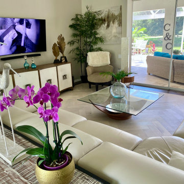
In the living room we decided to place a wood herringbone inlay, with a custom border as it made for a perfect integration with existing wood floors. Keep in mind that this area needed to be in installed by LG Kramer Flooring's elite certified master craftsman, as herringbone is a very complex and intensive install. If the layout veers off slightly, the mistake can grow exponentially into an installation disaster. That's why, as with many wood flooring installations, the planning and measuring that happens before a single slat is laid is so vital. Herringbone merits extra caution, because it is an unforgiving pattern.
If you are ready to be "floored" by LG Kramer Flooring certified installers give us a call or text at 941-587-3804
Need some inspiration? Visit LGKramerFlooring.com to see a gallery of what we are doing around town!
 TVL Creative Ltd.
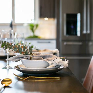
This 1950s home was sporting elements of the original kitchen and the dark space was not meeting our client’s needs. The original kitchen didn’t have much to offer in the way of functionality, so our first order of business was to create a design that would exponentially increase the usability of the kitchen. We brought in functional cabinetry, introduced uninterrupted work surfaces, and added plenty of lighting to brighten up their kitchen. They also wanted to open the new kitchen to the living room and create space for a larger dining table, so we started by removing the existing cabinetry that was visually cut the living space in two and minimized the power of the dramatic vaulted ceiling. We also extended the wood flooring into the kitchen as well to create seamless transitions between spaces. We fell in love with the idea of a two-toned cabinetry design for this kitchen and ultimately went head over heels for clean white painted base cabinets and a textured wood-look melamine on the uppers. This gave us a crisp backdrop that allowed us to bring is fun forms like the black light fixture over the table and the gorgeous silhouettes on the hardware. We played a lot with directionality in this space. The elongated open shelves and rectangular backsplash tiles give us wonderfully clean horizontal lines, but to balance those out we brought in a vertical grain pattern on the wall cabinets and added long black cabinetry pulls that emphasize the verticality of the space. The clients have a green thumb and wanted to make sure we created a home for their growing plant collection. The open shelving gives us plenty of opportunities for foliage and to showcase fun kitchen accessories. This design feels like home and brings together the clean lines and crisp finishes our clients were looking for.
 Lindy Design Build
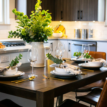
This 1950s home was sporting elements of the original kitchen and the dark space was not meeting our client’s needs. The original kitchen didn’t have much to offer in the way of functionality, so our first order of business was to create a design that would exponentially increase the usability of the kitchen. We brought in functional cabinetry, introduced uninterrupted work surfaces, and added plenty of lighting to brighten up their kitchen. They also wanted to open the new kitchen to the living room and create space for a larger dining table, so we started by removing the existing cabinetry that was visually cut the living space in two and minimized the power of the dramatic vaulted ceiling. We also extended the wood flooring into the kitchen as well to create seamless transitions between spaces.
We fell in love with the idea of a two-toned cabinetry design for this kitchen and ultimately went head over heels for clean white painted base cabinets and a textured wood-look melamine on the uppers. This gave us a crisp backdrop that allowed us to bring is fun forms like the black light fixture over the table and the gorgeous silhouettes on the hardware. We played a lot with directionality in this space. The elongated open shelves and rectangular backsplash tiles give us wonderfully clean horizontal lines, but to balance those out we brought in a vertical grain pattern on the wall cabinets and added long black cabinetry pulls that emphasize the verticality of the space. The clients have a green thumb and wanted to make sure we created a home for their growing plant collection. The open shelving gives us plenty of opportunities for foliage and to showcase fun kitchen accessories. This design feels like home and brings together the clean lines and crisp finishes our clients were looking.
4