
Search results for "Growing exponentially" in Home Design Ideas


 LG Kramer Flooring
FINAL - Living room
In the living room we decided to place a wood herringbone inlay, with a custom border as it made for a perfect integration with existing wood floors. Keep in mind that this area needed to be in installed by LG Kramer Flooring's elite certified master craftsman, as herringbone is a very complex and intensive install. If the layout veers off slightly, the mistake can grow exponentially into an installation disaster. That's why, as with many wood flooring installations, the planning and measuring that happens before a single slat is laid is so vital. Herringbone merits extra caution, because it is an unforgiving pattern.
If you are ready to be "floored" by LG Kramer Flooring certified installers give us a call or text at 941-587-3804
Need some inspiration? Visit LGKramerFlooring.com to see a gallery of what we are doing around town!
 LG Kramer Flooring
Final - Living room
In the living room we decided to place a wood herringbone inlay, with a custom border as it made for a perfect integration with existing wood floors. Keep in mind that this area needed to be in installed by LG Kramer Flooring's elite certified master craftsman, as herringbone is a very complex and intensive install. If the layout veers off slightly, the mistake can grow exponentially into an installation disaster. That's why, as with many wood flooring installations, the planning and measuring that happens before a single slat is laid is so vital. Herringbone merits extra caution, because it is an unforgiving pattern.
If you are ready to be "floored" by LG Kramer Flooring certified installers give us a call or text at 941-587-3804
Need some inspiration? Visit LGKramerFlooring.com to see a gallery of what we are doing around town!
Find the right local pro for your project

 LMB Interiors
We love designing homes in Piedmont. There are so many great examples of classic architectural styles here, and so many different families who want to relish these grand homes while also putting their own personal stamp, sometimes with a modern spin, sometimes more of a tradish twist, yet always warm, welcoming, gracious, and livable.
This home was built in the California Mediterranean style, with interior design updates to support a family with three children, and showcase their personal collections. We selected high quality, gorgeous materials and finishes, in a subtle and timeless palette, something that would be beautiful now, and would grow with the family.
Color and texture carpet runner kitchen design Oakland
A few key elements of the plans were emphasizing open flow and design connection through the entertaining spaces, from kitchen to living and dining rooms, plus remodeling the master bathroom, kitchen, guest bathroom, and powder room.
Elements that create the most impact which are sometimes a large investment but make an exponentially larger difference include relocating the more-expansive windows, which highlights the views to the large, verdant backyard. And opening up the connection between the family room and kitchen for a more integrated multi-use space that also makes it easier to keep an eye on children, while grownups are cooking in the kitchen.
 LMB Interiors
We love designing homes in Piedmont. There are so many great examples of classic architectural styles here, and so many different families who want to relish these grand homes while also putting their own personal stamp, sometimes with a modern spin, sometimes more of a tradish twist, yet always warm, welcoming, gracious, and livable.
This home was built in the California Mediterranean style, with interior design updates to support a family with three children, and showcase their personal collections. We selected high quality, gorgeous materials and finishes, in a subtle and timeless palette, something that would be beautiful now, and would grow with the family.
Color and texture carpet runner kitchen design Oakland
A few key elements of the plans were emphasizing open flow and design connection through the entertaining spaces, from kitchen to living and dining rooms, plus remodeling the master bathroom, kitchen, guest bathroom, and powder room.
Elements that create the most impact which are sometimes a large investment but make an exponentially larger difference include relocating the more-expansive windows, which highlights the views to the large, verdant backyard. And opening up the connection between the family room and kitchen for a more integrated multi-use space that also makes it easier to keep an eye on children, while grownups are cooking in the kitchen.
 LG Kramer Flooring
FINAL - Living room
In the living room we decided to place a wood herringbone inlay, with a custom border as it made for a perfect integration with existing wood floors. Keep in mind that this area needed to be in installed by LG Kramer Flooring's elite certified master craftsman, as herringbone is a very complex and intensive install. If the layout veers off slightly, the mistake can grow exponentially into an installation disaster. That's why, as with many wood flooring installations, the planning and measuring that happens before a single slat is laid is so vital. Herringbone merits extra caution, because it is an unforgiving pattern.
If you are ready to be "floored" by LG Kramer Flooring certified installers give us a call or text at 941-587-3804
Need some inspiration? Visit LGKramerFlooring.com to see a gallery of what we are doing around town!
 LMB Interiors
We love designing homes in Piedmont. There are so many great examples of classic architectural styles here, and so many different families who want to relish these grand homes while also putting their own personal stamp, sometimes with a modern spin, sometimes more of a tradish twist, yet always warm, welcoming, gracious, and livable.
This home was built in the California Mediterranean style, with interior design updates to support a family with three children, and showcase their personal collections. We selected high quality, gorgeous materials and finishes, in a subtle and timeless palette, something that would be beautiful now, and would grow with the family.
Color and texture carpet runner kitchen design Oakland
A few key elements of the plans were emphasizing open flow and design connection through the entertaining spaces, from kitchen to living and dining rooms, plus remodeling the master bathroom, kitchen, guest bathroom, and powder room.
Elements that create the most impact which are sometimes a large investment but make an exponentially larger difference include relocating the more-expansive windows, which highlights the views to the large, verdant backyard. And opening up the connection between the family room and kitchen for a more integrated multi-use space that also makes it easier to keep an eye on children, while grownups are cooking in the kitchen.
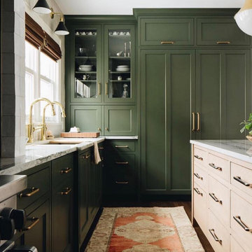

 LMB Interiors
We love designing homes in Piedmont. There are so many great examples of classic architectural styles here, and so many different families who want to relish these grand homes while also putting their own personal stamp, sometimes with a modern spin, sometimes more of a tradish twist, yet always warm, welcoming, gracious, and livable.
This home was built in the California Mediterranean style, with interior design updates to support a family with three children, and showcase their personal collections. We selected high quality, gorgeous materials and finishes, in a subtle and timeless palette, something that would be beautiful now, and would grow with the family.
Color and texture carpet runner kitchen design Oakland
A few key elements of the plans were emphasizing open flow and design connection through the entertaining spaces, from kitchen to living and dining rooms, plus remodeling the master bathroom, kitchen, guest bathroom, and powder room.
Elements that create the most impact which are sometimes a large investment but make an exponentially larger difference include relocating the more-expansive windows, which highlights the views to the large, verdant backyard. And opening up the connection between the family room and kitchen for a more integrated multi-use space that also makes it easier to keep an eye on children, while grownups are cooking in the kitchen.

 Prime 1 Builders
This project won in the 2013 Builders Association of Metropolitan Pittsburgh Housing Excellence Award for Best Urban Renewal Renovation Project. The glass bowl was made in the glass studio owned by the owner which is adjacent to the residence. The mirror is a repurposed window. The door is repurposed from a boarding house.
George Mendel
 FineLine Kitchens, Inc.
Our designer has achieved a stylish look by combining dark cabinets and light-colored marbles.


 TVL Creative Ltd.
This 1950s home was sporting elements of the original kitchen and the dark space was not meeting our client’s needs. The original kitchen didn’t have much to offer in the way of functionality, so our first order of business was to create a design that would exponentially increase the usability of the kitchen. We brought in functional cabinetry, introduced uninterrupted work surfaces, and added plenty of lighting to brighten up their kitchen. They also wanted to open the new kitchen to the living room and create space for a larger dining table, so we started by removing the existing cabinetry that was visually cut the living space in two and minimized the power of the dramatic vaulted ceiling. We also extended the wood flooring into the kitchen as well to create seamless transitions between spaces. We fell in love with the idea of a two-toned cabinetry design for this kitchen and ultimately went head over heels for clean white painted base cabinets and a textured wood-look melamine on the uppers. This gave us a crisp backdrop that allowed us to bring is fun forms like the black light fixture over the table and the gorgeous silhouettes on the hardware. We played a lot with directionality in this space. The elongated open shelves and rectangular backsplash tiles give us wonderfully clean horizontal lines, but to balance those out we brought in a vertical grain pattern on the wall cabinets and added long black cabinetry pulls that emphasize the verticality of the space. The clients have a green thumb and wanted to make sure we created a home for their growing plant collection. The open shelving gives us plenty of opportunities for foliage and to showcase fun kitchen accessories. This design feels like home and brings together the clean lines and crisp finishes our clients were looking for.
 TVL Creative Ltd.
This 1950s home was sporting elements of the original kitchen and the dark space was not meeting our client’s needs. The original kitchen didn’t have much to offer in the way of functionality, so our first order of business was to create a design that would exponentially increase the usability of the kitchen. We brought in functional cabinetry, introduced uninterrupted work surfaces, and added plenty of lighting to brighten up their kitchen. They also wanted to open the new kitchen to the living room and create space for a larger dining table, so we started by removing the existing cabinetry that was visually cut the living space in two and minimized the power of the dramatic vaulted ceiling. We also extended the wood flooring into the kitchen as well to create seamless transitions between spaces. We fell in love with the idea of a two-toned cabinetry design for this kitchen and ultimately went head over heels for clean white painted base cabinets and a textured wood-look melamine on the uppers. This gave us a crisp backdrop that allowed us to bring is fun forms like the black light fixture over the table and the gorgeous silhouettes on the hardware. We played a lot with directionality in this space. The elongated open shelves and rectangular backsplash tiles give us wonderfully clean horizontal lines, but to balance those out we brought in a vertical grain pattern on the wall cabinets and added long black cabinetry pulls that emphasize the verticality of the space. The clients have a green thumb and wanted to make sure we created a home for their growing plant collection. The open shelving gives us plenty of opportunities for foliage and to showcase fun kitchen accessories. This design feels like home and brings together the clean lines and crisp finishes our clients were looking for.
 TVL Creative Ltd.
This 1950s home was sporting elements of the original kitchen and the dark space was not meeting our client’s needs. The original kitchen didn’t have much to offer in the way of functionality, so our first order of business was to create a design that would exponentially increase the usability of the kitchen. We brought in functional cabinetry, introduced uninterrupted work surfaces, and added plenty of lighting to brighten up their kitchen. They also wanted to open the new kitchen to the living room and create space for a larger dining table, so we started by removing the existing cabinetry that was visually cut the living space in two and minimized the power of the dramatic vaulted ceiling. We also extended the wood flooring into the kitchen as well to create seamless transitions between spaces. We fell in love with the idea of a two-toned cabinetry design for this kitchen and ultimately went head over heels for clean white painted base cabinets and a textured wood-look melamine on the uppers. This gave us a crisp backdrop that allowed us to bring is fun forms like the black light fixture over the table and the gorgeous silhouettes on the hardware. We played a lot with directionality in this space. The elongated open shelves and rectangular backsplash tiles give us wonderfully clean horizontal lines, but to balance those out we brought in a vertical grain pattern on the wall cabinets and added long black cabinetry pulls that emphasize the verticality of the space. The clients have a green thumb and wanted to make sure we created a home for their growing plant collection. The open shelving gives us plenty of opportunities for foliage and to showcase fun kitchen accessories. This design feels like home and brings together the clean lines and crisp finishes our clients were looking for.
 TVL Creative Ltd.
This 1950s home was sporting elements of the original kitchen and the dark space was not meeting our client’s needs. The original kitchen didn’t have much to offer in the way of functionality, so our first order of business was to create a design that would exponentially increase the usability of the kitchen. We brought in functional cabinetry, introduced uninterrupted work surfaces, and added plenty of lighting to brighten up their kitchen. They also wanted to open the new kitchen to the living room and create space for a larger dining table, so we started by removing the existing cabinetry that was visually cut the living space in two and minimized the power of the dramatic vaulted ceiling. We also extended the wood flooring into the kitchen as well to create seamless transitions between spaces. We fell in love with the idea of a two-toned cabinetry design for this kitchen and ultimately went head over heels for clean white painted base cabinets and a textured wood-look melamine on the uppers. This gave us a crisp backdrop that allowed us to bring is fun forms like the black light fixture over the table and the gorgeous silhouettes on the hardware. We played a lot with directionality in this space. The elongated open shelves and rectangular backsplash tiles give us wonderfully clean horizontal lines, but to balance those out we brought in a vertical grain pattern on the wall cabinets and added long black cabinetry pulls that emphasize the verticality of the space. The clients have a green thumb and wanted to make sure we created a home for their growing plant collection. The open shelving gives us plenty of opportunities for foliage and to showcase fun kitchen accessories. This design feels like home and brings together the clean lines and crisp finishes our clients were looking for.
 TVL Creative Ltd.
This 1950s home was sporting elements of the original kitchen and the dark space was not meeting our client’s needs. The original kitchen didn’t have much to offer in the way of functionality, so our first order of business was to create a design that would exponentially increase the usability of the kitchen. We brought in functional cabinetry, introduced uninterrupted work surfaces, and added plenty of lighting to brighten up their kitchen. They also wanted to open the new kitchen to the living room and create space for a larger dining table, so we started by removing the existing cabinetry that was visually cut the living space in two and minimized the power of the dramatic vaulted ceiling. We also extended the wood flooring into the kitchen as well to create seamless transitions between spaces. We fell in love with the idea of a two-toned cabinetry design for this kitchen and ultimately went head over heels for clean white painted base cabinets and a textured wood-look melamine on the uppers. This gave us a crisp backdrop that allowed us to bring is fun forms like the black light fixture over the table and the gorgeous silhouettes on the hardware. We played a lot with directionality in this space. The elongated open shelves and rectangular backsplash tiles give us wonderfully clean horizontal lines, but to balance those out we brought in a vertical grain pattern on the wall cabinets and added long black cabinetry pulls that emphasize the verticality of the space. The clients have a green thumb and wanted to make sure we created a home for their growing plant collection. The open shelving gives us plenty of opportunities for foliage and to showcase fun kitchen accessories. This design feels like home and brings together the clean lines and crisp finishes our clients were looking for.
 TVL Creative Ltd.
This 1950s home was sporting elements of the original kitchen and the dark space was not meeting our client’s needs. The original kitchen didn’t have much to offer in the way of functionality, so our first order of business was to create a design that would exponentially increase the usability of the kitchen. We brought in functional cabinetry, introduced uninterrupted work surfaces, and added plenty of lighting to brighten up their kitchen. They also wanted to open the new kitchen to the living room and create space for a larger dining table, so we started by removing the existing cabinetry that was visually cut the living space in two and minimized the power of the dramatic vaulted ceiling. We also extended the wood flooring into the kitchen as well to create seamless transitions between spaces. We fell in love with the idea of a two-toned cabinetry design for this kitchen and ultimately went head over heels for clean white painted base cabinets and a textured wood-look melamine on the uppers. This gave us a crisp backdrop that allowed us to bring is fun forms like the black light fixture over the table and the gorgeous silhouettes on the hardware. We played a lot with directionality in this space. The elongated open shelves and rectangular backsplash tiles give us wonderfully clean horizontal lines, but to balance those out we brought in a vertical grain pattern on the wall cabinets and added long black cabinetry pulls that emphasize the verticality of the space. The clients have a green thumb and wanted to make sure we created a home for their growing plant collection. The open shelving gives us plenty of opportunities for foliage and to showcase fun kitchen accessories. This design feels like home and brings together the clean lines and crisp finishes our clients were looking for.
 TVL Creative Ltd.
This 1950s home was sporting elements of the original kitchen and the dark space was not meeting our client’s needs. The original kitchen didn’t have much to offer in the way of functionality, so our first order of business was to create a design that would exponentially increase the usability of the kitchen. We brought in functional cabinetry, introduced uninterrupted work surfaces, and added plenty of lighting to brighten up their kitchen. They also wanted to open the new kitchen to the living room and create space for a larger dining table, so we started by removing the existing cabinetry that was visually cut the living space in two and minimized the power of the dramatic vaulted ceiling. We also extended the wood flooring into the kitchen as well to create seamless transitions between spaces. We fell in love with the idea of a two-toned cabinetry design for this kitchen and ultimately went head over heels for clean white painted base cabinets and a textured wood-look melamine on the uppers. This gave us a crisp backdrop that allowed us to bring is fun forms like the black light fixture over the table and the gorgeous silhouettes on the hardware. We played a lot with directionality in this space. The elongated open shelves and rectangular backsplash tiles give us wonderfully clean horizontal lines, but to balance those out we brought in a vertical grain pattern on the wall cabinets and added long black cabinetry pulls that emphasize the verticality of the space. The clients have a green thumb and wanted to make sure we created a home for their growing plant collection. The open shelving gives us plenty of opportunities for foliage and to showcase fun kitchen accessories. This design feels like home and brings together the clean lines and crisp finishes our clients were looking for.

 User
This is an organic Lime Wash done with a true lime wash product as opposed to a brick mortar or concrete that is often seen on new houses. This product can be applied as a solid coating making the surface completely white, or can be applied and "washed off" in many artistic ways, as seen here. If you hate your brick or just want something unique this is a great option!
Photo credit: Jeff Murrey
 TVL Creative Ltd.
This 1950s home was sporting elements of the original kitchen and the dark space was not meeting our client’s needs. The original kitchen didn’t have much to offer in the way of functionality, so our first order of business was to create a design that would exponentially increase the usability of the kitchen. We brought in functional cabinetry, introduced uninterrupted work surfaces, and added plenty of lighting to brighten up their kitchen. They also wanted to open the new kitchen to the living room and create space for a larger dining table, so we started by removing the existing cabinetry that was visually cut the living space in two and minimized the power of the dramatic vaulted ceiling. We also extended the wood flooring into the kitchen as well to create seamless transitions between spaces. We fell in love with the idea of a two-toned cabinetry design for this kitchen and ultimately went head over heels for clean white painted base cabinets and a textured wood-look melamine on the uppers. This gave us a crisp backdrop that allowed us to bring is fun forms like the black light fixture over the table and the gorgeous silhouettes on the hardware. We played a lot with directionality in this space. The elongated open shelves and rectangular backsplash tiles give us wonderfully clean horizontal lines, but to balance those out we brought in a vertical grain pattern on the wall cabinets and added long black cabinetry pulls that emphasize the verticality of the space. The clients have a green thumb and wanted to make sure we created a home for their growing plant collection. The open shelving gives us plenty of opportunities for foliage and to showcase fun kitchen accessories. This design feels like home and brings together the clean lines and crisp finishes our clients were looking for.
1