
Search results for "Growing exponentially" in Home Design Ideas

 Kansas City Masonry /City Of Fountains
outdoor solar fountains kansas city
outdoor waterfall fountains kansas city
outdoor fountain ideas kansas city
lighted outdoor water fountains kansas city
outdoor fountains with lights kansas city
outdoor urn fountains kansas city
modern outdoor water fountain kansas city
outdoor bamboo fountains kansas city
outdoor stone fountains kansas city
outdoor floor fountains kansas city
corner fountains outdoor kansas city
large outdoor wall fountains kansas city
outdoor tiered fountains kansas city
outdoor vase fountains kansas city
mexican wall fountains outdoor kansas city
copper fountains outdoor kansas city
diy outdoor wall fountains kansas city
resin outdoor fountains kansas city
outdoor ceramic fountains kansas city

 Story Barns
Inspiration for a mid-sized rustic carpeted straight cable railing staircase remodel in Denver with carpeted risers
 Lindy Design Build
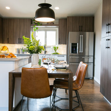
This 1950s home was sporting elements of the original kitchen and the dark space was not meeting our client’s needs. The original kitchen didn’t have much to offer in the way of functionality, so our first order of business was to create a design that would exponentially increase the usability of the kitchen. We brought in functional cabinetry, introduced uninterrupted work surfaces, and added plenty of lighting to brighten up their kitchen. They also wanted to open the new kitchen to the living room and create space for a larger dining table, so we started by removing the existing cabinetry that was visually cut the living space in two and minimized the power of the dramatic vaulted ceiling. We also extended the wood flooring into the kitchen as well to create seamless transitions between spaces.
We fell in love with the idea of a two-toned cabinetry design for this kitchen and ultimately went head over heels for clean white painted base cabinets and a textured wood-look melamine on the uppers. This gave us a crisp backdrop that allowed us to bring is fun forms like the black light fixture over the table and the gorgeous silhouettes on the hardware. We played a lot with directionality in this space. The elongated open shelves and rectangular backsplash tiles give us wonderfully clean horizontal lines, but to balance those out we brought in a vertical grain pattern on the wall cabinets and added long black cabinetry pulls that emphasize the verticality of the space. The clients have a green thumb and wanted to make sure we created a home for their growing plant collection. The open shelving gives us plenty of opportunities for foliage and to showcase fun kitchen accessories. This design feels like home and brings together the clean lines and crisp finishes our clients were looking.
Find the right local pro for your project
 Lindy Design Build
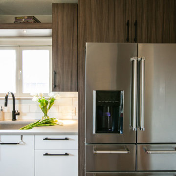
This 1950s home was sporting elements of the original kitchen and the dark space was not meeting our client’s needs. The original kitchen didn’t have much to offer in the way of functionality, so our first order of business was to create a design that would exponentially increase the usability of the kitchen. We brought in functional cabinetry, introduced uninterrupted work surfaces, and added plenty of lighting to brighten up their kitchen. They also wanted to open the new kitchen to the living room and create space for a larger dining table, so we started by removing the existing cabinetry that was visually cut the living space in two and minimized the power of the dramatic vaulted ceiling. We also extended the wood flooring into the kitchen as well to create seamless transitions between spaces.
We fell in love with the idea of a two-toned cabinetry design for this kitchen and ultimately went head over heels for clean white painted base cabinets and a textured wood-look melamine on the uppers. This gave us a crisp backdrop that allowed us to bring is fun forms like the black light fixture over the table and the gorgeous silhouettes on the hardware. We played a lot with directionality in this space. The elongated open shelves and rectangular backsplash tiles give us wonderfully clean horizontal lines, but to balance those out we brought in a vertical grain pattern on the wall cabinets and added long black cabinetry pulls that emphasize the verticality of the space. The clients have a green thumb and wanted to make sure we created a home for their growing plant collection. The open shelving gives us plenty of opportunities for foliage and to showcase fun kitchen accessories. This design feels like home and brings together the clean lines and crisp finishes our clients were looking.
 Lindy Design Build
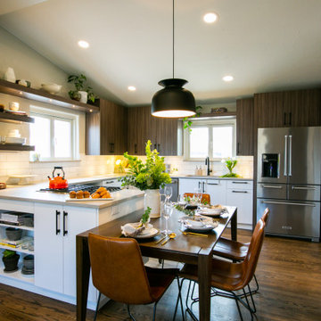
This 1950s home was sporting elements of the original kitchen and the dark space was not meeting our client’s needs. The original kitchen didn’t have much to offer in the way of functionality, so our first order of business was to create a design that would exponentially increase the usability of the kitchen. We brought in functional cabinetry, introduced uninterrupted work surfaces, and added plenty of lighting to brighten up their kitchen. They also wanted to open the new kitchen to the living room and create space for a larger dining table, so we started by removing the existing cabinetry that was visually cut the living space in two and minimized the power of the dramatic vaulted ceiling. We also extended the wood flooring into the kitchen as well to create seamless transitions between spaces.
We fell in love with the idea of a two-toned cabinetry design for this kitchen and ultimately went head over heels for clean white painted base cabinets and a textured wood-look melamine on the uppers. This gave us a crisp backdrop that allowed us to bring is fun forms like the black light fixture over the table and the gorgeous silhouettes on the hardware. We played a lot with directionality in this space. The elongated open shelves and rectangular backsplash tiles give us wonderfully clean horizontal lines, but to balance those out we brought in a vertical grain pattern on the wall cabinets and added long black cabinetry pulls that emphasize the verticality of the space. The clients have a green thumb and wanted to make sure we created a home for their growing plant collection. The open shelving gives us plenty of opportunities for foliage and to showcase fun kitchen accessories. This design feels like home and brings together the clean lines and crisp finishes our clients were looking.
 Lindy Design Build
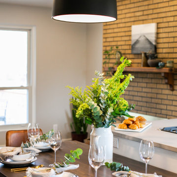
This 1950s home was sporting elements of the original kitchen and the dark space was not meeting our client’s needs. The original kitchen didn’t have much to offer in the way of functionality, so our first order of business was to create a design that would exponentially increase the usability of the kitchen. We brought in functional cabinetry, introduced uninterrupted work surfaces, and added plenty of lighting to brighten up their kitchen. They also wanted to open the new kitchen to the living room and create space for a larger dining table, so we started by removing the existing cabinetry that was visually cut the living space in two and minimized the power of the dramatic vaulted ceiling. We also extended the wood flooring into the kitchen as well to create seamless transitions between spaces.
We fell in love with the idea of a two-toned cabinetry design for this kitchen and ultimately went head over heels for clean white painted base cabinets and a textured wood-look melamine on the uppers. This gave us a crisp backdrop that allowed us to bring is fun forms like the black light fixture over the table and the gorgeous silhouettes on the hardware. We played a lot with directionality in this space. The elongated open shelves and rectangular backsplash tiles give us wonderfully clean horizontal lines, but to balance those out we brought in a vertical grain pattern on the wall cabinets and added long black cabinetry pulls that emphasize the verticality of the space. The clients have a green thumb and wanted to make sure we created a home for their growing plant collection. The open shelving gives us plenty of opportunities for foliage and to showcase fun kitchen accessories. This design feels like home and brings together the clean lines and crisp finishes our clients were looking.

 Meoded Paints & Decoration
Crystal Brush is a glitter paint which makes interior surfaces glisten and sparkle, giving your walls a contemporary look unmatched by any other paint. Easy to use, Crystal Brush will add a unique decorative flare to your space with just the swish of a brush.

 Lindy Design Build
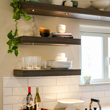
This 1950s home was sporting elements of the original kitchen and the dark space was not meeting our client’s needs. The original kitchen didn’t have much to offer in the way of functionality, so our first order of business was to create a design that would exponentially increase the usability of the kitchen. We brought in functional cabinetry, introduced uninterrupted work surfaces, and added plenty of lighting to brighten up their kitchen. They also wanted to open the new kitchen to the living room and create space for a larger dining table, so we started by removing the existing cabinetry that was visually cut the living space in two and minimized the power of the dramatic vaulted ceiling. We also extended the wood flooring into the kitchen as well to create seamless transitions between spaces.
We fell in love with the idea of a two-toned cabinetry design for this kitchen and ultimately went head over heels for clean white painted base cabinets and a textured wood-look melamine on the uppers. This gave us a crisp backdrop that allowed us to bring is fun forms like the black light fixture over the table and the gorgeous silhouettes on the hardware. We played a lot with directionality in this space. The elongated open shelves and rectangular backsplash tiles give us wonderfully clean horizontal lines, but to balance those out we brought in a vertical grain pattern on the wall cabinets and added long black cabinetry pulls that emphasize the verticality of the space. The clients have a green thumb and wanted to make sure we created a home for their growing plant collection. The open shelving gives us plenty of opportunities for foliage and to showcase fun kitchen accessories. This design feels like home and brings together the clean lines and crisp finishes our clients were looking.

 Outside Space NYC Landscape Design
Irene Kalina-Jones
Example of a mid-sized minimalist backyard stone patio container garden design in New York with no cover
Example of a mid-sized minimalist backyard stone patio container garden design in New York with no cover

 River Road Farms
Inspiration for a mid-sized traditional partial sun side yard outdoor basketball/tennis/multi-game court.

 Robert Elliott Custom Homes
Situated on one of the most prestigious streets in the distinguished neighborhood of Highland Park, 3517 Beverly is a transitional residence built by Robert Elliott Custom Homes. Designed by notable architect David Stocker of Stocker Hoesterey Montenegro, the 3-story, 5-bedroom and 6-bathroom residence is characterized by ample living space and signature high-end finishes. An expansive driveway on the oversized lot leads to an entrance with a courtyard fountain and glass pane front doors. The first floor features two living areas — each with its own fireplace and exposed wood beams — with one adjacent to a bar area. The kitchen is a convenient and elegant entertaining space with large marble countertops, a waterfall island and dual sinks. Beautifully tiled bathrooms are found throughout the home and have soaking tubs and walk-in showers. On the second floor, light filters through oversized windows into the bedrooms and bathrooms, and on the third floor, there is additional space for a sizable game room. There is an extensive outdoor living area, accessed via sliding glass doors from the living room, that opens to a patio with cedar ceilings and a fireplace.

 Regenesis Ecological Design
A modern steel mesh fence contrasts with spring growth of Cotoneaster multiflorus
http://annacaitlinphotography.com/

 Strand Design
A simple white hall with an opening into the next room. Residential design by Strand Design, Minneapolis.
Inspiration for a modern bedroom remodel in Minneapolis
Inspiration for a modern bedroom remodel in Minneapolis

 Amy Martin Landscape Design
Location: Cohasset, MA, United States
This elegant property has gorgeous views of the harbor, with sweeping stone walls that create a terraced effect. Since the house was a warm beige, I felt a bold red would really bring it to life, mixed with burgundy foliage and big, dramatic grasses.
Hay Scented Fern, Solomon's Seal and Hellebore create a dense, naturalistic ground cover along this slope at the bottom on a ledge cliff.

 LightScape Transformations
Doug & Jan Hansen selected LightScape Transformations to install integrated Infiniti 20 LED lighting fixtures to uplight their front Magnolia Tree. Photograph courtesy of Janie Jones Photography.
 Lindy Design Build
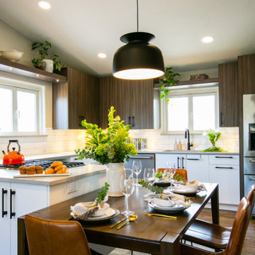
This 1950s home was sporting elements of the original kitchen and the dark space was not meeting our client’s needs. The original kitchen didn’t have much to offer in the way of functionality, so our first order of business was to create a design that would exponentially increase the usability of the kitchen. We brought in functional cabinetry, introduced uninterrupted work surfaces, and added plenty of lighting to brighten up their kitchen. They also wanted to open the new kitchen to the living room and create space for a larger dining table, so we started by removing the existing cabinetry that was visually cut the living space in two and minimized the power of the dramatic vaulted ceiling. We also extended the wood flooring into the kitchen as well to create seamless transitions between spaces.
We fell in love with the idea of a two-toned cabinetry design for this kitchen and ultimately went head over heels for clean white painted base cabinets and a textured wood-look melamine on the uppers. This gave us a crisp backdrop that allowed us to bring is fun forms like the black light fixture over the table and the gorgeous silhouettes on the hardware. We played a lot with directionality in this space. The elongated open shelves and rectangular backsplash tiles give us wonderfully clean horizontal lines, but to balance those out we brought in a vertical grain pattern on the wall cabinets and added long black cabinetry pulls that emphasize the verticality of the space. The clients have a green thumb and wanted to make sure we created a home for their growing plant collection. The open shelving gives us plenty of opportunities for foliage and to showcase fun kitchen accessories. This design feels like home and brings together the clean lines and crisp finishes our clients were looking.

 Paul Arcoite
Reclaimed fir T&G with faded grey finish.
Photo: Sterling Lorence
Example of a beach style deck design in Vancouver
Example of a beach style deck design in Vancouver


 Sarah Seung-McFarland
Photo: Sarah Seung McFarland © 2017 Houzz
Inspiration for an eclectic living room remodel in New York
Inspiration for an eclectic living room remodel in New York
7