
Search results for "Heath care" in Home Design Ideas
 SALA Architects
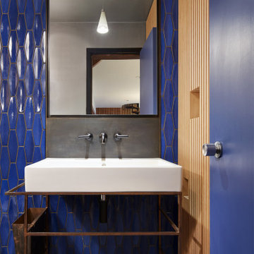
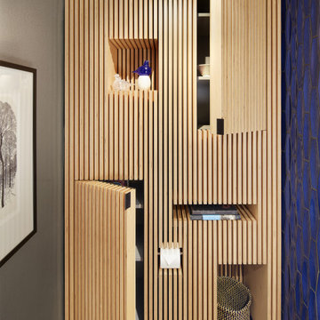
This 1963 architect designed home needed some careful design work to make it livable for a more modern couple, without forgoing its Mid-Century aesthetic. SALA Architects designed a slat wall with strategic pockets and doors to both be wall treatment and storage. Designed by David Wagner, AIA with Marta Snow, AIA.
 SALA Architects
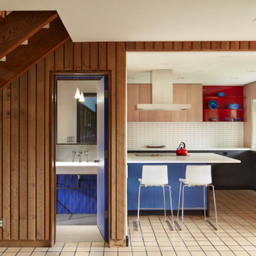
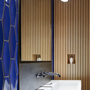
This 1963 architect designed home needed some careful design work to make it livable for a more modern couple, without forgoing its Mid-Century aesthetic. The bulk of the renovation work was done in the kitchen and powder room. Both rooms had been made dark and unappetizing previously by a 1990's remodel. Designed by David Wagner, AIA with Marta Snow, AIA.

Find the right local pro for your project
 TVL Creative Ltd.
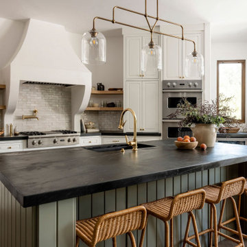
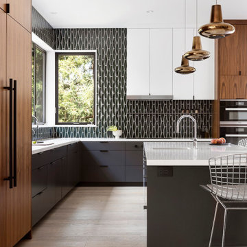
This project was kick-started by the removal of a large intrusive peninsula that competed with the young family’s bustling daily routine. Having already experienced the time investment of a sweat equity remodel, our clients enlisted us to do things a bit different while still paying careful attention to their personal aesthetic and lifestyle needs. The design sought to recreate a kitchen layout that would encourage gathering and create a welcoming space for friends and family, young and old. To open things up, the wall between the kitchen and dining room was eliminated. But we chose to retain and added on architectural elements to maintain a sense of intimate space within the new open concept. Those architectural elements were a creative way to accommodate existing structural elements and respect the bones of the home. The chunky early 00s arches were squared off for a more modern feel that better aligned with the client’s style. The hub of the home centers around the large walnut island featuring storage on three sides and seating for four. Handmade tile from Heath Ceramic creates a bold focal point. To ensure the space was bright and open, we opted for the two-tone mix of walnut and white cabinetry. The walnut cabinetry grounds the island and adds a touch of symmetry by flanking either side of the gas range. A new broom closet offers visual separation between the kitchen and the garage entry. Just of the garage door are a set of three tall cabinets that have been configured as locker storage for their kid's book bags, jackers, and shoes. Opposite the lockers is an overflow pantry space, window seat with extra storage, a nook for the dog bowls, and a mail station. A glass table in front of the window seat turns this area into the perfect homework nook. A set of three glass pendants from Pottery Barn illuminate the island. The soft white countertops are Daltile’s, Lincoln White matte quartz. Sleek cabinetry pulls from Amerock add that final touch. We are so in love with this cheerful, inviting main-level and are so happy our clients get to create memories inside these walls!
 SALA Architects
This 1963 architect designed home needed some careful design work to make it livable for a more modern couple, without forgoing its Mid-Century aesthetic. SALA Architects designed a slat wall with strategic pockets and doors to both be wall treatment and storage. Designed by David Wagner, AIA with Marta Snow, AIA.
 SALA Architects
This 1963 architect designed home needed some careful design work to make it livable for a more modern couple, without forgoing its Mid-Century aesthetic. SALA Architects designed a slat wall with strategic pockets and doors to both be wall treatment and storage. Designed by David Wagner, AIA with Marta Snow, AIA.

 Weil Friedman Architects
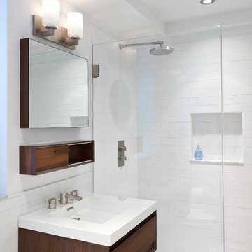
This sleek bathroom creates a serene and bright feeling by keeping things simple. The Wetstyle floating vanity is paired with matching wall cabinet and medicine for a simple unified focal point. Simple white subway tiles and trim are paired with Carrara marble mosaic floors for a bright timeless look.

 ZeroEnergy Design
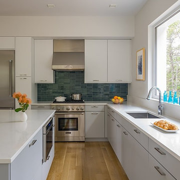
This modern green home offers both a vacation destination on Cape Cod near local family members and an opportunity for rental income.
FAMILY ROOTS. A West Coast couple living in the San Francisco Bay Area sought a permanent East Coast vacation home near family members living on Cape Cod. As academic professionals focused on sustainability, they sought a green, energy efficient home that was well-aligned with their values. With no green homes available for sale on Cape Cod, they decided to purchase land near their family and build their own.
SLOPED SITE. Comprised of a 3/4 acre lot nestled in the pines, the steeply sloping terrain called for a plan that embraced and took advantage of the slope. Of equal priority was optimizing solar exposure, preserving privacy from abutters, and creating outdoor living space. The design accomplished these goals with a simple, rectilinear form, offering living space on the both entry and lower/basement levels. The stepped foundation allows for a walk-out basement level with light-filled living space on the down-hill side of the home. The traditional basement on the eastern, up-hill side houses mechanical equipment and a home gym. The house welcomes natural light throughout, captures views of the forest, and delivers entertainment space that connects indoor living space to outdoor deck and dining patio.
MODERN VISION. The clean building form and uncomplicated finishes pay homage to the modern architectural legacy on the outer Cape. Durable and economical fiber cement panels, fixed with aluminum channels, clad the primary form. Cedar clapboards provide a visual accent at the south-facing living room, which extends a single roof plane to cover the entry porch.
SMART USE OF SPACE. On the entry level, the “L”-shaped living, dining, and kitchen space connects to the exterior living, dining, and grilling spaces to effectively double the home’s summertime entertainment area. Placed at the western end of the entry level (where it can retain privacy but still claim expansive downhill views) is the master suite with a built-in study. The lower level has two guest bedrooms, a second full bathroom, and laundry. The flexibility of the space—crucial in a house with a modest footprint—emerges in one of the guest bedrooms, which doubles as home office by opening the barn-style double doors to connect it to the bright, airy open stair leading up to the entry level. Thoughtful design, generous ceiling heights and large windows transform the modest 1,100 sf* footprint into a well-lit, spacious home. *(total finished space is 1800 sf)
RENTAL INCOME. The property works for its owners by netting rental income when the owners are home in San Francisco. The house especially caters to vacationers bound for nearby Mayo Beach and includes an outdoor shower adjacent to the lower level entry door. In contrast to the bare bones cottages that are typically available on the Cape, this home offers prospective tenants a modern aesthetic, paired with luxurious and green features. Durable finishes inside and out will ensure longevity with the heavier use that comes with a rental property.
COMFORT YEAR-ROUND. The home is super-insulated and air-tight, with mechanical ventilation to provide continuous fresh air from the outside. High performance triple-paned windows complement the building enclosure and maximize passive solar gain while ensuring a warm, draft-free winter, even when sitting close to the glass. A properly sized air source heat pump offers efficient heating & cooling, and includes a carefully designed the duct distribution system to provide even comfort throughout the house. The super-insulated envelope allows us to significantly reduce the equipment capacity, duct size, and airflow quantities, while maintaining unparalleled thermal comfort.
ENERGY EFFICIENT. The building’s shell and mechanical systems play instrumental roles in the home’s exceptional performance. The building enclosure reduces the most significant energy glutton: heating. Continuous super-insulation, thorough air sealing, triple-pane windows, and passive solar gain work together to yield a miniscule heating load. All active energy consumers are extremely efficient: an air source heat pump for heating and cooling, a heat pump hot water heater, LED lighting, energy recovery ventilation (ERV), and high efficiency appliances. The result is a home that uses 70% less energy than a similar new home built to code requirements.
OVERALL. The home embodies the owners’ goals and values while comprehensively enabling thermal comfort, energy efficiency, a vacation respite, and supplementary income.
PROJECT TEAM
ZeroEnergy Design - Architect & Mechanical Designer
A.F. Hultin & Co. - Contractor
Pamet Valley Landscape Design - Landscape & Masonry
Lisa Finch - Original Artwork
European Architectural Supply - Windows
Eric Roth Photography - Photography
 Nystrom Design
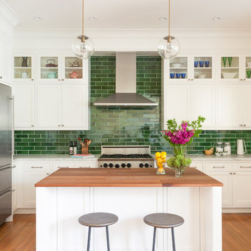
We were asked to achieve modern-day functionality and style while preserving the architectural character of this Victorian home built in 1900. We balanced a classic white cabinet style with a bold backsplash tile and an island countertop made from reclaimed high school bleacher seats.
// Photographer: Caroline Johnson
 Home & Garden Design, Atlanta - Danna Cain, ASLA
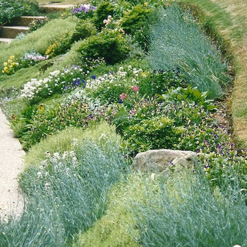
This very steep hillside is the focal point of the back yard as it is located along the outdoor living area, patio and courtyard just outside a wall of french doors. It was too steep to mow, dry, rocky and barren until we worked our magic. The client was from Scotland and desired a landscape that would remind her of a traditional " Rockery" with alpine plants, heaths and heathers. Since those specific plants don't do well in Atlanta, we choose plants that offered similar colors and textures. When the garden is the most lush, as seen here, only a few rocks are visible. In the winter when half of these plants are dormant, the hand selected and carefully placed boulders balance the design. This Buckhead client absolutely loves the results!
Photographer: Danna Cain, Home & Garden Design, Inc.
 FK Interior Design
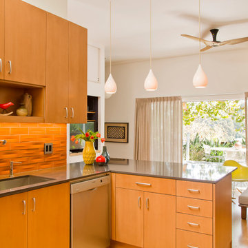
What began as a simple kitchen ‘face-lift’ turned into a more complex kitchen remodel when it was determined that what the client was really seeking was to create a space which evoked the warmth of wood. The challenge was to take a dated (c. 1980’s) white plastic laminate kitchen with a white Formica counter top and transform it into a warmly, wood-clad kitchen without having to demolish the entire kitchen cabinetry. With new door and drawer faces and the careful ‘skinning’ of the existing laminate cabinets with a stained maple veneer; the space became more luxurious and updated. The counter top was replaced with a new quartz slab from Eurostone. The peninsula now accommodates counter-height seating. The Haiku bamboo ceiling fan from Big Ass Fans graces the family room.
Photography: Manolo Langis
 Tali Hardonag Architect
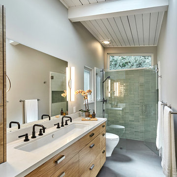
Mountain View Modern master bath with curbless shower, bamboo cabinets and double trough sink.
Green Heath Ceramics tile on shower wall, also in shower niche (reflected in mirror)
Exposed beams and skylight in ceiling.
Photography: Mark Pinkerton VI360


 Vidal Design Collaborative
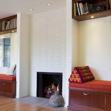
Photos by Marcia Prentice
Inspiration for a mid-century modern living room remodel in Los Angeles
Inspiration for a mid-century modern living room remodel in Los Angeles
 Mark Brand Architecture
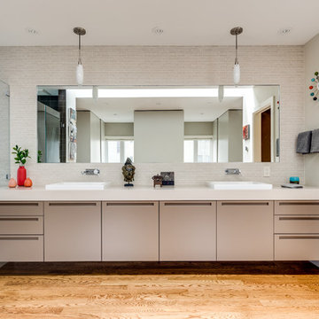
Our clients for this remodel of a 100 year old home in San Francisco’s Liberty Hill neighborhood recently moved to San Francisco. The house they purchased was very stately and had great bones, but lacked a true master suite and had recently been remodeled in a slightly generic modern style. We helped them with projects throughout the house. Our biggest project was creating a true master suite out of two bedrooms and an existing bathroom. We created an open concept bathroom with custom gray lacquer wardrobes and shoe storage units with a dramatic slot skylight overhead. Access to the master bedroom is through this room. The clean lines of the bathroom are complimented by a very long wall hung vanity with a CaesarStone counter which flows into the walk-in shower and becomes the curb. A variety of tiles including locally fabricated tile from Heath Ceramics were carefully selected to create a warm and inviting, yet modern, feeling. Oak floors similar to those in the rest of the house were used throughout the master suite for continuity. By using the same tile on the back wall of the bathroom we were able to create a visual unity from the shower through the vanity and the water closet. Our work also included a new fireplace in the living room. Photography by Christopher Stark.
 MAK Design + Build Inc.
Dave Adams Photography
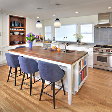
Example of a mid-sized transitional kitchen design in Sacramento
Example of a mid-sized transitional kitchen design in Sacramento
 Mark Brand Architecture
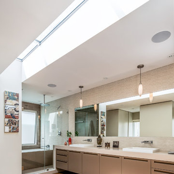
Our clients for this remodel of a 100 year old home in San Francisco’s Liberty Hill neighborhood recently moved to San Francisco. The house they purchased was very stately and had great bones, but lacked a true master suite and had recently been remodeled in a slightly generic modern style. We helped them with projects throughout the house. Our biggest project was creating a true master suite out of two bedrooms and an existing bathroom. We created an open concept bathroom with custom gray lacquer wardrobes and shoe storage units with a dramatic slot skylight overhead. Access to the master bedroom is through this room. The clean lines of the bathroom are complimented by a very long wall hung vanity with a CaesarStone counter which flows into the walk-in shower and becomes the curb. A variety of tiles including locally fabricated tile from Heath Ceramics were carefully selected to create a warm and inviting, yet modern, feeling. Oak floors similar to those in the rest of the house were used throughout the master suite for continuity. By using the same tile on the back wall of the bathroom we were able to create a visual unity from the shower through the vanity and the water closet. Our work also included a new fireplace in the living room. Photography by Christopher Stark.
1