
Search results for "Helps explain" in Home Design Ideas
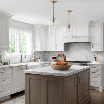
 Plain & Posh
Thse clients came to me for a kitchen refresh. Keeping the existing floor plan but updating as much as possible. After explaining my thoughts, they chose to go with a much larger project. The wall to the garage wash pushed bach 12" to allow for the island to happen. This almost couldn't happen as there is a support post in the garage we had to keep. I designed the last pantry area as on 10" deep, allowing us to conceal that behind the cabinets. Then, we opend up the wall to the dining room to make the rooms one large space. The wall to the family room was also openend up, leaving the half wall to allow for the kitchen eating area. They wanted to incorporate a bar area, without it feeling like a "bar" The fabulous tall custom unit houses their wine collection and then half of the dining room buffet area holds glassware and other bar items. I helped the clients with all of the design choices.We all wanted to keep the space classic, war, functional and with mixed materials. I chose to use the same countertop material for the backsplash, to keep the space feeling as large as possible.

 Eldorado Stone
“This design originated with the client’s desire to duplicate the warmth of Tuscan Architecture,” says Stolz. “The vision that South Coast Architects set forth was to create the feel of an old Tuscan Village as a private residence at their golf community, ‘The Hideaway’ in La Quinta, California. However, we had to keep in mind that we were still designing for a desert lifestyle, which meant an emphasis on indoor/outdoor living and capturing the spectacular views of the golf course and neighboring mountains,” Stolz adds.
“The owners had spent a lot of time in Europe and knew exactly what they wanted when it came to the overall look of the home, especially the stone,” says Muth. “The mason ended up creating a dozen mock-ups of various stone profiles and blends to help the family decide what really worked for them. Ultimately, they selected Eldorado Stone’s Orchard Cypress Ridge profile that offers a beautiful blend of stone sizes and colors.”
“The generous use of Eldorado Stone with brick detailing over the majority of the exterior of the home added the authenticity and timelessness that we were striving for in the design,” says Stolz.
“Our clients want the very best, but if we can duplicate something and save money, what client would say no? That’s why we use Eldorado Stone whenever we can. It gives us the opportunity to save money and gives clients exactly the look they desire so we can use more of their budget in other areas.”
Stolz explained that Eldorado Stone was also brought into the interior to continue that feel of authenticity and historical accuracy. Stone is used floor to ceiling in the kitchen for a pizza oven, as well as on the fireplace in the Great Room and on an entire wall in the master bedroom. “Using a material like Eldorado Stone allows for the seamless continuation of space” says Stolz.
“Stone is what made the house so authentic-looking” says Muth. “It’s such an integral part of the house that it either was going to be a make or break scenario if we made the wrong choice. Luckily, Eldorado Stone really made it!”
Eldorado Stone Profile Featured: Orchard Cypress Ridge with a khaki grout color (overgrout technique)
Eldorado Brick Profile Featured: Cassis ModenaBrick with a khaki grout color (overgrout technique)
Architect: South Coast Architects
Website: www.southcoastarchitects.com
Builder: Andrew Pierce Corporation, Palm Desert, CA
Website: www. andrewpiercecorp.com
Mason: RAS Masonry, Inc. Bob Serna, Corona, CA
Phone: 760-774-0090
Photography: Eric Figge Photography, Inc.
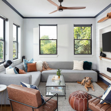
 TVL Creative Ltd.
This 1910 West Highlands home was so compartmentalized that you couldn't help to notice you were constantly entering a new room every 8-10 feet. There was also a 500 SF addition put on the back of the home to accommodate a living room, 3/4 bath, laundry room and back foyer - 350 SF of that was for the living room. Needless to say, the house needed to be gutted and replanned.
Kitchen+Dining+Laundry-Like most of these early 1900's homes, the kitchen was not the heartbeat of the home like they are today. This kitchen was tucked away in the back and smaller than any other social rooms in the house. We knocked out the walls of the dining room to expand and created an open floor plan suitable for any type of gathering. As a nod to the history of the home, we used butcherblock for all the countertops and shelving which was accented by tones of brass, dusty blues and light-warm greys. This room had no storage before so creating ample storage and a variety of storage types was a critical ask for the client. One of my favorite details is the blue crown that draws from one end of the space to the other, accenting a ceiling that was otherwise forgotten.
Primary Bath-This did not exist prior to the remodel and the client wanted a more neutral space with strong visual details. We split the walls in half with a datum line that transitions from penny gap molding to the tile in the shower. To provide some more visual drama, we did a chevron tile arrangement on the floor, gridded the shower enclosure for some deep contrast an array of brass and quartz to elevate the finishes.
Powder Bath-This is always a fun place to let your vision get out of the box a bit. All the elements were familiar to the space but modernized and more playful. The floor has a wood look tile in a herringbone arrangement, a navy vanity, gold fixtures that are all servants to the star of the room - the blue and white deco wall tile behind the vanity.
Full Bath-This was a quirky little bathroom that you'd always keep the door closed when guests are over. Now we have brought the blue tones into the space and accented it with bronze fixtures and a playful southwestern floor tile.
Living Room & Office-This room was too big for its own good and now serves multiple purposes. We condensed the space to provide a living area for the whole family plus other guests and left enough room to explain the space with floor cushions. The office was a bonus to the project as it provided privacy to a room that otherwise had none before.
Find the right local pro for your project

 Jennifer Flanders Inc.
Francis Smith
Inspiration for a transitional girl kids' room remodel in New York
Inspiration for a transitional girl kids' room remodel in New York

 Braun + Adams Interiors
Vivian Johnson
Study space transitional kids' study room photo in San Francisco
Study space transitional kids' study room photo in San Francisco

 Emerick Architects
A custom-designed paneled zinc barn door is a piece of art, as well as functioning to close off the living space when desired.
Photo by Lincoln Barber

 Castleman Carpentry, LLC
A Modern Farmhouse Kitchen remodel with subtle industrial styling, clean lines, texture and simple elegance Custom Cabinetry by Castleman Carpentry
- custom utensil / cutting board pull out

Sponsored
Sunbury, OH

J.Holderby - Renovations
Franklin County's Leading General Contractors - 2X Best of Houzz!

 Kelly Nelson Designs
Open concept kitchen - coastal medium tone wood floor and brown floor open concept kitchen idea in Philadelphia with an undermount sink, shaker cabinets, white cabinets, green backsplash, glass tile backsplash, stainless steel appliances, an island and white countertops

 Rochelle Silberman Design
Peter Lyons
Eat-in kitchen - mid-sized traditional l-shaped medium tone wood floor eat-in kitchen idea in San Francisco with an undermount sink, glass-front cabinets, white cabinets, beige backsplash, stainless steel appliances, beige walls, an island, marble countertops and stone slab backsplash
Eat-in kitchen - mid-sized traditional l-shaped medium tone wood floor eat-in kitchen idea in San Francisco with an undermount sink, glass-front cabinets, white cabinets, beige backsplash, stainless steel appliances, beige walls, an island, marble countertops and stone slab backsplash
 TVL Creative Ltd.
Our clients had just recently closed on their new house in Stapleton and were excited to transform it into their perfect forever home. They wanted to remodel the entire first floor to create a more open floor plan and develop a smoother flow through the house that better fit the needs of their family. The original layout consisted of several small rooms that just weren’t very functional, so we decided to remove the walls that were breaking up the space and restructure the first floor to create a wonderfully open feel.
After removing the existing walls, we rearranged their spaces to give them an office at the front of the house, a large living room, and a large dining room that connects seamlessly with the kitchen. We also wanted to center the foyer in the home and allow more light to travel through the first floor, so we replaced their existing doors with beautiful custom sliding doors to the back yard and a gorgeous walnut door with side lights to greet guests at the front of their home.
Living Room
Our clients wanted a living room that could accommodate an inviting sectional, a baby grand piano, and plenty of space for family game nights. So, we transformed what had been a small office and sitting room into a large open living room with custom wood columns. We wanted to avoid making the home feel too vast and monumental, so we designed custom beams and columns to define spaces and to make the house feel like a home. Aesthetically we wanted their home to be soft and inviting, so we utilized a neutral color palette with occasional accents of muted blues and greens.
Dining Room
Our clients were also looking for a large dining room that was open to the rest of the home and perfect for big family gatherings. So, we removed what had been a small family room and eat-in dining area to create a spacious dining room with a fireplace and bar. We added custom cabinetry to the bar area with open shelving for displaying and designed a custom surround for their fireplace that ties in with the wood work we designed for their living room. We brought in the tones and materiality from the kitchen to unite the spaces and added a mixed metal light fixture to bring the space together
Kitchen
We wanted the kitchen to be a real show stopper and carry through the calm muted tones we were utilizing throughout their home. We reoriented the kitchen to allow for a big beautiful custom island and to give us the opportunity for a focal wall with cooktop and range hood. Their custom island was perfectly complimented with a dramatic quartz counter top and oversized pendants making it the real center of their home. Since they enter the kitchen first when coming from their detached garage, we included a small mud-room area right by the back door to catch everyone’s coats and shoes as they come in. We also created a new walk-in pantry with plenty of open storage and a fun chalkboard door for writing notes, recipes, and grocery lists.
Office
We transformed the original dining room into a handsome office at the front of the house. We designed custom walnut built-ins to house all of their books, and added glass french doors to give them a bit of privacy without making the space too closed off. We painted the room a deep muted blue to create a glimpse of rich color through the french doors
Powder Room
The powder room is a wonderful play on textures. We used a neutral palette with contrasting tones to create dramatic moments in this little space with accents of brushed gold.
Master Bathroom
The existing master bathroom had an awkward layout and outdated finishes, so we redesigned the space to create a clean layout with a dream worthy shower. We continued to use neutral tones that tie in with the rest of the home, but had fun playing with tile textures and patterns to create an eye-catching vanity. The wood-look tile planks along the floor provide a soft backdrop for their new free-standing bathtub and contrast beautifully with the deep ash finish on the cabinetry.

 Sarah Greenman
Photo: Sarah Greenman © 2014 Houzz
Eclectic dining room photo in Dallas with beige walls
Eclectic dining room photo in Dallas with beige walls

 Allard Ward Architects
Wiff Harmer
Inspiration for a transitional white brick exterior home remodel in Nashville
Inspiration for a transitional white brick exterior home remodel in Nashville




 Donald Lococo Architects
John Cole Photography
Coastal two-story wood exterior home idea in Boston with a clipped gable roof
Coastal two-story wood exterior home idea in Boston with a clipped gable roof

 Adrienne DeRosa
Photo: Adrienne DeRosa © 2015 Houzz
Save for a few refinements, the layout of the space took shape exactly as Weiss had envisioned it from day one. Knowing that they were looking to design a loft-like environment, the couple kept to an open layout for the majority of the living space.
One of the most fantastic features of the space is a bank of clerestory windows that flood the interior with seemingly endless amounts of daylight. Originally added back when the building served as an artist studio, Weiss and Carpenter agreed that keeping them was a must. "The only original part of the house is the ceiling and the existing skylights and clerestory," Weiss describes. "We basically changed everything else."
The ceiling compliments the contents of the environment, but also continues the story of the homeowners' design philosophy. "We loved the original wood and steel ceiling, including steel beams forged at the Carnegie Steel Works," Carpenter explains. "In coming up with our design approach, we wanted to reflect some of the previous uses of the structure ... Keeping elements from the past not only
interested us aesthetically." he says, "It was important to us to reuse structures and objects in ways that are close to their originally intended use."


 Drewett Works
This photo: Interior designer Claire Ownby, who crafted furniture for the great room's living area, took her cues for the palette from the architecture. The sofa's Roma fabric mimics the Cantera Negra stone columns, chairs sport a Pindler granite hue, and the Innovations Rodeo faux leather on the coffee table resembles the floor tiles. Nearby, Shakuff's Tube chandelier hangs over a dining table surrounded by chairs in a charcoal Pindler fabric.
Positioned near the base of iconic Camelback Mountain, “Outside In” is a modernist home celebrating the love of outdoor living Arizonans crave. The design inspiration was honoring early territorial architecture while applying modernist design principles.
Dressed with undulating negra cantera stone, the massing elements of “Outside In” bring an artistic stature to the project’s design hierarchy. This home boasts a first (never seen before feature) — a re-entrant pocketing door which unveils virtually the entire home’s living space to the exterior pool and view terrace.
A timeless chocolate and white palette makes this home both elegant and refined. Oriented south, the spectacular interior natural light illuminates what promises to become another timeless piece of architecture for the Paradise Valley landscape.
Project Details | Outside In
Architect: CP Drewett, AIA, NCARB, Drewett Works
Builder: Bedbrock Developers
Interior Designer: Ownby Design
Photographer: Werner Segarra
Publications:
Luxe Interiors & Design, Jan/Feb 2018, "Outside In: Optimized for Entertaining, a Paradise Valley Home Connects with its Desert Surrounds"
Awards:
Gold Nugget Awards - 2018
Award of Merit – Best Indoor/Outdoor Lifestyle for a Home – Custom
The Nationals - 2017
Silver Award -- Best Architectural Design of a One of a Kind Home - Custom or Spec
http://www.drewettworks.com/outside-in/

Sponsored
Delaware, OH

Buckeye Basements, Inc.
Central Ohio's Basement Finishing ExpertsBest Of Houzz '13-'21

 Los Angeles Pool Builders, Inc
Pool - large modern backyard tile and rectangular infinity pool idea in Los Angeles


 Michaela Noelle Designs
Andrea Pesce Photography
Example of a classic formal medium tone wood floor living room design in Grand Rapids with gray walls
Example of a classic formal medium tone wood floor living room design in Grand Rapids with gray walls
1