
Search results for "Helps educate" in Home Design Ideas
 E_ Designs
Few opportunities come about to design/ renovate a home designed by St Paul’s own Clarence H. Johnston. 785 Dayton, is the only known residential Greek Revival commission by Minnesota’s most prolific architect. Johnston, designed at least 42 mansions along St. Paul’s Historic Summit Avenue.
Looking for additional assistance, the new homeowner’s found Castle to help them design and renovate a main floor ½ bath and create a new master bathroom in the existing 2nd floor master bedroom. Creating spaces that married with the original style and aesthetic of this historic home was essential.
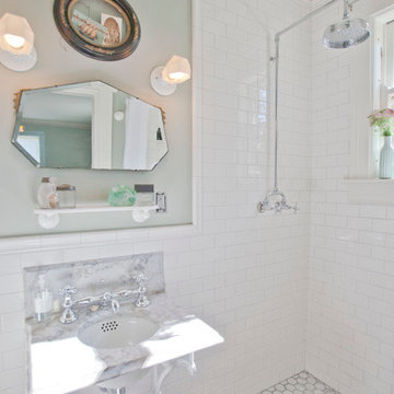
The brand new 2nd floor master bathroom was designed to complement an additional bathroom across the hallway. Taking an existing closet space, Castle was able to use the very small square footage to create a new bathroom that feels very spacious! New Carrera marble hex tiles floors were selected with a marble boarder to pair with the restored and hand-picked marble sink. Traditional subway tile was installed around the room and shower with a beautiful chair rail tile. The new linen closet was custom built by the homeowner’s personal cabinet maker. The storage was designed to match an original piece in the home, as well as provide function for the space. All of the details matter; push button electrical switching, new historically designed porcelain bath accessories by Rejuvenation Hardware, historically designed plumbing fixtures, solid marble shower curb and door threshold, salvaging the original closet door to be installed as a new pocket door, and salvaging the existing window.
Both bathrooms will be enjoyed for many generations to come and add to the beautiful history of the home. This home was a true joy for Castle to be a part of. Come visit this home at Castle’s Annual Educational Home Tour, Fall 2016.
 Castle Building & Remodeling
1950’s kitchens need love too... and make great remodels! These homeowners contacted Castle for help on their kitchen remodel. The biggest wish-list item was a larger and more functional kitchen layout (with expanded views into the previously completed rear addition/dining room).
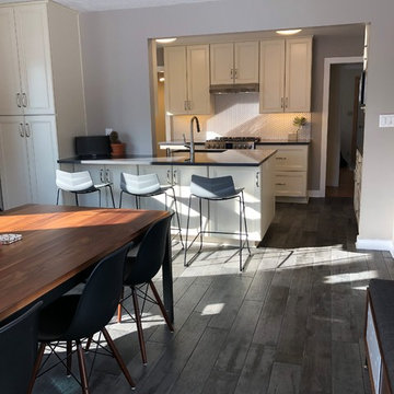
After some conceptual design concepts were assessed, we chose to keep this kitchen's existing footprint and expand the site lines into the rear dining space with a new drywall opening. We expanded the function of the kitchen by wrapping the peninsula around into the dining room with an additional pantry space for kitchen overflow storage. Each cabinet was well thought out for the homeowners use of the space to include functional storage accessories like plate divides, utensil pull-outs, and trash/recycle bins.
Working with the designer, the homeowners found a beautiful balance of some contemporary aesthetics like the overall color scheme combined with some classic elements such as the detailed cabinetry and herringbone tile backsplash. One of our favorite details in the kitchen is the new tile floor that continues into the dining room. The wood texture plank tile adds depth and texture as well as contrasts nicely with the softer and refined finishes above. New Cambria quartz countertops, new cabinetry, herringbone tile backsplash, new tile floors, custom lighting, and new plumbing fixtures complete the space. The new transitional styled kitchen can grow with the family for many years to come. With a swap out of some furniture the whole space can transition between contemporary or traditional. Truly timeless!
Designed by: Emily Blonigen. See the full details (including before photos) on our website: http://www.castlebri.com/kitchens/project-3309-1/
Make sure to check out this project on the Castle Educational Home Tour, September 29 - 30th, 2018!
 Vintage Cellars & Saunas
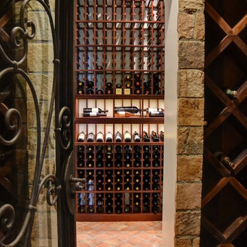
This recently completed wine cellar in Rancho Santa Fe, San Diego, California is great example that small can definitely be beautiful. The homeowners had a vision to redo their older, existing wine cellar - all the meanwhile keeping some of it’s original charm. The back wall of the original wine cellar / wine room was opened up, converting an adjacent closet into an additional room for the space. The rustic and traditional stone work and vertical diamond bins were kept to maintain the old world feel. Rustic works well in the luxury country estates throughout Rancho Santa Fe, San Diego, California. The team at Vintage Cellars created a beautiful and functional wine racking design in Poplar with a custom stain and finish to match the existing wine cellar aesthetics. The wine room also features high reveal display, room for case storage, and tiered coved trays for large format bottles.
Since 1990, Vintage Cellars has designed and built over 2,000 custom wine cellars in a wide range of styles and applications. Vintage Cellars offers a complete turnkey service (if needed), providing initial wine cellar design options, proper room preparation with vapor barrier and insulation, proper wine cellar cooling unit sizing and installation, wine racking fabrication with custom stain and lacquer options done in house, and final professional installation onsite. We can also design and ship the wine racking without install. We regularly work with Interior Designers, Architects, and Home Builders as well and can help carry out visions already in movement too.
Gene Walder, Jake Austad, and the team at Vintage Cellars specialize in Custom Wine Cellar Design and Consultation, Custom Wine Cellar Cooling Systems, Custom Wine Cellar Doors, Wine Cellar Racking, and everything else wine storage related. By working closely with clients, the team at Vintage Cellars is able to craft a wine storage space to match the collectors' vision and style.
Services Provided
Custom Wine Cellar Construction, Custom Wine Cellar Consultation, Modern Wine Cellars, Contemporary Wine Cellars, Rustic Wine Cellars, Metal Wine Cellars, Wood Wine Cellars, Wine Closet, Wine Room, Wine Cellar Cooling Systems, Wine Cellar Vapor Barrier and Insulation, Custom Wine Cellars, Wine Racking, Custom Wine Racking Design, Wine Cellars, Custom Home Bars, Wine Cellar Design, Wine Cellar Installation
Areas Served
Bonsall, Cardiff By The Sea, Carlsbad, Encinitas, Escondido, Hidden Meadows, Hidden Trails, La Costa, Oceanside, Ranch Santa Fe, Rancho Santa Fe, San Diego, San Marcos, Valley Center, Vista, Orange County, Beverly Hills, Malibu, Newport Beach, Dana Point, Santa Monica, Brentwood, Del Mar, Solana Beach, Napa, San Francisco, Los Angeles, Newport Coast, Corona Del Mar, La Jolla, Huntington Beach, Pacific Palisades, Bel Air, Coronado, Manhattan Beach, Palos Verdes, Ladera Heights, Westwood, Hancock Park, Laguna Beach, Crystal Cove, Laguna Niguel, Torrey Pines, Thousand Oaks, Coto De Caza, Danville
Certifications and Awards
Featured Articles in Wine Spectator Magazine
Featured in Articles in The Wall Street Journal
Featured in LUXE Magazine
Featured on Bob Vila's "This Old House"
Wine & Spirits Education Trust Certified Level 1, 2 & 3.
California Wine Appellation Specialists
Find the right local pro for your project
 TVL Creative Ltd.
Cramped kitchen be gone! That was the project motto and top priority. The goal was to transform the current layout from multiple smaller spaces into a connected whole that would activate the main level for our clients, a young family of four.
The biggest obstacle was the wall dividing the kitchen and the dining room. Removing this wall was central to opening up and integrating the main living spaces, but the existing ductwork that ran right through the center of the wall posed a design challenge, er design opportunity. The resulting design solution features a central pantry that captures the ductwork and provides valuable storage- especially when compared to the original kitchen's 18" wide pantry cabinet. The pantry also anchors the kitchen island and serves as a visual separation of space between the kitchen and homework area.
Through our design development process, we learned the formal living room was of no service to their lifestyle and therefore space they rarely spent time in. With that in mind, we proposed to eliminate the unused living room and make it the new dining room. Relocating the dining room to this space inherently felt right given the soaring ceiling and ample room for holiday dinners and celebrations. The new dining room was spacious enough for us to incorporate a conversational seating area in the warm, south-facing window alcove.
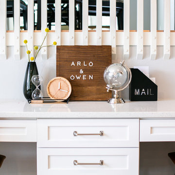
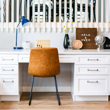
Now what to do with the old dining room?! To answer that question we took inspiration from our clients' shared profession in education and developed a craft area/homework station for both of their boys. The semi-custom cabinetry of the desk area carries over to the adjacent wall and forms window bench base with storage that we topped with butcher block for a touch of warmth. While the boys are young, the bench drawers are the perfect place for a stash of toys close to the kitchen.
The kitchen begins just beyond the window seat with their refrigerator enclosure. Opposite the refrigerator is the new pantry with twenty linear feet of shelving and space for brooms and a stick vacuum. Extending from the backside of the pantry the kitchen island design incorporates counter seating on the family room side and a cabinetry configuration on the kitchen side with drawer storage, a trashcan center, farmhouse sink, and dishwasher.
We took careful time in design and execution to align the range and sink because while it might seem like a small detail, it plays an important role in supporting the symmetrical configuration of the back wall of the kitchen. The rear wall design utilizes an appliance garage mirrors the visual impact of the refrigerator enclosure and helps keep the now open kitchen tidy. Between the appliance garage and refrigerator enclosure is the cooking zone with 30" of cabinetry and work surface on either side of the range, a chimney style vent hood, and a bold graphic tile backsplash.
The backsplash is just one of many personal touches we added to the space to reflect our client's modern eclectic style and love of color. Swooping lines of the mid-mod style barstools compliment the pendants and backsplash pattern. A pop of vibrant green on the frame of the pantry door adds a fresh wash of color to an otherwise neutral space. The big show stopper is the custom charcoal gray and copper chevron wall installation in the dining room. This was an idea our clients softly suggested, and we excitedly embraced the opportunity. It is also a kickass solution to the head-scratching design dilemma of how to fill a large and lofty wall.
We are so grateful to bring this design to life for our clients and now dear friends.

 Bill Fry Construction - Wm. H. Fry Const. Co.
Covid During Construction and Making Face Masks
Dear Houzz Folks,
We've started getting back to work and are educating everyone at our projects on how to be safe during COVID, posting signage, and we've been making masks for our employees, colleagues, friends, family etc... Here's some information on what I've learned so far in sewing the best fitting face mask for COVID.
1. Put in a wire at the nose bridge (about 3.5 inches) - it helps with fit and if you wear glasses, it keeps them from fogging up. I found that doorbell wire, available at the hardware store, seems to work well. It isn't too thin or too fat, bends easily and holds its shape. I attach it by using a zigzag stitch on the interior seam of the outside of the mask (so there's a bit more cushion on the inside).
2. For the shaped masks, I make a pocket in case my friends, family, colleagues, want to insert a filter - it also allows for three layers of fabric in the breathing area and less bulk where the ties go. For patterns that don't offer pockets, I just make my own pattern pocket. I also first baste the two inside pieces first and then sew the front on. This way, there's no worries about slipping. No pins are needed and no pins minimizes the number of extra air holes in the fabric.
3. So that the ties/loops can be replaced or modified, I make a channel for rather than sewing it in permanently. Many videos show using a safety pin to pull the elastic through. If you sew much, you might have a bodkin in your sewing box, but it might be a bit too wide. Instead, I use a long hairpin (you could probably make a long loop with a paper clip). I run the hairpin through the channel, loop the elastic through the end of the pin and pull through. That takes much less time than piercing it with a safety-pin.
4. For the inside of the masks, it is nice to have softer fabric inside, so high-thread-count sheets purchased on sale work great. Then you can easily tell what is inside as well.
5. For surgical-style masks, there's a pattern with a pocket on the inside and a wire. I like the ideas in this video but use 2 fabrics and make them bigger. About a 9x9 inch for the outside and 9x8 inch for the inside. 5/8 seam on the nose and 1/4 seam on the bottom.
6. For the fitted masks, there are two patterns that I like. For this one, https://moinliz.de/mundschutz-naehen-mit-schnittmuster it expects you to print on European-sized paper, so if you want to get the size right, print at 100%
I also really like this pattern and I added a pocket and lengthened the ends to make channels https://intermountainhealthcare.org/covid19-coronavirus/homemade-cloth-face-coverings/ (scroll down to a link to download the pdf) Lots of folks sew craftpassion, but I like the fit of these patterns better. There are still some other patterns I have left to try!
6. After breaking lots of needles, I realized that I really didn't need to topstich the fitted masks over the bridge, so I just started skipping the bridge.
7. If you're going to wear a face-covering for a really long time, you might want to skip the ear hangers and go for ties behind the head. Instead of two ties, I'll use one long one so that the bottom one is a loop and the top one ties. Bungee cord works nice.
Happy Sewing!
: ) Rhoda Fry, Bill Fry Construction
 TVL Creative Ltd.
Cramped kitchen be gone! That was the project motto and top priority. The goal was to transform the current layout from multiple smaller spaces into a connected whole that would activate the main level for our clients, a young family of four.
The biggest obstacle was the wall dividing the kitchen and the dining room. Removing this wall was central to opening up and integrating the main living spaces, but the existing ductwork that ran right through the center of the wall posed a design challenge, er design opportunity. The resulting design solution features a central pantry that captures the ductwork and provides valuable storage- especially when compared to the original kitchen's 18" wide pantry cabinet. The pantry also anchors the kitchen island and serves as a visual separation of space between the kitchen and homework area.
Through our design development process, we learned the formal living room was of no service to their lifestyle and therefore space they rarely spent time in. With that in mind, we proposed to eliminate the unused living room and make it the new dining room. Relocating the dining room to this space inherently felt right given the soaring ceiling and ample room for holiday dinners and celebrations. The new dining room was spacious enough for us to incorporate a conversational seating area in the warm, south-facing window alcove.
Now what to do with the old dining room?! To answer that question we took inspiration from our clients' shared profession in education and developed a craft area/homework station for both of their boys. The semi-custom cabinetry of the desk area carries over to the adjacent wall and forms window bench base with storage that we topped with butcher block for a touch of warmth. While the boys are young, the bench drawers are the perfect place for a stash of toys close to the kitchen.
The kitchen begins just beyond the window seat with their refrigerator enclosure. Opposite the refrigerator is the new pantry with twenty linear feet of shelving and space for brooms and a stick vacuum. Extending from the backside of the pantry the kitchen island design incorporates counter seating on the family room side and a cabinetry configuration on the kitchen side with drawer storage, a trashcan center, farmhouse sink, and dishwasher.
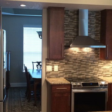
We took careful time in design and execution to align the range and sink because while it might seem like a small detail, it plays an important role in supporting the symmetrical configuration of the back wall of the kitchen. The rear wall design utilizes an appliance garage mirrors the visual impact of the refrigerator enclosure and helps keep the now open kitchen tidy. Between the appliance garage and refrigerator enclosure is the cooking zone with 30" of cabinetry and work surface on either side of the range, a chimney style vent hood, and a bold graphic tile backsplash.
The backsplash is just one of many personal touches we added to the space to reflect our client's modern eclectic style and love of color. Swooping lines of the mid-mod style barstools compliment the pendants and backsplash pattern. A pop of vibrant green on the frame of the pantry door adds a fresh wash of color to an otherwise neutral space. The big show stopper is the custom charcoal gray and copper chevron wall installation in the dining room. This was an idea our clients softly suggested, and we excitedly embraced the opportunity. It is also a kickass solution to the head-scratching design dilemma of how to fill a large and lofty wall.
We are so grateful to bring this design to life for our clients and now dear friends.
 Simply Perfect
Advice on interior design is available everywhere—from TV shows and websites to books, magazines and apps.
We love seeing people become engaged in design and educated on the wide range of possibilities. But we hope you’ll proceed with caution.
It’s not that style errors are a matter of life and death. It’s just that it’s easy to choose designs that aren’t necessarily reflective of your own personality and character. And since you’re typically stuck with your interior design decisions for years, styles that don’t quite fit can tend to grate on you.
Interiors that give one person comfort may unleash chaos in someone else. This goes beyond favorite colors or hot trends, right to the heart of interior design, where you find questions of composition, balance, repetition, space and more.
The goal is to find that unique combination of design elements that gives you comfort, support and balance.
In one home, that perfect balance was struck through the use of symmetry. A pair of comfortable swivel chairs sit beneath matching indigo patterned paintings. Matching bookcases below the paintings contain similar, but not identical, arrangements of books, vases and bowls. Woods and bronzes help warm up the simple white bookcase shelving.
Two matching poufs in front of the fireplace provide additional seating. The sofa is accented with a pair of pillows with a blue pattern that echoes the artwork.
The effect of the symmetry is to achieve order and simplicity, which I promote at every opportunity. After all, your home interiors should be the setting or the backdrop of your life—not center stage.
Antique bronze and blue are complementary colors. Together, they offer a rich palette of richness and depth, which brings out the beauty of wood and stone.
In the home office, a unique, whitewash-stained wooden desk rests on metal, Sawhorse-inspired legs for a warm, rustic look. The black leather chair features a contemporary silhouette with an antique brass frame. An adjustable desk lamp has bronze accents.
The bookcase combines a sleek, black metal frame with concrete shelves, for another unusual pairing. It’s kept uncluttered for an orderly, peaceful look. Items on the shelves include a bronze-accented lamp and a pair
of high gloss-finished wooden bookends.
The elegant artwork behind the desk is a simple midnight-blue and bronze with mottled white. Deep blues are again picked up in the rug, which adds a stately vibe with a modern pattern and satisfying texture.
Within the framework of symmetry, the living room repeats the blue-and-bronze color scheme.
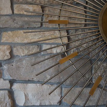
A large midcentury brass clock above the fireplace keeps the natural stone visible, rather than hidden behind a painting or television, while its straight lines and color create a beautiful contrast.
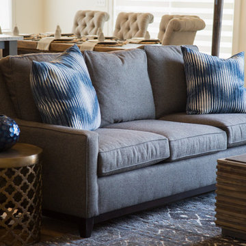
The sofa is a soft, neutral blue. The pattern on the round brass side table features echoes the darker blue-patterned rug, as well as the rug in the office, tying the rooms together.
Indigo blue books adjacent to bronze vases on the shelves repeat the color scheme. The soapstone-topped coffee table echoes the shape of the fireplace. A pair of tall, matching floor lamps with long wooden bases, brass pulls and simple linen shades combine both the colors and symmetry found throughout the home.

Sponsored
Columbus, OH

Hope Restoration & General Contracting
Columbus Design-Build, Kitchen & Bath Remodeling, Historic Renovations
 Simply Perfect
Advice on interior design is available everywhere—from TV shows and websites to books, magazines and apps.
We love seeing people become engaged in design and educated on the wide range of possibilities. But we hope you’ll proceed with caution.
It’s not that style errors are a matter of life and death. It’s just that it’s easy to choose designs that aren’t necessarily reflective of your own personality and character. And since you’re typically stuck with your interior design decisions for years, styles that don’t quite fit can tend to grate on you.
Interiors that give one person comfort may unleash chaos in someone else. This goes beyond favorite colors or hot trends, right to the heart of interior design, where you find questions of composition, balance, repetition, space and more.
The goal is to find that unique combination of design elements that gives you comfort, support and balance.
In one home, that perfect balance was struck through the use of symmetry. A pair of comfortable swivel chairs sit beneath matching indigo patterned paintings. Matching bookcases below the paintings contain similar, but not identical, arrangements of books, vases and bowls. Woods and bronzes help warm up the simple white bookcase shelving.
Two matching poufs in front of the fireplace provide additional seating. The sofa is accented with a pair of pillows with a blue pattern that echoes the artwork.
The effect of the symmetry is to achieve order and simplicity, which I promote at every opportunity. After all, your home interiors should be the setting or the backdrop of your life—not center stage.
Antique bronze and blue are complementary colors. Together, they offer a rich palette of richness and depth, which brings out the beauty of wood and stone.
In the home office, a unique, whitewash-stained wooden desk rests on metal, Sawhorse-inspired legs for a warm, rustic look. The black leather chair features a contemporary silhouette with an antique brass frame. An adjustable desk lamp has bronze accents.
The bookcase combines a sleek, black metal frame with concrete shelves, for another unusual pairing. It’s kept uncluttered for an orderly, peaceful look. Items on the shelves include a bronze-accented lamp and a pair
of high gloss-finished wooden bookends.
The elegant artwork behind the desk is a simple midnight-blue and bronze with mottled white. Deep blues are again picked up in the rug, which adds a stately vibe with a modern pattern and satisfying texture.
Within the framework of symmetry, the living room repeats the blue-and-bronze color scheme.
A large midcentury brass clock above the fireplace keeps the natural stone visible, rather than hidden behind a painting or television, while its straight lines and color create a beautiful contrast.
The sofa is a soft, neutral blue. The pattern on the round brass side table features echoes the darker blue-patterned rug, as well as the rug in the office, tying the rooms together.
Indigo blue books adjacent to bronze vases on the shelves repeat the color scheme. The soapstone-topped coffee table echoes the shape of the fireplace. A pair of tall, matching floor lamps with long wooden bases, brass pulls and simple linen shades combine both the colors and symmetry found throughout the home.
 Integrity Remodeling & Custom Homes, Inc.
Rich is a custom home builder with an emphasis on structural performance and energy efficiency. He is a Certified Master Builder building for over 20 years, in the resort mountain areas of the Blue Ridge Mountains, and now in the Orlando, Florida area for the last decade.
Rich seamlessly blends different architectural details, energy performance, and hardened structures to create high performance luxury homes. He gives personal attention to "Easy Living Design" in order to create a home that can adapt to the aging homeowner making life more convenient, enjoyable, and safe.
Rich works closely with his customers to ensure every detail, need, and expectation is exceeded. He has chosen a team of tradesmen that compliment his work and share the same work ethic and thoughts of delivering a quality product, and who desires to build lasting relationships with the homeowner long after their project is complete.
Rich engages the homeowner throughout the entire building project to ensure that he educates them on products and methods that are compatible with their desired goals. Understanding that the financial goals of a project are of equal importance, Rich provides a detailed job cost budget, so the homeowners are given the opportunity to help guide their project financially.
 Simply Perfect
Advice on interior design is available everywhere—from TV shows and websites to books, magazines and apps.
We love seeing people become engaged in design and educated on the wide range of possibilities. But we hope you’ll proceed with caution.
It’s not that style errors are a matter of life and death. It’s just that it’s easy to choose designs that aren’t necessarily reflective of your own personality and character. And since you’re typically stuck with your interior design decisions for years, styles that don’t quite fit can tend to grate on you.
Interiors that give one person comfort may unleash chaos in someone else. This goes beyond favorite colors or hot trends, right to the heart of interior design, where you find questions of composition, balance, repetition, space and more.
The goal is to find that unique combination of design elements that gives you comfort, support and balance.
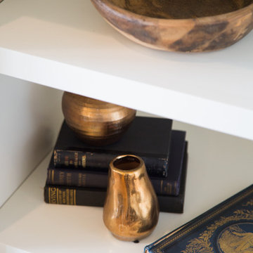
In one home, that perfect balance was struck through the use of symmetry. A pair of comfortable swivel chairs sit beneath matching indigo patterned paintings. Matching bookcases below the paintings contain similar, but not identical, arrangements of books, vases and bowls. Woods and bronzes help warm up the simple white bookcase shelving.
Two matching poufs in front of the fireplace provide additional seating. The sofa is accented with a pair of pillows with a blue pattern that echoes the artwork.
The effect of the symmetry is to achieve order and simplicity, which I promote at every opportunity. After all, your home interiors should be the setting or the backdrop of your life—not center stage.
Antique bronze and blue are complementary colors. Together, they offer a rich palette of richness and depth, which brings out the beauty of wood and stone.
In the home office, a unique, whitewash-stained wooden desk rests on metal, Sawhorse-inspired legs for a warm, rustic look. The black leather chair features a contemporary silhouette with an antique brass frame. An adjustable desk lamp has bronze accents.
The bookcase combines a sleek, black metal frame with concrete shelves, for another unusual pairing. It’s kept uncluttered for an orderly, peaceful look. Items on the shelves include a bronze-accented lamp and a pair
of high gloss-finished wooden bookends.
The elegant artwork behind the desk is a simple midnight-blue and bronze with mottled white. Deep blues are again picked up in the rug, which adds a stately vibe with a modern pattern and satisfying texture.
Within the framework of symmetry, the living room repeats the blue-and-bronze color scheme.
A large midcentury brass clock above the fireplace keeps the natural stone visible, rather than hidden behind a painting or television, while its straight lines and color create a beautiful contrast.
The sofa is a soft, neutral blue. The pattern on the round brass side table features echoes the darker blue-patterned rug, as well as the rug in the office, tying the rooms together.
Indigo blue books adjacent to bronze vases on the shelves repeat the color scheme. The soapstone-topped coffee table echoes the shape of the fireplace. A pair of tall, matching floor lamps with long wooden bases, brass pulls and simple linen shades combine both the colors and symmetry found throughout the home.
 Progressive Design Build
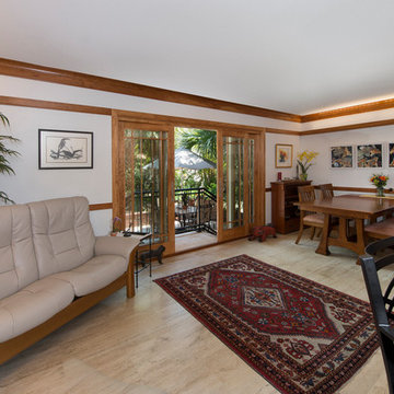
When a Historic District home was renovated in Fort Myers, a dream kitchen was created: open plan enough for gathering, with clearly delineated areas for cooking, reading and entertaining.
Challenge
Bill and Alison’s existing kitchen was small and dysfunctional. Each room seemed independent, and there was no flow through the house. The house felt small, with one entry and exit point.
As a planning consultant, Bill was no stranger to construction. He was a general contractor himself and had built several custom homes in years past. As a gardening enthusiast and professional educator, Alison also had an eye for design. They started with design, layout and planning on their own, but soon realized they needed help. After interviewing several contractors who seemed overwhelmed and unenthused by their project, they reached out to Progressive Design Build.
Solution
Mike was not only enthused about the project, but he established trust with Bill and Alison. Within a few short weeks he was hired to begin the planning phase, conducting thorough research on the project, meeting key subcontractors and establishing a realistic budget.
When the project began, internal walls were removed to open up the kitchen/dining areas and an island was built, giving the space an open and modern functionality. The eating area was enlarged, and a visual connection to the outside was established using Marvin insulated glass windows with Low E coatings—which rejects solar heat gain without reducing visible light passing through the glass.
In order to allow for the open concept layout that Bill and Alison desired, we built new structural beams to transfer the live load. The sliding patio doors opened onto a small terrace with a wrought iron handrail creating access to the private courtyard and garden area.
Finishing details included custom cherry cabinets and wood trimming, 16” x 32” natural stone flooring, granite countertops and historically correct plaster finishes.
Result
The project was completed within budget and two weeks ahead of schedule.
“That planning phase was the best money we spent on the project,” exclaimed Bill. “It was incredibly gratifying being able to watch the subcontractors and suppliers come and go with shared leadership and attention to details.”
 Simply Perfect
Advice on interior design is available everywhere—from TV shows and websites to books, magazines and apps.
We love seeing people become engaged in design and educated on the wide range of possibilities. But we hope you’ll proceed with caution.
It’s not that style errors are a matter of life and death. It’s just that it’s easy to choose designs that aren’t necessarily reflective of your own personality and character. And since you’re typically stuck with your interior design decisions for years, styles that don’t quite fit can tend to grate on you.
Interiors that give one person comfort may unleash chaos in someone else. This goes beyond favorite colors or hot trends, right to the heart of interior design, where you find questions of composition, balance, repetition, space and more.
The goal is to find that unique combination of design elements that gives you comfort, support and balance.
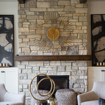
In one home, that perfect balance was struck through the use of symmetry. A pair of comfortable swivel chairs sit beneath matching indigo patterned paintings. Matching bookcases below the paintings contain similar, but not identical, arrangements of books, vases and bowls. Woods and bronzes help warm up the simple white bookcase shelving.
Two matching poufs in front of the fireplace provide additional seating. The sofa is accented with a pair of pillows with a blue pattern that echoes the artwork.
The effect of the symmetry is to achieve order and simplicity, which I promote at every opportunity. After all, your home interiors should be the setting or the backdrop of your life—not center stage.
Antique bronze and blue are complementary colors. Together, they offer a rich palette of richness and depth, which brings out the beauty of wood and stone.
In the home office, a unique, whitewash-stained wooden desk rests on metal, Sawhorse-inspired legs for a warm, rustic look. The black leather chair features a contemporary silhouette with an antique brass frame. An adjustable desk lamp has bronze accents.
The bookcase combines a sleek, black metal frame with concrete shelves, for another unusual pairing. It’s kept uncluttered for an orderly, peaceful look. Items on the shelves include a bronze-accented lamp and a pair
of high gloss-finished wooden bookends.
The elegant artwork behind the desk is a simple midnight-blue and bronze with mottled white. Deep blues are again picked up in the rug, which adds a stately vibe with a modern pattern and satisfying texture.
Within the framework of symmetry, the living room repeats the blue-and-bronze color scheme.
A large midcentury brass clock above the fireplace keeps the natural stone visible, rather than hidden behind a painting or television, while its straight lines and color create a beautiful contrast.
The sofa is a soft, neutral blue. The pattern on the round brass side table features echoes the darker blue-patterned rug, as well as the rug in the office, tying the rooms together.
Indigo blue books adjacent to bronze vases on the shelves repeat the color scheme. The soapstone-topped coffee table echoes the shape of the fireplace. A pair of tall, matching floor lamps with long wooden bases, brass pulls and simple linen shades combine both the colors and symmetry found throughout the home.
 Integrity Remodeling & Custom Homes, Inc.
Rich is a custom home builder with an emphasis on structural performance and energy efficiency. He is a Certified Master Builder building for over 20 years, in the resort mountain areas of the Blue Ridge Mountains, and now in the Orlando, Florida area for the last decade.
Rich seamlessly blends different architectural details, energy performance, and hardened structures to create high performance luxury homes. He gives personal attention to "Easy Living Design" in order to create a home that can adapt to the aging homeowner making life more convenient, enjoyable, and safe.
Rich works closely with his customers to ensure every detail, need, and expectation is exceeded. He has chosen a team of tradesmen that compliment his work and share the same work ethic and thoughts of delivering a quality product, and who desires to build lasting relationships with the homeowner long after their project is complete.
Rich engages the homeowner throughout the entire building project to ensure that he educates them on products and methods that are compatible with their desired goals. Understanding that the financial goals of a project are of equal importance, Rich provides a detailed job cost budget, so the homeowners are given the opportunity to help guide their project financially.

Sponsored
Sunbury, OH

J.Holderby - Renovations
Franklin County's Leading General Contractors - 2X Best of Houzz!
 TVL Creative Ltd.
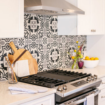
Cramped kitchen be gone! That was the project motto and top priority. The goal was to transform the current layout from multiple smaller spaces into a connected whole that would activate the main level for our clients, a young family of four.
The biggest obstacle was the wall dividing the kitchen and the dining room. Removing this wall was central to opening up and integrating the main living spaces, but the existing ductwork that ran right through the center of the wall posed a design challenge, er design opportunity. The resulting design solution features a central pantry that captures the ductwork and provides valuable storage- especially when compared to the original kitchen's 18" wide pantry cabinet. The pantry also anchors the kitchen island and serves as a visual separation of space between the kitchen and homework area.
Through our design development process, we learned the formal living room was of no service to their lifestyle and therefore space they rarely spent time in. With that in mind, we proposed to eliminate the unused living room and make it the new dining room. Relocating the dining room to this space inherently felt right given the soaring ceiling and ample room for holiday dinners and celebrations. The new dining room was spacious enough for us to incorporate a conversational seating area in the warm, south-facing window alcove.
Now what to do with the old dining room?! To answer that question we took inspiration from our clients' shared profession in education and developed a craft area/homework station for both of their boys. The semi-custom cabinetry of the desk area carries over to the adjacent wall and forms window bench base with storage that we topped with butcher block for a touch of warmth. While the boys are young, the bench drawers are the perfect place for a stash of toys close to the kitchen.
The kitchen begins just beyond the window seat with their refrigerator enclosure. Opposite the refrigerator is the new pantry with twenty linear feet of shelving and space for brooms and a stick vacuum. Extending from the backside of the pantry the kitchen island design incorporates counter seating on the family room side and a cabinetry configuration on the kitchen side with drawer storage, a trashcan center, farmhouse sink, and dishwasher.
We took careful time in design and execution to align the range and sink because while it might seem like a small detail, it plays an important role in supporting the symmetrical configuration of the back wall of the kitchen. The rear wall design utilizes an appliance garage mirrors the visual impact of the refrigerator enclosure and helps keep the now open kitchen tidy. Between the appliance garage and refrigerator enclosure is the cooking zone with 30" of cabinetry and work surface on either side of the range, a chimney style vent hood, and a bold graphic tile backsplash.
The backsplash is just one of many personal touches we added to the space to reflect our client's modern eclectic style and love of color. Swooping lines of the mid-mod style barstools compliment the pendants and backsplash pattern. A pop of vibrant green on the frame of the pantry door adds a fresh wash of color to an otherwise neutral space. The big show stopper is the custom charcoal gray and copper chevron wall installation in the dining room. This was an idea our clients softly suggested, and we excitedly embraced the opportunity. It is also a kickass solution to the head-scratching design dilemma of how to fill a large and lofty wall.
We are so grateful to bring this design to life for our clients and now dear friends.

 Anna Rodé Designs, Inc.
Juan Leonffu, Photographer
Scott Ryan, Realtor
Example of a large tuscan open concept medium tone wood floor living room design in San Diego with beige walls, a standard fireplace, a stone fireplace and no tv
Example of a large tuscan open concept medium tone wood floor living room design in San Diego with beige walls, a standard fireplace, a stone fireplace and no tv

 Don's Lock Smith Pomona, CA
Since it's unpredictable when you'll need a locksmith in Pomona, California, we want our clients to know that we're always here to help with any security needs they may have. Our clients can always expect quick and competent assistance from our locksmiths.
Arriving in nicely-marked vehicles, our team of workers will speedy pick out themselves so that you are assured handling security professionals no matter the emergency. Our locksmiths are properly-educated and courteous. We at Don’s Locksmith prioritize 100% patron delight in our everyday operations.
 Castle Building & Remodeling
1950’s kitchens need love too... and make great remodels! These homeowners contacted Castle for help on their kitchen remodel. The biggest wish-list item was a larger and more functional kitchen layout (with expanded views into the previously completed rear addition/dining room).
After some conceptual design concepts were assessed, we chose to keep this kitchen's existing footprint and expand the site lines into the rear dining space with a new drywall opening. We expanded the function of the kitchen by wrapping the peninsula around into the dining room with an additional pantry space for kitchen overflow storage. Each cabinet was well thought out for the homeowners use of the space to include functional storage accessories like plate divides, utensil pull-outs, and trash/recycle bins.
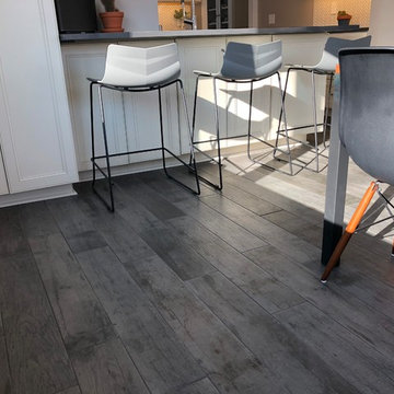
Working with the designer, the homeowners found a beautiful balance of some contemporary aesthetics like the overall color scheme combined with some classic elements such as the detailed cabinetry and herringbone tile backsplash. One of our favorite details in the kitchen is the new tile floor that continues into the dining room. The wood texture plank tile adds depth and texture as well as contrasts nicely with the softer and refined finishes above. New Cambria quartz countertops, new cabinetry, herringbone tile backsplash, new tile floors, custom lighting, and new plumbing fixtures complete the space. The new transitional styled kitchen can grow with the family for many years to come. With a swap out of some furniture the whole space can transition between contemporary or traditional. Truly timeless!
Designed by: Emily Blonigen. See the full details (including before photos) on our website: http://www.castlebri.com/kitchens/project-3309-1/
Make sure to check out this project on the Castle Educational Home Tour, September 29 - 30th, 2018!

Sponsored
Delaware, OH

Buckeye Basements, Inc.
Central Ohio's Basement Finishing ExpertsBest Of Houzz '13-'21
 Integrity Remodeling & Custom Homes, Inc.
Rich is a custom home builder with an emphasis on structural performance and energy efficiency. He is a Certified Master Builder building for over 20 years, in the resort mountain areas of the Blue Ridge Mountains, and now in the Orlando, Florida area for the last decade.
Rich seamlessly blends different architectural details, energy performance, and hardened structures to create high performance luxury homes. He gives personal attention to "Easy Living Design" in order to create a home that can adapt to the aging homeowner making life more convenient, enjoyable, and safe.
Rich works closely with his customers to ensure every detail, need, and expectation is exceeded. He has chosen a team of tradesmen that compliment his work and share the same work ethic and thoughts of delivering a quality product, and who desires to build lasting relationships with the homeowner long after their project is complete.
Rich engages the homeowner throughout the entire building project to ensure that he educates them on products and methods that are compatible with their desired goals. Understanding that the financial goals of a project are of equal importance, Rich provides a detailed job cost budget, so the homeowners are given the opportunity to help guide their project financially.
 Personalized Wallpaper Installers
? Nursery Wallpaper Installation in Pflugerville ?
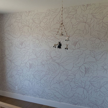
Create a dreamy, safe space for your little one with our expert nursery wallpaper installation services. As a professional wallpaper installer specializing in children's spaces, I combine non-toxic materials, playful designs, and precision craftsmanship for a perfect nursery transformation.
Why Choose Our Nursery Wallpaper Services?
✔ Child-Safe Materials – VOC-free adhesives & eco-friendly peel-and-stick wallpaper options
✔ Whimsical Designs – From custom murals to soft pastel patterns
✔ Durable & Washable – Scratch-resistant vinyl wallpaper for busy nurseries
✔ Themed Rooms – Animals, stars, woodland, or modern minimalist styles
✔ Fast & Fume-Free Installation – Completed before baby arrives
Popular Nursery Styles in Pflugerville:
? Adventure Themes – Safari, jungle, or outer space
? Calming Neutrals – Soft clouds, moons, and gentle textures
✏️ Educational Designs – Alphabet, world maps, or nature-inspired
? Custom Murals – Personalized name walls or hand-painted accents
Our Process:
1️⃣ Free Design Consultation – We help select the perfect pattern
2️⃣ Precision Installation – Flawless alignment for seamless looks
3️⃣ Safety First – Non-toxic, mold-resistant materials
4️⃣ Final Touches – Clean edges and bubble-free results
Serving Pflugerville parents & designers – let’s create a magical nursery with stress-free wallpaper installation!
 Simply Perfect
Advice on interior design is available everywhere—from TV shows and websites to books, magazines and apps.
We love seeing people become engaged in design and educated on the wide range of possibilities. But we hope you’ll proceed with caution.
It’s not that style errors are a matter of life and death. It’s just that it’s easy to choose designs that aren’t necessarily reflective of your own personality and character. And since you’re typically stuck with your interior design decisions for years, styles that don’t quite fit can tend to grate on you.
Interiors that give one person comfort may unleash chaos in someone else. This goes beyond favorite colors or hot trends, right to the heart of interior design, where you find questions of composition, balance, repetition, space and more.
The goal is to find that unique combination of design elements that gives you comfort, support and balance.
In one home, that perfect balance was struck through the use of symmetry. A pair of comfortable swivel chairs sit beneath matching indigo patterned paintings. Matching bookcases below the paintings contain similar, but not identical, arrangements of books, vases and bowls. Woods and bronzes help warm up the simple white bookcase shelving.
Two matching poufs in front of the fireplace provide additional seating. The sofa is accented with a pair of pillows with a blue pattern that echoes the artwork.
The effect of the symmetry is to achieve order and simplicity, which I promote at every opportunity. After all, your home interiors should be the setting or the backdrop of your life—not center stage.
Antique bronze and blue are complementary colors. Together, they offer a rich palette of richness and depth, which brings out the beauty of wood and stone.
In the home office, a unique, whitewash-stained wooden desk rests on metal, Sawhorse-inspired legs for a warm, rustic look. The black leather chair features a contemporary silhouette with an antique brass frame. An adjustable desk lamp has bronze accents.
The bookcase combines a sleek, black metal frame with concrete shelves, for another unusual pairing. It’s kept uncluttered for an orderly, peaceful look. Items on the shelves include a bronze-accented lamp and a pair
of high gloss-finished wooden bookends.
The elegant artwork behind the desk is a simple midnight-blue and bronze with mottled white. Deep blues are again picked up in the rug, which adds a stately vibe with a modern pattern and satisfying texture.
Within the framework of symmetry, the living room repeats the blue-and-bronze color scheme.
A large midcentury brass clock above the fireplace keeps the natural stone visible, rather than hidden behind a painting or television, while its straight lines and color create a beautiful contrast.
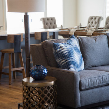
The sofa is a soft, neutral blue. The pattern on the round brass side table features echoes the darker blue-patterned rug, as well as the rug in the office, tying the rooms together.
Indigo blue books adjacent to bronze vases on the shelves repeat the color scheme. The soapstone-topped coffee table echoes the shape of the fireplace. A pair of tall, matching floor lamps with long wooden bases, brass pulls and simple linen shades combine both the colors and symmetry found throughout the home.
21