
Search results for "Helps increase" in Home Design Ideas
 TREX COMPANY INC
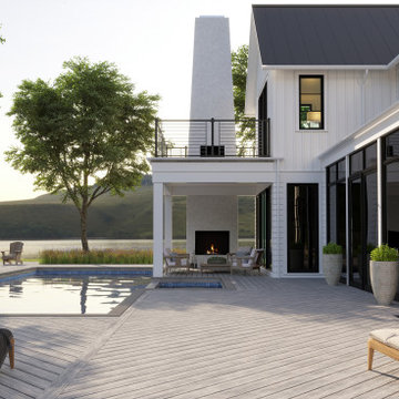
Trex Transcend® decking now comes in Rainier, an airy mountain grey inspired by nature. Trex Transcend® Lineage™ features a refined grain pattern with subtle streaking and tranquil tones, offering a clean canvas for your outdoor space.
 H2D Architecture + Design
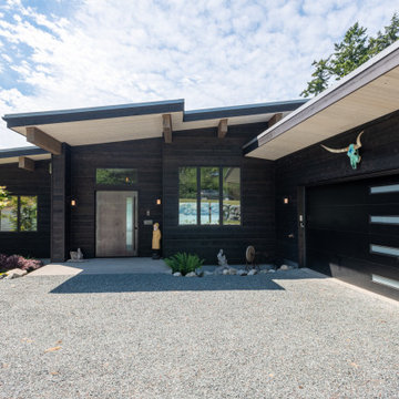
The Guemes Island cabin is designed with a SIPS roof and foundation built with ICF. The exterior walls are highly insulated to bring the home to a new passive house level of construction. The highly efficient exterior envelope of the home helps to reduce the amount of energy needed to heat and cool the home, thus creating a very comfortable environment in the home.
+ Architecture: H2D Architecture + Design
+ Interior Design: Karlee Coble Interiors
+ Built by: Carlisle Classic Homes
+ Photography: Chad Coleman Photography
www.h2darchitects.com

 Alair Homes Plano
Our clients came to us wanting to maximize the space they had. They were not planning on moving anytime soon, as they loved their neighborhood. They wanted to renovate the front of their house, which included the front atrium, living room, kitchen, and powder bath. They hated their kitchen because it was completely closed off, had low ceilings, was dark and outdated, not to mention the floors were different in each of these rooms! The pantry was in the breakfast area and the kitchen table became a junk catcher, being the first thing you see when coming in from the garage/laundry room. In their living room, they wanted the spaces on either side of the fireplace to be symmetrical, whether that be bookshelves, a wet bar or closed off. Both parents are working professionals with no time and/or desire to design, create and figure this out on their own. They needed help figuring out how to reconfigure their current space in order to maximize what they already had, as they could not see an obvious solution. They could not envision how it would look so the fact that our designers were able to show them their new kitchen in 3D was pertinent.
We removed the pass-through windows that surrounded the atrium and front dining room, as well as the entire kitchen wall, completely opening up those two rooms. We removed a hall that used to lead between the kitchen and the living room since it was a complete waste of space! The ceilings were raised to 10’ in the kitchen and we were able to leave the skylight, letting in that natural light they wanted. We were able to give them a much larger pantry with tons of shelving and increase the size of their laundry room by utilizing the space of their old breakfast nook.
We relocated the door to the garage into their new elongated laundry room, built a wet bar across from their new larger pantry (with a pocket door) and the flow and functionality of these new spaces is just perfect! All new Waypoint cabinets were installed one two main kitchen surrounding walls painted Linen. Calacatta Bianco Polished Porcelain Tile 4x12 was used for the backsplash. A large eat-at island was installed, painted Stone, where the family can now gather for homework, meals, and mingling. The soft champagne bronze hardware and accent lighting really give this white and gray kitchen a soft classic look.
In the living room, we removed the built-in bookshelves to the left of the fireplace and closed off the wet-bar on the other side, giving them more space in their master suite. White Oak wood flooring, stained Putney, was installed throughout the entire new space, giving it the continuity they were looking for.
In the guest bathroom, Carrara white herringbone marble mosaic 12x12 tile was used on the shower floor and niche, while basic marble Bianco polished 12x24 porcelain tile was used on the walls. Luxart polished chrome traditional hardware gives this timeless bathroom the perfect shine.
Our clients are so happy with the new functionality and look of their space. It has definitely changed their lives in a way they could have never imagined!
Find the right local pro for your project

 River Valley Landscapes
This project was the result of the owner’s desire to install a swimming pool and outdoor living space inspired by tropical resorts they had visited on family vacations. The one element asked for specifically was a large waterfall spilling into the pool. The challenge for the designers was how to achieve the look the owner’s wished without the use of clichéd items such as thatched huts and tiki torches. The designers decided lush full plantings using plants found in the northeast region that met certain design criteria would be the primary way of giving the tropical feel. Boulder outcroppings, irregular stone paving and fire bowls along the back of the pool would complete the look.
The property is located in a newer subdivision with homes on both sides and a school to the rear. A walkway connects the neighborhood and the school along one side. The desired privacy would be addressed by the placement of plants and trees around the perimeter in mounded beds. Placing the waterfall to the rear of the pool helped block the view of the school beyond. The township had restrictions on the amount of impervious material allowable on site. The patio was designed to the maximum allowable size with square footage going to where it would be most usable. Planting beds were cut into the patio to decrease unnecessary square footage, divide spaces, and allow for more places to add plants and trees.
A rectangular swimming pool was chosen to make it easier to install an automatic pool cover. The pool was designed, with input from the landscape designers, and contracted separately by the owner. The landscape designers chose the location of pool and waterfall so that it was prominently placed to be the focal point of the backyard. The pool includes a curving sunbathing shelf running from end to end, finished in a lighter color to make it more visible, with removable umbrellas for shade and to add to the resort feel. To tie into the boulders used throughout the design, a large boulder was used as a substitute for a diving board. The yard sloped down towards the back of the property which required a large amount of soil to be added and large boulder retaining wall along the back.
For the planting design, the designers choose to focus on plants with larger leaves, various leaf colors and textures, and plants with large flowers in bold colors. These plants were then arranged into a loose lush planting scheme mixed with more traditional northeast plants such as pines, grasses, and roses. Unique plants such as hardy bananas were added for their tropical and exotic look. The full planting beds help to nestle in and enclose the living space.
Broken flagstone was chosen for the patio and intentionally left irregular at the edges. PA flagstone was avoided and a stone with gold and brown tones was chosen. Boulder outcroppings added to the natural and tropical theme. The fire pit was designed with a large built-in bench to increase the amount of seating. The designers chose a rounded smooth shape and incorporated the same stone as the pool coping for the caps and bench. For entertaining guests the outdoor kitchen was outfitted with a large gas grill, beverage taps, refrigerator, sink and a dedicated lobster cooker. The kitchen was finished with granite countertops and stainless steel cabinets. Two strategically placed fire bowls, along with the low voltage lighting, add additional interest to the space at night.
While the designers were faced with many challenges the resulting design incorporated enough elements to achieve the desired look and feel. Using plants appropriate to the northeast that fit the design criteria and carefully choosing hardscaping materials was essential. The owner’s feel they now have their own tropical theme resort right in their Pennsylvania backyard.
 River Valley Landscapes
This project was the result of the owner’s desire to install a swimming pool and outdoor living space inspired by tropical resorts they had visited on family vacations. The one element asked for specifically was a large waterfall spilling into the pool. The challenge for the designers was how to achieve the look the owner’s wished without the use of clichéd items such as thatched huts and tiki torches. The designers decided lush full plantings using plants found in the northeast region that met certain design criteria would be the primary way of giving the tropical feel. Boulder outcroppings, irregular stone paving and fire bowls along the back of the pool would complete the look.
The property is located in a newer subdivision with homes on both sides and a school to the rear. A walkway connects the neighborhood and the school along one side. The desired privacy would be addressed by the placement of plants and trees around the perimeter in mounded beds. Placing the waterfall to the rear of the pool helped block the view of the school beyond. The township had restrictions on the amount of impervious material allowable on site. The patio was designed to the maximum allowable size with square footage going to where it would be most usable. Planting beds were cut into the patio to decrease unnecessary square footage, divide spaces, and allow for more places to add plants and trees.
A rectangular swimming pool was chosen to make it easier to install an automatic pool cover. The pool was designed, with input from the landscape designers, and contracted separately by the owner. The landscape designers chose the location of pool and waterfall so that it was prominently placed to be the focal point of the backyard. The pool includes a curving sunbathing shelf running from end to end, finished in a lighter color to make it more visible, with removable umbrellas for shade and to add to the resort feel. To tie into the boulders used throughout the design, a large boulder was used as a substitute for a diving board. The yard sloped down towards the back of the property which required a large amount of soil to be added and large boulder retaining wall along the back.
For the planting design, the designers choose to focus on plants with larger leaves, various leaf colors and textures, and plants with large flowers in bold colors. These plants were then arranged into a loose lush planting scheme mixed with more traditional northeast plants such as pines, grasses, and roses. Unique plants such as hardy bananas were added for their tropical and exotic look. The full planting beds help to nestle in and enclose the living space.
Broken flagstone was chosen for the patio and intentionally left irregular at the edges. PA flagstone was avoided and a stone with gold and brown tones was chosen. Boulder outcroppings added to the natural and tropical theme. The fire pit was designed with a large built-in bench to increase the amount of seating. The designers chose a rounded smooth shape and incorporated the same stone as the pool coping for the caps and bench. For entertaining guests the outdoor kitchen was outfitted with a large gas grill, beverage taps, refrigerator, sink and a dedicated lobster cooker. The kitchen was finished with granite countertops and stainless steel cabinets. Two strategically placed fire bowls, along with the low voltage lighting, add additional interest to the space at night.
While the designers were faced with many challenges the resulting design incorporated enough elements to achieve the desired look and feel. Using plants appropriate to the northeast that fit the design criteria and carefully choosing hardscaping materials was essential. The owner’s feel they now have their own tropical theme resort right in their Pennsylvania backyard.

 AirField Systems, LLC
AirField installed an AirPave grass fire lane for their porous flexible paving at Baptist Trinity Residential Hospice, creating a beautiful, functional, ecological friendly solution to facility access.
An installation of an AirField Systems grass fire lane at Baptist Trinity Residential Hospice brings green building benefits and incredible strength to a beautiful new facility. A time lapse photo series highlight the installation process of the 6,747 PSI sand filled 100% recycled geocell technology, providing the strength of asphalt and concrete while relieving some of the burden of costly storm sewers and drainage.
This new installation highlights the benefits of paving with grass, as well as the comparative ease of installation. Concrete and asphalt surfaces occupy twice the area of buildings and are the most detrimental to clean water. Concrete and asphalt surfaces dominate the landscape of our urban environments and prevent rainwater from being filtered naturally. They send harmful polluted water straight into our streams, rivers and lakes. In urban America, concrete and asphalt pavements produce two thirds of our excess water runoff. They are responsible for significant hydrocarbon pollutants on our ground and in our water, causing ground water decline, and resulting in local water shortages. These concrete and asphalt surfaces also create huge increases in temperature known as the urban “heat island effect”.
The pollution caused by impervious surfaces deteriorate the quality of our storm water runoff and create large overflows that our storm sewer systems cannot handle. It is also important to realize that the urban forest force is drastically diminishing, causing CO2 levels to rise, which in turn causes global warming. With all the negative influences of impervious pavements now is the time to turn our attention to alternatives for the benefit of the environment.
From fire lanes, overflow, and event parking, to temporary and stadium parking, reinforced grass parking systems deliver the same strength and durability of asphalt and concrete without the negative affects mentioned above. These incredibly strong geocells reinforce grass parking, prevent rutting from traffic, protect turf roots, and promote beautiful grass. Reinforced grass parking structures, also know as grass pavements, enhance the environment by naturally filtering auto and truck liquids such as oil drippings, antifreeze overflows and many other leaks and spills. They also help with air pollutants after they have been knocked to the ground by rainwater and greatly reduce hot surface temperatures thus fighting global warming and the “heat island effect”. Grass pavements allow our groundwater to be naturally replenished, the roots of trees to breathe, and they help our streams and rivers flow cleanly in dry hot summers. A large part of the solution to urban environmental problems is under our feet. By paying appropriate attention to the everyday materials on which we walk and drive, we can replenish renewable resources, restore the natural regenerative processes, and produce a cleaner, healthier, safer, more sustainable world in which we must live. Porous pavements are potentially the most important development in urban watersheds since the invention of storm sewers. By routing rainwater directly into the earth as nature intended, the need for costly storm water structures can be drastically reduced.
Reinforced grass parking has built in permeable spaces through which water and air can pass. Although some porous paving materials are nearly indistinguishable from nonporous materials in construction and superficial appearance, their environmental effects are qualitatively exponential. They allow air, water and heat to dissipate into the environment naturally helping to save the planet.
AirField reinforced grass parking provides beauty and comfort, and with the unbeatable price and performance of AirDrain you can’t go wrong. AirDrain is the reinforced grass pave system the industry has trusted for years !!!
Airfield Systems, LLC 8028 North May Avenue Oklahoma City, OK 73120 405-359-3775
Installer – GREENPRO Landscapes Kevin James 9847 Stewart Rd Arlington, TN 38002

 San Luis Kitchen Co.
When the homeowners decided to move from San Francisco to the Central Coast, they were looking for a more relaxed lifestyle, a unique place to call their own, and an environment conducive to raising their young children. They found it all in San Luis Obispo. They had owned a house here in SLO for several years that they had used as a rental. As the homeowners own and run a contracting business and relocation was not impossible, they decided to move their business and make this SLO rental into their dream home.
As a rental, the house was in a bare-bones condition. The kitchen had old white cabinets, boring white tile counters, and a horrendous vinyl tile floor. Not only was the kitchen out-of-date and old-fashioned, it was also pretty worn out. The tiles were cracking and the grout was stained, the cabinet doors were sagging, and the appliances were conflicting (ie: you could not open the stove and dishwasher at the same time).
To top it all off, the kitchen was just too small for the custom home the homeowners wanted to create.
Thus enters San Luis Kitchen. At the beginning of their quest to remodel, the homeowners visited San Luis Kitchen’s showroom and fell in love with our Tuscan Grotto display. They sat down with our designers and together we worked out the scope of the project, the budget for cabinetry and how that fit into their overall budget, and then we worked on the new design for the home starting with the kitchen.
As the homeowners felt the kitchen was cramped, it was decided to expand by moving the window wall out onto the existing porch. Besides the extra space gained, moving the wall brought the kitchen window out from under the porch roof – increasing the natural light available in the space. (It really helps when the homeowner both understands building and can do his own contracting and construction.) A new arched window and stone clad wall now highlights the end of the kitchen. As we gained wall space, we were able to move the range and add a plaster hood, creating a focal nice focal point for the kitchen.
The other long wall now houses a Sub-Zero refrigerator and lots of counter workspace. Then we completed the kitchen by adding a wrap-around wet bar extending into the old dining space. We included a pull-out pantry unit with open shelves above it, wine cubbies, a cabinet for glassware recessed into the wall, under-counter refrigerator drawers, sink base and trash cabinet, along with a decorative bookcase cabinet and bar seating. Lots of function in this corner of the kitchen; a bar for entertaining and a snack station for the kids.
After the kitchen design was finalized and ordered, the homeowners turned their attention to the rest of the house. They asked San Luis Kitchen to help with their master suite, a guest bath, their home control center (essentially a deck tucked under the main staircase) and finally their laundry room. Here are the photos:
I wish I could show you the rest of the house. The homeowners took a poor rental house and turned it into a showpiece! They added custom concrete floors, unique fiber optic lighting, large picture windows, and much more. There is now an outdoor kitchen complete with pizza oven, an outdoor shower and exquisite garden. They added a dedicated dog run to the side yard for their pooches and a rooftop deck at the very peak. Such a fun house.
Wood-Mode Fine Custom Cabinetry, Barcelona
Sponsored
Delaware, OH

Buckeye Basements, Inc.
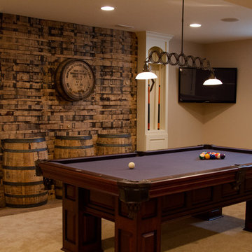
Central Ohio's Basement Finishing ExpertsBest Of Houzz '13-'21

 Jilli
Running your own restaurant is not an easy job. Apart from all the marketing, sales and payroll for your employees there is also one other detail most of us miss. Beautifying a space is every important no matter whether it is in interior form or even an exterior. Whether you are planning to this to your home or commercial space. Be the chance everyone is looking forward to experience. It is important that you look into the different ways you can do so. But if you are thinking that the total package is expensive, then you are quite wrong. This is why we brought you some budget friendly ideas to try.
What are the colors you can choose?
Colors are what make the different moods in people and it is essential to know which type of colors creates the different moods. For an example, bright and jarring colors can create the dramatic and energetic feeling when soft colors can be relaxing and soothing. Once you can recognize which type of mood you want to set, choosing colors will not be that hard and you don’t have to be a pro in it. Painting is one of the most easiest and cost effective thing we can do to make an old place look new and elegant.
Have outdoor space?
If you are running a restaurant with outdoor space, then you are really lucky. Because it gives you room to have outdoor functions, events, more space to place your tables for customers and let them enjoy the outdoor dining style. So, make the most out of this space. If you can do a bit of landscaping and beautifying of the exterior most probably the curb appeal of the surrounding will increase and your customers would love the style you have developed. Make sure the environment outdoors is safe of falling trees and other features. Check for the correct commercial outdoor furniture you need to buy according to the available space and how much seats you want.
Cleanliness should be preserved
Make sure that every day you clean and organize the whole space. Also before you open doors of your restaurant, check for all the dusty nooks and counters that needs cleaning. You can check for some cleaning services in your city or even have a separate cleaning staff for your restaurant. Not only that but also your bathrooms need to be perfectly clean. This can indicate how good the rest of your space is.
Choose the correct lighting
Again like colors, lights too help you to set the mood of your restaurants. If your restaurant is for romantic dining then, using candlelight and chandeliers would be ideal. For a place where you want to fun and playfulness, then different color lights would be great. Also, don’t forget to make the most out of the natural light.
 River Valley Landscapes
This project was the result of the owner’s desire to install a swimming pool and outdoor living space inspired by tropical resorts they had visited on family vacations. The one element asked for specifically was a large waterfall spilling into the pool. The challenge for the designers was how to achieve the look the owner’s wished without the use of clichéd items such as thatched huts and tiki torches. The designers decided lush full plantings using plants found in the northeast region that met certain design criteria would be the primary way of giving the tropical feel. Boulder outcroppings, irregular stone paving and fire bowls along the back of the pool would complete the look.
The property is located in a newer subdivision with homes on both sides and a school to the rear. A walkway connects the neighborhood and the school along one side. The desired privacy would be addressed by the placement of plants and trees around the perimeter in mounded beds. Placing the waterfall to the rear of the pool helped block the view of the school beyond. The township had restrictions on the amount of impervious material allowable on site. The patio was designed to the maximum allowable size with square footage going to where it would be most usable. Planting beds were cut into the patio to decrease unnecessary square footage, divide spaces, and allow for more places to add plants and trees.
A rectangular swimming pool was chosen to make it easier to install an automatic pool cover. The pool was designed, with input from the landscape designers, and contracted separately by the owner. The landscape designers chose the location of pool and waterfall so that it was prominently placed to be the focal point of the backyard. The pool includes a curving sunbathing shelf running from end to end, finished in a lighter color to make it more visible, with removable umbrellas for shade and to add to the resort feel. To tie into the boulders used throughout the design, a large boulder was used as a substitute for a diving board. The yard sloped down towards the back of the property which required a large amount of soil to be added and large boulder retaining wall along the back.
For the planting design, the designers choose to focus on plants with larger leaves, various leaf colors and textures, and plants with large flowers in bold colors. These plants were then arranged into a loose lush planting scheme mixed with more traditional northeast plants such as pines, grasses, and roses. Unique plants such as hardy bananas were added for their tropical and exotic look. The full planting beds help to nestle in and enclose the living space.
Broken flagstone was chosen for the patio and intentionally left irregular at the edges. PA flagstone was avoided and a stone with gold and brown tones was chosen. Boulder outcroppings added to the natural and tropical theme. The fire pit was designed with a large built-in bench to increase the amount of seating. The designers chose a rounded smooth shape and incorporated the same stone as the pool coping for the caps and bench. For entertaining guests the outdoor kitchen was outfitted with a large gas grill, beverage taps, refrigerator, sink and a dedicated lobster cooker. The kitchen was finished with granite countertops and stainless steel cabinets. Two strategically placed fire bowls, along with the low voltage lighting, add additional interest to the space at night.
While the designers were faced with many challenges the resulting design incorporated enough elements to achieve the desired look and feel. Using plants appropriate to the northeast that fit the design criteria and carefully choosing hardscaping materials was essential. The owner’s feel they now have their own tropical theme resort right in their Pennsylvania backyard.

 Advance Design Studio, Ltd.
After six years of living in their Huntley IL home, Chris and Meghan were tired of their dark, dingy, outdated kitchen and it was finally time for a long-anticipated change. “The kitchen is the place where we live, it’s where we do everything,” Meghan said. “It was important that it be a space where we wanted to be.” Meghan loves cooking and enjoys including their girls in healthy meal prepping, this led them to want a brighter, more enjoyable kitchen with increased functionality and improved storage.
For Chris especially, the laundry room was an entirely dysfunctional eyesore. “We had a washer and a dryer, but it was all kind-of cobbled together!” Chris said. “There were always laundry piles everywhere, we weren’t really sure what we wanted to do in there, but it was time for us to make a change.” The mess of the space was stressful every time they walked in the door from the garage each day. Kids’ backpacks and shoes piled up haphazardly in the makeshift boot-bench closet left the family feeling disorganized and stressed. They needed space for folding clothes and locker cubbies to help keep the family organized.
Having known Christine and Todd in the Huntley community for years, Chris and Meghan were familiar with their work. “We already trusted them personally and having seen their projects for years we knew they did top notch work. After we reviewed the initial round of designs, we knew that hiring them was definitely the right choice,” Meghan and Chris said. Although Chris had done a lot of work in their home himself, the kitchen and laundry room renovation was such a large undertaking that he didn’t want to steal time away from his family to spend what would surely be many long weekends doing the job himself. “That would not have been a wise choice for us,” Chris laughed.
“Our designer, Michelle was very, very, easy to work with; anything we wanted to see or weren’t sure about, she went above and beyond to make this easy for us. She was easy to get hold of and always quick to respond,” the couple said. Michelle pulled ideas that mirrored the couple’s taste and style and was adept at directing the couple to limited choices that didn’t overwhelm them and kept the process moving. “I have a hard time making decisions. Michelle made the decision-making process so easy. I loved how she listened to what I liked and then presented three great options for me to choose from,” Meghan said.
The main objectives for the kitchen were better storage solutions, they wanted the space to reflect their lifestyle and taste, and they wanted it to last for years with low maintenance. One of the first steps in creating a more functional kitchen was relocating the refrigerator, creating an improved workflow for the busy family.
“We didn’t know that we could even move the refrigerator to a new location where it is now, that was something that we never would have thought of,” Chris said. “The new refrigerator location makes the kitchen feel so much bigger. We didn’t add any space, but our whole kitchen with the new design just seems like it’s so much larger than before!” Meghan said.
The perimeter mist colored cabinets helped warm and brighten the entire room, while the graphite colored cabinets on the island added contrast. Using this fresh, clean color palette satisfied the couple’s desire for a bright space that was the exact opposite of what they had before. Organization accessories were also added to the cabinets such as a spice drawer tray and roll outs to create hidden convenience.
“I absolutely love the hidden spices – it makes cooking so much more enjoyable!” Chris said. “And all the pull outs, and the double trash bin, who would think you could get so excited about organization!” the couple said in unison.
One thing they hated in their original kitchen was how dark the space felt. Added lighting on the ceiling with the new light fixtures combined with the lighter cabinetry colors throughout solved this problem. “Our new kitchen has this warm, almost cozy feeling that our old kitchen never had, it’s just a space that I love spending my time in now,” Meghan said. The light airy feeling was accentuated with the use of floating white shelves on either side of the decorative range hood. “We have so much cabinetry space, the new design is amazing we actually have more storage space than we will ever need,” Meghan said.
The island was extended to create more work surface and added space for stool seating. “The new island changes how we live. Now the kids can be in the kitchen with us, doing homework, eating breakfast, and the three of us have special dinners there when Chris is working late,” Meghan said.
The Carrara Marmi Quartz countertops were chosen because they are, not only beautiful, but are made from hard-working material that doesn’t require maintenance. The white subway tile backsplash that wraps to the ceiling behind the focal point cooktop range/hood compliments the crisp white countertops perfectly, while brushed brass hardware and light fixtures keep the design fresh and new.
The couple had a few fears at the beginning of the project, as most homeowners do. Their biggest fear was being out of their kitchen and laundry room for an extended time. The crew made it very easy for the family to work in a limited space keeping the washer and dryer hooked up the majority of the time, and also getting appliances working with minimal downtime.
“They above and beyond accommodated us to get us through the process,” Meghan said. “They did a great job making sure we were as comfortable as possible throughout the process,” Chris added.
“Our project manager DJ did a great job. He was very good at updating us on schedule changes, getting guys in as quickly as possible. Everyone that stepped in the house was nice and did great work,” said Chris. They thought Advance’s carpenter was phenomenal and were impressed when he took a conceptual idea from a photograph and worked with designer Michelle to create a one of a kind range/hood that has become the topic of conversation with friends and family who visit the new kitchen. “He was in our house literally every day for several weeks. He was easy to work with and good at what he did,” Meghan and Chris said.
The focal point of the kitchen; a hand-crafted, custom-built ventilation hood was clad with handpicked reclaimed barnwood. Advance Design’s carpenter built the framework and the cladding to create a one-of-a-kind design element that the couple loves.
“I think it was especially fun for him to create something unique from scratch, showcasing his talent in this area,” Meghan said. “I love that my kitchen is not like everyone else’s. I got to pick out the wood on my hood and watch it being built and was able to choose what pieces of wood went where on it. It’s totally unique.”
Red Oak flooring was toothed-in throughout the kitchen and the rest of the first floor anywhere changes were made. Then the whole floor was refinished to tone down the orange undertones in the existing floor stain, ultimately changing the color complexion of the entire first floor. The result is a completely new feeling to the entire home.
Renovating the laundry room was extremely important to Meghan and Chris, but they had trouble visualizing what the possibilities were for the seemingly small space. Michelle produced beautiful 3D illustrations that helped them envision the space in a whole new way.
“I must have told Michelle 100 times that I am a visual person, seeing the designs in 3D made it so easy to make decisions and see what we could really do with our space,” Meghan said.
A dividing wall and doorway were removed between the existing laundry room and hallway formerly containing a coat closet, providing space to design specialized graphite colored cabinetry matching the kitchen island to house custom storage cubbies for each family member. Adding the tall utility cabinetry in the new laundry area helped solve the storage issue, tucking away cleaning supplies, household items, and even the cat got its own cubby.
“I love how everything is now hidden in its own space. I can’t tell you how much I hated coming home and seeing everything sitting around on counters,” Chris said.
Electrical outlets were planned for the inside of utility cabinets, so devices could charge in hidden locations. Stacking the washer and dryer allowed for wider countertop space to provide a folding area and a special space for clothes to hang. “The way I do laundry has been completely transformed! I can actually fold clothes and hang them now right out of the washer and dryer,” Meghan said.
“The end result in the kitchen and the laundry/mud room was an updated light and bright space, with a smarter work flow that better meets the needs of this family,” Michelle said.
“I would totally recommend Advance Design,” Meghan said. “Sometimes I sit and just look at my kitchen and laundry room and think ‘Wow, I can’t believe I get to live here!’ It’s an understatement to say we love our new space.”
 Alair Homes Plano
Our clients came to us wanting to maximize the space they had. They were not planning on moving anytime soon, as they loved their neighborhood. They wanted to renovate the front of their house, which included the front atrium, living room, kitchen, and powder bath. They hated their kitchen because it was completely closed off, had low ceilings, was dark and outdated, not to mention the floors were different in each of these rooms! The pantry was in the breakfast area and the kitchen table became a junk catcher, being the first thing you see when coming in from the garage/laundry room. In their living room, they wanted the spaces on either side of the fireplace to be symmetrical, whether that be bookshelves, a wet bar or closed off. Both parents are working professionals with no time and/or desire to design, create and figure this out on their own. They needed help figuring out how to reconfigure their current space in order to maximize what they already had, as they could not see an obvious solution. They could not envision how it would look so the fact that our designers were able to show them their new kitchen in 3D was pertinent.
We removed the pass-through windows that surrounded the atrium and front dining room, as well as the entire kitchen wall, completely opening up those two rooms. We removed a hall that used to lead between the kitchen and the living room since it was a complete waste of space! The ceilings were raised to 10’ in the kitchen and we were able to leave the skylight, letting in that natural light they wanted. We were able to give them a much larger pantry with tons of shelving and increase the size of their laundry room by utilizing the space of their old breakfast nook.
We relocated the door to the garage into their new elongated laundry room, built a wet bar across from their new larger pantry (with a pocket door) and the flow and functionality of these new spaces is just perfect! All new Waypoint cabinets were installed one two main kitchen surrounding walls painted Linen. Calacatta Bianco Polished Porcelain Tile 4x12 was used for the backsplash. A large eat-at island was installed, painted Stone, where the family can now gather for homework, meals, and mingling. The soft champagne bronze hardware and accent lighting really give this white and gray kitchen a soft classic look.
In the living room, we removed the built-in bookshelves to the left of the fireplace and closed off the wet-bar on the other side, giving them more space in their master suite. White Oak wood flooring, stained Putney, was installed throughout the entire new space, giving it the continuity they were looking for.
In the guest bathroom, Carrara white herringbone marble mosaic 12x12 tile was used on the shower floor and niche, while basic marble Bianco polished 12x24 porcelain tile was used on the walls. Luxart polished chrome traditional hardware gives this timeless bathroom the perfect shine.
Our clients are so happy with the new functionality and look of their space. It has definitely changed their lives in a way they could have never imagined!
 River Valley Landscapes
This project was the result of the owner’s desire to install a swimming pool and outdoor living space inspired by tropical resorts they had visited on family vacations. The one element asked for specifically was a large waterfall spilling into the pool. The challenge for the designers was how to achieve the look the owner’s wished without the use of clichéd items such as thatched huts and tiki torches. The designers decided lush full plantings using plants found in the northeast region that met certain design criteria would be the primary way of giving the tropical feel. Boulder outcroppings, irregular stone paving and fire bowls along the back of the pool would complete the look.
The property is located in a newer subdivision with homes on both sides and a school to the rear. A walkway connects the neighborhood and the school along one side. The desired privacy would be addressed by the placement of plants and trees around the perimeter in mounded beds. Placing the waterfall to the rear of the pool helped block the view of the school beyond. The township had restrictions on the amount of impervious material allowable on site. The patio was designed to the maximum allowable size with square footage going to where it would be most usable. Planting beds were cut into the patio to decrease unnecessary square footage, divide spaces, and allow for more places to add plants and trees.
A rectangular swimming pool was chosen to make it easier to install an automatic pool cover. The pool was designed, with input from the landscape designers, and contracted separately by the owner. The landscape designers chose the location of pool and waterfall so that it was prominently placed to be the focal point of the backyard. The pool includes a curving sunbathing shelf running from end to end, finished in a lighter color to make it more visible, with removable umbrellas for shade and to add to the resort feel. To tie into the boulders used throughout the design, a large boulder was used as a substitute for a diving board. The yard sloped down towards the back of the property which required a large amount of soil to be added and large boulder retaining wall along the back.
For the planting design, the designers choose to focus on plants with larger leaves, various leaf colors and textures, and plants with large flowers in bold colors. These plants were then arranged into a loose lush planting scheme mixed with more traditional northeast plants such as pines, grasses, and roses. Unique plants such as hardy bananas were added for their tropical and exotic look. The full planting beds help to nestle in and enclose the living space.
Broken flagstone was chosen for the patio and intentionally left irregular at the edges. PA flagstone was avoided and a stone with gold and brown tones was chosen. Boulder outcroppings added to the natural and tropical theme. The fire pit was designed with a large built-in bench to increase the amount of seating. The designers chose a rounded smooth shape and incorporated the same stone as the pool coping for the caps and bench. For entertaining guests the outdoor kitchen was outfitted with a large gas grill, beverage taps, refrigerator, sink and a dedicated lobster cooker. The kitchen was finished with granite countertops and stainless steel cabinets. Two strategically placed fire bowls, along with the low voltage lighting, add additional interest to the space at night.
While the designers were faced with many challenges the resulting design incorporated enough elements to achieve the desired look and feel. Using plants appropriate to the northeast that fit the design criteria and carefully choosing hardscaping materials was essential. The owner’s feel they now have their own tropical theme resort right in their Pennsylvania backyard.
 AirField Systems, LLC
AirField installed an AirPave grass fire lane for their porous flexible paving at Baptist Trinity Residential Hospice, creating a beautiful, functional, ecological friendly solution to facility access.
An installation of an AirField Systems grass fire lane at Baptist Trinity Residential Hospice brings green building benefits and incredible strength to a beautiful new facility. A time lapse photo series highlight the installation process of the 6,747 PSI sand filled 100% recycled geocell technology, providing the strength of asphalt and concrete while relieving some of the burden of costly storm sewers and drainage.
This new installation highlights the benefits of paving with grass, as well as the comparative ease of installation. Concrete and asphalt surfaces occupy twice the area of buildings and are the most detrimental to clean water. Concrete and asphalt surfaces dominate the landscape of our urban environments and prevent rainwater from being filtered naturally. They send harmful polluted water straight into our streams, rivers and lakes. In urban America, concrete and asphalt pavements produce two thirds of our excess water runoff. They are responsible for significant hydrocarbon pollutants on our ground and in our water, causing ground water decline, and resulting in local water shortages. These concrete and asphalt surfaces also create huge increases in temperature known as the urban “heat island effect”.
The pollution caused by impervious surfaces deteriorate the quality of our storm water runoff and create large overflows that our storm sewer systems cannot handle. It is also important to realize that the urban forest force is drastically diminishing, causing CO2 levels to rise, which in turn causes global warming. With all the negative influences of impervious pavements now is the time to turn our attention to alternatives for the benefit of the environment.
From fire lanes, overflow, and event parking, to temporary and stadium parking, reinforced grass parking systems deliver the same strength and durability of asphalt and concrete without the negative affects mentioned above. These incredibly strong geocells reinforce grass parking, prevent rutting from traffic, protect turf roots, and promote beautiful grass. Reinforced grass parking structures, also know as grass pavements, enhance the environment by naturally filtering auto and truck liquids such as oil drippings, antifreeze overflows and many other leaks and spills. They also help with air pollutants after they have been knocked to the ground by rainwater and greatly reduce hot surface temperatures thus fighting global warming and the “heat island effect”. Grass pavements allow our groundwater to be naturally replenished, the roots of trees to breathe, and they help our streams and rivers flow cleanly in dry hot summers. A large part of the solution to urban environmental problems is under our feet. By paying appropriate attention to the everyday materials on which we walk and drive, we can replenish renewable resources, restore the natural regenerative processes, and produce a cleaner, healthier, safer, more sustainable world in which we must live. Porous pavements are potentially the most important development in urban watersheds since the invention of storm sewers. By routing rainwater directly into the earth as nature intended, the need for costly storm water structures can be drastically reduced.
Reinforced grass parking has built in permeable spaces through which water and air can pass. Although some porous paving materials are nearly indistinguishable from nonporous materials in construction and superficial appearance, their environmental effects are qualitatively exponential. They allow air, water and heat to dissipate into the environment naturally helping to save the planet.
AirField reinforced grass parking provides beauty and comfort, and with the unbeatable price and performance of AirDrain you can’t go wrong. AirDrain is the reinforced grass pave system the industry has trusted for years !!!
Airfield Systems, LLC 8028 North May Avenue Oklahoma City, OK 73120 405-359-3775
Installer – GREENPRO Landscapes Kevin James 9847 Stewart Rd Arlington, TN 38002

Sponsored
Sunbury, OH

J.Holderby - Renovations
Franklin County's Leading General Contractors - 2X Best of Houzz!
 AirField Systems, LLC
AirField installed an AirPave grass fire lane for their porous flexible paving at Baptist Trinity Residential Hospice, creating a beautiful, functional, ecological friendly solution to facility access.
An installation of an AirField Systems grass fire lane at Baptist Trinity Residential Hospice brings green building benefits and incredible strength to a beautiful new facility. A time lapse photo series highlight the installation process of the 6,747 PSI sand filled 100% recycled geocell technology, providing the strength of asphalt and concrete while relieving some of the burden of costly storm sewers and drainage.
This new installation highlights the benefits of paving with grass, as well as the comparative ease of installation. Concrete and asphalt surfaces occupy twice the area of buildings and are the most detrimental to clean water. Concrete and asphalt surfaces dominate the landscape of our urban environments and prevent rainwater from being filtered naturally. They send harmful polluted water straight into our streams, rivers and lakes. In urban America, concrete and asphalt pavements produce two thirds of our excess water runoff. They are responsible for significant hydrocarbon pollutants on our ground and in our water, causing ground water decline, and resulting in local water shortages. These concrete and asphalt surfaces also create huge increases in temperature known as the urban “heat island effect”.
The pollution caused by impervious surfaces deteriorate the quality of our storm water runoff and create large overflows that our storm sewer systems cannot handle. It is also important to realize that the urban forest force is drastically diminishing, causing CO2 levels to rise, which in turn causes global warming. With all the negative influences of impervious pavements now is the time to turn our attention to alternatives for the benefit of the environment.
From fire lanes, overflow, and event parking, to temporary and stadium parking, reinforced grass parking systems deliver the same strength and durability of asphalt and concrete without the negative affects mentioned above. These incredibly strong geocells reinforce grass parking, prevent rutting from traffic, protect turf roots, and promote beautiful grass. Reinforced grass parking structures, also know as grass pavements, enhance the environment by naturally filtering auto and truck liquids such as oil drippings, antifreeze overflows and many other leaks and spills. They also help with air pollutants after they have been knocked to the ground by rainwater and greatly reduce hot surface temperatures thus fighting global warming and the “heat island effect”. Grass pavements allow our groundwater to be naturally replenished, the roots of trees to breathe, and they help our streams and rivers flow cleanly in dry hot summers. A large part of the solution to urban environmental problems is under our feet. By paying appropriate attention to the everyday materials on which we walk and drive, we can replenish renewable resources, restore the natural regenerative processes, and produce a cleaner, healthier, safer, more sustainable world in which we must live. Porous pavements are potentially the most important development in urban watersheds since the invention of storm sewers. By routing rainwater directly into the earth as nature intended, the need for costly storm water structures can be drastically reduced.
Reinforced grass parking has built in permeable spaces through which water and air can pass. Although some porous paving materials are nearly indistinguishable from nonporous materials in construction and superficial appearance, their environmental effects are qualitatively exponential. They allow air, water and heat to dissipate into the environment naturally helping to save the planet.
AirField reinforced grass parking provides beauty and comfort, and with the unbeatable price and performance of AirDrain you can’t go wrong. AirDrain is the reinforced grass pave system the industry has trusted for years !!!
Airfield Systems, LLC 8028 North May Avenue Oklahoma City, OK 73120 405-359-3775
Installer – GREENPRO Landscapes Kevin James 9847 Stewart Rd Arlington, TN 38002
 Alair Homes Plano
Our clients came to us wanting to maximize the space they had. They were not planning on moving anytime soon, as they loved their neighborhood. They wanted to renovate the front of their house, which included the front atrium, living room, kitchen, and powder bath. They hated their kitchen because it was completely closed off, had low ceilings, was dark and outdated, not to mention the floors were different in each of these rooms! The pantry was in the breakfast area and the kitchen table became a junk catcher, being the first thing you see when coming in from the garage/laundry room. In their living room, they wanted the spaces on either side of the fireplace to be symmetrical, whether that be bookshelves, a wet bar or closed off. Both parents are working professionals with no time and/or desire to design, create and figure this out on their own. They needed help figuring out how to reconfigure their current space in order to maximize what they already had, as they could not see an obvious solution. They could not envision how it would look so the fact that our designers were able to show them their new kitchen in 3D was pertinent.
We removed the pass-through windows that surrounded the atrium and front dining room, as well as the entire kitchen wall, completely opening up those two rooms. We removed a hall that used to lead between the kitchen and the living room since it was a complete waste of space! The ceilings were raised to 10’ in the kitchen and we were able to leave the skylight, letting in that natural light they wanted. We were able to give them a much larger pantry with tons of shelving and increase the size of their laundry room by utilizing the space of their old breakfast nook.
We relocated the door to the garage into their new elongated laundry room, built a wet bar across from their new larger pantry (with a pocket door) and the flow and functionality of these new spaces is just perfect! All new Waypoint cabinets were installed one two main kitchen surrounding walls painted Linen. Calacatta Bianco Polished Porcelain Tile 4x12 was used for the backsplash. A large eat-at island was installed, painted Stone, where the family can now gather for homework, meals, and mingling. The soft champagne bronze hardware and accent lighting really give this white and gray kitchen a soft classic look.
In the living room, we removed the built-in bookshelves to the left of the fireplace and closed off the wet-bar on the other side, giving them more space in their master suite. White Oak wood flooring, stained Putney, was installed throughout the entire new space, giving it the continuity they were looking for.
In the guest bathroom, Carrara white herringbone marble mosaic 12x12 tile was used on the shower floor and niche, while basic marble Bianco polished 12x24 porcelain tile was used on the walls. Luxart polished chrome traditional hardware gives this timeless bathroom the perfect shine.
Our clients are so happy with the new functionality and look of their space. It has definitely changed their lives in a way they could have never imagined!
 Twelve Stones Designs, LLC
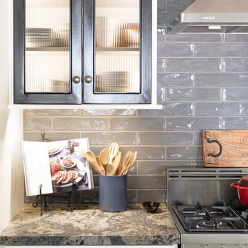
The owners of this kitchen had spent the money to upgrade the finishes in their kitchen upon building the home 12 years ago, but after living in the space for several years they realized how nonfunctional the layout really was. The (then) two preschool aged children had grown into busy, hungry teenagers with many friends who also liked to hang out at the house. So the family needed a more functional kitchen with better traffic flow, space for daily activities revolving around the kitchen at different times of day, and a kitchen that could accommodate cooking for and serving large groups. Furthermore, the dark, traditional finishes no longer reflected the homeowners’ style. They requested a brighter, more relaxed, coastal style that reflected their love of the seaside cities they like to visit.
Originally, the kitchen was U-shaped with a narrow island in the middle. The island created narrow aisles that bottle-necked at the dishwasher, refrigerator, and cooktop areas. There was a pass-through from the foyer into the kitchen, but the owners never liked that the pass-through was also located so close to the powder room. The awkward proximity was unappealing and made guests feel uncomfortable.
The kitchen’s storage was made up of lots of narrow cabinets, apothecary drawers, clipped corner units, and very few drawers. It lacked useful storage for the larger items the family used on a daily basis. And the kitchen’s only pantry was small closet that had only builder-grade, narrow shelving with no illumination to be able to see the contents inside.
Overall, the kitchen’s lighting plan was poorly executed. Only six recessed cans illuminated the entire kitchen and nook areas. The under cabinet lighting was not evenly distributed either. In fact, the builder had mis-placed the under cabinet lighting around the decorative pilasters which made for choppy, dark cubbies. Further, the builder didn’t include any lighting over the sink or the bar area, which meant whoever was doing the dishes was always in their own shadow. That, coupled with the steep overhang of the game room above made the bar area feel like a dim, cavernous space that wasn’t inviting or task oriented. The kitchen looked out into the main living space, but the raised bar and a narrow wall (which held the only large cabinet in the kitchen) created more of a barrier than a relationship to the living room or breakfast nook. In fact, one couldn’t even see the breakfast nook from the cooktop or sink areas due to its orientation. The raised bar top was too narrow to comfortably sit to either dine at or chat from due to the lack of knee space. The the homeowners confided that the kitchen felt more like a dark, dirty prison than place where the family, or their guests, wanted to gather and commune.
The clients' needs and desires were:
➢ to create a kitchen that would be a space the family loved to be in; to relate to the adjacent spaces all around, and to have better flow for entertaining large groups
➢ to remove the walls between the breakfast nook and living area and to be able to utilize the natural light from the windows in both those areas
➢ to incorporate a functional chopping block for prepping fresh food for home cooked meals, an island with a large sink and drain board, 2 pull out trash cans, and seating for at least the 2 teens to eat or do homework
➢ to design a kitchen and breakfast nook with an airy, coastal, relaxed vibe that blended with the rest of the house's coastal theme
➢ to integrate a layered lighting plan which would include ample general illumination, specific task lighting, decorative lighting, and lots of illuminated storage
➢ to design a kitchen with not only more storage for all the husband’s kitchen gadgets and collection of oils and spices, but smart storage, including a coffee/breakfast bar and a place to store and conceal the toaster oven and microwave
➢ to find a way to utilize the large open space between the kitchen, pantry area, and breakfast nook
Twelve Stones Designs achieved the owner's goals by:
➢ removing the walls between the kitchen and living room to allow the natural light to filter in from the adjacent rooms and to create a connection between the kitchen, nook, and living spaces for a sense of unity and communion
➢ removing the existing pantry and designing 3 large pantry style cabinets with LED tape lights and rollout drawers to house lots of kitchen appliances, gadgets, and tons of groceries. We also took the cabinets all the way up to the 9’ ceiling for additional storage for seasonal items and bulk storage.
➢ designing 2 islands - 1 with a gorgeous black walnut chopping block that houses a drawer for chopping and carving knives and a custom double pull out trash unit for point of use utilization - and 1 that houses the dishwasher, a large Blanco Gourmet sink with integrated drain board, woven baskets for fresh root vegetables and kitchen towels, plenty of drawer storage for kitchen items, and bar seating for up to 4 diners.
➢ closing off the space between the kitchen and the powder room to create a beautiful new private alcove for the powder room as well as adding some decorative storage. This also gave us space to include more tall storage near the new range for precision placement of the husband’s extensive oil and spice collection as well as a location for a combo-steam oven the wife wanted for baking and cooking healthy meals.
The project is enhanced functionally by:
➢ incorporated USB and standard receptacles for the kids’ laptops and phone charging in the large island
➢ designing the small island to include additional open shelving for items used on a daily basis such as a variety of bowls, plates, and colanders. This set up also works well for the husband who prefers to “plate” his dinners in restaurant-style fashion before presenting them to the table.
➢ the integration of specific storage units, such as double stacked cutlery drawers, a custom spice pull-out, a Kuerig coffee and tea pod drawer, and custom double stacked utensil drawers
➢ moving the refrigerator to the old oven location - this eliminated the bottle neck as well as created a better relationship to the eating table. It also utilizes the floor space between the pantry, nook, and kitchen
➢ creating a banquet style breakfast nook - this banquette seating not only doubles the amount of seating for large gatherings but it better utilizes the odd space between the kitchen and the previous nook area. It also helps to create a distinct pathway from the mudroom room through the pantry area, kitchen, nook, and living room.
➢ the coffee/breakfast bar area which includes the perfect location for the concealed microwave and toaster oven, convenient storage for the coffee pods and tea accoutrements. Roll-out drawers below also house the smoothie maker, hot water kettle, and a plethora of smoothie-making ingredients such as protein powders, smoothie additives, etc. Furthermore, the drawers below the Keurig house measuring utensil, cutlery, baking supplies and tupperware storage.
➢ incorporating lots of wide drawers and pullouts to accommodate large cookware.
➢ utilizing as much vertical space as possible by building storage to the ceiling which accommodates the family’s abundant amount of serving platters, baking sheets, bakeware, casserole dishes, and additional cutting boards.
The project is enhanced aesthetically by:
➢ new 5-piece Versailles pattern porcelain tile that now seamlessly joins the entire down stairs area together creating a bright, cohesiveness feeling instead of choppy separated spaces - it also adds a coastal feeling
➢ designing a cabinet to conceal the microwave and toaster oven
➢ the coastal influenced light fixtures over the nook table and island
➢ the sandy colors of the Langdon Cambria countertops. The swirling pattern and sparkling quartz pieces remind the homeowner of black-and-tan sandy beaches
➢ the striped banquet seating whose creamy white background and blue-green stripes were the inspiration for the cabinet and wall colors.
➢ All the interior doors were painted black to coordinate with the blacks and grays in the backsplash tile and countertop. This also adds a hint of tailored formality to an otherwise casual space.
➢ the use of WAC's Oculux small aperture LED units for the overhead lighting complimented with Diode LED strips for task lighting under the cabinets and inside the pantry and glass wall cabinets. All of the lighting applications are on separate dimmer switches.
Innovative uses of materials or construction methods by Realty Restoration LLC:
➢ Each 1-1/2” x 3” block of reclaimed end-grain black walnut that makes up the center island chopping block was hand milled and built in the shop. It was designed to look substantial and proportional to the surrounding elements, executed by creating the 4 inch tall top with a solid wood chamfered edge band.
➢ The metal doors on either side of the vent hood were also custom designed for this project and built in the Realty Restoration LLC shop. They are made 1x2, 11-gauge mild steel with ribbed glass. Weighing 60 lbs a piece, heavy duty cabinet hinges were added to support the weight of the door and keep them from sagging.
➢ Under-cabinet receptacles were added along the range wall in order to have a clean, uninterrupted backsplash.
Design obstacles to overcome:
➢ Because we were removing the demising walls between the kitchen and living room, we had to find a way to plumb and vent the new island. We did this by tunneling through the slab (the slab had post tension cables which prevented us from just trenching) to run a new wet vent through a nearby structural wall. We pulled the existing hot and cold lines between upper floor joists and ran them down the structural wall as well and up through a conduit in the tunnel.
➢ Since we were converting from wall overs to a gas range it allowed us to utilize the 220 feed for the wall ovens to provide a new sub panel for all the new kitchen circuits
➢ Due to framing deficiencies inherited from the original build there was a 1-1/2” differential in the floor-to-ceiling height over a 20 foot span; by utilizing the process of cutting and furring coupled with the crown moulding details on the cabinet elevations we were able to mask the problem and provide seamless transitions between the cabinet components.
Evidence of superior craftsmanship:
➢ uniquely designed, one-of-a-kind metal “X” end panels on the large island. The end panels were custom made in the Realty Restoration LLC shop and fitted to the exact dimensions of the island. The welding seams are completely indistinguishable - the posts look like they are cut from a single sheet of metal
➢ square metal posts on the small island were also custom made and designed to compliment and carry through the metal element s throughout the kitchen
➢ the beautiful, oversized end panels on the pantry cabinets which give the breakfast nook a tailored look
➢ integrating a large format 5 piece Versailles tile pattern to seamlessly flow from the existing spaces into the new kitchen space
➢ By constructing a custom cabinet that jogged around a corner we could not remodel (housing the entry way coat closet) we were able to camouflage the adjacent wall offset within the upper and lower cabinets. By designing around the existing jog in the structural walls we accomplished a few things: we were able to find the space to house, and hide, the microwave and toaster oven yet still have a clean cohesive appearance from the kitchen side. Additionally, the owners were able to keep their much needed coat closet and we didn’t have to increase the budget with unnecessary structural work.
 StoneUnlimited Kitchen and Bath Remodeling
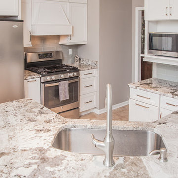
When our client expressed the need for extensive storage capacity; Sherry got right to work in re-configuring the space. Stoneunlimited Kitchen and bath can help you find innovative ways that you too can achieve a compact, optimum dream kitchen, with loads of storage!
1. Floor to ceiling cabinetry - These Waypoint Flat Panel Shaker Doors train the eyes to look up and give the illusion higher ceilings. High cabinet storage is ideal for seasonal dinnerware or items that are used periodically. You can also opt to choose glass panel doors and display colorful pieces that you wish to showcase.
2. White cabinets draw in light making the space look larger. These Waypoint Cabinets are in Painted Linen Finish.
3. An elegant tile back splash in a horizontal layout also make the walls appear wider. These tiles are 2x6 subway glass tiles in Linen Frost finish.
4. Last but not least - Take notice of the three panel doors in the island. There is plenty of storage hidden within those doors. Hardware handles are strategically placed so that the wondering eye won't notice. Furthermore, by bumping out the island slightly our home owner was allotted more storage space without having to compromise the under sink storage.
Have a small kitchen? Stoneunlimited Kitchen and Bath can help you create a space that will provide you with more storage solutions then you could ever imagine!
Cabinets: Waypoint Flat Panel Shaker Door in Painted Linen
Tile: 2x6 Glass Subway in Linen Frost
Countertops: 3CM Alpine White Granite with Ogee Edge
Hardware & Knobs: Brenton & Edgefiled in Satin Nickel
Sink: Stainless Steel

 Alair Homes Plano
Our clients came to us wanting to maximize the space they had. They were not planning on moving anytime soon, as they loved their neighborhood. They wanted to renovate the front of their house, which included the front atrium, living room, kitchen, and powder bath. They hated their kitchen because it was completely closed off, had low ceilings, was dark and outdated, not to mention the floors were different in each of these rooms! The pantry was in the breakfast area and the kitchen table became a junk catcher, being the first thing you see when coming in from the garage/laundry room. In their living room, they wanted the spaces on either side of the fireplace to be symmetrical, whether that be bookshelves, a wet bar or closed off. Both parents are working professionals with no time and/or desire to design, create and figure this out on their own. They needed help figuring out how to reconfigure their current space in order to maximize what they already had, as they could not see an obvious solution. They could not envision how it would look so the fact that our designers were able to show them their new kitchen in 3D was pertinent.
We removed the pass-through windows that surrounded the atrium and front dining room, as well as the entire kitchen wall, completely opening up those two rooms. We removed a hall that used to lead between the kitchen and the living room since it was a complete waste of space! The ceilings were raised to 10’ in the kitchen and we were able to leave the skylight, letting in that natural light they wanted. We were able to give them a much larger pantry with tons of shelving and increase the size of their laundry room by utilizing the space of their old breakfast nook.
We relocated the door to the garage into their new elongated laundry room, built a wet bar across from their new larger pantry (with a pocket door) and the flow and functionality of these new spaces is just perfect! All new Waypoint cabinets were installed one two main kitchen surrounding walls painted Linen. Calacatta Bianco Polished Porcelain Tile 4x12 was used for the backsplash. A large eat-at island was installed, painted Stone, where the family can now gather for homework, meals, and mingling. The soft champagne bronze hardware and accent lighting really give this white and gray kitchen a soft classic look.
In the living room, we removed the built-in bookshelves to the left of the fireplace and closed off the wet-bar on the other side, giving them more space in their master suite. White Oak wood flooring, stained Putney, was installed throughout the entire new space, giving it the continuity they were looking for.
In the guest bathroom, Carrara white herringbone marble mosaic 12x12 tile was used on the shower floor and niche, while basic marble Bianco polished 12x24 porcelain tile was used on the walls. Luxart polished chrome traditional hardware gives this timeless bathroom the perfect shine.
Our clients are so happy with the new functionality and look of their space. It has definitely changed their lives in a way they could have never imagined!
 River Valley Landscapes
This project was the result of the owner’s desire to install a swimming pool and outdoor living space inspired by tropical resorts they had visited on family vacations. The one element asked for specifically was a large waterfall spilling into the pool. The challenge for the designers was how to achieve the look the owner’s wished without the use of clichéd items such as thatched huts and tiki torches. The designers decided lush full plantings using plants found in the northeast region that met certain design criteria would be the primary way of giving the tropical feel. Boulder outcroppings, irregular stone paving and fire bowls along the back of the pool would complete the look.
The property is located in a newer subdivision with homes on both sides and a school to the rear. A walkway connects the neighborhood and the school along one side. The desired privacy would be addressed by the placement of plants and trees around the perimeter in mounded beds. Placing the waterfall to the rear of the pool helped block the view of the school beyond. The township had restrictions on the amount of impervious material allowable on site. The patio was designed to the maximum allowable size with square footage going to where it would be most usable. Planting beds were cut into the patio to decrease unnecessary square footage, divide spaces, and allow for more places to add plants and trees.
A rectangular swimming pool was chosen to make it easier to install an automatic pool cover. The pool was designed, with input from the landscape designers, and contracted separately by the owner. The landscape designers chose the location of pool and waterfall so that it was prominently placed to be the focal point of the backyard. The pool includes a curving sunbathing shelf running from end to end, finished in a lighter color to make it more visible, with removable umbrellas for shade and to add to the resort feel. To tie into the boulders used throughout the design, a large boulder was used as a substitute for a diving board. The yard sloped down towards the back of the property which required a large amount of soil to be added and large boulder retaining wall along the back.
For the planting design, the designers choose to focus on plants with larger leaves, various leaf colors and textures, and plants with large flowers in bold colors. These plants were then arranged into a loose lush planting scheme mixed with more traditional northeast plants such as pines, grasses, and roses. Unique plants such as hardy bananas were added for their tropical and exotic look. The full planting beds help to nestle in and enclose the living space.
Broken flagstone was chosen for the patio and intentionally left irregular at the edges. PA flagstone was avoided and a stone with gold and brown tones was chosen. Boulder outcroppings added to the natural and tropical theme. The fire pit was designed with a large built-in bench to increase the amount of seating. The designers chose a rounded smooth shape and incorporated the same stone as the pool coping for the caps and bench. For entertaining guests the outdoor kitchen was outfitted with a large gas grill, beverage taps, refrigerator, sink and a dedicated lobster cooker. The kitchen was finished with granite countertops and stainless steel cabinets. Two strategically placed fire bowls, along with the low voltage lighting, add additional interest to the space at night.
While the designers were faced with many challenges the resulting design incorporated enough elements to achieve the desired look and feel. Using plants appropriate to the northeast that fit the design criteria and carefully choosing hardscaping materials was essential. The owner’s feel they now have their own tropical theme resort right in their Pennsylvania backyard.
 San Luis Kitchen Co.
Tuscan design using a burnished & glazed finish on oak cabinets by Wood-Mode. The columns either side of the range pull out with spice and bottle storage behind. The curved profile of the top drawer-heads extends around the kitchen.
When the homeowners decided to move from San Francisco to the Central Coast, they were looking for a more relaxed lifestyle, a unique place to call their own, and an environment conducive to raising their young children. They found it all in San Luis Obispo. They had owned a house here in SLO for several years that they had used as a rental. As the homeowners own and run a contracting business and relocation was not impossible, they decided to move their business and make this SLO rental into their dream home.
As a rental, the house was in a bare-bones condition. The kitchen had old white cabinets, boring white tile counters, and a horrendous vinyl tile floor. Not only was the kitchen out-of-date and old-fashioned, it was also pretty worn out. The tiles were cracking and the grout was stained, the cabinet doors were sagging, and the appliances were conflicting (ie: you could not open the stove and dishwasher at the same time).
To top it all off, the kitchen was just too small for the custom home the homeowners wanted to create.
Thus enters San Luis Kitchen. At the beginning of their quest to remodel, the homeowners visited San Luis Kitchen’s showroom and fell in love with our Tuscan Grotto display. They sat down with our designers and together we worked out the scope of the project, the budget for cabinetry and how that fit into their overall budget, and then we worked on the new design for the home starting with the kitchen.
As the homeowners felt the kitchen was cramped, it was decided to expand by moving the window wall out onto the existing porch. Besides the extra space gained, moving the wall brought the kitchen window out from under the porch roof – increasing the natural light available in the space. (It really helps when the homeowner both understands building and can do his own contracting and construction.) A new arched window and stone clad wall now highlights the end of the kitchen. As we gained wall space, we were able to move the range and add a plaster hood, creating a focal nice focal point for the kitchen.
The other long wall now houses a Sub-Zero refrigerator and lots of counter workspace. Then we completed the kitchen by adding a wrap-around wet bar extending into the old dining space. We included a pull-out pantry unit with open shelves above it, wine cubbies, a cabinet for glassware recessed into the wall, under-counter refrigerator drawers, sink base and trash cabinet, along with a decorative bookcase cabinet and bar seating. Lots of function in this corner of the kitchen; a bar for entertaining and a snack station for the kids.
After the kitchen design was finalized and ordered, the homeowners turned their attention to the rest of the house. They asked San Luis Kitchen to help with their master suite, a guest bath, their home control center (essentially a deck tucked under the main staircase) and finally their laundry room. Here are the photos:
I wish I could show you the rest of the house. The homeowners took a poor rental house and turned it into a showpiece! They added custom concrete floors, unique fiber optic lighting, large picture windows, and much more. There is now an outdoor kitchen complete with pizza oven, an outdoor shower and exquisite garden. They added a dedicated dog run to the side yard for their pooches and a rooftop deck at the very peak. Such a fun house.
108