
Search results for "Helps increase" in Home Design Ideas

 Castle Building & Remodeling
With a master bath and second bathroom stuck in the 1970’s, the homeowners of this unique Minneapolis home were looking to upgrade their bathroom to fit their sophisticated minimalist taste. In the hall bath, the tub was removed and replaced with a no-threshold tiled shower and glass enclosure. To make the space feel larger a custom floating vanity was designed. Drawers were designed with a plumbing chase and built in cubbies to help keep everything neatly in one place. Outlets, a mirror de-fogger and a nightlight included in the medicine cabinet increase usable storage and add functionality. Porcelain tile was installed in the shower and on the floor of the bathroom. The old wallpaper was replaced with a modern navy windowpane patter.
To create a cohesive look, the same porcelain tile was installed throughout the master bathroom. Meanwhile, the swinging door to the toilet room was replaced with a pocket door to save size. The original vanity was replaced with a 42” high high-gloss cherry cabinet, Cambria top and toe-kick rope lighting. To create a spa-like experience, the tiled shower received an Italian shower unit by Fantini called the Acquapura – it includes a waterfall head and various body sprays. The walls were wallpapered with a neutral textured paper that picks up on the taupe running through the tile. A simple mirror and light fixture in chrome complete this modern minimalist bath.

 Independent Home Walk In Tubs New Jersey
Our installation experts at Independent Home just completed a walk in tub installation for our customer Edward of Haddonfield. Find out why he decided to go with Independent Home along with how the installation was completed.
Edward began shopping around for walk in tubs about a month ago. He was looking for a tub that was not only safe but could help with his arthritis. He received quotes from a few different companies but in the end decided on Independent Home. We were chosen because our salesmen were not pushy and were patient with answering all of Edward’s questions. A pre-installation meeting was then scheduled.
The pre-installation meeting involved our installation experts and, of course, Edward. The meeting consisted of discussing what tub would be best for Edward’s needs, where the best location would be, and what type of finish should be added. Edward and our experts decided to go with our celebrity walk in tub with hydrotherapy model.
The celebrity was the best choice for Edward because it had all of the requirements he was looking for. It met his safety requirements with a non-slip floor, an ADA compliant seat, and a low threshold for an easy entrance and exit. The tub’s hydrotherapy features will be able to reduce Edward’s arthritis pain. All he has to do is turn on the jets and relax. The way that the jets move will increase his circulation which will help his muscles and joints rehabilitate.
The entire installation process only took a couple of days to complete. This consisted of removing Edward’s old tub and foundation, bringing in the new tub, leveling the legs, connecting the water, and testing for leaks. The last step of the installation was building the finish with a simple tile wall surround that Edward had requested.
Edward loves his new tub. The hydrotherapy features have decreased his arthritis pain, allowing him to get out more.

 Paradise Found Construction
The homes in Heritage Hills in Chapel Hill, NC are representative of the popularity and explosive growth of American Home Ownership that occurred during the economic expansion that followed the end of WW II. They were designed and built to foster the benefits and sense of “community”, where families could come together and share theirs and their children’s lives. They are typically in very desirable locations within their larger communities, and remodeling them with modern amenities, increasing the performance and efficiency of them, and having them Green Certified (independent third-party verified) makes them extremely attractive to buyers, and helps to raise other property values within the neighborhood.
Green Certified Remodeled Homes offer significant value and advantage in the marketplace over similar homes in their area, which is especially important as a new, younger era of home buyers enter the market. Current trends suggest that younger (as well as many “seasoned”) homeowners are interested in smaller, more efficient (and thus affordable) homes situated closer to shopping, their work, entertainment opportunities, and access to the economic and environmental benefits of mass transit.
These older homes also offer an additional value that is continuing to gain visibility and appreciation in the market place. They were built from lumber from slower-growth trees (denser and harder wood), and as such offer superior structural support compared to the same home built using lumber from today’s faster-growing (softer and less-dense wood) trees.
Robin and Kent had lived in their 2-story Gambrel Roof home in Heritage Hills since 1994. The house was structurally sound, due in large part to the old-growth (and denser) yellow pine that was used in its framing. They loved the quiet neighborhood, its sense of community and amenities, and their home. It suited their life-style and needs; and they had decided that they would remain in the home. It was showing its age, and was in need of general repairs and maintenance, and its energy, water, and indoor air quality performance was continuing to increase their ongoing cost of ownership.
Robin loved the screen porch that looked out on their private and nicely landscaped back yard, but she wanted to be able to use it in the colder months of the year. She was unsatisfied with the kitchen and the mud room / laundry room, and the darkness of other living spaces. A previous water leak in the laundry room had resulted in a large patch of mold that had compromised flooring, wall board, and insulation and contributed to the homes reduced indoor air quality.
The home lacked insulation in the crawl, and inadequate insulation in the attic. The single HVAC unit had been replaced a few years earlier with a more efficient unit, but with a single programmable thermostat control on the first floor and aging and un-insulated ducting, the second floor was often over-heated in the summer months.
The original wood windows had begun to deteriorate and were drafty and inefficient, and the original wood-burning fireplace was an open conduit for escaping conditioned air as well as an inlet for wood-smoke smelling air being pulled into the home. The siding had been replaced a few years earlier with a cement-fiber product, but the exterior wood trim was compromised and beginning to look unsightly. Its original architecture had been altered over the years in ways that presented ongoing maintenance and durability issues, as well as disrupting the elegance of the original design.
Kent has worked for over 30 years in the Environmental Sciences field, and is considered to be a national expert in understanding the sources of, and human exposure to pollutants in indoor environments. He had always been very conscious and cautious about the effects on indoor air quality that the construction, furnishings, and products used in home had on him and his family.
Project Goals
Increase the performance of their home by improving energy efficiency by at least 40% and lowering their natural gas and electric utility costs.
Increase the performance of their home by reducing water usage by at least 40% and lowering the water utility costs.
Increase the comfort of their home that was being compromised by an inadequate HVAC design, inadequate insulation, inefficient and compromised wood windows, and copious air intrusions and drafts.
Improve the healthiness of the homes indoor air quality that was being compromised by an open wood-burning fireplace, and prior water intrusion that had allowed colonies of mold to thrive.
Create a new Kitchen, Family Room, Home Office, Mudroom, and Laundry Room that featured some of the latest designs and trends and harmonized with the rest of the homes charm.
Increase the usefulness and aesthetics of the screened porch by creating a warm and inviting semi-conditioned 3-Season Room that extended the times during the year that it was comfortable.
Introduce day-lighting into areas of the home that were dark and uninviting.
Brighten and harmonize all of the interior finishes.
Protect and restore the exterior of the home with superior-performing products and finishes.
Achieve Gold Level Green Home Certification in conformance with the ICC 700-2012 National Green Building Standards (NGBS).
Find the right local pro for your project

 KitchenVisions
When demoing this space the shower needed to be turned...the stairwell tread from the downstairs was framed higher than expected. It is now hidden from view under the bench. Needing it to move furthur into the expansive shower than truly needed, we created a ledge and capped it for product/backrest. We also utilized the area behind the bench for open cubbies for towels.
 Jordan Design Build Group
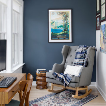
Outside of the primary bedroom suite, we created a small nook that serves double duty as a home office space and reading nook.
Example of a small transitional freestanding desk light wood floor home office design in DC Metro with blue walls
Example of a small transitional freestanding desk light wood floor home office design in DC Metro with blue walls

 User
The footprints and layouts of a house is the most important feature in a home. This is what can help or annoy a homeowner in everyday life and what can appeal or deter many future home buyer. You can almost certainly pinpoint a homes age by how the home is laid out. Formal living and formal dining areas were popular in the 90's and 2000's but no longer serve as more than an area to collect junk or wayward items. Many homeowners opt to close in the areas to create offices, guest rooms, or even media rooms; thus adding true value to the home.
In this home the formal living room was closed in to create another room. The elegant double french doors greet guests once they walk in the entrance. The room is equipped with a closet and its own entry into the master bathroom.
The master bathroom had to be reconfigured to add an entrance to the new bedroom. The small shower was shifted over and expanded, while a seat and a shampoo niche was added. The frame-less glass, Marazzi Silk in Distinguished, and Daltile Radiance deco-mesh create drama and a sophisticated elegance. The same tile was added around the garden tub to create an uniformed look. Custom ordered vanities topped with an indestructible Dekton countertop house the double sinks now side by side. The details such as the trim being added to the existing mirror. Matching trim and crown to the newly added room makes the space seem like it was always meant to be this way.
Added areas can increase the monetary value of a home but a layout that fits your lifestyle adds the greatest value of all. The trick is making it not seem like a remodel has been done. That is where a professional comes in. Kaleidoscope HD2 is here to help your home fit your lifestyle in the best way possible.

Sponsored
Delaware, OH

Buckeye Basements, Inc.
Central Ohio's Basement Finishing ExpertsBest Of Houzz '13-'21


 Otogawa-Anschel Design-Build
With the pending arrival of a beautiful baby girl, the homeowners of this 1928 Minneapolis Tudor wanted a basement that was conducive to a young child, but would still allow a place for family to gather and the occasional house guest. The original basement was typical; cold, lacking natural light with tiny, uncomfortably confined rooms and that “unique” basement smell. The goal was to reverse all of the ill effects of a rarely unappreciated space while increasing the performance of the older home.
The frigid temperatures and wet, mildew odor was remedied by demolishing the entire slab floor and excavating to gain an extra six inches in ceiling height. It also allowed us to insulate to R-15, moisture proof under the new slab, install a drain tile and sump pump. Within the concrete slab is a hydronic, in-floor radiant heating system which further helps to add comfort to the space. Lastly, we also sprayed a closed-cell, expanding urethane foam on the inside of the foundation walls all the way to the first floor.
To help bring more light down to the basement, we started by opening up the staircase on both sides. A curved wall bends light into the lower level while a countertop and cubbies below provide storage space for odds and ends. On the opposite wall, creatively placed cubbies provide places for paintings, ceramics and plants. We also removed the tiny 18” x 34” window on the south wall and installed a full-sized, high-efficiency, triple pane Pella egress window. To let lots of natural light into the window, we expanded the size of the cedar-lined egress well and included a built-in planter at the base to help bring life into an otherwise empty cavity.
Small, unspecified spaces that became storage areas now have purpose. The areas are defined, yet open. Upon descending down the stairs, one is greeted by a large living room with curved walls, custom design media center, built-in daybed and bookshelves. Use of paint was important in the design. Naturally in older homes basements are going to have exposed beams, soffits and a whole gambit of nooks and crannies. Instead of disguising them, we played them up, which created a layer effect with the color. The color also adds a touch of playfulness which anyone, regardless of age, can enjoy.
We scavenged the client’s garage and discovered that the previous homeowner kept the old, full-view glass front entry door in the garage. We re-installed the original glass knob and attached the door to sliding barn door hardware which was attached to the main structural beam of the lower level. On the other side of the door was the homeowners’ combined office and small fitness area. The office floor is a blend of thin strips of different colored cork. A built-in storage cabinet sits across from a site-built desk which forms to the curve of the dividing wall. A small, square hole in the curved wall provides a view to see who is coming down the stairs. Opposite of the office area and directly at the base of the stairs is a place for the homeowner’s treadmill.
Hidden is the mechanical room, which is home to many green and energy efficient products. The washing machine is a low-water consumption unit while the dryer requires less energy to operate than most standard units. Both sit atop a checkerboard pattern of different colored VCT tiles. We also replaced the aging boiler, which only heated the first and second level, with a 95% efficient heat source for the entire house—including the basement.
Behind the curved wall, the bathroom is conveniently located. A large, custom built no-formaldehyde added vanity supports the slab of remnant granite countertop. A piece of eco-resin wall panel, embedded with organic material, contains water in the shower and blends beautifully with the updated colors. Tucked under the stairs, we installed a dual-flush, low-water consumption toilet.
Through creative space planning, we packed a lot of into a rather small space. As a result, we have three very happy homeowners who are enjoying their light, clean and safe lower level of their home—however, they’ve been hard pressed to think of it as a “basement”.
highlights
Moisture management system
Insulated slab
Hydronic in-floor heat
Formaldehyde free cabinetry
MN-made custom cabinets
Ultra-low VOC paints
Wool carpet
Dual-flush toilet
Cork floor
No recessed lights
Cedar egress window well with planter
Re-used door
Eco-resin


 APPEARANCES INTERNATIONAL
The hangers have a rich natural finish and polished chrome hook, which add warmth and sophistication to any closet décor, all while providing convenient storage and organization. These wide, rounded shoulder, wooden hangers prevent garments from unsightly hanger bumps and help maintain your garments’ natural shape. They also help to increase hanging space in your closet, by keeping coordinating components stored on a single hanger. The skirt/pant hangers, with the no-slip grip clips, also allow you to conserve closet space, as well as prevent unwanted wrinkles.
With 4 large shelves, each supported by an innovative hanging system, this unit is well equipped to store all types of accessories, caps, sweaters, crafts, etc. Made from heavy duty polyester canvas material, this durable fabric breathes and neatly stores all of your items. Quick and easy installation (no tools required), on a standard sized closet rod. This system is the perfect organization solution for your home, dorm room, or office!
These handy storage solutions are just a small example of the many products by StorageManiac and J.S. Hanger. The innovative and sophisticated styling and design of each piece make these a welcome and useful addition to any home. These products allow you to keep everything tidy, neat, and in order, while providing a modern and sleek look. No matter the space, these products are bound to fit any need you may have!
Photo Credit: Lambert McOwusu
 User
The footprints and layouts of a house is the most important feature in a home. This is what can help or annoy a homeowner in everyday life and what can appeal or deter many future home buyer. You can almost certainly pinpoint a homes age by how the home is laid out. Formal living and formal dining areas were popular in the 90's and 2000's but no longer serve as more than an area to collect junk or wayward items. Many homeowners opt to close in the areas to create offices, guest rooms, or even media rooms; thus adding true value to the home.
In this home the formal living room was closed in to create another room. The elegant double french doors greet guests once they walk in the entrance. The room is equipped with a closet and its own entry into the master bathroom.
The master bathroom had to be reconfigured to add an entrance to the new bedroom. The small shower was shifted over and expanded, while a seat and a shampoo niche was added. The frame-less glass, Marazzi Silk in Distinguished, and Daltile Radiance deco-mesh create drama and a sophisticated elegance. The same tile was added around the garden tub to create an uniformed look. Custom ordered vanities topped with an indestructible Dekton countertop house the double sinks now side by side. The details such as the trim being added to the existing mirror. Matching trim and crown to the newly added room makes the space seem like it was always meant to be this way.
Added areas can increase the monetary value of a home but a layout that fits your lifestyle adds the greatest value of all. The trick is making it not seem like a remodel has been done. That is where a professional comes in. Kaleidoscope HD2 is here to help your home fit your lifestyle in the best way possible.
 User
The footprints and layouts of a house is the most important feature in a home. This is what can help or annoy a homeowner in everyday life and what can appeal or deter many future home buyer. You can almost certainly pinpoint a homes age by how the home is laid out. Formal living and formal dining areas were popular in the 90's and 2000's but no longer serve as more than an area to collect junk or wayward items. Many homeowners opt to close in the areas to create offices, guest rooms, or even media rooms; thus adding true value to the home.
In this home the formal living room was closed in to create another room. The elegant double french doors greet guests once they walk in the entrance. The room is equipped with a closet and its own entry into the master bathroom.
The master bathroom had to be reconfigured to add an entrance to the new bedroom. The small shower was shifted over and expanded, while a seat and a shampoo niche was added. The frame-less glass, Marazzi Silk in Distinguished, and Daltile Radiance deco-mesh create drama and a sophisticated elegance. The same tile was added around the garden tub to create an uniformed look. Custom ordered vanities topped with an indestructible Dekton countertop house the double sinks now side by side. The details such as the trim being added to the existing mirror. Matching trim and crown to the newly added room makes the space seem like it was always meant to be this way.
Added areas can increase the monetary value of a home but a layout that fits your lifestyle adds the greatest value of all. The trick is making it not seem like a remodel has been done. That is where a professional comes in. Kaleidoscope HD2 is here to help your home fit your lifestyle in the best way possible.

Sponsored
Sunbury, OH

J.Holderby - Renovations
Franklin County's Leading General Contractors - 2X Best of Houzz!


 M tech
Creating a Dream Kitchen: Where Beauty Meets Functionality
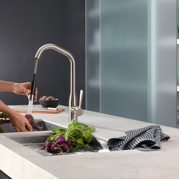
The kitchen is the heart of every modern home. Today, kitchen design goes beyond just cabinet layouts and color schemes—it’s about optimizing space and ensuring high-performance functionality. One often overlooked yet crucial element is a well-designed plumbing system, which can dramatically enhance both the aesthetics and efficiency of your space.
Hidden Plumbing: The Secret to Sleek, Modern Designs
Leading interior designers in Phoenix, Arizona, emphasize that a professional plumbing system can make a significant difference in a kitchen’s final look. Companies like APS Plumbing, with their expertise in concealed plumbing installations, help architects and homeowners achieve that flawless, minimalist design.
5 Key Plumbing Tips for an Efficient Kitchen:
Smart Placement – Strategically position faucets and drainage points to enhance both aesthetics and daily usability.
High-Quality Materials – Invest in durable pipes and fittings to minimize frequent repairs.
Professional Insulation – Prevent energy loss and reduce unwanted noise with proper pipe insulation.
Easy Access – Design the system so future repairs don’t require extensive demolition.
Appliance Compatibility – Ensure plumbing aligns with modern appliances like side-by-side refrigerators and advanced dishwashers.
Choosing the Right Professional
As seen in high-end design projects, working with experienced plumbing teams like APS Plumbing—who understand modern design needs—can prevent costly future issues. Their free pre-installation consultations help homeowners and designers choose the best solutions for combining beauty and functionality.
Final Thoughts
A truly modern kitchen achieves perfection by paying attention to every technical detail. Investing in a professional plumbing system not only increases your home’s value but also enhances everyday cooking and living experiences. For your next project, consult experts who combine technical knowledge with a strong sense of aesthetics.
The kitchen is the heart of every modern home. Today, kitchen design goes beyond just cabinet layouts and color schemes—it’s about optimizing space and ensuring high-performance functionality. One often overlooked yet crucial element is a well-designed plumbing system, which can dramatically enhance both the aesthetics and efficiency of your space.
Hidden Plumbing: The Secret to Sleek, Modern Designs
Leading interior designers in Phoenix, Arizona, emphasize that a professional plumbing system can make a significant difference in a kitchen’s final look. Companies like APS Plumbing, with their expertise in concealed plumbing installations, help architects and homeowners achieve that flawless, minimalist design.
5 Key Plumbing Tips for an Efficient Kitchen:
Smart Placement – Strategically position faucets and drainage points to enhance both aesthetics and daily usability.
High-Quality Materials – Invest in durable pipes and fittings to minimize frequent repairs.
Professional Insulation – Prevent energy loss and reduce unwanted noise with proper pipe insulation.
Easy Access – Design the system so future repairs don’t require extensive demolition.
Appliance Compatibility – Ensure plumbing aligns with modern appliances like side-by-side refrigerators and advanced dishwashers.
Choosing the Right Professional
As seen in high-end design projects, working with experienced plumbing teams like APS Plumbing—who understand modern design needs—can prevent costly future issues. Their free pre-installation consultations help homeowners and designers choose the best solutions for combining beauty and functionality.
Final Thoughts
A truly modern kitchen achieves perfection by paying attention to every technical detail. Investing in a professional plumbing system not only increases your home’s value but also enhances everyday cooking and living experiences. For your next project, consult experts who combine technical knowledge with a strong sense of aesthetics.
 User
The footprints and layouts of a house is the most important feature in a home. This is what can help or annoy a homeowner in everyday life and what can appeal or deter many future home buyer. You can almost certainly pinpoint a homes age by how the home is laid out. Formal living and formal dining areas were popular in the 90's and 2000's but no longer serve as more than an area to collect junk or wayward items. Many homeowners opt to close in the areas to create offices, guest rooms, or even media rooms; thus adding true value to the home.
In this home the formal living room was closed in to create another room. The elegant double french doors greet guests once they walk in the entrance. The room is equipped with a closet and its own entry into the master bathroom.
The master bathroom had to be reconfigured to add an entrance to the new bedroom. The small shower was shifted over and expanded, while a seat and a shampoo niche was added. The frame-less glass, Marazzi Silk in Distinguished, and Daltile Radiance deco-mesh create drama and a sophisticated elegance. The same tile was added around the garden tub to create an uniformed look. Custom ordered vanities topped with an indestructible Dekton countertop house the double sinks now side by side. The details such as the trim being added to the existing mirror. Matching trim and crown to the newly added room makes the space seem like it was always meant to be this way.
Added areas can increase the monetary value of a home but a layout that fits your lifestyle adds the greatest value of all. The trick is making it not seem like a remodel has been done. That is where a professional comes in. Kaleidoscope HD2 is here to help your home fit your lifestyle in the best way possible.

 Alair Homes Plano
The bathroom was completely transformed! We demoed the flooring, cabinets, sheetrock, countertops and soffits, as well as structural walls. There were two doors into the bathroom from the master bedroom that were both removed and one new one installed. New walls were framed out for the closet, tub, shower and toilet room. The sink was moved from its original location and located on the adjacent wall. Two small closets were also removed to increase the square footage of this bathroom. Pocket doors were added to the water closet, as well as the closet. The seated vanity was a must, so that was added into the new layout.
The original tub that the homeowners felt was too large was replaced with a freestanding soaker tub. The once dark corner shower was replaced with a new low curb entry shower surrounded with frameless glass and brushed nickel hardware. The shower floor tile is 1"x4" Eleganza loft Grigio, surrounded by 4"x16" Subway tile in a glossy cotton. A nice mosaic Frozen blend glass Allegro accent tile helps breaks up the white of this new bright bathroom. The homeowners are so pleased with their new bathroom. Design & Construction by Hatfield Builders & Remodelers | Photography by Versatile Imaging
Sponsored
Sunbury, OH
J.Holderby - Renovations
Franklin County's Leading General Contractors - 2X Best of Houzz!

 Twelve Stones Designs, LLC
The owners of this kitchen had spent the money to upgrade the finishes in their kitchen upon building the home 12 years ago, but after living in the space for several years they realized how nonfunctional the layout really was. The (then) two preschool aged children had grown into busy, hungry teenagers with many friends who also liked to hang out at the house. So the family needed a more functional kitchen with better traffic flow, space for daily activities revolving around the kitchen at different times of day, and a kitchen that could accommodate cooking for and serving large groups. Furthermore, the dark, traditional finishes no longer reflected the homeowners’ style. They requested a brighter, more relaxed, coastal style that reflected their love of the seaside cities they like to visit.
Originally, the kitchen was U-shaped with a narrow island in the middle. The island created narrow aisles that bottle-necked at the dishwasher, refrigerator, and cooktop areas. There was a pass-through from the foyer into the kitchen, but the owners never liked that the pass-through was also located so close to the powder room. The awkward proximity was unappealing and made guests feel uncomfortable.
The kitchen’s storage was made up of lots of narrow cabinets, apothecary drawers, clipped corner units, and very few drawers. It lacked useful storage for the larger items the family used on a daily basis. And the kitchen’s only pantry was small closet that had only builder-grade, narrow shelving with no illumination to be able to see the contents inside.
Overall, the kitchen’s lighting plan was poorly executed. Only six recessed cans illuminated the entire kitchen and nook areas. The under cabinet lighting was not evenly distributed either. In fact, the builder had mis-placed the under cabinet lighting around the decorative pilasters which made for choppy, dark cubbies. Further, the builder didn’t include any lighting over the sink or the bar area, which meant whoever was doing the dishes was always in their own shadow. That, coupled with the steep overhang of the game room above made the bar area feel like a dim, cavernous space that wasn’t inviting or task oriented. The kitchen looked out into the main living space, but the raised bar and a narrow wall (which held the only large cabinet in the kitchen) created more of a barrier than a relationship to the living room or breakfast nook. In fact, one couldn’t even see the breakfast nook from the cooktop or sink areas due to its orientation. The raised bar top was too narrow to comfortably sit to either dine at or chat from due to the lack of knee space. The the homeowners confided that the kitchen felt more like a dark, dirty prison than place where the family, or their guests, wanted to gather and commune.
The clients' needs and desires were:
➢ to create a kitchen that would be a space the family loved to be in; to relate to the adjacent spaces all around, and to have better flow for entertaining large groups
➢ to remove the walls between the breakfast nook and living area and to be able to utilize the natural light from the windows in both those areas
➢ to incorporate a functional chopping block for prepping fresh food for home cooked meals, an island with a large sink and drain board, 2 pull out trash cans, and seating for at least the 2 teens to eat or do homework
➢ to design a kitchen and breakfast nook with an airy, coastal, relaxed vibe that blended with the rest of the house's coastal theme
➢ to integrate a layered lighting plan which would include ample general illumination, specific task lighting, decorative lighting, and lots of illuminated storage
➢ to design a kitchen with not only more storage for all the husband’s kitchen gadgets and collection of oils and spices, but smart storage, including a coffee/breakfast bar and a place to store and conceal the toaster oven and microwave
➢ to find a way to utilize the large open space between the kitchen, pantry area, and breakfast nook
Twelve Stones Designs achieved the owner's goals by:
➢ removing the walls between the kitchen and living room to allow the natural light to filter in from the adjacent rooms and to create a connection between the kitchen, nook, and living spaces for a sense of unity and communion
➢ removing the existing pantry and designing 3 large pantry style cabinets with LED tape lights and rollout drawers to house lots of kitchen appliances, gadgets, and tons of groceries. We also took the cabinets all the way up to the 9’ ceiling for additional storage for seasonal items and bulk storage.
➢ designing 2 islands - 1 with a gorgeous black walnut chopping block that houses a drawer for chopping and carving knives and a custom double pull out trash unit for point of use utilization - and 1 that houses the dishwasher, a large Blanco Gourmet sink with integrated drain board, woven baskets for fresh root vegetables and kitchen towels, plenty of drawer storage for kitchen items, and bar seating for up to 4 diners.
➢ closing off the space between the kitchen and the powder room to create a beautiful new private alcove for the powder room as well as adding some decorative storage. This also gave us space to include more tall storage near the new range for precision placement of the husband’s extensive oil and spice collection as well as a location for a combo-steam oven the wife wanted for baking and cooking healthy meals.
The project is enhanced functionally by:
➢ incorporated USB and standard receptacles for the kids’ laptops and phone charging in the large island
➢ designing the small island to include additional open shelving for items used on a daily basis such as a variety of bowls, plates, and colanders. This set up also works well for the husband who prefers to “plate” his dinners in restaurant-style fashion before presenting them to the table.
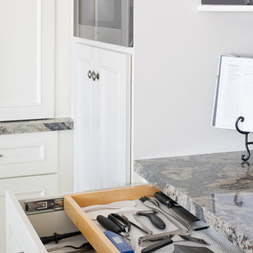
➢ the integration of specific storage units, such as double stacked cutlery drawers, a custom spice pull-out, a Kuerig coffee and tea pod drawer, and custom double stacked utensil drawers
➢ moving the refrigerator to the old oven location - this eliminated the bottle neck as well as created a better relationship to the eating table. It also utilizes the floor space between the pantry, nook, and kitchen
➢ creating a banquet style breakfast nook - this banquette seating not only doubles the amount of seating for large gatherings but it better utilizes the odd space between the kitchen and the previous nook area. It also helps to create a distinct pathway from the mudroom room through the pantry area, kitchen, nook, and living room.
➢ the coffee/breakfast bar area which includes the perfect location for the concealed microwave and toaster oven, convenient storage for the coffee pods and tea accoutrements. Roll-out drawers below also house the smoothie maker, hot water kettle, and a plethora of smoothie-making ingredients such as protein powders, smoothie additives, etc. Furthermore, the drawers below the Keurig house measuring utensil, cutlery, baking supplies and tupperware storage.
➢ incorporating lots of wide drawers and pullouts to accommodate large cookware.
➢ utilizing as much vertical space as possible by building storage to the ceiling which accommodates the family’s abundant amount of serving platters, baking sheets, bakeware, casserole dishes, and additional cutting boards.
The project is enhanced aesthetically by:
➢ new 5-piece Versailles pattern porcelain tile that now seamlessly joins the entire down stairs area together creating a bright, cohesiveness feeling instead of choppy separated spaces - it also adds a coastal feeling
➢ designing a cabinet to conceal the microwave and toaster oven
➢ the coastal influenced light fixtures over the nook table and island
➢ the sandy colors of the Langdon Cambria countertops. The swirling pattern and sparkling quartz pieces remind the homeowner of black-and-tan sandy beaches
➢ the striped banquet seating whose creamy white background and blue-green stripes were the inspiration for the cabinet and wall colors.
➢ All the interior doors were painted black to coordinate with the blacks and grays in the backsplash tile and countertop. This also adds a hint of tailored formality to an otherwise casual space.
➢ the use of WAC's Oculux small aperture LED units for the overhead lighting complimented with Diode LED strips for task lighting under the cabinets and inside the pantry and glass wall cabinets. All of the lighting applications are on separate dimmer switches.
Innovative uses of materials or construction methods by Realty Restoration LLC:
➢ Each 1-1/2” x 3” block of reclaimed end-grain black walnut that makes up the center island chopping block was hand milled and built in the shop. It was designed to look substantial and proportional to the surrounding elements, executed by creating the 4 inch tall top with a solid wood chamfered edge band.
➢ The metal doors on either side of the vent hood were also custom designed for this project and built in the Realty Restoration LLC shop. They are made 1x2, 11-gauge mild steel with ribbed glass. Weighing 60 lbs a piece, heavy duty cabinet hinges were added to support the weight of the door and keep them from sagging.
➢ Under-cabinet receptacles were added along the range wall in order to have a clean, uninterrupted backsplash.
Design obstacles to overcome:
➢ Because we were removing the demising walls between the kitchen and living room, we had to find a way to plumb and vent the new island. We did this by tunneling through the slab (the slab had post tension cables which prevented us from just trenching) to run a new wet vent through a nearby structural wall. We pulled the existing hot and cold lines between upper floor joists and ran them down the structural wall as well and up through a conduit in the tunnel.
➢ Since we were converting from wall overs to a gas range it allowed us to utilize the 220 feed for the wall ovens to provide a new sub panel for all the new kitchen circuits
➢ Due to framing deficiencies inherited from the original build there was a 1-1/2” differential in the floor-to-ceiling height over a 20 foot span; by utilizing the process of cutting and furring coupled with the crown moulding details on the cabinet elevations we were able to mask the problem and provide seamless transitions between the cabinet components.
Evidence of superior craftsmanship:
➢ uniquely designed, one-of-a-kind metal “X” end panels on the large island. The end panels were custom made in the Realty Restoration LLC shop and fitted to the exact dimensions of the island. The welding seams are completely indistinguishable - the posts look like they are cut from a single sheet of metal
➢ square metal posts on the small island were also custom made and designed to compliment and carry through the metal element s throughout the kitchen
➢ the beautiful, oversized end panels on the pantry cabinets which give the breakfast nook a tailored look
➢ integrating a large format 5 piece Versailles tile pattern to seamlessly flow from the existing spaces into the new kitchen space
➢ By constructing a custom cabinet that jogged around a corner we could not remodel (housing the entry way coat closet) we were able to camouflage the adjacent wall offset within the upper and lower cabinets. By designing around the existing jog in the structural walls we accomplished a few things: we were able to find the space to house, and hide, the microwave and toaster oven yet still have a clean cohesive appearance from the kitchen side. Additionally, the owners were able to keep their much needed coat closet and we didn’t have to increase the budget with unnecessary structural work.

 Advance Design Studio, Ltd.
Mike and Anne of Barrington Hills desperately needed to update and renovate both their kid’s hall bath and guest bath, and in their 1980’s home each project presented a different set of unique challenges to overcome. When they set out to identify the right remodeling company to partner with, it was important to find a company that could help them to visualize design solutions for the bath renovations. When they came across Advance Design Studio’s website, they were immediately drawn to the solution-oriented remodeling process and the family friendly company.
They say they chose Advance Design because of the integrated approach of “Common Sense Remodeling”, making the design, project management and construction all happen in one place. When they met with Project Designer Michelle Lecinski, they knew they chose the right company. “Michelle’s excellent work on the initial designs made it easy to proceed with Advance Design Studio,” Mike said.
Like most homeowners anticipating a big renovation project, they had some healthy fears; with two bathrooms being remodeled at the same time they worried about timeframes and staying within budget. With the help of Michelle, and the “Common Sense” guidelines, they were confident that Advance Design would stay true, orchestrating all the moving parts to stay within both the estimated timeline and budget.
The guest bath offered the biggest design challenge. A dormer obstruction made the already cramped shower awkward to access. Mike and Anne also wanted the shower size to be expanded, making it more accommodating. Working with Advance’s construction expert DJ Yurik, Michelle relocated the shower concealing the original dormer and creating a larger, more comfortable and aesthetically pleasing guest shower.
The unsightly and not at all user-friendly closet was removed and replaced with elegant White Maple Dura Supreme cabinetry with much improved function featuring dual tall linen cabinets, a special makeup area and two sinks, providing a dual vanity which was extremely important for better guest use.
The Fossil Brown quartz countertop is in pleasing contrast to the white cabinetry, and coordinates nicely with the mocha porcelain tile gracing the shower for an accent. The decorative glazed turquoise tile backsplash, tile border, and bottle niche adds a taste of marine green to the room, while marble-looking porcelain tile makes guests feel they are staying in a 5-star hotel. Polished nickel Kohler plumbing fixtures were chosen to add a touch of sophistication. This renovated guest bath is comfortable and elegant, and Anne and Mike’s house guests may never want to leave!
“The end result was updated and restyled bathrooms that the client will enjoy and increase the value of their home,” Designer Michelle said.
The children’s hall bath had its own set of challenges. The current placement of the sink was not conducive to the best use of the existing space, nor did it allow for any visual interest, something Advance’s designers always work to achieve even within the tight confines of a small bath. Advance removed the linen closet and used the gain in wall space to create a dramatic focal point on the vanity wall. They also took additional space that wasn’t being used for new Storm Gray Dura Supreme tall built-in linen cabinets, creating functional storage space that the former bath lacked. A customized glass splash panel was created for the bath, and the high ceilings with skylights were accented with a custom-made track lighting fixture featuring industrial pipe and cage materials.
Authentic cement encaustic tile was used wall to wall surrounding the vanity to create a dramatic and interesting back drop for the new elegant and stately furniture-like double sink wall. Hand-made encaustic tile originated in Western Europe beginning in the 1850’s and reminded Mike and Anne of tile they had seen and loved from their travels overseas. Today, encaustic tile has made a re-appearance in today’s modern bath design with its wide array of appealing patterns and artistic use of color.
Oil rubbed bronze Kohler fixtures echo the black accents in the beautiful tile pattern and reflect the matte black of the unique lighting detail. Easy to maintain Blanca Arabescato Quartz countertops add practicality and natural beauty and compliments the warm wood porcelain tile floors. This handsome bath has generated praise from friends and family even before it’s complete unveiling as photos of the space leaked out on social media! It’s not only completely functional to use, but especially pretty to look at.
“Advance Design Studio did a terrific job for us. We really appreciated how easy it was to work with them on a complex project of the complete remodeling of two bathrooms. They very capably handled all the details from design, to project management, to construction. It is a great group of people to work with and we would welcome the opportunity to work with them again anytime,” Mike said.
75