
Search results for "Helps increase" in Home Design Ideas

 Distinctive Landscaping
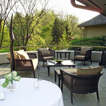
In this project, our clients purchased an existing restaurant fraught with stormwater management issues on the property. Runoff from an adjacent state highway and parking lot regularly flooded the kitchen. Additionally, a man-made pond on the property had become a problematic breeding ground for mosquitos that virtually prohibited outdoor dining during the summer. Both challenges restricted the restaurant from operating at its fullest potential. Our design/build team’s goals were to address the water runoff and mosquito issues using environmentally and financially sustainable practices. Lowering the grades around the building and parking, we were able to direct the runoff into a dry streambed enriched with water-worn cobbles and river stones and planted banks. We addressed the mosquito problem by increasing the pond’s depth, adding an aeration system, and planting the banks with wildflowers. By raising the outdoor dining, guests now overlook the pond and pleasing landscape. Natural breezes at this higher level help alleviate mosquitosl.
 MDRN Remodeling Company
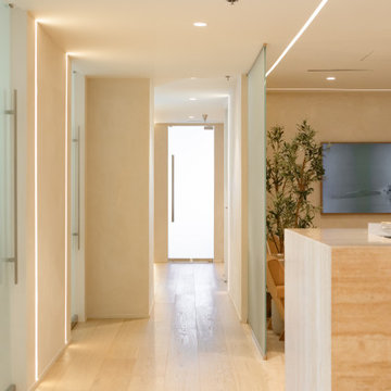
The remodeling process began with a complete demolition of the existing space. This phase was necessary to create a blank canvas from which to develop a space that would better serve patients and healthcare professionals alike. The design team, led by Guil, collaborated closely with the client to envision a modern and inviting environment that would significantly improve the clinic's functionality and atmosphere. By focusing on patient comfort and operational efficiency, the redesign aimed to enhance the overall experience for visitors and staff.
A standout feature of this remodel was the installation of glass doors. These doors not only served a practical purpose but also added a modern touch to the clinic. The use of glass allowed for increased natural light to flow into the space, promoting an open and airy feel. This design choice aligns with current trends in healthcare architecture, where patient comfort is prioritized.
Additionally, the choice of materials played a crucial role in the renovation. The installation of travertine tile throughout the walls and desk created a sense of elegance and durability. Travertine is a natural stone that not only provides a high-end look but also offers practical benefits, such as easy maintenance and longevity. The incorporation of engineered wood floors further enhanced the clinic's design. The warmth of wood can help in mitigating the often sterile feeling of medical environments, thereby promoting a more welcoming atmosphere.
Central to the success of this remodel was the dedication and hard work of the entire team at MDRN Remodeling, along with the collaborative spirit formed with the client.
 Modern Citi Group: Renovations & Remodeling
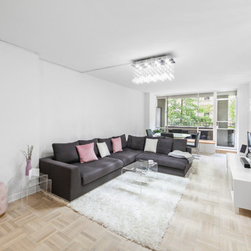
Modern Citi Group helped our clients Chris & Cinzia complete a full renovation of their three-bedroom Upper East Side apartment: master bedroom, guest bedroom, office, living room, hallway, closets, kitchen, and two bathrooms. Clients wanted the apartment to feel like their own with a modern style and fresh look.
The design challenge was to deliver an upscale aesthetic for the entire apartment at a feasible price. Chris & Cinzia wanted to open up their space, make it brighter, and also focus on making sure they have a lot of closet space. The designers worked on several layouts and design visualizations so they had options. Finally, the choice was made and the family felt confident in their decision.
Once the permits were filed and approved, the full apartment renovation began. During the building phase, the construction team renovated two bathrooms, completely reconfigured closets in all rooms, and made layout changes. They meticulously placed the exquisite and unique, Calacatta Classique quartz to serve as a floating countertop with a waterfall on both sides, and a backsplash slab, to give the kitchen a luxurious look. In order to maximize the space, the kitchen was opened up towards the dining area for an open concept that is sure to impress. In a matter of twelve weeks, Chris & Cinzia had a new three-bedroom home that fits their style, and vision and increased their home value for future resale.
Find the right local pro for your project
 A Designed Space
When our clients made the move from East to West coast, they wanted to bring parts of their past along with them. Blending New York style with the relaxed, coastal vibe of La Jolla’s Wind & Sea community offered a unique design challenge and opportunity.
From the outset, the bathrooms and kitchen were identified as the primary focus of this renovation. The aim was to weave the couple's distinctive style into the design while integrating modern touches.
As we explored these priorities, we found that increasing the square footage would not only expand their living space but also make room for the corner fireplace they had been dreaming of. This addition would enhance both the functionality and the ambiance of the home, aligning perfectly with their vision for a more spacious and cozy living environment.
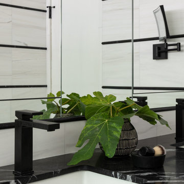
The design approach embraced a contemporary aesthetic through simple black and white color blocking, complemented by unique fixtures and fittings. To create a balanced and inviting atmosphere, the design incorporated natural light by way of skylights and larger windows, which helped highlight the deep wood grain cabinetry. Whimsical art and furnishings further personalized the space, infusing it with character and warmth.
 A Designed Space
When our clients made the move from East to West coast, they wanted to bring parts of their past along with them. Blending New York style with the relaxed, coastal vibe of La Jolla’s Wind & Sea community offered a unique design challenge and opportunity.
From the outset, the bathrooms and kitchen were identified as the primary focus of this renovation. The aim was to weave the couple's distinctive style into the design while integrating modern touches.
As we explored these priorities, we found that increasing the square footage would not only expand their living space but also make room for the corner fireplace they had been dreaming of. This addition would enhance both the functionality and the ambiance of the home, aligning perfectly with their vision for a more spacious and cozy living environment.
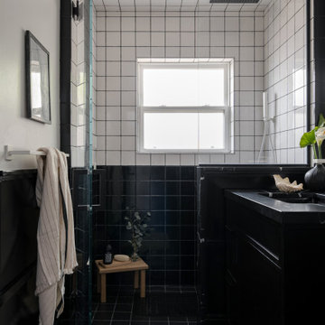
The design approach embraced a contemporary aesthetic through simple black and white color blocking, complemented by unique fixtures and fittings. To create a balanced and inviting atmosphere, the design incorporated natural light by way of skylights and larger windows, which helped highlight the deep wood grain cabinetry. Whimsical art and furnishings further personalized the space, infusing it with character and warmth.

 Southern Landscape
Xeric landscape designed and built by Southern Landscape. This Austin homeowner reduced their turf area by over 17,000 square feet, reducing water consumption and maintenance. The remaining turf areas were required for the septic leach field. Limestone retaining walls with leuders caps control erosion. The plant palette contains lantana, plumbago, various grasses, and yuccas, all chosen for their specific water usage appropriate to the area. Landscape lighting was also added to highlight the beauty of this large xeriscape.

 My House Design|Build|Team
Our client had a busy life and his Burnaby home was usually his refuge — a place to relax and unwind after a busy day. But, his home was no longer helping him unwind. He called the My House team to do a minimalist home renovation, to transform his home from busy to one free from distraction and clutter.
We started by changing the “vibe” in the kitchen, the homeowner’s favourite place in the home. We removed the kitchen walls, and used a maple-clad beam to match the new maple live-edge bar top. Opening up the kitchen instantly improved sight lines and traffic flow between the kitchen and adjacent rooms. This new layout also allowed us to create much needed additional counter top space and storage in the kitchen.
The kitchen cabinets were replaced with flat panel, square-edge cabinets and the uppers lift-open. To create an elegant minimalist feel, the full height quartz back splash looks almost like concrete. We also removed the kitchen nook and replaced it with a live-edge counter top, making it a haven to enjoy a morning cup of coffee.
Throughout the home, white cabinets help ground and soothe, while the maple accents create warmth without adding unwanted colour or texture.
Minimalist Home Renovation: Bathrooms Too
We gutted all three bathrooms in this minimalist home renovation and started from scratch. As part of the bathroom renovations, we added new energy-efficient windows.
We reconfigured the master bedroom to allow for a full master en suite including a freestanding tub, a usable bench seat for the shower, a wall hung compact toilet, and a minimalist pedestal sink. The new bathtub also has a handheld shower to increase functionality and has a clever built-in ledge to hold a beverage.
If your home design and layout are no longer meeting your needs, or you too would like a minimalist home renovation like this home in Burnaby, call the My House Design Build team today and we can help you fall in love with your home again.

 My House Design|Build|Team
Our client had a busy life and his Burnaby home was usually his refuge — a place to relax and unwind after a busy day. But, his home was no longer helping him unwind. He called the My House team to do a minimalist home renovation, to transform his home from busy to one free from distraction and clutter.
We started by changing the “vibe” in the kitchen, the homeowner’s favourite place in the home. We removed the kitchen walls, and used a maple-clad beam to match the new maple live-edge bar top. Opening up the kitchen instantly improved sight lines and traffic flow between the kitchen and adjacent rooms. This new layout also allowed us to create much needed additional counter top space and storage in the kitchen.
The kitchen cabinets were replaced with flat panel, square-edge cabinets and the uppers lift-open. To create an elegant minimalist feel, the full height quartz back splash looks almost like concrete. We also removed the kitchen nook and replaced it with a live-edge counter top, making it a haven to enjoy a morning cup of coffee.
Throughout the home, white cabinets help ground and soothe, while the maple accents create warmth without adding unwanted colour or texture.
Minimalist Home Renovation: Bathrooms Too
We gutted all three bathrooms in this minimalist home renovation and started from scratch. As part of the bathroom renovations, we added new energy-efficient windows.
We reconfigured the master bedroom to allow for a full master en suite including a freestanding tub, a usable bench seat for the shower, a wall hung compact toilet, and a minimalist pedestal sink. The new bathtub also has a handheld shower to increase functionality and has a clever built-in ledge to hold a beverage.
If your home design and layout are no longer meeting your needs, or you too would like a minimalist home renovation like this home in Burnaby, call the My House Design Build team today and we can help you fall in love with your home again.
 Pennsylvania Landscape & Nursery Association
Terren Landscapes http://www.terrenlandscapes.com
2014 PLNA Awards for Landscape Excellence Winner
Category: Residential $120,000 & Over
Award Level: Silver
Project Description:
The goal of the Vaccaro project was to change the existing non-functional landscape into multiple entertainment spaces while working within the tight confines of impervious coverage requirements. The project consisted of removing, redesigning and re-installing existing hardscaping, front and rear, reconfiguring the driveway to accommodate more parking, handling storm water on-site, and increasing the aesthetic appeal of the property.
The client was remodeling the home in the theme of a rustic French country estate and in our design we endeavored to adhere to this chosen theme. The existing driveway was a circular driveway located off of the main axis of the front door. Reconfiguring the driveway improved vehicular flow, provided additional parking, and reduced impervious space. By consolidating the parking to the side of the house where the garage is located, we maintained the French theme in encouraging arriving cars to pull up closer to the home's entry. We also worked with the architect in the renovation of the home to position the garage windows so that they were placed in the voids of the arbor we constructed over the parking spaces by the garage. The rustic arbor creates a vertical element and delineates the pedestrian walkway from vehicular traffic. The main walkway spans the front of the home so that it extends down to the parking area to guide visitors to the main entrance.
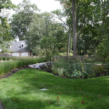
To handle the storm water generated by the driveway, we installed a rain garden, which was placed in the front right side yard. The rain garden area was excavated, the soil in the planting areas was heavily amended with compost, sand, and diatomaceous earth, and mostly native plant material was installed to help absorb excess water. In the bottom-most area of the basin filter fabric was laid to help prevent migration of the stone into the soil and decorative stone was spread to slow the flow of water. Storm water is held until it successfully infiltrates the soil, and the plant material provides a natural habitat that supports butterflies, birds, and beneficial insects.
The existing front patio was removed and the size increased to make the space more functional. To increase function and circulation we worked with the architect to create a dining room that extends to the out-of-doors by adding French doors to the front of the home, which open to the new gravel front terrace. The homeowner desired a planting scheme that would create delineation between the front yard and the gravel terrace without blocking the morning sunlight. To achieve this we chose standardized Physocarpus 'Diablo' to compliment the warm cream-colored stucco of the home and provide structure to the patio space.
In the rear of the property we removed the existing brick patio and installed a dry-laid quartzite patio that nicely compliments the cream-colored stucco. We redesigned the rear patio space using 45 degree angles to represent the old French design theory of bisecting spaces with diagonals. Utilizing this design theory created more interesting patio spaces and allowed us to soften the sharp angles by planting the negative spaces between the house and patio. Seat walls were also designed and installed to create more seating without sacrificing impervious space.
Per the homeowner's wishes, we also designed a separate area in the rear of the yard for a natural boulder fire pit, which is located along the axis of the kitchen window. Half of the ring utilizes boulders for seating for a small gathering while the other half
allowed the homeowner's addition of colorful Adirondack chairs to finish the fire circle.
Incorporating the French theme throughout, we also designed and installed a small vegetable garden in the side yard so the homeowner could grow her own vegetables and herbs.
Photo Credit:
Terren Landscapes

 Don Foote Contracting
Kids 3/4 bath with shower, single vanity and hand made hand painted ceramic sink. Floor is 6" marble set on the diagonal and as end lot selection afforded a great price point. Notice how the sconce (there are 2 of them) are cut right into the mirror. Helps give a small room the illusion of 'bigness'.

 Paul R. Maina Builders
Inspiration for a transitional screened-in porch remodel in New York with decking and a roof extension

 R-Squared Design
A narrow passageway to the master bathroom was originally intended to be an "open closet space"... we did not approve of this inellegant idea. Instead, we helped our client achieve a life-long dream: a shoe wall! Left to right, top to bottom and back-painted in a color both flattering to her complexion and her fabulous footwear. Custom cabinetry was installed directly opposite for various accessories and "unmentionables" and to create a casual dressing table.
Photo: Rick Rifle

 North Shore Kitchen & Bath
With this kitchen needing an update, we took the opportunity to move things around slightly to greatly improve the flow of the kitchen. By moving the refrigerator to the dining room side, it increased the flow coming into the kitchen from the entryway significantly. We also moved the sink to be centered on the window, allowing us a creative storage solution at the end of the dishwasher for cookie sheets, trays or cutting boards. We also removed the very large soffits (nearly 2' high) and were able to gain additional storage by taking the cabinetry all the way to the ceiling. By adding heated floors in this kitchen, it helps make this a nice cozy space to cook in. Using white cabinetry and adding in extra can lighting this space now looks and feel larger, brighter and more open. The grey textured subway tile and dark gunmetal hardware adds a bit of fun to the space, along with some contrast against the white cabinetry and countertops.

Sponsored
Sunbury, OH

J.Holderby - Renovations
Franklin County's Leading General Contractors - 2X Best of Houzz!

 Alair Homes Plano
The bathroom was completely transformed! We demoed the flooring, cabinets, sheetrock, countertops and soffits, as well as structural walls. There were two doors into the bathroom from the master bedroom that were both removed and one new one installed. New walls were framed out for the closet, tub, shower and toilet room. The sink was moved from its original location and located on the adjacent wall. Two small closets were also removed to increase the square footage of this bathroom. Pocket doors were added to the water closet, as well as the closet. The seated vanity was a must, so that was added into the new layout.
The original tub that the homeowners felt was too large was replaced with a freestanding soaker tub. The once dark corner shower was replaced with a new low curb entry shower surrounded with frameless glass and brushed nickel hardware. The shower floor tile is 1"x4" Eleganza loft Grigio, surrounded by 4"x16" Subway tile in a glossy cotton. A nice mosaic Frozen blend glass Allegro accent tile helps breaks up the white of this new bright bathroom. The homeowners are so pleased with their new bathroom. Design & Construction by Hatfield Builders & Remodelers | Photography by Versatile Imaging

 Designs by BSB
The clients believed the peninsula footprint was required due to the unique entry points from the hallway leading to the dining room and the foyer. The new island increases storage, counters and a more pleasant flow of traffic from all directions.
The biggest challenge was trying to make the structural beam that ran perpendicular to the space work in a new design; it was off center and difficult to balance the cabinetry and functional spaces to work with it. In the end it was decided to increase the budget and invest in moving the header in the ceiling to achieve the best design, esthetically and funcationlly.
Specific storage designed to meet the clients requests include:
- pocket doors at counter tops for everyday appliances
- deep drawers for pots, pans and Tupperware
- island includes designated zone for baking supplies
- tall and shallow pantry/food storage for easy access near island
- pull out spice near cooking
- tray dividers for assorted baking pans/sheets, cutting boards and numerous other serving trays
- cutlery and knife inserts and built in trash/recycle bins to keep things organized and convenient to use, out of sight
- custom design hutch to hold various, yet special dishes and silverware
Elements of design chosen to meet the clients wishes include:
- painted cabinetry to lighten up the room that lacks windows and give relief/contrast to the expansive wood floors
- monochromatic colors throughout give peaceful yet elegant atmosphere
o stained island provides interest and warmth with wood, but still unique in having a different stain than the wood floors – this is repeated in the tile mosaic backsplash behind the rangetop
- punch of fun color used on hutch for a unique, furniture feel
- carefully chosen detailed embellishments like the tile mosaic, valance toe boards, furniture base board around island, and island pendants are traditional details to not only the architecture of the home, but also the client’s furniture and décor.
- Paneled refrigerator minimizes the large appliance, help keeping an elegant feel
Superior cooking equipment includes a combi-steam oven, convection wall ovens paired with a built-in refrigerator with interior air filtration to better preserve fresh foods.
Photography by Gregg Willett
 My House Design|Build|Team
Our client had a busy life and his Burnaby home was usually his refuge — a place to relax and unwind after a busy day. But, his home was no longer helping him unwind. He called the My House team to do a minimalist home renovation, to transform his home from busy to one free from distraction and clutter.
We started by changing the “vibe” in the kitchen, the homeowner’s favourite place in the home. We removed the kitchen walls, and used a maple-clad beam to match the new maple live-edge bar top. Opening up the kitchen instantly improved sight lines and traffic flow between the kitchen and adjacent rooms. This new layout also allowed us to create much needed additional counter top space and storage in the kitchen.
The kitchen cabinets were replaced with flat panel, square-edge cabinets and the uppers lift-open. To create an elegant minimalist feel, the full height quartz back splash looks almost like concrete. We also removed the kitchen nook and replaced it with a live-edge counter top, making it a haven to enjoy a morning cup of coffee.
Throughout the home, white cabinets help ground and soothe, while the maple accents create warmth without adding unwanted colour or texture.
Minimalist Home Renovation: Bathrooms Too
We gutted all three bathrooms in this minimalist home renovation and started from scratch. As part of the bathroom renovations, we added new energy-efficient windows.
We reconfigured the master bedroom to allow for a full master en suite including a freestanding tub, a usable bench seat for the shower, a wall hung compact toilet, and a minimalist pedestal sink. The new bathtub also has a handheld shower to increase functionality and has a clever built-in ledge to hold a beverage.
If your home design and layout are no longer meeting your needs, or you too would like a minimalist home renovation like this home in Burnaby, call the My House Design Build team today and we can help you fall in love with your home again.
 OakWood Designers & Builders
Even if your home's bathroom is small, it doesn't have to look small.
This client was looking to make the most of their bathroom space, so they turned to OakWood to work our design & build magic.
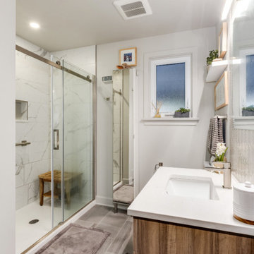
The first thing that we did was increase the size of the bathroom by pushing the shower into the back bedroom, allowing for a few extra inches of space.
The use of a floating vanity was another design choice that we made to save on space. Since floating vanities are raised from the floor, you’ll be able to see light bouncing off the bathroom floor with this option. This sense of openness (and light transmission) helps give the illusion of more space.
Another design choice that was made to give the impression of a larger space was the use of a glass shower door. One of the main reasons that homeowners decide on clear glass shower doors is that they want to have an open and modern design. With clear glass, your whole bathroom will look larger, no matter how small the space.
To top it off, we added safety measures to the shower, including a grab bar and a low-profile shower base to ensure that this bathroom meets their needs for today – and for the future!
Sponsored
Delaware, OH

Buckeye Basements, Inc.
Central Ohio's Basement Finishing ExpertsBest Of Houzz '13-'21
 My House Design|Build|Team
Our client had a busy life and his Burnaby home was usually his refuge — a place to relax and unwind after a busy day. But, his home was no longer helping him unwind. He called the My House team to do a minimalist home renovation, to transform his home from busy to one free from distraction and clutter.
We started by changing the “vibe” in the kitchen, the homeowner’s favourite place in the home. We removed the kitchen walls, and used a maple-clad beam to match the new maple live-edge bar top. Opening up the kitchen instantly improved sight lines and traffic flow between the kitchen and adjacent rooms. This new layout also allowed us to create much needed additional counter top space and storage in the kitchen.
The kitchen cabinets were replaced with flat panel, square-edge cabinets and the uppers lift-open. To create an elegant minimalist feel, the full height quartz back splash looks almost like concrete. We also removed the kitchen nook and replaced it with a live-edge counter top, making it a haven to enjoy a morning cup of coffee.
Throughout the home, white cabinets help ground and soothe, while the maple accents create warmth without adding unwanted colour or texture.
Minimalist Home Renovation: Bathrooms Too
We gutted all three bathrooms in this minimalist home renovation and started from scratch. As part of the bathroom renovations, we added new energy-efficient windows.
We reconfigured the master bedroom to allow for a full master en suite including a freestanding tub, a usable bench seat for the shower, a wall hung compact toilet, and a minimalist pedestal sink. The new bathtub also has a handheld shower to increase functionality and has a clever built-in ledge to hold a beverage.
If your home design and layout are no longer meeting your needs, or you too would like a minimalist home renovation like this home in Burnaby, call the My House Design Build team today and we can help you fall in love with your home again.


 Dream Kitchens
Imagine a lazy morning in this casually elegant kitchen, sipping your freshly brewed coffee as natural light pours through floor to ceiling windows. Then imagine being in this kitchen sipping your morning coffee and gazing out at the beautiful rolling landscape of one of New England’s prestigious golf clubs. Imagine . . .
The owner of this beautiful contemporary kitchen with its idyllic setting imagined ! And her kitchen designer captured her imagination and brought this inspired space to life in both style and function.
Columns of stainless steel are balanced by columns with the warmth of birch wood with just a hint of stain. On an adjacent wall one more wood column rises from floor to ceiling. A strong horizontal line of cabinetry seemingly intersects the vertical columns. While contemporary in design, the cabinetry in this kitchen found its beginnings with the Shakers and the designers of the Craftsman period. Increasing the size of the framing on the doors, accenting the cabinet shapes with square-edged trim and blocks of wood at varying depths, thinly slicing and randomly sizing the natural stone on the accent wall, and choosing oversized stainless steel handles definitively bring this kitchen forward in time. Recycled glass countertops in a soft, quiet color continue to help this kitchen live so harmoniously with its surroundings.
As the day unfolds and the lazy morning turns into ambitious meal preparation, it is clear that this kitchen is a chef’s delight. The stainless steel columns incorporate double ovens, a microwave and a steam oven. Two wood columns house a refrigerator and a freezer. The separate wood column reveals pantry storage, and a TV is hidden behind a lift-up door.
On the island with its clean, rectangular shape two dishwashers flank the sink. Imagine ! how much more pleasant the task of clean-up is when you overlook the family living space and vista beyond.
In the cook center, a complement of drawers provides excellent storage for pots and pans, utensils, spices and herbs around the 5-burner cooktop. A powerful vent with a rear exhaust maintains the horizontal design of the space. And the freshly-brewed coffee in the morning ? It comes from a built-in coffee maker that’s just around the corner from the refrigerator. Along with a wine refrigerator, it creates a beverage and serving center between the kitchen and the dining room.
The homeowner envisioned a kitchen that is as beautiful as its surroundings. Her kitchen designer wanted her kitchen to be as functional as it is beautiful. Both agree that this kitchen lives up to their expectations!
74