
Search results for "Heras short term" in Home Design Ideas
 Klopf Architecture
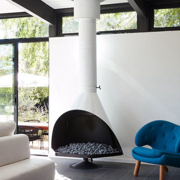
The Roger Lee designed house from 1962 was purchased by the current homeowners in almost original condition, as the previous owners elected to defer most maintenance projects over the years. The clients were able to see beyond the dated materials and finishes, single-paned glass and uninsulated walls and they approached Klopf Architecture to help them expand and update the entire home, one the family could settle into and enjoy for years to come. It was important that the new designs were aligned with Lee's original intent not only because of the client's appreciation for mid-century modern architecture, but also because the house was deemed historical. The Stanford Real Estate Office requires a stringent design review which safeguards the integrity of the community, which Klopf Architecture was happy to oblige going into their updated designs.
As with many original mid-century modern homes, the house was scaled to the 1960s lifestyle where rooms were smaller and openings to views were limited and tightly framed. The original conditions defined the direction the family of four would take in updating the house and making it comfortable for their modern lifestyle. Klopf designed a full gut remodel and major addition to bring the house into the 21st century and provide the living area needed for the client's family. The newly expanded house added just about 1,100 sf to create an airy, comfortable and family friendly house, taking full advantage of the beautiful southwestern views that extend out to the hills beyond. The enclosed garage created an additional 240 sf of covered space for long-term storage.
A cracked swimming pool created an eyesore taking up a majority of the backyard landscape, so it was one of the first elements to go during the transformation. Working with Outer Space Landscape Architects, the family asked for a mix of relaxing outdoor patio spaces that eventually blend into the native landscaping, extending their views outward toward the natural greenery of the trees beyond their property. Filling in the old pool was a smart way to expand the living spaces outward. The orientation of the house was designed to enjoy the views, but the original architecture provided the first homeowners with mere glimpses of the landscape outside.
Klopf was able to broaden those views, continuing and extending on the original architecture to take full advantage of the unobstructed natural views across the rear facade of the house. Small horizontal openings in the primary bedroom and office were replaced with much taller windows that now follow the angled roof line upward, extending across almost all of the facade. We worked with Western Windows, whose designs included an oblique-shaped, operable casement that allowed our design to rise with the slope. A new corner office added to the primary suite, offers a bright and functional work-from-home solution that looks out at the distant views and added natural light from the expanded window configuration that now wraps around the corner.
The existing lower level was designed by Lee as a utilitarian space, serving as a wet pool room with a drain in the center of the floor, bathroom, laundry and storage areas. Without the need for a pool room, Klopf was able to convert the area into a much more comfortable and functional living space with a new family room and guest suite. The new spaces enjoy easy access to a new outdoor patio through floor to ceiling, full-width glass sliders.
Continuing along the rear facade, a previously exposed deck extending from the living room and hallway provided access to the backyard through a single set of stairs leading toward the side of the house which made sense when the pool was in place. The new deck was re-envisioned as an extension of the main living room and now serves as a second outdoor living room. A new slatted pergola above provides the homeowners welcome relief from the hot afternoon sun. A second set of stairs now creates a better connection to the redesigned lower level. Klopf was able to reconfigure the spaces, extending the living room outward toward the views, where the family now claims it as the heart of the home, spending a large majority of their time outdoors.
Back inside, the original wood-burning Malm fireplace was beautifully restored and a gas burner installed to comply with California's strict air standards. It now rests in front of a wall of Heath accent tiles where a dated red brick wall used to stand. A new taller window brings more light and views into the refreshed interior living room. The original glass doors opposite the fireplace were replaced by larger sliders that when fully opened, create a seamless transition to the new outdoor living area so the two spaces feel like one connected space. The original utilitarian kitchen was needlessly tucked into the far back corner and closed-off, out of sight from the living room, so the clients asked Klopf to open it up and expand the kitchen forward so it felt more connected. Today the much larger kitchen is connected to the living area where a short wall with a cutout offers a visual glimpse into the kitchen and a handy pass-through counter for serving guests. A new breakfast nook was also added to create another spot where the family can gather for casual meals. Just outside, a new built-in outdoor grill and prep area extends the kitchen outside and connects to a new outdoor dining spot nestled amongst the trees, taking advantage of the views out back.
Klopf was able to expand the other two bedrooms, add a new laundry room and half-bath and convert the carport to an enclosed garage to add more storage areas which was lost when the pool house was converted to the family and guest room.
To maintain a historical connection to the original designs, the exterior siding was repeated on all exterior walls, a full-height stained glass window at the front entryway restored, and an interior slatted screen element repeated outside at the exterior entry courtyard and over the new outdoor living room to create a shade trellis. The new house stands proudly and shines against it's new landscaping features, while respecting and expanding on the original intent of Roger Lee's designs epitomizing the comforts of indoor-outdoor living in Northern California.
Completion year: 2020
Klopf Architecture project team: John Klopf, Klara Kevane, Noel Andrade
Contractor: ORB Construction, Brendan O'Reilly
Structural engineer: Sezen and Moon
Landscape architect: Outer space
Furnishings and decoration: Urbanism Designs
Photographer: Mariko Reed
 Jim Deen/Kitchen Kraft
John Evans
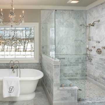
Inspiration for a timeless white tile and marble tile alcove shower remodel in Columbus with gray walls
Inspiration for a timeless white tile and marble tile alcove shower remodel in Columbus with gray walls

 Advance Design Studio, Ltd.
Jennifer and Dan have lived in their Deer Park Illinois home for 15 years, slowly making minor fixes like painting and decorating; but they had a new plan for their kitchen the entire time. An awkwardly placed garage door, and an island cooktop with a terrible downdraft made a full-scale kitchen remodel an absolute must. Jennifer had many ideas in mind and wanted to work with a company that could provide high-end work, while partnering with a designer that would tailor the kitchen to her ideas.
She was intrigued by the phrase “Common Sense Remodeling” in Advance Design’s feature she discovered while perusing an issue of the community’s Quintessential Barrington Magazine. Doing further research on the company’s website, as she looked through project profiles and read about Advance Design’s “Common Sense Remodeling” philosophy, she promptly scheduled an appointment to see if the people and ideas she read about were truly who they said they were. The more she read, the more she knew that the “Common Sense” approach to remodeling they described was exactly the type of company she was looking for.
The partnership was sealed after an initial consultation with Owner Todd Jurs and Project Designer Michelle Lecinski. They displayed a combination of friendliness, professionalism and respect that was unmatched by any of the other companies Jennifer talked to. She knew that with Advance Design, she would be able to retain the vision that she had in mind with high-quality craftsmanship.
“I reached out to Advance Design because of the ‘Common Sense Remodeling’ tagline,” Jennifer said. “That’s what lingered for me”. “Advance Design was the most respectful- of the house and of my design ideas, and the most professional of the handful of companies that looked at my project”.
Soon after the meeting Jennifer began working with Michelle on the project design. They quickly developed chemistry. Jennifer loved how Michelle researched and located every detail that Jennifer wanted for the kitchen. Between the two of them, every concept and idea was worked through and perfected. “Jennifer had definite ideas about what she wanted the new kitchen to look like, she just didn’t know how to bring it all together. We worked together really well to make her ideas into the practical reality necessary for a well-functioning kitchen, with the look and feel that she had envisioned”, says Michelle.
“Michelle was wonderful in using the CAD system she would show me new drawings every time we changed the layout while working through the design,” Jennifer said. “She was a really wonderful partner in execution, she made sure everything happened quickly and easily.”
The finished design drew out elements of Jennifer’s style and personality. The pair call the look “sophisticated farmhouse” to describe the kitchen renovation to family and friends. The result was a beautifully crafted, authentic-feeling space that satisfied Jennifer’s dreams 15 years in the making. The whole project consisted of a kitchen remodel, mudroom upgrade with powder room, and garage entry relocation. “The projects I personally like the best, are the ones that put the client’s dreams on display,” Project Designer Michelle said. “And this is one of those projects.”
The main focal point of the kitchen is custom zinc and brass ventilation hood with a vintage sheen, which was hand made to order by a small company in Indiana named Vogler Metalworking. “It’s like sculpture, a true work of art”, says Jennifer. Your eye is immediately drawn towards this elegant yet practical hood that eliminated the home’s downdraft problem and added a striking conversation piece at the same time. The carpenters had to use special gloves when transporting and installing it, so they didn’t smudge it with fingerprints. The beautiful hood centers proudly over the stunning black enamel and brass LaCornue Range. “I had a friend who had a LaCornue range and after learning how easy it was to cook perfect meals, I was convinced I wanted to have one”, says Jennifer. This unique, breathtaking combination anchors the entire kitchen and is apparent immediately as you walk into the great room the surrounds the space.
DuraSupreme Crestwood cabinets with a Kendall Panel add function and sophistication. A custom gray paint color paired with a storm blue was developed so that the new kitchen looked like it belonged to the existing space. Unlacquered brass faucets and hardware were important to Jennifer because she wanted the living finishes to age over time. Remarkable brass diamond mesh cabinet door inserts imported from the UK continue to add this one-of-a-kind kitchen renovation; giving it a “you won’t see this everywhere” quality. The use of old railcar flooring for the coffee bar countertop and reclaimed oak for the open shelving gives an authenticity to the space uncommon in kitchens today.
Jennifer and Michelle fell in love with the Limestone Grey Stone while they were investigating unique island countertop ideas. They liked the fact that the limestone as a living finish will age and change over time. Calcutta Miel Quartz countertops made for an excellent pairing around the perimeter, as it’s durable and perfect for cooking preparations. A textured white subway tile backsplash that runs to the ceiling keeps your eye moving towards the open shelving, and to the main focal point of the stunning range hood combination.
“The kitchen functions beautifully, and it’s gorgeous,” beams Jennifer as she gestures with both hands while smiling ear to ear. “The most important thing was I wanted a kitchen that had a wonderful flow, cooked beautiful meals and was a great gathering place for family and friends, and this space does that perfectly! Beauty wise, it turned out exactly how I had envisioned. I felt the function part was the hardest part, and that was nailed”!
Relocating the garage entry to the new mudroom was a huge priority and has finally separated the family’s arriving home functions from their kitchen. Now coats and shoes and bags have their own area for dropping once members arrive home. Matching gray DuraSupreme cabinetry helped create gorgeous, purposeful lockers for the family. A reclaimed vintage sink and custom wall paper were added to the tiny powder room to beautify the once previously only functional space. Advance Design was even able to create a custom space for their dog to sleep while the family is away.
“It was unbelievable that a project of this size was completed in such a short time, and I think that’s because of the large amount of planning and preparation that went into it,” Jennifer marveled, “When we started, we were ready, and everything was prepared”.
When it came to execution, Project Manager Justin Davis and his crew were quick, accessible, and organized. Projects like this kitchen are typically completed in as little as 8-10 weeks. Jennifer’s kitchen however despite the relocation of some challenging HVAC in a soffit and moving of an exterior door was completed remarkably fast in part because the team was working with an existing tile floor that ran throughout the first floor that the client really loved.
“You get to know these people really well because they’re living in your house while you’re living in your house. They were so fast and really good, it didn’t take as long as even planned” reported Jennifer. “I would text Justin and he always responded almost immediately. I got to know all the guys who were working in our house and they were all wonderful people”.
Details in a customized kitchen like this one require skill and care from the people who install it. “All the guys on the job were skilled at what the did. I wanted small details like little feet to look like furniture, that is where their carpentry skill came in to make these all perfect”, said Jennifer. “The tile guys were wonderful. They even let me determine how I wanted the texture with the grout to appear for a salt and pepper look; now that is a very skilled trade person making it custom”.
In Jennifer’s interview, she continued to reference Advance Design’s “Common Sense Remodeling”, so I took a minute to ask her exactly what that phrase meant to her and how it played out in her experience with her project and the Advance Design team. Here is what she said: “I was intrigued about Common Sense Remodeling and in my head that there would be clear costs and prices, great communication between the design team, the execution team and me”, said Jennifer. They did deliver on that, it was so clear about the cost breakdown, what I could expect from everyone who came to my house, and everything that we had ordered. That to me is the Common Sense”!
It’s great to see a client take literally our assertion that a well-planned remodeling project is simply “Common Sense”! She anticipated each step of the way would be clear, concise, and predictable, all the while protecting the outcome due to the careful upfront planning. “Advance Design delivered on their ‘Common Sense Remodeling’ promise,” Jennifer said. “From the design team, to the execution team - everything was straight forward like I imagined. The project turned out exactly how I envisioned, I enjoyed this process and absolutely would recommend Advance Design Studio to anyone.”
Find the right local pro for your project
 Mission Accomplished Interior Design & Staging
Short term rental
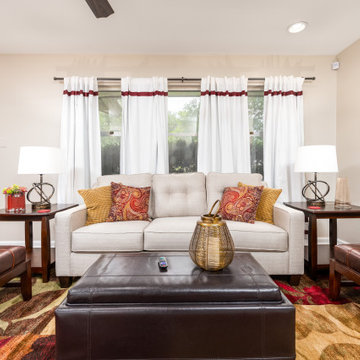
Example of a mid-sized classic enclosed vinyl floor and brown floor living room design in New Orleans with beige walls
Example of a mid-sized classic enclosed vinyl floor and brown floor living room design in New Orleans with beige walls
 Design MACS
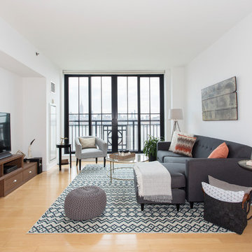
We designed this apartment for a couple who had just moved into a Hoboken rental for a one year term. Our goal was to create a bright and airy space that was inviting quickly and on a budget. The turnaround time from our initial meeting to move in was short, but we helped to make them immediately feel at home.
Photos: WalkThisHouse.com
 Housetrends Magazine
Since moving into her Dublin home two and a half years ago, Nancy Sanford has been peeling off the decades—quite literally. Built in the 1980s, the home was “very well-maintained, but very little had been done to it” in terms of updating the finishes or style, Sanford says. Plush white carpet ran from wall-to-wall-to-wall, almond-colored laminate coated the kitchen cabinets and wallpaper ran rampant—even covering some ceilings.
Despite her efforts, Sanford knew it was going to take more than cosmetic editing to shake the ‘80s and make the home her own. Although she lives in the traditional-leaning Muirfield community, Sanford adores a minimalist, contemporary style—and admits to devouring design magazines “ad nauseam.”
To implement her thoroughly modern vision, Sanford turned to Brigid Norton, an interior designer and family friend, and Kristi Youles, a kitchen designer with The JAE Company. Working together, the trio created a carefully considered contemporary design that’s easy on the eyes, and the body.
In addition to improving the flow of the kitchen—by removing a V-shaped peninsula that angled out into the room—and adding appliances like a stainless steel refrigerator, Sanford’s short list of must-haves included clean, uncluttered lines and no wall cabinets over the countertops. “I’ve found as I’ve aged, I’ve gotten shorter and just don’t use the upper cabinets,” Sanford explains.
Easy-access, smooth-slide drawers with clean slab fronts were the answer—resulting in strong visual lines, an open, airy feel and enhanced ergonomics. Starting with a “needs assessment,” Youles and Norton designed the space quite literally around Nancy. By looking at factors such as her height and which items she uses most frequently, they were able to determine the optimum placement for everything from canned goods in the pantry to cutlery, pans and plates in the customized drawers, all of which helped to achieve the ultimate kitchen organization.
But there’s more to the kitchen cabinets smooth façade than clean-lined storage. Walnut drawer fronts—found on the oven and the base of the island—are book-matched, allowing the grain to continue from drawer to drawer. And even in spaces where drawers weren’t feasible, beneath the sink and in a desk area, the designers continued the look with cabinet doors crafted to resemble drawers.
The visual continuity of these lines might not be as impactful if it weren’t for the careful selection of contrasting finishes. The designers filled the space with pure, glossy white—using a specific type of quartz, White Cliff by Cambria, to accent the bold rectangular design of the island. Then, to break up the expanse of accompanying white painted drawers, walnut was selected to bring the contrasting warmth and grain of wood without red undertones. It is commonly found in modern furniture design, as well as current productions of mid-century designs like the iconic Eames Lounge Chair from Herman Miller, Youles says.
 Wildheart Design
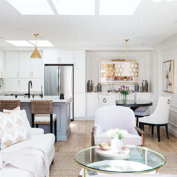
Complete remodel with low-maintenance materials.
Example of a small transitional open concept vinyl floor and wainscoting living room design in Los Angeles with white walls
Example of a small transitional open concept vinyl floor and wainscoting living room design in Los Angeles with white walls

 Landmark Custom Builder & Remodeling, LLC
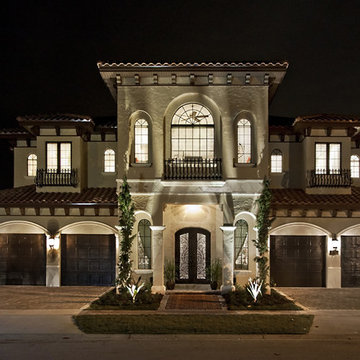
Huge mediterranean beige two-story stucco exterior home idea in Orlando with a hip roof
 Shelter Solutions LLC - ADU Specialist
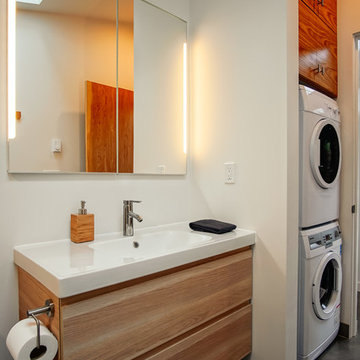
Contemporary detached ADU. One bedroom, one bath, for visiting parents and short term rentals
Carlos Rafael Photography
Home design - contemporary home design idea in Portland
Home design - contemporary home design idea in Portland
 Marilynn Taylor | Vacation Rental Expert
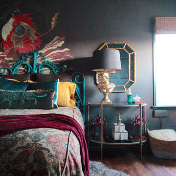
This is my vacation rental by LAX. I converted my home office in to a 2nd guest bedroom by adding a full size bed. TayloredRentals.com
This was originally designed for the Spring 2018 One Room Challenge. The wallpaper is from Murals Wallpaper, the headboard is from World Market, the trow pillows are custom and from Target. Everything else is vintage.
 Mission Accomplished Interior Design & Staging
Short term rental
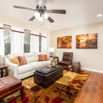
Mid-sized elegant enclosed vinyl floor and brown floor living room photo in New Orleans with beige walls
Mid-sized elegant enclosed vinyl floor and brown floor living room photo in New Orleans with beige walls

 Paradise Tiny Homes LLC
This tropical modern coastal Tiny Home is built on a trailer and is 8x24x14 feet. The blue exterior paint color is called cabana blue. The large circular window is quite the statement focal point for this how adding a ton of curb appeal. The round window is actually two round half-moon windows stuck together to form a circle. There is an indoor bar between the two windows to make the space more interactive and useful- important in a tiny home. There is also another interactive pass-through bar window on the deck leading to the kitchen making it essentially a wet bar. This window is mirrored with a second on the other side of the kitchen and the are actually repurposed french doors turned sideways. Even the front door is glass allowing for the maximum amount of light to brighten up this tiny home and make it feel spacious and open. This tiny home features a unique architectural design with curved ceiling beams and roofing, high vaulted ceilings, a tiled in shower with a skylight that points out over the tongue of the trailer saving space in the bathroom, and of course, the large bump-out circle window and awning window that provides dining spaces.

Sponsored
Columbus, OH

Hope Restoration & General Contracting
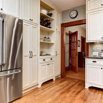
Columbus Design-Build, Kitchen & Bath Remodeling, Historic Renovations
 C. Boesch Design
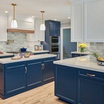
This kitchen was designed for a couple who have lived in their home for more than 30 years and have no plans to move. They LOVE the color blue.
In terms of design, the challenges were about striking the right balance between the family’s desire to have ‘everything’ blue and the existing 1980’s yellowed oak, prevalent throughout the home.
When we started out on the design journey, the existing style was very traditional with a lot of oak trim, walls, floors and doors, but as the project moved along it was evident that the family wanted to update the style, leaning towards a more Transitional style.
The existing kitchen was very dated with oak cabinets and floors and fell short in several areas: it was too small, without ample storage, had a tiny, angled island and was inefficient in terms of layout. In addition, the refrigerator was full depth and sat within a major walkway.
The kitchen and nook area are open to the adjacent family room, also filled with oak; floors, formal ceiling molding, cabinetry, fireplace wall and mantle. This was another challenge; to blend the existing oak with the new, creating a distinctive, harmonious, and very inter-connected space.
To address these issues, we framed in the existing wet bar in the family room, and opened that space into the kitchen. This was perfect for a counter-depth, built-in fridge and pantry and increased their storage capacity.
We removed the tiny angled island and replaced with a longer narrow island which now serves as a prep space and landing area for the cooking space.
We removed the existing dated hexagonal window in the nook, changed out the exterior door and created a new bar, complete with a more formal area within the nook to accommodate the glassware and dishware that was originally stored in the family room wet bar area.
The new kitchen design incorporates painted shaker cabinets, Pro-Style Sub Zero, Wolf and Cove appliances, multiple workspaces, and, of course the use of ‘Blue’.
To provide maximum ergonomic function, roll out trays were strategically planned at heights specific for convenient cooking apparatus and cutlery dividers included in drawers.
 C. Boesch Design
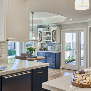
This kitchen was designed for a couple who have lived in their home for more than 30 years and have no plans to move. They LOVE the color blue.
In terms of design, the challenges were about striking the right balance between the family’s desire to have ‘everything’ blue and the existing 1980’s yellowed oak, prevalent throughout the home.
When we started out on the design journey, the existing style was very traditional with a lot of oak trim, walls, floors and doors, but as the project moved along it was evident that the family wanted to update the style, leaning towards a more Transitional style.
The existing kitchen was very dated with oak cabinets and floors and fell short in several areas: it was too small, without ample storage, had a tiny, angled island and was inefficient in terms of layout. In addition, the refrigerator was full depth and sat within a major walkway.
The kitchen and nook area are open to the adjacent family room, also filled with oak; floors, formal ceiling molding, cabinetry, fireplace wall and mantle. This was another challenge; to blend the existing oak with the new, creating a distinctive, harmonious, and very inter-connected space.
To address these issues, we framed in the existing wet bar in the family room, and opened that space into the kitchen. This was perfect for a counter-depth, built-in fridge and pantry and increased their storage capacity.
We removed the tiny angled island and replaced with a longer narrow island which now serves as a prep space and landing area for the cooking space.
We removed the existing dated hexagonal window in the nook, changed out the exterior door and created a new bar, complete with a more formal area within the nook to accommodate the glassware and dishware that was originally stored in the family room wet bar area.
The new kitchen design incorporates painted shaker cabinets, Pro-Style Sub Zero, Wolf and Cove appliances, multiple workspaces, and, of course the use of ‘Blue’.
To provide maximum ergonomic function, roll out trays were strategically planned at heights specific for convenient cooking apparatus and cutlery dividers included in drawers.
 Messi Thoughts Creative
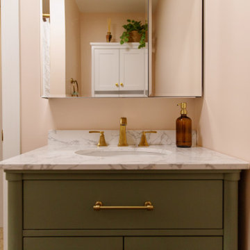
Inspiration for a small transitional 3/4 laminate floor, beige floor and single-sink alcove shower remodel in Providence with flat-panel cabinets, green cabinets, a one-piece toilet, beige walls, an undermount sink, marble countertops, white countertops and a freestanding vanity
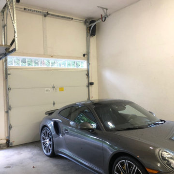
 New England Overhead Door
 who may be interested in New England Overhead Door.
Photos
See All
https://scontent-bos3-1.xx.fbcdn.net/v/t1.0-0/s600x600/122440855_3699472876770453_5130193353790148903_o.jpg?_nc_cat=100&ccb=2&_nc_sid=730e14&_nc_ohc=lGeMWOi7CqsAX9lIFZf&_nc_ht=scontent-bos3-1.xx&tp=7&oh=48b39001fa3296300a8484061fbb3375&oe=5FBB631B
https://scontent-bos3-1.xx.fbcdn.net/v/t1.0-0/p235x350/118626633_3544956762222066_1401902762494421989_n.jpg?_nc_cat=105&ccb=2&_nc_sid=730e14&_nc_ohc=EZMzPh06OJIAX-ibWr0&_nc_ht=scontent-bos3-1.xx&tp=6&oh=a618cfd64ab9c7b902e5251abbef2323&oe=5FBC4E62
https://scontent-bos3-1.xx.fbcdn.net/v/t1.0-0/p350x350/116427838_3458805414170535_5439332882631817520_o.jpg?_nc_cat=110&ccb=2&_nc_sid=730e14&_nc_ohc=wl4prWyEzXIAX8OGcYr&_nc_ht=scontent-bos3-1.xx&tp=6&oh=48fdd935b7cebdea0512fd4043c1060b&oe=5FBC8302
https://scontent-bos3-1.xx.fbcdn.net/v/t1.0-0/p350x350/116429512_3458805754170501_8545399322401356846_o.jpg?_nc_cat=105&ccb=2&_nc_sid=730e14&_nc_ohc=fc_OgV9jUlQAX-gMs-K&_nc_ht=scontent-bos3-1.xx&tp=6&oh=ee517d3fd6c3066980b2854beb3b82e9&oe=5FBD5AA4
https://scontent-bos3-1.xx.fbcdn.net/v/t1.0-0/p350x350/116807883_3458805957503814_1531271228116251007_o.jpg?_nc_cat=104&ccb=2&_nc_sid=730e14&_nc_ohc=3eAk54bLZqwAX94XmLv&_nc_ht=scontent-bos3-1.xx&tp=6&oh=6a250d2f1ee1a7387f1bb012afee3f22&oe=5FBE16DA
https://scontent-bos3-1.xx.fbcdn.net/v/t1.0-0/p350x350/116429512_3458806180837125_8639440518626099217_o.jpg?_nc_cat=101&ccb=2&_nc_sid=730e14&_nc_ohc=zd8FPOXlfEYAX-hsqpn&_nc_ht=scontent-bos3-1.xx&tp=6&oh=3d0a36f0cbf94fb0d640160eae146428&oe=5FBD0A43
Videos
See All
We are your local garage door experts! Call Today (800) 696-7723 for all of your garage door needs. Email Us: sales@newenglandoverheaddoor.com Visit Us: https://www.newenglandoverheaddoor.com/ - - - #garagedoors #newgaragedoor #garagedoorinstallation #garagedooropener #garagedoorrepair #garagedoorservice
123 Views · 14 weeks ago
Page Transparency
See All
Facebook is showing information to help you better understand the purpose of a Page. See actions taken by the people who manage and post content.
Page created - June 21, 2011
Privacy · Terms · Advertising · Ad Choices · Cookies · · Facebook © 2020
Create
PINNED POST
OTHER POSTS
New England Overhead Door
tSpAuSnguonmssornsigthm 1e8do ·
Design your own door! At New England Overhead Door we have a 'Design Your Own Door' feature. We strive to fit every type and style of home and we look to meet all of our customers wants and needs. Installing a new garage door on your home can completely transform your house!
Click the link below to create the garage door of your dreams:
https://www.newenglandoverheaddoor.com/garage-doors
Comments
Comment as New England Overhead Door
New England Overhead Door
tSpAuSnguonmssornsigthm 1e7do ·
Garage Door Tips for Homeowners!
- Tighten up the Hardware
- Test the Garage Door Balance
- Inspect/Replace Rollers (Done by a Professional)… See More
Comments
Comment as New England Overhead Door
New England Overhead Door
tSpAuSnguonmssornsigthm 1e2do ·
Before & After of New Installation in Hopkinton, MA!
Labor and materials to furnish and install the following:
(2) 9'0" x 7'0" Haas Model 663 Steel Insulated Garage Doors.
Design: Recessed Long Panel. Color: White. Windows: 4 Pane Rectangular (DSB Glass Non Insulated). Window Section: 3rd Section. 12" Radius Tracking. Torsion Springs. Full Weather Seal (White) Heavy 45 Degree Corners (6) 9'. 1 3/8" Thick Door.… See More
Comments
Comment as New England Overhead Door
New England Overhead Door
AhstuSfgpoeeustanco sho1r1edh ·
Winchester, MA
11 Stars out of 10 - FABULOUS REVIEW!
"From my first call with Robyn to my last goodbye with Dave at the end of the job, New England Garage Doors received a score of 11 out of a possible 10! Having owned and run two companies of my own, I know excellent service and attention to detail is what makes one company a winner over another. You guys did a phenomenal job!
For anyone reading this as a reference, I do not take putting claims like this in writing light… See More
Comments
Comment as New England Overhead Door
New England Overhead Door
AhstuSfgpoeeustanco sho1r0edh ·
New England Overhead Door updated their website address.
New England Overhead Door updated their website address.
Comments
Comment as New England Overhead Door
New England Overhead Door updated their status.
AhstuSfgpoeeustanco sho1r0edh ·
Comments
Comment as New England Overhead Door
New England Overhead Door updated their status.
AuotgSugpdonssaoth crr1hmere0d ·
Garage doors are the main point of access and entry in many homes today. You always want to make sure your garage doors are safely operating and running properly.
Our technicians perform 12-point safety inspections and offer a wide variety of repair services.
Call today to schedule an appointment (800) 696-7723 or go online at https://www.newenglandoverheaddoor.com/.… See More
Comments
Comment as New England Overhead Door
New England Overhead Door
AtougShghpounsortesctdih hr7 ·
New Installation in Winchester, MA!
Labor and materials furnished and installed:
Size: (2) 9' 0" X 6' 3". Gallery® Steel - Premium Series with Intellicore® - GD2SU. 3-Layer. 2" Intellicore® Insulated. R-Value 18.4. c Color: Ultra-Grain® Oak Dark Finish. Design: Short Panel Bead Board. Top Section: Short Solid - Bead Board. Glass Type: Not Applicable With Solid Top Section. Spring: Extension. Track Size: 3" Low Headroom Track. Track Type: Standard Mount. Type: Bracket. Track … See More
Comments
Comment as New England Overhead Door
New England Overhead Door
AtougShghpounsortesctdih hr5 ·
Residential Service Call in Sudbury, MA!
Labor and materials furnished and installed:
Installed New High Lift Track with Springs Hardware and Side Mount Opener. Extension Cord. (3) 8’ 1”x 4” Inside Wood Jambs to Allow Track to Follow Wall Properly. 76” Inches of Space, 120 lbs. Door Weight. Wireless Keypad & Battery Backup Installed.
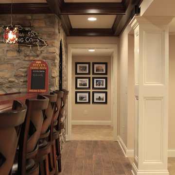
Sponsored
Delaware, OH

Buckeye Basements, Inc.
Central Ohio's Basement Finishing ExpertsBest Of Houzz '13-'21
 julianhardacre
Top Tips for Selling a Home in 2016
Want to sell your house in 2016? It’s a great year to sell your home and if you go about it the right way you’ll get what it’s worth and maybe more.
Now I could write this post and do the usual “do this, “do that” type stuff but I wouldn’t be doing you any favors. Because unless you know your numbers and the value of your home, you could wind up leaving money on the table or even losing it.
So here you go.
If you want tips for selling your house in 2016, listen to me - a guy who has bought and sold hundreds of properties as a full-time professional Real Estate Investor. Before you repair anything or call a real estate agent…
...you have to know your numbers.
Tip #1: Know the After Repair Value (ARV) of Your Home
If you’re going to get the right amount of money for your house, you have to know the After Repair Value (ARV). Essentially this means that you should know what your home can sell for after it’s is 100% rehabbed.
If you have a house that you can sell for $120,000, you need to know that. If it will sell for $350,000, you need to know what you need to do to your house to get it there. At the same time, you don’t want to overdo it.
If you have a house that’s currently worth $100,000 as is and it can sell for $115,000 when it’s all fixed up, you may or may not want to put the money into a rehab job. If you put $10,000 in just to make an extra $5,000, it might not be worth the hassle.
So whatever you do, know what it’s worth now (as -is) and know what it’ll sell for afterward. If you want to find out how much your house is worth, there are plenty of agents out there who will give you comps (Comps is a term that is short for “Comparisons” that lets you determine an appraisal value for your home by comparing it to recently sold homes in your area that are similar to yours) or advice for free, so ask them.
So don’t over do it, but don’t be hesitant to put money into your house if it’ll yield a big payoff when you sell it.
TIP #2: Make Your Agent Work For You
After you determine your ARV and enlist a good agent to help you sell your home, It might be worthwhile to hop in their Escalade to drive around town and look at some high end houses in your area to see what kind of upgrades they have. And when you see a common theme, you’ll have a good idea as to what kind of upgrades you might want to do to be able to sell your house.
Granite? Concrete? Tile? Carpet? Wood floors?
It depends.
I don’t know your area or market so you have to do the research, ask your agent questions, and exercise wisdom. Every market is different and you don’t want to put money into an upgrade or rehab if it’s not the type of thing people in your area are looking for.
So talk to a competent agent, and even offer to pay them a bit more in commissions if they can sell your home for a higher price.
This is not a waste of money.
A good agent with a proven track record is worth every penny because they know exactly what needs to be done to sell your home for the most money.
Tip #3: Interior Improvements
So once you have an idea about what your home is worth, have a good agent, and have toured homes in your area to see what kind of upgrades homes in your area typically have, it's time to look at your interior to decide what you should and shouldn’t do to sell your house in 2016.
No matter what you do, you need to be wise about it. Maybe you live in non-traditional or funky house. That’s fine. Just go through 2 or 3 times with a notepad, write down the frustrations you have with it, and do what you need to do to make it functional, warm, beautiful, and inviting.
Interior must-haves:
1. Make sure your kitchen is functional.
2. Always have (or add) a 2nd bathroom: If you don’t have a second bathroom, build one. Sure it could cost you $5-$6k, but it could net you an additional $20k when you sell. No matter what you do, make sure there is a second bathroom. It’s a must.
1. Open floor plans are huge in 2016: If you don’t have one, first- make sure it’s right for your area, and if it is, create one. This might mean building or breaking down a wall, but it’ll pay off in the end.
2. Stage your house: Just do it. Staging your home means that you hire a home stager and/or an interior design consultant (like the lady on Love It or List It) to set up your home in the most inviting way possible and tell you everything you need to do to make it sell. You’ll pay some cash up front but staged homes are shown to sell for 6% to 10% higher according to realtor.org.
Tip #4: Exterior Improvements
Just like the interior, you have to make sure the exterior of your house looks appealing if you want to get the most value of your house in 2016.
Exterior must haves:
1. Add curb appeal: When people pull up to your house, most won’t even want to go inside or look at it unless it looks good from the curb. So make sure it looks gorgeous. Rake the leaves, plant some flowers, mow the lawn - make it inviting.
2. Make sure the picture on the MLS listing matches what your house currently looks like: People don’t want to look at a picture and pull up to your house, only to be disappointed.
3. Hire a professional photographer: This is crucial. It could mean the difference between someone viewing your house, or someone skipping it because the pictures look like a child took them. Hire a pro - it’s worth it. Ask me how I know.
4. Don’t paint your house diarrhea green or brown: This is just common sense. If you’re going to paint, use a neutral color. You don’t want to make your house unsellable because you chose an odd color or made a bad decision elsewhere.
Tip #5: Common Sense, Common Sense, Common Sense
No matter what you do or do not do, don’t make any hasty decisions. Ask your agent questions, look around, be observant, and don't do anything extreme. If you need to fix up your house to see a big profit, do it. If you have a modest budget and improvements won’t raise the value or your house (the ARV) anyways, don’t go crazy.
2016 is a great year to sell your house.
Do it right and do it wisely.
Cheers,
Nate
---
Nate Pyles is a long term Real Estate Investor who made it through the crash in 2008 and spends his week buying and selling houses for profit in the Boise, ID area. He runs House Flip Mentor, has 4 kids, a gorgeous wife, loves to fly, and even built his own Irish pub on his property.
 Klopf Architecture
The Roger Lee designed house from 1962 was purchased by the current homeowners in almost original condition, as the previous owners elected to defer most maintenance projects over the years. The clients were able to see beyond the dated materials and finishes, single-paned glass and uninsulated walls and they approached Klopf Architecture to help them expand and update the entire home, one the family could settle into and enjoy for years to come. It was important that the new designs were aligned with Lee's original intent not only because of the client's appreciation for mid-century modern architecture, but also because the house was deemed historical. The Stanford Real Estate Office requires a stringent design review which safeguards the integrity of the community, which Klopf Architecture was happy to oblige going into their updated designs.
As with many original mid-century modern homes, the house was scaled to the 1960s lifestyle where rooms were smaller and openings to views were limited and tightly framed. The original conditions defined the direction the family of four would take in updating the house and making it comfortable for their modern lifestyle. Klopf designed a full gut remodel and major addition to bring the house into the 21st century and provide the living area needed for the client's family. The newly expanded house added just about 1,100 sf to create an airy, comfortable and family friendly house, taking full advantage of the beautiful southwestern views that extend out to the hills beyond. The enclosed garage created an additional 240 sf of covered space for long-term storage.
A cracked swimming pool created an eyesore taking up a majority of the backyard landscape, so it was one of the first elements to go during the transformation. Working with Outer Space Landscape Architects, the family asked for a mix of relaxing outdoor patio spaces that eventually blend into the native landscaping, extending their views outward toward the natural greenery of the trees beyond their property. Filling in the old pool was a smart way to expand the living spaces outward. The orientation of the house was designed to enjoy the views, but the original architecture provided the first homeowners with mere glimpses of the landscape outside.
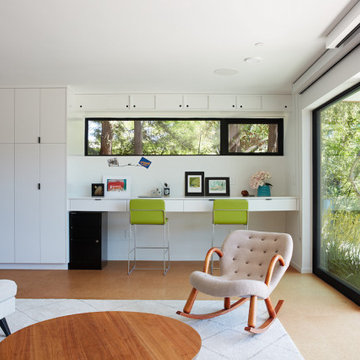
Klopf was able to broaden those views, continuing and extending on the original architecture to take full advantage of the unobstructed natural views across the rear facade of the house. Small horizontal openings in the primary bedroom and office were replaced with much taller windows that now follow the angled roof line upward, extending across almost all of the facade. We worked with Western Windows, whose designs included an oblique-shaped, operable casement that allowed our design to rise with the slope. A new corner office added to the primary suite, offers a bright and functional work-from-home solution that looks out at the distant views and added natural light from the expanded window configuration that now wraps around the corner.
The existing lower level was designed by Lee as a utilitarian space, serving as a wet pool room with a drain in the center of the floor, bathroom, laundry and storage areas. Without the need for a pool room, Klopf was able to convert the area into a much more comfortable and functional living space with a new family room and guest suite. The new spaces enjoy easy access to a new outdoor patio through floor to ceiling, full-width glass sliders.
Continuing along the rear facade, a previously exposed deck extending from the living room and hallway provided access to the backyard through a single set of stairs leading toward the side of the house which made sense when the pool was in place. The new deck was re-envisioned as an extension of the main living room and now serves as a second outdoor living room. A new slatted pergola above provides the homeowners welcome relief from the hot afternoon sun. A second set of stairs now creates a better connection to the redesigned lower level. Klopf was able to reconfigure the spaces, extending the living room outward toward the views, where the family now claims it as the heart of the home, spending a large majority of their time outdoors.
Back inside, the original wood-burning Malm fireplace was beautifully restored and a gas burner installed to comply with California's strict air standards. It now rests in front of a wall of Heath accent tiles where a dated red brick wall used to stand. A new taller window brings more light and views into the refreshed interior living room. The original glass doors opposite the fireplace were replaced by larger sliders that when fully opened, create a seamless transition to the new outdoor living area so the two spaces feel like one connected space. The original utilitarian kitchen was needlessly tucked into the far back corner and closed-off, out of sight from the living room, so the clients asked Klopf to open it up and expand the kitchen forward so it felt more connected. Today the much larger kitchen is connected to the living area where a short wall with a cutout offers a visual glimpse into the kitchen and a handy pass-through counter for serving guests. A new breakfast nook was also added to create another spot where the family can gather for casual meals. Just outside, a new built-in outdoor grill and prep area extends the kitchen outside and connects to a new outdoor dining spot nestled amongst the trees, taking advantage of the views out back.
Klopf was able to expand the other two bedrooms, add a new laundry room and half-bath and convert the carport to an enclosed garage to add more storage areas which was lost when the pool house was converted to the family and guest room.
To maintain a historical connection to the original designs, the exterior siding was repeated on all exterior walls, a full-height stained glass window at the front entryway restored, and an interior slatted screen element repeated outside at the exterior entry courtyard and over the new outdoor living room to create a shade trellis. The new house stands proudly and shines against it's new landscaping features, while respecting and expanding on the original intent of Roger Lee's designs epitomizing the comforts of indoor-outdoor living in Northern California.
Completion year: 2020
Klopf Architecture project team: John Klopf, Klara Kevane, Noel Andrade
Contractor: ORB Construction, Brendan O'Reilly
Structural engineer: Sezen and Moon
Landscape architect: Outer space
Furnishings and decoration: Urbanism Designs
Photographer: Mariko Reed

 JC Brothers General Contractor Siding Repair
Gutter Cleaning repair or replacement services in Short Hills NJ. We are gutter contractors, get right costs for gutter service
Example of a huge classic white two-story vinyl gable roof design in Newark
Example of a huge classic white two-story vinyl gable roof design in Newark
37