
Search results for "Hide - ugly" in Home Design Ideas

 Mark Brand Architecture
The original design of this late Mid-century Modern house featured a horrifically ugly entry which the owners needed our help to fix. In addition, they wanted to add a master suite, create a home theatre, and remodel the family room. Although they originally considered adding a second floor, our final design resulted in an extension of the house which accentuated its existing linear quality. Our solution to the entry problem included cutting back part of the vaulted roof to allow more light in and adding a cantilevered canopy instead. A new entry bridge crosses a koi pond, and new clerestory windows, stone planters and cedar trim complete the makeover of the previously bland plywood-clad box. The new master suite features 12 foot ceilings, clerestory windows, 8 foot high French doors and a fireplace. The exterior of the addition employs the same pallet of materials as the new façade but with a carefully composed composition of form and proportion. The new family room features the same stone cladding as we used on the exterior.
Photo by Christopher Stark Photography.
 Clearcut & Co
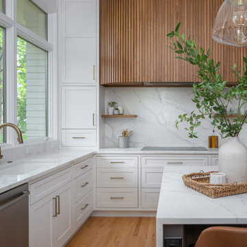
Inspiration for a large transitional u-shaped medium tone wood floor and brown floor enclosed kitchen remodel in Raleigh with an undermount sink, shaker cabinets, white cabinets, quartz countertops, white backsplash, quartz backsplash, stainless steel appliances, an island and white countertops

 Pangaea Interior Design, Portland, OR
Jeffrey Freeman Photography
Inspiration for a modern bathroom remodel in Portland
Inspiration for a modern bathroom remodel in Portland
Find the right local pro for your project
 Kowalske Kitchen & Bath
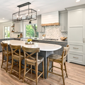
Creating a space to entertain was the top priority in this Mukwonago kitchen remodel. The homeowners wanted seating and counter space for hosting parties and watching sports. By opening the dining room wall, we extended the kitchen area. We added an island and custom designed furniture-style bar cabinet with retractable pocket doors. A new awning window overlooks the backyard and brings in natural light. Many in-cabinet storage features keep this kitchen neat and organized.
Bar Cabinet
The furniture-style bar cabinet has retractable pocket doors and a drop-in quartz counter. The homeowners can entertain in style, leaving the doors open during parties. Guests can grab a glass of wine or make a cocktail right in the cabinet.
Outlet Strips
Outlet strips on the island and peninsula keeps the end panels of the island and peninsula clean. The outlet strips also gives them options for plugging in appliances during parties.
Modern Farmhouse Design
The design of this kitchen is modern farmhouse. The materials, patterns, color and texture define this space. We used shades of golds and grays in the cabinetry, backsplash and hardware. The chevron backsplash and shiplap island adds visual interest.
Custom Cabinetry
This kitchen features frameless custom cabinets with light rail molding. It’s designed to hide the under cabinet lighting and angled plug molding. Putting the outlets under the cabinets keeps the backsplash uninterrupted.
Storage Features
Efficient storage and organization was important to these homeowners.
We opted for deep drawers to allow for easy access to stacks of dishes and bowls.
Under the cooktop, we used custom drawer heights to meet the homeowners’ storage needs.
A third drawer was added next to the spice drawer rollout.
Narrow pullout cabinets on either side of the cooktop for spices and oils.
The pantry rollout by the double oven rotates 90 degrees.
Other Updates
Staircase – We updated the staircase with a barn wood newel post and matte black balusters
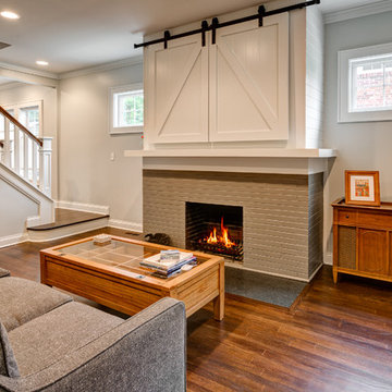
Fireplace – We whitewashed the fireplace and added a barn wood mantel and pilasters.

 HEDGE Garden Design & Nursery
Formal white garden running the length of the side of the apartment | HEDGE Garden Design & Nursery
This is an example of a mid-sized traditional partial sun side yard concrete paver formal garden in Wellington.
This is an example of a mid-sized traditional partial sun side yard concrete paver formal garden in Wellington.


 Steve Gray Renovations Inc.
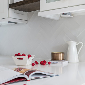
Mid-sized minimalist cork floor and brown floor eat-in kitchen photo in Indianapolis with an undermount sink, medium tone wood cabinets, granite countertops, white backsplash, porcelain backsplash, an island, flat-panel cabinets and paneled appliances


 Margot Hartford Photography
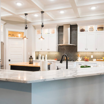
Photo: Margot Hartford © 2017 Houzz
Entryway - contemporary entryway idea in New York
Entryway - contemporary entryway idea in New York

 StyleHaus Interiors
Marc Fowler- Metropolis Studio
Cabinetry by Irpinia Kitchens Ottawa, Design by StyleHaus Interiors
Example of a transitional bathroom design in Ottawa
Example of a transitional bathroom design in Ottawa

 User
ASID Design Excellence First Place Residential – Kitchen and Bathroom: Michael Merrill Design Studio was approached three years ago by the homeowner to redesign her kitchen. Although she was dissatisfied with some aspects of her home, she still loved it dearly. As we discovered her passion for design, we began to rework her entire home--room by room, top to bottom.

 Zelaya Properties LLC
We used: Custom cherry cabinetry in Arts & Crafts Shaker style by Kabinart in Boulder and Espresso stains. Liberty Hardware Venetian bronze 1-1/2" cabinet knobs. KitchenAid Architect II Series 22 CF counter-depth French door refrigerator. KitchenAid Architect Series II 27" convection single wall oven. KitchenAid 36" 6-burner dual fuel freestanding commercial-style range. KitchenAid Architect II Series 24" dishwasher. Sharp Insight Pro Series 24" built-in microwave drawer (Model #KB6524PS). Crystorama Solaris 12" wide pendant lights in English bronze. Granite countertops in Brown Fantasy. 3"x6" polished marble backsplash.
Paint colors:
Walls: Glidden Silver Cloud 30YY 63/024
Ceilings/Trims/Doors: Glidden Swan White GLC23
Robert B. Narod Photography

 Saltwater Kitchen & Bath Studio
Mid-sized trendy l-shaped medium tone wood floor enclosed kitchen photo in Jacksonville with a double-bowl sink, shaker cabinets, light wood cabinets, granite countertops, blue backsplash, glass tile backsplash, stainless steel appliances and an island

 Delaney Window Fashions LLC
When the client spoke with the Delaney Window Fashions LLC workroom designer about the creation of a unique, Hawaiian-themed child’s bedroom, the bright pink and orange paint was already in place, along with the hibiscus floral fabric border. The impetus for the additional work was the transition from a baby’s room with a crib to a little girl’s room with a full-size bed. Although the room was started, it was far from complete.
With a limited amount of the client’s floral fabric, which had subsequently been discontinued, the designer created bedding and pillows and constructed a Hawaiian-themed bed canopy with lights. The homeowner wanted the bedding to be washable but not quilted and the bed crown to be light weight. A tailored, center-pleat bed skirt was created first. The remaining fabric, along with an accent fabric was used to create a comforter, envelope and bolster pillows. The comforter was created with two mitered corners; and micro-cording was purposely added around the middle section to hide the seam.The middle section was hand tacked to secure comforter layers for laundering.
To finish the bedding, a tiki hut-inspired bed crown was created, which was challenging because the material had to be light weight. Including LED garland added a
fun and whimsical element. With child safety in mind, shirred tulle panels were attached to the back and sides of the crown. In this way, the lights were visible, but not accessible to the child.
The project was a success, and the client loves the room. The child’s lighted tiki hut bed crown provided a cozy environment for nightly bedtime stories. It made for one happy little girl!
This project was applied for a competition.
Photographer: Simona Buna
Sponsored
Columbus, OH

Hope Restoration & General Contracting
Columbus Design-Build, Kitchen & Bath Remodeling, Historic Renovations
 Thyme & Place Design LLC
When my client had to move from her company office to work at home, she set up in the dining room. Despite her best efforts, this was not the long-term solution she was looking for. My client realized she needed a dedicated space not on the main floor of the home. On one hand, having your office space right next to the kitchen is handy. On the other hand, it made separating work and home life was not that easy.
The house was a ranch. In essence, the basement would run entire length of the home. As we came down the steps, we entered a time capsule. The house was built in the 1950’s. The walls were covered with original knotty pine paneling. There was a wood burning fireplace and considering this was a basement, high ceilings. In addition, there was everything her family could not store at their own homes. As we wound though the space, I though “wow this has potential”, Eventually, after walking through the laundry room we came to a small nicely lit room. This would be the office.
My client looked at me and asked what I thought. Undoubtedly, I said, this can be a great workspace, but do you really want to walk through this basement and laundry to get here? Without reservation, my client said where do we start?
Once the design was in place, we started the renovation. The knotty pine paneling had to go. Specifically, to add some insulation and control the dampness and humidity. The laundry room wall was relocated to create a hallway to the office.
At the far end of the room, we designated a workout zone. Weights, mats, exercise bike and television are at the ready for morning or afternoon workouts. The space can be concealed by a folding screen for party time. Doors to an old closet under the stairs were relocated to the workout area for hidden storage. Now we had nice wall for a beautiful console and mirror for storage and serving during parties.
In order to add architectural details, we covered the old ugly support columns with simple recessed millwork panels. This detail created a visual division between the bar area and the seating area in front of the fireplace. The old red brick on the fireplace surround was replaced with stack stone. A mantle was made from reclaimed wood. Additional reclaimed wood floating shelves left and right of the fireplace provides decorative display while maintaining a rustic element balancing the copper end table and leather swivel rocker.
We found an amazing rug which tied all of the colors together further defining the gathering space. Russet and burnt orange became the accent color unifying each space. With a bit of whimsy, a rather unusual light fixture which looks like roots from a tree growing through the ceiling is a conversation piece.
The office space is quite and removed from the main part of the basement. There is a desk large enough for multiple screens, a small bookcase holding office supplies and a comfortable chair for conference calls. Because working from home requires many online meetings, we added a shiplap wall painted in Hale Navy to contrast with the orange fabric on the chair. We finished the décor with a painting from my client’s father. This is the background online visitors will see.
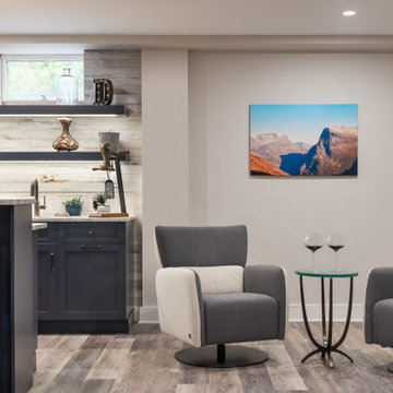
The last and best part of the renovation is the beautiful bar. My client is an avid collector of wine. She already had the EuroCave refrigerator, so I incorporated it into the design. The cabinets are painted Temptation Grey from Benjamin Moore. The counter tops are my favorite hard working quartzite Brown Fantasy. The backsplash is a combination of rustic wood and old tin ceiling like porcelain tiles. Together with the textures of the reclaimed wood and hide poofs balanced against the smooth finish of the cabinets, we created a comfortable luxury for relaxing.
There is ample storage for bottles, cans, glasses, and anything else you can think of for a great party. In addition to the wine storage, we incorporated a beverage refrigerator, an ice maker, and a sink. Floating shelves with integrated lighting illuminate the back bar. The raised height of the front bar provides the perfect wine tasting and paring spot. I especially love the pendant lights which look like wine glasses.
Finally, I selected carpet for the stairs and office. It is perfect for noise reduction. Meanwhile for the overall flooring, I specifically selected a high-performance vinyl plank floor. We often use this product as it is perfect to install on a concrete floor. It is soft to walk on, easy to clean and does not reduce the overall height of the space.

 Lowell Custom Homes
,Scott Lowell, Lowell Management Services, Inc., Lake Geneva, WI.,
Single story entry in the Craftsman tradition, door and sidelights with windows, white painted wall paneling and crown molding, staircase with square newel posts and balusters.

 Sans Soucie Art Glass
CUSTOMIZE YOUR INTERIOR GLASS DOOR! Interior glass doors ship for just $99 to most states, $159 to some East coast regions, custom packed and fully insured with a 1-4 day transit time. Available any size, as interior door glass insert only or pre-installed in an interior door frame, with 8 wood types available. ETA will vary 3-8 weeks depending on glass & door type.........Block the view, but brighten the look with a beautiful interior glass door featuring a custom frosted glass design by Sans Soucie! Select from dozens of sandblast etched obscure glass designs! Sans Soucie creates their interior glass door designs thru sandblasting the glass in different ways which create not only different levels of privacy, but different levels in price. Bathroom doors, laundry room doors and glass pantry doors with frosted glass designs by Sans Soucie become the conversation piece of any room. Choose from the highest quality and largest selection of frosted decorative glass interior doors available anywhere! The "same design, done different" - with no limit to design, there's something for every decor, regardless of style. Inside our fun, easy to use online Glass and Door Designer at sanssoucie.com, you'll get instant pricing on everything as YOU customize your door and the glass, just the way YOU want it, to compliment and coordinate with your decor. When you're all finished designing, you can place your order right there online! Glass and doors ship worldwide, custom packed in-house, fully insured via UPS Freight. Glass is sandblast frosted or etched and bathroom door designs are available in 3 effects: Solid frost, 2D surface etched or 3D carved. Visit our site to learn more!

 Moderne Builders
Gorgeous master bath with dramatic retro "wave" tile. Peak Photography
Example of a 1950s bathroom design in Los Angeles
Example of a 1950s bathroom design in Los Angeles
Sponsored
Columbus, OH

Snider & Metcalf Interior Design, LTD
Leading Interior Designers in Columbus, Ohio & Ponte Vedra, Florida

 Gaile Guevara
| DETAILS | in concrete constructed condos it's very rare that we ever want to have to core new drain locations. For the Master Ensuite more and more when we do full renovations down to studs we are removing the terrible 5' tubs and tiny itty bitty 3x3' showers. For some reason the idea of luxury meant squeeze as much as you can so you have a long list of features when you go to market. More and more we are doing oversized his and hers showers. So when you have a drain that you are repurposing from previous plumbing fixtures and the drain isn't centred, it's pretty much magic to have the team surprise you after several site meetings and evaluations - we opted for the plumbers favourite to use Schluter linear tile over drains and have the oversized tile cut to fit and provide the necessary grout lines for a flush shower threshold. This might seem like nothing but is everything when we have the perfect tile layout be inline with the what we think is a centred drain. These are the kind of details that make my OCD sister inside so happy, we call it the centre flush drain happy dance. Kudos to @caisleydevelopments @4thdimensionconstruction with the help of @stonetilevancouver for finding a perfect subtle sand toned oversized porcelain. A large format tile in a shade and same tone value as our hardwood floor and one shade darker than our Baltic Birch flush panels for ease of cleaning and hiding dirt. When you want things clean I opt for showers with minimal detailing to be in shades darker than white. Cleaning becomes less treacherous. Also gone is this idea of ugly accent tile, we opt for uniform tile one material throughout a bathroom floor to ceiling and if possible all walls. Construction geekery 101 continues
 User
This guest room was large enough to accommodate both a work space for two and the client's queen size bed. The drawers are file cabinets with the lower center cupboard housing printer and modem. Upper display space and closed storage will house many supplies.
And the "office" has a peekaboo view of the ocean!
Charlie Neuman, photographer

 DAB Interior Design, Inc.
We demolished the Living Room, tearing out the original parquet floors throughout the apartment, which were at least 60 years old and had been sanded and refinished, God knows how many times? They were extremely thin. We then built a very narrow soffit , which is just the size of the Crown Molding which gave it a very slim profile to hold the low profile LED lights . Previously there were no lights accept two Halogen Torcheres, which threw off a lot of heat, especially in the summer months and illuminated the ceiling.. The ceiling light in the foyer was kept high up, so it wouldn't affect a tall person. The large bulb was just put there until a Dining Fixture could be found? This is a great shot of the new wood floors, which made the Living Room, brighter, lighter, definitely more spacious and up to date and timeless. It also gives a very clear view of the new right wall, that previously had some strange draws, down near the closet ,which originally were part of the right closet door. We cleaned up the whole wall, so client could put some sort of media unit, that previously would have looked ridiculous with the draws and ugly very obvious door, hiding the Utility Closet. We left the Utility Closet in place, and put her commercial looking metal file cabinet, where client kept important documents and we put in electrical outlets and built her a shelf for her printer and other stationary supplies. We then put on flush solid core doors without molding, invisible hinges and hidden door hardware, so it just blended into the wall and no longer stuck out like a sore thumb!
33