
Search results for "Hosting easy" in Home Design Ideas
 Fiorito Interior Design
My clients approached this kitchen remodel hoping not only for improved functionality but for a space that invited comfort, warmth, and daily enjoyment. Their existing kitchen was limited in both layout and atmosphere where a small island barely larger than a podium offered little utility. An oversized double-width doorway at the rear of the room leading into the adjacent living space disrupted the flow, making furniture placement nearly impossible. They longed for a kitchen where cooking felt easy and intuitive, but also one where they could sit at the table with a book and a cup of tea, or host friends without feeling cramped or awkwardly positioned.
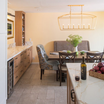
One of the most impactful decisions we made early on was to close off that extra-wide opening to the living room. Doing so allowed us to reclaim the wall, which not only improved circulation but also gave us the freedom to rethink the spacing of the kitchen and eat-in area. With that change, we could introduce a much larger island—truly functional this time—complete with generous workspace and storage. It became a true centerpiece for meal prep, casual dining, and gathering.
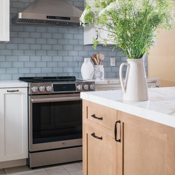
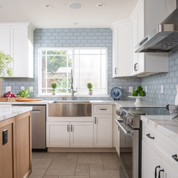
From there I turned my attention to layering in comfort, personality, and style. I curated a color palette of soft white, pale blue, light wood tones, and touches of sunshine yellow. This fresh and uplifting combination feels timeless and relaxed. We chose cabinetry with traditional Shaker-style doors, accented by black forged iron hardware for a subtle hint of contrast and authenticity. For the countertops we chose a Gold Calacatta-look quartz, bringing elegance and warmth with its soft veining and classic appeal.
To elevate the kitchen walls I selected a soft matte glass tile in a moody, sky-blue that blankets the backsplash, providing a gentle wash of color that’s calming and cohesive. On the floors I chose a limestone-look porcelain tile in a classic Versailles pattern as an homage to old English manor houses—bringing character and texture underfoot while remaining durable and low-maintenance for modern life.
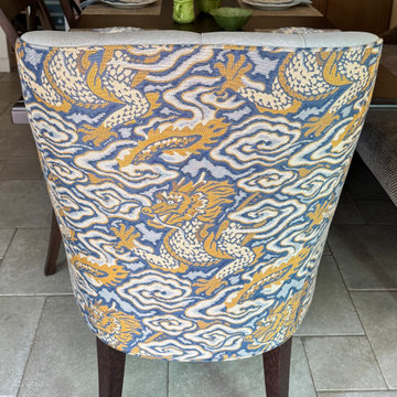
Lastly I transformed the adjacent eat-in area into a cozy, multifunctional space. We added custom built-in bookshelves and a sideboard for serving and display—perfect for entertaining or simply making daily routines feel more special. A black iron picture light softly illuminates the buffet, lending a warm, ambient glow in the evenings. I carefully planned the seating arrangement to include a space-saving banquette along the wall, paired with a trestle-style dining table and side chairs. At either end I placed tufted host chairs upholstered in an exquisite, tonal Chinoiserie dragon pattern that are comfortable enough to sit on for hours. Whether sharing a leisurely meal, reading in the sunlight, or gazing out at the greenery just beyond the windows, this spot now invites my clients to truly enjoy their home in a new, deeper way.
Photo: Bernardo Grijalva
 Fiorito Interior Design
My clients approached this kitchen remodel hoping not only for improved functionality but for a space that invited comfort, warmth, and daily enjoyment. Their existing kitchen was limited in both layout and atmosphere where a small island barely larger than a podium offered little utility. An oversized double-width doorway at the rear of the room leading into the adjacent living space disrupted the flow, making furniture placement nearly impossible. They longed for a kitchen where cooking felt easy and intuitive, but also one where they could sit at the table with a book and a cup of tea, or host friends without feeling cramped or awkwardly positioned.
One of the most impactful decisions we made early on was to close off that extra-wide opening to the living room. Doing so allowed us to reclaim the wall, which not only improved circulation but also gave us the freedom to rethink the spacing of the kitchen and eat-in area. With that change, we could introduce a much larger island—truly functional this time—complete with generous workspace and storage. It became a true centerpiece for meal prep, casual dining, and gathering.
From there I turned my attention to layering in comfort, personality, and style. I curated a color palette of soft white, pale blue, light wood tones, and touches of sunshine yellow. This fresh and uplifting combination feels timeless and relaxed. We chose cabinetry with traditional Shaker-style doors, accented by black forged iron hardware for a subtle hint of contrast and authenticity. For the countertops we chose a Gold Calacatta-look quartz, bringing elegance and warmth with its soft veining and classic appeal.
To elevate the kitchen walls I selected a soft matte glass tile in a moody, sky-blue that blankets the backsplash, providing a gentle wash of color that’s calming and cohesive. On the floors I chose a limestone-look porcelain tile in a classic Versailles pattern as an homage to old English manor houses—bringing character and texture underfoot while remaining durable and low-maintenance for modern life.
Lastly I transformed the adjacent eat-in area into a cozy, multifunctional space. We added custom built-in bookshelves and a sideboard for serving and display—perfect for entertaining or simply making daily routines feel more special. A black iron picture light softly illuminates the buffet, lending a warm, ambient glow in the evenings. I carefully planned the seating arrangement to include a space-saving banquette along the wall, paired with a trestle-style dining table and side chairs. At either end I placed tufted host chairs upholstered in an exquisite, tonal Chinoiserie dragon pattern that are comfortable enough to sit on for hours. Whether sharing a leisurely meal, reading in the sunlight, or gazing out at the greenery just beyond the windows, this spot now invites my clients to truly enjoy their home in a new, deeper way.
Photo: Bernardo Grijalva
 Fiorito Interior Design
My clients approached this kitchen remodel hoping not only for improved functionality but for a space that invited comfort, warmth, and daily enjoyment. Their existing kitchen was limited in both layout and atmosphere where a small island barely larger than a podium offered little utility. An oversized double-width doorway at the rear of the room leading into the adjacent living space disrupted the flow, making furniture placement nearly impossible. They longed for a kitchen where cooking felt easy and intuitive, but also one where they could sit at the table with a book and a cup of tea, or host friends without feeling cramped or awkwardly positioned.
One of the most impactful decisions we made early on was to close off that extra-wide opening to the living room. Doing so allowed us to reclaim the wall, which not only improved circulation but also gave us the freedom to rethink the spacing of the kitchen and eat-in area. With that change, we could introduce a much larger island—truly functional this time—complete with generous workspace and storage. It became a true centerpiece for meal prep, casual dining, and gathering.
From there I turned my attention to layering in comfort, personality, and style. I curated a color palette of soft white, pale blue, light wood tones, and touches of sunshine yellow. This fresh and uplifting combination feels timeless and relaxed. We chose cabinetry with traditional Shaker-style doors, accented by black forged iron hardware for a subtle hint of contrast and authenticity. For the countertops we chose a Gold Calacatta-look quartz, bringing elegance and warmth with its soft veining and classic appeal.
To elevate the kitchen walls I selected a soft matte glass tile in a moody, sky-blue that blankets the backsplash, providing a gentle wash of color that’s calming and cohesive. On the floors I chose a limestone-look porcelain tile in a classic Versailles pattern as an homage to old English manor houses—bringing character and texture underfoot while remaining durable and low-maintenance for modern life.
Lastly I transformed the adjacent eat-in area into a cozy, multifunctional space. We added custom built-in bookshelves and a sideboard for serving and display—perfect for entertaining or simply making daily routines feel more special. A black iron picture light softly illuminates the buffet, lending a warm, ambient glow in the evenings. I carefully planned the seating arrangement to include a space-saving banquette along the wall, paired with a trestle-style dining table and side chairs. At either end I placed tufted host chairs upholstered in an exquisite, tonal Chinoiserie dragon pattern that are comfortable enough to sit on for hours. Whether sharing a leisurely meal, reading in the sunlight, or gazing out at the greenery just beyond the windows, this spot now invites my clients to truly enjoy their home in a new, deeper way.
Photo: Bernardo Grijalva
Find the right local pro for your project
 Fiorito Interior Design
My clients approached this kitchen remodel hoping not only for improved functionality but for a space that invited comfort, warmth, and daily enjoyment. Their existing kitchen was limited in both layout and atmosphere where a small island barely larger than a podium offered little utility. An oversized double-width doorway at the rear of the room leading into the adjacent living space disrupted the flow, making furniture placement nearly impossible. They longed for a kitchen where cooking felt easy and intuitive, but also one where they could sit at the table with a book and a cup of tea, or host friends without feeling cramped or awkwardly positioned.
One of the most impactful decisions we made early on was to close off that extra-wide opening to the living room. Doing so allowed us to reclaim the wall, which not only improved circulation but also gave us the freedom to rethink the spacing of the kitchen and eat-in area. With that change, we could introduce a much larger island—truly functional this time—complete with generous workspace and storage. It became a true centerpiece for meal prep, casual dining, and gathering.
From there I turned my attention to layering in comfort, personality, and style. I curated a color palette of soft white, pale blue, light wood tones, and touches of sunshine yellow. This fresh and uplifting combination feels timeless and relaxed. We chose cabinetry with traditional Shaker-style doors, accented by black forged iron hardware for a subtle hint of contrast and authenticity. For the countertops we chose a Gold Calacatta-look quartz, bringing elegance and warmth with its soft veining and classic appeal.
To elevate the kitchen walls I selected a soft matte glass tile in a moody, sky-blue that blankets the backsplash, providing a gentle wash of color that’s calming and cohesive. On the floors I chose a limestone-look porcelain tile in a classic Versailles pattern as an homage to old English manor houses—bringing character and texture underfoot while remaining durable and low-maintenance for modern life.
Lastly I transformed the adjacent eat-in area into a cozy, multifunctional space. We added custom built-in bookshelves and a sideboard for serving and display—perfect for entertaining or simply making daily routines feel more special. A black iron picture light softly illuminates the buffet, lending a warm, ambient glow in the evenings. I carefully planned the seating arrangement to include a space-saving banquette along the wall, paired with a trestle-style dining table and side chairs. At either end I placed tufted host chairs upholstered in an exquisite, tonal Chinoiserie dragon pattern that are comfortable enough to sit on for hours. Whether sharing a leisurely meal, reading in the sunlight, or gazing out at the greenery just beyond the windows, this spot now invites my clients to truly enjoy their home in a new, deeper way.
Photo: Bernardo Grijalva
 Fiorito Interior Design
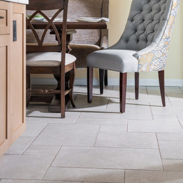
My clients approached this kitchen remodel hoping not only for improved functionality but for a space that invited comfort, warmth, and daily enjoyment. Their existing kitchen was limited in both layout and atmosphere where a small island barely larger than a podium offered little utility. An oversized double-width doorway at the rear of the room leading into the adjacent living space disrupted the flow, making furniture placement nearly impossible. They longed for a kitchen where cooking felt easy and intuitive, but also one where they could sit at the table with a book and a cup of tea, or host friends without feeling cramped or awkwardly positioned.
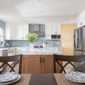
One of the most impactful decisions we made early on was to close off that extra-wide opening to the living room. Doing so allowed us to reclaim the wall, which not only improved circulation but also gave us the freedom to rethink the spacing of the kitchen and eat-in area. With that change, we could introduce a much larger island—truly functional this time—complete with generous workspace and storage. It became a true centerpiece for meal prep, casual dining, and gathering.
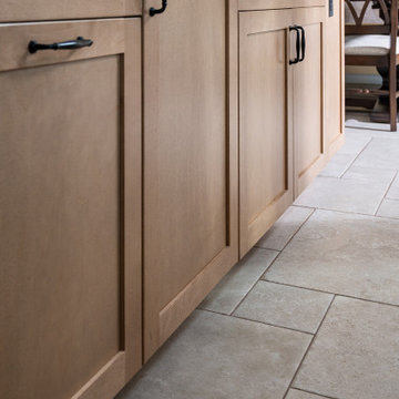
From there I turned my attention to layering in comfort, personality, and style. I curated a color palette of soft white, pale blue, light wood tones, and touches of sunshine yellow. This fresh and uplifting combination feels timeless and relaxed. We chose cabinetry with traditional Shaker-style doors, accented by black forged iron hardware for a subtle hint of contrast and authenticity. For the countertops we chose a Gold Calacatta-look quartz, bringing elegance and warmth with its soft veining and classic appeal.
To elevate the kitchen walls I selected a soft matte glass tile in a moody, sky-blue that blankets the backsplash, providing a gentle wash of color that’s calming and cohesive. On the floors I chose a limestone-look porcelain tile in a classic Versailles pattern as an homage to old English manor houses—bringing character and texture underfoot while remaining durable and low-maintenance for modern life.
Lastly I transformed the adjacent eat-in area into a cozy, multifunctional space. We added custom built-in bookshelves and a sideboard for serving and display—perfect for entertaining or simply making daily routines feel more special. A black iron picture light softly illuminates the buffet, lending a warm, ambient glow in the evenings. I carefully planned the seating arrangement to include a space-saving banquette along the wall, paired with a trestle-style dining table and side chairs. At either end I placed tufted host chairs upholstered in an exquisite, tonal Chinoiserie dragon pattern that are comfortable enough to sit on for hours. Whether sharing a leisurely meal, reading in the sunlight, or gazing out at the greenery just beyond the windows, this spot now invites my clients to truly enjoy their home in a new, deeper way.
Photo: Bernardo Grijalva
 Fiorito Interior Design
My clients approached this kitchen remodel hoping not only for improved functionality but for a space that invited comfort, warmth, and daily enjoyment. Their existing kitchen was limited in both layout and atmosphere where a small island barely larger than a podium offered little utility. An oversized double-width doorway at the rear of the room leading into the adjacent living space disrupted the flow, making furniture placement nearly impossible. They longed for a kitchen where cooking felt easy and intuitive, but also one where they could sit at the table with a book and a cup of tea, or host friends without feeling cramped or awkwardly positioned.
One of the most impactful decisions we made early on was to close off that extra-wide opening to the living room. Doing so allowed us to reclaim the wall, which not only improved circulation but also gave us the freedom to rethink the spacing of the kitchen and eat-in area. With that change, we could introduce a much larger island—truly functional this time—complete with generous workspace and storage. It became a true centerpiece for meal prep, casual dining, and gathering.
From there I turned my attention to layering in comfort, personality, and style. I curated a color palette of soft white, pale blue, light wood tones, and touches of sunshine yellow. This fresh and uplifting combination feels timeless and relaxed. We chose cabinetry with traditional Shaker-style doors, accented by black forged iron hardware for a subtle hint of contrast and authenticity. For the countertops we chose a Gold Calacatta-look quartz, bringing elegance and warmth with its soft veining and classic appeal.
To elevate the kitchen walls I selected a soft matte glass tile in a moody, sky-blue that blankets the backsplash, providing a gentle wash of color that’s calming and cohesive. On the floors I chose a limestone-look porcelain tile in a classic Versailles pattern as an homage to old English manor houses—bringing character and texture underfoot while remaining durable and low-maintenance for modern life.
Lastly I transformed the adjacent eat-in area into a cozy, multifunctional space. We added custom built-in bookshelves and a sideboard for serving and display—perfect for entertaining or simply making daily routines feel more special. A black iron picture light softly illuminates the buffet, lending a warm, ambient glow in the evenings. I carefully planned the seating arrangement to include a space-saving banquette along the wall, paired with a trestle-style dining table and side chairs. At either end I placed tufted host chairs upholstered in an exquisite, tonal Chinoiserie dragon pattern that are comfortable enough to sit on for hours. Whether sharing a leisurely meal, reading in the sunlight, or gazing out at the greenery just beyond the windows, this spot now invites my clients to truly enjoy their home in a new, deeper way.
Photo: Bernardo Grijalva
 Fiorito Interior Design
My clients approached this kitchen remodel hoping not only for improved functionality but for a space that invited comfort, warmth, and daily enjoyment. Their existing kitchen was limited in both layout and atmosphere where a small island barely larger than a podium offered little utility. An oversized double-width doorway at the rear of the room leading into the adjacent living space disrupted the flow, making furniture placement nearly impossible. They longed for a kitchen where cooking felt easy and intuitive, but also one where they could sit at the table with a book and a cup of tea, or host friends without feeling cramped or awkwardly positioned.
One of the most impactful decisions we made early on was to close off that extra-wide opening to the living room. Doing so allowed us to reclaim the wall, which not only improved circulation but also gave us the freedom to rethink the spacing of the kitchen and eat-in area. With that change, we could introduce a much larger island—truly functional this time—complete with generous workspace and storage. It became a true centerpiece for meal prep, casual dining, and gathering.
From there I turned my attention to layering in comfort, personality, and style. I curated a color palette of soft white, pale blue, light wood tones, and touches of sunshine yellow. This fresh and uplifting combination feels timeless and relaxed. We chose cabinetry with traditional Shaker-style doors, accented by black forged iron hardware for a subtle hint of contrast and authenticity. For the countertops we chose a Gold Calacatta-look quartz, bringing elegance and warmth with its soft veining and classic appeal.
To elevate the kitchen walls I selected a soft matte glass tile in a moody, sky-blue that blankets the backsplash, providing a gentle wash of color that’s calming and cohesive. On the floors I chose a limestone-look porcelain tile in a classic Versailles pattern as an homage to old English manor houses—bringing character and texture underfoot while remaining durable and low-maintenance for modern life.
Lastly I transformed the adjacent eat-in area into a cozy, multifunctional space. We added custom built-in bookshelves and a sideboard for serving and display—perfect for entertaining or simply making daily routines feel more special. A black iron picture light softly illuminates the buffet, lending a warm, ambient glow in the evenings. I carefully planned the seating arrangement to include a space-saving banquette along the wall, paired with a trestle-style dining table and side chairs. At either end I placed tufted host chairs upholstered in an exquisite, tonal Chinoiserie dragon pattern that are comfortable enough to sit on for hours. Whether sharing a leisurely meal, reading in the sunlight, or gazing out at the greenery just beyond the windows, this spot now invites my clients to truly enjoy their home in a new, deeper way.
Photo: Bernardo Grijalva
Sponsored
Sunbury, OH

J.Holderby - Renovations
Franklin County's Leading General Contractors - 2X Best of Houzz!
 Fiorito Interior Design
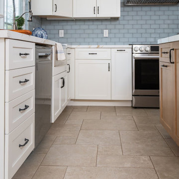
My clients approached this kitchen remodel hoping not only for improved functionality but for a space that invited comfort, warmth, and daily enjoyment. Their existing kitchen was limited in both layout and atmosphere where a small island barely larger than a podium offered little utility. An oversized double-width doorway at the rear of the room leading into the adjacent living space disrupted the flow, making furniture placement nearly impossible. They longed for a kitchen where cooking felt easy and intuitive, but also one where they could sit at the table with a book and a cup of tea, or host friends without feeling cramped or awkwardly positioned.
One of the most impactful decisions we made early on was to close off that extra-wide opening to the living room. Doing so allowed us to reclaim the wall, which not only improved circulation but also gave us the freedom to rethink the spacing of the kitchen and eat-in area. With that change, we could introduce a much larger island—truly functional this time—complete with generous workspace and storage. It became a true centerpiece for meal prep, casual dining, and gathering.
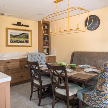
From there I turned my attention to layering in comfort, personality, and style. I curated a color palette of soft white, pale blue, light wood tones, and touches of sunshine yellow. This fresh and uplifting combination feels timeless and relaxed. We chose cabinetry with traditional Shaker-style doors, accented by black forged iron hardware for a subtle hint of contrast and authenticity. For the countertops we chose a Gold Calacatta-look quartz, bringing elegance and warmth with its soft veining and classic appeal.
To elevate the kitchen walls I selected a soft matte glass tile in a moody, sky-blue that blankets the backsplash, providing a gentle wash of color that’s calming and cohesive. On the floors I chose a limestone-look porcelain tile in a classic Versailles pattern as an homage to old English manor houses—bringing character and texture underfoot while remaining durable and low-maintenance for modern life.
Lastly I transformed the adjacent eat-in area into a cozy, multifunctional space. We added custom built-in bookshelves and a sideboard for serving and display—perfect for entertaining or simply making daily routines feel more special. A black iron picture light softly illuminates the buffet, lending a warm, ambient glow in the evenings. I carefully planned the seating arrangement to include a space-saving banquette along the wall, paired with a trestle-style dining table and side chairs. At either end I placed tufted host chairs upholstered in an exquisite, tonal Chinoiserie dragon pattern that are comfortable enough to sit on for hours. Whether sharing a leisurely meal, reading in the sunlight, or gazing out at the greenery just beyond the windows, this spot now invites my clients to truly enjoy their home in a new, deeper way.
Photo: Bernardo Grijalva
 Fiorito Interior Design
My clients approached this kitchen remodel hoping not only for improved functionality but for a space that invited comfort, warmth, and daily enjoyment. Their existing kitchen was limited in both layout and atmosphere where a small island barely larger than a podium offered little utility. An oversized double-width doorway at the rear of the room leading into the adjacent living space disrupted the flow, making furniture placement nearly impossible. They longed for a kitchen where cooking felt easy and intuitive, but also one where they could sit at the table with a book and a cup of tea, or host friends without feeling cramped or awkwardly positioned.
One of the most impactful decisions we made early on was to close off that extra-wide opening to the living room. Doing so allowed us to reclaim the wall, which not only improved circulation but also gave us the freedom to rethink the spacing of the kitchen and eat-in area. With that change, we could introduce a much larger island—truly functional this time—complete with generous workspace and storage. It became a true centerpiece for meal prep, casual dining, and gathering.
From there I turned my attention to layering in comfort, personality, and style. I curated a color palette of soft white, pale blue, light wood tones, and touches of sunshine yellow. This fresh and uplifting combination feels timeless and relaxed. We chose cabinetry with traditional Shaker-style doors, accented by black forged iron hardware for a subtle hint of contrast and authenticity. For the countertops we chose a Gold Calacatta-look quartz, bringing elegance and warmth with its soft veining and classic appeal.
To elevate the kitchen walls I selected a soft matte glass tile in a moody, sky-blue that blankets the backsplash, providing a gentle wash of color that’s calming and cohesive. On the floors I chose a limestone-look porcelain tile in a classic Versailles pattern as an homage to old English manor houses—bringing character and texture underfoot while remaining durable and low-maintenance for modern life.
Lastly I transformed the adjacent eat-in area into a cozy, multifunctional space. We added custom built-in bookshelves and a sideboard for serving and display—perfect for entertaining or simply making daily routines feel more special. A black iron picture light softly illuminates the buffet, lending a warm, ambient glow in the evenings. I carefully planned the seating arrangement to include a space-saving banquette along the wall, paired with a trestle-style dining table and side chairs. At either end I placed tufted host chairs upholstered in an exquisite, tonal Chinoiserie dragon pattern that are comfortable enough to sit on for hours. Whether sharing a leisurely meal, reading in the sunlight, or gazing out at the greenery just beyond the windows, this spot now invites my clients to truly enjoy their home in a new, deeper way.
Photo: Bernardo Grijalva

 Thompson Remodeling
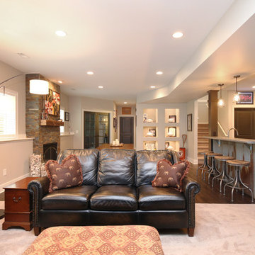
Thompson Remodeling really enjoyed working with this Grand Rapids family to remodel their basement into a family space where they could showcase their favorite sports memorabilia and other memories from their home state of Maryland.
After remodeling their previous home just 6 months earlier, circumstances required the family to move. One day upon returning to their new home, they found their basement flooded! Realizing they needed to act fast to repair the damage they contacted Thompson Remodeling to help.
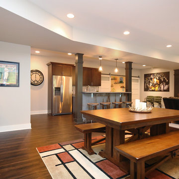
When discussing the design for the project, our clients told us how much they had loved the updates they made to their last home and were hoping to use similar warm tones and rustic materials. We looked at photos of that home for inspiration and developed a design that would serve as an entertaining and gathering space that would allow their fantastic collection of Maryland sports memorabilia to shine. Careful consideration was given on how to use every nook and cranny of space, as was the selection process for specific rustic materials that would contribute warmth and visual interest.
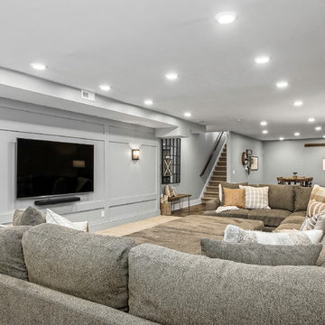
We used Ghost Wood to create a rich accent wall in the tv viewing area. The fireplace is made of stacked tile that looks like stone and the mantel is a handpicked, old barn beam. The clients told our designer that they wanted to hang a Maryland flag in the basement so she found this fantastic flag made of distressed wood which was hung above the mantel. For the flooring, we selected a gorgeous vinyl plank for easy cleaning and maintenance.
An existing closet area was used to create a lighted, built-in display area to house the family's prized autographed Baltimore Colts footballs and Baltimore Orioles baseballs.
The bar has a full-size refrigerator, microwave and sink. There are plenty of cabinets and drawers for everything they need for hosting parties on game days. The countertops are a very cool, silver-toned textured laminate. The rusted, recycled corrugated metal bar was hand selected by the client.
 Renovisions
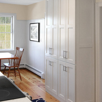
These South Shore of Boston homeowners desired a larger kitchen as their existing had limited space to host family events and entertain guests – they turned to Renovisions to help transform their small, outdated kitchen with separate walk-in pantry into a beautiful, open and spacious inspirational room.
Choosing the right cabinetry for the room and how to meet the needs of the client was critical to the overall success of this design. A traditional style was the framework of the home and the flat paneled doors on the white painted cabinetry support this aspect. Going vertical as possible with cabinets is a trend here to stay; keeping with that idea, we recommended the graceful tall pantry cabinet that flanks one side of the kitchen. This not only lends to an eye-appealing furniture-look, but adds significant storage space, allowing the cabinets to store items they may not use on a regular basis. In this case, the clients are amazed with the amount of storage they’ve gained and one that provides easy access to all interior items. Every inch of space was key to create this optimally functional kitchen. Must-haves such as tray dividers above the refrigerator are handy and the double pull-out trash/recycling bins on the right side of the sink were a simple and clean way to gain floor space and conceal unsightly trash.
The focal point of this kitchen is the expansive, soft-grey colored contrasting island with larger, deeper drawers for pots, pans and platters. The client was excited to switch to an induction chef-series range that featured a divided oven that can accommodate two different temperatures.
Fit and finish is important in any renovation and this certainly holds true in this kitchen project to personalize their space. The custom recessed panel columns with wainscot details add an architectural element that ties into the kitchen cabinet design and Carrera-look quartz countertops which provide a stunning classical look that ties nicely with the overall traditional style. These homeowners are excited to show off their open and spacious Renovision!
“We really enjoyed our new kitchen and it’s amazing improvement over the holidays. We got rave reviews from all of our guests!”
Steve & Mary S. (Duxbury)
 Sire Design
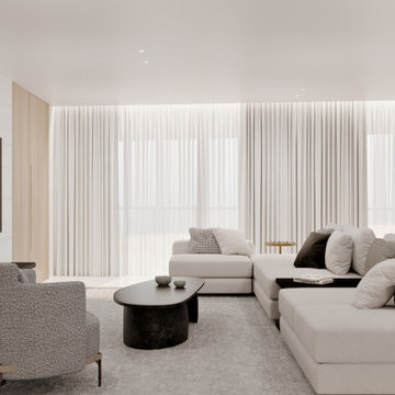
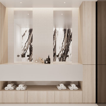
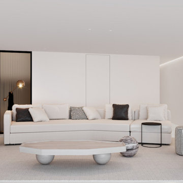
Situated in Miami Beach, Florida, the owner of this 4,000-square-foot luxury condo turned to Sire Design to make better use of the layout of her home as well as elevate her space into one fit for her entire family. While turning this three-bedroom unit into a four-bedroom home with a larger den was no easy feat, the resulting design is simple and elegant with elements that catch your eye throughout.
Taking an elegant approach to minimalism, light neutrals including bone and beige are juxtaposed against black and deep blue. The mix of materials incorporated including soft linens, bright wood tones, and hard marble, and pieces from Roche Bobois, Haute Living, and Kreon further accentuate the play on contrasting colors. To complement Florida’s beautiful weather, the design team also selected soft and warm neutrals for the condo’s walls and floors. Large furniture pieces and geometric art in deeper colors ground the space while custom millwork and flooring found throughout create cohesive and welcoming interiors.
Through thoughtful space planning, Sire Design transformed the condo to now include an additional bedroom and large den. The team also re-situated the open kitchen to look out upon the breathtaking bayside views. What once was the home’s small kitchen is now an expanded space that includes an area for dining to host family and guests. Sire Design also added a custom marble bar to the living room for added entertainment space. With the client’s five children coming to stay at the home on a rotating basis, it was important to make the three secondary bedrooms and den adaptable for all of the family’s changing needs. Furniture selected for the den helps it convert from a place to entertain to a fifth bedroom when needed. To keep the condo from feeling closed in and satisfy its low ceiling height, the design team used low profile lighting from Apure.
With a wealth of experience in high-end residential interiors, Sire Design put its timeless and classic touches on this home, not only making it highly functional for the whole family, but elevated in style too.

Sponsored
Columbus, OH

Wannemacher Interiors
Customized Award-Winning Interior Design Solutions in Franklin Cnty OH
 Sire Design
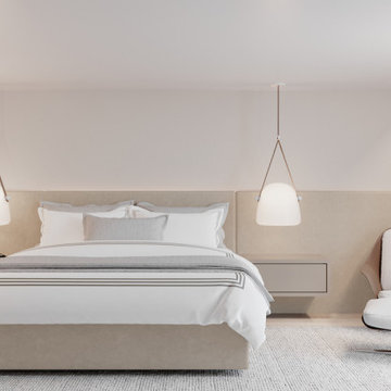
Situated in Miami Beach, Florida, the owner of this 4,000-square-foot luxury condo turned to Sire Design to make better use of the layout of her home as well as elevate her space into one fit for her entire family. While turning this three-bedroom unit into a four-bedroom home with a larger den was no easy feat, the resulting design is simple and elegant with elements that catch your eye throughout.
Taking an elegant approach to minimalism, light neutrals including bone and beige are juxtaposed against black and deep blue. The mix of materials incorporated including soft linens, bright wood tones, and hard marble, and pieces from Roche Bobois, Haute Living, and Kreon further accentuate the play on contrasting colors. To complement Florida’s beautiful weather, the design team also selected soft and warm neutrals for the condo’s walls and floors. Large furniture pieces and geometric art in deeper colors ground the space while custom millwork and flooring found throughout create cohesive and welcoming interiors.
Through thoughtful space planning, Sire Design transformed the condo to now include an additional bedroom and large den. The team also re-situated the open kitchen to look out upon the breathtaking bayside views. What once was the home’s small kitchen is now an expanded space that includes an area for dining to host family and guests. Sire Design also added a custom marble bar to the living room for added entertainment space. With the client’s five children coming to stay at the home on a rotating basis, it was important to make the three secondary bedrooms and den adaptable for all of the family’s changing needs. Furniture selected for the den helps it convert from a place to entertain to a fifth bedroom when needed. To keep the condo from feeling closed in and satisfy its low ceiling height, the design team used low profile lighting from Apure.
With a wealth of experience in high-end residential interiors, Sire Design put its timeless and classic touches on this home, not only making it highly functional for the whole family, but elevated in style too.
 Sire Design
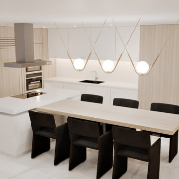
Situated in Miami Beach, Florida, the owner of this 4,000-square-foot luxury condo turned to Sire Design to make better use of the layout of her home as well as elevate her space into one fit for her entire family. While turning this three-bedroom unit into a four-bedroom home with a larger den was no easy feat, the resulting design is simple and elegant with elements that catch your eye throughout.
Taking an elegant approach to minimalism, light neutrals including bone and beige are juxtaposed against black and deep blue. The mix of materials incorporated including soft linens, bright wood tones, and hard marble, and pieces from Roche Bobois, Haute Living, and Kreon further accentuate the play on contrasting colors. To complement Florida’s beautiful weather, the design team also selected soft and warm neutrals for the condo’s walls and floors. Large furniture pieces and geometric art in deeper colors ground the space while custom millwork and flooring found throughout create cohesive and welcoming interiors.
Through thoughtful space planning, Sire Design transformed the condo to now include an additional bedroom and large den. The team also re-situated the open kitchen to look out upon the breathtaking bayside views. What once was the home’s small kitchen is now an expanded space that includes an area for dining to host family and guests. Sire Design also added a custom marble bar to the living room for added entertainment space. With the client’s five children coming to stay at the home on a rotating basis, it was important to make the three secondary bedrooms and den adaptable for all of the family’s changing needs. Furniture selected for the den helps it convert from a place to entertain to a fifth bedroom when needed. To keep the condo from feeling closed in and satisfy its low ceiling height, the design team used low profile lighting from Apure.
With a wealth of experience in high-end residential interiors, Sire Design put its timeless and classic touches on this home, not only making it highly functional for the whole family, but elevated in style too.
 Sire Design
Situated in Miami Beach, Florida, the owner of this 4,000-square-foot luxury condo turned to Sire Design to make better use of the layout of her home as well as elevate her space into one fit for her entire family. While turning this three-bedroom unit into a four-bedroom home with a larger den was no easy feat, the resulting design is simple and elegant with elements that catch your eye throughout.
Taking an elegant approach to minimalism, light neutrals including bone and beige are juxtaposed against black and deep blue. The mix of materials incorporated including soft linens, bright wood tones, and hard marble, and pieces from Roche Bobois, Haute Living, and Kreon further accentuate the play on contrasting colors. To complement Florida’s beautiful weather, the design team also selected soft and warm neutrals for the condo’s walls and floors. Large furniture pieces and geometric art in deeper colors ground the space while custom millwork and flooring found throughout create cohesive and welcoming interiors.
Through thoughtful space planning, Sire Design transformed the condo to now include an additional bedroom and large den. The team also re-situated the open kitchen to look out upon the breathtaking bayside views. What once was the home’s small kitchen is now an expanded space that includes an area for dining to host family and guests. Sire Design also added a custom marble bar to the living room for added entertainment space. With the client’s five children coming to stay at the home on a rotating basis, it was important to make the three secondary bedrooms and den adaptable for all of the family’s changing needs. Furniture selected for the den helps it convert from a place to entertain to a fifth bedroom when needed. To keep the condo from feeling closed in and satisfy its low ceiling height, the design team used low profile lighting from Apure.
With a wealth of experience in high-end residential interiors, Sire Design put its timeless and classic touches on this home, not only making it highly functional for the whole family, but elevated in style too.
 Sire Design
Situated in Miami Beach, Florida, the owner of this 4,000-square-foot luxury condo turned to Sire Design to make better use of the layout of her home as well as elevate her space into one fit for her entire family. While turning this three-bedroom unit into a four-bedroom home with a larger den was no easy feat, the resulting design is simple and elegant with elements that catch your eye throughout.
Taking an elegant approach to minimalism, light neutrals including bone and beige are juxtaposed against black and deep blue. The mix of materials incorporated including soft linens, bright wood tones, and hard marble, and pieces from Roche Bobois, Haute Living, and Kreon further accentuate the play on contrasting colors. To complement Florida’s beautiful weather, the design team also selected soft and warm neutrals for the condo’s walls and floors. Large furniture pieces and geometric art in deeper colors ground the space while custom millwork and flooring found throughout create cohesive and welcoming interiors.
Through thoughtful space planning, Sire Design transformed the condo to now include an additional bedroom and large den. The team also re-situated the open kitchen to look out upon the breathtaking bayside views. What once was the home’s small kitchen is now an expanded space that includes an area for dining to host family and guests. Sire Design also added a custom marble bar to the living room for added entertainment space. With the client’s five children coming to stay at the home on a rotating basis, it was important to make the three secondary bedrooms and den adaptable for all of the family’s changing needs. Furniture selected for the den helps it convert from a place to entertain to a fifth bedroom when needed. To keep the condo from feeling closed in and satisfy its low ceiling height, the design team used low profile lighting from Apure.
With a wealth of experience in high-end residential interiors, Sire Design put its timeless and classic touches on this home, not only making it highly functional for the whole family, but elevated in style too.
Sponsored
Sunbury, OH
J.Holderby - Renovations
Franklin County's Leading General Contractors - 2X Best of Houzz!
 Kowalske Kitchen & Bath
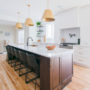
A Sussex family hired us as the design build remodel company to makeover this kitchen. This remodeling project had three main goals: improve storage, update the layout/style and enhance the functionality.
IMPROVE STORAGE
The original home builder put in very narrow cabinets. The small, narrow cabinets made it difficult for the homeowners to store items. They also said it was important to have a kitchen that works for their children. The new design incorporates an appliance cabinet and wide drawers for storing items. The kids have easy access to snack drawers and lower dish storage for plastic cups and plates. Also, we added two built-in cabinets in the dining room for more storage.
UPDATE THE LAYOUT & STYLE
While the area was large, it didn’t maximize the space or fit their contemporary style. They wanted plenty of counter prep space and enough room for friends and family to gather. We added a large wood island with seating – perfect for hosting parties and family dinners. The space is bright with white shaker cabinetry and subway tile backsplash. Warm touches include satin bronze light fixtures and hardware.
ENHANCE THE FUNCTIONALITY
This Sussex kitchen features a Galley Sink Workstation. Having a sink workstation facing the center of the room allows the homeowners to stay part of the conversation while preparing a meal or cleaning up. Sink workstations are one of the hottest kitchen trends.
HOMEOWNER REVIEW
“We recently completed our kitchen remodel with Kowalske and we can’t say enough good things about our experience. Not only was every member of the team amazing, the work that was done in our kitchen was very high quality. We have recommended Kowalske to all of our friends and plan to use them for our master bath remodel in the future!” – Nicole, homeowner (Houzz Review)
 Modern Wicker & Outdoor Furniture
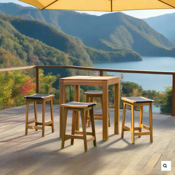
Panama Jack Laguna 5-Piece Pub Set
Elevated Style for Outdoor Entertainment
The Panama Jack LagunaPanama Jack Laguna 5-Piece Pub Set is a stylish and sophisticated addition to any outdoor entertainment area, perfectly blending function with a casual, elevated charm. This pub set includes four comfortable bar stools and a high pub table, each piece featuring a blend of traditional design elements with a modern twist. The warm, natural color scheme of the set complements a variety of outdoor settings, making it a versatile choice for patios, balconies, or poolside areas. The set's design not only adds an aesthetic appeal to your outdoor space but also offers durability and resistance to various weather conditions, ensuring longevity and continued enjoyment.
Comfort Meets Casual Elegance
Each bar stool in the PPanama Jack Laguna 5-Piece Pub Set is thoughtfully designed with comfort and elegance in mind. The stools are equipped with cushions that provide a soft, comfortable seating experience, ideal for leisurely evenings and social gatherings. These cushions are made from high-grade, fade-resistant fabric, ensuring that they remain vibrant and comfortable over time, despite exposure to the elements. The bar stools feature a supportive and ergonomic design, offering a relaxed seating option for enjoying drinks, casual meals, or engaging conversations.
Functional Design for Memorable Gatherings
The Panama Jack Laguna 5-Piece Pub Set is not just about good looks; it's also incredibly functional and adaptable. The high pub table is perfectly sized for socializing and dining, providing a unique and casual dining experience. The set is ideal for creating a focal point in your outdoor entertainment space, whether you're hosting a small gathering or enjoying a quiet evening. The robust construction of the table and stools ensures stability and safety, while the easy-to-clean materials used for the cushions and frames make maintenance a breeze. This pub set combines practicality, style, and comfort, making it an excellent choice for enhancing your outdoor living space with a touch of casual elegance.
 Thompson Remodeling
Thompson Remodeling really enjoyed working with this Grand Rapids family to remodel their basement into a family space where they could showcase their favorite sports memorabilia and other memories from their home state of Maryland.
After remodeling their previous home just 6 months earlier, circumstances required the family to move. One day upon returning to their new home, they found their basement flooded! Realizing they needed to act fast to repair the damage they contacted Thompson Remodeling to help.
When discussing the design for the project, our clients told us how much they had loved the updates they made to their last home and were hoping to use similar warm tones and rustic materials. We looked at photos of that home for inspiration and developed a design that would serve as an entertaining and gathering space that would allow their fantastic collection of Maryland sports memorabilia to shine. Careful consideration was given on how to use every nook and cranny of space, as was the selection process for specific rustic materials that would contribute warmth and visual interest.
We used Ghost Wood to create a rich accent wall in the tv viewing area. The fireplace is made of stacked tile that looks like stone and the mantel is a handpicked, old barn beam. The clients told our designer that they wanted to hang a Maryland flag in the basement so she found this fantastic flag made of distressed wood which was hung above the mantel. For the flooring, we selected a gorgeous vinyl plank for easy cleaning and maintenance.
An existing closet area was used to create a lighted, built-in display area to house the family's prized autographed Baltimore Colts footballs and Baltimore Orioles baseballs.
The bar has a full-size refrigerator, microwave and sink. There are plenty of cabinets and drawers for everything they need for hosting parties on game days. The countertops are a very cool, silver-toned textured laminate. The rusted, recycled corrugated metal bar was hand selected by the client. We installed a special outlet above the door at the end of the bar so that the Terps sign could be plugged in and hung there.
59