
Search results for "Identifies" in Home Design Ideas
 Kitchen Solvers of Spring Hill
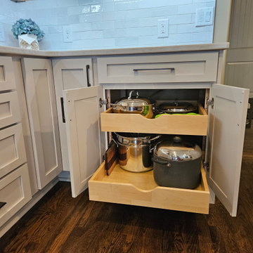
This homeowner had lived with her dark, crowded kitchen long enough and was ready for a change. Through our design process, we identified several ways to maximize storage, improve functionality, and create a brighter, more open feel.
To transform the space, we removed the raised bar top, repaired the rounded wall corners, added roll-out trays and an adjustable lazy Susan for easier access, installed tray dividers, repaired the refrigerator panel, modified toe-kick areas, and refaced all the cabinetry and range hood surround. We also installed beautiful new doors and drawer fronts, updated the countertops, added a stunning tile backsplash, and finished the project with task lighting to brighten every workspace.
The result is a kitchen that feels larger, more functional, and much more inviting while allowing the existing wood hood to remain a beautiful focal point.
The homeowner's reaction said it all: “Ahhh, I can finally breathe!”
 High Street Design
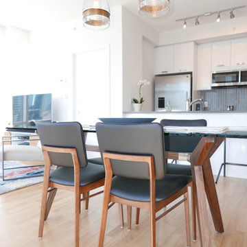
This recently built 1,200 sq ft condo had spectacular views but was otherwise in need of character and design. My client, a single man and first time homeowner had excellent taste but wasn't sure where to begin or how to pull things together. We quickly identified a mutual love of mid century modern pieces and created a modern yet industrial inspired space that compliments and enhances his homes stunning panoramic views of downtown.
Favourite pieces include the colourful and bold silk area rug that helps ground the otherwise monochromatic space, custom stools that are as comfortable as they are visually appealing with luggage leather seats, several walnut pieces that add warmth and a concrete coffee table for a mix of modern. The final look is clean, fresh and eclectic resulting in the masculine, unique feel my client wanted.
 Dream Kitchens
CONTACT
These home owners initially contacted their Designer to identify the reason that the floor in their upstairs bedroom suffered from a noticeable slant. The floor problem actually impacted a small bathroom and adjoining study also.
Early on, the decision was made to re-design the footprint for the 3 rooms in conjunction with repairing the uneven floor. The approach was to gut all three spaces of walls and floors and start from scratch. The new spaces were designed with the clients needs for accessibility in mind.
DESIGN
The design effort included identifying the products to be used throughout the spaces. This included everything from the flooring to the wall paint. Kohler plumbing fixtures and Adelphi cabinetry were decided on first. A radiant heat grid was included for the bathroom floor. Lighting, paint and tile soon followed. Wood flooring was installed throughout the adjoining spaces.
The master bedroom was redesigned to allow for entry from the study or the master bath via pocket doors. The study was given an access to the master bath also. The hardwood flooring ties the bedroom and study together and gives each room a very spacious feel. The original master bedroom was changed to incorporate a large walk-in closet that features custom storage throughout. The study that also doubles as the IT center for the home was updated with custom book cases and cabinetry from Adelphi Cabinets.
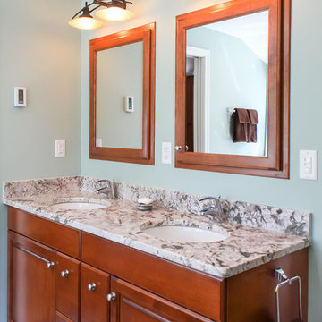
When discussing the reapportioning of the entire space for the individual rooms the bathroom was given priority. The previous small bathroom did not include a window for natural light. The new design corrected that in a big way by incorporating an existing bedroom window into the new space. The decision was made early on to allow for the inclusion of a large shower with full granite walls and custom plate glass surround. The shower system includes both fixed and hand held shower heads. A thermostatic control system was included to eliminate scalding. A large bench seat of matching granite allows for relaxing while getting squeaky clean. A separate air massage tub from Kohler centered under the new windows allows for a relaxed moment while being caressed by all those tiny bubbles. His and her side by side vanity sinks allows for efficient use of the space. The Caxton sinks and coordinated toilet were selected to match the color of the tub and do so beautifully!
CONSTRUCTION
We started the project not knowing what we were going to find. The slanting floor upstairs was not evident in the ceiling of the first floor
Once the demolition had been completed it was evident that the floor joists were at the heart of the problem. The home had been framed with floor joists that had been strung together to increase their length. Over time and with the house settling, the strung together joists started to droop from their connection point. This was concealed on the first floor by a large HVAC duct running through the garage. This was corrected by the addition of two laminated beams in the ceiling of the first floor (luckily in the garage) that re-supported the offending joists.
THE END
The project was a huge success in terms of problem solving and designing with budget and time frame in mind. The overall impact of the new space is impressive both visually and from a practicality point of view. The new master suite with upscale bathroom and study adds significant value to the home and the home owners quality of life!
Find the right local pro for your project
 Goldenline Remodeling
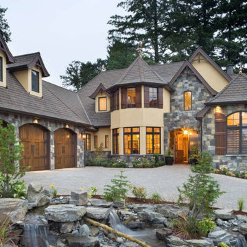
The roof are elements of the upper part of the structure, but they have characteristic differences. The roof can be called a supporting structure, which includes a rafter system, lathing, vapor barrier, waterproofing, insulation, roofing material, gables.
Remember that roofing is complicated, with variables required for both success and longevity. Even though you will be able to identify some roofing problems, contact a professional to verify your suspicions. Goldenline Remodeling can help you determine your roofing requirements. When it comes to proper roofing in SURBITON, our professionals can help address the specific needs and variables of each job. Contact is and you can learn more about roofing services from Goldenline Remodeling.
 Cantoni Houston
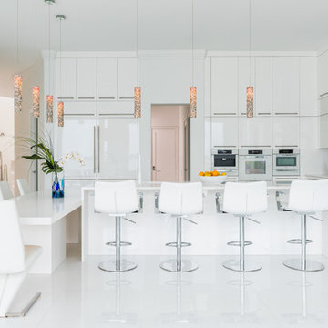
Faced with extensive water damage to their home, the Patel’s turned to Cantoni designer Andrea Petor to infuse new life into their family’s beloved weekend retreat in Montgomery, Texas. Balancing the client’s minimalist wants with their love of hosting, Andrea created a cohesive design to accommodate their frequent guests and large extended family. Beginning with the kitchen remodel, Andrea worked with the Patel’s to identify the best layout for the space, understanding it would be used regularly for entertaining. To maximize storage space, Andrea designed custom floor to ceiling cabinetry finished in high gloss white lacquer. She selected Miele optic white appliances to enhance the sleek design. Andrea had a custom dining table built into the island to provide ample seating and ensure the entire family could enjoy meals together. The kitchen’s monochromatic color palette was carried throughout the interiors allowing the home’s beautiful waterfront views to take center stage. Adding richness and texture to each room, Andrea selected sculptural, modern furnishings to complete the space and bring the Patel’s vision to life.
 High Street Design
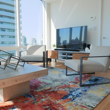
This recently built 1,200 sq ft condo had spectacular views but was otherwise in need of character and design. My client, a single man and first time homeowner had excellent taste but wasn't sure where to begin or how to pull things together. We quickly identified a mutual love of mid century modern pieces and created a modern yet industrial inspired space that compliments and enhances his homes stunning panoramic views of downtown.
Favourite pieces include the colourful and bold silk area rug that helps ground the otherwise monochromatic space, custom stools that are as comfortable as they are visually appealing with luggage leather seats, several walnut pieces that add warmth and a concrete coffee table for a mix of modern. The final look is clean, fresh and eclectic resulting in the masculine, unique feel my client wanted.
 Cantoni Houston
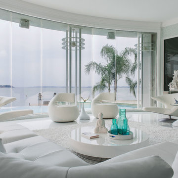
Faced with extensive water damage to their home, the Patel’s turned to Cantoni designer Andrea Petor to infuse new life into their family’s beloved weekend retreat in Montgomery, Texas. Balancing the client’s minimalist wants with their love of hosting, Andrea created a cohesive design to accommodate their frequent guests and large extended family. Beginning with the kitchen remodel, Andrea worked with the Patel’s to identify the best layout for the space, understanding it would be used regularly for entertaining. To maximize storage space, Andrea designed custom floor to ceiling cabinetry finished in high gloss white lacquer. She selected Miele optic white appliances to enhance the sleek design. Andrea had a custom dining table built into the island to provide ample seating and ensure the entire family could enjoy meals together. The kitchen’s monochromatic color palette was carried throughout the interiors allowing the home’s beautiful waterfront views to take center stage. Adding richness and texture to each room, Andrea selected sculptural, modern furnishings to complete the space and bring the Patel’s vision to life.
 AIA Pittsburgh
REGIONAL + URBAN DESIGN: Honor Award
PROJECT: Upper Lawrenceville Community Visioning
CLIENT: Lawrenceville Corporation, Matt Galluzo, Executive Director
ARCHITECTURE FIRM: evolveEA
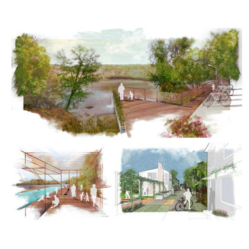
DESCRIPTION: This Strategy Study was the first significant planning effort dedicated solely to Upper Lawrenceville, or the 10th Ward. Through a series of community charrettes, a neighborhood identity was created, along with a series of principles that would help prioritize future development to suit the community’s long term livability goals. Three themes were established – Upper Lawrenceville as an affordable and authentic place to live, a place where people make (and grow) things, and recreational amenities that attract visitors who are inclined to stay as residents – and from those themes, six programs were identified that would be essential to create a place where people wanted to live, work, and play.
JURY COMMENTS: This study is a really comprehensive look at the existing residential fabric with a strong point of view towards handling growth. It is very well presented, attuned to the existing scale, and very sensitive to the needs of existing residents.
 Cantoni
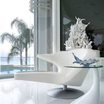
Faced with extensive water damage to their home, the Patel’s turned to Cantoni designer Andrea Petor to infuse new life into their family’s beloved weekend retreat in Montgomery, Texas. Balancing the client’s minimalist wants with their love of hosting, Andrea created a cohesive design to accommodate their frequent guests and large extended family. Beginning with the kitchen remodel, Andrea worked with the Patel’s to identify the best layout for the space, understanding it would be used regularly for entertaining. To maximize storage space, Andrea designed custom floor to ceiling cabinetry finished in high gloss white lacquer. She selected Miele optic white appliances to enhance the sleek design. Andrea had a custom dining table built into the island to provide ample seating and ensure the entire family could enjoy meals together. The kitchen’s monochromatic color palette was carried throughout the interiors allowing the home’s beautiful waterfront views to take center stage. Adding richness and texture to each room, Andrea selected sculptural, modern furnishings to complete the space and bring the Patel’s vision to life.
 Craft Homes Northwest
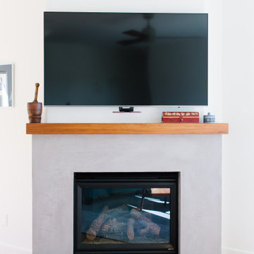
New to the Pacific Northwest, our recently retired clients had relocated from the Fairbanks area to take advantage of the more moderate climate and improved access to family and resources. They selected a nice home in a desirable location with a large enough lot next to some green space to afford them some breathing room.
Taking a less is more approach, the homeowners’ goal was to establish a more neutral pallet with white walls, wood and earthy accents. We kept the budget at the forefront of our conversations, and they took care to make practical decisions, investing strategically in the upgrades to their home.
Every decision and change made went a long way toward aligning the style of the home with the values of its new owners.
The homeowners identify with their Danish heritage, which they express through their aesthetic and selections.
The master bathroom improvements were especially important to the homeowners. We added heated floors and completely reworked the layout and design. It featured a new tub, a custom shower, tile throughout, shower glass, a custom cabinet made by a local cabinet maker and new lights and fixtures.
 Homes And Such LLC
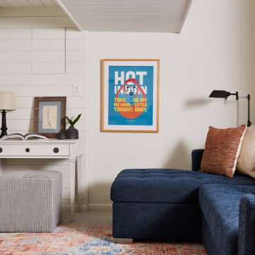
From addressing recurring water problems to integrating common eyesores seamlessly into the overall design, this basement transformed into a space the whole family (and their guests) love.
Like many 1920s homes in the Linden Hills area, the basement felt narrow, dark, and uninviting, but Homes and Such was committed to identifying creative solutions within the existing structure that transformed the space.
Subtle tweaks to the floor plan made better use of the available square footage and created a more functional design. At the bottom of the stairs, a bedroom was transformed into a cozy, living space, creating more openness with a central foyer and separation from the guest bedroom spaces.
 Rose T Bien-Aime
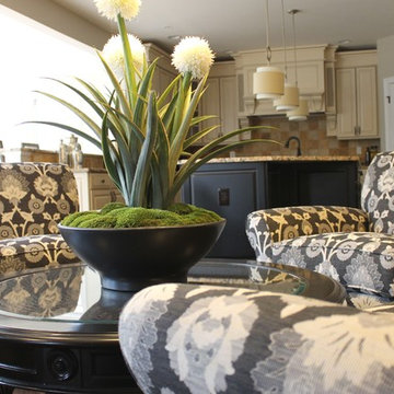
My client has a lot of extra room in between each space that she didn’t know what to do with it. As a designer, it’s my job to think outside the box and make every space functional. I came up with the concept of creating a space where she can sit and drink tea or coffee and conversate if they don’t want to be at the kitchen table. I used four lounge chairs with a round table in the middle to identify the space and create drama at the same time. I decided to use a bold floral pattern but still neutral with a black coffee table to ground the space. The curve of the round table surrounded by the repetition of the four chairs really create a dramatic effect in between the kitchen and the morning room. It invites you in to come in and take a seat, take a deep breath, drink some tea or coffee and relax!
 Cantoni Houston
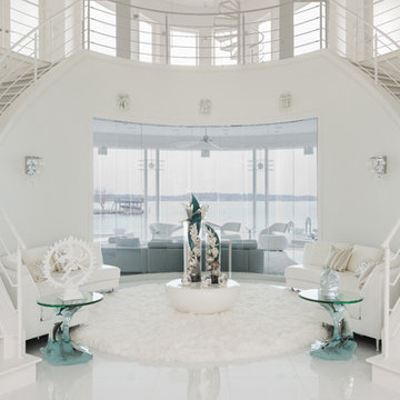
Faced with extensive water damage to their home, the Patel’s turned to Cantoni designer Andrea Petor to infuse new life into their family’s beloved weekend retreat in Montgomery, Texas. Balancing the client’s minimalist wants with their love of hosting, Andrea created a cohesive design to accommodate their frequent guests and large extended family. Beginning with the kitchen remodel, Andrea worked with the Patel’s to identify the best layout for the space, understanding it would be used regularly for entertaining. To maximize storage space, Andrea designed custom floor to ceiling cabinetry finished in high gloss white lacquer. She selected Miele optic white appliances to enhance the sleek design. Andrea had a custom dining table built into the island to provide ample seating and ensure the entire family could enjoy meals together. The kitchen’s monochromatic color palette was carried throughout the interiors allowing the home’s beautiful waterfront views to take center stage. Adding richness and texture to each room, Andrea selected sculptural, modern furnishings to complete the space and bring the Patel’s vision to life.
 G. Christianson Construction, Inc.
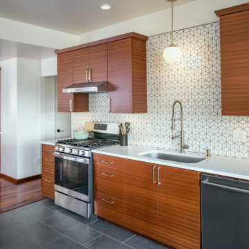
These clients fell in love with this home immediately when they saw it on the market, and quickly made the offer. From the unique lighting, retro architectural details, and view of the cascades, this home was full of potential to be remodeled to fit the lifestyle and personality of it’s new owners. Through the design process, we identified the aspects of the home that these owners loved, such as the Living Room soffit, grasscloth wallpaper, floating staircase and outdoor-feel basement. We then pinpointed the difficulties that the floor plan and materials presented for their lifestyle, such as the closed-off/compartmentalized floor plan, shag carpet in the living room, outdated finishes, lack of wood, and a newer kitchen that was an outlier within the style of the house. The finished product is a magazine-worthy transformation that thoughtfully unifies the owner’s personal style and the home’s retro roots.
 Imagine living space
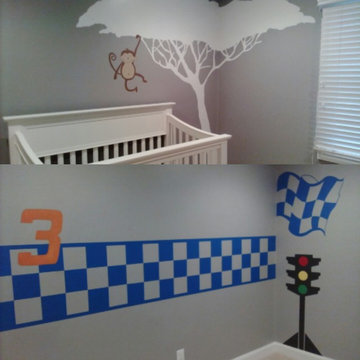
Customer's of mine bought their three year old son a race car toddler bed to support his current interests for Christmas. Before that his room was themed for nursery, designed with tree and monkey which is great for infants, but would no longer fit their new ideas. The homeowners also requested a time effective solution so we collaborated with one another and came up with the following Plan: I used the remaining paint from the original application to cover over the old work. This was the largest time savor in that the crib would be the only piece of furniture required to be moved. Prior to we agreed that subtlety was something we wanted to hold onto as much as possible. So I painted a running checker border, using only the accent color to the car and the original wall color rather than introducing an additional color which would have resulted in a louder feel. I designed the drag light as a teaching friendly tool. Building it with triangles at its base, rectangles within and circle silhouettes so that the toddler can easily identify with it's shapes. Using his current age I assigned him his first racing number and closed out this one day transformation with the finish line flag.
 Studio Zeren
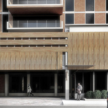
Standing resolute in the diligent Atlantic breezes, the Regency Tower condominiums have been a mainstay in the material culture of this New Jersey oceanside community. Our approach to the redesign of the building pediment compliments the resilience of its original construction and augments its present aesthetic. This “Boardwalk Canopy” concept is envisioned as an elegant revitalization of the Porte Cochere (canopy) and corresponding ground-scapes. We understand that the existing canopy is both an element of shelter and salient in accentuating the character of the existing edifice. Since the existing function of the Regency’s Porte Cochere is to provide covered entrance for inhabitants and visitors, our design proposal reinterprets this element as a figuratively organic ext4ntion of the boardwalk. Striking a sensitive relationship with the social theatre of place, the 5200 Boardwalk Canopy design generates a new linear and vertical continuity in gesture and form, while redefining a visual hierarchy for the pediment. The simple palette facilitates wayfinding and specifies a timeless and durable visual statement that engages with the Regency’s latent character. We believe this design presents a unique and identifiable reimagining of a building that has well withstood the test of time. Comprehensive architecture working drawings can be provided upon award of the commission.
 Kitchen Solvers of Spring Hill
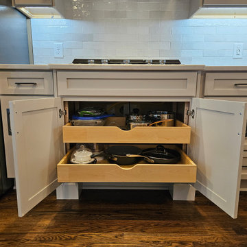
This homeowner had lived with her dark, crowded kitchen long enough and was ready for a change. Through our design process, we identified several ways to maximize storage, improve functionality, and create a brighter, more open feel.
To transform the space, we removed the raised bar top, repaired the rounded wall corners, added roll-out trays and an adjustable lazy Susan for easier access, installed tray dividers, repaired the refrigerator panel, modified toe-kick areas, and refaced all the cabinetry and range hood surround. We also installed beautiful new doors and drawer fronts, updated the countertops, added a stunning tile backsplash, and finished the project with task lighting to brighten every workspace.
The result is a kitchen that feels larger, more functional, and much more inviting while allowing the existing wood hood to remain a beautiful focal point.
The homeowner's reaction said it all: “Ahhh, I can finally breathe!”
 G. Christianson Construction, Inc.
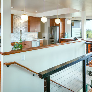
These clients fell in love with this home immediately when they saw it on the market, and quickly made the offer. From the unique lighting, retro architectural details, and view of the cascades, this home was full of potential to be remodeled to fit the lifestyle and personality of it’s new owners. Through the design process, we identified the aspects of the home that these owners loved, such as the Living Room soffit, grasscloth wallpaper, floating staircase and outdoor-feel basement. We then pinpointed the difficulties that the floor plan and materials presented for their lifestyle, such as the closed-off/compartmentalized floor plan, shag carpet in the living room, outdated finishes, lack of wood, and a newer kitchen that was an outlier within the style of the house. The finished product is a magazine-worthy transformation that thoughtfully unifies the owner’s personal style and the home’s retro roots.
 Kitchen Solvers of Spring Hill
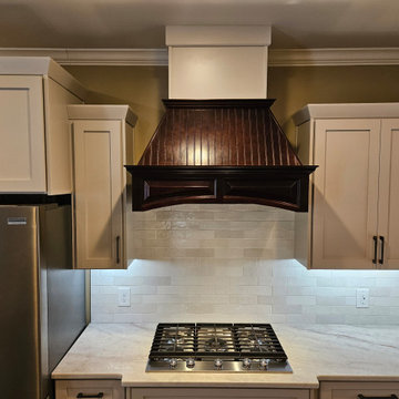
This homeowner had lived with her dark, crowded kitchen long enough and was ready for a change. Through our design process, we identified several ways to maximize storage, improve functionality, and create a brighter, more open feel.
To transform the space, we removed the raised bar top, repaired the rounded wall corners, added roll-out trays and an adjustable lazy Susan for easier access, installed tray dividers, repaired the refrigerator panel, modified toe-kick areas, and refaced all the cabinetry and range hood surround. We also installed beautiful new doors and drawer fronts, updated the countertops, added a stunning tile backsplash, and finished the project with task lighting to brighten every workspace.
The result is a kitchen that feels larger, more functional, and much more inviting while allowing the existing wood hood to remain a beautiful focal point.
The homeowner's reaction said it all: “Ahhh, I can finally breathe!”
 High Street Design
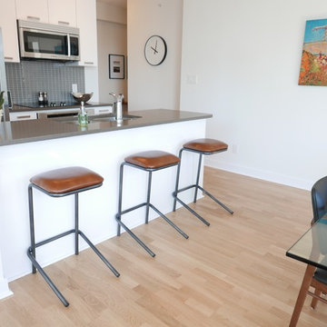
This recently built 1,200 sq ft condo had spectacular views but was otherwise in need of character and design. My client, a single man and first time homeowner had excellent taste but wasn't sure where to begin or how to pull things together. We quickly identified a mutual love of mid century modern pieces and created a modern yet industrial inspired space that compliments and enhances his homes stunning panoramic views of downtown.
Favourite pieces include the colourful and bold silk area rug that helps ground the otherwise monochromatic space, custom stools that are as comfortable as they are visually appealing with luggage leather seats, several walnut pieces that add warmth and a concrete coffee table for a mix of modern. The final look is clean, fresh and eclectic resulting in the masculine, unique feel my client wanted.
51