
Search results for "Illustrate" in Home Design Ideas
 Hays + Ewing Design Studio
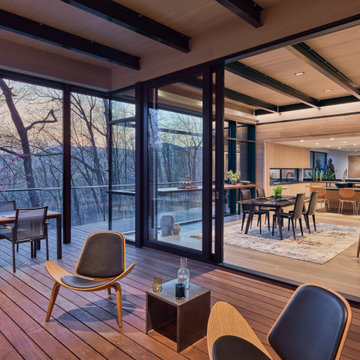
A covered porch has motorized screens which transforms the porch to a screened porch. The porch is an extension of the interior living space. The ceiling and flooring materials are continuous and intended to blur the distinction between interior and exterior spaces. Indoor/outdoor living at its best.

 Bilotta Kitchen & Home
This kitchen was designed by senior designer, Jeff Eakley, for a beautiful waterfront home in Rye, NY. The builder was long-time Bilotta partner, Murphy Brothers and architect, Keller/Eaton Architects, P.C. The kitchen features a mix of cabinetry lines: the perimeter is Rutt HandCrafted Cabinetry in a custom “Stone” paint on a stepped door; the island, by Artcraft, is a flat panel Molveno horizontal grain laminate. The backsplash is a stone mosaic which beautifully complements the color of the perimeter cabinets and the stone wall gives the room an overall rustic feel. Designer: Jeff Eakley, Bilotta Kitchens. Photo Credit: Peter Krupenye.

 FormLA Landscaping
While a formal swing set and play area ensure young kids have a spot of their own, as they age they prefer crunching gravel trails, hidden seating, and discovering fruits and veggies in the edible garden near a charming wooden shed. Photo: Lesly Hall Photography
The trail, and a petite patio to the side of the shed create defensible space, protecting the wood shed and wood fence from a fire that might catch the other. If fire were near, cushions would be placed within the shed, and the shed window closed as additional precautions.
Find the right local pro for your project

 Cantoni Atlanta
Cantoni is Designer's Choice for this Palatial Home in South Carolina. Cantoni partners on many projects with architects, interior designers, developers, realtors and others in the trade. The featured project in this eNewsletter is a spectacular example of a recent partnering between Susan Sentell ASID, Beaux Monde, Inc., Cumming, Georgia, and Design Consultant Kohl Sudnikovich of Cantoni Atlanta. While inspired by classic Italian architecture, this palatial home is not in the foothills of Italy’s Apennines but in the foothills of the Blue Ridge Mountains in South Carolina. When we saw the images of this stunning home and what went into planning and executing its interiors, I thought: here’s a perfect illustration of Cantoni’s branding theme: Great Design Is A Way of Life. Design isn’t just something cosmetic, something tacked on, but the very essence of a residence’s personality and of the personality of the people who make the house a home. This sensational South Carolina project is a superb example of Cantoni’s Great Design theme brought to life. According to Kohl, Cantoni’s involvement kicked in when Susan, whom he’d worked with before, contacted him to consult on furniture collections that would help her fulfill her and her client’s overall design theme. Susan says, "This is a 5,800-sq. ft. new construction designed by a prestigious national architectural group. Given the Mediterranean-influenced elevation and the client’s wish for an airy, Italian-contemporary interior treatment I felt Cantoni was the best source for furnishing some of the main rooms. "The theme of our project we called, ‘The Goddess House’ for its ethereal look and feel– open, warm, free, filled with light and natural colors, flowing with sophisticated detail. I felt Cantoni was the right choice to help us carry out the theme. I knew Cantoni not only for its Italian design but for the quality of its products and depth and breadth of its selection. "After creating furniture plans and the overall palette, I contacted Kohl and asked him to consult with us on Cantoni pieces that would realize our plans for the living room, dining room, master bedroom, media room and outdoor. "The finished product is a beautiful example of what you can achieve when the vision of the client and the skills of the design team are in alignment. I think the feeling you get in this home is a manifestation of that harmony.” Thanks so much to Susan for choosing Cantoni and for her client for generously allowing us to show the interiors of the rooms with Cantoni product. And good job Kohl and the Cantoni Atlanta team for your efforts–not the least of which were the logistics involved in delivery and installation, this home being a great distance from Atlanta. Great Design IS a Way of Life. That theme works at many levels: alluding to our clients’ tastes and dreams and sophistication, the product itself, and the creative talents of the designers.
 Cantoni Atlanta
Cantoni is Designer's Choice for this Palatial Home in South Carolina. Cantoni partners on many projects with architects, interior designers, developers, realtors and others in the trade. The featured project in this eNewsletter is a spectacular example of a recent partnering between Susan Sentell ASID, Beaux Monde, Inc., Cumming, Georgia, and Design Consultant Kohl Sudnikovich of Cantoni Atlanta. While inspired by classic Italian architecture, this palatial home is not in the foothills of Italy’s Apennines but in the foothills of the Blue Ridge Mountains in South Carolina. When we saw the images of this stunning home and what went into planning and executing its interiors, I thought: here’s a perfect illustration of Cantoni’s branding theme: Great Design Is A Way of Life. Design isn’t just something cosmetic, something tacked on, but the very essence of a residence’s personality and of the personality of the people who make the house a home. This sensational South Carolina project is a superb example of Cantoni’s Great Design theme brought to life. According to Kohl, Cantoni’s involvement kicked in when Susan, whom he’d worked with before, contacted him to consult on furniture collections that would help her fulfill her and her client’s overall design theme. Susan says, "This is a 5,800-sq. ft. new construction designed by a prestigious national architectural group. Given the Mediterranean-influenced elevation and the client’s wish for an airy, Italian-contemporary interior treatment I felt Cantoni was the best source for furnishing some of the main rooms. "The theme of our project we called, ‘The Goddess House’ for its ethereal look and feel– open, warm, free, filled with light and natural colors, flowing with sophisticated detail. I felt Cantoni was the right choice to help us carry out the theme. I knew Cantoni not only for its Italian design but for the quality of its products and depth and breadth of its selection. "After creating furniture plans and the overall palette, I contacted Kohl and asked him to consult with us on Cantoni pieces that would realize our plans for the living room, dining room, master bedroom, media room and outdoor. "The finished product is a beautiful example of what you can achieve when the vision of the client and the skills of the design team are in alignment. I think the feeling you get in this home is a manifestation of that harmony.” Thanks so much to Susan for choosing Cantoni and for her client for generously allowing us to show the interiors of the rooms with Cantoni product. And good job Kohl and the Cantoni Atlanta team for your efforts–not the least of which were the logistics involved in delivery and installation, this home being a great distance from Atlanta. Great Design IS a Way of Life. That theme works at many levels: alluding to our clients’ tastes and dreams and sophistication, the product itself, and the creative talents of the designers.
 Dimensions in Wood Inc
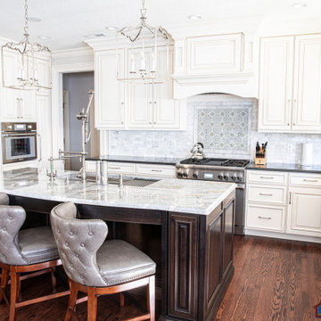
This client’s vision for their kitchen/hearth room remodel was to create a harmonious space for gathering and socializing with family and friends. Without the before and after photos, you would scarcely believe this was the same home.
This huge home renovation perfectly illustrates that Dimensions In Wood’s expert team can handle every aspect of your remodeling project. Plumbing, flooring, electrical wiring, custom cabinets, structural engineering, appliances, windows, interior and exterior doors, entertainment and more. Contact us today to discuss Translating Your Visions into Reality
The client was interested in new appliance technology, cabinetry to the ceiling, and an Island large enough to seat 3. They also wanted a built-in breakfast nook, improved pantry space, more functional storage on either side of their fireplace, and a built-in appearance for the TV above the mantel. The original built-in desk was not used, and they preferred for that space to serve as a small bar area with refrigeration and a place to store their printer. We designed several plans for the space before selecting the final layout.
The new design required the removal of the soffit over the old sink, as well as a small wall beside the old refrigerator. The wall beside the stairwell had to be shortened 13 inches and a new beam installed to carry the load of the home’s 2nd story to gain enough space for the large central island. The existing closet pantry walls were also reconfigured as per the new plan.
This serves as a great reminder that Dimensions In Wood is much more than just custom cabinets.
Central to the entire custom kitchen is an 8-foot Walnut island. The huge island, which comfortably seats three, is topped with Essenza Blue quartzite. The stone’s natural striations are beautiful. Quartzite is harder than granite, and less likely to stain than other stones because of its density. The couple had to look through multiple slabs to find a piece they LOVED. The island’s custom Walnut cabinetry, built to resemble a piece of custom furniture, was stained Bronzed Walnut by Sherwin Williams.
The 4-foot Galley Workstation in the island, handles all the kitchen’s prep, serving, and cleanup needs. The Galley’s culinary tools include an upper tier cutting board, upper tier drying rack, 2 lower tier platforms, 11″ colander with non-slip handles, and 11” mixing bowl with lid and non-slip bottom. Learn more about the amazing Galley Workstation here. A Waterstone gantry faucet in a pewter finish combines a pull-down sprayer for maximum mobility and a articulated swivel spout. A water tap with reverse osmosis filter provides the highest quality drinking water. To keep a clean and sleek counter we installed a raised air switch for the garbage disposal and integrated soap dispenser. The island also houses the Thermador Sapphire 7-Program Dishwasher with a hidden touch control panel and a custom Walnut wood front. The cabinetry under the Galley Workstation features a trash roll out, as well as storage for the culinary tools.
Shortening the stairwell wall, and reframing around the stairs, which included shortening the handrail, also made room for a bi-fold door walk-in pantry with extra roll out storage and space for a small microwave. Above the panty doors is a remote controlled, electric motor powered, lift up cabinet door which hides a flat screen TV, used while the family is cooking.
To the right of the walk-in pantry is cold food storage. The Thermador, 30-inch Freedom Collection refrigerator and 24-inch built-in freezer column with internal ice maker are covered with matching cabinetry fronts. An open display space was designed above the units, creating an aesthetically beautiful wall. To the right of the refrigerator & freezer columns is a tall cabinet designed for the built-in Thermador steam and convection oven. The convention steam oven is a relatively new technology for homes, but its versatility and food quality is amazing. To the right of this is a pull-out appliance pantry which provides easy access and storage for a stand mixer, blender, and any other appliance you do not want to clutter the counter.
The most visible wall of the kitchen features the 36-inch Thermador Professional Series Harmony Gas Range with Griddle. Between the range and custom designed wood hood, a framed mosaic tile accent in the backsplash, creates a focal point. To clear the air, the Professional Series Thermador 42-inch ventilation insert provides excellent exhaust capabilities, as well as providing multi-level, vivid LED lights for beautiful illumination.
The wall cabinetry symmetrically flanks the custom hood, utilizing deeper wall cabinetry on each end, allowing for storage of oversized dishware. The base cabinetry on this wall is made up of drawers, except for the corner, which is a Kesseböhmer LeMans II. This specially designed shelf system allows ease of access in underutilized blind corners. The dual action articulation system with soft close mechanism ensures a smooth open and close.
Rounding the corner to the outside wall, the base cabinetry was built to a narrower depth, providing additional space for the island, as well as easier access to the new larger pass-thru window which serves the screen porch. The client selected Black Vermont granite countertops with an ogee edge to contrast the Linen White painted cabinetry.
The door to the screen porch was replaced with a Marvin Exterior Door with a raised panel at the bottom of the 3⁄4 glass door.
Marvin Windows replaced the other windows in the space increasing the energy efficiency and value of the home. To establish the breakfast nook, a bench with drawers and an upholstered seat was built into the bay area of the room.
Custom bookshelves were built with open shelves, cabinet doors, and drawers on either side of the fireplace. A new stone hearth and fireplace surround were installed. Above the existing mantel we built a recessed space for the flat screen television hiding all wiring inside the walls for a completely clean look.
The space that was once a desk was transformed into a bar area. The glass shelves and glass cabinet front liquor cabinet stand out. But this bar area has hidden secrets. Tucked beneath the black granite is a Thermador under-counter double drawer refrigerator with matching wood front panels. They blend in perfectly with the cabinets. A wireless printer is easily accessed on a slide out drawer. Plus, what looks like merely wooden panels on the wall are concealing recessed storage for more bottles and glasses!
Overhead recessed lighting and speaker system provide illumination and entertainment through the entire space.
This luxury home had original, solid oak flooring through most of the first floor which the homeowner obviously wanted to keep but were in desperate need of repair and refinishing. Our master craftsmen wove in new wood flooring to match the old where needed, particularly where walls had been changed and where the floor was damaged. We sanded the floors, smoothing away years of wear and tear. The entire wood floor was then uniformly stained, making it impossible to differentiate where any repairs were made.
If this renovation has inspired you, then contact us today! There is no limit to our Dimensions.

 K. Dakin Design Inc.
A small courtyard garden in San Francisco.
• Creative use of space in the dense, urban fabric of hilly SF.
• For the last several years the clients had carved out a make shift courtyard garden at the top of their driveway. It was one of the few flat spaces in their yard where they could sit in the sun and enjoy a cup of coffee. We turned the top of a steep driveway into a courtyard garden.
• The actual courtyard design was planned for the maximum dimensions possible to host a dining table and a seating area. The space is conveniently located outside their kitchen and home offices. However we needed to save driveway space for parking the cars and getting in and out.
• The design, fabrication and installation team was comprised of people we knew. I was an acquaintance to the clients having met them through good friends. The landscape contractor, Boaz Mor, http://www.boazmor.com/, is their neighbor and someone I worked with before. The metal fabricator is Murray Sandford of Moz Designs, https://mozdesigns.com/, https://www.instagram.com/moz_designs/ . Both contractors have long histories of working in the Bay Area on a variety of complex designs.
• The size of this garden belies the complexity of the design. We did not want to remove any of the concrete driveway which was 12” or more in thickness, except for the area where the large planter was going. The driveway sloped in two directions. In order to get a “level”, properly, draining patio, we had to start it at around 21” tall at the outside and end it flush by the garage doors.
• The fence is the artful element in the garden. It is made of power-coated aluminum. The panels match the house color; and posts match the house trim. The effect is quiet, blending into the overall property. The panels are dramatic. Each fence panel is a different size with a unique pattern.
• The exterior panels that you see from the street are an abstract riff on the seasons of the Persian walnut tree in their front yard. The cut-outs illustrate spring bloom when the walnut leafs out to autumn when the nuts drop to the ground and the squirrels eats them, leaving a mess of shells everywhere. Even the pesky squirrel appears on one of the panels.
• The interior panels, lining the entry into the courtyard, are an abstraction of the entire walnut tree.
• Although the panel design is made of perforations, the openings are designed to retain privacy when you are inside the courtyard.
• There is a large planter on one side of the courtyard, big enough for a tree to soften a harsh expanse of a neighboring wall. Light through the branches cast playful shadows on the wall behind.
• The lighting, mounted on the house is a nod to the client’s love of New Orleans gas lights.
• The paving is black stone from India, dark enough to absorb the warmth of the sun on a cool, summer San Francisco day.

 Cantoni Los Angeles
It’s warm in Southern California, and that’s exactly the feeling Andy and Liz sought to maintain inside their new Tuscan-style home as they embarked on a modern interior makeover. After all, the couple had two small children and a dog to consider. Empty and austere simply wasn’t a good fit for the young family whose interests include photography, art and lots of Lego’s.
Andy, an engineer, became intrigued with Cantoni after driving past the Irvine location on his daily commute. It wasn’t long before he and Liz decided to venture into the Los Angeles showroom, and that’s where they met Bernadette. By all accounts, the trio made for great collaboration, and the project that began in February 2012 is still a work in progress today.
“We were impressed by Bernadette,” says Andy. “We liked her and her work, and she won us over.”
The project began with pictures sent and an in-home walk-through where measurements were taken. The couple knew they wanted furnishings for the living, dining and family rooms, as well as the media room and a study. They were open to art and accent pieces, and hoped to incorporate natural elements into the mix. Bernadette set to work.
“It was fun touring our LA showroom and listening to Liz and Andy discuss their likes and dislikes. One thing was for sure,” she adds, “the Laguna Sectional was going in their theater room even if we needed to knock out a wall!”
UpstairsPhase I of the job is complete (as you can see from the stunning images), but instead of parting ways, Andy and Liz decided to have Bernadette help re-imagine the master bedroom and kitchen, next. The ongoing nature of this project illustrates a trend we see with most of our clients: we build trusted, long-term relationships. It’s not about the transaction, but about great design, the design process, and the ability of our talented staff to help clients create the lifestyles they want.
As always, there’s plenty to love about the products seen in our feature stories. To help you shop the look, we’re introducing a Featured Products page via a link to the images in each story. We’ve also redesigned our site to make sourcing and finding that just-right piece a breeze.
 Decks by Kiefer LLC
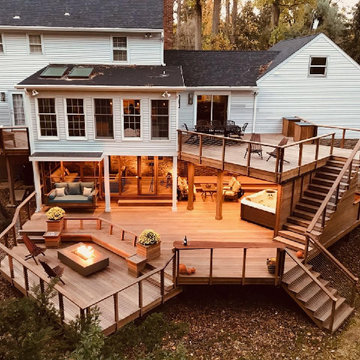
A square deck doesn’t have to be boring – just tilt the squares on an angle.
This client had a big wish list:
A screen porch was created under an existing elevated room.
A large upper deck for dining was waterproofed with EPDM roofing. This made for a large dry area on the lower deck furnished with couches, a television, spa, recessed lighting, and paddle fans.
An outdoor shower is enclosed under the stairs. For code purposes, we call it a rinsing station.
A small roof extension to the existing house provides covering and a spot for a hanging daybed.
The design also includes a live edge slab installed as a bar top at which to enjoy a casual drink while watching the children in the yard.
The lower deck leads down two more steps to the fire pit.

 InnovationLand
3D Rendering
A two-level pergola, circular firepit area and outdoor kitchen with a charcoal-gas combo grill star in this Houston patio addition designed for entertaining large crowds in style.
"The client was an attorney with a passion for cooking and entertaining," says the project's principal designer, Lisha Maxey of LGH Designs. "Her main objective with this space was to create a large area for 10 to 20 guests, including seating and the prep and cooking of meals."
Located in the backyard of the client's home in Spring, TX, this beautiful outdoor living and entertaining space includes a 28-by-12-foot patio with Fantastico silver travertine tile flooring, arranged in a Versailles pattern. The walkway is Oklahoma wister flagstone.
Providing filtered shade for the patio is a two-level pergola of treated pine stained honey gold. The larger, higher tier is about 18 by 10 feet; the smaller, lower tier is about 10 feet square.
"We covered the entire pergola with Lexan - a high-quality, clear acrylic sheet that provides protection from the sun, heat and rain," says Outdoor Homescapes of Houston owner Wayne Franks.
Beneath the lower tier of the pergola sits an L-shaped, 12-by-9-foot outdoor kitchen island faced with Carmel Country ledgestone. The island houses a Fire Magic® combination charcoal-gas grill and lowered power burner, a Pacific Living countertop pizza oven and a stainless steel RCS trash drawer and sink. The countertops and raised bar are Fantastico silver travertine (18-square-inch tiles) and the backsplash is real quartz.
"The most unique design item of this kitchen area is the hexagon/circular table we added to the end of the long bar," says Lisha. This enabled the client to add seating for her dining guests."
Under the higher, larger tier of the pergola is a seating area, made up of a coffee table and espresso-colored rattan sofa and club chairs with spring-green-and-white cushions.
"Lighting also plays an important role in this space, since the client often entertains in the evening," says Wayne. Enter the chandelier over the patio seating arrangement and - over the outdoor kitchen - pendant lamps and an industrial-modern ceiling fan with a light fixture in the center. "It's important to layer your lighting for ambiance, security and safety - from an all-over ambient light that fills the space to under-the-counter task lighting for food prep and cooking to path and retaining wall lighting."
Off the patio is a transition area of crushed granite and floating flagstone pavers, leading to a circular firepit area of stamped concrete.
At the center of this circle is the standalone firepit, framed at the back by a curved stone bench. The walls of the bench and column bases for the pergola, by the way, are the same ledgestone as the kitchen island. The top slab on the bench is a hearth piece of manmade stone.
"I think the finish materials blend with the home really well," says Wayne. "We met her objectives of being able to entertain with 10 to 12 to 20 people at one time and being able to cook with charcoal and gas separately in one unit. And of course, the project was on time, on budget."
"It is truly a paradise," says the client in her Houzz review of the project. "They listened to my vision and incorporated their expertise to create an outdoor living space just perfect for me and my family!"

 Advance Design Studio, Ltd.
After six years of living in their Huntley IL home, Chris and Meghan were tired of their dark, dingy, outdated kitchen and it was finally time for a long-anticipated change. “The kitchen is the place where we live, it’s where we do everything,” Meghan said. “It was important that it be a space where we wanted to be.” Meghan loves cooking and enjoys including their girls in healthy meal prepping, this led them to want a brighter, more enjoyable kitchen with increased functionality and improved storage.
For Chris especially, the laundry room was an entirely dysfunctional eyesore. “We had a washer and a dryer, but it was all kind-of cobbled together!” Chris said. “There were always laundry piles everywhere, we weren’t really sure what we wanted to do in there, but it was time for us to make a change.” The mess of the space was stressful every time they walked in the door from the garage each day. Kids’ backpacks and shoes piled up haphazardly in the makeshift boot-bench closet left the family feeling disorganized and stressed. They needed space for folding clothes and locker cubbies to help keep the family organized.
Having known Christine and Todd in the Huntley community for years, Chris and Meghan were familiar with their work. “We already trusted them personally and having seen their projects for years we knew they did top notch work. After we reviewed the initial round of designs, we knew that hiring them was definitely the right choice,” Meghan and Chris said. Although Chris had done a lot of work in their home himself, the kitchen and laundry room renovation was such a large undertaking that he didn’t want to steal time away from his family to spend what would surely be many long weekends doing the job himself. “That would not have been a wise choice for us,” Chris laughed.
“Our designer, Michelle was very, very, easy to work with; anything we wanted to see or weren’t sure about, she went above and beyond to make this easy for us. She was easy to get hold of and always quick to respond,” the couple said. Michelle pulled ideas that mirrored the couple’s taste and style and was adept at directing the couple to limited choices that didn’t overwhelm them and kept the process moving. “I have a hard time making decisions. Michelle made the decision-making process so easy. I loved how she listened to what I liked and then presented three great options for me to choose from,” Meghan said.
The main objectives for the kitchen were better storage solutions, they wanted the space to reflect their lifestyle and taste, and they wanted it to last for years with low maintenance. One of the first steps in creating a more functional kitchen was relocating the refrigerator, creating an improved workflow for the busy family.
“We didn’t know that we could even move the refrigerator to a new location where it is now, that was something that we never would have thought of,” Chris said. “The new refrigerator location makes the kitchen feel so much bigger. We didn’t add any space, but our whole kitchen with the new design just seems like it’s so much larger than before!” Meghan said.
The perimeter mist colored cabinets helped warm and brighten the entire room, while the graphite colored cabinets on the island added contrast. Using this fresh, clean color palette satisfied the couple’s desire for a bright space that was the exact opposite of what they had before. Organization accessories were also added to the cabinets such as a spice drawer tray and roll outs to create hidden convenience.
“I absolutely love the hidden spices – it makes cooking so much more enjoyable!” Chris said. “And all the pull outs, and the double trash bin, who would think you could get so excited about organization!” the couple said in unison.
One thing they hated in their original kitchen was how dark the space felt. Added lighting on the ceiling with the new light fixtures combined with the lighter cabinetry colors throughout solved this problem. “Our new kitchen has this warm, almost cozy feeling that our old kitchen never had, it’s just a space that I love spending my time in now,” Meghan said. The light airy feeling was accentuated with the use of floating white shelves on either side of the decorative range hood. “We have so much cabinetry space, the new design is amazing we actually have more storage space than we will ever need,” Meghan said.
The island was extended to create more work surface and added space for stool seating. “The new island changes how we live. Now the kids can be in the kitchen with us, doing homework, eating breakfast, and the three of us have special dinners there when Chris is working late,” Meghan said.
The Carrara Marmi Quartz countertops were chosen because they are, not only beautiful, but are made from hard-working material that doesn’t require maintenance. The white subway tile backsplash that wraps to the ceiling behind the focal point cooktop range/hood compliments the crisp white countertops perfectly, while brushed brass hardware and light fixtures keep the design fresh and new.
The couple had a few fears at the beginning of the project, as most homeowners do. Their biggest fear was being out of their kitchen and laundry room for an extended time. The crew made it very easy for the family to work in a limited space keeping the washer and dryer hooked up the majority of the time, and also getting appliances working with minimal downtime.
“They above and beyond accommodated us to get us through the process,” Meghan said. “They did a great job making sure we were as comfortable as possible throughout the process,” Chris added.
“Our project manager DJ did a great job. He was very good at updating us on schedule changes, getting guys in as quickly as possible. Everyone that stepped in the house was nice and did great work,” said Chris. They thought Advance’s carpenter was phenomenal and were impressed when he took a conceptual idea from a photograph and worked with designer Michelle to create a one of a kind range/hood that has become the topic of conversation with friends and family who visit the new kitchen. “He was in our house literally every day for several weeks. He was easy to work with and good at what he did,” Meghan and Chris said.
The focal point of the kitchen; a hand-crafted, custom-built ventilation hood was clad with handpicked reclaimed barnwood. Advance Design’s carpenter built the framework and the cladding to create a one-of-a-kind design element that the couple loves.
“I think it was especially fun for him to create something unique from scratch, showcasing his talent in this area,” Meghan said. “I love that my kitchen is not like everyone else’s. I got to pick out the wood on my hood and watch it being built and was able to choose what pieces of wood went where on it. It’s totally unique.”
Red Oak flooring was toothed-in throughout the kitchen and the rest of the first floor anywhere changes were made. Then the whole floor was refinished to tone down the orange undertones in the existing floor stain, ultimately changing the color complexion of the entire first floor. The result is a completely new feeling to the entire home.
Renovating the laundry room was extremely important to Meghan and Chris, but they had trouble visualizing what the possibilities were for the seemingly small space. Michelle produced beautiful 3D illustrations that helped them envision the space in a whole new way.
“I must have told Michelle 100 times that I am a visual person, seeing the designs in 3D made it so easy to make decisions and see what we could really do with our space,” Meghan said.
A dividing wall and doorway were removed between the existing laundry room and hallway formerly containing a coat closet, providing space to design specialized graphite colored cabinetry matching the kitchen island to house custom storage cubbies for each family member. Adding the tall utility cabinetry in the new laundry area helped solve the storage issue, tucking away cleaning supplies, household items, and even the cat got its own cubby.
“I love how everything is now hidden in its own space. I can’t tell you how much I hated coming home and seeing everything sitting around on counters,” Chris said.
Electrical outlets were planned for the inside of utility cabinets, so devices could charge in hidden locations. Stacking the washer and dryer allowed for wider countertop space to provide a folding area and a special space for clothes to hang. “The way I do laundry has been completely transformed! I can actually fold clothes and hang them now right out of the washer and dryer,” Meghan said.
“The end result in the kitchen and the laundry/mud room was an updated light and bright space, with a smarter work flow that better meets the needs of this family,” Michelle said.
“I would totally recommend Advance Design,” Meghan said. “Sometimes I sit and just look at my kitchen and laundry room and think ‘Wow, I can’t believe I get to live here!’ It’s an understatement to say we love our new space.”
 Cantoni Atlanta
Cantoni is Designer's Choice for this Palatial Home in South Carolina. Cantoni partners on many projects with architects, interior designers, developers, realtors and others in the trade. The featured project in this eNewsletter is a spectacular example of a recent partnering between Susan Sentell ASID, Beaux Monde, Inc., Cumming, Georgia, and Design Consultant Kohl Sudnikovich of Cantoni Atlanta. While inspired by classic Italian architecture, this palatial home is not in the foothills of Italy’s Apennines but in the foothills of the Blue Ridge Mountains in South Carolina. When we saw the images of this stunning home and what went into planning and executing its interiors, I thought: here’s a perfect illustration of Cantoni’s branding theme: Great Design Is A Way of Life. Design isn’t just something cosmetic, something tacked on, but the very essence of a residence’s personality and of the personality of the people who make the house a home. This sensational South Carolina project is a superb example of Cantoni’s Great Design theme brought to life. According to Kohl, Cantoni’s involvement kicked in when Susan, whom he’d worked with before, contacted him to consult on furniture collections that would help her fulfill her and her client’s overall design theme. Susan says, "This is a 5,800-sq. ft. new construction designed by a prestigious national architectural group. Given the Mediterranean-influenced elevation and the client’s wish for an airy, Italian-contemporary interior treatment I felt Cantoni was the best source for furnishing some of the main rooms. "The theme of our project we called, ‘The Goddess House’ for its ethereal look and feel– open, warm, free, filled with light and natural colors, flowing with sophisticated detail. I felt Cantoni was the right choice to help us carry out the theme. I knew Cantoni not only for its Italian design but for the quality of its products and depth and breadth of its selection. "After creating furniture plans and the overall palette, I contacted Kohl and asked him to consult with us on Cantoni pieces that would realize our plans for the living room, dining room, master bedroom, media room and outdoor. "The finished product is a beautiful example of what you can achieve when the vision of the client and the skills of the design team are in alignment. I think the feeling you get in this home is a manifestation of that harmony.” Thanks so much to Susan for choosing Cantoni and for her client for generously allowing us to show the interiors of the rooms with Cantoni product. And good job Kohl and the Cantoni Atlanta team for your efforts–not the least of which were the logistics involved in delivery and installation, this home being a great distance from Atlanta. Great Design IS a Way of Life. That theme works at many levels: alluding to our clients’ tastes and dreams and sophistication, the product itself, and the creative talents of the designers.
 VIRTUOSO INTERIOR DESIGN STUDIO
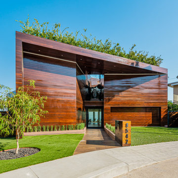
The Hollywood Hills Dollhouse - architectural gem and engineering masterpiece! Named to evoke a childhood memory of a dollhouse, this imposing architectural structure has a luxurious front facade and behind a remaining structure that is comprised of almost all glass giving the appearance and feeling of a dollhouse. This stunning gem is incomparable as there is no other house in the Los Angeles area that shares this unique architectural design. This unrivaled property is not the standard rectangular cube seen throughout the Hollywood Hills but an elegant, design-centric structure consisting of wood, glass and steel overlooking the city of Los Angeles and beyond.The rich, glossy Brazilian IPE hardwood that envelops the structure gives the this trophy house its recognizability from miles away, during both daytime and at night. It is brilliantly designed with an entrance that gives way to a sprawling open space with endless possibilities and approximately 13,000 sq feet for living, working and playing. This state-of-the art property was developed and built around three core principles: an unique and recognizable architectural design, endless views and a hotel-like experience. The property stands on a peerless promontory above the heart of the Sunset Strip offering 300+ degrees views. On every level there is a superb wrap-around experience where one can walk from one end of the property to the other while enjoying uninterrupted views. The structure comprises of 4 levels named for their functionality and versatility. First area, also known as the Play, Work & Be Well level is a 4000SF basement level comprised of terrace, orchard and indoor and outdoor space. In this level, there is also a Wellness Center with a twenty-three jet spa, a dry and infrared heat sauna, an aromatherapy Roman bath and a steam room. Also, on this level is what is dubbed the Play room with a red draped theater, game room, and a wine bar and cellar. An indoor-outdoor creative office space with a full-wall whiteboard, desks and conference table called the Work room is next door. Because this house is built with luxury amenities bearing in mind its future residents lifestyle it has an exterior basement stairwell allowing staff, associates, personal trainers, masseuse or stylists to arrive without entering via main entrance. This feature provides an additional level of privacy and decadence. Every detail of this house has been flawlessly curated to provide the utmost quality of luxe living. The Hollywood Hills Dollhouse has an entrance level with almost 2000 square foot ground floor that expands into an opulent 1800 square foot pool deck and catwalk. This area is referred to as Entertain level because it was designed to be the quintessential California experience. It has a spacious living area, full amenities kitchen and a phenomenal pool deck overlooking unique geometrically shaped pool and spa. The exquisite Masterpiece bedroom and three regal, en-suite bedrooms are situated on a sprawling 2,300 square foot floor designed around the breathtaking views. The Masterpiece bedroom, which is the name of master suite, embraces all the concepts that predominate in the creation of this house- modern architecture, energy, breathtaking views, functionality, recognizability, and luxury. The rooftop is named the Take your Breath Away level is an 2,800 square foot open deck with 360-degree views that provides a spectacular visual experience. It was designed to evoke a wondrous reaction in whomever walks towards this space.Each level is named after a verb mainly to illustrate what this monumental 13,000 square foot of meticulously developed space can provide which is a sanctuary to play, work, be well, entertain, rest and enjoy the breathtaking views in a tranquil setting. Simply put, the Hollywood Hills Dollhouse is unmatched in everything it has to offer. It is one of a kind and you will get a sense of awe the minute you set foot in this house beyond comparison.

 La Cuisine Appliances
You should never have to sacrifice practicality for trendiness when it comes to your kitchen. This why Bosch's high-end appliances offer the best of both worlds. This modern kitchen represents the combination of style and functionality with warm wood tones and Bosch's sleek stainless steel appliances, featuring Bosch's
Downdraft Ventilation, Induction Cooktop, Warming Drawer, Steam Convection Oven, Single Wall Oven, and Speed Microwave.
 K. Dakin Design Inc.
A small courtyard garden in San Francisco.
• Creative use of space in the dense, urban fabric of hilly SF.
• For the last several years the clients had carved out a make shift courtyard garden at the top of their driveway. It was one of the few flat spaces in their yard where they could sit in the sun and enjoy a cup of coffee. We turned the top of a steep driveway into a courtyard garden.
• The actual courtyard design was planned for the maximum dimensions possible to host a dining table and a seating area. The space is conveniently located outside their kitchen and home offices. However we needed to save driveway space for parking the cars and getting in and out.
• The design, fabrication and installation team was comprised of people we knew. I was an acquaintance to the clients having met them through good friends. The landscape contractor, Boaz Mor, http://www.boazmor.com/, is their neighbor and someone I worked with before. The metal fabricator is Murray Sandford of Moz Designs, https://mozdesigns.com/, https://www.instagram.com/moz_designs/ . Both contractors have long histories of working in the Bay Area on a variety of complex designs.
• The size of this garden belies the complexity of the design. We did not want to remove any of the concrete driveway which was 12” or more in thickness, except for the area where the large planter was going. The driveway sloped in two directions. In order to get a “level”, properly, draining patio, we had to start it at around 21” tall at the outside and end it flush by the garage doors.
• The fence is the artful element in the garden. It is made of power-coated aluminum. The panels match the house color; and posts match the house trim. The effect is quiet, blending into the overall property. The panels are dramatic. Each fence panel is a different size with a unique pattern.
• The exterior panels that you see from the street are an abstract riff on the seasons of the Persian walnut tree in their front yard. The cut-outs illustrate spring bloom when the walnut leafs out to autumn when the nuts drop to the ground and the squirrels eats them, leaving a mess of shells everywhere. Even the pesky squirrel appears on one of the panels.
• The interior panels, lining the entry into the courtyard, are an abstraction of the entire walnut tree.
• Although the panel design is made of perforations, the openings are designed to retain privacy when you are inside the courtyard.
• There is a large planter on one side of the courtyard, big enough for a tree to soften a harsh expanse of a neighboring wall. Light through the branches cast playful shadows on the wall behind.
• The lighting, mounted on the house is a nod to the client’s love of New Orleans gas lights.
• The paving is black stone from India, dark enough to absorb the warmth of the sun on a cool, summer San Francisco day.
 K. Dakin Design Inc.
A small courtyard garden in San Francisco.
• Creative use of space in the dense, urban fabric of hilly SF.
• For the last several years the clients had carved out a make shift courtyard garden at the top of their driveway. It was one of the few flat spaces in their yard where they could sit in the sun and enjoy a cup of coffee. We turned the top of a steep driveway into a courtyard garden.
• The actual courtyard design was planned for the maximum dimensions possible to host a dining table and a seating area. The space is conveniently located outside their kitchen and home offices. However we needed to save driveway space for parking the cars and getting in and out.
• The design, fabrication and installation team was comprised of people we knew. I was an acquaintance to the clients having met them through good friends. The landscape contractor, Boaz Mor, http://www.boazmor.com/, is their neighbor and someone I worked with before. The metal fabricator is Murray Sandford of Moz Designs, https://mozdesigns.com/, https://www.instagram.com/moz_designs/ . Both contractors have long histories of working in the Bay Area on a variety of complex designs.
• The size of this garden belies the complexity of the design. We did not want to remove any of the concrete driveway which was 12” or more in thickness, except for the area where the large planter was going. The driveway sloped in two directions. In order to get a “level”, properly, draining patio, we had to start it at around 21” tall at the outside and end it flush by the garage doors.
• The fence is the artful element in the garden. It is made of power-coated aluminum. The panels match the house color; and posts match the house trim. The effect is quiet, blending into the overall property. The panels are dramatic. Each fence panel is a different size with a unique pattern.
• The exterior panels that you see from the street are an abstract riff on the seasons of the Persian walnut tree in their front yard. The cut-outs illustrate spring bloom when the walnut leafs out to autumn when the nuts drop to the ground and the squirrels eats them, leaving a mess of shells everywhere. Even the pesky squirrel appears on one of the panels.
• The interior panels, lining the entry into the courtyard, are an abstraction of the entire walnut tree.
• Although the panel design is made of perforations, the openings are designed to retain privacy when you are inside the courtyard.
• There is a large planter on one side of the courtyard, big enough for a tree to soften a harsh expanse of a neighboring wall. Light through the branches cast playful shadows on the wall behind.
• The lighting, mounted on the house is a nod to the client’s love of New Orleans gas lights.
• The paving is black stone from India, dark enough to absorb the warmth of the sun on a cool, summer San Francisco day.
 Cantoni Atlanta
Cantoni is Designer's Choice for this Palatial Home in South Carolina. Cantoni partners on many projects with architects, interior designers, developers, realtors and others in the trade. The featured project in this eNewsletter is a spectacular example of a recent partnering between Susan Sentell ASID, Beaux Monde, Inc., Cumming, Georgia, and Design Consultant Kohl Sudnikovich of Cantoni Atlanta. While inspired by classic Italian architecture, this palatial home is not in the foothills of Italy’s Apennines but in the foothills of the Blue Ridge Mountains in South Carolina. When we saw the images of this stunning home and what went into planning and executing its interiors, I thought: here’s a perfect illustration of Cantoni’s branding theme: Great Design Is A Way of Life. Design isn’t just something cosmetic, something tacked on, but the very essence of a residence’s personality and of the personality of the people who make the house a home. This sensational South Carolina project is a superb example of Cantoni’s Great Design theme brought to life. According to Kohl, Cantoni’s involvement kicked in when Susan, whom he’d worked with before, contacted him to consult on furniture collections that would help her fulfill her and her client’s overall design theme. Susan says, "This is a 5,800-sq. ft. new construction designed by a prestigious national architectural group. Given the Mediterranean-influenced elevation and the client’s wish for an airy, Italian-contemporary interior treatment I felt Cantoni was the best source for furnishing some of the main rooms. "The theme of our project we called, ‘The Goddess House’ for its ethereal look and feel– open, warm, free, filled with light and natural colors, flowing with sophisticated detail. I felt Cantoni was the right choice to help us carry out the theme. I knew Cantoni not only for its Italian design but for the quality of its products and depth and breadth of its selection. "After creating furniture plans and the overall palette, I contacted Kohl and asked him to consult with us on Cantoni pieces that would realize our plans for the living room, dining room, master bedroom, media room and outdoor. "The finished product is a beautiful example of what you can achieve when the vision of the client and the skills of the design team are in alignment. I think the feeling you get in this home is a manifestation of that harmony.” Thanks so much to Susan for choosing Cantoni and for her client for generously allowing us to show the interiors of the rooms with Cantoni product. And good job Kohl and the Cantoni Atlanta team for your efforts–not the least of which were the logistics involved in delivery and installation, this home being a great distance from Atlanta. Great Design IS a Way of Life. That theme works at many levels: alluding to our clients’ tastes and dreams and sophistication, the product itself, and the creative talents of the designers.

 L & L Home Restoration, LLC
Complete luxury with this large walk-in shower. Overhead rainfall panel and two separate shower heads keep you warm and relaxed. The tile is a rustic barnwood look with small travertine squares for the inset.
 K. Dakin Design Inc.
A small courtyard garden in San Francisco.
• Creative use of space in the dense, urban fabric of hilly SF.
• For the last several years the clients had carved out a make shift courtyard garden at the top of their driveway. It was one of the few flat spaces in their yard where they could sit in the sun and enjoy a cup of coffee. We turned the top of a steep driveway into a courtyard garden.
• The actual courtyard design was planned for the maximum dimensions possible to host a dining table and a seating area. The space is conveniently located outside their kitchen and home offices. However we needed to save driveway space for parking the cars and getting in and out.
• The design, fabrication and installation team was comprised of people we knew. I was an acquaintance to the clients having met them through good friends. The landscape contractor, Boaz Mor, http://www.boazmor.com/, is their neighbor and someone I worked with before. The metal fabricator is Murray Sandford of Moz Designs, https://mozdesigns.com/, https://www.instagram.com/moz_designs/ . Both contractors have long histories of working in the Bay Area on a variety of complex designs.
• The size of this garden belies the complexity of the design. We did not want to remove any of the concrete driveway which was 12” or more in thickness, except for the area where the large planter was going. The driveway sloped in two directions. In order to get a “level”, properly, draining patio, we had to start it at around 21” tall at the outside and end it flush by the garage doors.
• The fence is the artful element in the garden. It is made of power-coated aluminum. The panels match the house color; and posts match the house trim. The effect is quiet, blending into the overall property. The panels are dramatic. Each fence panel is a different size with a unique pattern.
• The exterior panels that you see from the street are an abstract riff on the seasons of the Persian walnut tree in their front yard. The cut-outs illustrate spring bloom when the walnut leafs out to autumn when the nuts drop to the ground and the squirrels eats them, leaving a mess of shells everywhere. Even the pesky squirrel appears on one of the panels.
• The interior panels, lining the entry into the courtyard, are an abstraction of the entire walnut tree.
• Although the panel design is made of perforations, the openings are designed to retain privacy when you are inside the courtyard.
• There is a large planter on one side of the courtyard, big enough for a tree to soften a harsh expanse of a neighboring wall. Light through the branches cast playful shadows on the wall behind.
• The lighting, mounted on the house is a nod to the client’s love of New Orleans gas lights.
• The paving is black stone from India, dark enough to absorb the warmth of the sun on a cool, summer San Francisco day.

 VELUX
VELUX No Leak Solar Powered "Fresh Air" skylights fill this small living room with natural light to highlight color and textures used in the decor below. Blue room-darkening blinds give the ceiling a pop of color while also providing light control when needed.
183