
Search results for "Immediately's digital" in Home Design Ideas
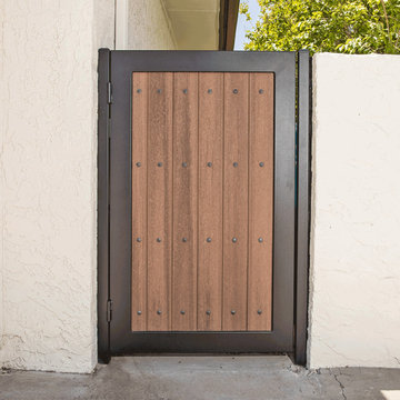
 First Impression Ironworks
Every Iron & Wood Gate from First Impression Ironworks is designed to provide security and beauty to your home, and is always custom built to your home’s specifications. Each gate is made in Arizona from the highest quality materials sourced here in the U.S.A., using only 100% American steel. Each Iron Gate is crafted from the most robust steel and gate posts available, as well as a standard 10” steel latch and lock guard, name brand Kwikset or Schlage hardware is always included, and customization is available for whatever needs fit your home best. Our product line includes a customizable array of steel plate gates, iron and wood gates, wrought iron and glass, or timeless iron and redwood gates. You can choose your Iron Gate from a variety of styles such as Contemporary, Traditional and Tuscan, and with additional options such as arches or digital locks. Our design consultants are here to help – let us know how we can create a one-of-a-kind Iron Gate for your home today!

 The English Contractor & Remodeling Services
This kitchen was part of large home addition in the 1990s. And while the layout largely worked for this busy family, it was time for an upgrade. Soffits, which immediately dated this pace, were removed, along with upper cabinetry. A new Ann Sacks backsplash traveled all the way to the skylight, with brass and glass shelves instantly modernizing this kitchen, as well as making it appear larger and more open. A gas Wolf range top with 6 burners replaced a smaller four burner gas stove top, along with a new Wolf double oven, Asko dishwasher and Sharp drawer microwave. On the far wall, white cabinetry was removed and replaced with a custom built-in hutch, created to look like a treasured family heirloom and large enough to display all of the family's serving and entertaining pieces, making it both storage and a design element in one.

 Gabriela Postole
Food Heaven & Hell
London Brothers’ bistro design concept started from the menu.“Food Heaven & Food Hell” made us immediately think of duality and also link it to British flag’s colors. It felt natural to divide the space into two almost symmetrical sides, and play with the blue-red color scheme.
In all restaurant projects we try to reflect the spirit of the place, so we opted for a contemporary design with industrial touches. We played with contrasting tones and textures: metal and greys, warm wood and plants.
Since the space was not generous to begin with, we descided to spice things up. Wall art in intense colors and using the ceiling for wood decoration. As for the sitting area, benches combined with chairs is the best option to save space. The lamps were chosen for their double role: functionality and decorative as a little bit of greenery is always welcomed.
The recipe was a success – yet we believe the best thing here is the delicious menu.
Find the right local pro for your project

 My House Design|Build|Team
My House Design/Build Team | www.myhousedesignbuild.com | 604-694-6873 | Duy Nguyen Photography -------------------------------------------------------Right from the beginning it was evident that this Coquitlam Renovation was unique. It’s first impression was memorable as immediately after entering the front door, just past the dining table, there was a tree growing in the middle of home! Upon further inspection of the space it became apparent that this home had undergone several alterations during its lifetime... We knew we wanted to transform this central space to be the focal point. The home’s design became based around the atrium and its tile ‘splash’. Other materials in this space that add to this effect are the 3D angular mouldings which flow from the glass ceiling to the floor. As well as the colour variation in the hexagon tile, radiating from light in the center to dark around the perimeter. These high contrast tiles not only draw your eye to the center of the atrium but the flush transition between the tiles and hardwood help connect the atrium with the rest of the home.

 User
This craftsman kitchen borrows natural elements from architect and design icon, Frank Lloyd Wright. A slate backsplash, soapstone counters, and wood cabinetry is a perfect throwback to midcentury design.
What ties this kitchen to present day design are elements such as stainless steel appliances and smart and hidden storage. This kitchen takes advantage of every nook and cranny to provide extra storage for pantry items and cookware.

 Thomas Roszak Architecture, LLC
Photo credit: Scott McDonald @ Hedrich Blessing
7RR-Ecohome:
The design objective was to build a house for a couple recently married who both had kids from previous marriages. How to bridge two families together?
The design looks forward in terms of how people live today. The home is an experiment in transparency and solid form; removing borders and edges from outside to inside the house, and to really depict “flowing and endless space”. The house floor plan is derived by pushing and pulling the house’s form to maximize the backyard and minimize the public front yard while welcoming the sun in key rooms by rotating the house 45-degrees to true north. The angular form of the house is a result of the family’s program, the zoning rules, the lot’s attributes, and the sun’s path. We wanted to construct a house that is smart and efficient in terms of construction and energy, both in terms of the building and the user. We could tell a story of how the house is built in terms of the constructability, structure and enclosure, with a nod to Japanese wood construction in the method in which the siding is installed and the exposed interior beams are placed in the double height space. We engineered the house to be smart which not only looks modern but acts modern; every aspect of user control is simplified to a digital touch button, whether lights, shades, blinds, HVAC, communication, audio, video, or security. We developed a planning module based on a 6-foot square room size and a 6-foot wide connector called an interstitial space for hallways, bathrooms, stairs and mechanical, which keeps the rooms pure and uncluttered. The house is 6,200 SF of livable space, plus garage and basement gallery for a total of 9,200 SF. A large formal foyer celebrates the entry and opens up to the living, dining, kitchen and family rooms all focused on the rear garden. The east side of the second floor is the Master wing and a center bridge connects it to the kid’s wing on the west. Second floor terraces and sunscreens provide views and shade in this suburban setting. The playful mathematical grid of the house in the x, y and z axis also extends into the layout of the trees and hard-scapes, all centered on a suburban one-acre lot.
Many green attributes were designed into the home; Ipe wood sunscreens and window shades block out unwanted solar gain in summer, but allow winter sun in. Patio door and operable windows provide ample opportunity for natural ventilation throughout the open floor plan. Minimal windows on east and west sides to reduce heat loss in winter and unwanted gains in summer. Open floor plan and large window expanse reduces lighting demands and maximizes available daylight. Skylights provide natural light to the basement rooms. Durable, low-maintenance exterior materials include stone, ipe wood siding and decking, and concrete roof pavers. Design is based on a 2' planning grid to minimize construction waste. Basement foundation walls and slab are highly insulated. FSC-certified walnut wood flooring was used. Light colored concrete roof pavers to reduce cooling loads by as much as 15%. 2x6 framing allows for more insulation and energy savings. Super efficient windows have low-E argon gas filled units, and thermally insulated aluminum frames. Permeable brick and stone pavers reduce the site’s storm-water runoff. Countertops use recycled composite materials. Energy-Star rated furnaces and smart thermostats are located throughout the house to minimize duct runs and avoid energy loss. Energy-Star rated boiler that heats up both radiant floors and domestic hot water. Low-flow toilets and plumbing fixtures are used to conserve water usage. No VOC finish options and direct venting fireplaces maintain a high interior air quality. Smart home system controls lighting, HVAC, and shades to better manage energy use. Plumbing runs through interior walls reducing possibilities of heat loss and freezing problems. A large food pantry was placed next to kitchen to reduce trips to the grocery store. Home office reduces need for automobile transit and associated CO2 footprint. Plan allows for aging in place, with guest suite than can become the master suite, with no need to move as family members mature.
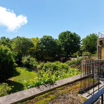
 Fin Wood Ltd
Our Canadian clients were immediately drawn to the character and warmth of reclaimed pine floorboards. They truly appreciated the raw, natural imperfections that only time can create, with a preference for the aged pine’s rich amber and honey-toned colour. Reclaimed materials offer a sustainable way to bring history into your home. By salvaging, recycling, and repurposing historic timber, we give these beautiful materials a second life. If you are searching for a flooring solution that feels natural, raw, and organic, reclaimed wood is an unparalleled choice.

Sponsored
Sunbury, OH

J.Holderby - Renovations
Franklin County's Leading General Contractors - 2X Best of Houzz!
 DECOLUX CORP
For more info visit:
www.decoluxcorp.com (gen. corporate website)
www.decohardwoods.com (custom flooring, millwork and hardwood/exotic lumber manufacturing and wholesale distribution and exports division of DECOLUX CORP, former Superior Hardwoods, Inc)
www.decoluxdoors.com (Decolux’s door division, former On Site Doors, Inc. Est. 2007)
WWW.C2CNYC.COM (Coast to Coast Construction & Development Services, Inc, former East Coast Design & Contracting, custom builder & specialty trade contractor since 2005)
Email Cyrus@decoluxcorp.com or call 347-606-8073 for immediate answers to any questions or for a free estimate

 Delano Designs
Location: Eugene, OR, USA
A modern, yet classic, black and white living room was this home owner’s dream.
This fresh new living room had all of the basics to start with, it just needed a little help tying everything all together to create the black and white look the homeowner had in mind. The neutral beige walls and carpet were the perfect warm backdrop for the cooler tones of the black and white accents that were going to be featured throughout the room. However, the current burgundy chairs, and artwork, definitely needed an update.
By re-covering the chairs, and adding matching accent pillows on the couch, this living room was immediately transformed into a clean, bright, and modern space. The dated painting above the couch was replaced with a gallery wall featuring black and white photographs which were perfectly fitting for the new look. More subtle changes, such as switching out the base of the coffee table, and adding new window treatments and lamps, completed the transformation.
Delano Designs
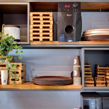 Gabriela Postole
Food Heaven & Hell
London Brothers’ bistro design concept started from the menu.“Food Heaven & Food Hell” made us immediately think of duality and also link it to British flag’s colors. It felt natural to divide the space into two almost symmetrical sides, and play with the blue-red color scheme.
In all restaurant projects we try to reflect the spirit of the place, so we opted for a contemporary design with industrial touches. We played with contrasting tones and textures: metal and greys, warm wood and plants.
Since the space was not generous to begin with, we descided to spice things up. Wall art in intense colors and using the ceiling for wood decoration. As for the sitting area, benches combined with chairs is the best option to save space. The lamps were chosen for their double role: functionality and decorative as a little bit of greenery is always welcomed.
The recipe was a success – yet we believe the best thing here is the delicious menu.
 Gayler Design Build
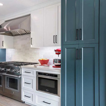
Removing the long, narrow center island immediately opened up the kitchen, creating a greater sense of space. Closing off an unnecessary doorway provided additional wall area, allowing the cooktop to be repositioned and improving the kitchen’s layout and flow.
The bold choice of a rich green for the cabinets gave the kitchen a striking, modern look, while still feeling balanced. The green acts as a neutral tone, complemented by calming pale oak flooring, neutral quartz countertops, and a textured backsplash in a similar hue for subtle visual interest.
The redesign also introduced functional zones: a dedicated baking area designed with their daughter in mind and a bar area perfect for entertaining family and friends.
 Gabriela Postole
Food Heaven & Hell
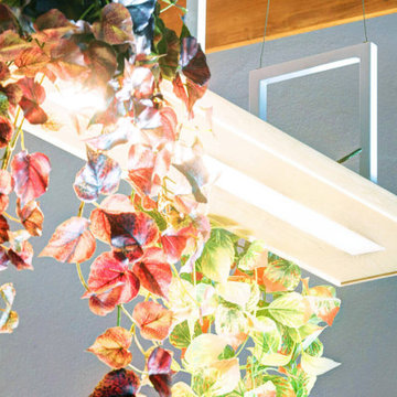
London Brothers’ bistro design concept started from the menu.“Food Heaven & Food Hell” made us immediately think of duality and also link it to British flag’s colors. It felt natural to divide the space into two almost symmetrical sides, and play with the blue-red color scheme.
In all restaurant projects we try to reflect the spirit of the place, so we opted for a contemporary design with industrial touches. We played with contrasting tones and textures: metal and greys, warm wood and plants.
Since the space was not generous to begin with, we descided to spice things up. Wall art in intense colors and using the ceiling for wood decoration. As for the sitting area, benches combined with chairs is the best option to save space. The lamps were chosen for their double role: functionality and decorative as a little bit of greenery is always welcomed.
The recipe was a success – yet we believe the best thing here is the delicious menu.
 My House Design|Build|Team
My House Design/Build Team | www.myhousedesignbuild.com | 604-694-6873 | Duy Nguyen Photography -------------------------------------------------------Right from the beginning it was evident that this Coquitlam Renovation was unique. It’s first impression was memorable as immediately after entering the front door, just past the dining table, there was a tree growing in the middle of home! Upon further inspection of the space it became apparent that this home had undergone several alterations during its lifetime... The kitchen was once a space that revealed the home’s layered history. It was evident there had been an addition as the dropped ceiling exposed where garage space had been captured to become part of the kitchen. By re-configuring the layout, we were able to create a gathering area at the peninsula, additional storage space, as well as add a hood fan – something the original space was lacking. Details like the Grand Canal paint colour from Sherwin Williams paired with the vertical grain walnut cabinets create a modern-vintage feel for this kitchen.

 My House Design|Build|Team
My House Design/Build Team | www.myhousedesignbuild.com | 604-694-6873 | Duy Nguyen Photography -------------------------------------------------------Right from the beginning it was evident that this Coquitlam Renovation was unique. It’s first impression was memorable as immediately after entering the front door, just past the dining table, there was a tree growing in the middle of home! Upon further inspection of the space it became apparent that this home had undergone several alterations during its lifetime... We knew we wanted to transform this central space to be the focal point. The home’s design became based around the atrium and its tile ‘splash’. Other materials in this space that add to this effect are the 3D angular mouldings which flow from the glass ceiling to the floor. As well as the colour variation in the hexagon tile, radiating from light in the center to dark around the perimeter. These high contrast tiles not only draw your eye to the center of the atrium but the flush transition between the tiles and hardwood help connect the atrium with the rest of the home.

 White Sands Coastal Development
A few months after moving into this aging 2200 s.f. 3 bedroom 2 1/2 bath Spanish bungalow, a creative couple decided to renovate to better fit their lifestyle.
In phase one, we demo-ed the entire downstairs to create a sunny, open-concept living area with a bar, kitchen, and dining. We also added built-in storage and a powder room, to make the home more functional.
When we finished this space, not only did the rooms flow into each other, but the new interior stucco flowed throughout the house. The stucco curved around corners and the edges of ceilings, forming a seamless fireplace mantle and hood, arched passageways, and hollow storage nooks. Phase two included replacing rotting wooden doors and windows with aluminum windows and new French doors. We installed a bubble-gum pink front door with simple cut-outs that, combined with the sensual stucco, imbued a hint of coastal art deco, a la Miami. We re-stuccoed the home’s exterior and resurfaced the polished concrete roof deck.
Now the former Spanish bungalow is as bright, eclectic, playful, and immediate as Venice Beach itself. Its vibe is part-vintage twee, part California contemporary, with a hint of Mediterranean in the exterior entry tire. But even with these varied influences, the space feels cohesive, clean, and airy. It’s a unique home that radiates the values (health, wellbeing, originality, and good times) of its inhabitants.
 White Sands Coastal Development
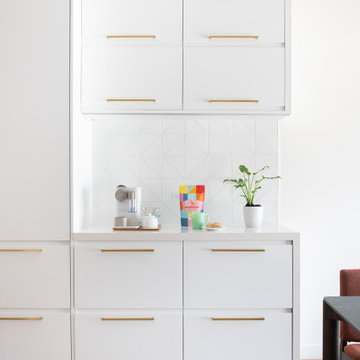
A few months after moving into this aging 2200 s.f. 3 bedroom 2 1/2 bath Spanish bungalow, a creative couple decided to renovate to better fit their lifestyle.
In phase one, we demo-ed the entire downstairs to create a sunny, open-concept living area with a bar, kitchen, and dining. We also added built-in storage and a powder room, to make the home more functional.
When we finished this space, not only did the rooms flow into each other, but the new interior stucco flowed throughout the house. The stucco curved around corners and the edges of ceilings, forming a seamless fireplace mantle and hood, arched passageways, and hollow storage nooks. Phase two included replacing rotting wooden doors and windows with aluminum windows and new French doors. We installed a bubble-gum pink front door with simple cut-outs that, combined with the sensual stucco, imbued a hint of coastal art deco, a la Miami. We re-stuccoed the home’s exterior and resurfaced the polished concrete roof deck.
Now the former Spanish bungalow is as bright, eclectic, playful, and immediate as Venice Beach itself. Its vibe is part-vintage twee, part California contemporary, with a hint of Mediterranean in the exterior entry tire. But even with these varied influences, the space feels cohesive, clean, and airy. It’s a unique home that radiates the values (health, wellbeing, originality, and good times) of its inhabitants.

 RHEINZINK
Photos images: Courtesy of the Homeowners
At the end of a dirt road in southern Vermont is a stunning timber and stone residence designed to resemble a small medieval Anglo-Norman manor house originally constructed in the 16th century. According to the owners, a husband and wife with a keen interest in both ancient and modern architecture, the 5,000 sq. ft. home was built slowly over eleven years by highly skilled craftsmen in order to complete all of the authentic hand-planed interior details. The craftsmen then spent an additional two years building the adjacent “ancient“ barn. “We always knew we wanted to take down a delapidated 19th-century hay barn and replace it with something of the period of the house,“ the husband said.
The owners designed the barn and began to consider zinc for the roof after looking at northern European architecture and discovering that zinc has been used extensively in Europe for 300 years. Approximately 4,200 sq. ft. of RHEINZINK prePATINA bright rolled Double Lock Standing Seam Roof Panels were utilized to roof the white oak structure. The bright rolled material was selected deliberately in order to achieve the “naturally aged look“ that the owners were seeking. “It’s gone almost immediately to a soft grey which is what we hoped would happen. As the years go by, the color of the weathering white oak and the aging zinc will come together in a dusty grey. Seeing this building in the fog five years from now will feel like seeing a 500-year-old ghost barn floating in the hills of Vermont.“
Installation of the RHEINZINK panels was done by Cold Hollow Contracting, Burlington, VT. “These folks had serious zinc-roofing experience and were clearly the most craft-oriented of all the roofers we met with,“ according to the husband.
The main focus was getting an “old look“ as quickly as possible, said Tim Heaghney, co-owner of Cold Hollow Contracting. “That’s really what makes the bright rolled so special—it ages quickly. We fabricated the 28 ft. panels on site and did the flashing fabrication in our shop. Many of the normal sheet metal skills apply to the zinc although we relied heavily on the RHEINZINK installation manual as well as personal support from their technical people. We used a radius cut and fold at the eve termination as opposed to the typical detail used in steel and copper where it‘s just cut at the 90 for the drip edge. The roof was steep but we do a lot of steeples and domes so we’re comfortable working at heights.“
The installers also utilized RHEINZINK’s AIR-Z structured underlayment to provide an air-gap behind the zinc.
The RHEINZINK distributor on the project was Beacon Sales, Shelburne, VT
Sponsored
Fredericksburg, OH

High Point Cabinets
Columbus' Experienced Custom Cabinet Builder | 4x Best of Houzz Winner
 My House Design|Build|Team
My House Design/Build Team | www.myhousedesignbuild.com | 604-694-6873 | Duy Nguyen Photography -------------------------------------------------------Right from the beginning it was evident that this Coquitlam Renovation was unique. It’s first impression was memorable as immediately after entering the front door, just past the dining table, there was a tree growing in the middle of home! Upon further inspection of the space it became apparent that this home had undergone several alterations during its lifetime... We knew we wanted to transform this central space to be the focal point. The home’s design became based around the atrium and its tile ‘splash’. Other materials in this space that add to this effect are the 3D angular mouldings which flow from the glass ceiling to the floor. As well as the colour variation in the hexagon tile, radiating from light in the center to dark around the perimeter. These high contrast tiles not only draw your eye to the center of the atrium but the flush transition between the tiles and hardwood help connect the atrium with the rest of the home.
 TKS Design Group
Download our free ebook, Creating the Ideal Kitchen. DOWNLOAD NOW
Lakefront property in the northwest suburbs of Chicago is hard to come by, so when we were hired by this young family with exactly that, we were immediately inspired by not just the unusually large footprint of this 1950’s colonial revival but also the lovely views of the manmade lake it was sited on. The large 5-bedroom home was solidly stuck in the 1980’s, but we saw tons of potential. We started out by updating the existing staircase with a fresh coat of paint and adding new herringbone slate to the entry hall.
The powder room off the entryway also got a refresh - new flooring, new cabinets and fixtures. We ran the new slate right through into this space for some consistency. A fun wallpaper and shiplap trim add a welcoming feel and set the tone for the home.
Next, we tackled the kitchen. Located away from the rest of the first floor, the kitchen felt a little isolated, so we immediately began planning for how to better connect it to the rest of the first floor. We landed on removing the wall between the kitchen and dining room and designed a modified galley style space with separate cooking and clean up zones. The cooking zone consists of the refrigerator, prep sink and cooktop, along with a nice long run of prep space at the island. The cleanup side of the kitchen consists of the main sink and dishwasher. Both areas are situated so that the user can view the lake during prep work and cleanup!
One of the home’s main puzzles was how to incorporate the mudroom and area in front of the patio doors at the back of the house. We already had a breakfast table area, so the space by the patio doors was a bit of a no man’s land. We decided to separate the kitchen proper from what became the new mudroom with a large set of barn doors. That way you can quickly hide any mudroom messes but have easy access to the light coming in through the patio doors as well as the outdoor grilling station. We also love the impact the barn doors add to the overall space.
The homeowners’ first words to us were “it’s time to ditch the brown,” so we did! We chose a lovely blue pallet that reflects the home’s location on the lake which is also vibrant yet easy on the eye. Countertops are white quartz, and the natural oak floor works well with the other honey accents. The breakfast table was given a refresh with new chairs, chandelier and window treatments that frame the gorgeous views of the lake out the back.
We coordinated the slate mudroom flooring with that used in the home’s main entrance for a consistent feel. The storage area consists of open and closed storage to allow for some clutter control as needed.
Next on our “to do” list was revamping the dated brown bar area in the neighboring dining room. We eliminated the clutter by adding some closed cabinets and did some easy updates to help the space feel more current. One snag we ran into here was the discovery of a beam above the existing open shelving that had to be modified with a smaller structural beam to allow for our new design to work. This was an unexpected surprise, but in the end we think it was well worth it!
We kept the colors here a bit more muted to blend with the homeowner’s existing furnishings. Open shelving and polished nickel hardware add some simple detail to the new entertainment zone which also looks out onto the lake!
Next we tackled the upstairs starting with the homeowner’s son’s bath. The bath originally had both a tub shower and a separate shower, so we decided to swap out the shower for a new laundry area. This freed up some space downstairs in what used to be the mudroom/laundry room and is much more convenient for daily laundry needs.
We continued the blue palette here with navy cabinetry and the navy tile in the shower. Porcelain floor tile and chrome fixtures keep maintenance to a minimum while matte black mirrors and lighting add some depth the design. A low maintenance runner adds some warmth underfoot and ties the whole space together.
We added a pocket door to the bathroom to minimize interference with the door swings. The left door of the laundry closet is on a 180 degree hinge to allow for easy full access to the machines. Next we tackled the master bath which is an en suite arrangement. The original was typical of the 1980’s with the vanity outside of the bathroom, situated near the master closet. And the brown theme continued here with multiple shades of brown.
Our first move was to segment off the bath and the closet from the master bedroom. We created a short hall from the bedroom to the bathroom with his and hers walk-in closets on the left and right as well as a separate toilet closet outside of the main bathroom for privacy and flexibility.
The original bathroom had a giant soaking tub with steps (dangerous!) as well as a small shower that did not work well for our homeowner who is 6’3”. With other bathtubs in the home, they decided to eliminate the tub and create an oversized shower which takes up the space where the old tub was located. The double vanity is on the opposite wall and a bench is located under the window for morning conversations and a place to set a couple of towels.
The pallet in here is light and airy with a mix of blond wood, creamy porcelain and marble tile, and brass accents. A simple roman shade adds some texture and it’s top-down mechanism allows for light and privacy.
This large whole house remodel gave our homeowners not only the ability to maximize the potential of their home but also created a lovely new frame from which to view their fabulous lake views.
Designed by: Susan Klimala, CKD, CBD
Photography by: Michael Kaskel
For more information on kitchen and bath design ideas go to: www.kitchenstudio-ge.com
 My House Design|Build|Team
My House Design/Build Team | www.myhousedesignbuild.com | 604-694-6873 | Duy Nguyen Photography -------------------------------------------------------Right from the beginning it was evident that this Coquitlam Renovation was unique. It’s first impression was memorable as immediately after entering the front door, just past the dining table, there was a tree growing in the middle of home! Upon further inspection of the space it became apparent that this home had undergone several alterations during its lifetime... We knew we wanted to transform this central space to be the focal point. The home’s design became based around the atrium and its tile ‘splash’. Other materials in this space that add to this effect are the 3D angular mouldings which flow from the glass ceiling to the floor. As well as the colour variation in the hexagon tile, radiating from light in the center to dark around the perimeter. These high contrast tiles not only draw your eye to the center of the atrium but the flush transition between the tiles and hardwood help connect the atrium with the rest of the home.
96