
Search results for "Immediately's digital" in Home Design Ideas

 INSPIRED KITCHEN DESIGN
The top priorities for Todd and his wife were the entertaining of guests and plenty of space for cooking. For this reason, the couple put lots of attention on the kitchen remodel. They really did their homework. At first, they looked at going the route of a full, custom renovation. They met with a designer and pored over all the details of just what they wanted. Then they received major sticker shock when the professional revealed the total cost.
“It was way more than we budgeted for,” Todd shared.
Thankfully, Todd and his wife are friends with another couple that had also recently set out on a kitchen remodeling project. Instead of going with the exorbitant expense of a traditional, custom renovation, the friends had opted for an IKEA kitchen. They shared that an IKEA kitchen renovation would be much more affordable. And also that it’s pretty simple to get the desired look and functionality —thanks to a handy, really affordable service they’d found online called “Inspired Kitchen Design” (for the record, that’s US!). Upon the friends’ recommendation, Todd immediately got in touch with us to begin the design of a new IKEA kitchen.

 Advance Design Studio, Ltd.
Jennifer and Dan have lived in their Deer Park Illinois home for 15 years, slowly making minor fixes like painting and decorating; but they had a new plan for their kitchen the entire time. An awkwardly placed garage door, and an island cooktop with a terrible downdraft made a full-scale kitchen remodel an absolute must. Jennifer had many ideas in mind and wanted to work with a company that could provide high-end work, while partnering with a designer that would tailor the kitchen to her ideas.
She was intrigued by the phrase “Common Sense Remodeling” in Advance Design’s feature she discovered while perusing an issue of the community’s Quintessential Barrington Magazine. Doing further research on the company’s website, as she looked through project profiles and read about Advance Design’s “Common Sense Remodeling” philosophy, she promptly scheduled an appointment to see if the people and ideas she read about were truly who they said they were. The more she read, the more she knew that the “Common Sense” approach to remodeling they described was exactly the type of company she was looking for.
The partnership was sealed after an initial consultation with Owner Todd Jurs and Project Designer Michelle Lecinski. They displayed a combination of friendliness, professionalism and respect that was unmatched by any of the other companies Jennifer talked to. She knew that with Advance Design, she would be able to retain the vision that she had in mind with high-quality craftsmanship.
“I reached out to Advance Design because of the ‘Common Sense Remodeling’ tagline,” Jennifer said. “That’s what lingered for me”. “Advance Design was the most respectful- of the house and of my design ideas, and the most professional of the handful of companies that looked at my project”.
Soon after the meeting Jennifer began working with Michelle on the project design. They quickly developed chemistry. Jennifer loved how Michelle researched and located every detail that Jennifer wanted for the kitchen. Between the two of them, every concept and idea was worked through and perfected. “Jennifer had definite ideas about what she wanted the new kitchen to look like, she just didn’t know how to bring it all together. We worked together really well to make her ideas into the practical reality necessary for a well-functioning kitchen, with the look and feel that she had envisioned”, says Michelle.
“Michelle was wonderful in using the CAD system she would show me new drawings every time we changed the layout while working through the design,” Jennifer said. “She was a really wonderful partner in execution, she made sure everything happened quickly and easily.”
The finished design drew out elements of Jennifer’s style and personality. The pair call the look “sophisticated farmhouse” to describe the kitchen renovation to family and friends. The result was a beautifully crafted, authentic-feeling space that satisfied Jennifer’s dreams 15 years in the making. The whole project consisted of a kitchen remodel, mudroom upgrade with powder room, and garage entry relocation. “The projects I personally like the best, are the ones that put the client’s dreams on display,” Project Designer Michelle said. “And this is one of those projects.”
The main focal point of the kitchen is custom zinc and brass ventilation hood with a vintage sheen, which was hand made to order by a small company in Indiana named Vogler Metalworking. “It’s like sculpture, a true work of art”, says Jennifer. Your eye is immediately drawn towards this elegant yet practical hood that eliminated the home’s downdraft problem and added a striking conversation piece at the same time. The carpenters had to use special gloves when transporting and installing it, so they didn’t smudge it with fingerprints. The beautiful hood centers proudly over the stunning black enamel and brass LaCornue Range. “I had a friend who had a LaCornue range and after learning how easy it was to cook perfect meals, I was convinced I wanted to have one”, says Jennifer. This unique, breathtaking combination anchors the entire kitchen and is apparent immediately as you walk into the great room the surrounds the space.
DuraSupreme Crestwood cabinets with a Kendall Panel add function and sophistication. A custom gray paint color paired with a storm blue was developed so that the new kitchen looked like it belonged to the existing space. Unlacquered brass faucets and hardware were important to Jennifer because she wanted the living finishes to age over time. Remarkable brass diamond mesh cabinet door inserts imported from the UK continue to add this one-of-a-kind kitchen renovation; giving it a “you won’t see this everywhere” quality. The use of old railcar flooring for the coffee bar countertop and reclaimed oak for the open shelving gives an authenticity to the space uncommon in kitchens today.
Jennifer and Michelle fell in love with the Limestone Grey Stone while they were investigating unique island countertop ideas. They liked the fact that the limestone as a living finish will age and change over time. Calcutta Miel Quartz countertops made for an excellent pairing around the perimeter, as it’s durable and perfect for cooking preparations. A textured white subway tile backsplash that runs to the ceiling keeps your eye moving towards the open shelving, and to the main focal point of the stunning range hood combination.
“The kitchen functions beautifully, and it’s gorgeous,” beams Jennifer as she gestures with both hands while smiling ear to ear. “The most important thing was I wanted a kitchen that had a wonderful flow, cooked beautiful meals and was a great gathering place for family and friends, and this space does that perfectly! Beauty wise, it turned out exactly how I had envisioned. I felt the function part was the hardest part, and that was nailed”!
Relocating the garage entry to the new mudroom was a huge priority and has finally separated the family’s arriving home functions from their kitchen. Now coats and shoes and bags have their own area for dropping once members arrive home. Matching gray DuraSupreme cabinetry helped create gorgeous, purposeful lockers for the family. A reclaimed vintage sink and custom wall paper were added to the tiny powder room to beautify the once previously only functional space. Advance Design was even able to create a custom space for their dog to sleep while the family is away.
“It was unbelievable that a project of this size was completed in such a short time, and I think that’s because of the large amount of planning and preparation that went into it,” Jennifer marveled, “When we started, we were ready, and everything was prepared”.
When it came to execution, Project Manager Justin Davis and his crew were quick, accessible, and organized. Projects like this kitchen are typically completed in as little as 8-10 weeks. Jennifer’s kitchen however despite the relocation of some challenging HVAC in a soffit and moving of an exterior door was completed remarkably fast in part because the team was working with an existing tile floor that ran throughout the first floor that the client really loved.
“You get to know these people really well because they’re living in your house while you’re living in your house. They were so fast and really good, it didn’t take as long as even planned” reported Jennifer. “I would text Justin and he always responded almost immediately. I got to know all the guys who were working in our house and they were all wonderful people”.
Details in a customized kitchen like this one require skill and care from the people who install it. “All the guys on the job were skilled at what the did. I wanted small details like little feet to look like furniture, that is where their carpentry skill came in to make these all perfect”, said Jennifer. “The tile guys were wonderful. They even let me determine how I wanted the texture with the grout to appear for a salt and pepper look; now that is a very skilled trade person making it custom”.
In Jennifer’s interview, she continued to reference Advance Design’s “Common Sense Remodeling”, so I took a minute to ask her exactly what that phrase meant to her and how it played out in her experience with her project and the Advance Design team. Here is what she said: “I was intrigued about Common Sense Remodeling and in my head that there would be clear costs and prices, great communication between the design team, the execution team and me”, said Jennifer. They did deliver on that, it was so clear about the cost breakdown, what I could expect from everyone who came to my house, and everything that we had ordered. That to me is the Common Sense”!
It’s great to see a client take literally our assertion that a well-planned remodeling project is simply “Common Sense”! She anticipated each step of the way would be clear, concise, and predictable, all the while protecting the outcome due to the careful upfront planning. “Advance Design delivered on their ‘Common Sense Remodeling’ promise,” Jennifer said. “From the design team, to the execution team - everything was straight forward like I imagined. The project turned out exactly how I envisioned, I enjoyed this process and absolutely would recommend Advance Design Studio to anyone.”

 TVL Creative Ltd.
This project was such an incredible design opportunity, and instilled inspiration and excitement at every turn! Our amazing clients came to us with the challenge of converting their beloved family home into a welcoming haven for all members of the family. At the time that we met our clients, they were struggling with the difficult personal decision of the fate of the home. Their father/father-in-law had passed away and their mother/mother-in-law had recently been admitted into a nursing facility and was fighting Alzheimer’s. Resistant to loss of the home now that both parents were out of it, our clients purchased the home to keep in in the family. Despite their permanent home currently being in New Jersey, these clients dedicated themselves to keeping and revitalizing the house. We were moved by the story and became immediately passionate about bringing this dream to life.
The home was built by the parents of our clients and was only ever owned by them, making this a truly special space to the family. Our goal was to revitalize the home and to bring new energy into every room without losing the special characteristics that were original to the home when it was built. In this way, we were able to develop a house that maintains its own unique personality while offering a space of welcoming neutrality for all members of the family to enjoy over time.
The renovation touched every part of the home: the exterior, foyer, kitchen, living room, sun room, garage, six bedrooms, three bathrooms, the laundry room, and everything in between. The focus was to develop a style that carried consistently from space to space, but allowed for unique expression in the small details in every room.
Starting at the entry, we renovated the front door and entry point to offer more presence and to bring more of the mid-century vibe to the home’s exterior. We integrated a new modern front door, cedar shingle accents, new exterior paint, and gorgeous contemporary house numbers that really allow the home to stand out. Just inside the entry, we renovated the foyer to create a playful entry point worthy of attention. Cement look tile adorns the foyer floor, and we’ve added new lighting and upgraded the entry coat storage.
Upon entering the home, one will immediately be captivated by the stunning kitchen just off the entry. We transformed this space in just about every way. While the footprint of the home ultimately remained almost identical, the aesthetics were completely turned on their head. We re-worked the kitchen to maximize storage and to create an informal dining area that is great for casual hosting or morning coffee.
We removed the entry to the garage that was once in the informal dining, and created a peninsula in its place that offers a unique division between the kitchen/informal dining and the formal dining and living areas. The simple light warm light gray cabinetry offers a bit of traditional elegance, along with the marble backsplash and quartz countertops. We extended the original wood flooring into the kitchen and stained all floors to match for a warmth that truly resonates through all spaces. We upgraded appliances, added lighting everywhere, and finished the space with some gorgeous mid century furniture pieces.
In the formal dining and living room, we really focused on maintaining the original marble fireplace as a focal point. We cleaned the marble, repaired the mortar, and refinished the original fireplace screen to give a new sleek look in black. We then integrated a new gas insert for modern heating and painted the upper portion in a rich navy blue; an accent that is carried through the home consistently as a nod to our client’s love of the color.
The former entry into the old covered porch is now an elegant glass door leading to a stunning finished sunroom. This room was completely upgraded as well. We wrapped the entire space in cozy white shiplap to keep a casual feel with brightness. We tiled the floor with large format concrete look tile, and painted the old brick fireplace a bright white. We installed a new gas burning unit, and integrated transitional style lighting to bring warmth and elegance into the space. The new black-frame windows are adorned with decorative shades that feature hand-sketched bird prints, and we’ve created a dedicated garden-ware “nook” for our client who loves to work in the yard. The far end of this space is completed with two oversized chaise loungers and overhead lights…the most perfect little reading nook!
Just off the dining room, we created an entirely new space to the home: a mudroom. The clients lacked this space and desperately needed a landing spot upon entering the home from the garage. We uniquely planned existing space in the garage to utilize for this purpose, and were able to create a small but functional entry point without losing the ability to park cars in the garage. This new space features cement-look tile, gorgeous deep brown cabinetry, and plenty of storage for all the small items one might need to store while moving in and out of the home.
The remainder of the upstairs level includes massive renovations to the guest hall bathroom and guest bedroom, upstairs master bed/bath suite, and a third bedroom that we converted into a home office for the client.
Some of the largest transformations were made in the basement, where unfinished space and lack of light were converted into gloriously lit, cozy, finished spaces. Our first task was to convert the massive basement living room into the new master bedroom for our clients. We removed existing built-ins, created an entirely new walk-in closet, painted the old brick fireplace, installed a new gas unit, added carpet, introduced new lighting, replaced windows, and upgraded every part of the aesthetic appearance. One of the most incredible features of this space is the custom double sliding barn door made by a Denver artisan. This space is truly a retreat for our clients!
We also completely transformed the laundry room, back storage room, basement master bathroom, and two bedrooms.
This home’s massive scope and ever-evolving challenges were thrilling and exciting to work with, and the result is absolutely amazing. At the end of the day, this home offers a look and feel that the clients love. Above all, though, the clients feel the spirit of their family home and have a welcoming environment for all members of the family to enjoy for years to come.
Find the right local pro for your project

 ASR DESIGN STUDIO
Our clients wanted to make the most of space so we gutted the home and rebuilt the inside to create a functional and kid-friendly home with timeless style.
Our clients’ vision was clear: They wanted a warm and timeless design that was easy to clean and maintain with two-active boys.
“It’s not unusual for our friends and family to drop past unannounced any day of the week. And we love it!” They told us during our initial Design Therapy Sesh.
We knew immediately what she meant - we have an open-door policy with our families, too! Which was why we consciously created living spaces that were open, inviting and welcoming.
Now, the only problem our clients would have would be convincing their guests to leave!
Our clients also enjoy coffee and tea so we created a separate coffee nook to help them kick start their day.
Photography: Helynn Ospina

 Cummings Architecture + Interiors
Designing additions for Victorian homes is a challenging task. The architects and builders who designed and built these homes were masters in their craft. No detail of design or proportion went unattended. Cummings Architects is often approached to work on these types of projects because of their unwavering dedication to ensure structural and aesthetic continuity both inside and out.
Upon meeting the owner of this stately home in Winchester, Massachusetts, Mathew immediately began sketching a beautifully detail drawing of a design for a family room with an upstairs master suite. Though the initial ideas were just rough concepts, the client could already see that Mathew’s vision for the house would blend the new space seamlessly into the fabric of the turn of the century home.
In the finished design, expanses of glass stretch along the lines of the living room, letting in an expansive amount of light and creating a sense of openness. The exterior walls and interior trims were designed to create an environment that merged the indoors and outdoors into a single comfortable space. The family enjoys this new room so much, that is has become their primary living space, making the original sitting rooms in the home a bit jealous.
Photo Credit: Cydney Ambrose

 Thomas Roszak Architecture, LLC
Photo credit: Scott McDonald @ Hedrich Blessing
7RR-Ecohome:
The design objective was to build a house for a couple recently married who both had kids from previous marriages. How to bridge two families together?
The design looks forward in terms of how people live today. The home is an experiment in transparency and solid form; removing borders and edges from outside to inside the house, and to really depict “flowing and endless space”. The house floor plan is derived by pushing and pulling the house’s form to maximize the backyard and minimize the public front yard while welcoming the sun in key rooms by rotating the house 45-degrees to true north. The angular form of the house is a result of the family’s program, the zoning rules, the lot’s attributes, and the sun’s path. We wanted to construct a house that is smart and efficient in terms of construction and energy, both in terms of the building and the user. We could tell a story of how the house is built in terms of the constructability, structure and enclosure, with a nod to Japanese wood construction in the method in which the siding is installed and the exposed interior beams are placed in the double height space. We engineered the house to be smart which not only looks modern but acts modern; every aspect of user control is simplified to a digital touch button, whether lights, shades, blinds, HVAC, communication, audio, video, or security. We developed a planning module based on a 6-foot square room size and a 6-foot wide connector called an interstitial space for hallways, bathrooms, stairs and mechanical, which keeps the rooms pure and uncluttered. The house is 6,200 SF of livable space, plus garage and basement gallery for a total of 9,200 SF. A large formal foyer celebrates the entry and opens up to the living, dining, kitchen and family rooms all focused on the rear garden. The east side of the second floor is the Master wing and a center bridge connects it to the kid’s wing on the west. Second floor terraces and sunscreens provide views and shade in this suburban setting. The playful mathematical grid of the house in the x, y and z axis also extends into the layout of the trees and hard-scapes, all centered on a suburban one-acre lot.
Many green attributes were designed into the home; Ipe wood sunscreens and window shades block out unwanted solar gain in summer, but allow winter sun in. Patio door and operable windows provide ample opportunity for natural ventilation throughout the open floor plan. Minimal windows on east and west sides to reduce heat loss in winter and unwanted gains in summer. Open floor plan and large window expanse reduces lighting demands and maximizes available daylight. Skylights provide natural light to the basement rooms. Durable, low-maintenance exterior materials include stone, ipe wood siding and decking, and concrete roof pavers. Design is based on a 2' planning grid to minimize construction waste. Basement foundation walls and slab are highly insulated. FSC-certified walnut wood flooring was used. Light colored concrete roof pavers to reduce cooling loads by as much as 15%. 2x6 framing allows for more insulation and energy savings. Super efficient windows have low-E argon gas filled units, and thermally insulated aluminum frames. Permeable brick and stone pavers reduce the site’s storm-water runoff. Countertops use recycled composite materials. Energy-Star rated furnaces and smart thermostats are located throughout the house to minimize duct runs and avoid energy loss. Energy-Star rated boiler that heats up both radiant floors and domestic hot water. Low-flow toilets and plumbing fixtures are used to conserve water usage. No VOC finish options and direct venting fireplaces maintain a high interior air quality. Smart home system controls lighting, HVAC, and shades to better manage energy use. Plumbing runs through interior walls reducing possibilities of heat loss and freezing problems. A large food pantry was placed next to kitchen to reduce trips to the grocery store. Home office reduces need for automobile transit and associated CO2 footprint. Plan allows for aging in place, with guest suite than can become the master suite, with no need to move as family members mature.

 My House Design|Build|Team
My House Design/Build Team | www.myhousedesignbuild.com | 604-694-6873 | Duy Nguyen Photography -------------------------------------------------------Right from the beginning it was evident that this Coquitlam Renovation was unique. It’s first impression was memorable as immediately after entering the front door, just past the dining table, there was a tree growing in the middle of home! Upon further inspection of the space it became apparent that this home had undergone several alterations during its lifetime... We knew we wanted to transform this central space to be the focal point. The home’s design became based around the atrium and its tile ‘splash’. Other materials in this space that add to this effect are the 3D angular mouldings which flow from the glass ceiling to the floor. As well as the colour variation in the hexagon tile, radiating from light in the center to dark around the perimeter. These high contrast tiles not only draw your eye to the center of the atrium but the flush transition between the tiles and hardwood help connect the atrium with the rest of the home.


 Quarry Mill
This custom Manhattan real thin stone veneer blend from the Quarry Mill adds character to the exterior of this beautiful home. Manhattan natural stone veneer features a range of medium to dark grey tones with subtle tan undertones. The stone is a natural granite gneiss and has a slight shimmer in the light. Manhattan’s individual pieces are sawed to set heights of 2”, 3” and 5” with snapped ends. Each piece has a sawed top and bottom making for quicker installation. The finished look of Manhattan is clean and sleek; it is perfect for modern or contemporary design. This is a premium quality real stone veneer we import from overseas. We have pallets in our warehouse ready for immediate delivery.
 My House Design|Build|Team
My House Design/Build Team | www.myhousedesignbuild.com | 604-694-6873 | Duy Nguyen Photography -------------------------------------------------------Right from the beginning it was evident that this Coquitlam Renovation was unique. It’s first impression was memorable as immediately after entering the front door, just past the dining table, there was a tree growing in the middle of home! Upon further inspection of the space it became apparent that this home had undergone several alterations during its lifetime... We knew we wanted to transform this central space to be the focal point. The home’s design became based around the atrium and its tile ‘splash’. Other materials in this space that add to this effect are the 3D angular mouldings which flow from the glass ceiling to the floor. As well as the colour variation in the hexagon tile, radiating from light in the center to dark around the perimeter. These high contrast tiles not only draw your eye to the center of the atrium but the flush transition between the tiles and hardwood help connect the atrium with the rest of the home.
 Gayler Design Build
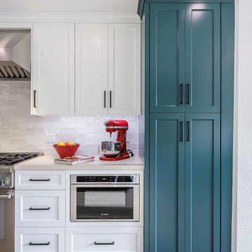
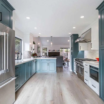
Removing the long, narrow center island immediately opened up the kitchen, creating a greater sense of space. Closing off an unnecessary doorway provided additional wall area, allowing the cooktop to be repositioned and improving the kitchen’s layout and flow.
The bold choice of a rich green for the cabinets gave the kitchen a striking, modern look, while still feeling balanced. The green acts as a neutral tone, complemented by calming pale oak flooring, neutral quartz countertops, and a textured backsplash in a similar hue for subtle visual interest.
The redesign also introduced functional zones: a dedicated baking area designed with their daughter in mind and a bar area perfect for entertaining family and friends.
 ASR DESIGN STUDIO
Built in 1907 and nestled into the beating heart of San Fran’s Bernal Heights neighbourhood, this adorable abode was an unpolished gem ready to be turned into our clients’ dream home.
Our mission was to gift Bonview with classic, natural and timeless style while setting it up with impressive functionality so that it was ready to be the pet-friendly, kid-friendly and entertaining-friendly home they needed it to be. Mission accepted!
Our clients’ vision was clear: They wanted whites, blacks and wood tones with texture and personality. Oh, and that spunky wine fridge? Yep, that was a non-negotiable. ?
“It’s not unusual for our friends and family to drop past unannounced any day of the week. And we love it!” They told us during our initial Design Therapy Sesh.
We knew immediately what she meant - we have an open-door policy with our families, too! Which was why we consciously created living spaces that were open, inviting and welcoming.
Now, the only problem our clients would have would be convincing their guests to leave!
Our clients also enjoyed cooking and baking casually, so we created an organized, intuitive and functional kitchen and pantry that made whipping up homemade dips and snacks for their game nights a breeze.
 TKS Design Group
Download our free ebook, Creating the Ideal Kitchen. DOWNLOAD NOW
Lakefront property in the northwest suburbs of Chicago is hard to come by, so when we were hired by this young family with exactly that, we were immediately inspired by not just the unusually large footprint of this 1950’s colonial revival but also the lovely views of the manmade lake it was sited on. The large 5-bedroom home was solidly stuck in the 1980’s, but we saw tons of potential. We started out by updating the existing staircase with a fresh coat of paint and adding new herringbone slate to the entry hall.
The powder room off the entryway also got a refresh - new flooring, new cabinets and fixtures. We ran the new slate right through into this space for some consistency. A fun wallpaper and shiplap trim add a welcoming feel and set the tone for the home.
Next, we tackled the kitchen. Located away from the rest of the first floor, the kitchen felt a little isolated, so we immediately began planning for how to better connect it to the rest of the first floor. We landed on removing the wall between the kitchen and dining room and designed a modified galley style space with separate cooking and clean up zones. The cooking zone consists of the refrigerator, prep sink and cooktop, along with a nice long run of prep space at the island. The cleanup side of the kitchen consists of the main sink and dishwasher. Both areas are situated so that the user can view the lake during prep work and cleanup!
One of the home’s main puzzles was how to incorporate the mudroom and area in front of the patio doors at the back of the house. We already had a breakfast table area, so the space by the patio doors was a bit of a no man’s land. We decided to separate the kitchen proper from what became the new mudroom with a large set of barn doors. That way you can quickly hide any mudroom messes but have easy access to the light coming in through the patio doors as well as the outdoor grilling station. We also love the impact the barn doors add to the overall space.
The homeowners’ first words to us were “it’s time to ditch the brown,” so we did! We chose a lovely blue pallet that reflects the home’s location on the lake which is also vibrant yet easy on the eye. Countertops are white quartz, and the natural oak floor works well with the other honey accents. The breakfast table was given a refresh with new chairs, chandelier and window treatments that frame the gorgeous views of the lake out the back.
We coordinated the slate mudroom flooring with that used in the home’s main entrance for a consistent feel. The storage area consists of open and closed storage to allow for some clutter control as needed.
Next on our “to do” list was revamping the dated brown bar area in the neighboring dining room. We eliminated the clutter by adding some closed cabinets and did some easy updates to help the space feel more current. One snag we ran into here was the discovery of a beam above the existing open shelving that had to be modified with a smaller structural beam to allow for our new design to work. This was an unexpected surprise, but in the end we think it was well worth it!
We kept the colors here a bit more muted to blend with the homeowner’s existing furnishings. Open shelving and polished nickel hardware add some simple detail to the new entertainment zone which also looks out onto the lake!
Next we tackled the upstairs starting with the homeowner’s son’s bath. The bath originally had both a tub shower and a separate shower, so we decided to swap out the shower for a new laundry area. This freed up some space downstairs in what used to be the mudroom/laundry room and is much more convenient for daily laundry needs.
We continued the blue palette here with navy cabinetry and the navy tile in the shower. Porcelain floor tile and chrome fixtures keep maintenance to a minimum while matte black mirrors and lighting add some depth the design. A low maintenance runner adds some warmth underfoot and ties the whole space together.
We added a pocket door to the bathroom to minimize interference with the door swings. The left door of the laundry closet is on a 180 degree hinge to allow for easy full access to the machines. Next we tackled the master bath which is an en suite arrangement. The original was typical of the 1980’s with the vanity outside of the bathroom, situated near the master closet. And the brown theme continued here with multiple shades of brown.
Our first move was to segment off the bath and the closet from the master bedroom. We created a short hall from the bedroom to the bathroom with his and hers walk-in closets on the left and right as well as a separate toilet closet outside of the main bathroom for privacy and flexibility.
The original bathroom had a giant soaking tub with steps (dangerous!) as well as a small shower that did not work well for our homeowner who is 6’3”. With other bathtubs in the home, they decided to eliminate the tub and create an oversized shower which takes up the space where the old tub was located. The double vanity is on the opposite wall and a bench is located under the window for morning conversations and a place to set a couple of towels.
The pallet in here is light and airy with a mix of blond wood, creamy porcelain and marble tile, and brass accents. A simple roman shade adds some texture and it’s top-down mechanism allows for light and privacy.
This large whole house remodel gave our homeowners not only the ability to maximize the potential of their home but also created a lovely new frame from which to view their fabulous lake views.
Designed by: Susan Klimala, CKD, CBD
Photography by: Michael Kaskel
For more information on kitchen and bath design ideas go to: www.kitchenstudio-ge.com

 Nanette Wong
Photo: Nanette Wong © 2016 Houzz
Example of a mid-century modern bedroom design in San Francisco
Example of a mid-century modern bedroom design in San Francisco
Sponsored
Sunbury, OH

J.Holderby - Renovations
Franklin County's Leading General Contractors - 2X Best of Houzz!

 ALVAREZ-DIAZ & VILLALON
Photography by Carlos Esteva.
When this private client, a married couple, first approached Álvarez-Díaz & Villalón to build ‘the house of their dreams’ on the grounds of their sprawling family estate, the first challenge was to identify the exact location that would maximize the positive aspects of the topography while affording the most gracious views. Propped up on scaffolding, juggling digital cameras and folding ladders, the design team photographed the property from hundreds of angles before the ideal site was selected.
Once the site was selected, construction could begin.
The building’s foundation was raised slightly off the ground to disperse geothermal heat. In addition, the designers studied daily sunlight patterns and positioned the structure accordingly in order to warm the swimming pool during the cooler morning hours and illuminate the principal living quarters during the late afternoon. Finally, the main house was designed with functional balconies on all sides: each balcony meticulously planned ~ and precisely positioned ~ to
both optimize wind flow and frame the property’s most breath-taking views.
Stylistically, the goal was to create an authentic Spanish hacienda. Following Old World tradition, the house was anchored around a centralized interior patio
in the Moorish style: enclosed on three sides ~ yet
open on the fourth (similar to the Alcázar of Seville) ~ to reveal a reflecting pool ~ and mirror the water motif of the home’s magnificent marble fountain. A bell tower, horseshoe arches, a colonnaded,vineyard-style patio, and
ornamental Moorish mosaic tilework (“azulejos”) completed this picturesque portrait of a faraway fantasy world of castles, chivalry, and swordsplay, reminiscent of Medieval Spain.
Shortly after completion, this showcase home was showcased on the TVE Spanish television series Spaniards Around The World (Españoles Alrededor
Del Mundo) as a prime example of authentic Spanish architecture designed outside the peninsula. Not surprising. After all, the story of a fairy-tale retreat as
magical as this one deserves a happy ending.
 Gayler Design Build
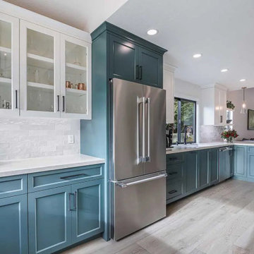
Removing the long, narrow center island immediately opened up the kitchen, creating a greater sense of space. Closing off an unnecessary doorway provided additional wall area, allowing the cooktop to be repositioned and improving the kitchen’s layout and flow.
The bold choice of a rich green for the cabinets gave the kitchen a striking, modern look, while still feeling balanced. The green acts as a neutral tone, complemented by calming pale oak flooring, neutral quartz countertops, and a textured backsplash in a similar hue for subtle visual interest.
The redesign also introduced functional zones: a dedicated baking area designed with their daughter in mind and a bar area perfect for entertaining family and friends.

 Décor Aid
When a family living in Singapore decided to purchase a New York City pied-à-terre, they settled on the historic Langham Place, a 60-floor building along 5th Ave which features a mixture of permanent residencies and 5-star hotel suites. Immediately after purchasing the condo, they reached out to Decor Aid, and tasked us with designing a home that would reflect their jet-setting lifestyle and chic sensibility.
Book Your Free In-Home Consultation
Connecting to the historic Tiffany Building at 404 5th Ave, the exterior of Langham Place is a combination of highly contemporary architecture and 1920’s art deco design. And with this highly unique architecture, came highly angular, outward leaning floor-to-ceiling windows, which would prove to be our biggest design challenge.
One of the apartment’s quirks was negotiating an uneven balance of natural light throughout the space. Parts of the apartment, such one of the kids’ bedrooms, feature floor-to-ceiling windows and an abundance of natural light, while other areas, such as one corner of the living room, receive little natural light.
By sourcing a combination of contemporary, low-profile furniture pieces and metallic accents, we were able to compensate for apartment’s pockets of darkness. A low-profile beige sectional from Room & Board was an obvious choice, which we complemented with a lucite console and a bronze Riverstone coffee table from Mitchell Gold+Bob Williams.
Circular tables were placed throughout the apartment in order to establish a design scheme that would be easy to walk through. A marble tulip table from Sit Down New York provides an opulent dining room space, without crowding the floor plan. The finishing touches include a sumptuous swivel chair from Safavieh, to create a sleek, welcoming vacation home for this international client.

 FabricSeen
Thanks to FabricSeen customer Cheryl V. for sharing her story with us:
“My husband and I inherited a 75 year old chair from my husband’s father –which was beautiful but very tired. Additionally, the green color did not fit our décor. After several years considering what to do with the chair, I decided to search upholstery fabric online. The FabricSeen website was the first website I searched. Of course, I spent several hours searching other websites before I decided that the Princess in Peacock blue was the perfect fabric and color for our fabulous chair. The Princess in Peacock blue not only fits our décor but is a period color. It is perfect! I was skeptical of ordering upholstery fabric online but your service could not have been better and my fears were immediately abated. Thank you…we are delighted with our “new” chair!”
Sponsored
Sunbury, OH
J.Holderby - Renovations
Franklin County's Leading General Contractors - 2X Best of Houzz!
 Advance Design Studio, Ltd.
Richard and Monica of Huntley, IL, needed to make better use of their kitchen as well as more storage for pots, pans, and countertop appliances. Their space was laid out unconventionally, making cooking a challenge. A triangular nook held their refrigerator, hard-to-reach cabinets, and a cramped pantry. They needed to find a solution, so they searched Facebook for home remodeling companies in their area. Soon they found Advance Design Studio’s profile and were immediately impressed.
“Advance Design was the first and last studio I contacted,” Richard said.
Richard called Advance Design and felt an immediate connection with Project Designer Nicole. She was knowledgeable and thorough and offered many unique solutions to their kitchen layout problem.
A week later, Nicole came out to their home to meet the couple. They talked about their kitchen remodeling project and told Nicole what they wanted in their dream kitchen. Nicole saw that the kitchen had weird angles that hindered the cabinets you could use. She knew that designing a space that met both the client’s needs and dreams would be challenging.
Nicole worked with Richard and Monica to create an innovative design. When the couple came out to Advance Design Studio in Gilberts, they were blown away by the 3D illustrations Nicole showed them.
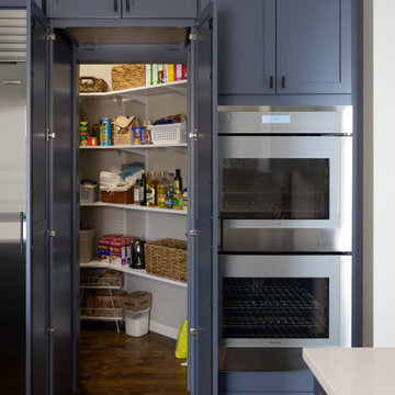
“I incorporated a hidden pantry cabinet to not only be a cool feature but also allowed me to square off the walls to gain more cabinet space,” Nicole said.
The hidden pantry added storage and squared off the strange triangular nook, creating a more traditional and functional kitchen layout. With the layout problems solved, they worked together to select materials. Richard and Monica wanted something brighter than their previous dark brown kitchen. They chose a combination of blue and white cabinetry with a white subway tile backsplash and white quartz countertops. The design was finalized, the materials were selected. It was time to begin construction.
One fear most homeowners have when beginning a home remodel is dust. Advance Design uses BuildClean HEPA filters to eliminate dust throughout the house while construction is going on. Project Manager Jason and his crew created temporary walls and cleaned up after every day of work.
“We were very impressed with how clean and organized the crew kept things while the remodeling process was underway,” Richard said.
The result is just what Richard and Monica envisioned when they began the process. Richard’s love for cooking can be explored through all-new Thermador appliances, featuring an easy-to-use induction cooktop, built-in double oven, and spacious refrigerator. Matte black hardware contrasts the bright white backsplash, countertops, and cabinets, while the stunning blue cabinets complement the dark hardwood floor and stainless-steel appliances. The dual pendant light fixtures over the reconfigured island are eye-catching and add necessary lighting.
This Huntley kitchen renovation turned out better than Richard and Monica hoped. Their experience with Advance Design’s Common Sense Remodeling process has them thinking about other projects they could do in the future.
Our award-winning design team would love to create a beautiful, functional, and spacious place for you and your family. With our “Common Sense Remodeling” approach, the process of renovating your home has never been easier. Contact us today at 847-665-1711 or schedule an appointment.
 Gayler Design Build
Removing the long, narrow center island immediately opened up the kitchen, creating a greater sense of space. Closing off an unnecessary doorway provided additional wall area, allowing the cooktop to be repositioned and improving the kitchen’s layout and flow.
The bold choice of a rich green for the cabinets gave the kitchen a striking, modern look, while still feeling balanced. The green acts as a neutral tone, complemented by calming pale oak flooring, neutral quartz countertops, and a textured backsplash in a similar hue for subtle visual interest.
The redesign also introduced functional zones: a dedicated baking area designed with their daughter in mind and a bar area perfect for entertaining family and friends.

 Interiors by Maite Granda
Project Feature in: Luxe Magazine & Luxury Living Brickell
From skiing in the Swiss Alps to water sports in Key Biscayne, a relocation for a Chilean couple with three small children was a sea change. “They’re probably the most opposite places in the world,” says the husband about moving
from Switzerland to Miami. The couple fell in love with a tropical modern house in Key Biscayne with architecture by Marta Zubillaga and Juan Jose Zubillaga of Zubillaga Design. The white-stucco home with horizontal planks of red cedar had them at hello due to the open interiors kept bright and airy with limestone and marble plus an abundance of windows. “The light,” the husband says, “is something we loved.”
While in Miami on an overseas trip, the wife met with designer Maite Granda, whose style she had seen and liked online. For their interview, the homeowner brought along a photo book she created that essentially offered a roadmap to their family with profiles, likes, sports, and hobbies to navigate through the design. They immediately clicked, and Granda’s passion for designing children’s rooms was a value-added perk that the mother of three appreciated. “She painted a picture for me of each of the kids,” recalls Granda. “She said, ‘My boy is very creative—always building; he loves Legos. My oldest girl is very artistic— always dressing up in costumes, and she likes to sing. And the little one—we’re still discovering her personality.’”
To read more visit:
https://maitegranda.com/wp-content/uploads/2017/01/LX_MIA11_HOM_Maite_12.compressed.pdf
Rolando Diaz
95