
Search results for "Implementation" in Home Design Ideas

 Michael Nash Design, Build & Homes
The owners of this single-family home were tired of their single-family home appearance. The front red brick fascia a run of the mill front porch was story of the past.
Our design staff had countless meeting with homeowners and finally everyone agreed on a wraparound porch. Big enough to give them swing set, wicker furniture space, but not too big to take over the front yard.
This new front porch implemented through major excavation and clearing dirt from two sides of the house.
Roofed in with dark bronze metal, columns wrapped in a tapered shape over stone pillars make this porch stand out in this street.
The ceiling cedar panels stained with a complimentary tone with new paint on all Brick fascia. Recess lights, Lantern lights and four ceiling panels are all making this home stand tall.
The wide lead walk cover with Sunset Buff chiseled flagstone complimenting the pillar stone and Trex decking on the porch floors,
The side yard was cleared to have a large flagstone built with wrapped around seating stone walls, the existing deck posts were wrapped in with PVC, giving a clean appearance of old deck.
A river stoned bed was built on the backyard running into a fish pond bringing a bit of nature into this heavenly backyard.
The front landscaping around the walk and the riverbed looks glorious and breathtaking.
The transformation of this home was so huge that they neighborhood committee selected this home as Icon home for festive holidays.
Homeowners are thrilled with this transformation.

 Utopia 360 Studio
Leader Online, a UK-based company, approached us to support the launch of Nosa, a new sanitary ware brand targeting the British market.
With competition in the sector increasing, they required a cohesive set of visuals for their numerous products to establish a consistent visual language across e-commerce platforms, catalogs, and promotional materials.
It was a complete brand creation from scratch, and we pulled it off.
Key tasks:
- Develop a cohesive visual brand identity for Nosa
- Produce over 2,000 high-quality 3D visualizations
within five months
- Optimize workflows for high efficiency and a unified
visual standard
Our approach:
To efficiently manage high production volumes and accelerate feedback, we implemented an optimized workflow system. This transformed our render production into an assembly line, drastically cutting individual product processing time while upholding top image quality.
Nosa's unique marble, with its distinct veins and inclusions, was central to their brand. Since no existing textures matched, we requested physical samples.
Upon receiving the stone, we set up an improvised photo studio, capturing every detail. Our goal was
not just to replicate the marble in 3D, but to preserve
its raw, organic beauty.
We applied the same meticulous process to metal materials for accurate shade representation. Nosa prioritized authenticity, ensuring buyers saw the true material, not an over-polished version.
Result:
Nosa's market entry surpassed all expectations.
Fueled by its compelling visual identity, the brand achieved strong initial sales and is now rapidly expanding its product range, cementing its presence.
We are proud to continue our partnership with Nosa
to this day.

 Haifa Architects
Duplex Y is located in a multi apartment building, typical to the Carmel mountain neighborhoods. The building has several entrances due to the slope it sits on.
Duplex Y has its own separate entrance and a beautiful view towards Haifa bay and the Golan Heights that can be seen on a clear weather day.
The client - a computer high-tech couple, with their two small daughters asked us for a simple and functional design that could remind them of their frequent visits to central and northern Europe. Their request has been accepted.
Our planning approach was simple indeed, maybe even simple in a radical way:
We followed the principle of clean and ultra minimal spaces, that serve their direct mission only.
Complicated geometry of the rooms has been simplified by implementing built-in wood furniture into numerous niches.
The most 'complicated' room (due to its broken geometry, narrow proportions and sloped ceiling) has been turned into a kid's room shaped as a clean 'wood box' for fun, games and 'edutainment'.
The storage room has been refurbished to maximize it's purpose by creating enough space to store 90% of the entire family's demand.
We've tried to avoid unnecessary decoration. 97% of the design has its functional use in addition to its atmospheric qualities.
Several elements like the structural cylindrical column were exposed to show their original material - concrete.
Photos: Julia Berezina
Find the right local pro for your project
 Michael Nash Design, Build & Homes
The owners of this single-family home were tired of their single-family home appearance. The front red brick fascia a run of the mill front porch was story of the past.
Our design staff had countless meeting with homeowners and finally everyone agreed on a wraparound porch. Big enough to give them swing set, wicker furniture space, but not too big to take over the front yard.
This new front porch implemented through major excavation and clearing dirt from two sides of the house.
Roofed in with dark bronze metal, columns wrapped in a tapered shape over stone pillars make this porch stand out in this street.
The ceiling cedar panels stained with a complimentary tone with new paint on all Brick fascia. Recess lights, Lantern lights and four ceiling panels are all making this home stand tall.
The wide lead walk cover with Sunset Buff chiseled flagstone complimenting the pillar stone and Trex decking on the porch floors,
The side yard was cleared to have a large flagstone built with wrapped around seating stone walls, the existing deck posts were wrapped in with PVC, giving a clean appearance of old deck.
A river stoned bed was built on the backyard running into a fish pond bringing a bit of nature into this heavenly backyard.
The front landscaping around the walk and the riverbed looks glorious and breathtaking.
The transformation of this home was so huge that they neighborhood committee selected this home as Icon home for festive holidays.
Homeowners are thrilled with this transformation.
 Che Interiors
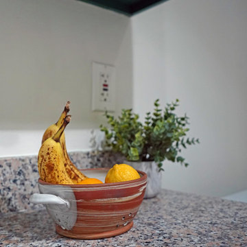
 worked closely with our client to plan, design, and implement a renovation of two children’s rooms, create a mudroom with laundry area in an unused downstairs space, renovate a kitchenette area, and create a home office space in a downstairs living room by adding floor to ceiling room dividers. As the children were growing so were their needs and we took this into account when planning for both kids’ rooms. As one child was graduating to a big kids room the other was moving into their siblings nursery. We wanted to update the nursery so that it became something new and unique to its new inhabitant. For this room we repurposed a lot of the furniture, repainted all the walls, added a striking outer-space whale wallpaper that would grow with the little one and added a few new features; a toddlers busy board with fun twists and knobs to encourage brain function and growth, a few floor mats for rolling around, and a climbing arch that could double as a artist work desk as the little grows. Downstairs we created a whimsical big kids room by repainting all the walls, building a custom bookshelf, sourcing the coolest toddler bed with trundle for sleepovers, featured a whimsical wonderland wallpaper, adding a few animal toy baskets, we sourced large monstera rugs, a toddlers table with chairs, fun colorful felt hooks and a few climbing foam pieces for jumping and rolling on. For the kitchenette, we worked closely with the General Contractor to repaint the cabinets, add handle pulls, and install new mudroom and laundry furniture. We carried the kitchenette green color to the bathroom cabinets and to the floor to ceiling room dividers for the home office space. Lastly we brought in an organization team to help de-clutter and create a fluid everything-has-its-place system that would make our client’s lives easier.
 Utopia 360 Studio
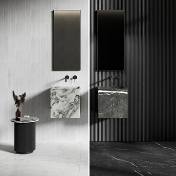
Leader Online, a UK-based company, approached us to support the launch of Nosa, a new sanitary ware brand targeting the British market.
With competition in the sector increasing, they required a cohesive set of visuals for their numerous products to establish a consistent visual language across e-commerce platforms, catalogs, and promotional materials.
It was a complete brand creation from scratch, and we pulled it off.
Key tasks:
- Develop a cohesive visual brand identity for Nosa
- Produce over 2,000 high-quality 3D visualizations
within five months
- Optimize workflows for high efficiency and a unified
visual standard
Our approach:
To efficiently manage high production volumes and accelerate feedback, we implemented an optimized workflow system. This transformed our render production into an assembly line, drastically cutting individual product processing time while upholding top image quality.
Nosa's unique marble, with its distinct veins and inclusions, was central to their brand. Since no existing textures matched, we requested physical samples.
Upon receiving the stone, we set up an improvised photo studio, capturing every detail. Our goal was
not just to replicate the marble in 3D, but to preserve
its raw, organic beauty.
We applied the same meticulous process to metal materials for accurate shade representation. Nosa prioritized authenticity, ensuring buyers saw the true material, not an over-polished version.
Result:
Nosa's market entry surpassed all expectations.
Fueled by its compelling visual identity, the brand achieved strong initial sales and is now rapidly expanding its product range, cementing its presence.
We are proud to continue our partnership with Nosa
to this day.
 Che Interiors
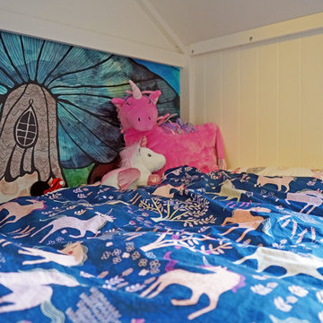
 worked closely with our client to plan, design, and implement a renovation of two children’s rooms, create a mudroom with laundry area in an unused downstairs space, renovate a kitchenette area, and create a home office space in a downstairs living room by adding floor to ceiling room dividers. As the children were growing so were their needs and we took this into account when planning for both kids’ rooms. As one child was graduating to a big kids room the other was moving into their siblings nursery. We wanted to update the nursery so that it became something new and unique to its new inhabitant. For this room we repurposed a lot of the furniture, repainted all the walls, added a striking outer-space whale wallpaper that would grow with the little one and added a few new features; a toddlers busy board with fun twists and knobs to encourage brain function and growth, a few floor mats for rolling around, and a climbing arch that could double as a artist work desk as the little grows. Downstairs we created a whimsical big kids room by repainting all the walls, building a custom bookshelf, sourcing the coolest toddler bed with trundle for sleepovers, featured a whimsical wonderland wallpaper, adding a few animal toy baskets, we sourced large monstera rugs, a toddlers table with chairs, fun colorful felt hooks and a few climbing foam pieces for jumping and rolling on. For the kitchenette, we worked closely with the General Contractor to repaint the cabinets, add handle pulls, and install new mudroom and laundry furniture. We carried the kitchenette green color to the bathroom cabinets and to the floor to ceiling room dividers for the home office space. Lastly we brought in an organization team to help de-clutter and create a fluid everything-has-its-place system that would make our client’s lives easier.
 Michael Nash Design, Build & Homes
The owners of this single-family home were tired of their single-family home appearance. The front red brick fascia a run of the mill front porch was story of the past.
Our design staff had countless meeting with homeowners and finally everyone agreed on a wraparound porch. Big enough to give them swing set, wicker furniture space, but not too big to take over the front yard.
This new front porch implemented through major excavation and clearing dirt from two sides of the house.
Roofed in with dark bronze metal, columns wrapped in a tapered shape over stone pillars make this porch stand out in this street.
The ceiling cedar panels stained with a complimentary tone with new paint on all Brick fascia. Recess lights, Lantern lights and four ceiling panels are all making this home stand tall.
The wide lead walk cover with Sunset Buff chiseled flagstone complimenting the pillar stone and Trex decking on the porch floors,
The side yard was cleared to have a large flagstone built with wrapped around seating stone walls, the existing deck posts were wrapped in with PVC, giving a clean appearance of old deck.
A river stoned bed was built on the backyard running into a fish pond bringing a bit of nature into this heavenly backyard.
The front landscaping around the walk and the riverbed looks glorious and breathtaking.
The transformation of this home was so huge that they neighborhood committee selected this home as Icon home for festive holidays.
Homeowners are thrilled with this transformation.
 Che Interiors
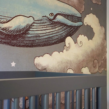
 worked closely with our client to plan, design, and implement a renovation of two children’s rooms, create a mudroom with laundry area in an unused downstairs space, renovate a kitchenette area, and create a home office space in a downstairs living room by adding floor to ceiling room dividers. As the children were growing so were their needs and we took this into account when planning for both kids’ rooms. As one child was graduating to a big kids room the other was moving into their siblings nursery. We wanted to update the nursery so that it became something new and unique to its new inhabitant. For this room we repurposed a lot of the furniture, repainted all the walls, added a striking outer-space whale wallpaper that would grow with the little one and added a few new features; a toddlers busy board with fun twists and knobs to encourage brain function and growth, a few floor mats for rolling around, and a climbing arch that could double as a artist work desk as the little grows. Downstairs we created a whimsical big kids room by repainting all the walls, building a custom bookshelf, sourcing the coolest toddler bed with trundle for sleepovers, featured a whimsical wonderland wallpaper, adding a few animal toy baskets, we sourced large monstera rugs, a toddlers table with chairs, fun colorful felt hooks and a few climbing foam pieces for jumping and rolling on. For the kitchenette, we worked closely with the General Contractor to repaint the cabinets, add handle pulls, and install new mudroom and laundry furniture. We carried the kitchenette green color to the bathroom cabinets and to the floor to ceiling room dividers for the home office space. Lastly we brought in an organization team to help de-clutter and create a fluid everything-has-its-place system that would make our client’s lives easier.
 Michael Nash Design, Build & Homes
2010 REGIONAL AWARD WINNER
Built in 2000, this center hall colonial in Fairfax Station, Virginia had a kitchen that was neither functional nor aesthetically pleasing.
First, the floor plan was poorly rationalized. The work triangle was inefficient, a large pantry took up too much floor space, and a series of railings between the kitchen and family room obstructed traffic flow.
Aesthetically, the space was dated. Dutch cabinetry, floral wallpaper and a faux Victorian chandelier all cried for an update. Additionally, the homeowners wanted to incorporate high-end appliances and other amenities like a wine cooler and steam cooker.
Overall, the owners were seeking to replace worn out-of-style kitchen with a substantially upgraded “open” facility that combines traditional and contemporary features configured to support multiple social and culinary needs.
Working with Michael Nash Design, Build & Homes, they decided to implement a series of strategic revisions that would support their new use goals.
First, they removed an obstructive bearing wall between the existing kitchen and mudroom, creating a recessed niche for a new 48” gas range with custom hood. An unused desk taken out provided a spot for the new 48” two-drawer refrigerator/freezer.
A custom-designed L-shaped granite-surfaced island with bar sink, icemaker and mini-drawer refrigerator takes center stage in the space and offers seating for six. Now the chef can entertain guests while preparing the meal.
From an aesthetic point of view, the interior features are nothing less than stunning. Softly painted walls, decorative ceramic tile backsplashes and granite surfaces combine with custom made cabinets to create an elegant space. Antiqued soft-opaque cabinet facings, wood panel refrigerator door inserts, glass-facing display cabinets and a custom mantle range hood are true works of craftsmanship. Fine detail is expressed with flutes and corbels. Beauty is truly in the details of this award-winning kitchen.
 Michael Nash Design, Build & Homes
The owners of this single-family home were tired of their single-family home appearance. The front red brick fascia a run of the mill front porch was story of the past.
Our design staff had countless meeting with homeowners and finally everyone agreed on a wraparound porch. Big enough to give them swing set, wicker furniture space, but not too big to take over the front yard.
This new front porch implemented through major excavation and clearing dirt from two sides of the house.
Roofed in with dark bronze metal, columns wrapped in a tapered shape over stone pillars make this porch stand out in this street.
The ceiling cedar panels stained with a complimentary tone with new paint on all Brick fascia. Recess lights, Lantern lights and four ceiling panels are all making this home stand tall.
The wide lead walk cover with Sunset Buff chiseled flagstone complimenting the pillar stone and Trex decking on the porch floors,
The side yard was cleared to have a large flagstone built with wrapped around seating stone walls, the existing deck posts were wrapped in with PVC, giving a clean appearance of old deck.
A river stoned bed was built on the backyard running into a fish pond bringing a bit of nature into this heavenly backyard.
The front landscaping around the walk and the riverbed looks glorious and breathtaking.
The transformation of this home was so huge that they neighborhood committee selected this home as Icon home for festive holidays.
Homeowners are thrilled with this transformation.

 Innovative Design Build
Our clients wanted to utilize this particular area of their home and really give it a function. It has been many things over the years: bonus room, dining area, etc. The kitchen is the natural gathering spot. They wanted to create a space that was an extension of the kitchen for entertaining and serving family and friends.
Architect, Cynthia Karegeannes was hired to draw up plans for a mudroom to corral the couple’s two dogs and stash the pet’s leashes, treats, etc. A large butler pantry was imagined with a full size refrigerator, prep sink, dishwasher and custom cabinetry to have items handy for entertaining. Innovative Construction, helped finalize the details and implemented the plans for the new addition. Interior Designer, Beth Weltlich with The House Dressing worked with homeowners, to select materials and finishes to unify the areas of the existing kitchen and the new spaces. A custom banquette was created with room under the staircase so that all of the space could be utilized. Furniture and accessories are still in the works as the homeowners let the area evolve to see exactly what their needs are. A collaborative effort-for sure!
The challenges included creating three separate areas (mudroom, banquette and butler pantry) with storage and versatility in one existing space. Having this additional space that was not always utilized, the homeowners feel the new addition will become an integral part of the families' living area.
 Michael Nash Design, Build & Homes
The owners of this single-family home were tired of their single-family home appearance. The front red brick fascia a run of the mill front porch was story of the past.
Our design staff had countless meeting with homeowners and finally everyone agreed on a wraparound porch. Big enough to give them swing set, wicker furniture space, but not too big to take over the front yard.
This new front porch implemented through major excavation and clearing dirt from two sides of the house.
Roofed in with dark bronze metal, columns wrapped in a tapered shape over stone pillars make this porch stand out in this street.
The ceiling cedar panels stained with a complimentary tone with new paint on all Brick fascia. Recess lights, Lantern lights and four ceiling panels are all making this home stand tall.
The wide lead walk cover with Sunset Buff chiseled flagstone complimenting the pillar stone and Trex decking on the porch floors,
The side yard was cleared to have a large flagstone built with wrapped around seating stone walls, the existing deck posts were wrapped in with PVC, giving a clean appearance of old deck.
A river stoned bed was built on the backyard running into a fish pond bringing a bit of nature into this heavenly backyard.
The front landscaping around the walk and the riverbed looks glorious and breathtaking.
The transformation of this home was so huge that they neighborhood committee selected this home as Icon home for festive holidays.
Homeowners are thrilled with this transformation.
 Che Interiors
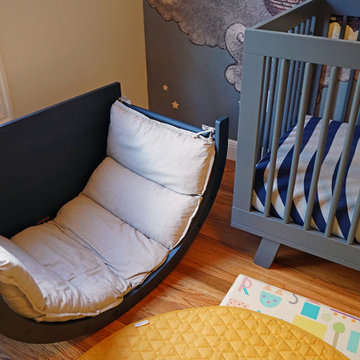
 worked closely with our client to plan, design, and implement a renovation of two children’s rooms, create a mudroom with laundry area in an unused downstairs space, renovate a kitchenette area, and create a home office space in a downstairs living room by adding floor to ceiling room dividers. As the children were growing so were their needs and we took this into account when planning for both kids’ rooms. As one child was graduating to a big kids room the other was moving into their siblings nursery. We wanted to update the nursery so that it became something new and unique to its new inhabitant. For this room we repurposed a lot of the furniture, repainted all the walls, added a striking outer-space whale wallpaper that would grow with the little one and added a few new features; a toddlers busy board with fun twists and knobs to encourage brain function and growth, a few floor mats for rolling around, and a climbing arch that could double as a artist work desk as the little grows. Downstairs we created a whimsical big kids room by repainting all the walls, building a custom bookshelf, sourcing the coolest toddler bed with trundle for sleepovers, featured a whimsical wonderland wallpaper, adding a few animal toy baskets, we sourced large monstera rugs, a toddlers table with chairs, fun colorful felt hooks and a few climbing foam pieces for jumping and rolling on. For the kitchenette, we worked closely with the General Contractor to repaint the cabinets, add handle pulls, and install new mudroom and laundry furniture. We carried the kitchenette green color to the bathroom cabinets and to the floor to ceiling room dividers for the home office space. Lastly we brought in an organization team to help de-clutter and create a fluid everything-has-its-place system that would make our client’s lives easier.
 Michael Nash Design, Build & Homes
2011 NARI CAPITAL COTY FINALIST AWARD WINNER
This Cape Cod home located in Great Falls, VA, was in need of a major face lift. The front elevation had no defining character. Because the homeowners have three young active boys, their outdoor living space is important. They wanted to be able to have a porch to relax on while watching over the kids, have them hold a camp fire outdoors, and be able to entertain on the new side patio. Also the home’s entrance needed to be much more appealing.
The new design included a new front covered porch made out of solid concrete walls with crawl space underneath for shed storage. Entire walls, floor, steps and walkway were done in flagstone. The half columns and patio with its retaining walls were also done in the same flagstone.
The entire front face of old home was demolished. Then a 10’x30’ covered porch was framed-up to match the existing front elevation. Matching siding and roofing tied this look together. The front entrance was widened and includes a new mahogany door with leaded glass. A new bow window was added to bring more daylight into living room.
Inside, a new kitchen with blond cabinetry, dark granite counters and rich wood floors has become a central gathering place. New stainless steel appliances, including a range hood, form a highly efficient work triangle. A tile backsplash and recessed lighting complete the redesign.
The Arts & Crafts front porch with wide columns and railing, beaded ceiling panel, embedded lighting and ceiling fan made the front appearance a delightful place for the family to hang out. Implementing this front porch into the existing flat front Cape Cod had a major impact on the total appearance of this home. Now it looks like a brand new home has been added to the neighborhood.
 Michael Nash Design, Build & Homes
The owners of this single-family home were tired of their single-family home appearance. The front red brick fascia a run of the mill front porch was story of the past.
Our design staff had countless meeting with homeowners and finally everyone agreed on a wraparound porch. Big enough to give them swing set, wicker furniture space, but not too big to take over the front yard.
This new front porch implemented through major excavation and clearing dirt from two sides of the house.
Roofed in with dark bronze metal, columns wrapped in a tapered shape over stone pillars make this porch stand out in this street.
The ceiling cedar panels stained with a complimentary tone with new paint on all Brick fascia. Recess lights, Lantern lights and four ceiling panels are all making this home stand tall.
The wide lead walk cover with Sunset Buff chiseled flagstone complimenting the pillar stone and Trex decking on the porch floors,
The side yard was cleared to have a large flagstone built with wrapped around seating stone walls, the existing deck posts were wrapped in with PVC, giving a clean appearance of old deck.
A river stoned bed was built on the backyard running into a fish pond bringing a bit of nature into this heavenly backyard.
The front landscaping around the walk and the riverbed looks glorious and breathtaking.
The transformation of this home was so huge that they neighborhood committee selected this home as Icon home for festive holidays.
Homeowners are thrilled with this transformation.
 Michael Nash Design, Build & Homes
The owners of this single-family home were tired of their single-family home appearance. The front red brick fascia a run of the mill front porch was story of the past.
Our design staff had countless meeting with homeowners and finally everyone agreed on a wraparound porch. Big enough to give them swing set, wicker furniture space, but not too big to take over the front yard.
This new front porch implemented through major excavation and clearing dirt from two sides of the house.
Roofed in with dark bronze metal, columns wrapped in a tapered shape over stone pillars make this porch stand out in this street.
The ceiling cedar panels stained with a complimentary tone with new paint on all Brick fascia. Recess lights, Lantern lights and four ceiling panels are all making this home stand tall.
The wide lead walk cover with Sunset Buff chiseled flagstone complimenting the pillar stone and Trex decking on the porch floors,
The side yard was cleared to have a large flagstone built with wrapped around seating stone walls, the existing deck posts were wrapped in with PVC, giving a clean appearance of old deck.
A river stoned bed was built on the backyard running into a fish pond bringing a bit of nature into this heavenly backyard.
The front landscaping around the walk and the riverbed looks glorious and breathtaking.
The transformation of this home was so huge that they neighborhood committee selected this home as Icon home for festive holidays.
Homeowners are thrilled with this transformation.
 Haifa Architects
Duplex Y is located in a multi apartment building, typical to the Carmel mountain neighborhoods. The building has several entrances due to the slope it sits on.
Duplex Y has its own separate entrance and a beautiful view towards Haifa bay and the Golan Heights that can be seen on a clear weather day.
The client - a computer high-tech couple, with their two small daughters asked us for a simple and functional design that could remind them of their frequent visits to central and northern Europe. Their request has been accepted.
Our planning approach was simple indeed, maybe even simple in a radical way:
We followed the principle of clean and ultra minimal spaces, that serve their direct mission only.
Complicated geometry of the rooms has been simplified by implementing built-in wood furniture into numerous niches.
The most 'complicated' room (due to its broken geometry, narrow proportions and sloped ceiling) has been turned into a kid's room shaped as a clean 'wood box' for fun, games and 'edutainment'.
The storage room has been refurbished to maximize it's purpose by creating enough space to store 90% of the entire family's demand.
We've tried to avoid unnecessary decoration. 97% of the design has its functional use in addition to its atmospheric qualities.
Several elements like the structural cylindrical column were exposed to show their original material - concrete.
Photos: Julia Berezina
 Che Interiors
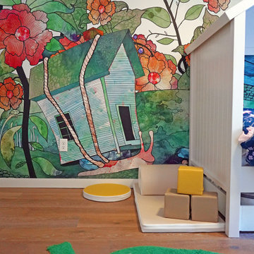
 worked closely with our client to plan, design, and implement a renovation of two children’s rooms, create a mudroom with laundry area in an unused downstairs space, renovate a kitchenette area, and create a home office space in a downstairs living room by adding floor to ceiling room dividers. As the children were growing so were their needs and we took this into account when planning for both kids’ rooms. As one child was graduating to a big kids room the other was moving into their siblings nursery. We wanted to update the nursery so that it became something new and unique to its new inhabitant. For this room we repurposed a lot of the furniture, repainted all the walls, added a striking outer-space whale wallpaper that would grow with the little one and added a few new features; a toddlers busy board with fun twists and knobs to encourage brain function and growth, a few floor mats for rolling around, and a climbing arch that could double as a artist work desk as the little grows. Downstairs we created a whimsical big kids room by repainting all the walls, building a custom bookshelf, sourcing the coolest toddler bed with trundle for sleepovers, featured a whimsical wonderland wallpaper, adding a few animal toy baskets, we sourced large monstera rugs, a toddlers table with chairs, fun colorful felt hooks and a few climbing foam pieces for jumping and rolling on. For the kitchenette, we worked closely with the General Contractor to repaint the cabinets, add handle pulls, and install new mudroom and laundry furniture. We carried the kitchenette green color to the bathroom cabinets and to the floor to ceiling room dividers for the home office space. Lastly we brought in an organization team to help de-clutter and create a fluid everything-has-its-place system that would make our client’s lives easier.
 Haifa Architects
Duplex Y is located in a multi apartment building, typical to the Carmel mountain neighborhoods. The building has several entrances due to the slope it sits on.
Duplex Y has its own separate entrance and a beautiful view towards Haifa bay and the Golan Heights that can be seen on a clear weather day.
The client - a computer high-tech couple, with their two small daughters asked us for a simple and functional design that could remind them of their frequent visits to central and northern Europe. Their request has been accepted.
Our planning approach was simple indeed, maybe even simple in a radical way:
We followed the principle of clean and ultra minimal spaces, that serve their direct mission only.
Complicated geometry of the rooms has been simplified by implementing built-in wood furniture into numerous niches.
The most 'complicated' room (due to its broken geometry, narrow proportions and sloped ceiling) has been turned into a kid's room shaped as a clean 'wood box' for fun, games and 'edutainment'.
The storage room has been refurbished to maximize it's purpose by creating enough space to store 90% of the entire family's demand.
We've tried to avoid unnecessary decoration. 97% of the design has its functional use in addition to its atmospheric qualities.
Several elements like the structural cylindrical column were exposed to show their original material - concrete.
Photos: Julia Berezina
214