
Search results for "Implementation" in Home Design Ideas

 Ernest M. Ferizi
German Embassy in Pristina - Kosovo, contracted the architecture office “Ferizi + Ferizi Architects” to plan and implement an Annex Office building for their purposes. As detached part of this building is designed the waiting area, as alone standing structure.
This Office Building is constructed by assembling of Eight used office containers that were delivered on trucks and set up after only a few hours on the basis of the LEGO principle, according to the planning on strip foundations.
By removing the flexible exterior wall panels, a large room of 115 m² was created, with the counter wall as a room partition between two office spaces, each with seven workstations as well as three counters for agents on one side and a room for visitors on the other side.
With this system, room solutions can be easily implemented in all dimensions.
The container, seen as a geometric shape, is a simple, octagonal, solid box.
The standardized perfection of its dimensions is striking: 2.44 meters wide, 2.59 meters high and 6.06 meters or 12.19 meters long.
Since its introduction in 1956 by the American transport entrepreneur Malcom McLean, the container has become a standardized transport module worldwide, whether on ships, trucks or construction sites.
The shipping containers have additionally revolutionized the transport industry, pushed the globalization noticeably, and thus directly or indirectly influenced all our lives.
But after only a few years, when the first overseas containers wore out, many engineers recognized the positive properties of used shipping containers for building houses, especially since they are robust, flexible, multifunctional and second-hand relatively inexpensive to purchase. The time has long passed by to treat containers exclusively as transport objects.
As a "measure of all things", containers can hardly be ignored in construction.
Their use is no longer limited to temporary use since school containers, information containers, office containers or entire residential buildings are now part of our everyday life in the construction industry.
However, current examples of the container architecture prove that even the most demanding solutions for container building are feasible. For their specific aesthetic and spatial qualities, containers also serve as design parameters for the development of new forms of architecture and urbanity.
The office building as an extension of the visa section, characterized by modern materials and contemporary aesthetics has been designed and built mainly as a low-energy building.
Extensive insulation to achieve a comfortable and sustainable constant temperature in the interior, high window quality and low energy consumption make the building energy-efficient.
The sophisticated lighting technology, networks, heating systems and air-conditioning systems are also components of this equipment.
It creates an overall harmonic picture and guarantees the highest standard in sustainable construction, taking into consideration the fact that environmentally friendly recycling and reutilization have become an increasingly important issue in our society.
West and East side of the wooden facade is compact and has few openings, while the southern facade is completely open with lot of glass. Its spatial openness ensures a transparent, friendly work environment, which allows a lot of light into the space.
This openness allows an uninterrupted, pleasant and close-to-nature view from interior spaces into the beautiful garden. During the installation of sophisticated light sources in the garden, emphasis was not only put on functionality and security, but also on the beauty of the garden shown through the illumination in the evening.
Large, horizontal white “brisole” serve as external sun protection systems, mounted on the canopies of the entrance areas of the modular construction and the enclosure, adeptly cast shade on these areas and at the same time shape the entire architectural language.
While on one hand, the two quadratic ledges suspended in the air, are docked with steel stairs and match the wooden façade, lead the staff to their office space, the artful modern interior, on the other hand, perfectly unites the functionality, innovative technology, culture and positive effects on the employees' efficiency and wellbeing.
A lot of white, interjected by warm wooden and colored accents, determines the ambience.
In the case of the lighting solution, the mainly linear ceiling lighting is used as the overlapping design element both for the offices of the visa section as well as for the counters and the waiting area for the visitors.
They underline the puristic design in order to create a pleasant light for a desired general illumination and ensure optimal light conditions without causing disturbing reflections on the computer screens.
In addition, precisely positioned pendant luminaires are installed at the workstations, which ensure pleasant room brightness.
In the entrance area, the harmonic and uniform lighting effect from the ground highlights the integration of photography and architecture.
Photographs of landscapes, people, places, expressing unforgettable, impressive moments and memories have been lovingly engraved on 8 x 8cm square oak blocks.
The idea of an effective, impressive environment that stimulates and inspires the work was the premiss on which the whole design concept was based. Consequently, the modular construction was no longer viewed through its history of utilization and scars, but rather as a structure of work ambiance, art and elegance.
FERIZI + FERIZI Architects
Photo: Arben Llapashtica

 Crystal Kitchen + Bath
Infusing this once, drab 80’s kitchen with light and color was one goal in this extensive remodel. By removing the wall separating the dining room from the kitchen, the space doubled in size and allowed natural light to flood it.
Creating a design that filled the space yet remained very functional to the homeowner was extremely important. By implementing the two working triangles, one homeowner can be using the sink, cooktop and refrigerator while the other uses the secondary island for food prep as it has an additional sink.
A large soffit housing HVAC runs through the middle of the townhome and seemed intrusive to the space at first. After embracing it in the design, it’s as if it were meant to be. Three aluminum framed cabinets hang below, one directly underneath the soffit to create an asymmetrical design.
On a budget but still wanting a beautiful design, Crystal’s semi-custom line of cabinetry came into play. Simply White and Light Grey provide the perfect backdrop for natural maple, brushed gold hardware and accessories that infuse the space with color. Inside the cabinetry, the best storage solutions make for an extremely functional kitchen!
What a dream it is to have a kitchen that boasts quality, functionality and makes a person feel inspired within it.
Photography: Paige Kilgore

 Michael Nash Design, Build & Homes
The owners of this single-family home were tired of their single-family home appearance. The front red brick fascia a run of the mill front porch was story of the past.
Our design staff had countless meeting with homeowners and finally everyone agreed on a wraparound porch. Big enough to give them swing set, wicker furniture space, but not too big to take over the front yard.
This new front porch implemented through major excavation and clearing dirt from two sides of the house.
Roofed in with dark bronze metal, columns wrapped in a tapered shape over stone pillars make this porch stand out in this street.
The ceiling cedar panels stained with a complimentary tone with new paint on all Brick fascia. Recess lights, Lantern lights and four ceiling panels are all making this home stand tall.
The wide lead walk cover with Sunset Buff chiseled flagstone complimenting the pillar stone and Trex decking on the porch floors,
The side yard was cleared to have a large flagstone built with wrapped around seating stone walls, the existing deck posts were wrapped in with PVC, giving a clean appearance of old deck.
A river stoned bed was built on the backyard running into a fish pond bringing a bit of nature into this heavenly backyard.
The front landscaping around the walk and the riverbed looks glorious and breathtaking.
The transformation of this home was so huge that they neighborhood committee selected this home as Icon home for festive holidays.
Homeowners are thrilled with this transformation.
Find the right local pro for your project
 Colorworks Landscape Design
DC Ranch Community
Style: Traditional-Southwest
Project Range: $40,000 - $50,000
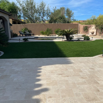
Backyard Refresh: Replaced sod with synthetic turf, resurfaced bbq with new travertine patio, updated irrigation, lighting and new landscape
We are thrilled to announce the successful completion of a traditional Southwest project in the esteemed DC Ranch Community. Our team had the pleasure of working with a wonderful client to transform their backyard into a stunning oasis that perfectly blends the charm of the Southwest with modern amenities.
The centerpiece of this project was the installation of new synthetic turf, providing the clients with a lush and maintenance-free lawn all year round. The vibrant green turf complements the surrounding desert landscape, creating a harmonious balance between nature and design. To further enhance the outdoor living experience, we resurfaced the barbecue area with exquisite travertine patio tiles. The rich earth tones of the travertine beautifully complement the Southwest aesthetic while adding a touch of elegance.
To ensure the outdoor space remains vibrant and well-nourished, we upgraded the irrigation system. Our team implemented state-of-the-art technology that optimizes water usage, promoting sustainability without compromising the health and beauty of the landscape. Additionally, we revamped the lighting system, strategically placing fixtures to accentuate architectural features and highlight the natural beauty of the surroundings during evening hours. The warm and inviting glow of the lights adds an enchanting ambiance, perfect for entertaining guests or enjoying peaceful evenings outdoors.
With the completion of this traditional Southwest project, our team has created a breathtaking outdoor space that seamlessly blends the natural beauty of the DC Ranch Community with modern amenities. It is our utmost pleasure to have worked with our valued client, and we are delighted to witness the transformation of their backyard into a captivating retreat that will be cherished for years to come.
 Che Interiors
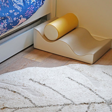
 worked closely with our client to plan, design, and implement a renovation of two children’s rooms, create a mudroom with laundry area in an unused downstairs space, renovate a kitchenette area, and create a home office space in a downstairs living room by adding floor to ceiling room dividers. As the children were growing so were their needs and we took this into account when planning for both kids’ rooms. As one child was graduating to a big kids room the other was moving into their siblings nursery. We wanted to update the nursery so that it became something new and unique to its new inhabitant. For this room we repurposed a lot of the furniture, repainted all the walls, added a striking outer-space whale wallpaper that would grow with the little one and added a few new features; a toddlers busy board with fun twists and knobs to encourage brain function and growth, a few floor mats for rolling around, and a climbing arch that could double as a artist work desk as the little grows. Downstairs we created a whimsical big kids room by repainting all the walls, building a custom bookshelf, sourcing the coolest toddler bed with trundle for sleepovers, featured a whimsical wonderland wallpaper, adding a few animal toy baskets, we sourced large monstera rugs, a toddlers table with chairs, fun colorful felt hooks and a few climbing foam pieces for jumping and rolling on. For the kitchenette, we worked closely with the General Contractor to repaint the cabinets, add handle pulls, and install new mudroom and laundry furniture. We carried the kitchenette green color to the bathroom cabinets and to the floor to ceiling room dividers for the home office space. Lastly we brought in an organization team to help de-clutter and create a fluid everything-has-its-place system that would make our client’s lives easier.
 Michael Nash Design, Build & Homes
This couple have been living in their single-family Ashburn home for a wile and getting ready to update their home one step at the time.
Their kitchen was very small & dated. They would like to add sunroom. After talking to our designer, they come to conclusion to add sunroom/ Breakfast area to extend the kitchen & kill two birds with one stone.
Also, they decide to renovate two bathrooms upstairs. (Master bathroom & Hall bathroom)
Master bathroom was too small & after meeting with designer they agreed to take couple feet from bedroom & enlarge master bathroom.
She felt cramped and out dated in her old kitchen. A big pantry closet was taking way too much real estate out of her kitchen space.
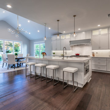
We have taken down bearing wall to adjacent family room to expand kitchen and implement 10’ feet long Island with sink, dishwasher and microwave into it.
The gas line and new 48” professional stove was relocated to west wall and now home for a long run of floor to ceiling cabinetry.
Display glass front lit cabinetry is place for her color full china’s
The north wall where closet used to be now is place for large scale refrigerator and freezer towers and pantry space. A tall unit of secondary oven and steam one is now placed in this wall
Installing matching wide plank espresso hardwood flooring has expanded this kitchen into all adjacent rooms.
New lighting plans, gorgeous pendent lighting make this center island to stand tall.
The traffic flow has been improved a lot allowing large gathering and entertainment much more than ever before.
She has carefully selected a soft tone backsplash to compliment the soapstone counter tops.
On the end they decided to have a stone patio right next to sunroom & enjoy their outdoor gathering as well.
 Utopia 360 Studio
Leader Online, a UK-based company, approached us to support the launch of Nosa, a new sanitary ware brand targeting the British market.
With competition in the sector increasing, they required a cohesive set of visuals for their numerous products to establish a consistent visual language across e-commerce platforms, catalogs, and promotional materials.
It was a complete brand creation from scratch, and we pulled it off.
Key tasks:
- Develop a cohesive visual brand identity for Nosa
- Produce over 2,000 high-quality 3D visualizations
within five months
- Optimize workflows for high efficiency and a unified
visual standard
Our approach:
To efficiently manage high production volumes and accelerate feedback, we implemented an optimized workflow system. This transformed our render production into an assembly line, drastically cutting individual product processing time while upholding top image quality.
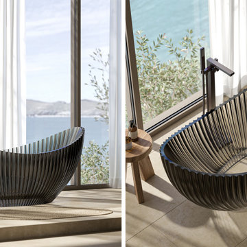
Nosa's unique marble, with its distinct veins and inclusions, was central to their brand. Since no existing textures matched, we requested physical samples.
Upon receiving the stone, we set up an improvised photo studio, capturing every detail. Our goal was
not just to replicate the marble in 3D, but to preserve
its raw, organic beauty.
We applied the same meticulous process to metal materials for accurate shade representation. Nosa prioritized authenticity, ensuring buyers saw the true material, not an over-polished version.
Result:
Nosa's market entry surpassed all expectations.
Fueled by its compelling visual identity, the brand achieved strong initial sales and is now rapidly expanding its product range, cementing its presence.
We are proud to continue our partnership with Nosa
to this day.
 Michael Nash Design, Build & Homes
The owners of this single-family home were tired of their single-family home appearance. The front red brick fascia a run of the mill front porch was story of the past.
Our design staff had countless meeting with homeowners and finally everyone agreed on a wraparound porch. Big enough to give them swing set, wicker furniture space, but not too big to take over the front yard.
This new front porch implemented through major excavation and clearing dirt from two sides of the house.
Roofed in with dark bronze metal, columns wrapped in a tapered shape over stone pillars make this porch stand out in this street.
The ceiling cedar panels stained with a complimentary tone with new paint on all Brick fascia. Recess lights, Lantern lights and four ceiling panels are all making this home stand tall.
The wide lead walk cover with Sunset Buff chiseled flagstone complimenting the pillar stone and Trex decking on the porch floors,
The side yard was cleared to have a large flagstone built with wrapped around seating stone walls, the existing deck posts were wrapped in with PVC, giving a clean appearance of old deck.
A river stoned bed was built on the backyard running into a fish pond bringing a bit of nature into this heavenly backyard.
The front landscaping around the walk and the riverbed looks glorious and breathtaking.
The transformation of this home was so huge that they neighborhood committee selected this home as Icon home for festive holidays.
Homeowners are thrilled with this transformation.
 Michael Nash Design, Build & Homes
The owners of this single-family home were tired of their single-family home appearance. The front red brick fascia a run of the mill front porch was story of the past.
Our design staff had countless meeting with homeowners and finally everyone agreed on a wraparound porch. Big enough to give them swing set, wicker furniture space, but not too big to take over the front yard.
This new front porch implemented through major excavation and clearing dirt from two sides of the house.
Roofed in with dark bronze metal, columns wrapped in a tapered shape over stone pillars make this porch stand out in this street.
The ceiling cedar panels stained with a complimentary tone with new paint on all Brick fascia. Recess lights, Lantern lights and four ceiling panels are all making this home stand tall.
The wide lead walk cover with Sunset Buff chiseled flagstone complimenting the pillar stone and Trex decking on the porch floors,
The side yard was cleared to have a large flagstone built with wrapped around seating stone walls, the existing deck posts were wrapped in with PVC, giving a clean appearance of old deck.
A river stoned bed was built on the backyard running into a fish pond bringing a bit of nature into this heavenly backyard.
The front landscaping around the walk and the riverbed looks glorious and breathtaking.
The transformation of this home was so huge that they neighborhood committee selected this home as Icon home for festive holidays.
Homeowners are thrilled with this transformation.
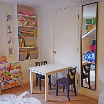 Che Interiors
 worked closely with our client to plan, design, and implement a renovation of two children’s rooms, create a mudroom with laundry area in an unused downstairs space, renovate a kitchenette area, and create a home office space in a downstairs living room by adding floor to ceiling room dividers. As the children were growing so were their needs and we took this into account when planning for both kids’ rooms. As one child was graduating to a big kids room the other was moving into their siblings nursery. We wanted to update the nursery so that it became something new and unique to its new inhabitant. For this room we repurposed a lot of the furniture, repainted all the walls, added a striking outer-space whale wallpaper that would grow with the little one and added a few new features; a toddlers busy board with fun twists and knobs to encourage brain function and growth, a few floor mats for rolling around, and a climbing arch that could double as a artist work desk as the little grows. Downstairs we created a whimsical big kids room by repainting all the walls, building a custom bookshelf, sourcing the coolest toddler bed with trundle for sleepovers, featured a whimsical wonderland wallpaper, adding a few animal toy baskets, we sourced large monstera rugs, a toddlers table with chairs, fun colorful felt hooks and a few climbing foam pieces for jumping and rolling on. For the kitchenette, we worked closely with the General Contractor to repaint the cabinets, add handle pulls, and install new mudroom and laundry furniture. We carried the kitchenette green color to the bathroom cabinets and to the floor to ceiling room dividers for the home office space. Lastly we brought in an organization team to help de-clutter and create a fluid everything-has-its-place system that would make our client’s lives easier.
 Michael Nash Design, Build & Homes
The owners of this single-family home were tired of their single-family home appearance. The front red brick fascia a run of the mill front porch was story of the past.
Our design staff had countless meeting with homeowners and finally everyone agreed on a wraparound porch. Big enough to give them swing set, wicker furniture space, but not too big to take over the front yard.
This new front porch implemented through major excavation and clearing dirt from two sides of the house.
Roofed in with dark bronze metal, columns wrapped in a tapered shape over stone pillars make this porch stand out in this street.
The ceiling cedar panels stained with a complimentary tone with new paint on all Brick fascia. Recess lights, Lantern lights and four ceiling panels are all making this home stand tall.
The wide lead walk cover with Sunset Buff chiseled flagstone complimenting the pillar stone and Trex decking on the porch floors,
The side yard was cleared to have a large flagstone built with wrapped around seating stone walls, the existing deck posts were wrapped in with PVC, giving a clean appearance of old deck.
A river stoned bed was built on the backyard running into a fish pond bringing a bit of nature into this heavenly backyard.
The front landscaping around the walk and the riverbed looks glorious and breathtaking.
The transformation of this home was so huge that they neighborhood committee selected this home as Icon home for festive holidays.
Homeowners are thrilled with this transformation.
 Michael Nash Design, Build & Homes
When the homeowners purchased this traditional colonial in Vienna, Virginia, they were already planning on making some serious changes. The home’s original floor plan was boxy and closed in, making traffic flow from one room to the next virtually non-existent. Additionally, the existing décor left a lot to be desired. Their vision was to open up the layout and create a more contemporary look using lots of light, soft colors and high end materials.
They decided to add a two-story addition to the back of the home’s existing breakfast room and the small upstairs bedroom above it. The old breakfast area was too small for their daily meals and their teenage son needed more space in his bedroom. They also decided to add a sunroom/family room to the left side of their old family room. This new room offers a vaulted ceiling with four skylights and lots of windows with a better view of the side and backyard.
To create a more open floor plan, the team at Michael Nash Design, Build & Homes removed the load bearing wall between the kitchen and family room and installed a large beam to handle the second floor load. Not only did this open up the space, but it allowed for the addition of a breakfast bar.
The right side bearing wall of the old family room was also removed and replaced with structural beams. This action created a continuous flow between the new sunroom and old family room. Separated by a double-sided stone fireplace, this new sunroom is connected to a new outside sun deck built using a maintenance-free decking material. The old family room with new lighting now serves as a casual seating area. It also features an eight-foot long built-in desk.
The newly updated kitchen features granite countertops with matching tile backsplash, professional-quality appliances, a porcelain tile floor and custom cabinets, including a large pantry. The new breakfast room is more spacious and gets daylight from three different angles.
Upstairs, a new 12’ x 20’ bedroom is a great place for this teenage football fan to hang out. It provides significantly more closet space than the old room and lets in more sunlight as well.
The old laundry room was converted to a new mudroom with locker style cabinetry and a place for kids to store their bag packs. New plumbing and electrical were implemented in a new closet in an upper hallway to facilitate the new washer and dryer.
In this remodel, form and function have come together in an open concept design that meets the needs of the entire family.
 Michael Nash Design, Build & Homes
2011 NARI CAPITAL COTY FINALIST AWARD WINNER
This Cape Cod home located in Great Falls, VA, was in need of a major face lift. The front elevation had no defining character. Because the homeowners have three young active boys, their outdoor living space is important. They wanted to be able to have a porch to relax on while watching over the kids, have them hold a camp fire outdoors, and be able to entertain on the new side patio. Also the home’s entrance needed to be much more appealing.
The new design included a new front covered porch made out of solid concrete walls with crawl space underneath for shed storage. Entire walls, floor, steps and walkway were done in flagstone. The half columns and patio with its retaining walls were also done in the same flagstone.
The entire front face of old home was demolished. Then a 10’x30’ covered porch was framed-up to match the existing front elevation. Matching siding and roofing tied this look together. The front entrance was widened and includes a new mahogany door with leaded glass. A new bow window was added to bring more daylight into living room.
Inside, a new kitchen with blond cabinetry, dark granite counters and rich wood floors has become a central gathering place. New stainless steel appliances, including a range hood, form a highly efficient work triangle. A tile backsplash and recessed lighting complete the redesign.
The Arts & Crafts front porch with wide columns and railing, beaded ceiling panel, embedded lighting and ceiling fan made the front appearance a delightful place for the family to hang out. Implementing this front porch into the existing flat front Cape Cod had a major impact on the total appearance of this home. Now it looks like a brand new home has been added to the neighborhood.
 Michael Nash Design, Build & Homes
The first floor of this single-family home in Arlington, VA was divided to narrow staircase in front of the front door separating Living room and dining room. Just behind the dining room, was a very small kitchen, a nonfunctioning kitchen space, with a 2' wide window and just behind it an addition of storage room that literally served no purpose for them.
They were looking for an updated look with lots of daylight and open first floor plan,
plans were drawn up for both wall on sides of steps to be taken down giving openness to both living room and dining room.
Three bearing walls separating kitchen and dining room, kitchen and added storage, and kitchen and living room were taken down and new structural support inserted instead. A major amount of plumbing and duct work were relocated allowing open space.
The old storage area was converted mudroom, closet space with tile floor, ceiling was raised, side add was added and back windows were installed. Portion old storage space was given to create much added powder room. Cutely decorated with flowered design floor tiles and restored furniture style vanity cabinet.
Installed a Double window to allow much needed lighting in the kitchen area. Large Island with prep sink was implemented in center of kitchen and old dining room, a butler area with wine chiller and glass cabinets was install just steps away from new Dining & Living room space. the old wood burning fireplace was converted to gas log with new marble heart.
New barn door was installed to allow clear path to adjacent study.
Upscale stainless-steel appliances, exotic stone top and subway tiles are added more pizzazz to this comfortable yet welcoming kitchen.
she is more than pleased with her decisions and can't wait to throw more parties in her home.

 TVL Creative Ltd.
This wonderful client returned to us for her living room remodel with the goal of transforming the space into a comfortable, stylish area for lounging and entertaining. The focal point of the room, the fireplace, became an ode to the client's father. At the time of the project’s start, he had recently passed away. Our client’s father had always believed that the space needed a fireplace, and this was a special implementation that we could make to honor that. Aside from creating an inviting and warm fireplace corner, the other goals of the project included a strategic working of aesthetic and form. As a first move, we removed a long wall at the entry of the space. This immediately created a more open and welcoming entry off the front door. Subtle division was still established here by integrating a new sofa and sofa back table. Another goal was to carry the luxe transitional feeling that we had previously developed in her upstairs bathroom renovation a few years prior down into the other public spaces of the home. On the fireplace, chenille white stacked stone was installed and paired with a custom wood mantle. Throughout the space, layers of texture, pattern and finishes were utilized to create a dynamic and elegant completion. We combined metal, wood, marble, limestone, chunky fabric knits, soft chenille, mother of pearl and rattan for a complex aesthetic language that is diverse and beautiful. As part of our final touches, we worked to brighten and lighten the space. We updated window coverings and installed new can lighting in the dining room and kitchen areas. The hardwood floors were refinished and paint was updated throughout. We also completed the space with seating appropriate for entertaining in a smaller space. For example, accent chairs in this room also function as dining chairs for the head of the table. It feels so fitting to have something that brings warmth into a space tied to our client's memory of their father and we are so honored to have had a part in creating something in honor of him.
 TVL Creative Ltd.
This wonderful client returned to us for her living room remodel with the goal of transforming the space into a comfortable, stylish area for lounging and entertaining. The focal point of the room, the fireplace, became an ode to the client's father. At the time of the project’s start, he had recently passed away. Our client’s father had always believed that the space needed a fireplace, and this was a special implementation that we could make to honor that. Aside from creating an inviting and warm fireplace corner, the other goals of the project included a strategic working of aesthetic and form. As a first move, we removed a long wall at the entry of the space. This immediately created a more open and welcoming entry off the front door. Subtle division was still established here by integrating a new sofa and sofa back table. Another goal was to carry the luxe transitional feeling that we had previously developed in her upstairs bathroom renovation a few years prior down into the other public spaces of the home. On the fireplace, chenille white stacked stone was installed and paired with a custom wood mantle. Throughout the space, layers of texture, pattern and finishes were utilized to create a dynamic and elegant completion. We combined metal, wood, marble, limestone, chunky fabric knits, soft chenille, mother of pearl and rattan for a complex aesthetic language that is diverse and beautiful. As part of our final touches, we worked to brighten and lighten the space. We updated window coverings and installed new can lighting in the dining room and kitchen areas. The hardwood floors were refinished and paint was updated throughout. We also completed the space with seating appropriate for entertaining in a smaller space. For example, accent chairs in this room also function as dining chairs for the head of the table. It feels so fitting to have something that brings warmth into a space tied to our client's memory of their father and we are so honored to have had a part in creating something in honor of him.

 Zola European Windows
This Boulder, Colorado remodel by fuentesdesign demonstrates the possibility of renewal in American suburbs, and Passive House design principles. Once an inefficient single story 1,000 square-foot ranch house with a forced air furnace, has been transformed into a two-story, solar powered 2500 square-foot three bedroom home ready for the next generation.
The new design for the home is modern with a sustainable theme, incorporating a palette of natural materials including; reclaimed wood finishes, FSC-certified pine Zola windows and doors, and natural earth and lime plasters that soften the interior and crisp contemporary exterior with a flavor of the west. A Ninety-percent efficient energy recovery fresh air ventilation system provides constant filtered fresh air to every room. The existing interior brick was removed and replaced with insulation. The remaining heating and cooling loads are easily met with the highest degree of comfort via a mini-split heat pump, the peak heat load has been cut by a factor of 4, despite the house doubling in size. During the coldest part of the Colorado winter, a wood stove for ambiance and low carbon back up heat creates a special place in both the living and kitchen area, and upstairs loft.
This ultra energy efficient home relies on extremely high levels of insulation, air-tight detailing and construction, and the implementation of high performance, custom made European windows and doors by Zola Windows. Zola’s ThermoPlus Clad line, which boasts R-11 triple glazing and is thermally broken with a layer of patented German Purenit®, was selected for the project. These windows also provide a seamless indoor/outdoor connection, with 9′ wide folding doors from the dining area and a matching 9′ wide custom countertop folding window that opens the kitchen up to a grassy court where mature trees provide shade and extend the living space during the summer months.
With air-tight construction, this home meets the Passive House Retrofit (EnerPHit) air-tightness standard of

 Advance Design Studio, Ltd.
Karen and Chad of Tower Lakes, IL were tired of their unfinished basement functioning as nothing more than a storage area and depressing gym. They wanted to increase the livable square footage of their home with a cohesive finished basement design, while incorporating space for the kids and adults to hang out.
“We wanted to make sure that upon renovating the basement, that we can have a place where we can spend time and watch movies, but also entertain and showcase the wine collection that we have,” Karen said.
After a long search comparing many different remodeling companies, Karen and Chad found Advance Design Studio. They were drawn towards the unique “Common Sense Remodeling” process that simplifies the renovation experience into predictable steps focused on customer satisfaction.
“There are so many other design/build companies, who may not have transparency, or a focused process in mind and I think that is what separated Advance Design Studio from the rest,” Karen said.
Karen loved how designer Claudia Pop was able to take very high-level concepts, “non-negotiable items” and implement them in the initial 3D drawings. Claudia and Project Manager DJ Yurik kept the couple in constant communication through the project. “Claudia was very receptive to the ideas we had, but she was also very good at infusing her own points and thoughts, she was very responsive, and we had an open line of communication,” Karen said.
A very important part of the basement renovation for the couple was the home gym and sauna. The “high-end hotel” look and feel of the openly blended work out area is both highly functional and beautiful to look at. The home sauna gives them a place to relax after a long day of work or a tough workout. “The gym was a very important feature for us,” Karen said. “And I think (Advance Design) did a very great job in not only making the gym a functional area, but also an aesthetic point in our basement”.
An extremely unique wow-factor in this basement is the walk in glass wine cellar that elegantly displays Karen and Chad’s extensive wine collection. Immediate access to the stunning wet bar accompanies the wine cellar to make this basement a popular spot for friends and family.
The custom-built wine bar brings together two natural elements; Calacatta Vicenza Quartz and thick distressed Black Walnut. Sophisticated yet warm Graphite Dura Supreme cabinetry provides contrast to the soft beige walls and the Calacatta Gold backsplash. An undermount sink across from the bar in a matching Calacatta Vicenza Quartz countertop adds functionality and convenience to the bar, while identical distressed walnut floating shelves add an interesting design element and increased storage. Rich true brown Rustic Oak hardwood floors soften and warm the space drawing all the areas together.
Across from the bar is a comfortable living area perfect for the family to sit down at a watch a movie. A full bath completes this finished basement with a spacious walk-in shower, Cocoa Brown Dura Supreme vanity with Calacatta Vicenza Quartz countertop, a crisp white sink and a stainless-steel Voss faucet.
Advance Design’s Common Sense process gives clients the opportunity to walk through the basement renovation process one step at a time, in a completely predictable and controlled environment. “Everything was designed and built exactly how we envisioned it, and we are really enjoying it to it’s full potential,” Karen said.
Constantly striving for customer satisfaction, Advance Design’s success is heavily reliant upon happy clients referring their friends and family. “We definitely will and have recommended Advance Design Studio to friends who are looking to embark on a remodeling project small or large,” Karen exclaimed at the completion of her project.

 SDM Design, Inc.
This house was designed for a couple and their son. One of the design program requirements was to have two master suites on the main level. They enjoy cooking and entertaining so the public and food prep. areas are functional, attractive and conducive to people gathering around. Consequently, the square footage of the main level is large.
The house is also on a very steep slope which didn't help with the required footprint. In order to minimize the related costs of building with this site condition, the footprint of the house is long and not deep as it reaches down the slope.
The scale of the existing homes in the neighborhood are unimposing. In order to play down the size as viewed from the street, the facade is broken up into several different masses with low sloping roofs.
Once you're inside, the house opens up with 14 foot ceilings in the entry and living areas. The ceiling height of other spaces on the main level are 10 feet. Universal design was implemented on the main level to provide inherent accessibility for everyone.
The lower level accommodates several guest rooms and baths, an exercise room, a guest den with wet bar and a man cave.
Another design program requirement was to make the house as maintenance-free as possible. Exterior materials include stucco, Pennsylvania Blue Stone and a new aluminum siding product called Longboard. The siding comes in many wood grain finishes and to everyone that has seen it, they think it's real wood. It's also made from heavy gauge aluminum so it doesn't ding like traditional aluminum siding. The roofs are metal standing seam.
The house is energy efficient. It's fully insulated with spray foam insulation-lots of it. The exterior walls were designed with 2x6 studs and roof rafters are 2x12 to provide plenty of space for the insulation, exceeding the required R-values. Windows and doors of course are energy efficient as well. All lighting is LED.
The decking around the exterior is locust, a very hard native wood which is naturally insect and rot resistant.
The best part of the whole project are the owners who love their new home. They initially had plans to live in this house during the summer months and Florida during the winter. They are now seriously considering living here full-time.
 SDM Design, Inc.
This house was designed for a couple and their son. One of the design program requirements was to have two master suites on the main level. They enjoy cooking and entertaining so the public and food prep. areas are functional, attractive and conducive to people gathering around. Consequently, the square footage of the main level is large.
The house is also on a very steep slope which didn't help with the required footprint. In order to minimize the related costs of building with this site condition, the footprint of the house is long and not deep as it reaches down the slope.
The scale of the existing homes in the neighborhood are unimposing. In order to play down the size as viewed from the street, the facade is broken up into several different masses with low sloping roofs.
Once you're inside, the house opens up with 14 foot ceilings in the entry and living areas. The ceiling height of other spaces on the main level are 10 feet. Universal design was implemented on the main level to provide inherent accessibility for everyone.
The lower level accommodates several guest rooms and baths, an exercise room, a guest den with wet bar and a man cave.
Another design program requirement was to make the house as maintenance-free as possible. Exterior materials include stucco, Pennsylvania Blue Stone and a new aluminum siding product called Longboard. The siding comes in many wood grain finishes and to everyone that has seen it, they think it's real wood. It's also made from heavy gauge aluminum so it doesn't ding like traditional aluminum siding. The roofs are metal standing seam.
The house is energy efficient. It's fully insulated with spray foam insulation-lots of it. The exterior walls were designed with 2x6 studs and roof rafters are 2x12 to provide plenty of space for the insulation, exceeding the required R-values. Windows and doors of course are energy efficient as well. All lighting is LED.
The decking around the exterior is locust, a very hard native wood which is naturally insect and rot resistant.
The best part of the whole project are the owners who love their new home. They initially had plans to live in this house during the summer months and Florida during the winter. They are now seriously considering living here full-time.
215