
Search results for "Implementation" in Home Design Ideas

 Pool Environments, Inc.
The client purchased this property with grand plans of renovating the entire place; from top to bottom, and from inside to outside. And while the inside canvas was very generous and even somewhat forgiving, the outside space would be anything but.
We wanted to squeeze in as much seating space as possible in their limited courtyard area, without encroaching on the already compact-sized pool. The first and most obvious solution was to get rid of the trees and shrubs that separated this house from its zero-lot-line neighbor. With the addition of Lueder limestone slabs, this alone would free up nearly 120 additional square feet, which happened to be the perfect amount of space for a mobile gas fire pit and sectional sofa. And all of this would make for the perfect place to enjoy the afternoon sunset with the implementation of a custom-built metal pergola standing above it all.
The next problem we saw was that around the patio area, there were too many levels of steps and stairs, which meant that it would have been difficult to have any sort of traditional furniture arrangement. Randy knew that it only made sense to bring in a wood deck that could be mated to the highest level of the patio, thus creating gaining the most continuous amount of flat space that the client was wanting. But even so, that flat space would be limited to a tight "L-shape" around the pool. And knowing this, the client decided that the larger space would be more valuable to them than the spa, so they opted to have a portion of the deck built over it in order to allow for a more generous amount of patio space.
And with the edge of the patio/deck dropping off almost 2 feet to the waterline, it now created the perfect opportunity to have a visually compelling raised wall that could be adorned with different hues of plank-shaped tiles. From inside the pool, the varying shades of brown were a great accent to the wood deck that sat just above.
However, the true visual crowning jewel of this project would end up being the raised back wall along the fence, fully encased in a large format, 24x24 slate grey tile, complete with a custom stainless steel, square-tube scupper bank, installed at just the right height to create the perfect amount of water noise.
But Randy wasn't done just yet. With two entirely new entertaining areas opened up at opposite ends of the pool, the only thing left to do now was to connect them. Knowing that he nor the client wanted to eliminate any more water space, he decided to bring a new traffic pattern right into the pool by way of two "floating", Lueder limestone stepper pads. It would be a visually perfect union of both pool and walking spaces.
The existing steps and walkways were then cut away and replaced with matching Lueder limestone caps and steppers. All remaining gaps were then filled with Mexican beach pebble, which helped to promote a very "zen-like" feel in this outdoor space.
The interior of the pool was coated with Wet Edge Primerastone "Blue Pacific Coast" plaster, and lit up with Pentair GloBrite LED pool lights.
In the end, the client ended up gaining the additional entertaining and seating space that they needed, and the updated, modern feel that they loved.


 Valentini Kids Furniture Brooklyn NY
Modern Wall Unit Velvet 918 by Artigian Mobili Italy
Made in Italy
Velvet by ArtigianMobili is an ultra modern collection of wall unit and entertainment centers for your modern home. The Velvet line is modular, providing flexible solutions for your living room, taking into account your specific dimensions and functional requirements. All the units within this wall unit collection are made in Italy according high European quality standards and using the finest materials. The variety of units is presented in different sizes, making possible to customize any composition to fit your particular dimensions and match the design. Color is also flexible within the Velvet Wall Unit Collection. All the units can be ordered wood finished, wood open pore matt lacquered, or lacquered even in your custom RAL COLOR, either gloss or matt! Please select from our "as shown" wall unit compositions or implement your creativity building a unique one!
Contact our Office regarding customization of this wall unit - we are always ready to help!
MATERIAL/CONSTRUCTION:
Structure is made of 18 mm (0.7") thick wooden particles melamine panels
The lacquered structures and fronts are made of REAL LACQUERING, which is non toxic and non allergic product
Lights (if any) CE marked and comply with the directives 93/68/EEC and 92/31/EEC
The starting price is for the Wall Unit Composition Velvet 918 as shown in the main picture in Dark Oak Finish & Matt Dark Red (RAL 3007) Lacquer (Structure) and Dark Oak Finish / Extra Clear Dark Red Lacquered Glass (Fronts).
Dimensions:
Wall Unit: W141.7" x D14.6"/22.3" x H71"
TV Space: W53" x H35.4"
Find the right local pro for your project

 Zola European Windows
This Boulder, Colorado remodel by fuentesdesign demonstrates the possibility of renewal in American suburbs, and Passive House design principles. Once an inefficient single story 1,000 square-foot ranch house with a forced air furnace, has been transformed into a two-story, solar powered 2500 square-foot three bedroom home ready for the next generation.
The new design for the home is modern with a sustainable theme, incorporating a palette of natural materials including; reclaimed wood finishes, FSC-certified pine Zola windows and doors, and natural earth and lime plasters that soften the interior and crisp contemporary exterior with a flavor of the west. A Ninety-percent efficient energy recovery fresh air ventilation system provides constant filtered fresh air to every room. The existing interior brick was removed and replaced with insulation. The remaining heating and cooling loads are easily met with the highest degree of comfort via a mini-split heat pump, the peak heat load has been cut by a factor of 4, despite the house doubling in size. During the coldest part of the Colorado winter, a wood stove for ambiance and low carbon back up heat creates a special place in both the living and kitchen area, and upstairs loft.
This ultra energy efficient home relies on extremely high levels of insulation, air-tight detailing and construction, and the implementation of high performance, custom made European windows and doors by Zola Windows. Zola’s ThermoPlus Clad line, which boasts R-11 triple glazing and is thermally broken with a layer of patented German Purenit®, was selected for the project. These windows also provide a seamless indoor/outdoor connection, with 9′ wide folding doors from the dining area and a matching 9′ wide custom countertop folding window that opens the kitchen up to a grassy court where mature trees provide shade and extend the living space during the summer months.
With air-tight construction, this home meets the Passive House Retrofit (EnerPHit) air-tightness standard of

 SDM Design, Inc.
This house was designed for a couple and their son. One of the design program requirements was to have two master suites on the main level. They enjoy cooking and entertaining so the public and food prep. areas are functional, attractive and conducive to people gathering around. Consequently, the square footage of the main level is large.
The house is also on a very steep slope which didn't help with the required footprint. In order to minimize the related costs of building with this site condition, the footprint of the house is long and not deep as it reaches down the slope.
The scale of the existing homes in the neighborhood are unimposing. In order to play down the size as viewed from the street, the facade is broken up into several different masses with low sloping roofs.
Once you're inside, the house opens up with 14 foot ceilings in the entry and living areas. The ceiling height of other spaces on the main level are 10 feet. Universal design was implemented on the main level to provide inherent accessibility for everyone.
The lower level accommodates several guest rooms and baths, an exercise room, a guest den with wet bar and a man cave.
Another design program requirement was to make the house as maintenance-free as possible. Exterior materials include stucco, Pennsylvania Blue Stone and a new aluminum siding product called Longboard. The siding comes in many wood grain finishes and to everyone that has seen it, they think it's real wood. It's also made from heavy gauge aluminum so it doesn't ding like traditional aluminum siding. The roofs are metal standing seam.
The house is energy efficient. It's fully insulated with spray foam insulation-lots of it. The exterior walls were designed with 2x6 studs and roof rafters are 2x12 to provide plenty of space for the insulation, exceeding the required R-values. Windows and doors of course are energy efficient as well. All lighting is LED.
The decking around the exterior is locust, a very hard native wood which is naturally insect and rot resistant.
The best part of the whole project are the owners who love their new home. They initially had plans to live in this house during the summer months and Florida during the winter. They are now seriously considering living here full-time.
 SDM Design, Inc.
This house was designed for a couple and their son. One of the design program requirements was to have two master suites on the main level. They enjoy cooking and entertaining so the public and food prep. areas are functional, attractive and conducive to people gathering around. Consequently, the square footage of the main level is large.
The house is also on a very steep slope which didn't help with the required footprint. In order to minimize the related costs of building with this site condition, the footprint of the house is long and not deep as it reaches down the slope.
The scale of the existing homes in the neighborhood are unimposing. In order to play down the size as viewed from the street, the facade is broken up into several different masses with low sloping roofs.
Once you're inside, the house opens up with 14 foot ceilings in the entry and living areas. The ceiling height of other spaces on the main level are 10 feet. Universal design was implemented on the main level to provide inherent accessibility for everyone.
The lower level accommodates several guest rooms and baths, an exercise room, a guest den with wet bar and a man cave.
Another design program requirement was to make the house as maintenance-free as possible. Exterior materials include stucco, Pennsylvania Blue Stone and a new aluminum siding product called Longboard. The siding comes in many wood grain finishes and to everyone that has seen it, they think it's real wood. It's also made from heavy gauge aluminum so it doesn't ding like traditional aluminum siding. The roofs are metal standing seam.
The house is energy efficient. It's fully insulated with spray foam insulation-lots of it. The exterior walls were designed with 2x6 studs and roof rafters are 2x12 to provide plenty of space for the insulation, exceeding the required R-values. Windows and doors of course are energy efficient as well. All lighting is LED.
The decking around the exterior is locust, a very hard native wood which is naturally insect and rot resistant.
The best part of the whole project are the owners who love their new home. They initially had plans to live in this house during the summer months and Florida during the winter. They are now seriously considering living here full-time.

 Ernest M. Ferizi
German Embassy in Pristina - Kosovo, contracted the architecture office “Ferizi + Ferizi Architects” to plan and implement an Annex Office building for their purposes. As detached part of this building is designed the waiting area, as alone standing structure.
This Office Building is constructed by assembling of Eight used office containers that were delivered on trucks and set up after only a few hours on the basis of the LEGO principle, according to the planning on strip foundations.
By removing the flexible exterior wall panels, a large room of 115 m² was created, with the counter wall as a room partition between two office spaces, each with seven workstations as well as three counters for agents on one side and a room for visitors on the other side.
With this system, room solutions can be easily implemented in all dimensions.
The container, seen as a geometric shape, is a simple, octagonal, solid box.
The standardized perfection of its dimensions is striking: 2.44 meters wide, 2.59 meters high and 6.06 meters or 12.19 meters long.
Since its introduction in 1956 by the American transport entrepreneur Malcom McLean, the container has become a standardized transport module worldwide, whether on ships, trucks or construction sites.
The shipping containers have additionally revolutionized the transport industry, pushed the globalization noticeably, and thus directly or indirectly influenced all our lives.
But after only a few years, when the first overseas containers wore out, many engineers recognized the positive properties of used shipping containers for building houses, especially since they are robust, flexible, multifunctional and second-hand relatively inexpensive to purchase. The time has long passed by to treat containers exclusively as transport objects.
As a "measure of all things", containers can hardly be ignored in construction.
Their use is no longer limited to temporary use since school containers, information containers, office containers or entire residential buildings are now part of our everyday life in the construction industry.
However, current examples of the container architecture prove that even the most demanding solutions for container building are feasible. For their specific aesthetic and spatial qualities, containers also serve as design parameters for the development of new forms of architecture and urbanity.
The office building as an extension of the visa section, characterized by modern materials and contemporary aesthetics has been designed and built mainly as a low-energy building.
Extensive insulation to achieve a comfortable and sustainable constant temperature in the interior, high window quality and low energy consumption make the building energy-efficient.
The sophisticated lighting technology, networks, heating systems and air-conditioning systems are also components of this equipment.
It creates an overall harmonic picture and guarantees the highest standard in sustainable construction, taking into consideration the fact that environmentally friendly recycling and reutilization have become an increasingly important issue in our society.
West and East side of the wooden facade is compact and has few openings, while the southern facade is completely open with lot of glass. Its spatial openness ensures a transparent, friendly work environment, which allows a lot of light into the space.
This openness allows an uninterrupted, pleasant and close-to-nature view from interior spaces into the beautiful garden. During the installation of sophisticated light sources in the garden, emphasis was not only put on functionality and security, but also on the beauty of the garden shown through the illumination in the evening.
Large, horizontal white “brisole” serve as external sun protection systems, mounted on the canopies of the entrance areas of the modular construction and the enclosure, adeptly cast shade on these areas and at the same time shape the entire architectural language.
While on one hand, the two quadratic ledges suspended in the air, are docked with steel stairs and match the wooden façade, lead the staff to their office space, the artful modern interior, on the other hand, perfectly unites the functionality, innovative technology, culture and positive effects on the employees' efficiency and wellbeing.
A lot of white, interjected by warm wooden and colored accents, determines the ambience.
In the case of the lighting solution, the mainly linear ceiling lighting is used as the overlapping design element both for the offices of the visa section as well as for the counters and the waiting area for the visitors.
They underline the puristic design in order to create a pleasant light for a desired general illumination and ensure optimal light conditions without causing disturbing reflections on the computer screens.
In addition, precisely positioned pendant luminaires are installed at the workstations, which ensure pleasant room brightness.
In the entrance area, the harmonic and uniform lighting effect from the ground highlights the integration of photography and architecture.
Photographs of landscapes, people, places, expressing unforgettable, impressive moments and memories have been lovingly engraved on 8 x 8cm square oak blocks.
The idea of an effective, impressive environment that stimulates and inspires the work was the premiss on which the whole design concept was based. Consequently, the modular construction was no longer viewed through its history of utilization and scars, but rather as a structure of work ambiance, art and elegance.
FERIZI + FERIZI Architects
Photo: Arben Llapashtica

 Advance Design Studio, Ltd.
Karen and Chad of Tower Lakes, IL were tired of their unfinished basement functioning as nothing more than a storage area and depressing gym. They wanted to increase the livable square footage of their home with a cohesive finished basement design, while incorporating space for the kids and adults to hang out.
“We wanted to make sure that upon renovating the basement, that we can have a place where we can spend time and watch movies, but also entertain and showcase the wine collection that we have,” Karen said.
After a long search comparing many different remodeling companies, Karen and Chad found Advance Design Studio. They were drawn towards the unique “Common Sense Remodeling” process that simplifies the renovation experience into predictable steps focused on customer satisfaction.
“There are so many other design/build companies, who may not have transparency, or a focused process in mind and I think that is what separated Advance Design Studio from the rest,” Karen said.
Karen loved how designer Claudia Pop was able to take very high-level concepts, “non-negotiable items” and implement them in the initial 3D drawings. Claudia and Project Manager DJ Yurik kept the couple in constant communication through the project. “Claudia was very receptive to the ideas we had, but she was also very good at infusing her own points and thoughts, she was very responsive, and we had an open line of communication,” Karen said.
A very important part of the basement renovation for the couple was the home gym and sauna. The “high-end hotel” look and feel of the openly blended work out area is both highly functional and beautiful to look at. The home sauna gives them a place to relax after a long day of work or a tough workout. “The gym was a very important feature for us,” Karen said. “And I think (Advance Design) did a very great job in not only making the gym a functional area, but also an aesthetic point in our basement”.
An extremely unique wow-factor in this basement is the walk in glass wine cellar that elegantly displays Karen and Chad’s extensive wine collection. Immediate access to the stunning wet bar accompanies the wine cellar to make this basement a popular spot for friends and family.
The custom-built wine bar brings together two natural elements; Calacatta Vicenza Quartz and thick distressed Black Walnut. Sophisticated yet warm Graphite Dura Supreme cabinetry provides contrast to the soft beige walls and the Calacatta Gold backsplash. An undermount sink across from the bar in a matching Calacatta Vicenza Quartz countertop adds functionality and convenience to the bar, while identical distressed walnut floating shelves add an interesting design element and increased storage. Rich true brown Rustic Oak hardwood floors soften and warm the space drawing all the areas together.
Across from the bar is a comfortable living area perfect for the family to sit down at a watch a movie. A full bath completes this finished basement with a spacious walk-in shower, Cocoa Brown Dura Supreme vanity with Calacatta Vicenza Quartz countertop, a crisp white sink and a stainless-steel Voss faucet.
Advance Design’s Common Sense process gives clients the opportunity to walk through the basement renovation process one step at a time, in a completely predictable and controlled environment. “Everything was designed and built exactly how we envisioned it, and we are really enjoying it to it’s full potential,” Karen said.
Constantly striving for customer satisfaction, Advance Design’s success is heavily reliant upon happy clients referring their friends and family. “We definitely will and have recommended Advance Design Studio to friends who are looking to embark on a remodeling project small or large,” Karen exclaimed at the completion of her project.
 Pool Environments, Inc.
The client purchased this property with grand plans of renovating the entire place; from top to bottom, and from inside to outside. And while the inside canvas was very generous and even somewhat forgiving, the outside space would be anything but.
We wanted to squeeze in as much seating space as possible in their limited courtyard area, without encroaching on the already compact-sized pool. The first and most obvious solution was to get rid of the trees and shrubs that separated this house from its zero-lot-line neighbor. With the addition of Lueder limestone slabs, this alone would free up nearly 120 additional square feet, which happened to be the perfect amount of space for a mobile gas fire pit and sectional sofa. And all of this would make for the perfect place to enjoy the afternoon sunset with the implementation of a custom-built metal pergola standing above it all.
The next problem we saw was that around the patio area, there were too many levels of steps and stairs, which meant that it would have been difficult to have any sort of traditional furniture arrangement. Randy knew that it only made sense to bring in a wood deck that could be mated to the highest level of the patio, thus creating gaining the most continuous amount of flat space that the client was wanting. But even so, that flat space would be limited to a tight "L-shape" around the pool. And knowing this, the client decided that the larger space would be more valuable to them than the spa, so they opted to have a portion of the deck built over it in order to allow for a more generous amount of patio space.
And with the edge of the patio/deck dropping off almost 2 feet to the waterline, it now created the perfect opportunity to have a visually compelling raised wall that could be adorned with different hues of plank-shaped tiles. From inside the pool, the varying shades of brown were a great accent to the wood deck that sat just above.
However, the true visual crowning jewel of this project would end up being the raised back wall along the fence, fully encased in a large format, 24x24 slate grey tile, complete with a custom stainless steel, square-tube scupper bank, installed at just the right height to create the perfect amount of water noise.
But Randy wasn't done just yet. With two entirely new entertaining areas opened up at opposite ends of the pool, the only thing left to do now was to connect them. Knowing that he nor the client wanted to eliminate any more water space, he decided to bring a new traffic pattern right into the pool by way of two "floating", Lueder limestone stepper pads. It would be a visually perfect union of both pool and walking spaces.
The existing steps and walkways were then cut away and replaced with matching Lueder limestone caps and steppers. All remaining gaps were then filled with Mexican beach pebble, which helped to promote a very "zen-like" feel in this outdoor space.
The interior of the pool was coated with Wet Edge Primerastone "Blue Pacific Coast" plaster, and lit up with Pentair GloBrite LED pool lights.
In the end, the client ended up gaining the additional entertaining and seating space that they needed, and the updated, modern feel that they loved.

 Michael Nash Design, Build & Homes
2011 CAPITAL COTY HONORABLE MENTION AWARD
Located in the new Trump International Golf Course Community, this contemporary home has a great location overlooking the golf course. The current layout, however, prevented the owners from taking advantage of its breathtaking view.
Goals of the remodel were to open up the first floor layout by taking down the partition walls between the kitchen and dining room. The homeowner also wanted to update the home’s galley kitchen, replacing its dark cabinets and counters.
Once the walls were removed, major obstacles because they were load bearing, the new design could evolve. The ten foot ceilings provided the opportunity to stack up decorative glass cabinetry and highly crafted crown moldings on top, while maintaining a considerable amount of cabinetry right below it. The custom made brush stroke finished cabinetry with bells and whistles such as corbels and chimney style wood hood surrounded with leaded glass cabinetry. Pillars were all part of detailed craftsmanship of this project.
A large 5’ x 14’ island is the focal point of the design. The island consists of main sink with a pedal style control disposal, dishwasher, microwave, second bar sink, beverage center refrigerator and still has room to sit five to six people. Its darker cabinetry provides a beautiful contrast to the opaque white cabinets on the surrounding walls.
White marble counters and backsplash brighten up the kitchen and two crystal chandeliers create a timeless yet elegant feel. High-end Thermador appliances covered in custom inset panels are part of this featured project to implement the classic look the homeowner wanted for this kitchen. Finally, a featured cabinet arch with leaded glass separates the kitchen from the dining room and displays the homeowner’s fine china.
Finally, large windows and French doors offer beautiful golf course views from multiple vantage points.

 Renovisions
This South Shore of Boston client approached the team of Renovisions to remodel her existing basement bathroom. This bath, with an outdated fiberglass shower stall was cracked and leaking into the concrete floor below. The room had inadequate storage, was dark and did not boost this home’s overall market value.
It was definitely time for a Renovision and the client was excited to get started! She was looking forward to sharing the new space with guests that stay at her home and use the bathroom often.
Working alongside this client was fun and productive as great design and product choices were selected together. In the design process, Renovisions presented a unique idea; using the basement foundation ledge for a shelf that ran into the shower area, gaining extra space for shampoos and soaps, eliminating the need for a niche. Another great idea was to implement a Grohe Smart Control valve which brings this shower experience to another level; they can choose ways to spray with the right degree of warmth. The stunning stream-lined shower trims in brushed nickel finish match the style and finish on the single-lever vanity faucet.
The contrasting dark grey, large format porcelain floor tile’s texture resembles a linen-look pattern the client requested while complimenting the darker veining in the quartz curb, shelf and vanity countertop.
The Carrera-look porcelain shower wall tiles boast no-maintenance and provides a clean, brighter appeal seen through the beautiful custom shower glass enclosure. We lightened up the bath with a light blue paint color which added a fresh look, giving the illusion of a bigger space.
As you can see, with the right colors, textures and accessories, we transformed this basement bath from Drab to Fab. The client was thrilled with her basement Renovision, a true Breath of Fresh Flair’!
 Michael Nash Design, Build & Homes
2010 REGIONAL AWARD WINNER
Built in 2000, this center hall colonial in Fairfax Station, Virginia had a kitchen that was neither functional nor aesthetically pleasing.
First, the floor plan was poorly rationalized. The work triangle was inefficient, a large pantry took up too much floor space, and a series of railings between the kitchen and family room obstructed traffic flow.
Aesthetically, the space was dated. Dutch cabinetry, floral wallpaper and a faux Victorian chandelier all cried for an update. Additionally, the homeowners wanted to incorporate high-end appliances and other amenities like a wine cooler and steam cooker.
Overall, the owners were seeking to replace worn out-of-style kitchen with a substantially upgraded “open” facility that combines traditional and contemporary features configured to support multiple social and culinary needs.
Working with Michael Nash Design, Build & Homes, they decided to implement a series of strategic revisions that would support their new use goals.
First, they removed an obstructive bearing wall between the existing kitchen and mudroom, creating a recessed niche for a new 48” gas range with custom hood. An unused desk taken out provided a spot for the new 48” two-drawer refrigerator/freezer.
A custom-designed L-shaped granite-surfaced island with bar sink, icemaker and mini-drawer refrigerator takes center stage in the space and offers seating for six. Now the chef can entertain guests while preparing the meal.
From an aesthetic point of view, the interior features are nothing less than stunning. Softly painted walls, decorative ceramic tile backsplashes and granite surfaces combine with custom made cabinets to create an elegant space. Antiqued soft-opaque cabinet facings, wood panel refrigerator door inserts, glass-facing display cabinets and a custom mantle range hood are true works of craftsmanship. Fine detail is expressed with flutes and corbels. Beauty is truly in the details of this award-winning kitchen.

 Amanda Martocchio Architecture
When a world class sailing champion approached us to design a Newport home for his family, with lodging for his sailing crew, we set out to create a clean, light-filled modern home that would integrate with the natural surroundings of the waterfront property, and respect the character of the historic district.
Our approach was to make the marine landscape an integral feature throughout the home. One hundred eighty degree views of the ocean from the top floors are the result of the pinwheel massing. The home is designed as an extension of the curvilinear approach to the property through the woods and reflects the gentle undulating waterline of the adjacent saltwater marsh. Floodplain regulations dictated that the primary occupied spaces be located significantly above grade; accordingly, we designed the first and second floors on a stone “plinth” above a walk-out basement with ample storage for sailing equipment. The curved stone base slopes to grade and houses the shallow entry stair, while the same stone clads the interior’s vertical core to the roof, along which the wood, glass and stainless steel stair ascends to the upper level.
One critical programmatic requirement was enough sleeping space for the sailing crew, and informal party spaces for the end of race-day gatherings. The private master suite is situated on one side of the public central volume, giving the homeowners views of approaching visitors. A “bedroom bar,” designed to accommodate a full house of guests, emerges from the other side of the central volume, and serves as a backdrop for the infinity pool and the cove beyond.
Also essential to the design process was ecological sensitivity and stewardship. The wetlands of the adjacent saltwater marsh were designed to be restored; an extensive geo-thermal heating and cooling system was implemented; low carbon footprint materials and permeable surfaces were used where possible. Native and non-invasive plant species were utilized in the landscape. The abundance of windows and glass railings maximize views of the landscape, and, in deference to the adjacent bird sanctuary, bird-friendly glazing was used throughout.
Photo: Michael Moran/OTTO Photography
 Michael Nash Design, Build & Homes
2010 REGIONAL AWARD WINNER
Built in 2000, this center hall colonial in Fairfax Station, Virginia had a kitchen that was neither functional nor aesthetically pleasing.
First, the floor plan was poorly rationalized. The work triangle was inefficient, a large pantry took up too much floor space, and a series of railings between the kitchen and family room obstructed traffic flow.
Aesthetically, the space was dated. Dutch cabinetry, floral wallpaper and a faux Victorian chandelier all cried for an update. Additionally, the homeowners wanted to incorporate high-end appliances and other amenities like a wine cooler and steam cooker.
Overall, the owners were seeking to replace worn out-of-style kitchen with a substantially upgraded “open” facility that combines traditional and contemporary features configured to support multiple social and culinary needs.
Working with Michael Nash Design, Build & Homes, they decided to implement a series of strategic revisions that would support their new use goals.
First, they removed an obstructive bearing wall between the existing kitchen and mudroom, creating a recessed niche for a new 48” gas range with custom hood. An unused desk taken out provided a spot for the new 48” two-drawer refrigerator/freezer.
A custom-designed L-shaped granite-surfaced island with bar sink, icemaker and mini-drawer refrigerator takes center stage in the space and offers seating for six. Now the chef can entertain guests while preparing the meal.
From an aesthetic point of view, the interior features are nothing less than stunning. Softly painted walls, decorative ceramic tile backsplashes and granite surfaces combine with custom made cabinets to create an elegant space. Antiqued soft-opaque cabinet facings, wood panel refrigerator door inserts, glass-facing display cabinets and a custom mantle range hood are true works of craftsmanship. Fine detail is expressed with flutes and corbels. Beauty is truly in the details of this award-winning kitchen.

 TVL Creative Ltd.
This wonderful client returned to us for her living room remodel with the goal of transforming the space into a comfortable, stylish area for lounging and entertaining. The focal point of the room, the fireplace, became an ode to the client's father. At the time of the project’s start, he had recently passed away. Our client’s father had always believed that the space needed a fireplace, and this was a special implementation that we could make to honor that. Aside from creating an inviting and warm fireplace corner, the other goals of the project included a strategic working of aesthetic and form. As a first move, we removed a long wall at the entry of the space. This immediately created a more open and welcoming entry off the front door. Subtle division was still established here by integrating a new sofa and sofa back table. Another goal was to carry the luxe transitional feeling that we had previously developed in her upstairs bathroom renovation a few years prior down into the other public spaces of the home. On the fireplace, chenille white stacked stone was installed and paired with a custom wood mantle. Throughout the space, layers of texture, pattern and finishes were utilized to create a dynamic and elegant completion. We combined metal, wood, marble, limestone, chunky fabric knits, soft chenille, mother of pearl and rattan for a complex aesthetic language that is diverse and beautiful. As part of our final touches, we worked to brighten and lighten the space. We updated window coverings and installed new can lighting in the dining room and kitchen areas. The hardwood floors were refinished and paint was updated throughout. We also completed the space with seating appropriate for entertaining in a smaller space. For example, accent chairs in this room also function as dining chairs for the head of the table. It feels so fitting to have something that brings warmth into a space tied to our client's memory of their father and we are so honored to have had a part in creating something in honor of him.
 Michael Nash Design, Build & Homes
2011 CAPITAL COTY HONORABLE MENTION AWARD
Located in the new Trump International Golf Course Community, this contemporary home has a great location overlooking the golf course. The current layout, however, prevented the owners from taking advantage of its breathtaking view.
Goals of the remodel were to open up the first floor layout by taking down the partition walls between the kitchen and dining room. The homeowner also wanted to update the home’s galley kitchen, replacing its dark cabinets and counters.
Once the walls were removed, major obstacles because they were load bearing, the new design could evolve. The ten foot ceilings provided the opportunity to stack up decorative glass cabinetry and highly crafted crown moldings on top, while maintaining a considerable amount of cabinetry right below it. The custom made brush stroke finished cabinetry with bells and whistles such as corbels and chimney style wood hood surrounded with leaded glass cabinetry. Pillars were all part of detailed craftsmanship of this project.
A large 5’ x 14’ island is the focal point of the design. The island consists of main sink with a pedal style control disposal, dishwasher, microwave, second bar sink, beverage center refrigerator and still has room to sit five to six people. Its darker cabinetry provides a beautiful contrast to the opaque white cabinets on the surrounding walls.
White marble counters and backsplash brighten up the kitchen and two crystal chandeliers create a timeless yet elegant feel. High-end Thermador appliances covered in custom inset panels are part of this featured project to implement the classic look the homeowner wanted for this kitchen. Finally, a featured cabinet arch with leaded glass separates the kitchen from the dining room and displays the homeowner’s fine china.
Finally, large windows and French doors offer beautiful golf course views from multiple vantage points.
 Michael Nash Design, Build & Homes
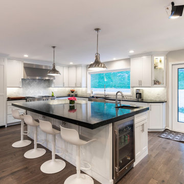
This 1980’s colonial home in the heart of McLean, VA is home to a busy family of four who had been searching for ideas in Houzz for a long time.
The previous kitchen was a dungeon-like maze, small and dark, front dining room was outdated, the powder room and pantry wrapped around a stack of duct pipes.
After meeting with our design staff, we came up with plenty of recommendations which they loved.
Our expert team set out to, eliminate the powder room from the middle of the kitchen and relocate to far end of a dead space in family room, eliminate closet and stack of second floor ducts, widen doorway to foyer with structural beam, widen window above sink to allow more daylight, relocate the back door to allow more cabinet space to the right of the sink, take down a major cinder block and brick wall separating family room from kitchen, inserting steel beam and steel post opening the entire kitchen to family room and adding floor space to kitchen.
We implemented a large Island with dark black contrasting stain in the middle of kitchen space. Island includes a bar, sink, microwave and beverage center built in.
Our designers suggested a polished marble backsplash with a chevron pattern behind the stove to make the kitchen stand taller.
Clever use of various lighting sources and contrasting cabinet colors off set the unique three-inch thick soapstone island countertop.
Complete with large-scale appliances, such as 48-inch steam oven, 48-inch tower fridge/freezer and others, we completely updated this 1980’s kitchen.


 Michael Nash Design, Build & Homes
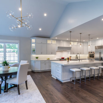
This couple have been living in their single-family Ashburn home for a wile and getting ready to update their home one step at the time.
Their kitchen was very small & dated. They would like to add sunroom. After talking to our designer, they come to conclusion to add sunroom/ Breakfast area to extend the kitchen & kill two birds with one stone.
Also, they decide to renovate two bathrooms upstairs. (Master bathroom & Hall bathroom)
Master bathroom was too small & after meeting with designer they agreed to take couple feet from bedroom & enlarge master bathroom.
She felt cramped and out dated in her old kitchen. A big pantry closet was taking way too much real estate out of her kitchen space.
We have taken down bearing wall to adjacent family room to expand kitchen and implement 10’ feet long Island with sink, dishwasher and microwave into it.
The gas line and new 48” professional stove was relocated to west wall and now home for a long run of floor to ceiling cabinetry.
Display glass front lit cabinetry is place for her color full china’s
The north wall where closet used to be now is place for large scale refrigerator and freezer towers and pantry space. A tall unit of secondary oven and steam one is now placed in this wall
Installing matching wide plank espresso hardwood flooring has expanded this kitchen into all adjacent rooms.
New lighting plans, gorgeous pendent lighting make this center island to stand tall.
The traffic flow has been improved a lot allowing large gathering and entertainment much more than ever before.
She has carefully selected a soft tone backsplash to compliment the soapstone counter tops.
On the end they decided to have a stone patio right next to sunroom & enjoy their outdoor gathering as well.
 Michael Nash Design, Build & Homes
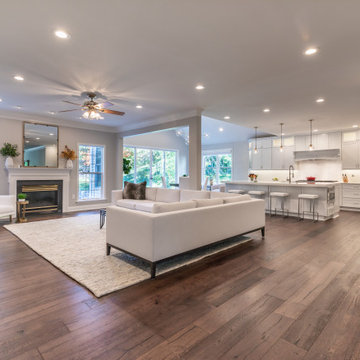
This couple have been living in their single-family Ashburn home for a wile and getting ready to update their home one step at the time.
Their kitchen was very small & dated. They would like to add sunroom. After talking to our designer, they come to conclusion to add sunroom/ Breakfast area to extend the kitchen & kill two birds with one stone.
Also, they decide to renovate two bathrooms upstairs. (Master bathroom & Hall bathroom)
Master bathroom was too small & after meeting with designer they agreed to take couple feet from bedroom & enlarge master bathroom.
She felt cramped and out dated in her old kitchen. A big pantry closet was taking way too much real estate out of her kitchen space.
We have taken down bearing wall to adjacent family room to expand kitchen and implement 10’ feet long Island with sink, dishwasher and microwave into it.
The gas line and new 48” professional stove was relocated to west wall and now home for a long run of floor to ceiling cabinetry.
Display glass front lit cabinetry is place for her color full china’s
The north wall where closet used to be now is place for large scale refrigerator and freezer towers and pantry space. A tall unit of secondary oven and steam one is now placed in this wall
Installing matching wide plank espresso hardwood flooring has expanded this kitchen into all adjacent rooms.
New lighting plans, gorgeous pendent lighting make this center island to stand tall.
The traffic flow has been improved a lot allowing large gathering and entertainment much more than ever before.
She has carefully selected a soft tone backsplash to compliment the soapstone counter tops.
On the end they decided to have a stone patio right next to sunroom & enjoy their outdoor gathering as well.
216