
Search results for "Implementation" in Home Design Ideas

 The Masons Co and Dionysian Artificers Landscape
Pond, garden water features, Kansas City Fountain Design Group , the Fountain Builders in Kansas City, is an innovative firm of fountain restoration Kansas City, fountain installation Kansas City, historic fountain repair Kansas City with specific skills in fountain design, pond, garden water features Kansas City, strategic and open space planning, open space master planning, urban and environmental design and community consultation with high standards of graphic and technical outputs. We pride ourselves on the development of aquascape and hardscape design ,site responsive and implementable concept, with demonstrated technical and project skills to ensure the successful translation of innovative designs to high quality constructed works.
Large and small fountains Kansas City
Large and small water gardens Kansas City
Waterfalls and streams Kansas City
Waterwalls and architectural water features Kansas City
Architectural and Statuary Fountains Kansas City
Custom Fountains, Rock Fountains Kansas City
Pool installation & management Kansas City
Lake Management Kansas City
Sprayring and jet manifolds Kansas City
Reflecting Pools Kansas City
Fountain LED Lights Kansas City
Floating fountains Kansas City
Lake Fountains Kansas City

 threshold interiors
Location: New York, NY, United States
This Loft was tastefully renovated back in the '90s, but was due for an update and an expansion of the kitchen and dining areas to accommodate the client's cooking skills and entertaining needs. EnlargIing the island and adding cabinetry to delineate the office, bar and dining areas was a priority. The bathroom was updated to feel like a tranquil spa with beautiful new tile, plumbing fixtures and cabinets. Our biggest challenge was coordinating the entire renovation while our client was out of town for the Summer!
Photographed by: James Salomon

 TaylorPro Design and Remodeling, Inc.
"TaylorPro remodeled our kitchen, replacing cabinets, countertops and appliances. Keeping with the same footprint of our original kitchen and keeping our original travertine floors, Kerry Taylor helped us select a palette of rich, natural colors and materials--mocha-maple glazed cabinets, handsome granite and polished travertine backsplash tiles--to create a warm and beautiful new kitchen. He offered excellent design suggestions for placements of cabinetry and appliances. He recommended and implemented window trim enhancements as well as paint color and lighting design that brought the kitchen and attached family room together with a modern and very warm look. He created a rich, textured backsplash behind the stovetop that enhances the modern stainless steel vent hood. We couldn't be more pleased with the character and design of the kitchen and family room suite.
To begin with, Kerry gave us a detailed estimate covering the likely costs of labor, cabinetry, granite, tile backsplash, construction materials and appliances. His estimate for labor, granite and tile turned out to be ""spot-on"" accurate. Much to our surprise, for example, the granite slabs we selected from Daltile turned out to be exactly the price Kerry had estimated when evaluating the level of materials we would likely install in our kitchen. Kerry kept to his original labor costs, to the penny. Each week, he provided us with an invoice that showed, in percentages, exactly how much labor had been performed that week and how much remained to be done in future weeks. The amounts he charged each week for his labor were exact percentages of the amount of labor his crew had performed to that point. Though these invoices invited us to do a little math to confirm the accuracy of these percentages, Kerry's figures were consistently accurate.
The only categories in which Kerry's original estimate did not conform to the actual costs were in the areas of supplies from Home Depot (needed for the remodeling) and supplies from paint and hardware stores (needed for painting). These materials ended up costing somewhat more that Kerry had estimated. However, Kerry did provide us with receipts for all of these supplies.
Kerry's cabinet man, Jerry, made a very workable design using pre-fabricated cabinets; he then customized the sizes of at least half of these cabinets to conform to the requirements of the center island, cooktop and pantry spaces. We are very happy with the quality of the cabinets. We found the installation expertise of Jerry's installer, Gil, to be top-rate. His installation achieved a custom look and all the cupboards and drawers worked flawlessly.
Kerry's crew, Jake, Randall and Kevin, were great guys to have on site. They respected our property (and our dog) and possessed both skill and integrity. They arrived daily at the time they specified and worked tirelessly to achieve what they set out to do. We couldn't have been happier with their work. Kerry was on site frequently to supervise and coordinate their work and the work of subcontractors.
The project went quickly and efficiently, and the final result was outstanding. We recommend TaylorPro very highly."
~ Judy & Ron C, Clients
Photo By: Kerry W. Taylor
Find the right local pro for your project

 Advance Design Studio, Ltd.
Karen and Chad of Tower Lakes, IL were tired of their unfinished basement functioning as nothing more than a storage area and depressing gym. They wanted to increase the livable square footage of their home with a cohesive finished basement design, while incorporating space for the kids and adults to hang out.
“We wanted to make sure that upon renovating the basement, that we can have a place where we can spend time and watch movies, but also entertain and showcase the wine collection that we have,” Karen said.
After a long search comparing many different remodeling companies, Karen and Chad found Advance Design Studio. They were drawn towards the unique “Common Sense Remodeling” process that simplifies the renovation experience into predictable steps focused on customer satisfaction.
“There are so many other design/build companies, who may not have transparency, or a focused process in mind and I think that is what separated Advance Design Studio from the rest,” Karen said.
Karen loved how designer Claudia Pop was able to take very high-level concepts, “non-negotiable items” and implement them in the initial 3D drawings. Claudia and Project Manager DJ Yurik kept the couple in constant communication through the project. “Claudia was very receptive to the ideas we had, but she was also very good at infusing her own points and thoughts, she was very responsive, and we had an open line of communication,” Karen said.
A very important part of the basement renovation for the couple was the home gym and sauna. The “high-end hotel” look and feel of the openly blended work out area is both highly functional and beautiful to look at. The home sauna gives them a place to relax after a long day of work or a tough workout. “The gym was a very important feature for us,” Karen said. “And I think (Advance Design) did a very great job in not only making the gym a functional area, but also an aesthetic point in our basement”.
An extremely unique wow-factor in this basement is the walk in glass wine cellar that elegantly displays Karen and Chad’s extensive wine collection. Immediate access to the stunning wet bar accompanies the wine cellar to make this basement a popular spot for friends and family.
The custom-built wine bar brings together two natural elements; Calacatta Vicenza Quartz and thick distressed Black Walnut. Sophisticated yet warm Graphite Dura Supreme cabinetry provides contrast to the soft beige walls and the Calacatta Gold backsplash. An undermount sink across from the bar in a matching Calacatta Vicenza Quartz countertop adds functionality and convenience to the bar, while identical distressed walnut floating shelves add an interesting design element and increased storage. Rich true brown Rustic Oak hardwood floors soften and warm the space drawing all the areas together.
Across from the bar is a comfortable living area perfect for the family to sit down at a watch a movie. A full bath completes this finished basement with a spacious walk-in shower, Cocoa Brown Dura Supreme vanity with Calacatta Vicenza Quartz countertop, a crisp white sink and a stainless-steel Voss faucet.
Advance Design’s Common Sense process gives clients the opportunity to walk through the basement renovation process one step at a time, in a completely predictable and controlled environment. “Everything was designed and built exactly how we envisioned it, and we are really enjoying it to it’s full potential,” Karen said.
Constantly striving for customer satisfaction, Advance Design’s success is heavily reliant upon happy clients referring their friends and family. “We definitely will and have recommended Advance Design Studio to friends who are looking to embark on a remodeling project small or large,” Karen exclaimed at the completion of her project.

 Kitchen Magic
Some remodeling customers are uncertain about the best way to change the look of their space, and turn to us at Kitchen Magic for guidance; other homeowners already have a clear idea of what they want, and ask us to make their vision a reality. The latter was very much the case in a recent remodeling project we completed in Milford, New Jersey.
The home had been designed by the homeowner, who was clearly accustomed to creating and implementing an artistic vision for their living space. By the time Kitchen Magic arrived on the scene, the homeowner already had clear ideas about the colors and materials that would go into creating the look of their new kitchen. Cabinet refacing was the perfect solution for staying within budget, yet still having the kitchen they had always dreamed of.
Building on the Existing Decor is Key
The sleek, black appliances already in place demanded a bold complement, and the rich, deep hue of Cordovan on Cherry stain fit the bill perfectly. The arched cabinet doors add a classic touch of elegance, but one that blends seamlessly with the modern feel of the other design elements. The clean lines and chrome finish of the cabinet hardware serve to unite the vivid cherry cabinetry with the gray toned counters and backsplash.
That backsplash, a custom design envisioned by the homeowner, brings both unity and contrast to the entire space. The splashes of lighter values brighten the deep red tones of the cabinets, keeping the room from feeling too dark. The use of texture and varied tonal values create a unique piece that adds dimension to the kitchen's personality and reflects the creative energy of the homeowners.
The luxury of the deep cherry-red cabinets and the sleekly modern lines of the furnishings create a timeless and bold back drop for the counters, and only one stone perfectly fits that bill: granite! The black Uba Tuba granite countertops chosen by the homeowners have the visual weight and richness to pair with the Cordovan on Cherry, and the marbling of lighter and darker values echo of the custom-designed backsplash over the range, completing the new design.
Taken together, the effect of the homeowners' choices create a striking, elegant, and almost decadent feel without any heavy or dark characters. The sleek lines and organic look created by the arched cabinet doors give the room a sense of grace and motion that is entirely appropriate to the homeowners' aesthetic, given their fondness for the adventure of hot-air ballooning and active life style.
David Glasofer
 TKS Design Group
Download our free ebook, Creating the Ideal Kitchen. DOWNLOAD NOW
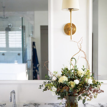
A tired primary bathroom, with varying ceiling heights and a beige-on-beige color scheme, was screaming for love. Squaring the room and adding natural materials erased the memory of the lack luster space and converted it to a bright and welcoming spa oasis. The home was a new build in 2005 and it looked like all the builder’s material choices remained. The client was clear on their design direction but were challenged by the differing ceiling heights and were looking to hire a design-build firm that could resolve that issue.
This local Glen Ellyn couple found us on Instagram (@kitchenstudioge, follow us ?). They loved our designs and felt like we fit their style. They requested a full primary bath renovation to include a large shower, soaking tub, double vanity with storage options, and heated floors. The wife also really wanted a separate make-up vanity. The biggest challenge presented to us was to architecturally marry the various ceiling heights and deliver a streamlined design.
The existing layout worked well for the couple, so we kept everything in place, except we enlarged the shower and replaced the built-in tub with a lovely free-standing model. We also added a sitting make-up vanity. We were able to eliminate the awkward ceiling lines by extending all the walls to the highest level. Then, to accommodate the sprinklers and HVAC, lowered the ceiling height over the entrance and shower area which then opens to the 2-story vanity and tub area. Very dramatic!
This high-end home deserved high-end fixtures. The homeowners also quickly realized they loved the look of natural marble and wanted to use as much of it as possible in their new bath. They chose a marble slab from the stone yard for the countertops and back splash, and we found complimentary marble tile for the shower. The homeowners also liked the idea of mixing metals in their new posh bathroom and loved the look of black, gold, and chrome.
Although our clients were very clear on their style, they were having a difficult time pulling it all together and envisioning the final product. As interior designers it is our job to translate and elevate our clients’ ideas into a deliverable design. We presented the homeowners with mood boards and 3D renderings of our modern, clean, white marble design. Since the color scheme was relatively neutral, at the homeowner’s request, we decided to add of interest with the patterns and shapes in the room.
We were first inspired by the shower floor tile with its circular/linear motif. We designed the cabinetry, floor and wall tiles, mirrors, cabinet pulls, and wainscoting to have a square or rectangular shape, and then to create interest we added perfectly placed circles to contrast with the rectangular shapes. The globe shaped chandelier against the square wall trim is a delightful yet subtle juxtaposition.
The clients were overjoyed with our interpretation of their vision and impressed with the level of detail we brought to the project. It’s one thing to know how you want a space to look, but it takes a special set of skills to create the design and see it thorough to implementation. Could hiring The Kitchen Studio be the first step to making your home dreams come to life?

 User
DECO Window Fashions
Sheer pleated custom made drapes, ceiling mount metal rod.
Trendy bedroom photo in Austin
Trendy bedroom photo in Austin
 Bilotta Kitchen & Home
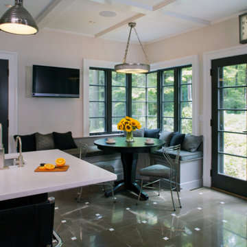
This two-toned kitchen was designed by Paula Greer, CKD of Bilotta Kitchens with Robin Zahn of Robin Prince Zahn Architecture. The u-shaped space has perimeter cabinets in Bilotta’s own line, the Bilotta Collection in a custom gray paint. The island is Wood-Mode Cabinetry in cherry with a stain. Countertops are Caesarstone’s London Grey with a built-in walnut cutting board on one corner of the island from Brooks Custom. The custom Madison Hood by Rangecraft is in a Dark Antique Steel finish and extends up accentuating the high ceiling above the cooking triangle. Two of the most interesting elements of this space are the banquette area and the coffered ceilings. By far, the most frequent installation of banquettes is tucking them into a corner of the room, regardless of how much seating is available at the island. In this kitchen, the island provides enough space for four to five stools. But because the space is separated from the rest of the house, the client wanted to ensure there was sufficient seating for their frequent entertaining. Also, the house is situated in a secluded wooded area; the new kitchen includes an abundance of unobstructed windows to fully experience the beautiful outdoor surroundings. The corner banquette (under more windows!) makes it feel like you’re dining in the trees. The bonus feature is that there’s extra storage below for table linens or seldom-used serving pieces. This really functions like a couch, complete with throw pillows and a TV, where the empty-nesters love spending time even when it isn’t mealtime. As for the ceiling, coffers don’t necessarily have to be large and intricately detailed with layers of moldings in order to be effective. This kitchen features two different ceiling heights: a small section of an addition contains a vaulted ceiling, while the larger island and eating area are tucked under a 2nd floor balcony and bedrooms. The client wanted to distinguish the lower area from the vaulted section, but in a subtle manner. The architect chose to implement shallow coffers with minimal trim for a softer result. The geometric pattern also reflects the floor tile and other lines within the room. The most interesting aspect, though, is that the vaulted area is actually concealed from view when you’re standing in the breakfast area; but as you approach the sink and window, the ceiling explodes above you for a visual surprise. And lastly, of course during this time of “work from home” the desk tucked in a nook opposite the banquette creates the perfect space for Zoom meetings, email checking and just the day-to-day activities we used to go into the office to do. The kitchen is an all-around perfect space for cooking, entertaining, relaxing or working!
Bilotta Designer: Paula Greer
Photographer: Philip Jensen-Carter
Architect: Robin Prince Zahn Architecture


 Drury Design
THE SETUP
When we first encountered this basement for a family with three boys, we saw a space with untapped potential. Though previously remodeled, it lacked a cohesive design strategy. The expansive area housed various entertainment pieces (a shuffleboard table, air hockey, foosball, etc.) scattered haphazardly throughout the space.
While the basement included a workout room and a rudimentary kitchen area, it lacked a dedicated game room or proper bar. Excessive storage closets along the back wall consumed valuable real estate that could be repurposed for more engaging uses.
In essence, the basement was spacious but disjointed—functional for family use but falling short as an entertainment hub. It didn’t align with the sophistication of the rest of the home. Our clients envisioned a transformation: a fresh, organized space that would not only serve their family’s needs but also shine as an inviting arena for entertaining friends and hosting gatherings – especially sports-focused gatherings!
Design Objectives:
Reimagine the basement layout, creating distinct zones for varied activities.
Expand the workout area to accommodate new equipment, including a Smith machine.
Implement a multi-screen setup inspired by high-end sports bars, allowing guests to follow multiple games while socializing.
Enhance existing features while developing new areas:
Optimize a workout space for all equipment needs
Establish a dedicated children’s space with guest room capabilities
Create an integrated bar and entertainment area
Retain and incorporate the existing projector setup
Design Challenges:
Navigate layout constraints in the new workout room due to fixed utility areas.
Carve out a distinct space for kids within the open plan.
Revitalize an underutilized section of the basement.
Elevate the existing big screen area with purposeful design elements.
Develop a full-fledged bar area while maintaining kitchen functions applicable for hangout snacking.
Work around immovable structural elements (soffits, load-bearing support columns)
THE RENEWED SPACE
Design Solutions:
Install a stylish barn door for the utility area of the new workout space, improving aesthetics and accessibility.
Repurpose the former workout room into a dedicated game room for kids, utilizing couches with pull-out beds so the area can double as overflow guest accommodations.
Transform the unused area into a vibrant pub-style area for card and table games.
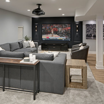
Enhance the big screen area with elegant wainscoting and ambient theatre-style lighting.
Design a multi-functional wet bar area featuring varied seating, prep areas, and a microwave.
Base the bar sink area width off the soffit above it.
In the big screen area, use the soffit to inform the width of a wainscoting section.
For the immovable support columns, dress one up to match the wainscoting of the nearby big screen wall. Hide the other one in a new wall.
Final Thoughts:
The reimagined basement has exceeded our clients’ expectations, evolving into the ultimate entertainment hub. With seven strategically placed screens, it’s perfect for gatherings focused on major sporting events and casual gatherings, as well. The space strikes a balance between adult sophistication and family-friendly functionality, featuring distinct zones for various activities.
The new design not only maximizes functionality for modern, multi-screen entertainment but also elevates the aesthetic appeal. It integrates flawlessly with the rest of the home’s transitional style while allowing each basement section to maintain its unique character. The result is a versatile space that caters to both intimate family time and large-scale entertaining.

 Quarry Mill
Corinthian real thin stone veneer from the Quarry Mill adds a sleek and modern touch to this exterior pillar. Corinthian stone brings a calm range of whites, grays, and blacks with a touch of tans to your stone project. The various sizes of the rectangular stones help this natural stone veneer look great on any project.
 TaylorPro Design and Remodeling, Inc.
"TaylorPro remodeled our kitchen, replacing cabinets, countertops and appliances. Keeping with the same footprint of our original kitchen and keeping our original travertine floors, Kerry Taylor helped us select a palette of rich, natural colors and materials--mocha-maple glazed cabinets, handsome granite and polished travertine backsplash tiles--to create a warm and beautiful new kitchen. He offered excellent design suggestions for placements of cabinetry and appliances. He recommended and implemented window trim enhancements as well as paint color and lighting design that brought the kitchen and attached family room together with a modern and very warm look. He created a rich, textured backsplash behind the stovetop that enhances the modern stainless steel vent hood. We couldn't be more pleased with the character and design of the kitchen and family room suite.
To begin with, Kerry gave us a detailed estimate covering the likely costs of labor, cabinetry, granite, tile backsplash, construction materials and appliances. His estimate for labor, granite and tile turned out to be ""spot-on"" accurate. Much to our surprise, for example, the granite slabs we selected from Daltile turned out to be exactly the price Kerry had estimated when evaluating the level of materials we would likely install in our kitchen. Kerry kept to his original labor costs, to the penny. Each week, he provided us with an invoice that showed, in percentages, exactly how much labor had been performed that week and how much remained to be done in future weeks. The amounts he charged each week for his labor were exact percentages of the amount of labor his crew had performed to that point. Though these invoices invited us to do a little math to confirm the accuracy of these percentages, Kerry's figures were consistently accurate.
The only categories in which Kerry's original estimate did not conform to the actual costs were in the areas of supplies from Home Depot (needed for the remodeling) and supplies from paint and hardware stores (needed for painting). These materials ended up costing somewhat more that Kerry had estimated. However, Kerry did provide us with receipts for all of these supplies.
Kerry's cabinet man, Jerry, made a very workable design using pre-fabricated cabinets; he then customized the sizes of at least half of these cabinets to conform to the requirements of the center island, cooktop and pantry spaces. We are very happy with the quality of the cabinets. We found the installation expertise of Jerry's installer, Gil, to be top-rate. His installation achieved a custom look and all the cupboards and drawers worked flawlessly.
Kerry's crew, Jake, Randall and Kevin, were great guys to have on site. They respected our property (and our dog) and possessed both skill and integrity. They arrived daily at the time they specified and worked tirelessly to achieve what they set out to do. We couldn't have been happier with their work. Kerry was on site frequently to supervise and coordinate their work and the work of subcontractors.
The project went quickly and efficiently, and the final result was outstanding. We recommend TaylorPro very highly."
~ Judy & Ron C, Clients
Photo By: Kerry W. Taylor


 Sheila Rich Interiors, LLC
In the dining room, the formerly plastic-encased seating was reupholstered in a contemporary gray fabric. To create an interesting detail, a stripe pattern was used on the front of the chairs and a solid color on the back. The table, chandelier and cabinet remained and we brought in the mirror and shelf that once hung in the living room. The shelf now functions as a much needed server under the window in the dining room.
Photography Peter Rymwid

 Florida Plumbing Kitchen & Bath Gallery
With its distinctive modern design, the Silhouette Collection freestanding vanity makes a bold statement. The geometric metal base in your choice of five lustrous finishes—satin brass, matte black, polished chrome, polished nickel and brushed nickel—lends a glamorous appeal to the streamlined silhouette, while the suspended frosted glass shelf keeps the design open and airy. Choose from rich, polyurethane-protected color finishes including Brandy and Ash Grey woodgrains, or ultra-modern Glossy White and Sapphire . Pair it with your choice of countertop/basin options in X-Stone™ Solid Surface, Quartzstone stone, glass or ceramic designs to create your custom furniture look. Premiere features including extensive storage options, soft-closing, European hardware, and other signature Madeli features make it as functional as it is beautiful.
 Bilotta Kitchen & Home
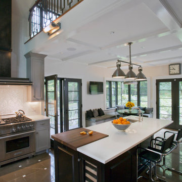
This two-toned kitchen was designed by Paula Greer, CKD of Bilotta Kitchens with Robin Zahn of Robin Prince Zahn Architecture. The u-shaped space has perimeter cabinets in Bilotta’s own line, the Bilotta Collection in a custom gray paint. The island is Wood-Mode Cabinetry in cherry with a stain. Countertops are Caesarstone’s London Grey with a built-in walnut cutting board on one corner of the island from Brooks Custom. The custom Madison Hood by Rangecraft is in a Dark Antique Steel finish and extends up accentuating the high ceiling above the cooking triangle. Two of the most interesting elements of this space are the banquette area and the coffered ceilings. By far, the most frequent installation of banquettes is tucking them into a corner of the room, regardless of how much seating is available at the island. In this kitchen, the island provides enough space for four to five stools. But because the space is separated from the rest of the house, the client wanted to ensure there was sufficient seating for their frequent entertaining. Also, the house is situated in a secluded wooded area; the new kitchen includes an abundance of unobstructed windows to fully experience the beautiful outdoor surroundings. The corner banquette (under more windows!) makes it feel like you’re dining in the trees. The bonus feature is that there’s extra storage below for table linens or seldom-used serving pieces. This really functions like a couch, complete with throw pillows and a TV, where the empty-nesters love spending time even when it isn’t mealtime. As for the ceiling, coffers don’t necessarily have to be large and intricately detailed with layers of moldings in order to be effective. This kitchen features two different ceiling heights: a small section of an addition contains a vaulted ceiling, while the larger island and eating area are tucked under a 2nd floor balcony and bedrooms. The client wanted to distinguish the lower area from the vaulted section, but in a subtle manner. The architect chose to implement shallow coffers with minimal trim for a softer result. The geometric pattern also reflects the floor tile and other lines within the room. The most interesting aspect, though, is that the vaulted area is actually concealed from view when you’re standing in the breakfast area; but as you approach the sink and window, the ceiling explodes above you for a visual surprise. And lastly, of course during this time of “work from home” the desk tucked in a nook opposite the banquette creates the perfect space for Zoom meetings, email checking and just the day-to-day activities we used to go into the office to do. The kitchen is an all-around perfect space for cooking, entertaining, relaxing or working!
Bilotta Designer: Paula Greer
Photographer: Philip Jensen-Carter
Architect: Robin Prince Zahn Architecture

 Direct Tile Warehouse
Regent Victorian tiles are a lovely choice for Victorian hall tiles or for creating bathrooms or kitchens in an original style. These are versatile decor floor tiles with borders and angles to facilitate individual designs. Please be aware there are 9 variations for the corner tiles (please see below). Orders will be made up with a mix of corners tiles and we cannot guarantee which tiles will be delivered.

 Gurchie Designs
faux stained glass panel to cover unused door on plexiglass
Inspiration for a bedroom and mid-sized eclectic gender-neutral kids' bedroom remodel in New York
Inspiration for a bedroom and mid-sized eclectic gender-neutral kids' bedroom remodel in New York
 Irene Designs
Home Remodeling Project Overview
This extensive home remodeling project transformed a dated and inefficient layout into a functional, open, and aesthetically cohesive living space. The original layout had several challenges:
• A kitchen with limited storage, no cabinets on the window side, a sink facing the wall, and a range crammed into the corner. The pantry closet was too deep and impractical.
• A living room that couldn’t accommodate furniture without interfering with traffic flow.
• A front foyer with wasted space.
• A claustrophobic hallway toilet room without a sink, located near the laundry room.
The Remodeling Concept
The scope of this project extended well beyond the kitchen. We proposed several layout options to address issues in all adjacent spaces, ultimately implementing a plan that:
• Removed two walls and moved doorways.
• Replaced the kitchen window.
• Converted the hallway toilet room into a storage space.
• Installed pocket doors to separate the laundry hallway from the living room.
Kitchen Transformation
• Open Concept: By removing the wall between the kitchen and dining room, the two spaces became a seamless open area.
• New Layout: Cabinets were relocated to the window side for more storage and natural light. A central island with storage and seating was added, and a coffee bar was installed in the dining room.
• Updated Pantry: The deep pantry closet was converted into a pullout pantry with a cabinet front for better accessibility.
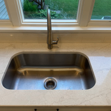
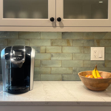
• Design Details: Off-white kitchen cabinets pair beautifully with a light green island. Warm white quartz counters and an artisan tile backsplash complete the look.
Dining Room
• Expanded Space: Most of the wall separating the dining room and foyer was removed, creating a more spacious area while still accommodating all furniture thanks to careful measurements.
Living Room Improvements
• Optimized Layout: Moving doorways and installing pocket doors allowed for better furniture placement, including a sofa that doesn’t interfere with traffic flow.
• Fireplace Upgrade: The brick fireplace was updated with a three-dimensional staggered stone veneer in a color matching the kitchen cabinets, creating a cohesive look. A TV was installed above the fireplace at a comfortable viewing angle.
Additional Updates
• New Flooring: All remodeled rooms now feature updated flooring.
• Ceilings: Popcorn ceilings were replaced with smooth, flat finishes, complemented by recessed lighting.
• Walls: Fresh paint throughout the space, with an accent wall in the living room matching the light green of the kitchen island.
• Lighting: Stylish sconces were added for a touch of elegance.
The Result
The homeowners are thrilled with the transformation, marveling at how their once cramped and inefficient home now feels spacious, functional, and beautifully cohesive. They can’t believe their house could ever look like this!
 Irene Designs
Home Remodeling Project Overview
This extensive home remodeling project transformed a dated and inefficient layout into a functional, open, and aesthetically cohesive living space. The original layout had several challenges:
• A kitchen with limited storage, no cabinets on the window side, a sink facing the wall, and a range crammed into the corner. The pantry closet was too deep and impractical.
• A living room that couldn’t accommodate furniture without interfering with traffic flow.
• A front foyer with wasted space.
• A claustrophobic hallway toilet room without a sink, located near the laundry room.
The Remodeling Concept
The scope of this project extended well beyond the kitchen. We proposed several layout options to address issues in all adjacent spaces, ultimately implementing a plan that:
• Removed two walls and moved doorways.
• Replaced the kitchen window.
• Converted the hallway toilet room into a storage space.
• Installed pocket doors to separate the laundry hallway from the living room.
Kitchen Transformation
• Open Concept: By removing the wall between the kitchen and dining room, the two spaces became a seamless open area.
• New Layout: Cabinets were relocated to the window side for more storage and natural light. A central island with storage and seating was added, and a coffee bar was installed in the dining room.
• Updated Pantry: The deep pantry closet was converted into a pullout pantry with a cabinet front for better accessibility.
• Design Details: Off-white kitchen cabinets pair beautifully with a light green island. Warm white quartz counters and an artisan tile backsplash complete the look.
Dining Room
• Expanded Space: Most of the wall separating the dining room and foyer was removed, creating a more spacious area while still accommodating all furniture thanks to careful measurements.
Living Room Improvements
• Optimized Layout: Moving doorways and installing pocket doors allowed for better furniture placement, including a sofa that doesn’t interfere with traffic flow.
• Fireplace Upgrade: The brick fireplace was updated with a three-dimensional staggered stone veneer in a color matching the kitchen cabinets, creating a cohesive look. A TV was installed above the fireplace at a comfortable viewing angle.
Additional Updates
• New Flooring: All remodeled rooms now feature updated flooring.
• Ceilings: Popcorn ceilings were replaced with smooth, flat finishes, complemented by recessed lighting.
• Walls: Fresh paint throughout the space, with an accent wall in the living room matching the light green of the kitchen island.
• Lighting: Stylish sconces were added for a touch of elegance.
The Result
The homeowners are thrilled with the transformation, marveling at how their once cramped and inefficient home now feels spacious, functional, and beautifully cohesive. They can’t believe their house could ever look like this!
238