
Search results for "Important" in Home Design Ideas
 Carmel Stone Imports
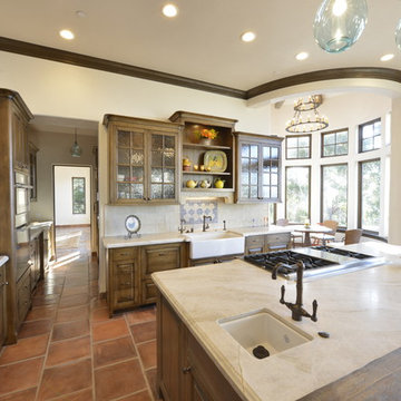
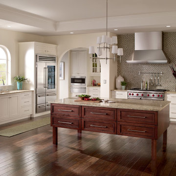
Large elegant l-shaped terra-cotta tile and red floor enclosed kitchen photo in San Francisco with a farmhouse sink, raised-panel cabinets, dark wood cabinets, quartzite countertops, beige backsplash, ceramic backsplash, stainless steel appliances, an island and beige countertops

 Equilibrium Interior Design Inc
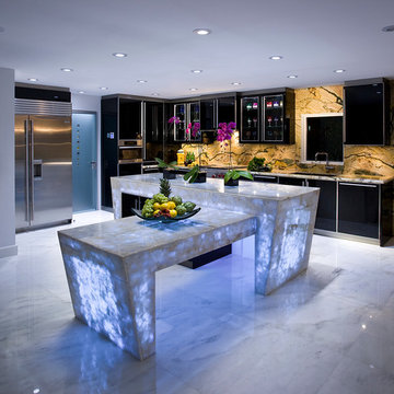
This unique and functional kitchen gives a new meaning to the phrase “Kitchen is the heart of a home”. Here, kitchen is the center of all attention and a conversation piece at every party.
Black glass cabinet fronts used in the design offer ease of maintenance, and the kaleidoscope stone countertops and backsplash contrast the cabinetry and always look clean. Color was very important to this Client and this kitchen is definitely not lacking life.
Designed for a client who loves to entertain, the centerpiece is an artistic interpretation of a kitchen island. This monolithic sculpture raises out of the white marble floor and glows in this open concept kitchen.
But this island isn’t just beautiful. It is also extremely practical. It is designed using two intercrossing parts creating two heights for different purposes. 36” high surface for prep work and 30” high surface for sit down dining. The height differences and location encourages use of the entire table top for preparations. Furthermore, storage cabinets are installed under part of this island closest to the working triangle.
For a client who loves to cook, appliances were very important, and sub-zero and wolf appliances we used give them the best product available.
Overhead energy efficient LED lighting was selected paying special attention to the lamp’s CRI to ensure proper color rendition of items below, especially important when working with meat. Under-cabinet task lighting offers illumination where it is most needed on the countertops.
Interior Design, Decorating & Project Management by Equilibrium Interior Design Inc
Photography by Craig Denis
Find the right local pro for your project
 Unique Stone Imports
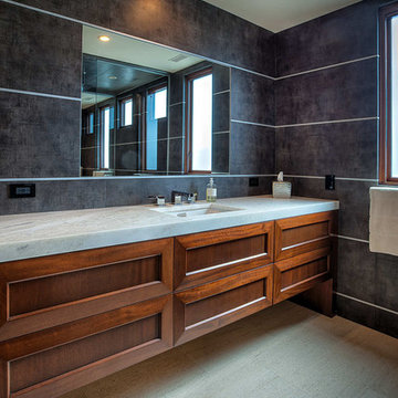
This secondary Master Bath features Moca Cream limestone throughout the floor space with a dark, textural porcelain wrapping all of the walls. Metal strips break up the porcelain and create linear movement throughout the space. The African mahogany floating vanities are topped with Bianco Rhino Savana marble, which adds a soft lightness to the space.
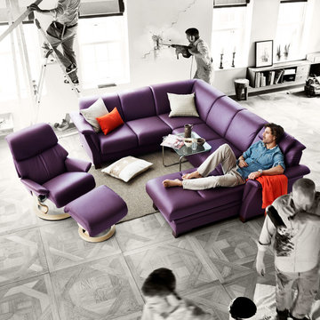
 Ergo Beds
"E-400" group shown. Imported from Norway, Stressless recliner, sofa, and home theatre seating is where eloquent and stylish design meet ergonomic form and function. Available in over 100 fabric and leather options, some stocked in NJ.

 JM Kitchen & Bath Design
Juli
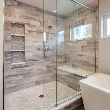
Huge trendy master beige tile and ceramic tile bathroom photo in Denver with gray walls, an undermount sink and granite countertops
Huge trendy master beige tile and ceramic tile bathroom photo in Denver with gray walls, an undermount sink and granite countertops
Sponsored
Fredericksburg, OH

High Point Cabinets
Columbus' Experienced Custom Cabinet Builder | 4x Best of Houzz Winner
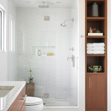
 Beth Kooby Design
Emily Jenkins Followill photography
This bath was one of Atlanta Homes and Lifestyles Bath of the Year winners for 2014!!
Mid-sized minimalist master white tile and glass tile marble floor bathroom photo in Atlanta with an undermount sink, flat-panel cabinets, medium tone wood cabinets and white walls
Mid-sized minimalist master white tile and glass tile marble floor bathroom photo in Atlanta with an undermount sink, flat-panel cabinets, medium tone wood cabinets and white walls


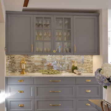
 Bilotta Kitchen & Home
For this project, the entire kitchen was designed around the “must-have” Lacanche range in the stunning French Blue with brass trim. That was the client’s dream and everything had to be built to complement it. Bilotta senior designer, Randy O’Kane, CKD worked with Paul Benowitz and Dipti Shah of Benowitz Shah Architects to contemporize the kitchen while staying true to the original house which was designed in 1928 by regionally noted architect Franklin P. Hammond. The clients purchased the home over two years ago from the original owner. While the house has a magnificent architectural presence from the street, the basic systems, appointments, and most importantly, the layout and flow were inappropriately suited to contemporary living.
The new plan removed an outdated screened porch at the rear which was replaced with the new family room and moved the kitchen from a dark corner in the front of the house to the center. The visual connection from the kitchen through the family room is dramatic and gives direct access to the rear yard and patio. It was important that the island separating the kitchen from the family room have ample space to the left and right to facilitate traffic patterns, and interaction among family members. Hence vertical kitchen elements were placed primarily on existing interior walls. The cabinetry used was Bilotta’s private label, the Bilotta Collection – they selected beautiful, dramatic, yet subdued finishes for the meticulously handcrafted cabinetry. The double islands allow for the busy family to have a space for everything – the island closer to the range has seating and makes a perfect space for doing homework or crafts, or having breakfast or snacks. The second island has ample space for storage and books and acts as a staging area from the kitchen to the dinner table. The kitchen perimeter and both islands are painted in Benjamin Moore’s Paper White. The wall cabinets flanking the sink have wire mesh fronts in a statuary bronze – the insides of these cabinets are painted blue to match the range. The breakfast room cabinetry is Benjamin Moore’s Lampblack with the interiors of the glass cabinets painted in Paper White to match the kitchen. All countertops are Vermont White Quartzite from Eastern Stone. The backsplash is Artistic Tile’s Kyoto White and Kyoto Steel. The fireclay apron-front main sink is from Rohl while the smaller prep sink is from Linkasink. All faucets are from Waterstone in their antique pewter finish. The brass hardware is from Armac Martin and the pendants above the center island are from Circa Lighting. The appliances, aside from the range, are a mix of Sub-Zero, Thermador and Bosch with panels on everything.


 Ashcroft Imports Furniture Co.
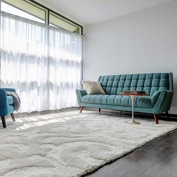
Living room - mid-sized 1960s formal and open concept dark wood floor living room idea in San Diego with white walls, no fireplace and no tv

 Villa & Mission Imports
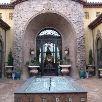
Cantera Floor Fountain
Cantera has been sealed and enhanced.
Design ideas for a mid-sized mediterranean partial sun courtyard stone landscaping in San Diego.
Design ideas for a mid-sized mediterranean partial sun courtyard stone landscaping in San Diego.
 Advance Design Studio, Ltd.
After six years of living in their Huntley IL home, Chris and Meghan were tired of their dark, dingy, outdated kitchen and it was finally time for a long-anticipated change. “The kitchen is the place where we live, it’s where we do everything,” Meghan said. “It was important that it be a space where we wanted to be.” Meghan loves cooking and enjoys including their girls in healthy meal prepping, this led them to want a brighter, more enjoyable kitchen with increased functionality and improved storage.
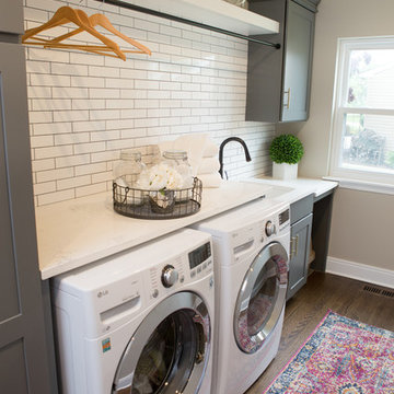
For Chris especially, the laundry room was an entirely dysfunctional eyesore. “We had a washer and a dryer, but it was all kind-of cobbled together!” Chris said. “There were always laundry piles everywhere, we weren’t really sure what we wanted to do in there, but it was time for us to make a change.” The mess of the space was stressful every time they walked in the door from the garage each day. Kids’ backpacks and shoes piled up haphazardly in the makeshift boot-bench closet left the family feeling disorganized and stressed. They needed space for folding clothes and locker cubbies to help keep the family organized.
Having known Christine and Todd in the Huntley community for years, Chris and Meghan were familiar with their work. “We already trusted them personally and having seen their projects for years we knew they did top notch work. After we reviewed the initial round of designs, we knew that hiring them was definitely the right choice,” Meghan and Chris said. Although Chris had done a lot of work in their home himself, the kitchen and laundry room renovation was such a large undertaking that he didn’t want to steal time away from his family to spend what would surely be many long weekends doing the job himself. “That would not have been a wise choice for us,” Chris laughed.
“Our designer, Michelle was very, very, easy to work with; anything we wanted to see or weren’t sure about, she went above and beyond to make this easy for us. She was easy to get hold of and always quick to respond,” the couple said. Michelle pulled ideas that mirrored the couple’s taste and style and was adept at directing the couple to limited choices that didn’t overwhelm them and kept the process moving. “I have a hard time making decisions. Michelle made the decision-making process so easy. I loved how she listened to what I liked and then presented three great options for me to choose from,” Meghan said.
The main objectives for the kitchen were better storage solutions, they wanted the space to reflect their lifestyle and taste, and they wanted it to last for years with low maintenance. One of the first steps in creating a more functional kitchen was relocating the refrigerator, creating an improved workflow for the busy family.
“We didn’t know that we could even move the refrigerator to a new location where it is now, that was something that we never would have thought of,” Chris said. “The new refrigerator location makes the kitchen feel so much bigger. We didn’t add any space, but our whole kitchen with the new design just seems like it’s so much larger than before!” Meghan said.
The perimeter mist colored cabinets helped warm and brighten the entire room, while the graphite colored cabinets on the island added contrast. Using this fresh, clean color palette satisfied the couple’s desire for a bright space that was the exact opposite of what they had before. Organization accessories were also added to the cabinets such as a spice drawer tray and roll outs to create hidden convenience.
“I absolutely love the hidden spices – it makes cooking so much more enjoyable!” Chris said. “And all the pull outs, and the double trash bin, who would think you could get so excited about organization!” the couple said in unison.
One thing they hated in their original kitchen was how dark the space felt. Added lighting on the ceiling with the new light fixtures combined with the lighter cabinetry colors throughout solved this problem. “Our new kitchen has this warm, almost cozy feeling that our old kitchen never had, it’s just a space that I love spending my time in now,” Meghan said. The light airy feeling was accentuated with the use of floating white shelves on either side of the decorative range hood. “We have so much cabinetry space, the new design is amazing we actually have more storage space than we will ever need,” Meghan said.
The island was extended to create more work surface and added space for stool seating. “The new island changes how we live. Now the kids can be in the kitchen with us, doing homework, eating breakfast, and the three of us have special dinners there when Chris is working late,” Meghan said.
The Carrara Marmi Quartz countertops were chosen because they are, not only beautiful, but are made from hard-working material that doesn’t require maintenance. The white subway tile backsplash that wraps to the ceiling behind the focal point cooktop range/hood compliments the crisp white countertops perfectly, while brushed brass hardware and light fixtures keep the design fresh and new.
The couple had a few fears at the beginning of the project, as most homeowners do. Their biggest fear was being out of their kitchen and laundry room for an extended time. The crew made it very easy for the family to work in a limited space keeping the washer and dryer hooked up the majority of the time, and also getting appliances working with minimal downtime.
“They above and beyond accommodated us to get us through the process,” Meghan said. “They did a great job making sure we were as comfortable as possible throughout the process,” Chris added.
“Our project manager DJ did a great job. He was very good at updating us on schedule changes, getting guys in as quickly as possible. Everyone that stepped in the house was nice and did great work,” said Chris. They thought Advance’s carpenter was phenomenal and were impressed when he took a conceptual idea from a photograph and worked with designer Michelle to create a one of a kind range/hood that has become the topic of conversation with friends and family who visit the new kitchen. “He was in our house literally every day for several weeks. He was easy to work with and good at what he did,” Meghan and Chris said.
The focal point of the kitchen; a hand-crafted, custom-built ventilation hood was clad with handpicked reclaimed barnwood. Advance Design’s carpenter built the framework and the cladding to create a one-of-a-kind design element that the couple loves.
“I think it was especially fun for him to create something unique from scratch, showcasing his talent in this area,” Meghan said. “I love that my kitchen is not like everyone else’s. I got to pick out the wood on my hood and watch it being built and was able to choose what pieces of wood went where on it. It’s totally unique.”
Red Oak flooring was toothed-in throughout the kitchen and the rest of the first floor anywhere changes were made. Then the whole floor was refinished to tone down the orange undertones in the existing floor stain, ultimately changing the color complexion of the entire first floor. The result is a completely new feeling to the entire home.
Renovating the laundry room was extremely important to Meghan and Chris, but they had trouble visualizing what the possibilities were for the seemingly small space. Michelle produced beautiful 3D illustrations that helped them envision the space in a whole new way.
“I must have told Michelle 100 times that I am a visual person, seeing the designs in 3D made it so easy to make decisions and see what we could really do with our space,” Meghan said.
A dividing wall and doorway were removed between the existing laundry room and hallway formerly containing a coat closet, providing space to design specialized graphite colored cabinetry matching the kitchen island to house custom storage cubbies for each family member. Adding the tall utility cabinetry in the new laundry area helped solve the storage issue, tucking away cleaning supplies, household items, and even the cat got its own cubby.
“I love how everything is now hidden in its own space. I can’t tell you how much I hated coming home and seeing everything sitting around on counters,” Chris said.
Electrical outlets were planned for the inside of utility cabinets, so devices could charge in hidden locations. Stacking the washer and dryer allowed for wider countertop space to provide a folding area and a special space for clothes to hang. “The way I do laundry has been completely transformed! I can actually fold clothes and hang them now right out of the washer and dryer,” Meghan said.
“The end result in the kitchen and the laundry/mud room was an updated light and bright space, with a smarter work flow that better meets the needs of this family,” Michelle said.
“I would totally recommend Advance Design,” Meghan said. “Sometimes I sit and just look at my kitchen and laundry room and think ‘Wow, I can’t believe I get to live here!’ It’s an understatement to say we love our new space.”

 MARKET IMPORTS
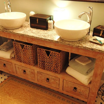
One of our creative customers took this console from Market Imports and created a unique bathroom vanity.
 Clearcut & Co
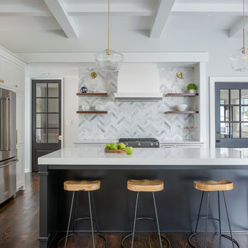
Kitchen renovation, creating a open feel, pantry, office, and a better transition to back yard!
Bob Fortner photography, .
Hero Tile,
Masterworks custom cabinets.
 place architecture:design
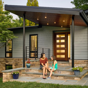
The shape of the angled porch-roof, sets the tone for a truly modern entryway. This protective covering makes a dramatic statement, as it hovers over the front door. The blue-stone terrace conveys even more interest, as it gradually moves upward, morphing into steps, until it reaches the porch.
Porch Detail
The multicolored tan stone, used for the risers and retaining walls, is proportionally carried around the base of the house. Horizontal sustainable-fiber cement board replaces the original vertical wood siding, and widens the appearance of the facade. The color scheme — blue-grey siding, cherry-wood door and roof underside, and varied shades of tan and blue stone — is complimented by the crisp-contrasting black accents of the thin-round metal columns, railing, window sashes, and the roof fascia board and gutters.
This project is a stunning example of an exterior, that is both asymmetrical and symmetrical. Prior to the renovation, the house had a bland 1970s exterior. Now, it is interesting, unique, and inviting.
Photography Credit: Tom Holdsworth Photography
Contractor: Owings Brothers Contracting
44