Search results for "Inappropriate" in Home Design Ideas

The new owners opted to replace the aging, historically inappropriate vinyl siding on this Wicker Park single family home with double-dipped McNear “Limehouse" thin brick. Believe it or not, there's a red brick under those two coats of limewash!
Initially, these easy-going homeowners sought out a pure white brick, but ended up using this rustic alternative instead. Notes of the red brick subtly peek through the lime, giving the residence an old world flavor. These bricks were attached using Glen Gery ThinTech panels, and will be sealed soon to protect the wash and allow for easy maintenance. Contrary to popular belief, siding is actually more expensive to take care of over time than masonry!
A special shoutout goes to woman-owned business D. Jones Construction, whose interest in learning all about this unique product before install was welcomed and appreciated!

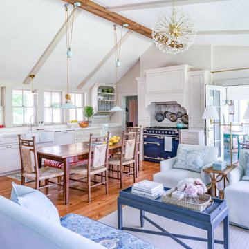
For this project, the entire kitchen was designed around the “must-have” Lacanche range in the stunning French Blue with brass trim. That was the client’s dream and everything had to be built to complement it. Bilotta senior designer, Randy O’Kane, CKD worked with Paul Benowitz and Dipti Shah of Benowitz Shah Architects to contemporize the kitchen while staying true to the original house which was designed in 1928 by regionally noted architect Franklin P. Hammond. The clients purchased the home over two years ago from the original owner. While the house has a magnificent architectural presence from the street, the basic systems, appointments, and most importantly, the layout and flow were inappropriately suited to contemporary living.
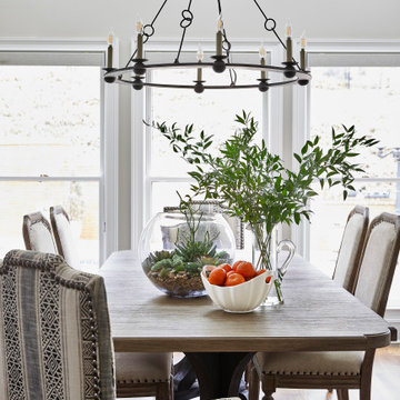
The new plan removed an outdated screened porch at the rear which was replaced with the new family room and moved the kitchen from a dark corner in the front of the house to the center. The visual connection from the kitchen through the family room is dramatic and gives direct access to the rear yard and patio. It was important that the island separating the kitchen from the family room have ample space to the left and right to facilitate traffic patterns, and interaction among family members. Hence vertical kitchen elements were placed primarily on existing interior walls. The cabinetry used was Bilotta’s private label, the Bilotta Collection – they selected beautiful, dramatic, yet subdued finishes for the meticulously handcrafted cabinetry. The double islands allow for the busy family to have a space for everything – the island closer to the range has seating and makes a perfect space for doing homework or crafts, or having breakfast or snacks. The second island has ample space for storage and books and acts as a staging area from the kitchen to the dinner table. The kitchen perimeter and both islands are painted in Benjamin Moore’s Paper White. The wall cabinets flanking the sink have wire mesh fronts in a statuary bronze – the insides of these cabinets are painted blue to match the range. The breakfast room cabinetry is Benjamin Moore’s Lampblack with the interiors of the glass cabinets painted in Paper White to match the kitchen. All countertops are Vermont White Quartzite from Eastern Stone. The backsplash is Artistic Tile’s Kyoto White and Kyoto Steel. The fireclay apron-front main sink is from Rohl while the smaller prep sink is from Linkasink. All faucets are from Waterstone in their antique pewter finish. The brass hardware is from Armac Martin and the pendants above the center island are from Circa Lighting. The appliances, aside from the range, are a mix of Sub-Zero, Thermador and Bosch with panels on everything.

This 1790 farmhouse had received an addition to the historic ell in the 1970s, with a more recent renovation encompassing the kitchen and adding a small mudroom & laundry room in the ’90s. Unfortunately, as happens all too often, it had been done in a way that was architecturally inappropriate style of the home.
We worked within the available footprint to create “layers of implied time,” reinstating stylistic integrity and un-muddling the mistakes of more recent renovations.
Find the right local pro for your project

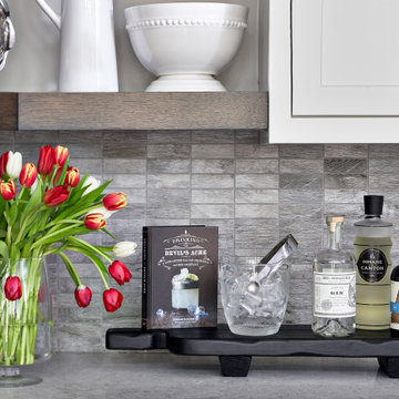
This was a full gut an renovation. The existing kitchen had very dated cabinets and didn't function well for the clients. A previous desk area was turned into hidden cabinetry to house the microwave and larger appliances and to keep the countertops clutter free. The original pendants were about 4" wide and were inappropriate for the large island. They were replaced with larger, brighter and more sophisticated pendants. The use of panel ready appliances with large matte black hardware made gave this a clean and sophisticated look. Mosaic tile was installed from the countertop to the ceiling and wall sconces were installed over the kitchen window. A different tile was used in the bar area which has a beverage refrigerator and an ice machine and floating shelves. The cabinetry in this area also includes a pullout drawer for dog food.

This 1790 farmhouse had received an addition to the historic ell in the 1970s, with a more recent renovation encompassing the kitchen and adding a small mudroom & laundry room in the ’90s. Unfortunately, as happens all too often, it had been done in a way that was architecturally inappropriate style of the home.
We worked within the available footprint to create “layers of implied time,” reinstating stylistic integrity and un-muddling the mistakes of more recent renovations.

jeri houseworth photography
just completed a complete remodel of my 1930 farmhouse kitchen using all of the elements i love...old barnwood island top, hood trim and shelves, white shaker cabinets, chalk painted server which covers an off center radiator, a brick herb wall which ties into the brick fireplace in the family room off the new kitchen and allows us to have fresh herbs at our fingertips, as well as the white shiplap walls, professional appliances ...it turned out just as i had hoped...airy, bright, open but not an open concept which i feel is inappropriate in an older home, cozy, warm and extremely functional...oh and oh so pretty!

For this project, the entire kitchen was designed around the “must-have” Lacanche range in the stunning French Blue with brass trim. That was the client’s dream and everything had to be built to complement it. Bilotta senior designer, Randy O’Kane, CKD worked with Paul Benowitz and Dipti Shah of Benowitz Shah Architects to contemporize the kitchen while staying true to the original house which was designed in 1928 by regionally noted architect Franklin P. Hammond. The clients purchased the home over two years ago from the original owner. While the house has a magnificent architectural presence from the street, the basic systems, appointments, and most importantly, the layout and flow were inappropriately suited to contemporary living.
The new plan removed an outdated screened porch at the rear which was replaced with the new family room and moved the kitchen from a dark corner in the front of the house to the center. The visual connection from the kitchen through the family room is dramatic and gives direct access to the rear yard and patio. It was important that the island separating the kitchen from the family room have ample space to the left and right to facilitate traffic patterns, and interaction among family members. Hence vertical kitchen elements were placed primarily on existing interior walls. The cabinetry used was Bilotta’s private label, the Bilotta Collection – they selected beautiful, dramatic, yet subdued finishes for the meticulously handcrafted cabinetry. The double islands allow for the busy family to have a space for everything – the island closer to the range has seating and makes a perfect space for doing homework or crafts, or having breakfast or snacks. The second island has ample space for storage and books and acts as a staging area from the kitchen to the dinner table. The kitchen perimeter and both islands are painted in Benjamin Moore’s Paper White. The wall cabinets flanking the sink have wire mesh fronts in a statuary bronze – the insides of these cabinets are painted blue to match the range. The breakfast room cabinetry is Benjamin Moore’s Lampblack with the interiors of the glass cabinets painted in Paper White to match the kitchen. All countertops are Vermont White Quartzite from Eastern Stone. The backsplash is Artistic Tile’s Kyoto White and Kyoto Steel. The fireclay apron-front main sink is from Rohl while the smaller prep sink is from Linkasink. All faucets are from Waterstone in their antique pewter finish. The brass hardware is from Armac Martin and the pendants above the center island are from Circa Lighting. The appliances, aside from the range, are a mix of Sub-Zero, Thermador and Bosch with panels on everything.

A large mirror backed wood carving adds a touch of sparkle and intrigue above the master bath’s soaking tub while concealing an inappropriate marble mosaic that failed to enhance the space. Limestone baseboards, door and window casings were added to upgrade the bath, requiring less maintenance.

The new owners opted to replace the aging, historically inappropriate vinyl siding on this Wicker Park single family home with double-dipped McNear “Limehouse" thin brick. Believe it or not, there's a red brick under those two coats of limewash!
Initially, these easy-going homeowners sought out a pure white brick, but ended up using this rustic alternative instead. Notes of the red brick subtly peek through the lime, giving the residence an old world flavor. These bricks were attached using Glen Gery ThinTech panels, and will be sealed soon to protect the wash and allow for easy maintenance. Contrary to popular belief, siding is actually more expensive to take care of over time than masonry!
A special shoutout goes to woman-owned business D. Jones Construction, whose interest in learning all about this unique product before install was welcomed and appreciated!

The new owners opted to replace the aging, historically inappropriate vinyl siding on this Wicker Park single family home with double-dipped McNear “Limehouse" thin brick. Believe it or not, there's a red brick under those two coats of limewash!
Initially, these easy-going homeowners sought out a pure white brick, but ended up using this rustic alternative instead. Notes of the red brick subtly peek through the lime, giving the residence an old world flavor. These bricks were attached using Glen Gery ThinTech panels, and will be sealed soon to protect the wash and allow for easy maintenance. Contrary to popular belief, siding is actually more expensive to take care of over time than masonry!
A special shoutout goes to woman-owned business D. Jones Construction, whose interest in learning all about this unique product before install was welcomed and appreciated!

For this project, the entire kitchen was designed around the “must-have” Lacanche range in the stunning French Blue with brass trim. That was the client’s dream and everything had to be built to complement it. Bilotta senior designer, Randy O’Kane, CKD worked with Paul Benowitz and Dipti Shah of Benowitz Shah Architects to contemporize the kitchen while staying true to the original house which was designed in 1928 by regionally noted architect Franklin P. Hammond. The clients purchased the home over two years ago from the original owner. While the house has a magnificent architectural presence from the street, the basic systems, appointments, and most importantly, the layout and flow were inappropriately suited to contemporary living.
The new plan removed an outdated screened porch at the rear which was replaced with the new family room and moved the kitchen from a dark corner in the front of the house to the center. The visual connection from the kitchen through the family room is dramatic and gives direct access to the rear yard and patio. It was important that the island separating the kitchen from the family room have ample space to the left and right to facilitate traffic patterns, and interaction among family members. Hence vertical kitchen elements were placed primarily on existing interior walls. The cabinetry used was Bilotta’s private label, the Bilotta Collection – they selected beautiful, dramatic, yet subdued finishes for the meticulously handcrafted cabinetry. The double islands allow for the busy family to have a space for everything – the island closer to the range has seating and makes a perfect space for doing homework or crafts, or having breakfast or snacks. The second island has ample space for storage and books and acts as a staging area from the kitchen to the dinner table. The kitchen perimeter and both islands are painted in Benjamin Moore’s Paper White. The wall cabinets flanking the sink have wire mesh fronts in a statuary bronze – the insides of these cabinets are painted blue to match the range. The breakfast room cabinetry is Benjamin Moore’s Lampblack with the interiors of the glass cabinets painted in Paper White to match the kitchen. All countertops are Vermont White Quartzite from Eastern Stone. The backsplash is Artistic Tile’s Kyoto White and Kyoto Steel. The fireclay apron-front main sink is from Rohl while the smaller prep sink is from Linkasink. All faucets are from Waterstone in their antique pewter finish. The brass hardware is from Armac Martin and the pendants above the center island are from Circa Lighting. The appliances, aside from the range, are a mix of Sub-Zero, Thermador and Bosch with panels on everything.

For this project, the entire kitchen was designed around the “must-have” Lacanche range in the stunning French Blue with brass trim. That was the client’s dream and everything had to be built to complement it. Bilotta senior designer, Randy O’Kane, CKD worked with Paul Benowitz and Dipti Shah of Benowitz Shah Architects to contemporize the kitchen while staying true to the original house which was designed in 1928 by regionally noted architect Franklin P. Hammond. The clients purchased the home over two years ago from the original owner. While the house has a magnificent architectural presence from the street, the basic systems, appointments, and most importantly, the layout and flow were inappropriately suited to contemporary living.
The new plan removed an outdated screened porch at the rear which was replaced with the new family room and moved the kitchen from a dark corner in the front of the house to the center. The visual connection from the kitchen through the family room is dramatic and gives direct access to the rear yard and patio. It was important that the island separating the kitchen from the family room have ample space to the left and right to facilitate traffic patterns, and interaction among family members. Hence vertical kitchen elements were placed primarily on existing interior walls. The cabinetry used was Bilotta’s private label, the Bilotta Collection – they selected beautiful, dramatic, yet subdued finishes for the meticulously handcrafted cabinetry. The double islands allow for the busy family to have a space for everything – the island closer to the range has seating and makes a perfect space for doing homework or crafts, or having breakfast or snacks. The second island has ample space for storage and books and acts as a staging area from the kitchen to the dinner table. The kitchen perimeter and both islands are painted in Benjamin Moore’s Paper White. The wall cabinets flanking the sink have wire mesh fronts in a statuary bronze – the insides of these cabinets are painted blue to match the range. The breakfast room cabinetry is Benjamin Moore’s Lampblack with the interiors of the glass cabinets painted in Paper White to match the kitchen. All countertops are Vermont White Quartzite from Eastern Stone. The backsplash is Artistic Tile’s Kyoto White and Kyoto Steel. The fireclay apron-front main sink is from Rohl while the smaller prep sink is from Linkasink. All faucets are from Waterstone in their antique pewter finish. The brass hardware is from Armac Martin and the pendants above the center island are from Circa Lighting. The appliances, aside from the range, are a mix of Sub-Zero, Thermador and Bosch with panels on everything.

This 1790 farmhouse had received an addition to the historic ell in the 1970s, with a more recent renovation encompassing the kitchen and adding a small mudroom & laundry room in the ’90s. Unfortunately, as happens all too often, it had been done in a way that was architecturally inappropriate style of the home.
We worked within the available footprint to create “layers of implied time,” reinstating stylistic integrity and un-muddling the mistakes of more recent renovations.

This was a full gut an renovation. The existing kitchen had very dated cabinets and didn't function well for the clients. A previous desk area was turned into hidden cabinetry to house the microwave and larger appliances and to keep the countertops clutter free. The original pendants were about 4" wide and were inappropriate for the large island. They were replaced with larger, brighter and more sophisticated pendants. The use of panel ready appliances with large matte black hardware made gave this a clean and sophisticated look. Mosaic tile was installed from the countertop to the ceiling and wall sconces were installed over the kitchen window. A different tile was used in the bar area which has a beverage refrigerator and an ice machine and floating shelves. The cabinetry in this area also includes a pullout drawer for dog food.

For this project, the entire kitchen was designed around the “must-have” Lacanche range in the stunning French Blue with brass trim. That was the client’s dream and everything had to be built to complement it. Bilotta senior designer, Randy O’Kane, CKD worked with Paul Benowitz and Dipti Shah of Benowitz Shah Architects to contemporize the kitchen while staying true to the original house which was designed in 1928 by regionally noted architect Franklin P. Hammond. The clients purchased the home over two years ago from the original owner. While the house has a magnificent architectural presence from the street, the basic systems, appointments, and most importantly, the layout and flow were inappropriately suited to contemporary living.
The new plan removed an outdated screened porch at the rear which was replaced with the new family room and moved the kitchen from a dark corner in the front of the house to the center. The visual connection from the kitchen through the family room is dramatic and gives direct access to the rear yard and patio. It was important that the island separating the kitchen from the family room have ample space to the left and right to facilitate traffic patterns, and interaction among family members. Hence vertical kitchen elements were placed primarily on existing interior walls. The cabinetry used was Bilotta’s private label, the Bilotta Collection – they selected beautiful, dramatic, yet subdued finishes for the meticulously handcrafted cabinetry. The double islands allow for the busy family to have a space for everything – the island closer to the range has seating and makes a perfect space for doing homework or crafts, or having breakfast or snacks. The second island has ample space for storage and books and acts as a staging area from the kitchen to the dinner table. The kitchen perimeter and both islands are painted in Benjamin Moore’s Paper White. The wall cabinets flanking the sink have wire mesh fronts in a statuary bronze – the insides of these cabinets are painted blue to match the range. The breakfast room cabinetry is Benjamin Moore’s Lampblack with the interiors of the glass cabinets painted in Paper White to match the kitchen. All countertops are Vermont White Quartzite from Eastern Stone. The backsplash is Artistic Tile’s Kyoto White and Kyoto Steel. The fireclay apron-front main sink is from Rohl while the smaller prep sink is from Linkasink. All faucets are from Waterstone in their antique pewter finish. The brass hardware is from Armac Martin and the pendants above the center island are from Circa Lighting. The appliances, aside from the range, are a mix of Sub-Zero, Thermador and Bosch with panels on everything.

This was a full gut an renovation. The existing kitchen had very dated cabinets and didn't function well for the clients. A previous desk area was turned into hidden cabinetry to house the microwave and larger appliances and to keep the countertops clutter free. The original pendants were about 4" wide and were inappropriate for the large island. They were replaced with larger, brighter and more sophisticated pendants. The use of panel ready appliances with large matte black hardware made gave this a clean and sophisticated look. Mosaic tile was installed from the countertop to the ceiling and wall sconces were installed over the kitchen window. A different tile was used in the bar area which has a beverage refrigerator and an ice machine and floating shelves. The cabinetry in this area also includes a pullout drawer for dog food.

Adding dummy hinge barrels to this decorative rustic shutter gives the impression of functional shutters that differentiate Dynamic Garage Door's custom architectural shutters. Our handmade shutters are made to look real and achieve an authentic appearance to the curb appeal of your home. Each shutter project is custom-fitted for that perfect fit.
One of the biggest mistake in shutter additions is the lack of proper fitting which makes shutters look obviously wrong and inappropriately done for the home in question. Dynamic Garage Door designers and craftsmen are quite discerning when it comes to these details because one wrong measurement can break the entire look and sabotage the ultimate goal.
Our custom shutters are made to perfection and remain authentic to your home's style. We strive to assist you with our educated suggestions while incorporating your own taste and saving your home's architectural identity. Let Dynamic Garage Door create, construct and install your next shutter project. You'll not only gain aesthetic curb appeal but your property/home will increase in value!
Call our design center in Orange County today! (855) 343-3667

This 1790 farmhouse had received an addition to the historic ell in the 1970s, with a more recent renovation encompassing the kitchen and adding a small mudroom & laundry room in the ’90s. Unfortunately, as happens all too often, it had been done in a way that was architecturally inappropriate style of the home.
We worked within the available footprint to create “layers of implied time,” reinstating stylistic integrity and un-muddling the mistakes of more recent renovations.

For this project, the entire kitchen was designed around the “must-have” Lacanche range in the stunning French Blue with brass trim. That was the client’s dream and everything had to be built to complement it. Bilotta senior designer, Randy O’Kane, CKD worked with Paul Benowitz and Dipti Shah of Benowitz Shah Architects to contemporize the kitchen while staying true to the original house which was designed in 1928 by regionally noted architect Franklin P. Hammond. The clients purchased the home over two years ago from the original owner. While the house has a magnificent architectural presence from the street, the basic systems, appointments, and most importantly, the layout and flow were inappropriately suited to contemporary living.
The new plan removed an outdated screened porch at the rear which was replaced with the new family room and moved the kitchen from a dark corner in the front of the house to the center. The visual connection from the kitchen through the family room is dramatic and gives direct access to the rear yard and patio. It was important that the island separating the kitchen from the family room have ample space to the left and right to facilitate traffic patterns, and interaction among family members. Hence vertical kitchen elements were placed primarily on existing interior walls. The cabinetry used was Bilotta’s private label, the Bilotta Collection – they selected beautiful, dramatic, yet subdued finishes for the meticulously handcrafted cabinetry. The double islands allow for the busy family to have a space for everything – the island closer to the range has seating and makes a perfect space for doing homework or crafts, or having breakfast or snacks. The second island has ample space for storage and books and acts as a staging area from the kitchen to the dinner table. The kitchen perimeter and both islands are painted in Benjamin Moore’s Paper White. The wall cabinets flanking the sink have wire mesh fronts in a statuary bronze – the insides of these cabinets are painted blue to match the range. The breakfast room cabinetry is Benjamin Moore’s Lampblack with the interiors of the glass cabinets painted in Paper White to match the kitchen. All countertops are Vermont White Quartzite from Eastern Stone. The backsplash is Artistic Tile’s Kyoto White and Kyoto Steel. The fireclay apron-front main sink is from Rohl while the smaller prep sink is from Linkasink. All faucets are from Waterstone in their antique pewter finish. The brass hardware is from Armac Martin and the pendants above the center island are from Circa Lighting. The appliances, aside from the range, are a mix of Sub-Zero, Thermador and Bosch with panels on everything.

This 1790 farmhouse had received an addition to the historic ell in the 1970s, with a more recent renovation encompassing the kitchen and adding a small mudroom & laundry room in the ’90s. Unfortunately, as happens all too often, it had been done in a way that was architecturally inappropriate style of the home.
We worked within the available footprint to create “layers of implied time,” reinstating stylistic integrity and un-muddling the mistakes of more recent renovations.
7