
Search results for "Including projected" in Home Design Ideas
 Studio M Interiors
Scott Amundson Photography
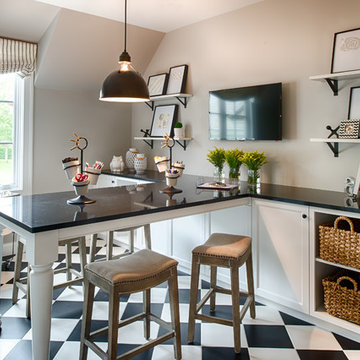
Example of a mid-sized classic built-in desk craft room design in Minneapolis with gray walls
Example of a mid-sized classic built-in desk craft room design in Minneapolis with gray walls
 Lewis Design-Build-Remodel
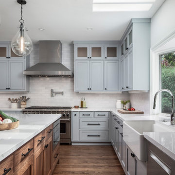
Example of a large transitional u-shaped medium tone wood floor and brown floor kitchen design in San Francisco with a farmhouse sink, shaker cabinets, quartz countertops, white backsplash, brick backsplash, stainless steel appliances, white countertops, gray cabinets and an island
 Rob Bowen Design Group
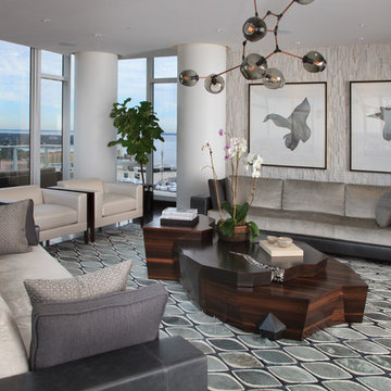
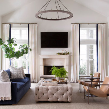
Inspiration for a large contemporary living room remodel in Tampa with gray walls
Find the right local pro for your project
 Cape Associates, Inc.
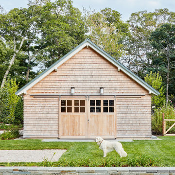
This home, set at the end of a long, private driveway, is far more than meets the eye. Built in three sections and connected by two breezeways, the home’s setting takes full advantage of the clean ocean air. Set back from the water on an open plot, its lush lawn is bordered by fieldstone walls that lead to an ocean cove.
The hideaway calms the mind and spirit, not only by its privacy from the noise of daily life, but through well-chosen elements, clean lines, and a bright, cheerful feel throughout. The interior is show-stopping, covered almost entirely in clear, vertical-grain fir—most of which was source from the same place. From the flooring to the walls, columns, staircases and ceiling beams, this special, tight-grain wood brightens every room in the home.
At just over 3,000 feet of living area, storage and smart use of space was a huge consideration in the creation of this home. For example, the mudroom and living room were both built with expansive window seating with storage beneath. Built-in drawers and cabinets can also be found throughout, yet never interfere with the distinctly uncluttered feel of the rooms.
The homeowners wanted the home to fit in as naturally as possible with the Cape Cod landscape, and also desired a feeling of virtual seamlessness between the indoors and out, resulting in an abundance of windows and doors throughout.
This home has high performance windows, which are rated to withstand hurricane-force winds and impact rated against wind-borne debris. The 24-foot skylight, which was installed by crane, consists of six independently mechanized shades operating in unison.
The open kitchen blends in with the home’s great room, and includes a Sub Zero refrigerator and a Wolf stove. Eco-friendly features in the home include low-flow faucets, dual-flush toilets in the bathrooms, and an energy recovery ventilation system, which conditions and improves indoor air quality.
Other natural materials incorporated for the home included a variety of stone, including bluestone and boulders. Hand-made ceramic tiles were used for the bathroom showers, and the kitchen counters are covered in granite – eye-catching and long-lasting.
 Hammer & Hand
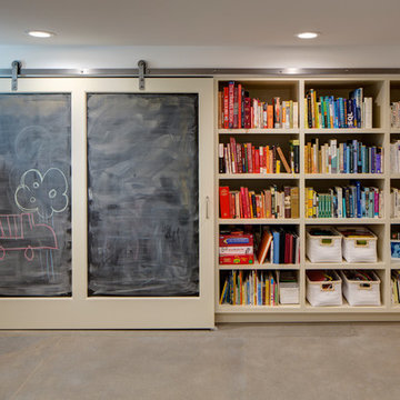
Referred to inside H&H as “the basement of dreams,” this project transformed a raw, dark, unfinished basement into a bright living space flooded with daylight. Working with architect Sean Barnett of Polymath Studio, Hammer & Hand added several 4’ windows to the perimeter of the basement, a new entrance, and wired the unit for future ADU conversion.
This basement is filled with custom touches reflecting the young family’s project goals. H&H milled custom trim to match the existing home’s trim, making the basement feel original to the historic house. The H&H shop crafted a barn door with an inlaid chalkboard for their toddler to draw on, while the rest of the H&H team designed a custom closet with movable hanging racks to store and dry their camping gear.
Photography by Jeff Amram.
 AquaTerra Outdoors
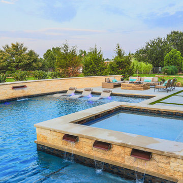
This late 70's ranch style home was recently renovated with a clean, modern twist on the ranch style architecture of the existing residence. We were hired to create the entire outdoor environemnt including the new pool and spa. Similar to the renovated home, this aquatic environment was designed to take a traditional pool and gives it a clean, modern twist. The site proved to be perfect for a long, sweeping curved water feature that can be seen from all of the outdoor gathering spaces as well as many rooms inside the residence. This design draws people outside and allows them to explore all of the features of the pool and outdoor spaces. Features of this resort like outdoor environment include play pool with two lounge areas with LED lit bubblers, Pebble Tec Pebble Sheen Luminous series pool finish, Lightstreams glass tile, spa with six custom copper Bobe water spillway scuppers, water feature wall with three custom copper Bobe water scuppers, Fully automated with Pentair Equipment, LED lighting throughout the pool and spa, gathering space with automated fire pit, lounge deck area, synthetic turf between step pads and deck and a fully loaded Gourmet outdoor kitchen to meet all the entertaining needs.
This outdoor environment cohesively brings the clean & modern finishes of the renovated home seamlessly to the outdoors to a pool and spa for play, exercise and relaxation.
Photography: Daniel Driensky
 Studio Nauleau
Ashley Batz
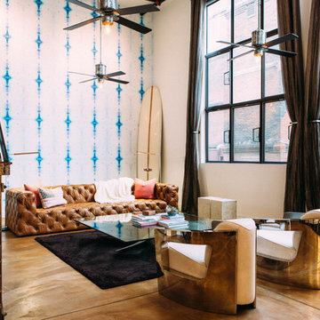
Living room - large industrial open concept concrete floor living room idea in San Francisco with multicolored walls, no fireplace and no tv
Living room - large industrial open concept concrete floor living room idea in San Francisco with multicolored walls, no fireplace and no tv
Sponsored
Delaware, OH

Buckeye Basements, Inc.
Central Ohio's Basement Finishing ExpertsBest Of Houzz '13-'21
 TKS Design Group
Free ebook, Creating the Ideal Kitchen. DOWNLOAD NOW
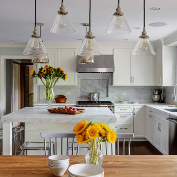
Starting out with a project that has good bones is always a bonus as was the case with the project. This young family has a great house on a great street in a great location. The kitchen was a large space with ample room and great view to the backyard. The dated cabinets and large peninsula layout however were not working for them, so they came in looking for a fresh start.
Goals for the project included adding a large island with seating for four and a bright, open and cheerful space for daily meals and entertaining. Our clients also wanted to keep the existing breakfast table, but the original space did not allow for an island and breakfast table. Our solution was to create banquette seating which gave us the extra inches necessary to accomplish both.
The larger awning window over the kitchen sink allows for ample light in the new space. The wall between the kitchen and family room was partially removed to provide the more open feeling our clients desired.
The work triangle is centered on the island which serves as a big open prep space conveniently located across from the large pro style range. The island also houses the microwave and a 2nd oven for larger gatherings. A new counter depth fridge and beverage center provide options for refrigeration.
A simple pallet of white cabinetry, Carrera marble countertops and polished nickel fixtures will be a timeless look and provide a lovely backdrop for entertaining and spending time with family.
Designed by: Susan Klimala, CKD, CBD
Photography by: Mike Kaskel
For more information on kitchen and bath design ideas go to: www.kitchenstudio-ge.com

 Rudloff Custom Builders
Photos by Alicia's Art, LLC
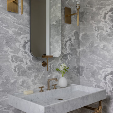
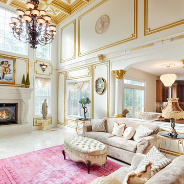
RUDLOFF Custom Builders, is a residential construction company that connects with clients early in the design phase to ensure every detail of your project is captured just as you imagined. RUDLOFF Custom Builders will create the project of your dreams that is executed by on-site project managers and skilled craftsman, while creating lifetime client relationships that are build on trust and integrity.
We are a full service, certified remodeling company that covers all of the Philadelphia suburban area including West Chester, Gladwynne, Malvern, Wayne, Haverford and more.
As a 6 time Best of Houzz winner, we look forward to working with you on your next project.
 Sun Design Remodeling Specialists, Inc.
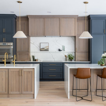
Kitchen - transitional kitchen idea in DC Metro with a drop-in sink, quartzite countertops, white backsplash, quartz backsplash, stainless steel appliances, two islands and white countertops
 JBMP Architecture and Interior Design
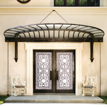
Entryway - mediterranean entryway idea in New York with a dark wood front door
 Drewett Works
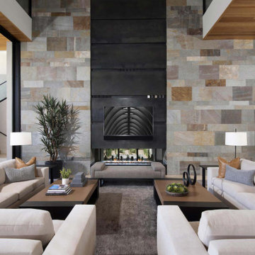
With adjacent neighbors within a fairly dense section of Paradise Valley, Arizona, C.P. Drewett sought to provide a tranquil retreat for a new-to-the-Valley surgeon and his family who were seeking the modernism they loved though had never lived in. With a goal of consuming all possible site lines and views while maintaining autonomy, a portion of the house — including the entry, office, and master bedroom wing — is subterranean. This subterranean nature of the home provides interior grandeur for guests but offers a welcoming and humble approach, fully satisfying the clients requests.
While the lot has an east-west orientation, the home was designed to capture mainly north and south light which is more desirable and soothing. The architecture’s interior loftiness is created with overlapping, undulating planes of plaster, glass, and steel. The woven nature of horizontal planes throughout the living spaces provides an uplifting sense, inviting a symphony of light to enter the space. The more voluminous public spaces are comprised of stone-clad massing elements which convert into a desert pavilion embracing the outdoor spaces. Every room opens to exterior spaces providing a dramatic embrace of home to natural environment.
Grand Award winner for Best Interior Design of a Custom Home
The material palette began with a rich, tonal, large-format Quartzite stone cladding. The stone’s tones gaveforth the rest of the material palette including a champagne-colored metal fascia, a tonal stucco system, and ceilings clad with hemlock, a tight-grained but softer wood that was tonally perfect with the rest of the materials. The interior case goods and wood-wrapped openings further contribute to the tonal harmony of architecture and materials.
Grand Award Winner for Best Indoor Outdoor Lifestyle for a Home This award-winning project was recognized at the 2020 Gold Nugget Awards with two Grand Awards, one for Best Indoor/Outdoor Lifestyle for a Home, and another for Best Interior Design of a One of a Kind or Custom Home.
At the 2020 Design Excellence Awards and Gala presented by ASID AZ North, Ownby Design received five awards for Tonal Harmony. The project was recognized for 1st place – Bathroom; 3rd place – Furniture; 1st place – Kitchen; 1st place – Outdoor Living; and 2nd place – Residence over 6,000 square ft. Congratulations to Claire Ownby, Kalysha Manzo, and the entire Ownby Design team.
Tonal Harmony was also featured on the cover of the July/August 2020 issue of Luxe Interiors + Design and received a 14-page editorial feature entitled “A Place in the Sun” within the magazine.

 TKS Design Group
Download our free ebook, Creating the Ideal Kitchen. DOWNLOAD NOW
This client was referred to us from a past client. They are a busy 2-career household with young children and enjoy entertaining friends and family in their home. They have a beautiful open concept home but unfortunately the kitchen was not fitting for the rest of the home. They were not quite sure what to do with the space. We talked about trying to refresh it or do more of a minor remodel, but in the end they decided a full gut would get them to where they wanted to be.
One problem was there was no place for guests to hang out other than the large and awkward banquette area. The brick wall and tiled hood area were feeling a bit dated and tired. The space was just not functional for their lifestyle. There was no prep space near the cooktop and no landing area for items coming out of the ovens or refrigerator, plus a big dead zone in the center of the room.
Banquettes, like the one they previously had in the space, are great for small spaces, but when they get really large like this one, it makes getting in and out of the seating area awkward and uncomfortable. Plus, there was room for a large table, so we eliminated the awkward built in.
We started by removing the faux brick wall between the kitchen and back entry. We relocated the entry to the garage over a couple feet in order to get every last inch out of the new kitchen. We also made the decision to close up the primary window that faced the pretty ho hum brick wall of the neighbor’s house. There was plenty of light coming in from the seating area, so we just didn’t feel the window was adding much to the room.
Construction went smoothy. There was a bit of rework with electrical, flooring and HVAC, but in the end, we think it was well worth it.
The clients really wanted a sleek contemporary look, and we originally had planned for a full height slab backsplash, but due to it’s size, it was a budget buster. Instead, we got creative and settled on large format porcelain tiles that have a similar feel but were a fraction of the cost. We made sure the wall was plumb and level so that the fit and finish would mimic that of slab material.
The final space was quite a change. A large prep sink sits directly across from the new pro-style range with plenty additional prep space on the large island. The refrigerator and ovens now have miles of landing space, and a nice tight work triangle makes cooking a breeze.
Since we wanted a more contemporary feel, not many wall cabinets were included. Instead, we outfitted some of the drawers for dish storage with a peg system. Two large pantries flanking the refrigerator hold baking supplies and small appliances. Large drawers by the cooktop hold pots and pans, and an appliance garage tucked away to the left of the range hides away miscellaneous items. The large island also houses a microwave drawer and tons of storage, most of which is drawers offering maximum convenience.
The island now seats 5-6 people comfortably along with the new table in the seating area which can seat up to 8. Entertaining will be a breeze in this space. With such a clean backdrop, we knew we would need some drama with the lighting, so we chose two sets of staggered pendants, which we adjusted for the right visual balance above the island.
We also included a small coffee station to the right of the main kitchen, which helps keep the coffee clutter out of the kitchen proper. Two tones of complimentary gray are featured in this kitchen. The perimeter is a light gray that reads almost white. The island is a gray stain that adds some depth and interest with the visible wood texture. The countertops are clean white quartz, and the hardware, barstools and light fixtures add warm brass tones. I see lots of cooking and entertaining with family and friends in the near future in this bright and airy new space.
Designed by: Susan Klimala, CKD, CBD
Photography by: Michael Kaskel
For more information on kitchen and bath design ideas go to: www.kitchenstudio-ge.com
 TKS Design Group
Free ebook, Creating the Ideal Kitchen. DOWNLOAD NOW
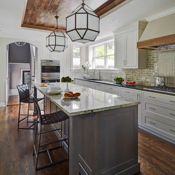
This young family of four came in right after closing on their house and with a new baby on the way. Our goal was to complete the project prior to baby’s arrival so this project went on the expedite track. The beautiful 1920’s era brick home sits on a hill in a very picturesque neighborhood, so we were eager to give it the kitchen it deserves. The clients’ dream kitchen included pro-style appliances, a large island with seating for five and a kitchen that feels appropriate to the home’s era but that also is fresh and modern. They explicitly stated they did not want a “cookie cutter” design, so we took that to heart.
The key challenge was to fit in all of the items on their wish given the room’s constraints. We eliminated an existing breakfast area and bay window and incorporated that area into the kitchen. The bay window was bricked in, and to compensate for the loss of seating, we widened the opening between the kitchen and formal dining room for more of an open concept plan.
The ceiling in the original kitchen is about a foot lower than the rest of the house, and once it was determined that it was to hide pipes and other mechanicals, we reframed a large tray over the island and left the rest of the ceiling as is. Clad in walnut planks, the tray provides an interesting feature and ties in with the custom walnut and plaster hood.
The space feels modern yet appropriate to its Tudor roots. The room boasts large family friendly appliances, including a beverage center and cooktop/double oven combination. Soft white inset cabinets paired with a slate gray island provide a gentle backdrop to the multi-toned island top, a color echoed in the backsplash tile. The handmade subway tile has a textured pattern at the cooktop, and large pendant lights add more than a bit of drama to the room.
Designed by: Susan Klimala, CKD, CBD
Photography by: Mike Kaskel
For more information on kitchen and bath design ideas go to: www.kitchenstudio-ge.com

 Gallery KBNY
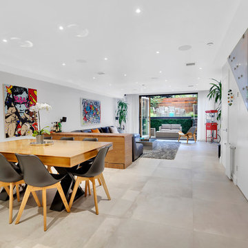
The owner of this historic and landmarked town-home renovation in Hudson Square, originally built in 1826, hired Gallery Kitchen and Bath to fully gut-renovate this 3-unit row-home. The scope of work included a full-scale renovation of the owners unit, including the renovation of the kitchen, one 4-piece master ensuite bathroom, one 3-piece bathroom with a walk-in steam shower, and a beautiful powder room. Additional work in the owners unit also included flooring, electrical upgrade, major plumbing work, new HVAC system, restoration of a fireplace, installation of a fully integrated smart home system and landmarked approved windows.
CELLAR RENOVATION IN NYC LANDMARKED TOWN-HOME
Rounding out the owners unit we renovated the cellar, which was converted into an entertainment space and featured a custom glass curtain wall, along with a custom staircase with an exposed brick wall. During the demolition phase of the cellar, our team discovered 56 wine jugs filled with wine from the prohibition era, leading us to name this project the prohibition house. For the two tenant units, Gallery Kitchen and Bath undertook the renovation of 2 kitchens, 4 bathrooms, new hardwood flooring throughout, along with detailed carpentry work in the entire home.
WHY GALLERY KITCHEN AND BATH
After interviewing multiple contractors, our client decided on Gallery Kitchen and Bath primarily because of our turnkey design, selection, and build process. In a renovation of this magnitude it is crucial to have a centralized full service contractor under one roof to handle all of the aspects and simultaneous moving parts of the project. Decentralizing the entire process by having multiple unaffiliated vendors handle various parts of the process can easily become chaotic, time consuming, and costly.
Because Gallery Kitchen and Bath undertook the entire process, from the design of the entire space to the selection and procurement of all finishes and fixtures, down to the procurement of all permits and LPC filings, it made a seemingly chaotic project a’lot more manageable.
PHASE 1: DESIGN, SELECTION, PROCUREMENT
Our client wanted the renovation to incorporate a fully modern design into his Hudson Square town-house. Being that this is a landmarked property, the exterior facade had to be restored and kept with the original aesthetic, the interior of the home however was a whole different story.
In keeping up with the modern aesthetic, our designers went to work to design a custom kitchen that included fully custom flat panel base cabinets in a white high gloss finish and an absolute matte black appliance/pantry wall. The kitchen design also included a white quartz countertop and backsplash with a waterfall edge island. To bring warmth to the modern kitchen, our designers incorporated a rifted and quartered select oak wood floor in a herringbone pattern, and custom blended stain with matte polyurethane finish. For continuity, the wood floor was also extended throughout the entire owners unit.
In the ensuite bathroom we created a “wet area” which houses a standalone soaking tub as well as a beautiful rainfall shower, completely leveled with the rest of the floor in the bathroom. Some highlights within this space include a tiled square drain, large niche cutouts with a carrera marble accents. Once again, to bring warmth to this modern bathroom, our designers incorporated a floating rustic oak vanity and carrera marble mosaic floor tile.
Last on the list on the owners unit floor was the cellar, which our client wanted to utilize as an entertainment space for his friends and family. During the design phase, we incorporated an open concept layout, wedding the indoor and outdoor space with a custom glass curtain wall. The design also included custom walnut built-ins that serve as a custom wet bar and storage piece.
With the design approved and selections made our office liaisons moved to procure all of the material selections and finishes.
PHASE 2: DEMO
Because this home is almost two centuries old, we had to take extra precaution during the interior demolition phase of the project. One specific area that we had to pay special attention to was the existing brick. Over time the mortar in old brick homes deteriorates and turns into dust – for this reason it was extremely important that a thorough and ongoing inspection of the exteriors and interior walls took place during the demolition of the space.
After 14 30-yard debris containers and 56 wine filled jugs from the prohibition era later , the demolition of this historic Hudson Square town-home came to an end. If you are wondering whether we tried the wine? After notifying the owner we agreed to open one of the jugs and try them together – nothing but vinegar.
PHASE 3: BUILD
One of the challenges in a renovation project of this scope is nailing down the logistics and delivery of fixtures and finish material. Adding to this challenge was a narrow entry door that required us to use a boom truck in order to deliver some of the larger materials on site. To ensure a succinct time schedule, we boomed all of the materials through the 3rd floor for the entire project and worked our renovation work from top floor to cellar. This technique also insured that any unexpected water issues during the renovation process would not damage a finished floor.
With all roughing and framing complete, the Gallery KBNY team proceeded to execute on the design plan.
THE REVEAL
From what was once a dilapidated town-home with nothing but potential, to a glamorous and luxurious modern interior space – the prohibition house was complete. Ready to speak with us about your renovation project? Contact us to schedule your free consultation and let Gallery KBNY show you why our all-inclusive approach to your renovation is the smartest way to renovating in NYC.


 Twelve Stones Designs, LLC
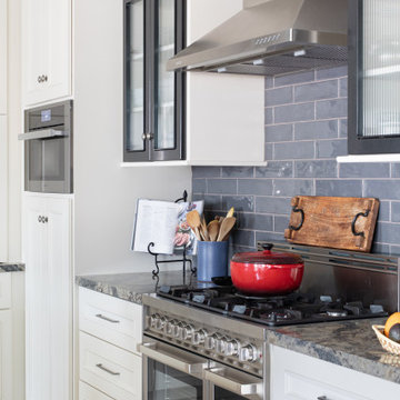
The owners of this kitchen had spent the money to upgrade the finishes in their kitchen upon building the home 12 years ago, but after living in the space for several years they realized how nonfunctional the layout really was. The (then) two preschool aged children had grown into busy, hungry teenagers with many friends who also liked to hang out at the house. So the family needed a more functional kitchen with better traffic flow, space for daily activities revolving around the kitchen at different times of day, and a kitchen that could accommodate cooking for and serving large groups. Furthermore, the dark, traditional finishes no longer reflected the homeowners’ style. They requested a brighter, more relaxed, coastal style that reflected their love of the seaside cities they like to visit.
Originally, the kitchen was U-shaped with a narrow island in the middle. The island created narrow aisles that bottle-necked at the dishwasher, refrigerator, and cooktop areas. There was a pass-through from the foyer into the kitchen, but the owners never liked that the pass-through was also located so close to the powder room. The awkward proximity was unappealing and made guests feel uncomfortable.
The kitchen’s storage was made up of lots of narrow cabinets, apothecary drawers, clipped corner units, and very few drawers. It lacked useful storage for the larger items the family used on a daily basis. And the kitchen’s only pantry was small closet that had only builder-grade, narrow shelving with no illumination to be able to see the contents inside.
Overall, the kitchen’s lighting plan was poorly executed. Only six recessed cans illuminated the entire kitchen and nook areas. The under cabinet lighting was not evenly distributed either. In fact, the builder had mis-placed the under cabinet lighting around the decorative pilasters which made for choppy, dark cubbies. Further, the builder didn’t include any lighting over the sink or the bar area, which meant whoever was doing the dishes was always in their own shadow. That, coupled with the steep overhang of the game room above made the bar area feel like a dim, cavernous space that wasn’t inviting or task oriented. The kitchen looked out into the main living space, but the raised bar and a narrow wall (which held the only large cabinet in the kitchen) created more of a barrier than a relationship to the living room or breakfast nook. In fact, one couldn’t even see the breakfast nook from the cooktop or sink areas due to its orientation. The raised bar top was too narrow to comfortably sit to either dine at or chat from due to the lack of knee space. The the homeowners confided that the kitchen felt more like a dark, dirty prison than place where the family, or their guests, wanted to gather and commune.
The clients' needs and desires were:
➢ to create a kitchen that would be a space the family loved to be in; to relate to the adjacent spaces all around, and to have better flow for entertaining large groups
➢ to remove the walls between the breakfast nook and living area and to be able to utilize the natural light from the windows in both those areas
➢ to incorporate a functional chopping block for prepping fresh food for home cooked meals, an island with a large sink and drain board, 2 pull out trash cans, and seating for at least the 2 teens to eat or do homework
➢ to design a kitchen and breakfast nook with an airy, coastal, relaxed vibe that blended with the rest of the house's coastal theme
➢ to integrate a layered lighting plan which would include ample general illumination, specific task lighting, decorative lighting, and lots of illuminated storage
➢ to design a kitchen with not only more storage for all the husband’s kitchen gadgets and collection of oils and spices, but smart storage, including a coffee/breakfast bar and a place to store and conceal the toaster oven and microwave
➢ to find a way to utilize the large open space between the kitchen, pantry area, and breakfast nook
Twelve Stones Designs achieved the owner's goals by:
➢ removing the walls between the kitchen and living room to allow the natural light to filter in from the adjacent rooms and to create a connection between the kitchen, nook, and living spaces for a sense of unity and communion
➢ removing the existing pantry and designing 3 large pantry style cabinets with LED tape lights and rollout drawers to house lots of kitchen appliances, gadgets, and tons of groceries. We also took the cabinets all the way up to the 9’ ceiling for additional storage for seasonal items and bulk storage.
➢ designing 2 islands - 1 with a gorgeous black walnut chopping block that houses a drawer for chopping and carving knives and a custom double pull out trash unit for point of use utilization - and 1 that houses the dishwasher, a large Blanco Gourmet sink with integrated drain board, woven baskets for fresh root vegetables and kitchen towels, plenty of drawer storage for kitchen items, and bar seating for up to 4 diners.
➢ closing off the space between the kitchen and the powder room to create a beautiful new private alcove for the powder room as well as adding some decorative storage. This also gave us space to include more tall storage near the new range for precision placement of the husband’s extensive oil and spice collection as well as a location for a combo-steam oven the wife wanted for baking and cooking healthy meals.
The project is enhanced functionally by:
➢ incorporated USB and standard receptacles for the kids’ laptops and phone charging in the large island
➢ designing the small island to include additional open shelving for items used on a daily basis such as a variety of bowls, plates, and colanders. This set up also works well for the husband who prefers to “plate” his dinners in restaurant-style fashion before presenting them to the table.
➢ the integration of specific storage units, such as double stacked cutlery drawers, a custom spice pull-out, a Kuerig coffee and tea pod drawer, and custom double stacked utensil drawers
➢ moving the refrigerator to the old oven location - this eliminated the bottle neck as well as created a better relationship to the eating table. It also utilizes the floor space between the pantry, nook, and kitchen
➢ creating a banquet style breakfast nook - this banquette seating not only doubles the amount of seating for large gatherings but it better utilizes the odd space between the kitchen and the previous nook area. It also helps to create a distinct pathway from the mudroom room through the pantry area, kitchen, nook, and living room.
➢ the coffee/breakfast bar area which includes the perfect location for the concealed microwave and toaster oven, convenient storage for the coffee pods and tea accoutrements. Roll-out drawers below also house the smoothie maker, hot water kettle, and a plethora of smoothie-making ingredients such as protein powders, smoothie additives, etc. Furthermore, the drawers below the Keurig house measuring utensil, cutlery, baking supplies and tupperware storage.
➢ incorporating lots of wide drawers and pullouts to accommodate large cookware.
➢ utilizing as much vertical space as possible by building storage to the ceiling which accommodates the family’s abundant amount of serving platters, baking sheets, bakeware, casserole dishes, and additional cutting boards.
The project is enhanced aesthetically by:
➢ new 5-piece Versailles pattern porcelain tile that now seamlessly joins the entire down stairs area together creating a bright, cohesiveness feeling instead of choppy separated spaces - it also adds a coastal feeling
➢ designing a cabinet to conceal the microwave and toaster oven
➢ the coastal influenced light fixtures over the nook table and island
➢ the sandy colors of the Langdon Cambria countertops. The swirling pattern and sparkling quartz pieces remind the homeowner of black-and-tan sandy beaches
➢ the striped banquet seating whose creamy white background and blue-green stripes were the inspiration for the cabinet and wall colors.
➢ All the interior doors were painted black to coordinate with the blacks and grays in the backsplash tile and countertop. This also adds a hint of tailored formality to an otherwise casual space.
➢ the use of WAC's Oculux small aperture LED units for the overhead lighting complimented with Diode LED strips for task lighting under the cabinets and inside the pantry and glass wall cabinets. All of the lighting applications are on separate dimmer switches.
Innovative uses of materials or construction methods by Realty Restoration LLC:
➢ Each 1-1/2” x 3” block of reclaimed end-grain black walnut that makes up the center island chopping block was hand milled and built in the shop. It was designed to look substantial and proportional to the surrounding elements, executed by creating the 4 inch tall top with a solid wood chamfered edge band.
➢ The metal doors on either side of the vent hood were also custom designed for this project and built in the Realty Restoration LLC shop. They are made 1x2, 11-gauge mild steel with ribbed glass. Weighing 60 lbs a piece, heavy duty cabinet hinges were added to support the weight of the door and keep them from sagging.
➢ Under-cabinet receptacles were added along the range wall in order to have a clean, uninterrupted backsplash.
Design obstacles to overcome:
➢ Because we were removing the demising walls between the kitchen and living room, we had to find a way to plumb and vent the new island. We did this by tunneling through the slab (the slab had post tension cables which prevented us from just trenching) to run a new wet vent through a nearby structural wall. We pulled the existing hot and cold lines between upper floor joists and ran them down the structural wall as well and up through a conduit in the tunnel.
➢ Since we were converting from wall overs to a gas range it allowed us to utilize the 220 feed for the wall ovens to provide a new sub panel for all the new kitchen circuits
➢ Due to framing deficiencies inherited from the original build there was a 1-1/2” differential in the floor-to-ceiling height over a 20 foot span; by utilizing the process of cutting and furring coupled with the crown moulding details on the cabinet elevations we were able to mask the problem and provide seamless transitions between the cabinet components.
Evidence of superior craftsmanship:
➢ uniquely designed, one-of-a-kind metal “X” end panels on the large island. The end panels were custom made in the Realty Restoration LLC shop and fitted to the exact dimensions of the island. The welding seams are completely indistinguishable - the posts look like they are cut from a single sheet of metal
➢ square metal posts on the small island were also custom made and designed to compliment and carry through the metal element s throughout the kitchen
➢ the beautiful, oversized end panels on the pantry cabinets which give the breakfast nook a tailored look
➢ integrating a large format 5 piece Versailles tile pattern to seamlessly flow from the existing spaces into the new kitchen space
➢ By constructing a custom cabinet that jogged around a corner we could not remodel (housing the entry way coat closet) we were able to camouflage the adjacent wall offset within the upper and lower cabinets. By designing around the existing jog in the structural walls we accomplished a few things: we were able to find the space to house, and hide, the microwave and toaster oven yet still have a clean cohesive appearance from the kitchen side. Additionally, the owners were able to keep their much needed coat closet and we didn’t have to increase the budget with unnecessary structural work.
 WERK | Building Modern
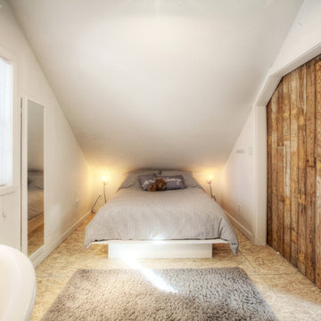
Carriage House loft bedroom shares space directly with open bathroom with barn door separation from loft kitchen/living space - Interior Architecture: HAUS | Architecture + BRUSFO - Construction Management: WERK | Build - Photo: HAUS | Architecture

23